Wisteria sits between lavender and lilac on the color spectrum, a soft purple that feels dreamy, nostalgic, and quietly confident. It is often linked with creativity, romance, and calm, making it perfect for storytelling visuals, cozy aesthetics, and elegant branding. When used well, a wisteria color palette can instantly soften your scene, flatter skin tones, and create a memorable atmosphere for your audience.
For creators, wisteria works beautifully in video intros, YouTube thumbnails, lower thirds, social posts, and even full brand systems. Below you will find carefully curated wisteria color palettes with HEX codes you can plug straight into Filmora or your design tools. Each palette is tuned for specific moods and content types, so you can move from idea to finished edit with a cohesive, cinematic look.
In this article
Soft and Romantic Wisteria Color Palettes
Twilight Garden Glow
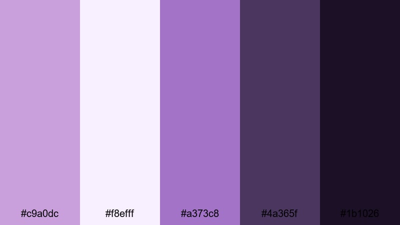
- HEX Codes: #c9a0dc, #f8efff, #a373c8, #4a365f, #1b1026
- Mood: Dreamy, nostalgic, and intimate.
- Use for: Perfect for wedding highlight reels, engagement stories, or romantic travel vlogs where you want a soft cinematic glow.
Twilight Garden Glow mixes gentle wisteria and lilac with rich plum shadows, creating a soft-focus look that feels like golden hour sliding into night. The lighter HEX tones (#c9a0dc and #f8efff) are ideal for titles, borders, or text backgrounds, while the deeper shades (#4a365f and #1b1026) give your frames depth and contrast.
This palette is made for storytelling that lingers on emotion: slow wedding montages, proposal recaps, or intimate travel sequences. Use the lighter hues in your opening titles, then bring the darker purples into lower thirds, chapter cards, or end screens to frame your couple or subject against a moody, cinematic backdrop.
Pro Tip: Build a Cinematic Wisteria Look in Filmora
To keep a Twilight Garden Glow aesthetic consistent, start by picking one or two key HEX colors from this palette and apply them across all your Filmora assets. Use them in your title templates, lower thirds, and background shapes so every scene feels like part of the same romantic evening.
You can also lean on Filmora transitions and soft blur effects to echo the dreamy feel of wisteria tones. Subtle crossfades or light leaks between shots, combined with this palette, help your wedding reels and love stories feel cohesive from intro to outro, and across vertical clips, teasers, and full edits.
AI Color Palette
If you have a favorite still frame, moodboard, or photo of real wisteria flowers, you can turn it into a reference image for your entire edit. Filmora's AI Color Palette feature lets you sample the color mood from that one image and apply it automatically to other clips in your timeline.
Simply load your reference shot with the wisteria tones you love, then use AI Color Palette to match the look across your A-roll, B-roll, and cutaways. This saves time and ensures that every scene, thumbnail still, and social cut carries the same soft purple cinematic signature.
HSL, Color Wheels & Curves
Once you have a base wisteria look, fine-tune it in Filmora using HSL, color wheels, and curves. You can gently push purples toward a warmer, rosy tint for romantic skin tones, or cool them down for a more mysterious twilight vibe. Tools like the midtone color wheel and RGB curves give you precise control while keeping the palette balanced.
For a deeper dive into balancing highlights and shadows, explore Filmora's color correction tools to learn how small curve adjustments can protect detail in white dresses, veils, and night skies while keeping those wisteria shadows rich and cinematic.
1000+ Video Filters & 3D LUTs
If you want to stylize your wisteria palette fast, Filmora's video filters and 3D LUTs make it easy to test different looks without rebuilding your grade from scratch. Start with a romantic or cinematic LUT, then adjust intensity so your Twilight Garden Glow colors still feel natural.
You can save your favorite combinations of LUT + wisteria palette as presets and reuse them across wedding edits, teaser trailers, and social snippets. This keeps your brand or studio recognizable while speeding up your color workflow for every new project.
Lavender Letters
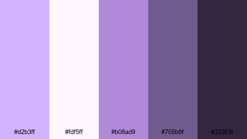
- HEX Codes: #d2b3ff, #fdf5ff, #b08ad9, #705b8f, #33263f
- Mood: Sentimental, cozy, and handwritten.
- Use for: Ideal for journaling vlogs, study-with-me videos, or nostalgic storytime content with a gentle romantic flair.
Lavender Letters feels like opening an old notebook filled with pressed flowers and ink sketches. The soft lavenders and warm off-whites create a gentle base, while the inky purples (#705b8f and #33263f) mimic pen strokes and shadows.
Use the lightest HEX (#fdf5ff) for background cards and chapter titles, then bring in the darker tones for text, hand-drawn doodles, or subtle borders around your footage. This palette works especially well in journaling vlogs, study-with-me layouts, and storytime thumbnails where you want every frame to feel personal and written by hand.
Moonlit Balcony
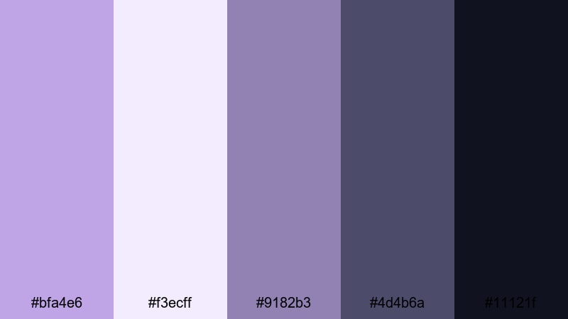
- HEX Codes: #bfa4e6, #f3ecff, #9182b3, #4d4b6a, #11121f
- Mood: Cinematic, quiet, and contemplative.
- Use for: Use for slow-paced night scenes, lyrical music videos, or cinematic short films with emotional depth.
Moonlit Balcony combines silvery wisteria with dusky blues and almost-black shadows to capture the hush of late-night scenes. The midtone purple-blues (#bfa4e6 and #9182b3) keep your visuals soft, while #11121f anchors your frames with a true night-sky depth.
Apply this palette to narrative short films, night-time B-roll, or moody music videos. Use the lightest tone (#f3ecff) for subtitles or fine line graphics so text remains readable over darker footage, and reserve the deepest HEX for letterbox bars, logo stings, or closing slates to give your project a polished cinematic finish.
Petal Dust Dreams
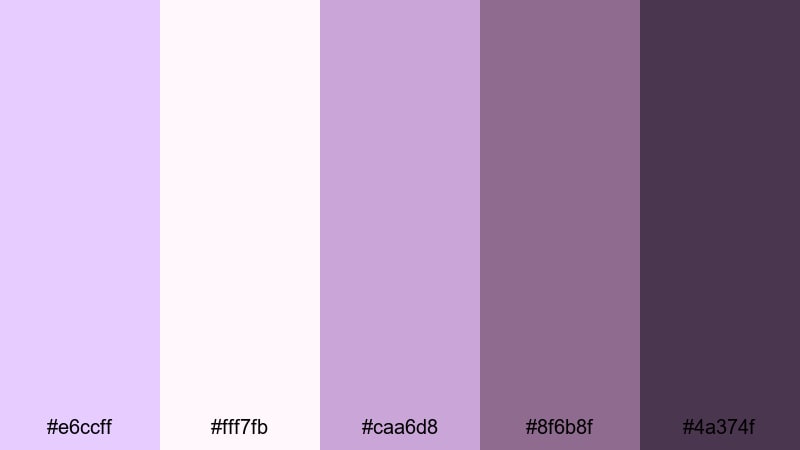
- HEX Codes: #e6ccff, #fff7fb, #caa6d8, #8f6b8f, #4a374f
- Mood: Whimsical, feminine, and soft-focus.
- Use for: Lovely for bridal content, beauty tutorials, or dreamy product flatlays in soft light.
Petal Dust Dreams layers blush lilac and dusty plum to create a hazy, ultra-soft look that flatters skin tones and delicate textures. The pastel top end (#e6ccff and #fff7fb) gives you gentle highlights that never feel stark, while the muted purples (#8f6b8f and #4a374f) add depth without going too dark.
This palette shines in bridal and beauty content, flatlays, and product closeups. Use the lighter shades for background gradients in your intros and end cards, and bring in the deeper tones for typography, icons, and drop shadows on your thumbnails so your text is still easy to read against soft-focus visuals.
Pastel Wisteria Color Palettes for Lifestyle Content
Sunday Brunch Pastels
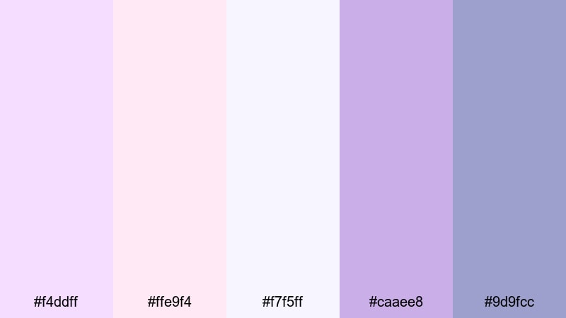
- HEX Codes: #f4ddff, #ffe9f4, #f7f5ff, #caaee8, #9d9fcc
- Mood: Lighthearted, friendly, and inviting.
- Use for: Great for lifestyle vlogs, brunch reels, and creator intros that need a soft pastel pop.
Sunday Brunch Pastels feels like a bright, chatty morning with friends. Soft wisteria, blush, and near-white tones make your content approachable and clean without looking flat. The pastel purples (#f4ddff and #caaee8) add personality, while #9d9fcc introduces just enough contrast for on-screen elements.
Use this palette for lifestyle vlogs, morning routines, Q and A videos, or channel trailers. Let the lighter HEX codes fill your frames with subtle background shapes or lower-third bars, and reserve the slightly deeper purples for buttons, CTAs, or your channel name on thumbnails so viewers can spot your brand instantly.
Cloudy Macaron Mix
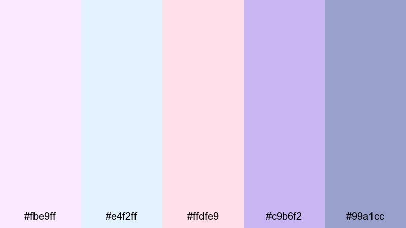
- HEX Codes: #fbe9ff, #e4f2ff, #ffdfe9, #c9b6f2, #99a1cc
- Mood: Playful, sweet, and candy-inspired.
- Use for: Perfect for baking videos, stationery hauls, and kawaii or cozy desk setups.
Cloudy Macaron Mix blends lilac, baby blue, and soft pink into a sugary, dessert-like palette. The bright pastels (#fbe9ff, #e4f2ff, #ffdfe9) keep everything light and friendly, while #c9b6f2 and #99a1cc provide just enough saturation for headings and key icons.
Apply this mix to recipe tutorials, stationery hauls, or kawaii desk tours. Use the lighter tones as backgrounds for animated stickers, comment bubbles, and overlay doodles, then rely on the deeper pastel purple for your channel logo, subscribe buttons, and bold thumbnail text that still fits the sweet aesthetic.
Studio Daylight Haze
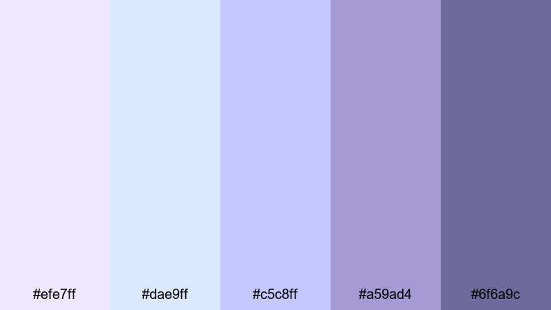
- HEX Codes: #efe7ff, #dae9ff, #c5c8ff, #a59ad4, #6f6a9c
- Mood: Clean, relaxed, and softly professional.
- Use for: Well suited to productivity vlogs, gentle tech reviews, or calm educational content.
Studio Daylight Haze mimics the feel of a bright but diffused studio. Cool lilacs and blues keep your visuals fresh and neutral, while the deeper slate purple (#6f6a9c) adds structure. This palette is perfect if you want your channel to feel calm and competent without drifting into harsh corporate tones.
Use the light blues and lilacs for slide backgrounds, chapter titles, and info cards in tutorials or productivity vlogs. Bring in #a59ad4 and #6f6a9c for key labels, diagram outlines, and thumbnail typography so your educational content looks clean, modern, and easy to follow on any screen.
Cottagecore Morning Mist
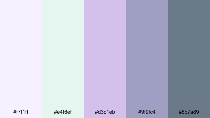
- HEX Codes: #f7f1ff, #e4f6ef, #d3c1eb, #9f9fc4, #6b7a89
- Mood: Gentle, organic, and nostalgic.
- Use for: Ideal for cottagecore edits, garden tours, and slow-living lifestyle content.
Cottagecore Morning Mist pairs soft wisteria with muted greens and misty grays, giving your edits a nature-touched, nostalgic feel. The gentle purple tones (#f7f1ff and #d3c1eb) bring in the wisteria romance, while #e4f6ef and #6b7a89 create a grounded, earthy contrast.
Use this palette for garden tours, journaling in nature, slow-living routines, or cozy homestead videos. Let the lighter hues wash your intro cards and overlay frames, while the deeper slate and green-grays support legible text, icons, and delicate hand-drawn flourishes in your branding.
Elegant and Modern Wisteria Color Palettes
Penthouse Evening Chic
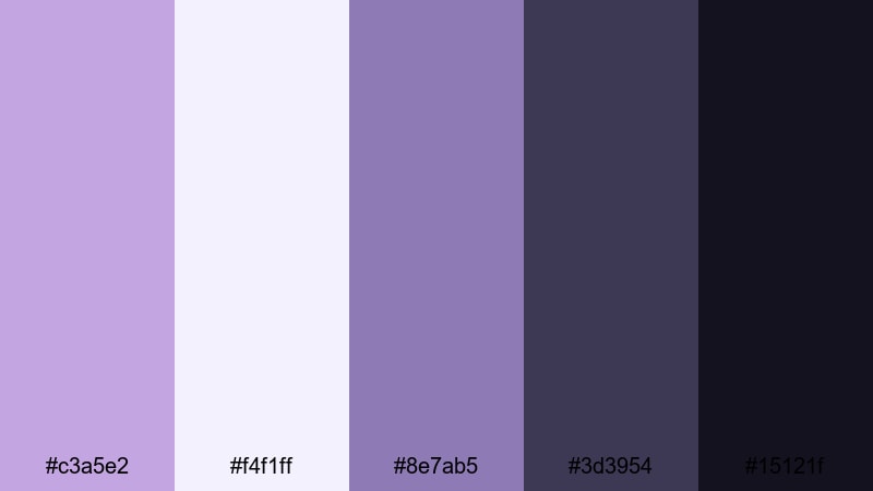
- HEX Codes: #c3a5e2, #f4f1ff, #8e7ab5, #3d3954, #15121f
- Mood: Sophisticated, polished, and upscale.
- Use for: Use for fashion campaigns, luxury product promos, or sleek channel rebrands.
Penthouse Evening Chic combines refined wisteria hues with charcoal and ink-like neutrals. The soft purples (#c3a5e2 and #8e7ab5) feel high-end but approachable, while #3d3954 and #15121f add sleek contrast reminiscent of a city skyline at night.
Apply this palette to fashion lookbooks, beauty brand promos, or luxury unboxings. Use #f4f1ff for clean negative space in thumbnails and hero slides, and anchor logos, price tags, and CTAs with the darkest tones. This ensures your visuals feel premium on both long-form videos and short social clips.
Minimal Loft Orchid
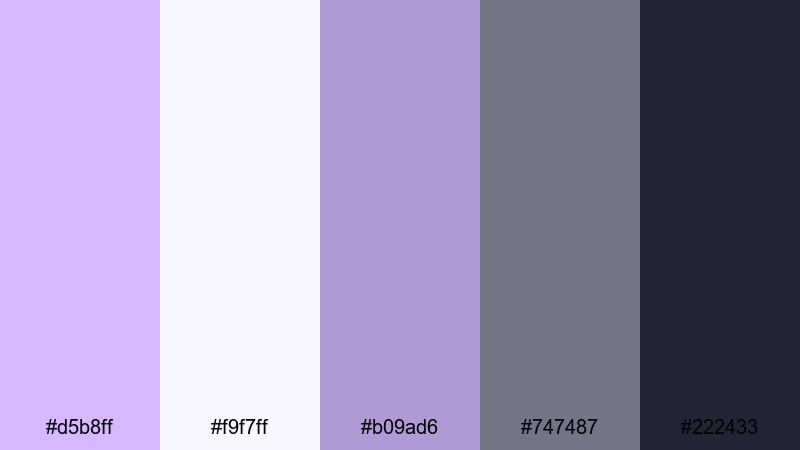
- HEX Codes: #d5b8ff, #f9f7ff, #b09ad6, #747487, #222433
- Mood: Minimal, calm, and design-forward.
- Use for: Great for UI-inspired graphics, portfolio videos, and modern brand intros.
Minimal Loft Orchid pairs orchid purples with soft whites and slate neutrals for a streamlined, design-aware aesthetic. The palette balances a creative edge (#d5b8ff and #b09ad6) with grounded grays (#747487 and #222433) that keep layouts clean and legible.
Use this for portfolio reels, UI demos, and modern channel branding. Let the lightest shade (#f9f7ff) carry your background and grid lines, then use the deeper neutrals for typography, icons, and timeline markers. Wisteria accents can highlight key stats, project titles, or callouts without cluttering the frame.
Marble Atrium Whisper
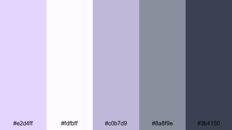
- HEX Codes: #e2d4ff, #fdfbff, #c0b7d9, #8a8f9e, #3b4150
- Mood: Quiet luxury, calm, and architectural.
- Use for: Ideal for interior design content, brand decks, or cinematic B-roll of spaces.
Marble Atrium Whisper feels like soft daylight filtering through an architectural atrium. Gentle lavender-grays (#e2d4ff and #c0b7d9) mimic veined marble, while the neutral grays (#8a8f9e and #3b4150) give your visuals a quiet luxury mood.
Use this palette for interior design walkthroughs, architectural B-roll, or pitch decks turned into video. Work with #fdfbff as a clean canvas for diagrams and floor plans, and drop in wisteria accents for room labels, section markers, and thumbnail headlines to keep everything cohesive and refined.
Luxe Branding Symphony
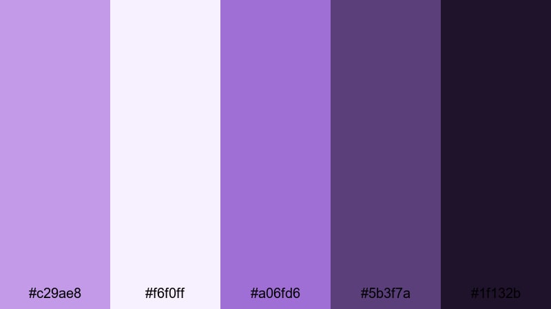
- HEX Codes: #c29ae8, #f6f0ff, #a06fd6, #5b3f7a, #1f132b
- Mood: Boldly refined, artistic, and premium.
- Use for: Perfect for brand style guides, logo animations, and premium course thumbnails.
Luxe Branding Symphony layers soft wisteria with rich violet and inky purple to create a flexible premium system. The brighter accents (#c29ae8 and #a06fd6) draw attention to important elements, while the darker shades (#5b3f7a and #1f132b) add drama and depth.
Use this palette when building a signature brand look for your channel or online course. Define logo colors, primary text, and background treatments from these HEX codes, then carry them through intros, lower thirds, transitions, and thumbnail frames so your audience recognizes your content at a glance.
Bold and Cinematic Wisteria Color Palettes
Neon Night Premiere
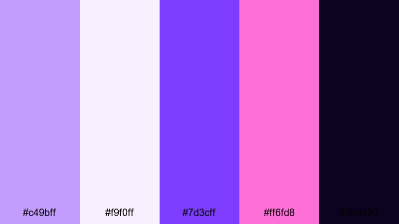
- HEX Codes: #c49bff, #f9f0ff, #7d3cff, #ff6fd8, #0b0420
- Mood: Electric, dramatic, and eye-catching.
- Use for: Use for trailer-style intros, gaming content, or festival recap videos that need punch.
Neon Night Premiere pits glowing violets and hot magenta against a deep midnight base. The saturated purples (#c49bff and #7d3cff) and neon pink (#ff6fd8) cut sharply through the darkness of #0b0420, creating thumbnail-ready contrast.
Apply this when you need maximum impact: gaming intros, highlight reels, or festival recaps. Use #f9f0ff for bold, legible headline text and let the neon tones outline shapes, strokes, or motion graphics so your titles and buttons jump off the screen even on small mobile displays.
Cosmic Trailer Title
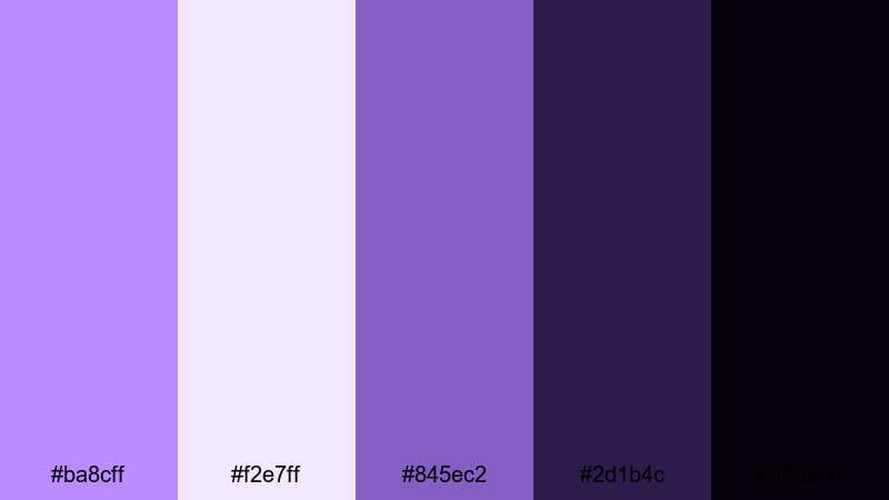
- HEX Codes: #ba8cff, #f2e7ff, #845ec2, #2d1b4c, #05020d
- Mood: Epic, sci fi, and atmospheric.
- Use for: Perfect for cinematic trailers, motion graphics, and tech or space-themed edits.
Cosmic Trailer Title uses cosmic purples and deep galaxy shadows to deliver a blockbuster vibe. The lighter nebula tones (#ba8cff and #f2e7ff) sit beautifully in glows and lens flares, while #2d1b4c and #05020d ground your frames in deep space.
Use this for sci-fi intros, tech explainers with a space twist, or high-energy trailers. Combine glowing text in the brighter HEX colors with starfield or abstract backgrounds in the darker shades, and add animated HUD elements using #845ec2 for a cohesive futuristic look.
Electric Festival Stage
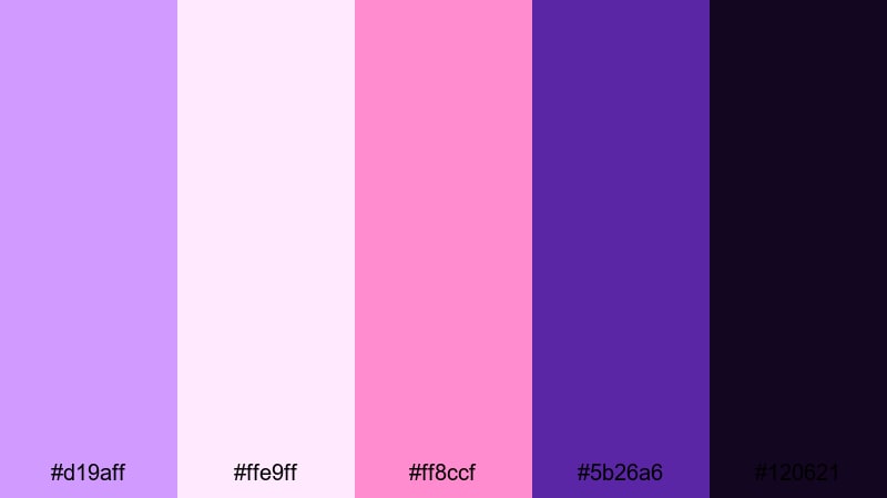
- HEX Codes: #d19aff, #ffe9ff, #ff8ccf, #5b26a6, #120621
- Mood: Energetic, fun, and performance-ready.
- Use for: Great for concert recaps, dance edits, and high-energy event promos.
Electric Festival Stage captures the surge of live shows with vibrant wisteria, hot pink, and stage-deep violets. The bright purples and pinks (#d19aff, #ffe9ff, #ff8ccf) echo LED lights and stage graphics, while #5b26a6 and #120621 feel like the crowd and the night sky.
Use this palette for concert recaps, dance edits, DJ promos, or festival highlight reels. Build kinetic typography in the brighter HEX colors and place it over footage tinted with the darker shades for strong separation. For thumbnails, frame your main subject in #ffe9ff while surrounding them with electric accents so the image feels alive and clickable.
Tips for Creating Wisteria Color Palettes
Wisteria is versatile: it can be soft and romantic, calm and professional, or bold and neon depending on how you combine it with other hues. These tips will help you shape wisteria-based palettes that look great in video, thumbnails, and brand assets.
- Balance light and dark: pair pale wisteria with at least one deep shade (navy, charcoal, or plum) so text and UI elements stay readable on all screens.
- Use neutrals to avoid overload: mix in off-whites, soft grays, or beige so your frames do not become too purple-heavy or visually tiring.
- Define roles for each HEX: choose one color for backgrounds, one for primary text, one for accents, and stick to that system for consistent branding.
- Check contrast on thumbnails: zoom out and test if your title text still pops against your chosen wisteria background at very small sizes.
- Match the footage mood: cooler wisteria tones suit night scenes and tech content, while warmer or pinkish wisteria works better for romance and lifestyle.
- Unify intros and end screens: reuse the same palette in your openers, lower thirds, and end cards so each video clearly belongs to your channel.
- Test on different devices: preview your palette on both phone and desktop to ensure whites are not too bright and dark purples are not crushed.
- Save presets in your editor: once you dial in a wisteria grade in Filmora, save titles, color presets, and overlays so you can reuse them effortlessly.
Wisteria color palettes can completely transform how your content feels, from dreamy wedding stories to bold festival recaps and polished brand intros. By choosing the right combination of soft purples, grounding neutrals, and accent colors, you build a visual identity that your audience remembers.
Use the HEX codes in this guide as starting points, then refine them inside Filmora until they match your footage and style. Whether you lean toward pastel, modern, or neon wisteria, keeping your palette consistent across intros, B-roll, and thumbnails will make your channel look more professional.
Open Filmora, load a reference palette you love, and start experimenting with titles, overlays, and color grading tools. With a few saved presets, your signature wisteria look will be ready for every new video, reel, or short you publish.
Next: Malachite Color Palette


 100% Security Verified | No Subscription Required | No Malware
