
 100% Security Verified | No Subscription Required | No Malware


 ChatGPT
 Perplexity
 Gemini
 Claude
 Grok
Grok
Blue Taupe sits between cool blue and grounded taupe, giving it a calm, intelligent, and slightly nostalgic feel. It is soft enough for cozy scenes yet structured enough for modern brands, which makes it ideal for cinematic vlogs, aesthetic thumbnails, and polished social content. Because it is not overly saturated, Blue Taupe reads as mature and trustworthy on screen.
For video creators, designers, and Filmora users, Blue Taupe works beautifully in intros, lower thirds, overlay graphics, and color grading. Below you will find ready-made Blue Taupe color palettes with HEX codes that you can plug straight into your branding, thumbnails, and video edits to keep a consistent, recognizable aesthetic.
In this article
Soft & Cozy Blue Taupe Color Palettes
Foggy Harbor Morning
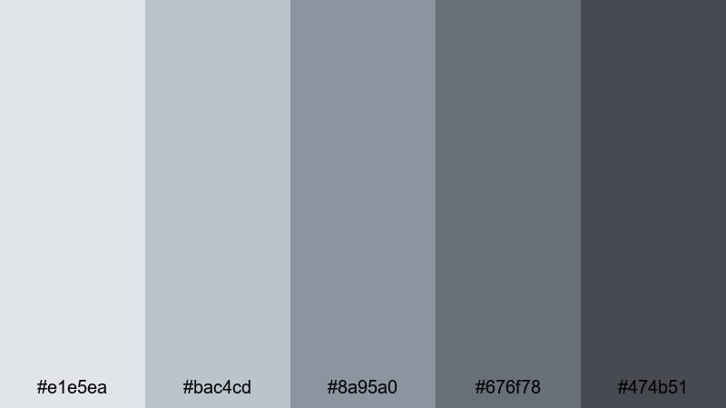
- HEX Codes: #e1e5ea, #bac4cd, #8a95a0, #676f78, #474b51
- Mood: Calm, nostalgic, and gently muted.
- Use for: Great for reflective vlog sequences, intro cards, and quiet storytelling edits.
Foggy Harbor Morning feels like watching the shoreline wake up through a light mist. Soft grays melt into Blue Taupe midtones, creating a hazy, cinematic calm that works wonderfully for introspective voiceovers, morning routines, and peaceful travel vlogs.
Use the lightest tones for background cards or lower thirds, and keep the deeper Blue Taupe and charcoal shades for typography, callouts, and overlays. This palette is also strong for YouTube channel branding where you want an understated, grown-up aesthetic that still feels approachable.
Pro Tip: Build a Cinematic Blue Taupe Look in Filmora
To keep this misty Blue Taupe mood consistent from intro to end screen, build a simple style guide inside Filmora. Reuse the same HEX codes for title cards, subtitles, and shapes, and then save them as custom presets. That way your b-roll, talking head clips, and social cutdowns all share the same harbor-inspired tones.
When you are mixing different cameras or lighting conditions, add a soft Blue Taupe tint by using color grading on an adjustment layer. This keeps the palette cohesive across multiple scenes without re-editing each clip one by one.
AI Color Palette
If you have a still frame or mood board that perfectly captures this Foggy Harbor Morning palette, you can turn it into a look for your whole video. Filmora's AI Color Palette feature analyzes your reference colors and applies a matching grade across selected clips, so your entire timeline inherits the same calm Blue Taupe atmosphere.
Drop your reference image into Filmora, pick a target clip, and let AI Color Palette do the heavy lifting. It is a fast way to match your vlog, b-roll, and thumbnails, keeping your branding aligned across YouTube, Instagram, and TikTok.
 secure download

HSL, Color Wheels & Curves
To refine your Blue Taupe mood, use Filmora's HSL, color wheels, and curves to nudge tones into place. Gently lower saturation in the blues and cyans to keep things misty, lift the shadows just a little, and add a slight cool tint to the highlights for that foggy glow.
For more control, adjust mid-tone wheels to favor Blue Taupe while keeping skin tones natural. You can follow Filmora's guide to color correction in Filmora to balance contrast and color so your footage stays cinematic but not overly dark.
secure download1000+ Video Filters & 3D LUTs
Once your base Blue Taupe grade is in place, you can quickly stylize it with Filmora's filters and LUTs. Filmora's video filters and 3D LUTs make it easy to add a matte finish, film grain, or subtle glow that enhances the foggy harbor look without breaking your palette.
Try stacking a soft cinematic LUT with a gentle vignette on an adjustment layer to keep eyes on your subject. Save these combinations as custom presets so every new vlog or reel can instantly match your established Blue Taupe aesthetic.
secure downloadCashmere Knit Evening
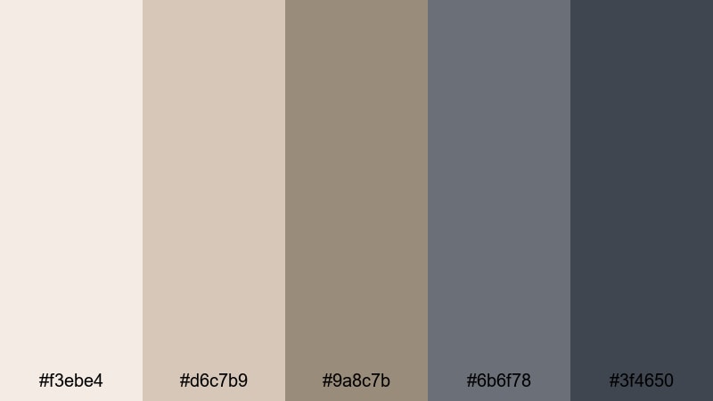
- HEX Codes: #f3ebe4, #d6c7b9, #9a8c7b, #6b6f78, #3f4650
- Mood: Warm, intimate, and homelike.
- Use for: Perfect for lifestyle vlogs, home decor videos, and warm product flat lays.
Cashmere Knit Evening wraps soft creams and beiges around deeper Blue Taupe accents, like a favorite sweater lit by warm lamps. It balances warmth and coolness, creating a cozy but not overly yellow look that flatters interiors and skin tones.
Use lighter neutrals for backgrounds and negative space, then anchor key elements such as logos, lower thirds, and text in the cooler Blue Taupe tones. It works especially well in home decor vlogs, unboxings, and product demos where you want the scene to feel lived-in and tactile.
Rain on Windowpane
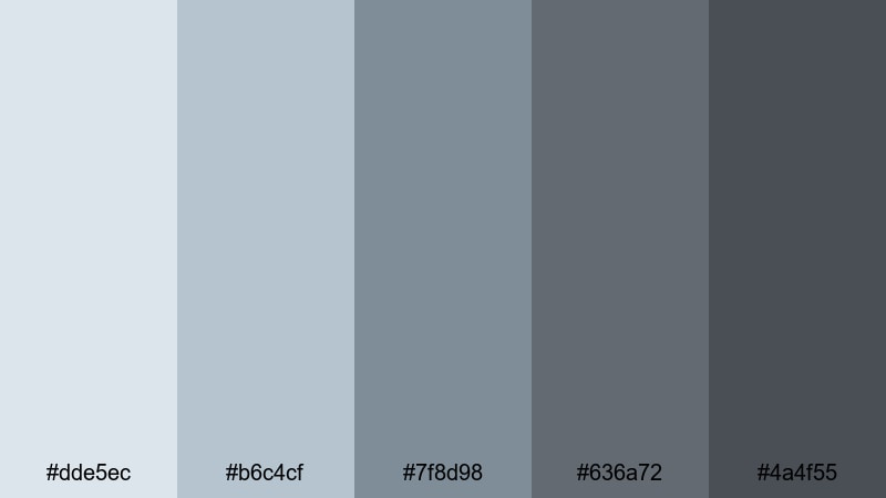
- HEX Codes: #dde5ec, #b6c4cf, #7f8d98, #636a72, #4a4f55
- Mood: Melancholic yet comforting, like a rainy day indoors.
- Use for: Use for storytelling shorts, lo-fi music visuals, and reflective voiceover edits.
Rain on Windowpane leans into cool blue-grays and soft Blue Taupe shadows, mimicking the dim, washed-out light of a rainy afternoon. It creates a gentle, introspective mood that is perfect for contemplative edits, poetry readings, and slow-paced montages.
Apply the lighter blues to your titles and chapter cards, while the darker Blue Taupe shades can guide the viewer's eye toward your subject. This palette also pairs nicely with lo-fi or ambient music, making it a natural choice for study-with-me videos and moody BGM loops.
Seaside Cottage Calm
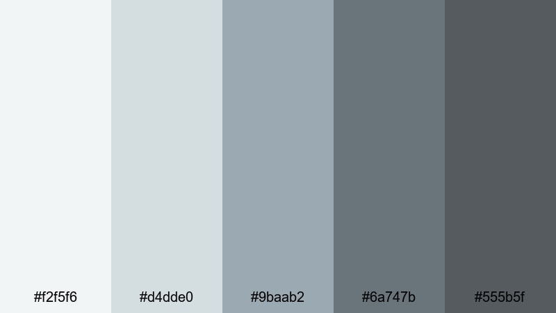
- HEX Codes: #f2f5f6, #d4dde0, #9baab2, #6a747b, #555b5f
- Mood: Airy, coastal, and relaxed.
- Use for: Great for travel vlogs, beach house tours, and coastal-inspired thumbnails.
Seaside Cottage Calm combines pale seafoam tints with grounded Blue Taupe tones for a crisp, seaside breeze effect. It keeps your frames bright and fresh, but avoids the harsh contrast of pure white and navy.
Use the palest shades for sky-inspired backdrops and thumbnail borders, then lean on the mid-Blue Taupe values for text, buttons, and overlay shapes. This is a strong palette for coastal AirBnB tours, vacation vlogs, and any brand that wants a modern beach house identity without leaning into overly saturated blues.
Winter Storybook Glow
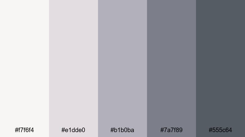
- HEX Codes: #f7f6f4, #e1dde0, #b1b0ba, #7a7f89, #555c64
- Mood: Gentle, dreamy, and slightly nostalgic.
- Use for: Best for winter diaries, family compilations, and soft cinematic montages.
Winter Storybook Glow feels like flipping through a favorite winter album, with soft whites and mauve-tinted Blue Taupe providing a dreamy, emotional base. It keeps the scene light and airy while still holding enough depth to make memories feel rich and important.
Choose the lightest tones for backgrounds and frames in your family videos, and reserve the deeper Blue Taupe shades for subtitles, logo locks, and end screens. This palette is perfect for holiday compilations, cozy cabin vlogs, and any edit that aims to feel gentle and sentimental rather than bold and flashy.
Modern & Minimal Blue Taupe Color Palettes
Urban Loft Neutrals

- HEX Codes: #f5f5f5, #d3d6da, #9aa2aa, #656e76, #2f3439
- Mood: Sleek, contemporary, and quietly confident.
- Use for: Ideal for tech reviews, productivity channels, and design-forward brand intros.
Urban Loft Neutrals captures the feeling of a clean, industrial city apartment with concrete walls and soft daylight. Cool grays and Blue Taupe mids paired with charcoal accents give your visuals a polished, design-savvy edge.
Use the lightest gray as a base for UI-style overlays and background panels, while the mid and dark Blue Taupe tones handle typography, icons, and call-to-action buttons. It is an excellent palette for tech content, Notion templates, and productivity workflows where clarity and professionalism are key.
Scandinavian Desk Setup

- HEX Codes: #faf9f7, #e1ded6, #b1b3b3, #737c83, #3b4247
- Mood: Clean, organized, and softly professional.
- Use for: Great for workspace tours, study-with-me videos, and productivity app promos.
Scandinavian Desk Setup blends warm off-whites with neutral grays and Blue Taupe for a minimalist, functional workspace vibe. It feels organized and intentional, but not cold or corporate.
Apply the light neutrals to your background cards and margins, then highlight key details such as timestamps, progress bars, and icons using the deeper Blue Taupe and graphite tones. This palette supports clean, distraction-free layouts for tutorials, screen recordings, and productivity-focused branding.
Glass Tower Horizon
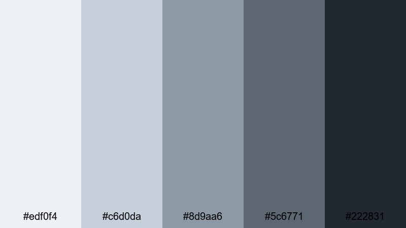
- HEX Codes: #edf0f4, #c6d0da, #8d9aa6, #5c6771, #222831
- Mood: Corporate, polished, and future-focused.
- Use for: Use for business reels, SaaS explainers, and portfolio landing pages.
Glass Tower Horizon evokes the look of glass skyscrapers reflecting a pale sky. The range of cool grays and steel-blue Taupe tones feels corporate and forward-looking, perfect for brand stories, pitch decks, and investor content.
Use the brighter tones behind text in your explainers, then emphasize analytics, charts, and callouts with the darker Blue Taupe and near-black shade. The palette keeps your visuals crisp and confident without resorting to overly aggressive color accents.
Minimal Studio Flat
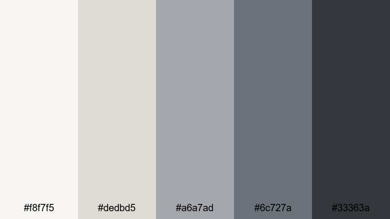
- HEX Codes: #f8f7f5, #dedbd5, #a6a7ad, #6c727a, #33363a
- Mood: Balanced, neutral, and editorial.
- Use for: Perfect for fashion lookbooks, portfolio reels, and brand identity slides.
Minimal Studio Flat feels like a curated studio apartment or gallery, with off-whites, soft taupes, and Blue Taupe accents creating an editorial-grade neutral base. It puts the focus firmly on your subject, whether that is clothing, photography, or product design.
Keep backgrounds light and let your footage or images carry the visual weight, then add minimal Blue Taupe overlays for titles, logos, and navigation. This palette is ideal for brands that want to appear modern, tasteful, and understated.
Monochrome Interface Shift
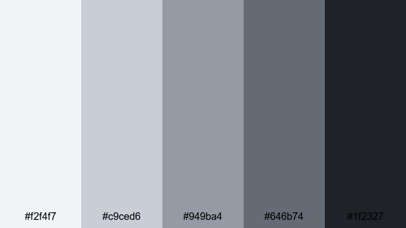
- HEX Codes: #f2f4f7, #c9ced6, #949ba4, #646b74, #1f2327
- Mood: Technical, streamlined, and UI-friendly.
- Use for: Great for app demos, software UI mockups, and tutorial overlays.
Monochrome Interface Shift is built around cool grays and Blue Taupe, tuned for maximum legibility and a modern interface feel. It is restrained enough to let real UI screenshots stand out, while still giving your edit a unified visual language.
Use the lightest tones for panels and code blocks, the mid-Blues for secondary text, and the darkest shade for key labels and headings. This palette shines in step-by-step tutorials, UI breakdowns, and developer-focused content where clarity is crucial.
Moody & Cinematic Blue Taupe Color Palettes
Midnight Rooftop Echo
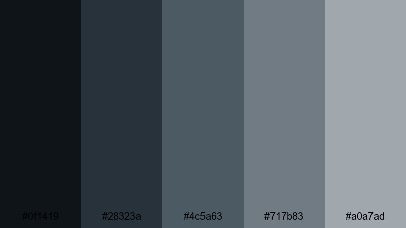
- HEX Codes: #0f1419, #28323a, #4c5a63, #717b83, #a0a7ad
- Mood: Brooding, cinematic, and introspective.
- Use for: Perfect for night city b-roll, narrative shorts, and dramatic music videos.
Midnight Rooftop Echo layers deep navy shadows under Blue Taupe highlights, capturing the mood of a quiet city rooftop at night. It delivers cinematic contrast while keeping blues toned down enough to avoid neon or comic-book vibes.
Push the darkest tones into your shadows and backgrounds, and let the lighter Blue Taupe hues highlight faces, text, and key details. This palette is perfect for moody music videos, introspective spoken word pieces, and atmospheric city montages.
Old Film Harbor
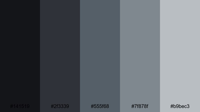
- HEX Codes: #141519, #2f3339, #555f68, #7f878f, #b9bec3
- Mood: Vintage, reflective, and slightly desaturated.
- Use for: Use for retro travel edits, memory sequences, and narrative flashbacks.
Old Film Harbor uses muted Blue Taupe and softened grays to evoke the feeling of faded dockside footage. It is slightly desaturated by design, ideal for story segments that represent memories, flashbacks, or old home videos.
Lower saturation a bit in your grade and overlay a light film grain or vignette to complete the look. This palette stands out in travel documentaries, harbor scenes, and nostalgic reels where you want emotion without oversaturated color.
Noir Apartment Silence

- HEX Codes: #0b0d10, #23252a, #444a51, #707880, #a7afb7
- Mood: Quiet, suspenseful, and film-noir inspired.
- Use for: Ideal for thriller teasers, dialogue-heavy scenes, and poetic short films.
Noir Apartment Silence leans into near-blacks and cool Blue Taupe midtones to create an intimate, shadow-filled mood. It suits close interiors, nighttime conversations, and slow, tense moments where subtext matters more than action.
Let the darkest shades dominate the frame, then use the lighter Blue Taupe tones for keylines, subtitles, or minimal UI elements. It is a strong choice for teasers, short films, and dialogue scenes that borrow from classic noir but with a modern, desaturated edge.
Twilight Forest Walk
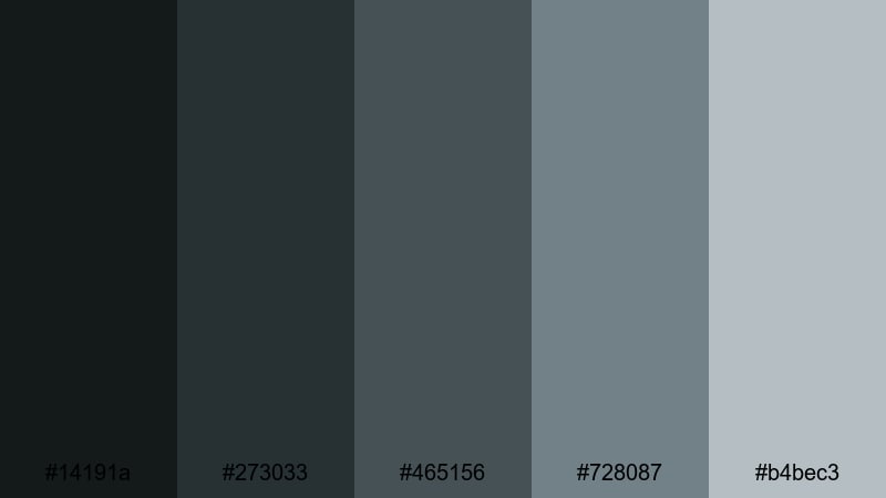
- HEX Codes: #14191a, #273033, #465156, #728087, #b4bec3
- Mood: Mysterious, grounded, and nature-driven.
- Use for: Great for hiking films, outdoor b-roll, and ambient ASMR visuals.
Twilight Forest Walk mixes deep forest greens with misty Blue Taupe highlights, echoing the look of a trail at dusk. It feels rooted in nature but cool and subdued, making it a good fit for atmospheric outdoor content.
Use darker tones in the shadows of trees and rocks, and place the lighter Blue Taupe hues on titles, overlays, or misty light leaks. This palette works particularly well for ASMR nature walks, meditative hikes, and cinematic landscape reels.
Stormbound City Streets
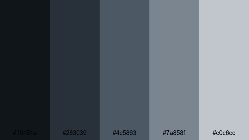
- HEX Codes: #10151a, #283039, #4c5863, #7a858f, #c0c6cc
- Mood: Dramatic, rain-soaked, and cinematic.
- Use for: Best for action montages, city sequences, and dramatic travel vlogs.
Stormbound City Streets mimics wet asphalt, overcast skies, and glints of Blue Taupe reflections on puddles. It has enough contrast to feel dramatic, but the cool tones keep everything cohesive and filmic.
Use the deepest shades for roads and skies, then let the mid and lighter Blue Taupe colors define neon reflections, subtitles, and HUD-style overlays. This palette is ideal for dynamic city edits, moody travel vlogs in the rain, and stylish car or bike sequences.
Tips for Creating Blue Taupe Color Palettes
Blue Taupe is versatile, but it really shines when you balance it carefully with neutrals, contrast, and readable accents. Use these tips to build or tweak Blue Taupe palettes that look great in both design and video.
- Pair Blue Taupe with soft off-whites or beiges for cozy content, and with cool grays or charcoals for modern, minimal branding.
- Always test text color against your Blue Taupe backgrounds; aim for strong light-on-dark or dark-on-light contrast to keep subtitles and titles readable on all screens.
- Keep accent colors limited; one supporting hue (like muted seafoam or deep green) is usually enough to complement Blue Taupe without cluttering your frame.
- When color grading footage, push midtones slightly toward Blue Taupe while protecting skin tones, so your overall mood stays cohesive but people still look natural.
- Use the lightest tones in your palette for negative space, background cards, and margins, then reserve the darkest tones for type, icons, and key lines.
- Create separate Blue Taupe variations for day and night content: lighter, airier versions for daytime scenes and deeper, more contrasted ones for night or noir edits.
- Save your most saturated or darkest Blue Taupe only for calls to action, important labels, or key frames so they stand out in thumbnails and end screens.
- Check your palettes on mobile and desktop; subtle Blue Taupe contrasts that look good on a monitor may need a small boost in contrast or brightness for phone screens.
Blue Taupe color palettes can completely shift the mood of your videos, from soft and nostalgic to sleek and cinematic. By choosing a few consistent palettes and reusing them across intros, titles, overlays, and thumbnails, you build a clear visual identity that viewers remember.
Whether you prefer cozy indoor scenes, minimalist desk setups, or rain-soaked cityscapes, there is a Blue Taupe combination that fits your style. Try dropping these HEX codes into Filmora, build adjustment layers with matching grades, and save presets so every new project feels like part of the same visual universe.
Experiment, tweak the tones with Filmora's tools, and let Blue Taupe become a signature part of your brand language across YouTube, TikTok, Instagram, and beyond.
secure downloadNext: Baby Blue Color Palette
