
 100% Security Verified | No Subscription Required | No Malware

Copper sits between orange and brown, bringing warmth, depth, and a subtle metallic glow. It feels handcrafted and human, but still premium enough for cinematic intros, logos, and title cards. In video, Copper tones can add golden-hour nostalgia, industrial studio vibes, or romantic vintage warmth without looking overly saturated.
This guide gathers 15 Copper color palettes with ready-to-use HEX codes so you can build cohesive thumbnails, intros, lower thirds, and branding. Whether you edit in Filmora or design thumbnails and overlays elsewhere, these Copper color combinations will help you create a consistent, cinematic aesthetic across your channel and social content.
In this article
Warm Cinematic Copper Color Palettes
Sunset Studio Copper
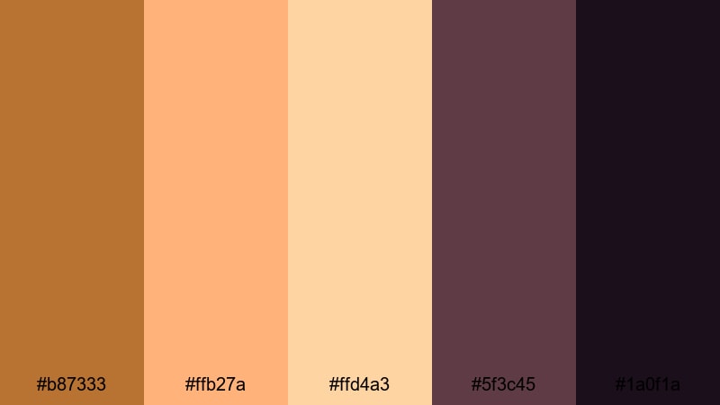
- HEX Codes: #b87333, #ffb27a, #ffd4a3, #5f3c45, #1a0f1a
- Mood: Warm, cinematic, and nostalgic like a golden hour studio shoot.
- Use for: Perfect for vlog intros, bokeh overlays, and YouTube thumbnails that need a dreamy, filmic glow.
Sunset Studio Copper wraps your frame in soft golden light, like sunlight spilling through a studio window. The main Copper tone (#b87333) adds rich warmth, while peach and cream highlights (#ffb27a, #ffd4a3) keep titles and UI elements gentle and inviting. Deep plum shadows (#5f3c45, #1a0f1a) prevent the look from feeling flat, adding moody depth behind text or subject edges.
Use this palette for cinematic vlogs, talking-head intros, or storytelling edits where you want skin tones to feel flattering and the environment to glow. Try Copper for logo elements and lower thirds, balance them with the lighter tones for readable text, and let the darkest shades sit in your backgrounds, gradients, or Filmora overlays to frame your subject.
Pro Tip: Build a Cinematic Copper Look in Filmora
To keep a Copper look like Sunset Studio Copper consistent across your whole edit, start by setting a reference. Drop a still frame or thumbnail mockup using these HEX codes into Filmora, then match the warmth and contrast of the rest of your clips to that frame. You can use the darker swatches as a guide for shadow levels and the lighter peaches as a guide for highlights.
Apply a base color correction on one clip until the Copper tones feel rich but not orange, then copy and paste those settings to similar shots. For intros, b-roll, and social cutdowns, reuse the same Copper title color and shadow tones so your brand feels unified from start to end.
AI Color Palette
If you already built a Copper mood in a thumbnail or still image, you can transfer that exact feeling to your video using Filmora's AI Color Palette. Import a frame that uses the Sunset Studio Copper scheme, then let Filmora analyze and apply that palette across your footage so your intros, b-roll, and outro screens all share the same warm coppery glow.
Filmora's AI Color Palette feature helps you keep consistent color even when clips come from different cameras, locations, or times of day. Instead of manually matching every shot, you can build one Copper reference and let the AI handle the rest, then fine-tune any tricky clips afterwards.
 secure download

HSL, Color Wheels & Curves
Once the Copper mood is in place, use Filmora's HSL, Color Wheels, and Curves to refine it. Slightly shift oranges toward red for deeper Copper, or desaturate yellows so skin tones stay natural while backgrounds keep that warm studio look. With color wheels, warm the midtones while keeping highlights cleaner, so bright areas do not turn too orange.
You can push shadows a little toward plum or deep brown to echo the darkest HEX values in this palette, then use curves to gently lift the toe for a softer, filmic contrast roll-off. For more structured guidance, follow a step-by-step color correction workflow in Filmora and plug your Copper choices into that process.
secure download1000+ Video Filters & 3D LUTs
If you want a fast route to a Copper-driven style, start from Filmora's filter and LUT library, then tweak toward your preferred HEX values. Many warm, cinematic LUTs already push footage toward golden browns; you can combine these with customized titles and overlays based on the Sunset Studio Copper palette for a complete look.
Filmora's video filters and 3D LUTs make it easy to apply a consistent Copper grade across long timelines. Apply a LUT to your base layer, add a warm filter to b-roll, and keep your text and graphics locked to the same Copper, peach, and plum swatches so everything feels like part of one visual system.
secure downloadEmber Lens Glow
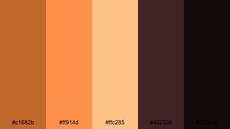
- HEX Codes: #c1682b, #ff914d, #ffc285, #402326, #120b0b
- Mood: Intense, fiery, and dramatic with strong contrast.
- Use for: Use in action trailers, gaming intros, or dramatic title cards where bold warmth and contrast are key.
Ember Lens Glow turns Copper into a flame. The primary Copper and ember oranges (#c1682b, #ff914d) feel hot and energetic, while creamy highlight (#ffc285) adds just enough softness for legible text. The deep wine and near-black shadows (#402326, #120b0b) deliver strong contrast that makes titles, HUDs, and graphic elements explode off the screen.
Use this palette for high-intensity content such as gaming streams, action cuts, or bold announcement trailers. Make your main Copper the accent on buttons, countdown timers, and call-to-action bars, with dark backgrounds behind them. The lighter peach can be used for hover states or subtitle boxes so everything stays readable even at smaller mobile thumbnail sizes.
Cinematic Desert Fade
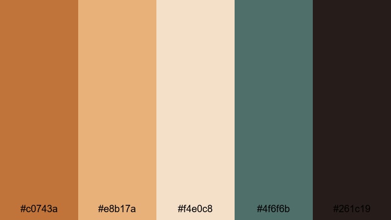
- HEX Codes: #c0743a, #e8b17a, #f4e0c8, #4f6f6b, #261c19
- Mood: Dusty, expansive, and contemplative like a road movie in the desert.
- Use for: Ideal for travel films, drone footage overlays, and documentary lower thirds with a warm yet grounded feel.
Cinematic Desert Fade blends sunbaked Copper and sand (#c0743a, #e8b17a, #f4e0c8) with muted teal shadows (#4f6f6b) and earthy dark browns (#261c19). The result feels like a long road trip through desert landscapes, where air is warm but colors are slightly faded and cinematic.
In Filmora, this palette suits travel vlogs, car POV sequences, and drone shots over dunes or mountains. Use the light sand tones as background blocks for lower thirds and subtitles, Copper for icons and highlight text, and the teal accent for map graphics or callouts. The deep brown adds a grounded base for letterbox bars, end cards, or logo reveals.
Loft Filmmaker Warmth
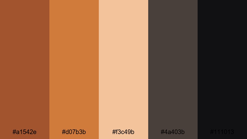
- HEX Codes: #a1542e, #d07b3b, #f3c49b, #4a403b, #111013
- Mood: Cozy, creative, and urban with industrial character.
- Use for: Great for studio tour videos, behind-the-scenes edits, and creator branding overlays.
Loft Filmmaker Warmth feels like a creative studio filled with brick walls, coffee mugs, and camera gear. The base Coppers (#a1542e, #d07b3b) mimic brick and aged metal, while the latte highlight (#f3c49b) softens the entire palette. Dark browns and inky near-black (#4a403b, #111013) give you strong foundations for text and UI elements.
This palette works beautifully for channel branding, BTS reels, and gear walkthroughs. Try using the latte tone as your background color for titles, Copper for logo marks and progress bars, and the darkest color for typography to keep everything legible. It also looks great in Instagram Reels and Shorts when you want a cozy but professional visual language.
Modern Minimal Copper Color Palettes
Minimal Grid Copper
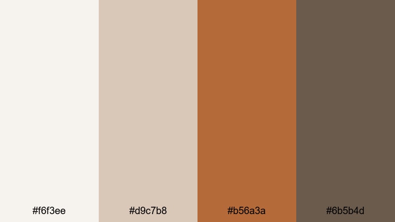
- HEX Codes: #f6f3ee, #d9c7b8, #b56a3a, #6b5b4d
- Mood: Clean, minimal, and softly warm with a design-forward feel.
- Use for: Best for channel branding, minimalist title cards, and UI-style lower thirds in tutorials or tech reviews.
Minimal Grid Copper pairs light neutrals (#f6f3ee, #d9c7b8) with a single strong Copper accent (#b56a3a) and a grounded brown (#6b5b4d). It feels modern and curated, like a carefully arranged flat lay or a clean app UI with just one warm highlight color.
Use the off-white and beige as your base for backgrounds, frames, and panels in tutorials, then let Copper draw the eye to key CTAs, subscribe buttons, or highlighted text lines. The deeper brown is perfect for body text and icons, giving you a clear hierarchy in thumbnails, video overlays, or channel banner designs.
Concrete And Copper Line
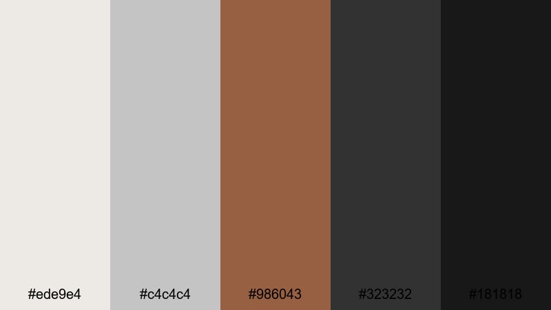
- HEX Codes: #ede9e4, #c4c4c4, #986043, #323232, #181818
- Mood: Urban, structured, and professional with subtle warmth.
- Use for: Use for product demos, architecture reels, and portfolio videos needing a sharp but approachable tone.
Concrete And Copper Line balances cool concrete grays (#ede9e4, #c4c4c4) with a focused Copper stripe (#986043) and deep charcoal blacks (#323232, #181818). It feels architectural and precise, as if Copper is an accent metal in a minimalist loft or showroom.
Apply the grays as your primary background and grid color in motion graphics, with Copper reserved for key lines, progress bars, or important keywords in titles. The dark tones are ideal for typography and header blocks in product showcases or portfolio reels where you want your visuals to feel clean, premium, and city-inspired.
Soft Interface Copper
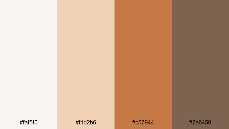
- HEX Codes: #faf5f0, #f1d2b6, #c57944, #7e6450
- Mood: Soft, friendly, and UI-inspired with gentle warmth.
- Use for: Great for app promos, onboarding explainers, and social UI mockups with subtle Copper accents.
Soft Interface Copper is all about calm, approachable design. Pale creams and peaches (#faf5f0, #f1d2b6) give you that soft app background vibe, while the Copper button tone (#c57944) works perfectly for CTAs and UI highlights. The muted brown (#7e6450) keeps things readable without feeling harsh.
Use this palette in onboarding videos, SaaS explainers, or UI breakdowns. Build your mock interface with the light tones, make key actions Copper so viewers know where to look, and use the darker shade for labels, captions, and timestamps. It reads well on both desktop and mobile screens.
Clean Tech Copper
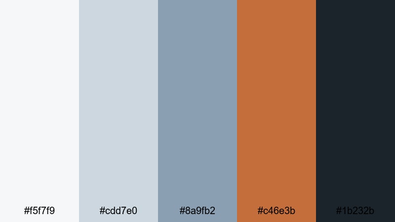
- HEX Codes: #f5f7f9, #cdd7e0, #8a9fb2, #c46e3b, #1b232b
- Mood: Sleek, innovative, and balanced between cool tech and warm metal.
- Use for: Ideal for software walkthroughs, device promos, and motion graphics where Copper adds human warmth to tech visuals.
Clean Tech Copper mixes cool bluish grays and blues (#f5f7f9, #cdd7e0, #8a9fb2) with a precise Copper accent (#c46e3b) and a dark navy-black (#1b232b). It feels like a modern OS interface that still has a warm, human touch.
In tech content, use the cool grays as your base, building cards, device frames, or infographics. Reserve Copper for key icons, important labels, or call-to-action banners so your viewer's eye always lands where you need it. The deep navy is perfect for titles, subtitles, and background gradients in hero sections or end screens.
Romantic Vintage Copper Color Palettes
Vintage Record Copper
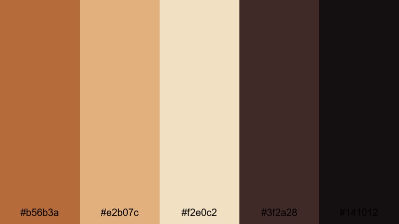
- HEX Codes: #b56b3a, #e2b07c, #f2e0c2, #3f2a28, #141012
- Mood: Nostalgic, analog, and cozy like an old record shop.
- Use for: Use in lifestyle vlogs, film photography edits, and retro title sequences.
Vintage Record Copper combines muted Copper and caramel tones (#b56b3a, #e2b07c) with creamy parchment (#f2e0c2) and deep vinyl shadows (#3f2a28, #141012). It feels like flipping through records, with warm halogen lights and slightly faded print.
This palette fits lifestyle vlogs, analog photo edits, and retro-styled openers. Use the parchment color as a base for text boxes and chapter cards, Copper and caramel for headings and icons, and the darkest tones as a background behind logos or textured frames. It also makes channel banners and playlist covers feel instantly nostalgic.
Old Town Streetlight
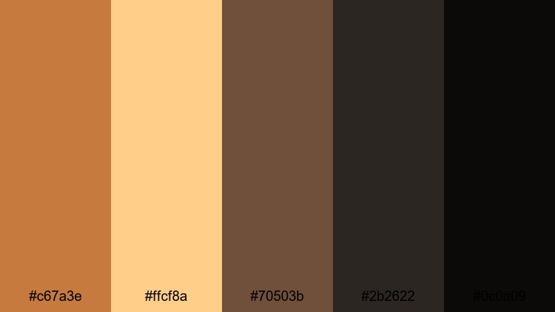
- HEX Codes: #c67a3e, #ffcf8a, #70503b, #2b2622, #0c0a09
- Mood: Romantic, moody, and cinematic like evening streets lit by lanterns.
- Use for: Perfect for travel diaries, date-night montages, and city b-roll with warm glows and deep contrast.
Old Town Streetlight captures the glow of Copper and amber streetlamps (#c67a3e, #ffcf8a) against rich browns and almost-black shadows (#70503b, #2b2622, #0c0a09). It is romantic and moody, ideal for night city scenes with small pools of warm light.
Use this palette for travel diaries, date-night sequences, or city b-roll. Build deep, nearly black backgrounds for titles and transitions, then let Copper and amber mark windows of light, subtitles, or location tags. It works especially well for vertical content where high contrast helps separate subjects from busy nighttime streets.
Antique Letterbox Copper
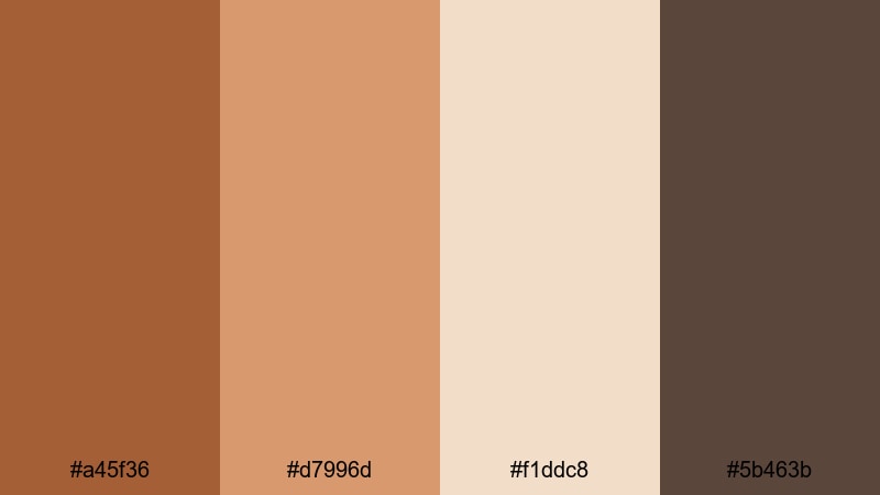
- HEX Codes: #a45f36, #d7996d, #f1ddc8, #5b463b
- Mood: Storytelling, literary, and softly vintage.
- Use for: Great for documentary captions, journaling overlays, and storytelling reels with handwritten graphics.
Antique Letterbox Copper feels like old postcards and handwritten letters. Paper-worn Copper and tan (#a45f36, #d7996d) sit alongside creamy parchment (#f1ddc8) and an ink-brown accent (#5b463b), giving you a delicate, text-friendly palette.
This is ideal for diary-style vlogs, documentary captions, bookish content, and reels that feature handwriting or sketch overlays. Use the parchment as your main background for text, Copper for headings and small illustrations, and the ink-brown for body copy or timestamps so everything stays warm but legible.
Copper Rose Wedding
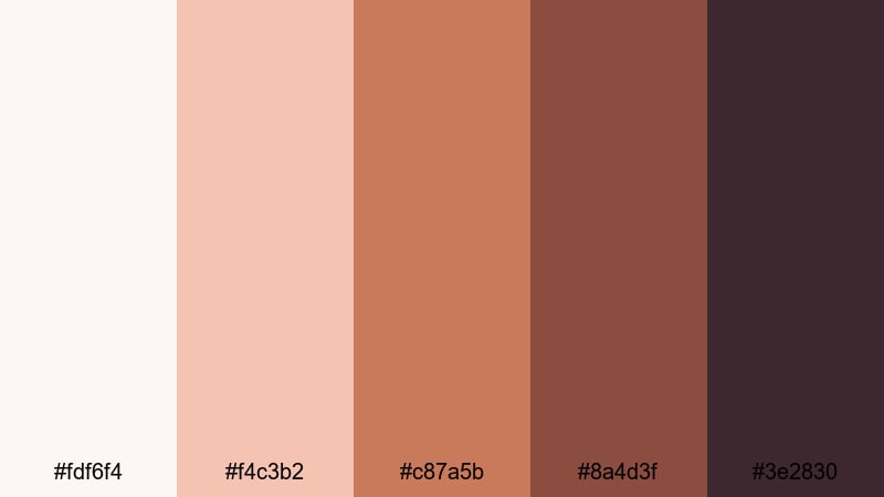
- HEX Codes: #fdf6f4, #f4c3b2, #c87a5b, #8a4d3f, #3e2830
- Mood: Romantic, elegant, and intimate with a soft blush touch.
- Use for: Ideal for wedding highlight films, engagement reels, and romantic brand content.
Copper Rose Wedding brings Copper into the world of blush and rose. Pale pinkish cream and blush (#fdf6f4, #f4c3b2) pair with rich Copper-rose tones (#c87a5b, #8a4d3f) and a deep plum-brown (#3e2830) for grounding. It feels soft, emotional, and luxurious.
Use this palette for wedding highlights, engagement announcements, or romantic brand storytelling. Light tones work beautifully for lower thirds, quote cards, and vows overlays, while deeper Copper and plum define titles, monograms, and calligraphy graphics. It also fits beauty, skincare, and lifestyle brands that want a warm but elegant identity.
Bold High-Contrast Copper Color Palettes
Neon Night Copper
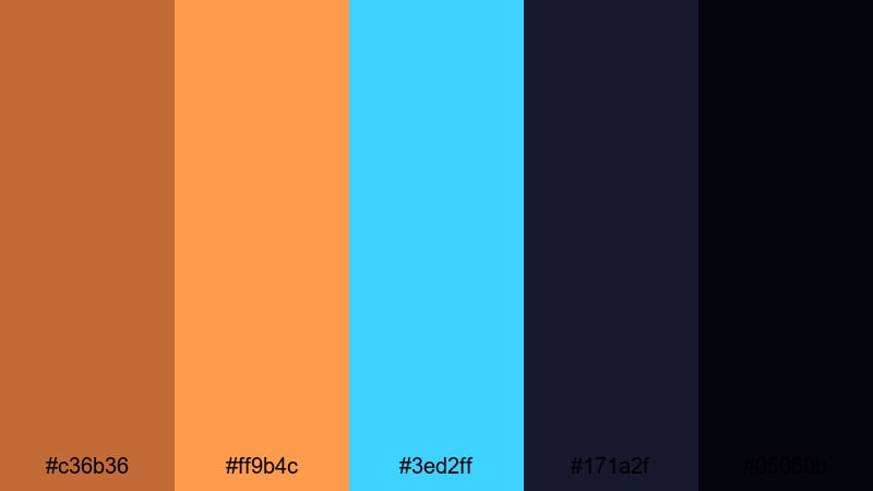
- HEX Codes: #c36b36, #ff9b4c, #3ed2ff, #171a2f, #05060b
- Mood: Electric, bold, and nightlife-inspired with a cyber edge.
- Use for: Use for music videos, club promos, or gaming streams that need vivid, high-energy contrast.
Neon Night Copper crashes hot Copper and orange (#c36b36, #ff9b4c) into neon cyan (#3ed2ff) on top of inky midnight blues and blacks (#171a2f, #05060b). It feels like a city at night full of billboards, LEDs, and chrome reflections.
Use this palette for music videos, DJ sets, club promos, or gaming overlays. Let the dark blues be your base, Copper and orange highlight key UI elements, and neon cyan add a cyber accent for buttons or glitch text. The strong contrast reads well even in tiny YouTube thumbnails and stream badges.
Copper And Teal Pop
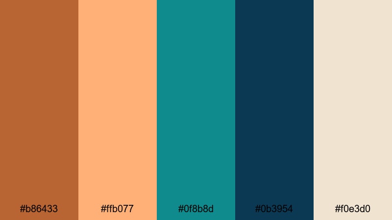
- HEX Codes: #b86433, #ffb077, #0f8b8d, #0b3954, #f0e3d0
- Mood: Fresh, punchy, and modern with a coastal twist.
- Use for: Great for travel vlogs, lifestyle channels, and product shots where you want Copper warmth with cool contrast.
Copper And Teal Pop pairs vibrant Copper and soft coral (#b86433, #ffb077) with rich teals and deep blue-green (#0f8b8d, #0b3954), all resting on a warm ivory base (#f0e3d0). It feels coastal, fresh, and energetic.
This combination is perfect for lifestyle channels, beach travel vlogs, or modern product showcases. Use ivory as the main canvas for titles, Copper and coral for key accents and buttons, and teal for supporting elements like tags, icons, and info boxes. The teal-Copper contrast also makes great split-color backgrounds in thumbnails and opening title screens.
Midnight Copper Contrast
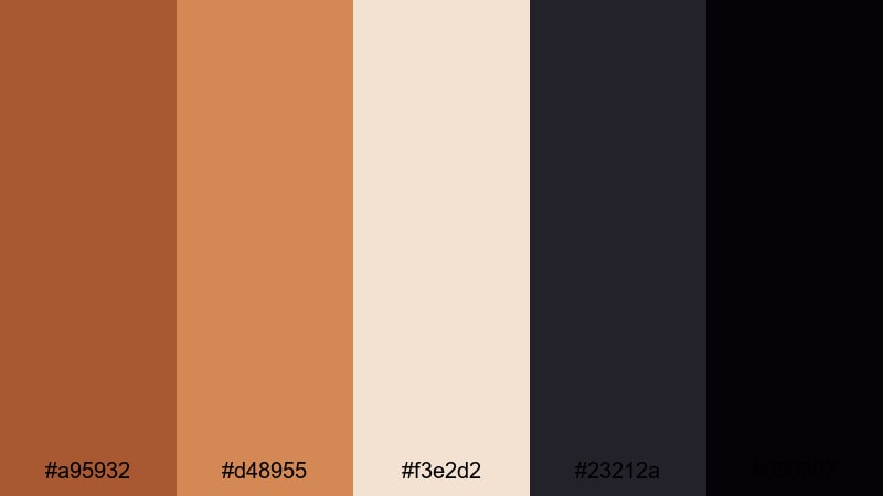
- HEX Codes: #a95932, #d48955, #f3e2d2, #23212a, #050307
- Mood: Dramatic, moody, and cinematic with spotlight warmth.
- Use for: Perfect for cinematic trailers, title sequences, and moody fashion or beauty edits.
Midnight Copper Contrast drops bright Copper highlights (#a95932, #d48955) onto creamy neutrals (#f3e2d2) and near-black midnight tones (#23212a, #050307). It feels like a spotlight cutting through darkness, ideal for dramatic reveals and fashion-forward visuals.
Use this palette for trailers, title sequences, and beauty or fashion edits where you want Copper to feel like the star. Let the dark tones dominate your backgrounds, the cream act as a soft spotlight or text box color, and Copper mark logos, product names, and key transitions. It is simple but incredibly striking when paired with slow-motion shots and strong typography.
Tips for Creating Copper Color Palettes
When building your own Copper color palette for video or design, think about how Copper interacts with light, shadow, and supporting hues so your final look stays clear, on-brand, and cinematic across all your assets.
- Pair Copper with a light neutral (ivory, cream, or soft gray) so titles, captions, and UI elements stay readable on mobile devices.
- Use a cool contrast color like teal, muted blue, or slate green if your edit risks feeling too hot or orange; this balances warmth and keeps skin tones natural.
- Always include at least one deep shadow color (charcoal, plum, or espresso brown) so you have a solid base for overlays, letterbox bars, and background gradients.
- Test your Copper choices on real footage: apply a quick grade in Filmora, then drop your text and graphics on top to see if anything blends into the background.
- For branding, lock in a primary Copper HEX code plus one light and one dark companion, then reuse them everywhere from thumbnails to lower thirds for instant recognition.
- Check accessibility by placing Copper text over your light colors and vice versa; if it is hard to read at small sizes, darken the text or lighten the background.
- Use saturation carefully: slightly desaturated Coppers feel cinematic and professional, while ultra-saturated Coppers work better for gaming, music, or high-energy promos.
- Save your favorite Copper looks as Filmora presets or LUTs so you can apply the same mood to future projects with one click.
Copper color palettes can completely reshape the mood of your videos, from cozy studio vlogs and romantic highlights to bold trailers and tech explainers. By choosing the right combinations of Copper, neutrals, shadows, and contrast colors, you build a visual identity that viewers recognize instantly in their feed.
Try these 15 palettes as starting points, then fine-tune them inside Filmora using AI Color Palette, HSL, color wheels, curves, filters, and LUTs. With a few saved presets and consistent use of your chosen HEX codes, your thumbnails, intros, and overlays will all feel like part of the same Copper-themed brand.
Experiment, export a few variants, and see which Copper story fits your channel best. Once you find your signature look, apply it across your main videos, Shorts, and social content to build a strong, cinematic presence.
secure downloadNext: Ivory Color Palette
