
 100% Security Verified | No Subscription Required | No Malware

Deep Frame Gray sits between charcoal and slate, giving visuals a grounded, cinematic base. It feels calm, confident, and slightly mysterious, which is why it shows up so often in film frames, UI designs, and modern branding. In video, this color can act like a visual anchor, letting skin tones, text, and accent hues stand out without the background stealing attention.
For creators and Filmora users, Deep Frame Gray is a powerful choice for thumbnails, intros, lower thirds, and full color grades. Below you will find ready-made Deep Frame Gray color palettes with HEX codes that you can plug straight into your edits, channel branding, and design projects.
In this article
Cinematic & Moody Deep Frame Gray Color Palettes
Noir Edit Studio
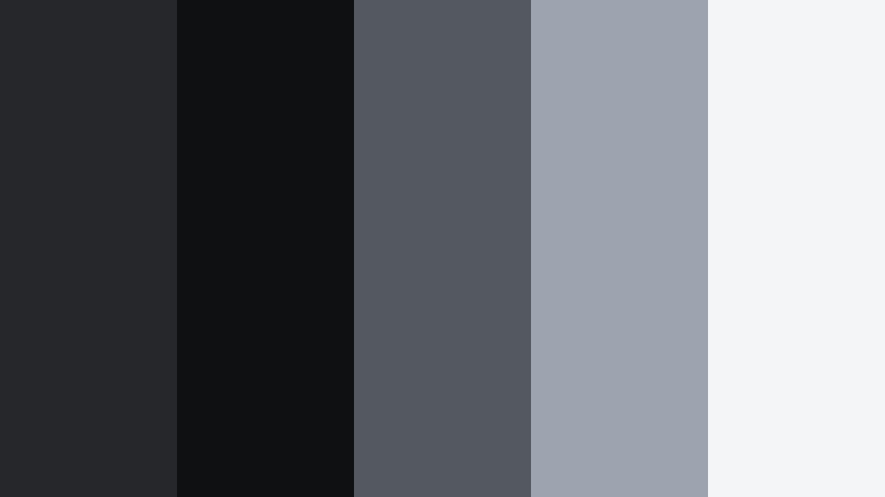
- HEX Codes: #26272a, #0f1012, #545861, #9da3af, #f4f5f7
- Mood: dark, cinematic, and introspective
- Use for: Perfect for dramatic film edits, moody B-roll sequences, and minimalist title cards.
Noir Edit Studio revolves around inky Deep Frame Gray tones and soft silvery highlights. The darker shades (#26272a and #0f1012) create the feeling of a dark theater or a late-night city alley, while the lighter grays and off-whites carry just enough detail to keep your frame readable.
Use this palette when you want your video to feel serious, intimate, or reflective. It works beautifully for cold opens, emotional vlogs, narrative shorts, and minimalist title cards or end screens. In thumbnails and channel banners, pair the darkest gray as a background with light text and subtle accent lines to get that high-end, film-studio look.
Pro Tip: Build a Cinematic Deep Frame Gray Look in Filmora
To keep a Noir Edit Studio look consistent, start by grading one hero clip in Filmora using Deep Frame Gray as the base for your shadows and midtones. Set your darkest values around #0f1012, then gently lift midtones toward #545861 so details do not disappear on mobile screens. Save this as a custom preset and reuse it on intros, b-roll, and end screens to maintain a cohesive cinematic style.
For branding, design your lower thirds and title cards inside Filmora with solid Deep Frame Gray backgrounds and clean white or soft gray text. Reuse the same HEX codes for shapes, borders, and drop shadows so your entire edit, from YouTube thumbnail to final frame, feels like it belongs to the same visual universe.
AI Color Palette
You can capture the Noir Edit Studio mood from a single reference frame and spread it across your whole timeline. Filmora's AI Color Palette feature lets you pick a perfectly graded shot or a color card based on these HEX codes, then match the colors of all other clips in one go.
Import your reference, apply the AI Color Palette tool, and Filmora will harmonize shadows, midtones, and highlights so every scene shares the same Deep Frame Gray character. This is especially useful when you mix camera sources or combine daylight footage with staged low-light shots.
 secure download

HSL, Color Wheels & Curves
Once the overall match is done, refine the Deep Frame Gray tones with HSL, color wheels, and curves. Use the color wheels in Filmora to cool down shadows slightly, then push highlights closer to #f4f5f7 so text and faces pop. Adjust curves to deepen contrast without crushing detail, and fine-tune saturation so any subtle color in your footage still feels natural within this gray-based palette.
If you need a walkthrough on balancing tones, Filmora's tutorials on using color wheels and curves for cinematic grading can give you a visual reference. Apply these techniques to lock in that moody, gallery-like aesthetic.
secure download1000+ Video Filters & 3D LUTs
To speed up your Deep Frame Gray workflow, layer built-in looks on top of this palette. Filmora's video filters and 3D LUTs make it easy to add grainy noir, soft fade, or high-contrast drama while keeping your gray base intact. Choose a subtle filter and then tweak opacity so it enhances, rather than replaces, your carefully chosen HEX colors.
You can also stack LUTs with minor HSL adjustments to create your own signature Deep Frame Gray style. Save these as presets so every new project starts from the same cinematic foundation, whether you are grading talking heads, B-roll, or social clips cut down from longer edits.
secure downloadUrban Frame Grit

- HEX Codes: #303136, #15161a, #6b7078, #b3b7bf, #ffb347
- Mood: gritty, urban, and energetic
- Use for: Great for street vlog intros, skate edits, and fast-cut city montage videos.
Urban Frame Grit mixes concrete-like Deep Frame Gray tones with a punchy amber accent (#ffb347). The palette feels like wet asphalt under streetlights, balancing cool, desaturated bases with one energetic warm note.
Use the darker grays for backgrounds, overlays, and frames, then reserve the warm accent for key text, subscribe buttons, or motion graphic details in your intros and thumbnails. This combination works especially well for high-energy, handheld footage and urban lifestyle branding.
Midnight Lens Drift

- HEX Codes: #202126, #0a0b10, #4b4f59, #7e8490, #e3e7ef
- Mood: mysterious, calm, and late-night
- Use for: Works well for late-night study vlogs, lo-fi music visuals, and ambient overlays.
Midnight Lens Drift leans into soft, cool grays that mimic the glow of a monitor in a dark room. The darkest shades ground the image, while the lighter tones (#7e8490 and #e3e7ef) feel like diffuse screen light or hazy windows at night.
Apply this palette to create a chill late-night atmosphere for lo-fi edits, background visuals for music, or study-with-me streams. In thumbnails and overlays, use the brighter gray as a base for legible text and keep the Deep Frame Gray tones for borders, shadows, and background gradients.
Indie Grain Narrative
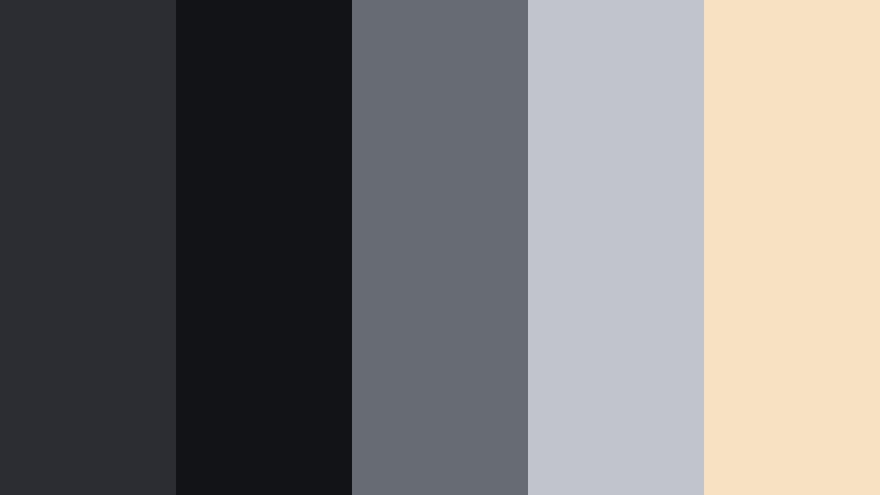
- HEX Codes: #2c2d32, #121317, #676b72, #c1c4cc, #f7e1c3
- Mood: indie, nostalgic, and story-driven
- Use for: Ideal for short films, character-driven vlogs, and narrative project titles.
Indie Grain Narrative softens Deep Frame Gray with a gentle, vintage-inspired highlight (#f7e1c3). The result feels like an old festival poster or a still frame from a low-budget indie film, with muted contrast and warm edges.
Use the warm beige as a subtle light source or background for quotes, character names, and title cards, while the grays carry your main visuals. This palette suits story-driven edits, behind-the-scenes reels, and creator brands that want a handmade, film-grain aesthetic rather than a hyper-digital look.
Shadowframe Documentary

- HEX Codes: #27282c, #101114, #5a5f66, #8f949c, #ffd66d
- Mood: serious, focused, and documentary-style
- Use for: Best for docu-style intros, interviews, and informative explainer videos.
Shadowframe Documentary is a balanced palette that keeps things professional and grounded. The Deep Frame Gray base tones support interviews and talking-head shots, while the soft yellow accent (#ffd66d) adds clarity and warmth without feeling playful.
Use the accent color for lower third bars, important stats, and call-to-action text in both videos and thumbnails. The layered grays make it easy to keep backgrounds clean and distraction-free, ideal for educational content, explainers, and documentary-style series branding.
Minimal & Modern Deep Frame Gray Color Palettes
Monolith Interface Clean

- HEX Codes: #2b2c30, #18191d, #f5f5f7, #c4c6cc, #5d6067
- Mood: minimal, sharp, and professional
- Use for: Perfect for app mockups, UI overlays in tutorials, and sleek tech channel branding.
Monolith Interface Clean contrasts rich Deep Frame Gray backgrounds with crisp near-whites and cool mid-grays. It instantly reads as modern, tech-driven, and polished, similar to a high-end software interface.
Use the darkest shade for full-screen backgrounds, the white and light grays for text and panels, and the mid-gray (#5d6067) for secondary labels or icons. This palette is ideal for software tutorials, UI walkthroughs, and tech review thumbnails where clarity and structure matter.
Slate Studio Grid

- HEX Codes: #34353a, #1b1c20, #ededf0, #a1a4ac, #ff6b3d
- Mood: modern, precise, and design-forward
- Use for: Great for motion graphics, lower thirds, and stylish tutorial thumbnails.
Slate Studio Grid builds a clean Deep Frame Gray structure and then slices through it with a bold orange accent (#ff6b3d). It feels like a design system: controlled, modular, and ready for motion graphics.
Use the orange to highlight important steps, chapter markers, or key icons in your videos. The pale background gray (#ededf0) is perfect for title cards and infographics, while the darker tones frame your footage, keeping the viewer focused on the content.
Soft Monitor Glow

- HEX Codes: #2d2e33, #18191d, #e9f0ff, #a8b3c7, #ff9bb6
- Mood: soft, techy, and approachable
- Use for: Use for creator brand intros, overlays for streaming layouts, and channel rebrands.
Soft Monitor Glow tempers Deep Frame Gray with pale blue and a soft pink accent (#ff9bb6). The combination feels friendly but still modern, like a pastel UI floating over a dark device.
Use the lighter blue tone for cards and panels, and the pink as a sparing accent for subscribe buttons, badges, or icons in overlays. This palette fits creator intros, streaming layouts, and channels that want to be techy without feeling cold or overly corporate.
Graphite Title Card

- HEX Codes: #26272b, #101114, #ffffff, #b7bac2, #4f535b
- Mood: timeless, clean, and editorial
- Use for: Ideal for text-only title cards, credits, and minimalist product showcase clips.
Graphite Title Card is a classic grayscale palette built around Deep Frame Gray, bright white, and soft neutrals. It feels like editorial layout design, with strong contrast and a focus on typography.
Use the darkest gray and blackish tones for solid backgrounds, then set headlines in pure white and body copy in the mid-gray (#4f535b). This palette is perfect for clean title cards, credit screens, and minimalist product showcases where text and composition carry the story.
Digital Slate Accent

- HEX Codes: #303238, #181a1f, #f2f4f8, #8b8fa0, #00c2ff
- Mood: fresh, digital, and energetic
- Use for: Great for tech reviews, SaaS promos, and overlay graphics in screen-recorded content.
Digital Slate Accent layers neutral Deep Frame Gray tones with a bright cyan accent (#00c2ff). The result is energetic without being overwhelming, ideal for tech and digital product content.
Use cyan sparingly to guide the eye to CTAs, key stats, or UI elements in your overlays and thumbnails. The off-white background (#f2f4f8) keeps layouts bright, while the deeper grays frame devices and screens so they stand out cleanly.
Warm & Cozy Deep Frame Gray Color Palettes
Editing Room Ember

- HEX Codes: #2f3034, #18191c, #ffb787, #e5d0b5, #6a6d73
- Mood: warm, creative, and cozy
- Use for: Perfect for editing vlog rooms, behind-the-scenes content, and creative process reels.
Editing Room Ember pairs cool Deep Frame Gray with glowing amber and beige notes. It feels like a dimly lit studio with a desk lamp on and a warm beverage nearby, inviting viewers into your creative space.
Use the warm tones to highlight key areas like your desk, hands, or tools, while the grays sit in the background. This palette works well for behind-the-scenes edits, workspace tours, and thumbnails that should feel personal and welcoming rather than flashy.
Coffee Desk Cutaway

- HEX Codes: #343439, #1d1d21, #c3986b, #f3e2cf, #777b83
- Mood: comforting, grounded, and lifestyle-focused
- Use for: Great for productivity vlogs, desk tours, and cozy lifestyle thumbnails.
Coffee Desk Cutaway blends Deep Frame Gray with cafe-inspired browns and creams. The palette feels grounded and everyday, like a morning routine shot with a focus on details.
Use the brown accent (#c3986b) for mugs, notebooks, or props, and let the lighter cream (#f3e2cf) support on-screen text or title cards. This is a strong choice for productivity content, lifestyle vlogs, and branding that aims to feel real and lived-in.
Autumn Render Fade

- HEX Codes: #313238, #18191d, #f5b384, #fbe4c5, #8b8e95
- Mood: seasonal, mellow, and cinematic
- Use for: Use for fall lookbooks, travel diaries, and seasonal channel updates.
Autumn Render Fade combines Deep Frame Gray with muted orange and cream tones. It feels like overcast autumn days, fallen leaves, and soft sweaters captured on a slightly faded film stock.
Let the warm orange (#f5b384) appear in clothing, foliage, or graphic accents, and keep Deep Frame Gray in the background for contrast. This palette is perfect for fall-themed series, seasonal announcement videos, and thumbnails that signal a cozy, cinematic shift in your content.
Studio Lamp Haze

- HEX Codes: #2b2c31, #14151a, #ffd8a2, #f6ede1, #7b7f88
- Mood: intimate, gentle, and atmospheric
- Use for: Best for night-time talking videos, Q and A sessions, and calm podcasts on camera.
Studio Lamp Haze surrounds Deep Frame Gray shadows with soft lamplight beiges. The palette feels intimate and slightly hazy, like a quiet late-night conversation in front of a warm bulb.
Use the lighter tones (#ffd8a2 and #f6ede1) to paint gentle highlights on faces or backdrops, while the grays keep the scene grounded and free of distractions. It is an excellent choice for Q and A videos, podcasts recorded on camera, or any content where the focus is on calm, authentic dialogue.
Color Pop Deep Frame Gray Color Palettes
Neon Timeline Burst

- HEX Codes: #26272c, #111217, #ff4f8b, #42e8ff, #f4f4f8
- Mood: bold, playful, and high-energy
- Use for: Ideal for gaming intros, fast-paced edits, and attention-grabbing YouTube thumbnails.
Neon Timeline Burst throws electric pink (#ff4f8b) and cyan (#42e8ff) against a Deep Frame Gray canvas. The contrast is strong and instantly attention-grabbing, ideal for genres where motion and impact matter.
Use the neon colors in HUD elements, streaks, and title text, while Deep Frame Gray handles backgrounds and shadowy areas. The light neutral (#f4f4f8) gives you a clean option for readable text or UI panels. This palette works especially well for gaming intros, highlight reels, and thumbnails that need to stand out in a crowded feed.
Tips for Creating Deep Frame Gray Color Palettes
Deep Frame Gray is versatile, but it shines most when paired thoughtfully with highlights, accents, and skin tones. Use the tips below to design palettes that look great in both video and static design.
- Decide the role of Deep Frame Gray first: is it your background, your text color, or your midtone anchor? Use it consistently across your brand.
- Pair Deep Frame Gray with one strong accent color (like Cinematic Bronze, cyan, or warm amber) instead of many saturated tones to keep things cinematic.
- Check text contrast on mobile: test white and light gray text on your chosen Deep Frame Gray value to make sure it meets readability standards.
- Match your grade to set design: if your room or props already lean warm, add warm accents to your Deep Frame Gray palette rather than fighting the natural color.
- Use lighter neutrals (off-whites and pale grays) for overlays and title cards so Deep Frame Gray can sit behind them as a frame or border.
- Keep brand consistency by reusing the same 3 to 5 HEX codes for thumbnails, lower thirds, and end screens across every upload.
- For skin tones, avoid making Deep Frame Gray too blue; slightly neutral or warm grays keep faces from looking lifeless on camera.
- Test palettes under different lighting by checking your designs in both light and dark mode interfaces and on various devices.
Deep Frame Gray gives you a flexible foundation for building cinematic, modern, or cozy looks without overwhelming your footage. Whether you are crafting intros, thumbnails, or full color grades, these palettes can guide your choices so every upload feels intentional and on brand.
Try a few of these HEX combinations inside Filmora, save your favorite grades as presets, and reuse them across intros, B-roll, shorts, and social cuts. Over time, your audience will start to recognize your Deep Frame Gray signature even before they see your channel name.
Combine these palettes with Filmora's grading tools, AI features, and filters, and you can move from a flat raw clip to a polished, cinematic frame in just a few clicks.
secure download