
 100% Security Verified | No Subscription Required | No Malware

 ChatGPT
 Perplexity
 Gemini
 Claude
 Grok
Grok
Deep Sea Blue sits between navy and teal, carrying the calm of the ocean with a hint of mystery and depth. It feels steady, intelligent, and cinematic, which is why it appears so often in movie posters, luxury branding, and tech visuals. On screen, Deep Sea Blue instantly cools down a frame, making skin tones stand out and adding a moody, immersive atmosphere.
For video creators and designers, this color is a powerful base for thumbnails, intros, overlays, and full color grades. The palettes below bring together Deep Sea Blue with accent tones and neutrals, each with ready-to-use HEX codes. You can apply them easily in Filmora for cinematic edits, stylish vlogs, channel branding, and social posts that look cohesive from first frame to final export.
In this article
Cinematic Deep Sea Blue Color Palettes
Midnight Harbor Cinema

- HEX Codes: #012a36, #014f86, #5e6472, #d8e2dc
- Mood: Moody, dramatic, and cinematic with a cool maritime edge.
- Use for: Ideal for dramatic travel films, nighttime city b-roll, and suspenseful title cards.
This palette moves from inky teal (#012a36) through a strong Deep Sea Blue (#014f86) into muted slate (#5e6472) and a misty off white (#d8e2dc). Together they feel like standing on a quiet pier at night, with distant harbor lights diffused by fog. It is instantly cinematic and leans into the cool, dramatic side of Deep Sea Blue.
Use it for moody storytime vlogs, noir style travel edits, or intros where you want text and logos to sit over deep, atmospheric backgrounds. The darker tones work well for lower thirds and overlay frames, while the pale neutral is perfect for readable titles and UI style elements. In thumbnails, pair the darkest blue as a background with white or light gray typography for a sharp, premium look.
Pro Tip: Build a Cinematic Deep Sea Blue Look in Filmora
To keep a Midnight Harbor Cinema style consistent, set this palette as your visual reference inside Filmora. Use the deepest blue for solid color backgrounds, borders, and end screens, and repeat the lighter gray and off white on titles and subtitles. When you grade footage, gently cool the midtones toward Deep Sea Blue so that b roll, talking head clips, and overlays all share the same maritime mood.
You can also save text styles, lower thirds, and transition screens using these HEX values, then reuse them across episodes or a full series. This gives your channel a recognizable Deep Sea Blue signature, even when you switch locations or lighting setups.
AI Color Palette
Filmoras AI Color Palette makes it easy to spread this cinematic Deep Sea Blue look across an entire timeline. Capture a still frame or create a simple color card using these HEX codes, then use that image as your reference. Filmoras AI Color Palette feature analyzes the tones and automatically matches your other clips to that deep, harbor inspired grade.
This is especially helpful if you are mixing smartphone, DSLR, and screen recordings in one project. Instead of adjusting each clip manually, let AI bring them closer to the same Deep Sea Blue atmosphere in just a few clicks, and then fine tune only where needed.
 secure download

HSL, Color Wheels & Curves
Once your base match is done, use HSL sliders in Filmora to gently desaturate non essential colors and push blues and teals closer to your chosen Deep Sea Blue range. Color wheels help you cool shadows while keeping highlights neutral, which preserves realistic skin tones against darker, cinematic backgrounds. Curves let you deepen the blacks for more contrast, or lift the shadows slightly if you want a softer, misty harbor feel.
For a deeper dive into grading, you can follow Filmoras tutorial on using curves, wheels, and HSL tools in combination so your Deep Sea Blue palette looks polished and intentional from shot to shot.
secure download1000+ Video Filters & 3D LUTs
If you want instant style, Filmora offers built in looks that play well with Deep Sea Blue palettes. You can start from a cinematic or teal and orange LUT, then adjust intensity until it supports your HEX colors instead of fighting them. Filmoras video filters and 3D LUTs make it easy to give your Midnight Harbor Cinema palette a consistent, professional finish.
Apply a LUT to adjustment layers above your clips, then tweak local contrast, exposure, and saturation on individual shots. This way, your palette stays unified while each scene still has the correct brightness and detail.
secure downloadStormy Ocean Fade

- HEX Codes: #021b2c, #01497c, #2c7da0, #adb5bd
- Mood: Tense, atmospheric, and slightly desaturated like a brewing storm at sea.
- Use for: Perfect for cinematic trailers, dramatic storytime vlogs, and documentary sequences over water or rain.
Stormy Ocean Fade leans into deep navy blacks (#021b2c) and weathered sea blues (#01497c, #2c7da0), ending in a soft steel gray (#adb5bd). The mix feels tense and atmospheric, like clouds building over open water. It has a slightly desaturated look that keeps things serious and grounded.
Use this palette when you want mood and narrative tension: true crime intros, emotional travel monologues, or any sequence with rain, reflections, or night streets. In thumbnails and titles, let the darkest blue act as a vignette and place key text in the gray zone so it stays readable while still feeling part of the stormy scene.
Deep Current Noir

- HEX Codes: #000814, #001d3d, #003566, #9d4edd
- Mood: Edgy, mysterious, and modern with a subtle neon accent.
- Use for: Use for tech reviews, cyberpunk edits, and high-contrast title screens that need a bold focal pop.
Deep Current Noir layers nearly black navy (#000814) with deep channel blues (#001d3d, #003566) and a vivid violet accent (#9d4edd). It feels like a noir alley lit by a single neon sign, modern and a little dangerous. The purple accent acts as a focal point against the otherwise moody Deep Sea Blue base.
This palette is ideal for tech and gadget reviews, cyberpunk themed edits, or minimalist channel branding where you want one bright color to guide the eye. Use the violet for progress bars, subscribe buttons, or logo highlights, and keep backgrounds in the darker blues for high contrast thumbnails and intro animations.
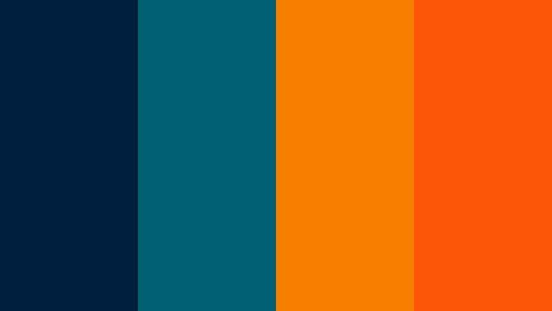
Submerged Neon Drift

- HEX Codes: #001219, #005f73, #0a9396, #fca311
- Mood: Surreal, high-energy, and immersive like neon lights under water.
- Use for: Great for music videos, dance montages, and stylized motion graphics or lyric videos.
Submerged Neon Drift mixes very dark teal navy (#001219) with rich aquatic teals (#005f73, #0a9396) and an electric amber accent (#fca311). The result feels like liquid neon, glowing under the surface of deep water. It is immersive and surreal, with the warm orange cutting sharply through the cool Deep Sea Blue base.
Use the teal range for gradients, backgrounds, and overlays, and reserve the bright amber for beats, lyrics, or key action moments in music videos and dance edits. For thumbnails, placing a subject against the darker teal with amber text or outlines will create bold, scroll stopping contrast without losing the underwater vibe.
Soft & Serene Deep Sea Blue Color Palettes
Tidal Dawn Calm

- HEX Codes: #013a63, #2c7da0, #84a59d, #f6f4f0
- Mood: Peaceful, reflective, and softly coastal.
- Use for: Ideal for morning routines, mindfulness content, study vlogs, and calm brand intros.
Tidal Dawn Calm blends a gentle Deep Sea Blue (#013a63) with softer coastal blue (#2c7da0), muted sage (#84a59d), and warm off white (#f6f4f0). It feels like an early morning by the sea, quiet and reflective. The cool tones are balanced by the subtle warmth of the light neutral.
This palette suits slow, calm content like morning routines, journaling sessions, and meditative voiceovers. Use the light off white as your main background for titles and overlays, and weave the blues and sage into icons, progress bars, or chapter markers. For channel branding, it gives a soft but still professional Deep Sea Blue identity that works well on both light and dark UI themes.
Sea Glass Whispers

- HEX Codes: #01497c, #61a5c2, #b5e2fa, #fdf0d5
- Mood: Airy, nostalgic, and softly sunlit like worn sea glass on sand.
- Use for: Beautiful for travel diaries, beach highlight reels, and dreamy overlay graphics.
Sea Glass Whispers starts with a rich sea blue (#01497c) and fades into breezy aqua (#61a5c2), pale sky blue (#b5e2fa), and a sand toned cream (#fdf0d5). It captures the look of sea glass washed onto a warm shore, giving a soft, slightly nostalgic feeling.
Use the lighter blues and cream for background blocks, lower thirds, and subtle gradient overlays in beach or vacation vlogs. The deeper blue can frame your footage in borders or line accents without feeling harsh. For thumbnails, pairing the sandy cream with pale blue text over a darker Deep Sea Blue corner helps keep readability high while protecting the airy, sunlit mood.
Harbor Mist Minimal

- HEX Codes: #012a4a, #468faf, #a9bcd0, #edf2f4
- Mood: Minimal, calm, and modern with a gentle haze.
- Use for: Use in minimalist title cards, productivity dashboards, and clean tutorial overlays.
Harbor Mist Minimal combines a grounded Deep Sea Blue (#012a4a) with soft cyan blue (#468faf), dusty slate (#a9bcd0), and a chilled off white (#edf2f4). It feels modern and minimal, like a foggy harbor seen through frosted glass. Nothing is too saturated, which keeps the look calm and uncluttered.
This palette is great for tutorials, productivity content, and channels that favor a clean UI aesthetic. Use the lightest tone as your main canvas for text, charts, and chapter labels, and bring in the darker blues sparingly for headings, icons, or subtle dividers. It translates well across thumbnails, intros, and end screens when you want clarity first and mood second.
Ocean Journal Pastel

- HEX Codes: #014f86, #56cfe1, #bee9e8, #ffddd2
- Mood: Lighthearted, cozy, and slightly pastel with a journaling vibe.
- Use for: Great for bullet journal videos, study-with-me content, and soft, aesthetic social posts.
Ocean Journal Pastel mixes a solid Deep Sea Blue (#014f86) with bright aqua (#56cfe1), frosty teal (#bee9e8), and a warm blush pastel (#ffddd2). It feels like stationery, pastel markers, and sticky notes spread across a desk by a window looking onto the sea.
Use this palette in study with me videos, productivity recaps, and aesthetic reels. Let the blush pastel back your main text or frames, and switch between the blues for headers, highlights, and annotation arrows. The Deep Sea Blue keeps the palette grounded so it does not become too sweet, making it a good choice for creators who want soft visuals with a hint of structure.
Bold & Energetic Deep Sea Blue Color Palettes
Regatta Spotlight

- HEX Codes: #012a4a, #0077b6, #ffc300, #ff6b35
- Mood: Sporty, energetic, and confident like a racing yacht under bright flags.
- Use for: Perfect for sports edits, challenge videos, and dynamic call-to-action screens.
Regatta Spotlight anchors a deep maritime blue (#012a4a) with a vibrant cyan blue (#0077b6), then adds striking flag yellow (#ffc300) and bold orange (#ff6b35). It feels fast and competitive, like sails snapping in the wind under bright regatta banners.
This palette is made for high energy content: sports highlights, challenges, countdowns, or anything with motion and stakes. Keep the Deep Sea Blue as your base for backgrounds and motion graphics, and use yellow and orange for CTAs, score counters, and highlighted words in titles. On thumbnails, placing your subject against the dark blue with yellow text and an orange accent bar can massively improve click through rates.
Tropical Abyss Pop
- HEX Codes: #001f3f, #005f73, #f77f00, #fb5607
- Mood: Vibrant, adventurous, and bold with tropical warmth against deep water.
- Use for: Use in travel vlogs, adventure challenges, and eye-catching lower thirds.
Tropical Abyss Pop layers dark ocean navy (#001f3f) and teal (#005f73) with hot mango orange (#f77f00) and tangerine (#fb5607). It is adventurous and outgoing, like a sunset over deep water with bright cocktails and city lights.
Use this palette in travel montages, adventure challenges, and food or street content shot near the sea. Let the blues hold the frame and keep detail in the scene, then use the oranges to draw instant attention to titles, prices, or key locations on maps. In channel branding it delivers a strong Deep Sea Blue base with enough warmth to feel inviting, not cold.
Electric Marina Pulse

- HEX Codes: #000814, #023e8a, #48cae4, #ff0054
- Mood: High-energy, nightlife-inspired, and slightly edgy.
- Use for: Great for gaming intros, streamer overlays, and electronic music visuals.
Electric Marina Pulse leans into near black Deep Sea Blue (#000814), punchy marina blue (#023e8a), neon cyan (#48cae4), and a loud magenta pink (#ff0054). It evokes a waterfront city at night, full of LED signs and reflections on dark water.
This is a strong fit for gaming channels, EDM edits, and streaming overlays. Use the darkest blue as your base for panels and backgrounds, then light up edges and highlights with cyan. Reserve the hot pink for live indicators, alerts, or subscribe / follow prompts so they really stand out on screen and in thumbnail text.
Ocean Festival Lights
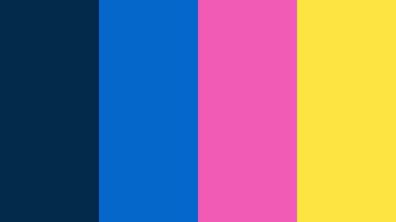
- HEX Codes: #012a4a, #0466c8, #f15bb5, #fee440
- Mood: Playful, festive, and social-media ready.
- Use for: Ideal for event recaps, party highlights, and upbeat YouTube channel branding.
Ocean Festival Lights starts with Deep Sea Blue (#012a4a) and bright ocean blue (#0466c8), then adds candy magenta (#f15bb5) and neon lemon (#fee440). It feels like a night festival by the water, full of color, music, and motion.
Use this palette for event recaps, party reels, and upbeat lifestyle content. The blues keep footage connected to the ocean theme, while the pink and yellow work well for text, stickers, and animated doodles. In thumbnails, place text in the yellow and pink range against the darker blue corners to get lively but still readable combinations on mobile feeds.
Elegant & Modern Deep Sea Blue Color Palettes
Nautical Luxe Contrast
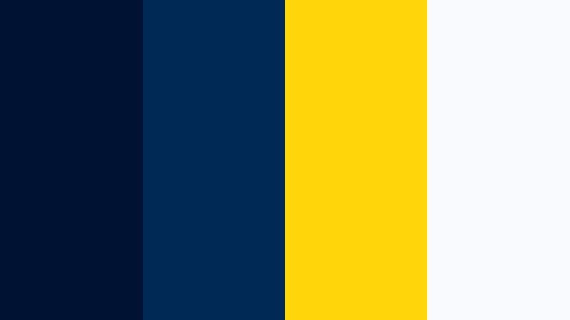
- HEX Codes: #001233, #002855, #ffd60a, #f8f9fa
- Mood: Refined, classic, and slightly luxurious with a nautical twist.
- Use for: Perfect for premium brand intros, logo stings, and polished corporate explainers.
Nautical Luxe Contrast uses rich navy Deep Sea Blue (#001233, #002855) with a sophisticated gold yellow (#ffd60a) and crisp white (#f8f9fa). It instantly reads as high end, with a classic maritime influence inspired by yachts and tailored uniforms.
This palette is ideal for premium branding, corporate intros, and logo animations. Use navy as the primary background and interface color, white for clean typography, and gold as a sparing accent on logos, key words, or icons. On thumbnails and end screens, this trio makes your content feel trustworthy, polished, and ready for clients or sponsors.
Marina Slate Modern
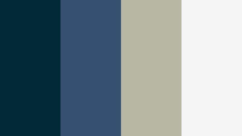
- HEX Codes: #012a36, #355070, #b7b7a4, #f5f5f5
- Mood: Sleek, balanced, and contemporary with muted neutrals.
- Use for: Use for portfolio reels, tech startups, and UI-style lower thirds.
Marina Slate Modern balances a steady teal navy (#012a36) and slate blue (#355070) with warm gray (#b7b7a4) and soft white (#f5f5f5). It feels structured and contemporary, like a modern design studio overlooking a marina.
This palette works well for portfolios, SaaS explainers, and channel branding for designers or developers. Use the Deep Sea Blue as your accent color for buttons, highlighted text, and hover states, while keeping most backgrounds in the light neutral. This keeps screens clean and readable while your brand still has a recognizable cool tone running through every asset.
Pearl Trench Harmony

- HEX Codes: #001f3f, #194a61, #d9d9d9, #fdfbf9
- Mood: Understated, calm, and premium like pearl against a deep trench.
- Use for: Great for wedding films, brand documentaries, and aesthetic lookbooks needing subtle elegance.
Pearl Trench Harmony pairs trench blue (#001f3f, #194a61) with soft pearl gray (#d9d9d9) and an almost paper white (#fdfbf9). It feels quiet and refined, like jewelry photographed against a deep velvet backdrop.
Use this palette for wedding films, brand stories, and fashion or lifestyle lookbooks. The blues give your frames depth without overpowering skin tones, while the grays and whites provide safe spaces for names, dates, and logos. In thumbnails and title cards, keep most of the space light and let Deep Sea Blue appear in bands, corners, or minimal accents for an editorial, magazine like finish.
Graphite Tide Studio

- HEX Codes: #000814, #313131, #014f86, #e5e5e5
- Mood: Urban, refined, and studio-ready with a monochrome edge.
- Use for: Ideal for product showcases, gear reviews, and minimalist channel branding.
Graphite Tide Studio blends near black navy (#000814) with charcoal gray (#313131), a focused Deep Sea Blue accent (#014f86), and a light gray (#e5e5e5). It feels like a modern studio set or camera showroom, sleek and under control.
This palette is perfect for gear reviews, unboxings, and any minimalist channel where the product should be the brightest thing on screen. Use the grays and deep navy for backdrops and frames, and let Deep Sea Blue highlight key details like model names or spec callouts. In thumbnails, this combination lets your subject or product photography take center stage while the palette quietly signals professionalism.
Tips for Creating Deep Sea Blue Color Palettes
Deep Sea Blue is flexible, but it works best when combined thoughtfully with neutrals, accents, and skin tones. Use these practical tips to build palettes that look great in both video and static design.
- Pair Deep Sea Blue with one light neutral (off white or soft gray) to keep text and UI elements readable on thumbnails, overlays, and end screens.
- Use warm accents like gold, orange, or blush sparingly to balance the coolness and guide the eye toward titles, CTAs, and key information.
- Check mobile contrast by zooming out or previewing your thumbnail small; if Deep Sea Blue backgrounds swallow your text, brighten the text color or add a subtle drop shadow.
- Keep skin tones natural by applying Deep Sea Blue mainly to shadows and midtones, not to highlights; avoid pushing faces too far into cyan.
- For branding, lock in 1 primary Deep Sea Blue and 2 to 3 supporting colors, then reuse them consistently in intros, lower thirds, and social templates.
- Match your footage to your chosen palette using color wheels and HSL in Filmora; gently shift stray hues toward your base blues or desaturate them to avoid a messy rainbow look.
- When combining Deep Sea Blue with bright neons, leave enough dark negative space so that the accents do not overwhelm the viewer.
- Test light and dark modes by inverting your palette: use Deep Sea Blue as a background in dark layouts and as an accent in light layouts to keep flexibility across platforms.
Deep Sea Blue palettes can make your edits feel cinematic, trustworthy, or high energy, depending on how you pair them with neutrals and accents. They shape the mood of your channel and help viewers recognize your brand even before they read the title.
Try a few of the palettes above inside Filmora, saving your favorites as reusable presets for titles, overlays, and color grades. Whether you lean toward moody harbor tones, soft coastal pastels, or neon nightlife looks, a consistent Deep Sea Blue scheme will keep your videos and designs looking intentional and cohesive.
As you experiment, pay attention to how different blues interact with your footage, lighting, and niche. With a solid palette and Filmoras color tools, you can build a signature Deep Sea Blue aesthetic that feels both professional and personal to your style.

