
 100% Security Verified | No Subscription Required | No Malware


 ChatGPT
 Perplexity
 Gemini
 Claude
 Grok
Grok
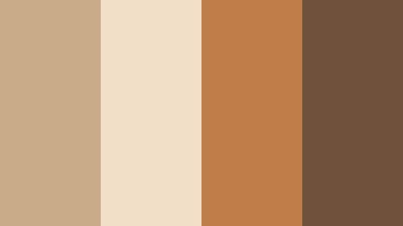
Dusty Sand sits in that sweet spot between beige and soft caramel, bringing warmth without feeling loud. It reads as grounded, calm, and quietly premium, which is why it shows up so often in lifestyle brands, skincare, interiors, and editorial layouts. On screen, Dusty Sand softens harsh contrasts, makes skin tones feel more flattering, and gives videos a subtle, cinematic warmth.
For creators and Filmora users, Dusty Sand is perfect for neutral YouTube thumbnails, vlog intros, end cards, and brand kits that still feel stylish and modern. Below you will find ready to use Dusty Sand color palettes with HEX codes, plus ideas on how to apply them in video frames, overlays, and titles so your channel and social feeds stay consistent and polished.
In this article
Soft & Romantic Dusty Sand Color Palettes
Sunlit Dune Romance
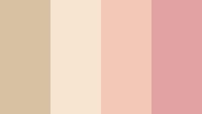
- HEX Codes: #d8c1a3, #f6e4d0, #f3c7b6, #e0a3a1
- Mood: gentle, nostalgic, and softly romantic
- Use for: Use for wedding highlight videos, proposal reels, and dreamy storytelling thumbnails.
Sunlit Dune Romance feels like warm sand at golden hour, with Dusty Sand tones melting into peach and muted rose. It gives your visuals a hazy glow that flatters skin tones and makes every frame look like a soft memory.
Use this palette for wedding titles, lower thirds on proposal reels, or chapter cards in romantic travel vlogs. In thumbnails and intro screens, keep Dusty Sand as the background, and let the peach and rose shades highlight key text, call to action buttons, and subtle frame borders.
Pro Tip: Build a Cinematic Dusty Sand Look in Filmora
To keep this romantic Dusty Sand palette consistent from your opener to the end card, build a simple style guide inside Filmora. Use one of the lighter Dusty Sand HEX codes for backgrounds on titles, then save custom text presets using the peach and rose accents for headlines and subheads.
Once you dial in a warm, soft grading style that suits Sunlit Dune Romance, save that color correction as a preset. You can reuse it across all your A roll, B roll, reels, and shorts so everything connected to that love story or wedding project feels like part of one cinematic universe.
AI Color Palette
If you have a reference photo from the wedding location or a mood board featuring this Dusty Sand palette, you can turn it into a video wide look in a few clicks. Filmora's AI Color Palette feature analyzes the colors in your reference image and transfers that vibe across your timeline.
Import a still that showcases your favorite mix of Dusty Sand, peach, and muted rose, then let AI Color Palette match your footage to it. This helps keep your ceremony, reception, and candid clips wrapped in the same warm, nostalgic atmosphere without manual grading on every shot.
 secure download

HSL, Color Wheels & Curves
To fine tune your Dusty Sand footage, use HSL to gently desaturate strong reds and yellows while slightly boosting the oranges for flattering skin tones. Then use Filmora's color wheels to warm midtones and keep highlights soft, so your whites lean toward champagne rather than stark blue.
Curves give you precise control over contrast. Lift the shadows a touch for that dreamy, low contrast feel, and bend the RGB curves slightly toward warm tones in the midrange to reinforce the Sunlit Dune Romance palette. You can see similar grading ideas in Filmora's YouTube tutorials on cinematic color, which walk through using wheels and curves for subtle, filmic looks.
secure download1000+ Video Filters & 3D LUTs
If you want to push your Dusty Sand palette into a more stylized direction, Filmora's video filters and 3D LUTs make it easy to experiment. Start with subtle film inspired LUTs to add grain, bloom, or gentle fade to your Sunlit Dune Romance clips.
You can then layer light leaks, bokeh, or vignette filters to frame your subjects and deepen the romantic mood. Save your favorite combination as a custom preset so future engagement videos, elopement highlights, or anniversary edits match the same Dusty Sand identity.
secure downloadBlush Desert Evening

- HEX Codes: #d3b79a, #f8ddd4, #f0b7b3, #b58d94
- Mood: soft, intimate, and quietly cinematic
- Use for: Perfect for aesthetic vlogs, lookbooks, and soft spoken commentary videos.
Blush Desert Evening wraps Dusty Sand in layers of pale blush and muted mauve, creating a cozy twilight feel. It is gentle on the eyes and ideal for long form content where you want viewers to relax and stay.
Use Dusty Sand as your base for backgrounds and frames, with blush for highlight text or timestamps and mauve for icons, buttons, or subtle outlines. This palette works beautifully for aesthetic vlog thumbnails, soft spoken commentary titles, and intro screens for beauty or lifestyle playlists.
Vintage Linen Love

- HEX Codes: #cfb79b, #f3e6d7, #e7c9b0, #c39ba5
- Mood: nostalgic, delicate, and handcrafted
- Use for: Use in nostalgic travel edits, journaling videos, and soft product showcases.
Vintage Linen Love feels like old letters and postcard paper. Dusty Sand mixes with linen creams and a touch of mauve to create a handcrafted, analog mood that suits slow, thoughtful storytelling.
In Filmora, try this palette for journaling sequences, scrapbooking videos, or retro travel recaps. Use the lightest tone as a paper like background for text, Dusty Sand for body copy, and mauve accents for stamps, stickers, and animated doodles on your frames.
Rose Tinted Sandscape

- HEX Codes: #d9c0a4, #fae4de, #f0b8c0, #bf8d8b
- Mood: romantic, dreamy, and slightly whimsical
- Use for: Ideal for beauty channels, skincare promos, and dreamy fashion reels.
Rose Tinted Sandscape pairs Dusty Sand with rose tints to create a soft focus, editorial feeling palette. It brings both warmth and a gentle, feminine character to your frames.
Use Dusty Sand behind your main subject or title, and reserve the pinker shades for key phrases, badges, or product callouts. This set works especially well on beauty channel thumbnails, lookbook title slides, and short, dreamy reels that highlight textures like silk, satin, or glowing skin.
Candlelit Terracotta Kiss
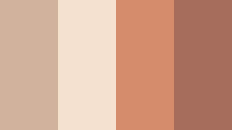
- HEX Codes: #d0b39a, #f4e0cf, #d58c6b, #a56c5c
- Mood: warm, intimate, and cozy
- Use for: Great for dinner vlog edits, lifestyle storytelling, and cozy home decor content.
Candlelit Terracotta Kiss blends Dusty Sand with baked terracotta and rich brown, echoing the feel of a softly lit restaurant or home dinner table. It adds depth and warmth without becoming too heavy.
Use the lighter tones for text and background plates, and let the terracotta and brown shades frame your footage or emphasize key overlays like recipe steps or location names. This palette works beautifully for cozy lifestyle intros, seasonal decor tours, or moody food thumbnails.
Minimal & Modern Dusty Sand Color Palettes
Neutral Studio Grid
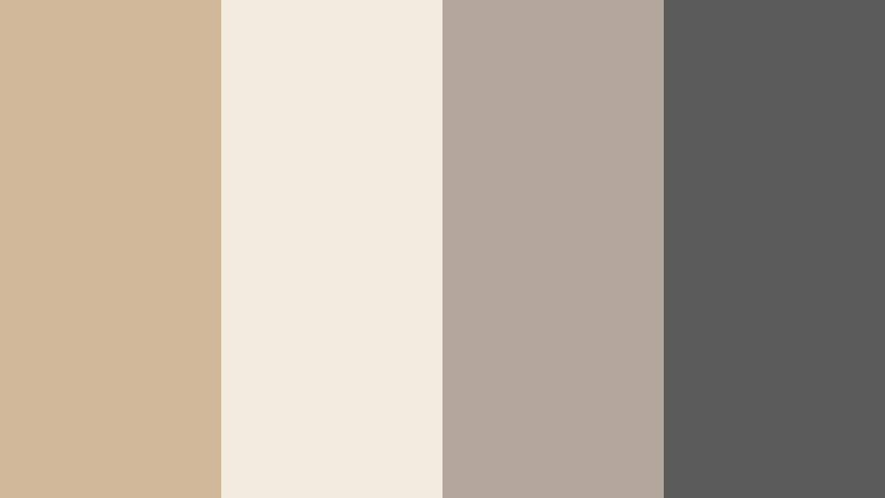
- HEX Codes: #d2b89b, #f4ebdf, #b2a79a, #5b5b5b
- Mood: clean, modern, and professionally minimal
- Use for: Use for channel branding, tech reviews, and minimalist UI overlays in video.
Neutral Studio Grid gives you a polished mix of Dusty Sand, soft ivory, taupe, and charcoal. It feels like a modern studio set or a carefully lit workspace, ideal for creators who want a neutral but not boring aesthetic.
Apply Dusty Sand and ivory for backgrounds, taupe for secondary text or icons, and charcoal for high contrast headlines. This palette is perfect for tech review overlays, clean tutorial titles, and channel branding where you want the content to shine while the design stays quietly premium.
Calm Workspace Neutrals

- HEX Codes: #d4bfa3, #f7f1e7, #c6cfd6, #88929d
- Mood: focused, airy, and reassuring
- Use for: Perfect for productivity vlogs, study with me videos, and SaaS explainer graphics.
Calm Workspace Neutrals pairs Dusty Sand with off white and cool blue grays, creating a balanced mix of warmth and clarity. It feels organized and professional, like a tidy desktop setup.
Use the warm shades for backgrounds and face cam frames, and use the blue grays for charts, graphs, and UI inspired overlays. This palette keeps productivity and SaaS explainers looking fresh and legible while still having a human, approachable base in Dusty Sand.
Editorial Sand Monochrome

- HEX Codes: #c9ac8f, #e0c9ae, #f1e0c8, #a1866b
- Mood: sophisticated, timeless, and editorial
- Use for: Use in magazine inspired lookbooks, portfolio reels, and brand intros.
Editorial Sand Monochrome layers several tones of Dusty Sand into a monochrome story. It looks like a fashion magazine spread or a high end portfolio, with subtle contrast and lots of negative space.
Use the lightest shade for full frame backgrounds, mid tones for panels and columns, and the deepest Dusty Sand for text and borders. This palette is ideal for designers, photographers, and stylists showcasing work in clean, grid based reels and minimal brand intros.
Modern Beige Interface

- HEX Codes: #d1b79d, #f5eee4, #9da3a8, #34373b
- Mood: sleek, digital, and quietly premium
- Use for: Great for app mockups, UI overlays in tutorials, and modern brand explainers.
Modern Beige Interface combines Dusty Sand and soft whites with cool mid gray and deep graphite. It feels like a well designed app interface translated into video graphics.
Use Dusty Sand and off white as your core UI background colors in screen mockups, and use gray and graphite for buttons, captions, and key labels. This palette suits software tutorials, product demos, and digital brand explainers that want to look cutting edge but still warm and human.
Muted Capsule Wardrobe

- HEX Codes: #cfb59a, #f3e8da, #b8b1aa, #6c655d
- Mood: capsule chic, restrained, and calm
- Use for: Perfect for fashion capsules, closet tours, and lifestyle channels with a neutral brand.
Muted Capsule Wardrobe mirrors the tones you would see in a carefully curated closet: Dusty Sand, soft ecru, and muted grays. It is calm, sophisticated, and very on trend for minimalist lifestyle content.
Use the light tones for clothing rack overlays, lookbook title cards, and outfit breakdown graphics. Reserve the darker gray for text and small icons so everything stays readable. This palette makes closet tours, styling tips, and capsule wardrobe series feel coherent and brand ready.
Earthy & Organic Dusty Sand Color Palettes
Coastal Driftwood Calm

- HEX Codes: #d3bda0, #f2e8dd, #a7b9be, #6c7c82
- Mood: serene, breezy, and nature grounded
- Use for: Use for travel vlogs, beach documentaries, and mindful lifestyle edits.
Coastal Driftwood Calm brings together Dusty Sand, driftwood cream, and sea glass blues. It feels like a quiet walk by the shore on a cloudy day, soft and refreshing at the same time.
Use Dusty Sand for lower thirds and chapter markers, and let the blue grays highlight maps, location pins, or weather overlays. This palette suits slow travel vlogs, ocean documentaries, and calming lifestyle edits where you want viewers to feel grounded and peaceful.
Clay Market Morning

- HEX Codes: #cda883, #f6e2ce, #d48e59, #7f5a43
- Mood: earthy, bustling, and artisanal
- Use for: Great for market tours, food vlogs, and handmade product spotlights.
Clay Market Morning mixes Dusty Sand with clay orange and deep brown, capturing the warmth of a handmade ceramics stall or a busy morning market. It feels artisanal and full of life.
Use the lighter tones as backgrounds for price tags, ingredient lists, or vendor titles, and use the richer clay colors for dividers, badges, and logo marks. This palette works especially well for food content, craft fairs, maker profiles, and any storyline built around earthy textures and natural materials.
Olive Grove Retreat
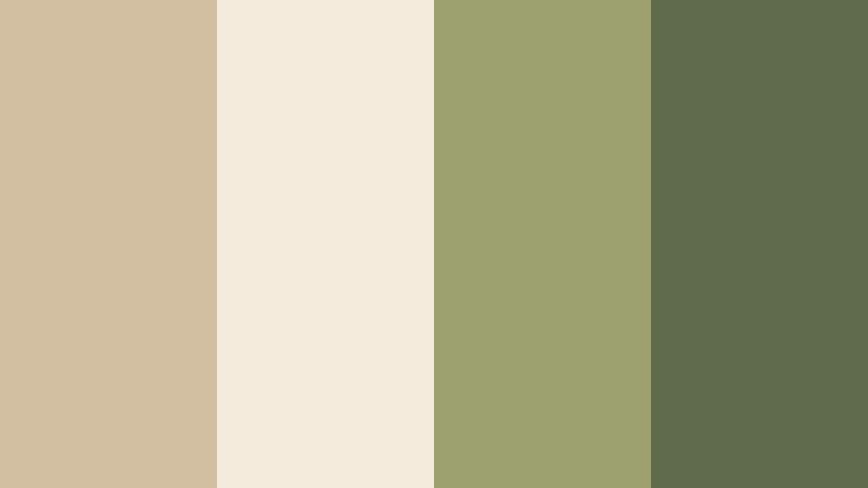
- HEX Codes: #d2bfa1, #f4ebdd, #9c9f6e, #5f6a4a
- Mood: grounded, restorative, and quietly luxurious
- Use for: Perfect for wellness content, retreat promos, and slow travel storytelling.
Olive Grove Retreat softens Dusty Sand with herbal olive greens and cream, giving a spa like, restorative feeling. It is both natural and slightly luxurious, ideal for calm, mindful content.
Use Dusty Sand and cream as the base of your titles and full screen cards, and use the olive hues for logos, icons, and emphasis text. This palette fits yoga retreats, spa tours, slow travel diaries, and wellness brands that want a grounded yet upscale look.
Nomad Caravan Trail
- HEX Codes: #c9aa89, #f1dfc7, #bf7e49, #70513a
- Mood: adventurous, rustic, and cinematic
- Use for: Use in travel documentaries, road trip vlogs, and storytelling shorts with desert scenes.
Nomad Caravan Trail combines Dusty Sand with sun baked orange and rugged browns, echoing desert roads and vintage expedition films. It brings a cinematic, adventurous tone to your visuals.
Use the paler Dusty Sand and cream tones for maps, route overlays, or subtitle bars, and the deeper oranges and browns for title cards and transitions. This palette is perfect for desert vlogs, van life stories, and travel shorts that follow long journeys through warm landscapes.
Herbal Linen Kitchen

- HEX Codes: #d4bda1, #f7eee0, #b0c3aa, #7b8d71
- Mood: homey, fresh, and subtly rustic
- Use for: Ideal for recipe videos, kitchen makeovers, and homesteading channels.
Herbal Linen Kitchen pairs Dusty Sand with herb greens and linen cream, creating the feel of a bright farm kitchen or garden side table. It balances freshness with comfort.
Use the light neutrals for recipe cards and step callouts, and use the greens to highlight ingredients, measurements, or tips. This palette suits cooking channels, kitchen DIY makeovers, and homesteading content where you want visuals to feel wholesome and inviting.
Cinematic & Moody Dusty Sand Color Palettes
Desert Noir Frame

- HEX Codes: #c9ac8d, #e9ddcf, #7c6b5d, #252220
- Mood: moody, cinematic, and slightly mysterious
- Use for: Use for short films, title sequences, and dramatic storytelling thumbnails.
Desert Noir Frame places soft Dusty Sand tones against smoky browns and deep charcoal, suggesting a desert landscape at night. It feels cinematic and mysterious, ideal for more dramatic content.
Use the lighter neutrals for opening titles and credits, and let the darker browns and charcoal define letterbox bars, overlays, and strong text. This palette suits short films, narrative intros, mystery series branding, and thumbnails where you want intrigue without losing that Dusty Sand warmth.
Tips for Creating Dusty Sand Color Palettes
Dusty Sand works as a flexible base for many aesthetics, from soft romance to minimal tech. A few practical guidelines will help you build palettes that look great on screen and stay consistent across your Filmora projects.
- Pair Dusty Sand with one main accent color only (rose, olive, clay, or blue gray) to avoid visual clutter in thumbnails and intros.
- Keep text contrast high: use deeper browns, charcoal, or dark gray for headlines on Dusty Sand backgrounds so titles remain readable on mobile.
- Use lighter Dusty Sand tones for full screen backgrounds and overlays, and reserve the richest neutrals for small elements like icons, borders, and shadows.
- Match your grading to your palette: warm up midtones for romantic or earthy looks, or keep tones more neutral for modern, tech oriented branding.
- Create a reusable style kit: in Filmora, save your favorite Dusty Sand colors, fonts, and lower thirds as presets so every new video aligns with your brand.
- Test your palette on different devices by exporting a short sample and checking it on phones, tablets, and desktops to ensure it stays balanced.
- Use accent colors to guide attention: reserve the boldest shade in your Dusty Sand palette for CTAs, important numbers, or key phrases.
- Balance warmth with airiness by mixing Dusty Sand with a touch of off white, so your frames feel light but still grounded and cinematic.
Dusty Sand palettes are powerful tools for shaping mood, storytelling, and brand identity. They bring warmth, calm, and sophistication to everything from wedding films to UI explainers and lifestyle vlogs.
With ready made HEX codes and clear use cases, you can quickly test these palettes in Filmora for your thumbnails, intros, and full length edits. Save your favorite combinations as presets, and your channel will soon carry a distinctive Dusty Sand signature that viewers recognize instantly.
Open a project in Filmora, drop in one of these palettes, and experiment with titles, overlays, and color grading until the visuals match your story. A consistent neutral aesthetic can quietly lift your content and make every upload feel more intentional.
secure downloadNext: Warm Stone Color Palette
