
 100% Security Verified | No Subscription Required | No Malware

Film Shadow Purple sits where cinematic mystery meets emotional depth. It blends deep violet shadows with muted highlights to create a mood that feels intimate, moody, and slightly futuristic. On screen, this shade suggests late-night edits, neon-lit streets, and quiet studio corners, making it a favorite for cinematic color grading, introspective vlogs, and narrative storytelling.
Used well, a Film Shadow Purple color palette can instantly brand your channel, polish thumbnails, and unify intros, titles, and overlays. Below you will find ready-made Film Shadow Purple color palettes with HEX codes for creators and Filmora users, so you can quickly bring a cohesive look to videos, social posts, and graphic assets.
In this article
Cinematic & Moody Film Shadow Purple Color Palettes
Midnight Studio Noir
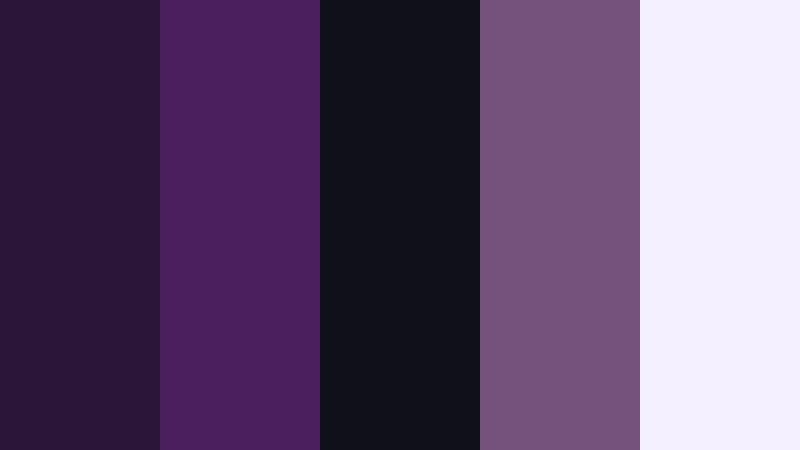
- HEX Codes: #2b1538, #4b1f5e, #0f1018, #73527c, #f5f0ff
- Mood: Dark, cinematic, and introspective with a hint of studio glamour.
- Use for: Perfect for dramatic film trailers, narrative shorts, and moody podcast cover art.
This palette layers deep plum and inky charcoal with a soft lavender highlight. It feels like a late-night edit bay or a soundstage lit only by practicals, where every highlight is intentional and every shadow carries story weight.
Use Midnight Studio Noir to grade introspective short films, anchor your YouTube thumbnails, or style podcast cover art with strong contrast and focused highlights. The lightest tone (#f5f0ff) is ideal for titles and UI elements, while the darker purples and charcoal form the background of cinematic intros, end cards, and overlay frames.
Pro Tip: Build a Cinematic Film Shadow Purple Look in Filmora
To keep a Midnight Studio Noir vibe consistent, design your text, lower thirds, and overlays around the same Film Shadow Purple tones in Filmora. Use the darkest swatches for backgrounds, then repeat the mid-tone purple for logo accents, buttons, and subtle strokes around titles.
Create a simple brand toolkit inside Filmora by saving custom colors in the color picker. Reuse these for captions, transitions, and b-roll overlays so your entire edit, from opening logo reveal to end screen, carries the same moody studio identity.
AI Color Palette
You can capture this exact palette from a reference card or thumbnail and apply it across your video using Filmora's AI Color Palette tool. Import a frame or design that already uses Midnight Studio Noir, then let the algorithm read the Film Shadow Purple tones and map them onto your footage.
Filmora's AI Color Palette feature helps you match b-roll, A-roll, and cutaway shots so they all share the same shadow depth and highlight softness. It is a fast way to turn mixed camera sources into a unified cinematic sequence.
 secure download

HSL, Color Wheels & Curves
Once your base look is in place, refine your Film Shadow Purple tones with HSL, color wheels, and curves in Filmora. Nudge the purple hue slightly toward magenta for a more stylized studio look, deepen luma in the shadows for extra drama, and keep highlights cool to preserve that airy lavender accent.
You can follow Filmora tutorials that break down cinematic color grading and show how to balance shadows, midtones, and highlights while protecting skin tones. Use curves to shape contrast so dark purples stay rich without crushing detail, and HSL to selectively boost purples while keeping other colors neutral.
secure download1000+ Video Filters & 3D LUTs
If you want a quicker workflow, you can stack Film Shadow Purple tones with Filmora presets. Start with a neutral grade using this palette, then add a subtle LUT or filter from the Filmora library to push your look toward noir, neon, or soft drama without rebuilding everything from scratch.
Filmora's video filters and 3D LUTs make it easy to test multiple moods on the same palette. Save your favorites as presets so future intros, trailers, and thumbnails keep the same Midnight Studio Noir identity.
secure downloadShadow Reel Atmosphere

- HEX Codes: #1f1029, #3d2650, #6a4a7e, #0b101b, #e2ddf5
- Mood: Hazy and atmospheric, like a dim projection room before the film begins.
- Use for: Great for title cards, lower thirds, and overlays in essay films or ambient vlogs.
Shadow Reel Atmosphere feels like walking into a quiet cinema where the projector has not started yet. Smoky purples blend into almost-black shadows, with a soft violet highlight that keeps the look from becoming too heavy.
Apply this palette to opener title cards, subtle lower thirds, and transparent overlay blocks in video essays and slow, reflective vlogs. The darkest tones anchor backgrounds and frames, while #e2ddf5 is perfect for readable captions and icons over deep Film Shadow Purple footage.
Backlot Twilight Grade

- HEX Codes: #281537, #5a2d69, #9063a9, #121523, #ffcbe8
- Mood: Cinematic twilight with a subtle neon flair, balancing mystery and allure.
- Use for: Use in color grading packs, movie reaction channels, and stylish trailer templates.
Backlot Twilight Grade captures that blue-hour feeling on a studio lot: rich violet shadows, a softly glowing sky, and a hint of pink neon in the distance. It strikes a balance between moody and glamorous, ideal when you want drama without going full noir.
Use the deeper purples and near-black (#121523) for background plates, then let #9063a9 and #ffcbe8 highlight call-to-action text, subtitles, and UI elements in trailer templates or reaction channel graphics. This palette works especially well with anamorphic flares, lens blur overlays, and slow-motion b-roll.
Projection Room Grit

- HEX Codes: #201024, #4a2753, #7a467e, #111820, #f0e4ff
- Mood: Gritty yet polished, like indie cinema with festival-ready finesse.
- Use for: Ideal for indie film posters, credit sequences, and documentary thumbnails.
Projection Room Grit mixes dusty purples with dark neutrals to create an art-house feel. It is cinematic but slightly rough around the edges, like a 16mm film scanned and projected in a small festival theater.
Use the neutral dark #111820 to keep backgrounds grounded, then layer #4a2753 and #7a467e into typography, line accents, and frames. The soft highlight #f0e4ff prevents your indie posters, end credits, and documentary thumbnails from getting muddy while keeping the overall tone serious and thoughtful.
Soft & Romantic Film Shadow Purple Color Palettes
Lavender Cinema Dream

- HEX Codes: #3a2152, #7f5ca6, #c9a6ff, #f6e8ff, #fcd7e8
- Mood: Romantic, dreamy, and gently nostalgic like soft-focus film stills.
- Use for: Perfect for wedding highlight reels, engagement reels, and romantic storytelling posts.
Lavender Cinema Dream wraps Film Shadow Purple in airy pastels, creating a soft-focus, romantic glow. The base violet grounds your visuals, while lilac and blush tones skim across highlights like light leaks on vintage film.
Use this palette for wedding films, engagement reels, and love-story edits. The deeper purples can anchor titles and borders, while #c9a6ff, #f6e8ff, and #fcd7e8 work beautifully for lower thirds, script fonts, and overlay frames on thumbnails and Reels covers.
Blush Curtain Glow

- HEX Codes: #402043, #8a4f7a, #f39db5, #ffd9e8, #f8f3ff
- Mood: Softly glowing and intimate, perfect for behind the scenes and lifestyle stories.
- Use for: Use for studio portraits, cozy lifestyle vlogs, and beauty channel branding.
Blush Curtain Glow feels like a backstage dressing room lit by warm bulbs behind soft curtains. Deep plum contrasts with flushed pinks and gentle off-whites, giving footage a flattering, skin-friendly glow.
Use the darker tones for background blocks on story highlights, channel banners, and thumbnail borders. Then let #f39db5, #ffd9e8, and #f8f3ff carry your main typography, icons, and buttons. This palette is especially effective for beauty channels, lifestyle vlogs, and Instagram stories with handwritten or brush fonts.
Violet Diary Memoir

- HEX Codes: #381f3e, #734673, #b981b0, #f3d4ff, #fff6fb
- Mood: Tender and reflective, like handwritten notes under evening light.
- Use for: Great for journaling channels, study vlogs, and calm storytelling sequences.
Violet Diary Memoir combines gentle violets with creamy highlights to evoke notebook pages, highlighters, and late-night journaling. It is calm and introspective, with just enough contrast to stay readable and clean.
Apply the deeper purples to text overlays, chapter titles, and sidebar graphics, while #f3d4ff and #fff6fb form backgrounds for quote cards, study tips, or reflection prompts. This palette works particularly well on commentary channels, study-with-me videos, and any voiceover-led content that aims for calm focus.
Candlelit Premiere Rose
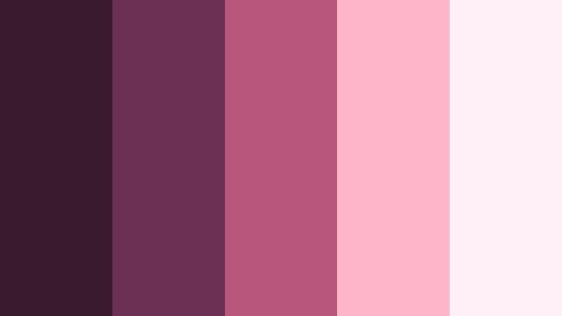
- HEX Codes: #3a1b2d, #6c3055, #b8567c, #ffb5c9, #fff0f7
- Mood: Warm, intimate, and slightly vintage with a cinematic rose tint.
- Use for: Perfect for event recaps, dinner vlogs, and lifestyle intros with a cozy feel.
Candlelit Premiere Rose infuses Film Shadow Purple with warm rose and blush tones, creating a cozy, slightly vintage atmosphere. It feels like a premiere afterparty or candlelit dinner captured on soft film.
Use the darkest shades for lower thirds and title backgrounds, then highlight moments and call-to-actions with #b8567c and #ffb5c9. The lightest #fff0f7 works well behind text in Instagram Reels covers, event recap thumbnails, and lifestyle vlog intro slates.
Bold & Vibrant Film Shadow Purple Color Palettes
Neon Trailer Pulse

- HEX Codes: #2b1234, #7d2f8c, #ff3fad, #00f0ff, #101119
- Mood: High-energy, electric, and futuristic like a late-night city trailer.
- Use for: Ideal for gaming intros, tech promos, and fast-cut montage edits.
Neon Trailer Pulse throws hot magenta and bright cyan against deep Film Shadow Purple, creating an electric, futuristic look. It feels like neon signs flickering in a rainy cyberpunk alley.
Use #2b1234 and #101119 as your base for backgrounds and gradient overlays, then let #ff3fad and #00f0ff drive accents, glitch effects, and bold text. This palette is perfect for gaming intros, tech promo bumpers, and kinetic typography in trailers and montage edits.
Festival Spotlight Surge

- HEX Codes: #34104a, #a132b3, #ff6fd3, #ffd34f, #050814
- Mood: Loud and celebratory, capturing festival lights and stage energy.
- Use for: Use for concert recap videos, festival promos, and bold social ads.
Festival Spotlight Surge captures the clash of stage lights, lasers, and screens over a dark crowd. Rich purple and black create a night-sky base, while vivid pink and gold mimic moving spotlights.
Use #050814 and #34104a as backgrounds for highly saturated footage, then layer #a132b3, #ff6fd3, and #ffd34f into titles, animated shapes, and callouts. This palette is strong enough to punch through fast-moving concert b-roll, recap teasers, and social ads for events or music releases.
Arcade Lens Flare

- HEX Codes: #260f3b, #5e2da1, #f347ff, #34ffb9, #11121f
- Mood: Retro-futuristic and playful, like lights bouncing off an arcade cabinet.
- Use for: Great for retro gaming edits, motion graphics, and bold channel rebrands.
Arcade Lens Flare combines saturated purples with electric magenta and mint, evoking CRT glow and arcade reflections. It is retro and futuristic at the same time, ideal when you want playful intensity.
Use #260f3b and #11121f as your dark canvas, then pop UI elements, score counters, and glitch transitions with #f347ff and #34ffb9. This palette is perfect for gaming montages, motion graphics packs, and bold YouTube channel branding that leans into nostalgia.
Marquee Night Hype

- HEX Codes: #320e2c, #7e255f, #ff3374, #ffb347, #0a0712
- Mood: Energetic and glamorous like a city marquee at night.
- Use for: Perfect for show promos, creator announcements, and YouTube thumbnails that need pop.
Marquee Night Hype feels like bold pink and gold letters flashing over a dark cinema street. Deep Film Shadow Purple anchors the look, while hot pink and amber provide instant showtime energy.
Use #320e2c and #0a0712 for backgrounds and gradient vignettes, then highlight titles, episode numbers, and buttons with #ff3374 and #ffb347. This palette is ideal for channel announcements, premiere countdowns, and thumbnails that need to stand out in a crowded feed.
Elegant & Modern Film Shadow Purple Color Palettes
Editorial Luxe Frame

- HEX Codes: #231325, #4c3258, #7d5f8f, #c7b7da, #f8f4ff
- Mood: Sophisticated and editorial with a quiet luxury feel.
- Use for: Ideal for brand films, portfolio reels, and premium product promos.
Editorial Luxe Frame uses muted purples and soft neutrals to create a refined, magazine-style look. It is understated but rich, perfect when you want a premium aesthetic without loud colors.
Use the darker tones as letterboxed bars, lower thirds backgrounds, and keyline frames around product shots. #c7b7da and #f8f4ff make excellent backgrounds for case-study slides, portfolio titles, and minimalist social posts that need a high-end yet approachable look.
Studio Title Minimal

- HEX Codes: #18131f, #3e314d, #725f8a, #d4cfde, #ffffff
- Mood: Minimal, modern, and calm with strong typography focus.
- Use for: Great for minimalist openers, lower thirds, and UI elements in video templates.
Studio Title Minimal focuses on clean contrast: deep Film Shadow Purple, balanced mid-tones, and crisp white. The palette keeps attention on typography and layout rather than complex color.
Use #18131f and #3e314d for backgrounds and containers, with #725f8a for accent lines or icons. #d4cfde softens secondary text and labels, while pure white is reserved for main titles and key information in openers, lower thirds, and YouTube end screens.
Premiere Suite Mono

- HEX Codes: #120f16, #33263e, #5e4a6c, #a99fba, #ebe7f5
- Mood: Quiet, polished, and professional like a premium edit suite.
- Use for: Use for corporate explainers, software demos, and calm productivity content.
Premiere Suite Mono keeps Film Shadow Purple restrained and monochrome, with gentle steps from deep shadow to soft highlight. It feels like a professional edit suite interface, calm and distraction-free.
Use the darker hues as backgrounds for screencasts and explainers, while #a99fba and #ebe7f5 provide clean panels for text, charts, and UI callouts. This palette is excellent for productivity channels, SaaS demos, and any content where clarity and focus matter more than bright color.
Tips for Creating Film Shadow Purple Color Palettes
When building your own Film Shadow Purple color combinations for video and design, focus on balance: deep, cinematic shadows; mid-tones that match your footage; and highlights that keep text readable and details visible.
- Pair Film Shadow Purple with a clear light accent (off-white, soft lavender, or blush) so titles, captions, and UI elements stay legible on thumbnails and mobile screens.
- Use the darkest purple or near-black tone for backgrounds and letterbox bars, then limit bright neons or warm accents to small areas so the frame does not feel noisy.
- Keep brand consistency by saving a limited set of HEX codes in Filmora and reusing them across intros, lower thirds, end cards, and social cutdowns.
- Check contrast on both desktop and phone; if white text on Film Shadow Purple feels too stark, try a softer highlight tone like pale lavender or cool gray.
- Match your palette to your footage by sampling colors from key frames, then adjusting saturation and brightness so overlays and graphics feel integrated, not pasted on top.
- For cinematic looks, keep saturation moderate in the mid-tones and let contrast and lighting do more of the storytelling work.
- When using bold neons with Film Shadow Purple, always include at least one neutral or soft tone to give the eye a place to rest.
- Create different variants of your palette (dark, mid, and light) so you can adapt it to night scenes, daylight shots, and animated graphics without breaking your visual identity.
Film Shadow Purple can shape how your audience feels about your content, from intimate diaries and wedding films to bold trailers and neon gaming montages. With the right palette, your channel gains a recognizable mood and brand identity that carries across thumbnails, titles, intros, and overlays.
Try these 15 palettes as starting points inside Filmora. Save your favorite combinations as presets, build theme-based templates, and experiment with small tweaks in saturation and contrast until your visuals match the stories you are telling.
Once you find a Film Shadow Purple look that fits, use it consistently in Filmora projects, social snippets, and channel art so your viewers recognize your style at a glance.
secure download