
 100% Security Verified | No Subscription Required | No Malware


 ChatGPT
 Perplexity
 Gemini
 Claude
 Grok
Grok
Harbor Blue sits between deep teal and muted navy, carrying the calm of the ocean with a modern, confident edge. It feels stable, trustworthy, and quietly sophisticated, which makes it a favorite for brands that want to appear grounded yet creative. In color psychology, Harbor Blue suggests clarity, reliability, and focus without the coldness of pure navy or the playfulness of bright turquoise.
On screen, Harbor Blue works beautifully in YouTube thumbnails, cinematic intros, lower thirds, and channel branding. It pairs well with both warm and cool accents, so you can shape it toward dreamy vlogs, minimalist tech content, or bold cinematic edits. Below you will find Harbor Blue color palettes with HEX codes tailored for creators and Filmora users, so you can match your footage, overlays, and graphics with ease.
In this article
Calm & Coastal Harbor Blue Color Palettes
Harbor Morning Mist
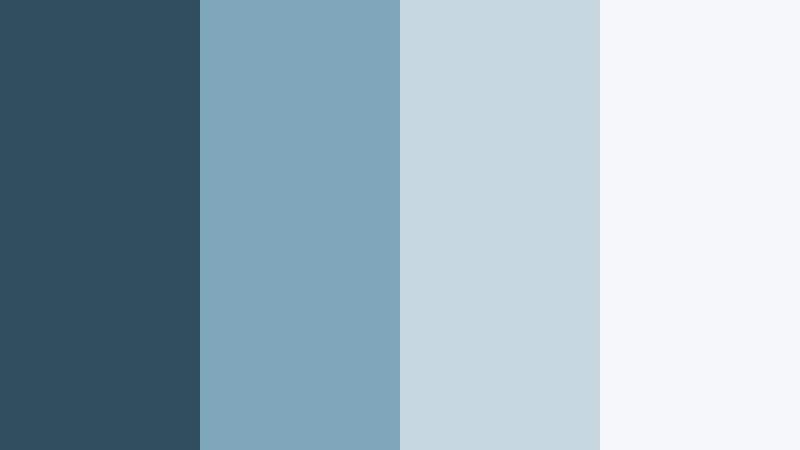
- HEX Codes: #2f4f60, #7fa6b8, #c7d7e0, #f5f7f9
- Mood: Quiet, airy, and reflective like an early walk along a foggy pier.
- Use for: Ideal for minimalist vlog intros, travel diaries, and understated brand openers that need a soft nautical vibe.
Harbor Morning Mist wraps Harbor Blue in pale, misty neutrals that feel like sunrise over still water. The darkest shade (#2f4f60) grounds the palette, while the softer blues and off white tones keep everything light, breathable, and easy on the eyes.
Use the deeper Harbor Blue for titles, logo marks, and key UI elements, then let the lighter tones sit behind your footage as background blocks or subtle overlays. It is perfect for vlog thumbnails, calm talking head setups, and YouTube intros where you want a coastal story without loud colors fighting your footage.
Pro Tip: Keep Your Harbor Blue Aesthetic Consistent in Filmora
When you find a Harbor Blue palette you love, the key is consistency from intro to end screen. In Filmora, you can save your custom colors in the title editor and reuse them for text, shapes, and overlays across your whole timeline. This keeps Harbor Morning Mist feeling intentional on thumbnails, lower thirds, chapter cards, and outros.
Build a simple graphic system: use #2f4f60 for headlines, #7fa6b8 for accent lines and icons, and #c7d7e0 or #f5f7f9 as safe backgrounds behind faces. As you edit shorts, full videos, and repurposed clips, this gives your channel a recognizable harbor inspired identity.
AI Color Palette
You can also turn Harbor Morning Mist into a look that covers your entire video. Filmora's AI Color Palette feature lets you grab the color feel from a reference image, thumbnail mockup, or brand card and apply it to other clips automatically.
Import a still frame or design that uses these Harbor Blue HEX codes, then use AI Color Palette to match your b roll, A roll, and cutaways. The tool aligns tones and contrast so everything feels like it lives in the same quiet, coastal world, even if you shot on different days or cameras.
 secure download

HSL, Color Wheels & Curves
To refine Harbor Blue tones, Filmora gives you HSL, color wheels, and curves so you can nudge the palette toward cooler, mistier, or more cinematic looks. Use the HSL panel to slightly desaturate blues for a softer, lifestyle feel, or push teals for a more coastal teal and blue color palette. Then, with color wheels, lift midtones for brighter vlogs or deepen shadows to add subtle drama without losing calmness.
The curves tool lets you add a gentle S curve for contrast while keeping highlights soft and foggy, ideal for early morning harbor vibes. You can explore more grading approaches like this in Filmora's YouTube tutorials, then save your grade as a preset to reuse across episodes for a consistent Harbor Blue aesthetic.
secure download1000+ Video Filters & 3D LUTs
If you want to stylize Harbor Morning Mist quickly, Filmora's video filters and 3D LUTs make it easy to test different cinematic looks on top of your blue base. You can stack soft film emulations, vignette effects, or pastel LUTs over your footage while still keeping Harbor Blue as the anchor color for graphics and text.
Apply a LUT for a cinematic vlog look, then dial back the intensity so your Harbor Blue overlays and titles stay readable and on brand. Once you like the combination, save it as a custom preset and reuse it across your vlogs, reels, and shorts to keep your harbor themed aesthetic consistent with almost no extra work.
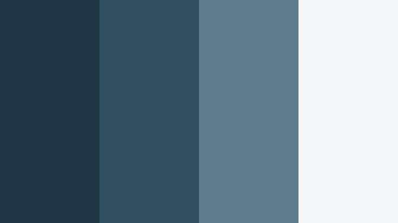
secure downloadTidepool Reflections

- HEX Codes: #264552, #3f6b7b, #78a3a8, #d3ebe9
- Mood: Contemplative and fluid, evoking shallow tidepools at golden hour.
- Use for: Works well for cinematic b roll sequences, reflective voiceovers, and moody channel branding.
Tidepool Reflections layers deeper Harbor Blue with teal influenced midtones and a pale aquatic highlight. It feels thoughtful and cinematic, like light dancing across water in slow motion. The gradient from #264552 to #d3ebe9 gives you a built in depth range for backgrounds and overlays.
Use darker shades behind white text for emotional titles or essay videos, and fade lighter tones into your lower thirds or end screens. This palette is strong for cinematic b roll, channel trailers with reflective narration, and Instagram covers where you want moody blues without going fully dark.
Seaglass Shoreline

- HEX Codes: #295062, #4c7c8c, #9bc5c4, #f0faf7
- Mood: Fresh, breezy, and slightly nostalgic, like collecting seaglass on a quiet beach.
- Use for: Great for lifestyle vlogs, wellness channels, and soft product showcases that need a clean coastal identity.
Seaglass Shoreline mixes Harbor Blue with seafoam and soft off white to create a light, breathable palette. The transition from #295062 through #9bc5c4 captures that washed glass feeling, balancing freshness with a hint of nostalgia.
Lean on the darker blue for logos and accent icons, the mid seafoam for buttons and callouts, and the pale #f0faf7 as a gentle background behind your footage. It works especially well for lifestyle thumbnails, wellness intros, and product flatlays where you want a coastal blue color palette that still feels modern and clean.
Harbor Dusk Horizon

- HEX Codes: #1f3745, #2f4f60, #7a98a6, #c0ccd1
- Mood: Moody yet calm, capturing the quiet transition from day to night over the water.
- Use for: Perfect for travel montages, narrative shorts, and end screen graphics with a cinematic, end of day tone.
Harbor Dusk Horizon deepens Harbor Blue into shadowy tones and pairs them with soft grey blue highlights. It has a twilight feel, ideal for content that moves from bright day sequences into more reflective or emotional moments.
Use #1f3745 and #2f4f60 for letterbox bars, overlays, and title cards, then let #7a98a6 and #c0ccd1 handle UI elements, progress bars, and end screen layouts. This palette supports cinematic travel edits, narrative vlogs, and outro screens where you want a calm but slightly dramatic goodbye.
Nautical Linen Calm

- HEX Codes: #314e5c, #4c6c7a, #d8d0c3, #f7f3ea
- Mood: Relaxed and polished, like a modern coastal home with linen and weathered wood.
- Use for: Use for talking head videos, home decor content, and brand explainers that need a soft yet confident base.
Nautical Linen Calm blends grounded Harbor Blue tones with warm linen neutrals. The combination of #314e5c and #4c6c7a with #d8d0c3 and #f7f3ea feels like fabric, driftwood, and sea air all in one palette.
It is great for home decor or DIY intros, interior walkthroughs, and personal branding where you want both coastal freshness and professional warmth. Try Harbor Blue for text and icon outlines, and let the linen shades carry backgrounds, frames, and lower thirds so your video content stays easy to read and inviting.
Modern & Minimal Harbor Blue Color Palettes
Harbor Blueprint Grid
- HEX Codes: #203643, #2f4f60, #5f7b8b, #f5f6f7
- Mood: Smart, structured, and technical, with a subtle engineering edge.
- Use for: Ideal for tutorials, app walkthroughs, and SaaS product videos needing a clean tech forward identity.
Harbor Blueprint Grid takes Harbor Blue into a structured, technical territory. The darker #203643 and #2f4f60 feel like blueprints and dashboards, while #5f7b8b and #f5f6f7 keep everything legible and modern.
Use deep blues for navigation bars, code snippets, and key callouts, and pair them with the near white background for slides, screen recordings, and overlays. This palette is strong for SaaS explainers, UI demo videos, and channel branding around productivity, coding, or design tools.
Minimal Harbor Monochrome

- HEX Codes: #1c2f38, #2f4f60, #688493, #dfe6ea
- Mood: Cool, focused, and professional with a restrained, monochrome feel.
- Use for: Great for corporate explainers, LinkedIn content, and personal branding where clarity and trust are key.
Minimal Harbor Monochrome stays within a cool blue grey family, creating a focused, distraction free look. The hierarchy from #1c2f38 up to #dfe6ea gives you clear roles for text, backgrounds, and supporting graphics.
Use the darkest blue for strong headings and logo marks, Harbor Blue for accents, and the lighter tones for content blocks and lower thirds. This is ideal for LinkedIn video posts, online courses, and pitch decks turned into videos where you want a serious but not stiff brand presence.
Soft UI Harbor Glow

- HEX Codes: #2f4f60, #4e7b90, #b4d4e0, #f8fbff
- Mood: Light, friendly, and modern, like a clean app interface with soft gradients.
- Use for: Use for UI overlays, lower thirds, and titles in tech, productivity, or finance videos.
Soft UI Harbor Glow pairs Harbor Blue with airy sky tints that feel like modern app interfaces. The palette is perfect for clean explainer graphics, notification style popups, and gradient title cards.
Let #2f4f60 handle key text and icons, use #4e7b90 as a secondary accent, and keep #b4d4e0 and #f8fbff for panels, cards, and subtle glows behind UI screenshots. This works brilliantly in tech channel intros, dashboard walkthroughs, and productivity content where you want clarity plus a gentle, digital glow.
Steel Harbor Framework

- HEX Codes: #22313a, #2f4f60, #8a9ba5, #f2f4f5
- Mood: Reliable and grounded with an industrial but not harsh presence.
- Use for: Works well for gear reviews, how to videos, and channels that focus on tools, tech, or filmmaking.
Steel Harbor Framework introduces an industrial edge to Harbor Blue by pairing it with charcoal and steel grey. The result feels robust and trustworthy, without tipping into aggressive or overly dark territory.
Reserve #22313a and #2f4f60 for title bars, specs boxes, and comparison tables. #8a9ba5 and #f2f4f5 keep your backgrounds and overlays clean for gear b roll and tutorial overlays. It suits camera and tech reviews, filmmaking tips, and any channel where tools and hardware take center stage.
Harbor Office Clarity

- HEX Codes: #275066, #4e88a3, #c6dde9, #ffffff
- Mood: Clear, organized, and optimistic with a modern business feel.
- Use for: Ideal for slide style videos, course content, and clean channel branding for entrepreneurs and educators.
Harbor Office Clarity gives Harbor Blue a business upgrade, with crisp whites and optimistic light blues. It feels like a modern presentation template translated into video.
Use the darker tones for headings, data points, and brand marks, while #c6dde9 and white support diagrams, bullet lists, and chapter cards. This palette is excellent for course intros, webinar replays, and entrepreneur content where you want to look organized, transparent, and trustworthy.
Bold & Cinematic Harbor Blue Color Palettes
Neon Harbor Nights
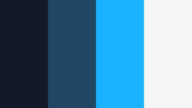
- HEX Codes: #111827, #214663, #19b3ff, #f5f5f5
- Mood: Energetic and urban, like neon reflections on a dark harbor at midnight.
- Use for: Perfect for gaming intros, music videos, and high energy channel trailers.
Neon Harbor Nights throws electric cyan (#19b3ff) against inky Harbor Blues for a bold, urban contrast. It suggests city lights bouncing off dark water, making it ideal for dynamic and energetic edits.
Let #111827 and #214663 form your background, frames, and motion graphic shapes, while #19b3ff hits key words, progress bars, and glitch accents. #f5f5f5 keeps small text legible. This palette shines in gaming overlays, music visualizers, and hype trailers where you want Harbor Blue to feel fast and neon charged.
Storm Harbor Drama
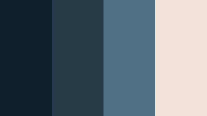
- HEX Codes: #0f1f28, #253c4a, #4f7080, #f0e3d8
- Mood: Intense and cinematic, like a storm rolling over open water.
- Use for: Great for trailers, short films, and dramatic storytelling with rich contrast and tension.
Storm Harbor Drama pushes Harbor Blue into stormy territory, using deep shadows and a warm off white highlight (#f0e3d8) for contrast. It is made for narratives with tension, reflection, or mystery.
Use the darkest tones for letterbox bars, transitions, and title backgrounds. Let #4f7080 and #f0e3d8 pull key text and symbols forward. This palette is strong for short film posters, cinematic intro sequences, and dramatic voiceover thumbnails.
Copper Harbor Contrast

- HEX Codes: #233745, #2f4f60, #d07a42, #f6efe9
- Mood: Warm against cool, combining industrial copper with deep harbor tones.
- Use for: Use for product promos, luxury gadgets, or branding where you want bold contrast that still feels premium.
Copper Harbor Contrast sets deep Harbor Blues against a rich copper accent (#d07a42). The result feels premium and cinematic, as if metal surfaces are catching warm studio light over a cool background.
Apply Harbor Blue as your base for frames and typography, then use copper sparingly on key CTAs, price tags, or product highlights. #f6efe9 helps soften the look on backgrounds and info panels. It is an excellent choice for luxury product videos, gadget reveals, or brand intros where you want a strong but refined statement.
Harbor Cyber Wave
- HEX Codes: #05151f, #274c61, #00f0ff, #f9fafb
- Mood: Futuristic and high energy, with a cyberpunk inspired twist on oceanic tones.
- Use for: Ideal for tech channels, motion graphics, and glitch transitions with a digital edge.
Harbor Cyber Wave blends digital black blue (#05151f) with Harbor Blue and a glowing aqua accent (#00f0ff). It feels like a futuristic harbor city, making it perfect for tech and motion graphics heavy content.
Use the darkest tone as your canvas for HUDs, glitch overlays, and waveform graphics. Harbor Blue (#274c61) supports secondary elements, while aqua highlights bring attention to icons, buttons, and animated text. #f9fafb keeps text and small labels readable. This palette works well in channel branding for tech reviews, coding, and digital art.
Soft & Dreamy Harbor Blue Color Palettes
Pastel Harbor Daydream

- HEX Codes: #3a6479, #7fb2c4, #d4e8f0, #ffeef5
- Mood: Soft, dreamy, and slightly whimsical with a pastel seaside charm.
- Use for: Great for lifestyle vlogs, stationery brands, and channel art that leans cute and airy.
Pastel Harbor Daydream softens Harbor Blue into a dreamy seaside palette. The combination of #3a6479 and #7fb2c4 keeps things grounded, while #d4e8f0 and #ffeef5 add cotton candy lightness without becoming overly loud.
Use the deeper Harbor Blue for outlines and main text, while the pastel tones handle backgrounds, frames, and doodle style graphics. This palette is ideal for lifestyle and stationery channels, cozy vlogs, and cute intro animations where you want an aesthetic color palette for vlogs that still feels calm enough for everyday content.
Tips for Creating Harbor Blue Color Palettes
When building your own Harbor Blue color combinations for video and design, focus on balance, readability, and how the palette supports your story and brand. These tips will help you turn HEX codes into cohesive visuals across thumbnails, intros, and full edits.
- Pick a primary Harbor Blue: Choose one core shade (for example around #2f4f60) as your main brand color for titles, logo, and key accents.
- Add light neutrals for breathing room: Pair Harbor Blue with soft whites, light greys, or warm linen tones so text and UI elements stay clean and easy to read.
- Use contrast to guide attention: Combine deep Harbor Blues with a single bright accent (like aqua or copper) to highlight CTAs, important numbers, or episode titles.
- Test text on small screens: Always check your palette in thumbnail size and on mobile. Dark Harbor Blue on very light backgrounds tends to be more legible than the reverse.
- Match your footage temperature: If your footage is warm and golden, lean toward Harbor palettes with beige or copper. For cool footage, pick palettes with teal, steel, or pastel blues.
- Limit your accent colors: Stick to one or two accent shades alongside Harbor Blue to avoid a messy look, especially in lower thirds and animated titles.
- Create a simple role system: Decide which color is for headings, which is for body text, which is for buttons, and which is for backgrounds, then stay consistent across all videos.
- Save presets in Filmora: Once you lock in your Harbor Blue combo, save title and color grading presets in Filmora so every new project starts with your branded look.
Harbor Blue is flexible enough to feel coastal, corporate, futuristic, or dreamy depending on what you pair it with. By choosing a palette that fits your tone and sticking to clear roles for each color, you can shape everything from first impression thumbnails to long form edits and end screens.
Try these 15 Harbor Blue palettes as starting points in Filmora. Drop the HEX codes into your titles and shapes, then refine your footage with AI Color Palette, HSL, and LUTs until your entire channel feels like one coherent visual world.
As you experiment, pay attention to how your audience responds to different moods, from calm and coastal to bold and cinematic. Over time, your Harbor Blue aesthetic can become a recognizable signature that sets your content apart.
secure download