
 100% Security Verified | No Subscription Required | No Malware


 ChatGPT
 Perplexity
 Gemini
 Claude
 Grok
Grok
Khaki beige sits in a sweet spot between warm neutrals and earthy browns. It feels calm, grounded, and approachable, which makes it a favorite for lifestyle branding, minimalist feeds, and cinematic edits. In color psychology, khaki beige often suggests stability, warmth, and quiet confidence, so it works beautifully for channels that want to feel trustworthy and human rather than loud or flashy.
For video creators, this tone is perfect for thumbnails, intros, lower thirds, backgrounds, and even UI overlays on screen. A cohesive khaki beige color palette can tie together vlog footage, B-roll, and social cutdowns so your brand looks consistent everywhere. Below you will find 15 khaki beige color palettes with HEX codes, ready for Filmora users and other creators to drop straight into titles, graphics, and color grading.
In this article
Soft & Cozy Khaki Beige Palettes
Morning Latte Glow

- HEX Codes: #f5efe3, #e3d1b5, #c2a98b, #9b7b63, #5e4a3b
- Mood: Calm, inviting, and gently energizing like a slow morning start.
- Use for: Perfect for lifestyle vlogs, morning routines, and cozy podcast thumbnails.
Morning Latte Glow feels like soft sunlight sliding across a kitchen table. The light creams and latte tones give you a friendly, relaxed look that is easy on the eyes while the deeper browns add a hint of structure and warmth.
Use this palette for morning routine videos, channel intros, and thumbnail backgrounds where you want audiences to feel safe, welcome, and ready to listen. In Filmora, you can apply these HEX codes to title cards, lower thirds, and background shapes so your entire edit feels like one calm, khaki beige story.
Pro Tip: Build a Cozy Khaki Beige Aesthetic in Filmora
To keep a soft khaki beige mood across a whole video, start by designing one hero frame in Filmora: a title card, an intro scene, or a YouTube thumbnail mockup using the Morning Latte Glow HEX codes. Then reuse those exact colors for chapter titles, subscribe reminders, and end screens so every touchpoint carries the same warm latte energy.
Filmora lets you save custom color presets for text, shapes, and overlays. Once you dial in your perfect beige for one element, you can quickly apply it to B-roll labels, callouts, and social cutdowns, keeping your visual identity consistent from long-form videos to Reels and Shorts.
AI Color Palette
If you already have a photo that captures your ideal khaki beige look (like a latte flatlay or a soft bedroom shot), you can turn it into a video-wide grade. Filmora's AI Color Palette feature analyzes the reference frame and applies its tones to your whole timeline.
Import your reference image or clip, choose it as the style source, and let AI match the warmth, contrast, and beige balance across every scene. This is especially helpful when you shoot on different days or cameras but want one unified, cozy khaki beige finish.
 secure download

HSL, Color Wheels & Curves
Even with a great base palette, you may want to nudge your khaki beige tones a bit warmer, cooler, or more cinematic. With Filmora's HSL controls and color wheels, you can gently desaturate bright oranges, deepen browns, and push shadows toward a soft espresso tone while keeping skin tones natural. A detailed walkthrough in Filmora's color correction guide shows how to combine these tools for polished, on-brand looks.
Use curves to give your footage a subtle S-curve: lift the highlights to keep whites creamy, and lower the darkest points so shadows feel rich, not muddy. This keeps your beige areas from looking flat, especially in thumbnails and title cards where contrast really matters.
secure download1000+ Video Filters & 3D LUTs
Once your base khaki beige palette is set, you can give it extra personality with Filmora's library of filters and LUTs. Filmora's video filters and 3D LUTs make it easy to add subtle film grain, vintage fades, or soft glow that works beautifully with warm beige scenes.
Try stacking a gentle cinematic LUT on top of your latte tones to make vlog B-roll feel like a short film, or use a minimalist filter to keep desk setups and talking-head shots looking clean. Because you can adjust filter strength, it is simple to keep the edit polished without overpowering your neutral palette.
secure downloadBlanket Fort Afternoon
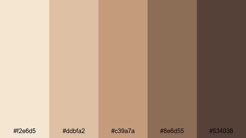
- HEX Codes: #f2e6d5, #ddbfa2, #c39a7a, #8e6d55, #534038
- Mood: Snug, nostalgic, and slightly vintage.
- Use for: Great for study-with-me edits, reading nook tours, and nostalgic home videos.
Blanket Fort Afternoon is all about soft browns and beiges that feel like curling up with a favorite book. The palette leans a bit more sepia, giving footage a subtle vintage touch without going full retro.
Use it for study-with-me videos, slow reading montages, or nostalgic family clips. In thumbnails, pair the lighter beige tones with serif fonts and simple icons to emphasize the cozy, introspective vibe. This palette works well for channels that want to feel homely and intimate.
Muted Storybook Neutrals
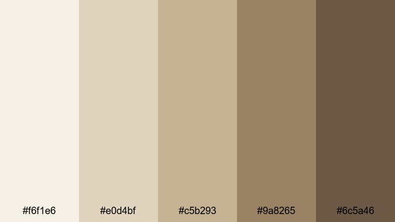
- HEX Codes: #f6f1e6, #e0d4bf, #c5b293, #9a8265, #6c5a46
- Mood: Whimsical yet grounded, like a favorite worn novel.
- Use for: Ideal for narration-heavy shorts, aesthetic journaling videos, and calm educational content.
Muted Storybook Neutrals blends parchment whites with warm khaki beige, echoing old pages and worn book covers. It creates a subtle, literary backdrop that lets your voice and story stay in focus.
Use it for voiceover-heavy content, journaling sequences, or explainer videos where on-screen notes and diagrams should look pleasant but not distracting. In Filmora, you can color your text boxes and hand-drawn doodles with these HEX codes to create a consistent storybook-style identity.
Candlelit Workspace

- HEX Codes: #f3e8da, #e0c7aa, #bf9b79, #8b6a4e, #3e3027
- Mood: Focused, intimate, and warmly productive.
- Use for: Use in productivity vlogs, desk setups, and creator workspace reveals.
Candlelit Workspace brings together candle glow, warm wood, and grounded khaki beige. The darker brown and near-black give you plenty of contrast for text and UI, while the mid-tones keep everything feeling soft and focused.
Apply this palette to productivity vlogs, desk tours, and behind-the-scenes creator content. Use the darkest shade for titles and icons, the mid beige for background panels, and the light cream for timestamps or chapter markers so your workspace videos feel cohesive and intentional.
Rainy Window Light
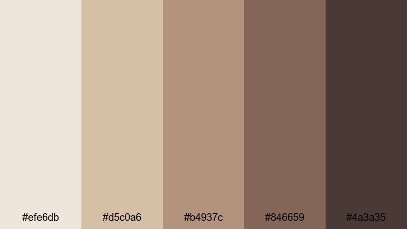
- HEX Codes: #efe6db, #d5c0a6, #b4937c, #846659, #4a3a35
- Mood: Melancholic, reflective, and cinematic.
- Use for: Great for moody vlogs, reflective travel diaries, or slow B-roll sequences.
Rainy Window Light uses soft beige and muted browns to mimic the feel of a gray day indoors. It has a gentle, slightly melancholic tone that works well with piano tracks, ambient sound, and slow motion shots.
Use this palette on travel diaries, emotional storytelling, or reflective commentary videos. In your thumbnails, combine the lighter beige with subtle grain overlays and serif type to create a cinematic mood that still feels grounded and earthy.
Modern Minimal Khaki Beige Palettes
Clean Studio Neutral
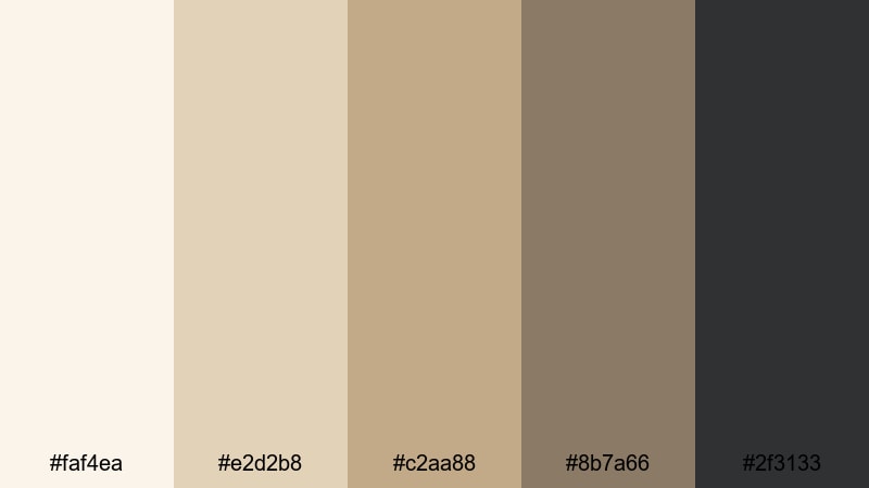
- HEX Codes: #faf4ea, #e2d2b8, #c2aa88, #8b7a66, #2f3133
- Mood: Minimal, fresh, and quietly professional.
- Use for: Perfect for tech reviews, studio tours, and creator branding with a modern edge.
Clean Studio Neutral blends airy off-whites and structured khaki beige with a crisp charcoal accent. The combination feels like a modern studio set: tidy, professional, and polished without being cold.
Use this palette for tech reviews, tutorials, and brand channels that want a neutral but premium feel. In your Filmora titles and overlays, keep backgrounds in the light beige range and use the charcoal shade for text to maintain readability while staying within the minimal color story.
Beige Grid UI
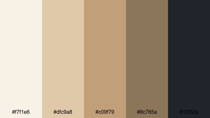
- HEX Codes: #f7f1e6, #dfc9a8, #c09f79, #8c765a, #1f252a
- Mood: Organized, smart, and design-forward.
- Use for: Ideal for app mockups, UI overlays in tutorials, and infographic-style animations.
Beige Grid UI is built for on-screen interfaces. The range of beiges works well for cards, panels, and charts, while the deep slate tone anchors text, buttons, and icons so they stand out.
Use it in software tutorials, app breakdowns, and dashboard explainers. In Filmora, design lower thirds and info panels using the lighter beige as the card, mid beige for dividers, and the darkest shade for typography to create a clean, modern UI look that still feels warm and human.
Sleek Capsule Wardrobe
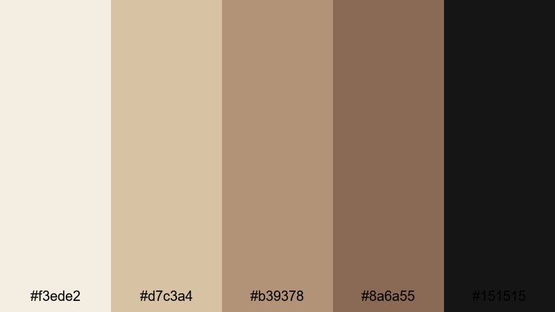
- HEX Codes: #f3ede2, #d7c3a4, #b39378, #8a6a55, #151515
- Mood: Chic, fashion-forward, and editorial.
- Use for: Great for fashion lookbooks, capsule wardrobe reels, and high-end product showcases.
Sleek Capsule Wardrobe pairs warm khaki beige and tan with a sharp black accent. The result is minimal yet high contrast, reminiscent of fashion magazines and curated closets.
Use this palette in clothing hauls, styling tips, and brand collaborations. Let the beige and tan shades dominate your backgrounds and frames, while black is reserved for typography, frames, and logo marks. This balance keeps your content airy but still strong enough to feel editorial.
Minimal Desk Flatlay
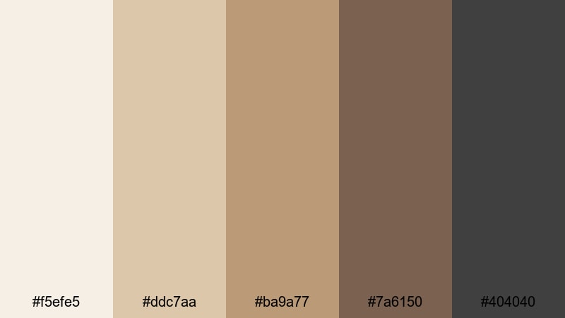
- HEX Codes: #f5efe5, #ddc7aa, #ba9a77, #7a6150, #404040
- Mood: Balanced, tidy, and quietly aesthetic.
- Use for: Perfect for productivity shorts, stationery promos, and social media carousels.
Minimal Desk Flatlay mixes paper whites, leather browns, and graphite gray into a refined neutral set. It is ideal for top-down desk shots, stationery layouts, and planning content.
Use the lighter tones for background canvases and calendar elements, while the darker shades define pens, outlines, and text. This palette keeps your grid and thumbnails cohesive if you post a lot of desk or planner content across platforms.
Earthy Cinematic Khaki Beige Palettes
Desert Dusk Frames

- HEX Codes: #f3e5d3, #d9b894, #b68c64, #805b3c, #2b2724
- Mood: Cinematic, adventurous, and sun-baked.
- Use for: Best for travel films, cinematic B-roll, and establishing shots in outdoor edits.
Desert Dusk Frames captures golden sand, khaki beige, and deep shadow tones inspired by dry landscapes at sunset. It has strong cinematic potential, especially for wide outdoor scenes and slow pans.
Use this palette when grading travel footage or desert-inspired lookbooks. Let the mid beiges and browns dominate your frames, while the darkest tone anchors titles or letterbox bars for a filmic look. It is a powerful option for intros and transitions in longer travel edits.
Olive Field Walk
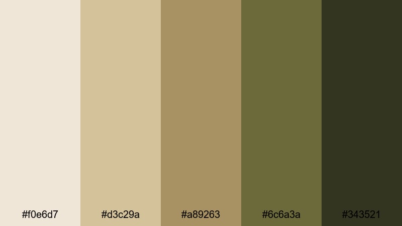
- HEX Codes: #f0e6d7, #d3c29a, #a89263, #6c6a3a, #343521
- Mood: Grounded, organic, and documentary-like.
- Use for: Use for nature vlogs, farm or garden content, and eco-conscious brand visuals.
Olive Field Walk combines khaki beige with muted olive greens and earthy shadows. It feels unpolished in the best way, like real life captured on a slightly faded film stock.
Use it in nature vlogs, gardening content, or sustainable brand stories. In titles, lean on the olive and darkest green for headings and accents, and keep background panels in soft beige so the overall impression stays organic and calm.
Autumn Market Scene

- HEX Codes: #f4e3cf, #d4b48a, #b3845a, #7a4f39, #261c19
- Mood: Lively, textured, and nostalgic.
- Use for: Perfect for street food videos, market tours, and handheld documentary cuts.
Autumn Market Scene brings together khaki beige, caramel, and chestnut tones that feel like a busy street market in late fall. It is warm, textured, and slightly nostalgic, ideal for handheld footage and ambient soundscapes.
Use this palette for street food tours, flea market finds, or everyday city moments. In thumbnails and titles, you can place bold text in the darkest shade over mid-tone beiges to keep everything readable while still echoing the warmth of your footage.
Elegant Warm Khaki Beige Palettes
Hotel Lobby Luxe
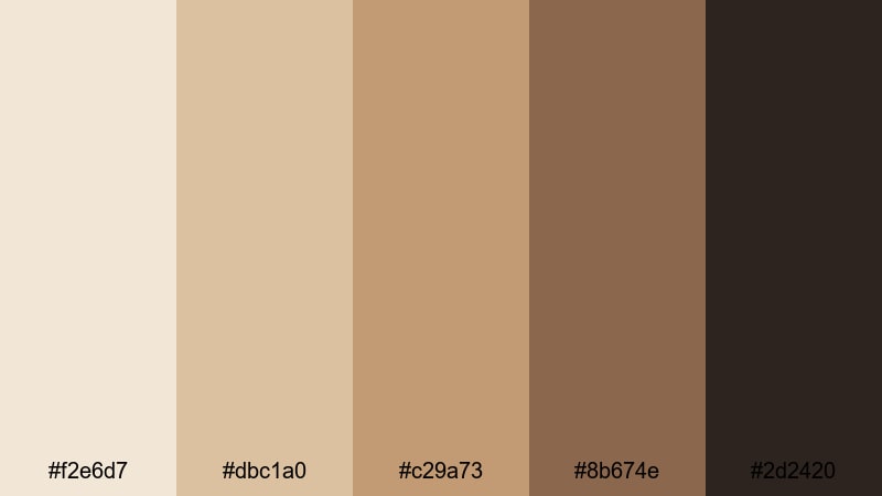
- HEX Codes: #f2e6d7, #dbc1a0, #c29a73, #8b674e, #2d2420
- Mood: Opulent, calm, and refined.
- Use for: Great for hospitality promos, travel reviews, and upscale brand intros.
Hotel Lobby Luxe captures marble floors, leather chairs, and soft khaki beige walls. It feels like quiet luxury, with rich mid-browns and a deep near-black for elegant contrast.
Use this palette in hotel reviews, premium product promos, or personal brand intros that aim for a high-end but approachable atmosphere. Reserve the darkest shade for headlines and logo marks, and keep most of your backgrounds in the softly glowing beige range.
Golden Hour Reception
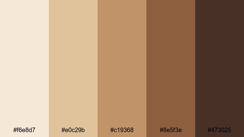
- HEX Codes: #f6e8d7, #e0c29b, #c19368, #8e5f3e, #473025
- Mood: Romantic, celebratory, and softly glamorous.
- Use for: Ideal for wedding highlight films, event recaps, and warm cinematic titles.
Golden Hour Reception mixes sunlit khaki beige with honey gold and rich cocoa shadows. It mirrors the look of late-afternoon light pouring into a reception hall or event space.
Use this palette for wedding highlights, engagement films, or event montages. In your Filmora projects, color your lower thirds and titles with the warm beiges and gold, then frame the whole piece with darker accents in openings and closings for a cinematic, emotionally rich feel.
Classic Trench Edit
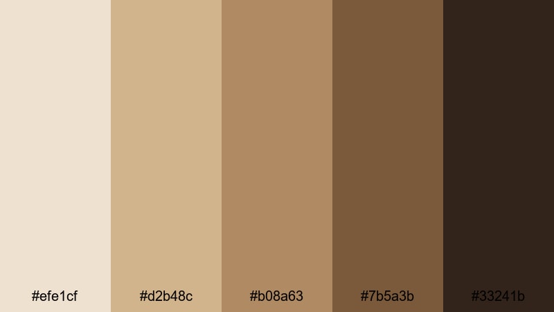
- HEX Codes: #efe1cf, #d2b48c, #b08a63, #7b5a3b, #33241b
- Mood: Timeless, sophisticated, and subtly cinematic.
- Use for: Perfect for brand films, editorials, and thoughtfully paced lookbooks.
Classic Trench Edit centers on iconic trench coat beige, supported by warm browns and deep espresso. It is timeless and sophisticated, the kind of palette that looks right in almost any decade.
Use it for brand films, classic fashion stories, or slow, intentional lookbooks. Build your color hierarchy with trench beige as the hero background, mid browns for frames or borders, and the darkest espresso for body text and logo applications so your visuals always feel composed and enduring.
Tips for Creating Khaki Beige Color Palettes
Khaki beige is incredibly flexible, but it really shines when you balance warmth, contrast, and supporting colors. These tips will help you combine it with other tones for thumbnails, intros, and branding that look polished on every screen.
- Pair khaki beige with deeper browns, charcoal, or espresso for readable text and strong UI elements, especially on mobile thumbnails.
- Use one primary khaki beige shade and limit yourself to 2 or 3 accent colors so your brand stays recognizable across all videos and platforms.
- Add a subtle accent color such as olive, soft gold, or muted pink for call-to-action buttons or key words in titles to guide viewer attention.
- Test your palette on both light and dark backgrounds inside Filmora to ensure subtitles, overlays, and icons stay legible in bright and low-light scenes.
- Keep skin tones natural by adjusting HSL rather than pushing the whole image too far toward beige; let your graphic elements carry most of the color identity.
- Create separate versions of the same palette for thumbnails and in-video graphics, with slightly higher contrast for thumbnails to help them stand out in feeds.
- Save your main khaki beige HEX values as presets in Filmora so you can reuse them for titles, shapes, and filters without guessing or eye-dropping each time.
- When mixing footage from different cameras, apply a base color correction first, then layer your khaki beige LUT or AI Color Palette so the final look stays consistent.
Khaki beige color palettes are ideal for creators who want warmth, calm, and a touch of elegance in their visuals. Whether you are filming morning routines, studio tours, or cinematic travel diaries, the right combination of beiges, browns, and supporting tones can instantly communicate your mood and brand personality.
With Filmora, you can turn these 15 palettes into complete visual systems: from thumbnail design and intro graphics to color grading and LUTs that match across platforms. Start by picking the palette that best fits your channel, then build your titles, lower thirds, and filters around those exact HEX codes.
As you experiment, refine your favorites and save them as reusable presets in Filmora. Over time, your consistent khaki beige aesthetic will make your content instantly recognizable, no matter where your audience discovers you.
secure download