
 100% Security Verified | No Subscription Required | No Malware

Muted colors sit between bright saturation and deep neutrals, creating a soft, cinematic look that feels calm, modern, and refined. Instead of shouting for attention, a muted color palette gently guides the eye and builds a mood: romantic, nostalgic, urban, or atmospheric. This makes muted tones ideal for creators who want visuals that feel aesthetic and professional without being overwhelming.
In video editing, branding, thumbnails, and intros, muted color combinations can instantly make your content look cohesive and intentional. Below you will find 15 curated muted color palettes with HEX codes you can copy into your design tools and bring into Filmora. Use them to grade your footage, design titles and overlays, and keep a consistent visual identity across vlogs, reels, and YouTube videos.
In this article
Soft & Romantic Muted Color Palettes
Blush Quiet Morning
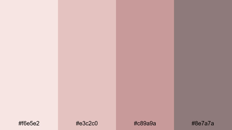
- HEX Codes: #f6e5e2, #e3c2c0, #c89a9a, #8e7a7a
- Mood: Gentle, intimate, and softly nostalgic.
- Use for: Ideal for cozy vlog intros, couple highlight reels, and soft lifestyle thumbnails.
Blush Quiet Morning mixes gentle blush, muted rose, and warm taupe to create a soft, emotional atmosphere. It feels like early light through sheer curtains: calm, tender, and slightly nostalgic without feeling sugary or childish.
Use this palette for couple vlogs, engagement or anniversary edits, and lifestyle thumbnails where you want warmth and connection but prefer low saturation. In Filmora, you can apply these tones to text, lower thirds, and background plates so your intros, b-roll, and end screens all share the same quiet romantic vibe.
Pro Tip: Build Soft Muted Aesthetics With Filmora
To keep this blush-toned palette consistent, start by color grading your main hero shot in Filmora until skin tones and backgrounds feel warm but not oversaturated. Then use that graded clip as your reference and match the rest of your timeline, so every cut in your vlog or reel keeps the same tender, muted mood.
You can also create a simple style system: one blush tone for titles, a slightly deeper rose for callout boxes, and taupe for backgrounds. Save these as custom presets in Filmora so every new intro, reel cover, and community post thumbnail automatically matches your muted brand look.
AI Color Palette
If you have a still frame, moodboard, or Pinterest reference that perfectly captures your romantic blush look, you can turn it into a grading shortcut. Filmora's AI Color Palette feature analyzes your reference colors and applies that same muted style to the rest of your clips.
Import your reference shot, select it as the source, and let AI harmonize other scenes: talking-head segments, b-roll, overlay shots, and even alternate camera angles. This is an easy way to keep blush tones from shifting too pink, too beige, or too contrasty between different lighting setups.
 secure download

HSL, Color Wheels & Curves
To keep blush tones muted instead of neon, adjust them gently with Filmora's HSL controls, color wheels, and curves. Slightly lower saturation in the reds and magentas, lift the midtones, and soften contrast in the curves to keep the entire frame airy and flattering on skin.
You can also use the color wheels to warm the highlights while cooling the shadows for an even more cinematic feeling, similar to advanced grading workflows described in Filmora's color correction guide. Once you are happy with the look, save it as a custom preset and reuse it on future romantic or lifestyle projects.
secure download1000+ Video Filters & 3D LUTs
If you want to move even faster, Filmora's video filters and 3D LUTs make it easy to get a soft, romantic muted base in one click. Try warm film-style filters, retro looks, or pastel-inspired LUTs, then fine-tune saturation and contrast to match the Blush Quiet Morning palette.
Once you find a filter combination that fits your channel, apply it across intros, talking-head shots, b-roll, and end screens. This keeps your audience surrounded by the same gentle blush ambiance every time they watch your content.
secure downloadDusty Rose Whisper
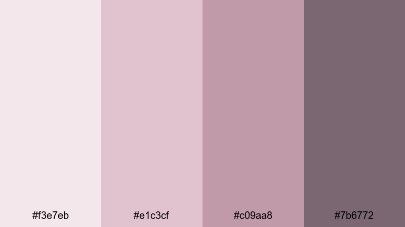
- HEX Codes: #f3e7eb, #e1c3cf, #c09aa8, #7b6772
- Mood: Dreamy, feminine, and poetic.
- Use for: Use in beauty tutorials, wedding highlight videos, and soft product promos for skincare or fashion.
Dusty Rose Whisper combines powdery pinks and mauves to create a dreamy, feminine look that feels polished rather than childish. The desaturated tones keep everything soft and professional, perfect for brands that want elegance and warmth.
Apply this palette to lower thirds, text boxes, and background shapes in beauty tutorials, wedding highlight reels, or skincare promos. Matching your thumbnail frames and channel banner to these HEX codes can instantly create a recognizable, poetic aesthetic for your brand.
Vintage Linen Love
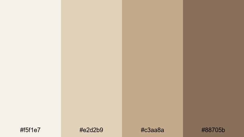
- HEX Codes: #f5f1e7, #e2d2b9, #c3aa8a, #88705b
- Mood: Warm, nostalgic, and timeless.
- Use for: Great for storytelling shorts, nostalgic travel diaries, and heritage brand intros.
Vintage Linen Love blends creamy linen tones with soft beige and warm browns, echoing old photographs and sun-faded prints. It feels timeless and grounded, ideal for stories about family, memory, or slow travel.
Use these colors for title cards, chapter markers, and subtle frames around your footage in Filmora. They work especially well for storytelling shorts, nostalgic travel diaries, and brand intros where you want viewers to feel like they are leafing through a treasured album.
Powder Petal Dream
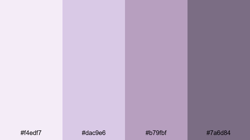
- HEX Codes: #f4edf7, #dac9e6, #b79fbf, #7a6d84
- Mood: Ethereal, calm, and slightly whimsical.
- Use for: Perfect for dreamy montage sequences, calm productivity vlogs, and aesthetic reel covers.
Powder Petal Dream leans into lavender-tinted pastels with softened contrast. The palette feels like a daydream: gentle, floaty, and slightly otherworldly, without ever tipping into neon or childish purple.
Try these tones for aesthetic productivity vlogs, time-lapse study sessions, or dreamy montage sequences. In Filmora, use them for shapes behind your text, progress bars, checklist graphics, and reel covers to keep the whole project wrapped in the same cloudlike mood.
Minimal & Modern Muted Color Palettes
Stone Studio Calm
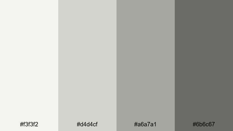
- HEX Codes: #f3f3f2, #d4d4cf, #a6a7a1, #6b6c67
- Mood: Clean, balanced, and thoughtfully understated.
- Use for: Ideal for minimal tech reviews, design studio reels, and UX case study presentations.
Stone Studio Calm uses cool stone greys to create a gallery-like backdrop that feels neutral and refined. The palette quietly frames your content instead of competing with it, which is perfect when clarity and professionalism matter.
Use these HEX codes for backgrounds, text boxes, and simple line icons in tech reviews, design breakdowns, or UX walkthroughs. In Filmora, combine this palette with minimal typography and clean transitions to make your videos feel like polished product demos or studio showreels.
Muted Urban Grid
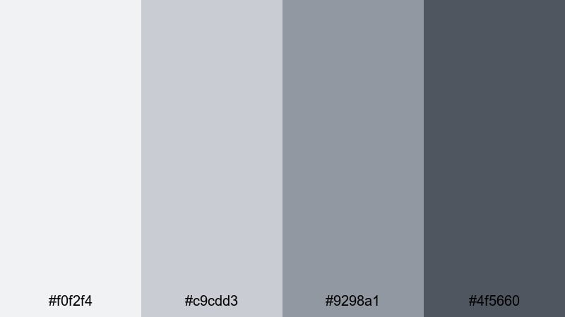
- HEX Codes: #f0f2f4, #c9cdd3, #9298a1, #4f5660
- Mood: Urban, sleek, and contemporary.
- Use for: Use in city vlogs, architecture features, and tech channel branding with a refined edge.
Muted Urban Grid captures the look of overcast city skylines and glass buildings with soft steel blues and greys. It feels modern and metropolitan, giving your visuals a sleek, slightly cinematic edge.
Apply this palette to your lower thirds, map graphics, and split-screen layouts for city vlogs, architecture walkthroughs, or tech channel branding. Paired with clean motion graphics in Filmora, it creates a cohesive urban identity that works across intros, banners, and thumbnails.
Foggy Interface Neutrals
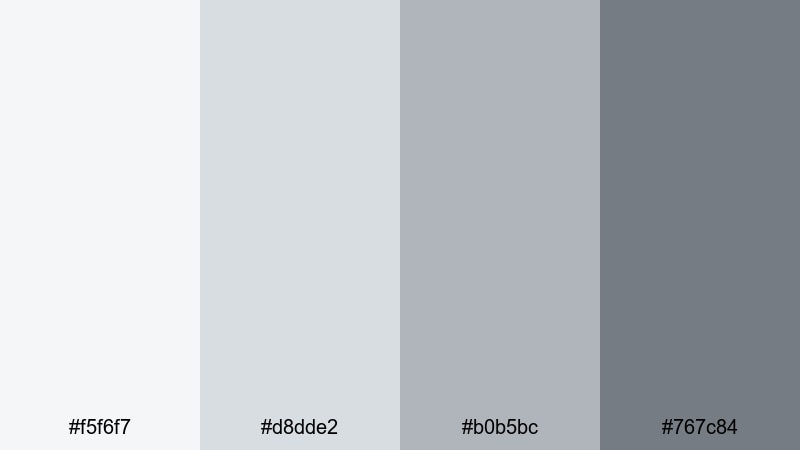
- HEX Codes: #f5f6f7, #d8dde2, #b0b5bc, #767c84
- Mood: Subtle, professional, and digital-friendly.
- Use for: Great for app promos, UI walkthroughs, and software tutorials where clarity is key.
Foggy Interface Neutrals is built from soft interface greys with gentle contrast that stays easy on the eyes. It feels like a modern dashboard or web app theme, making it perfect for digital-first content.
Use these tones to mock up UI panels, highlight cursors, and frame screen recordings in your tutorials. In Filmora, you can recreate app-like overlays and keep everything readable, clean, and aligned with contemporary product design standards.
Clean Editorial Muted
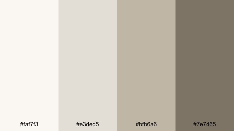
- HEX Codes: #faf7f3, #e3ded5, #bfb6a6, #7e7465
- Mood: Sophisticated, editorial, and airy.
- Use for: Perfect for fashion lookbooks, brand story videos, and minimalist social banners.
Clean Editorial Muted uses warm off-whites and desaturated browns for a magazine-style look. It feels curated and high-end while staying soft and approachable, ideal for brands that want a luxury but minimal presence.
Design your lower thirds, product name cards, and story titles with this palette for fashion lookbooks, brand films, or minimalist Instagram reels. Consistently using these tones in Filmora will help your channel look like a cohesive editorial spread rather than a collection of random uploads.
Warm Cinematic Muted Color Palettes
Autumn Fade Reel
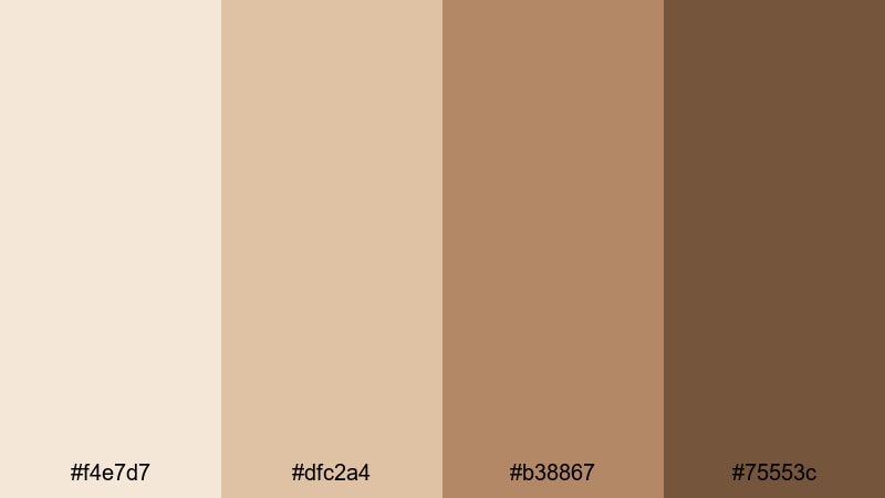
- HEX Codes: #f4e7d7, #dfc2a4, #b38867, #75553c
- Mood: Cinematic, cozy, and story-driven.
- Use for: Use in fall travel vlogs, moody short films, and narrative-driven edits.
Autumn Fade Reel layers soft amber and brown tones that resemble faded film stills from a late autumn road trip. The colors feel warm and cozy, but the muted saturation adds a touch of melancholy, ideal for storytelling.
Use this palette to grade your fall travel vlogs, cinematic b-roll, or character-driven shorts. In Filmora, apply these HEX codes to title cards and overlays, and nudge your color grading toward these warm browns to make the entire edit feel like one cohesive autumn chapter.
Soft Ember Glow
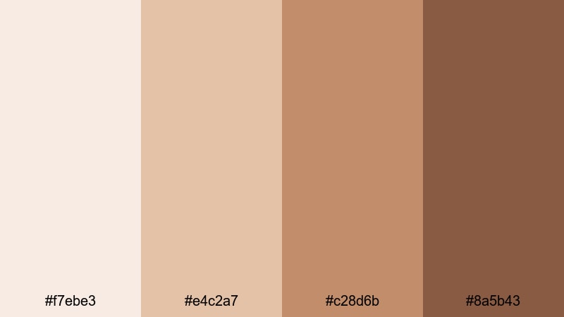
- HEX Codes: #f7ebe3, #e4c2a7, #c28d6b, #8a5b43
- Mood: Warm, intimate, and gently dramatic.
- Use for: Great for indoor scenes, cozy cooking videos, and storytelling around fireplaces or candles.
Soft Ember Glow mixes smoky warm oranges and browns that feel like candlelight or glowing coals. It has a cinematic, intimate character that works beautifully in indoor settings and cozy storytelling.
Use these colors for recipe titles, chapter cards, and subtle frames around your cooking or home content. In Filmora, push your highlights gently toward these warm tones and keep saturation under control so the glow feels natural, not cartoonish.
Muted Sunset Frames
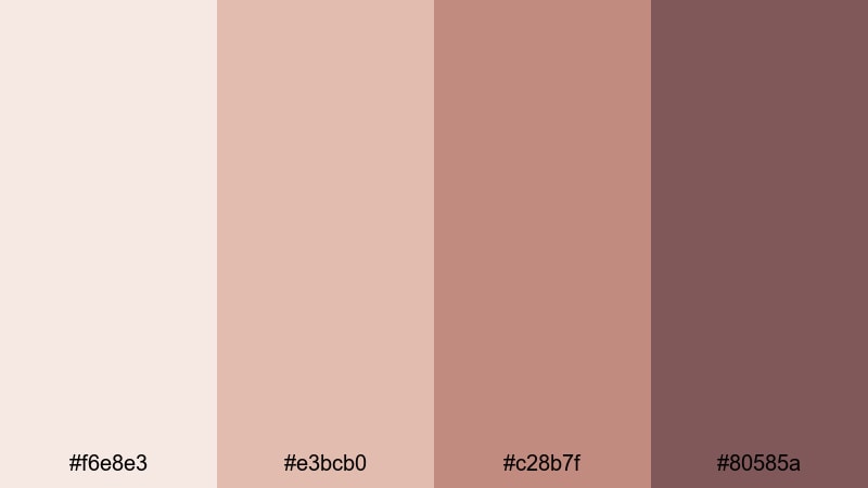
- HEX Codes: #f6e8e3, #e3bcb0, #c28b7f, #80585a
- Mood: Melancholic, romantic, and quietly bold.
- Use for: Ideal for golden hour b-roll, music videos, and emotional montage sequences.
Muted Sunset Frames uses dusty peach and warm plum to echo sunset skies while staying soft and cinematic. The combination creates a bittersweet, romantic feeling that suits more emotional edits.
Try this palette on golden hour b-roll, lyric videos, or slow montage sequences. Build gradient backgrounds or shape overlays in these colors inside Filmora, then lightly grade your footage toward the same hues for a unified sunset-inspired look.
Retro Sandgrain Film
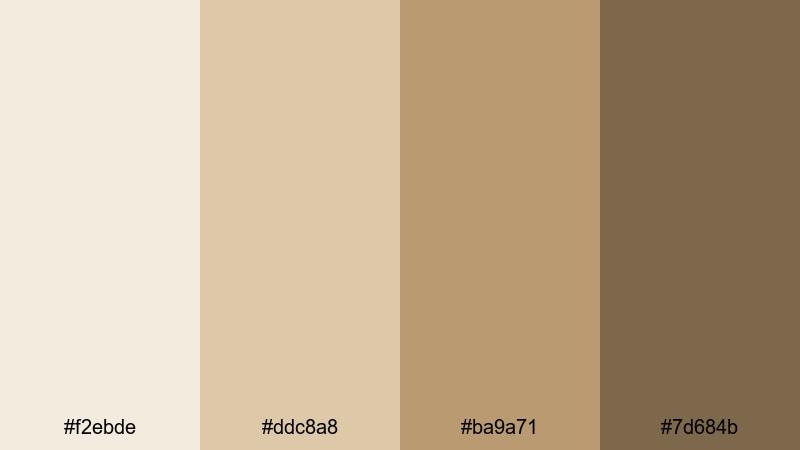
- HEX Codes: #f2ebde, #ddc8a8, #ba9a71, #7d684b
- Mood: Retro, grainy, and storytelling-focused.
- Use for: Perfect for faux-analog edits, travel diaries, and documentary-inspired sequences.
Retro Sandgrain Film blends desaturated sand and caramel browns, recreating the look of sun-faded film stock. It feels nostalgic and tactile, especially when paired with film grain or subtle vignette effects.
Use this palette for road trip diaries, retro-inspired short films, or brand stories that feel grounded and human. In Filmora, combine this color scheme with grain overlays and subtle camera shake to amplify the analog storytelling vibe.
Cool Atmospheric Muted Color Palettes
Overcast City Haze
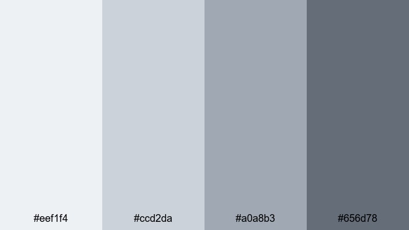
- HEX Codes: #eef1f4, #ccd2da, #a0a8b3, #656d78
- Mood: Moody, reflective, and cinematic.
- Use for: Great for cityscapes, rainy day vlogs, and reflective talking-head scenes.
Overcast City Haze combines smoky blues and greys to capture the calm of a cloudy skyline. It feels introspective and slightly moody, which is perfect for reflective narratives and slow-paced city footage.
Use these tones to grade rainy day vlogs, street photography reels, or thoughtful talking-head videos. In Filmora, match your text and graphic accents to this palette so your titles, subtitles, and frame lines all echo the same atmospheric city mood.
Muted Ocean Drift
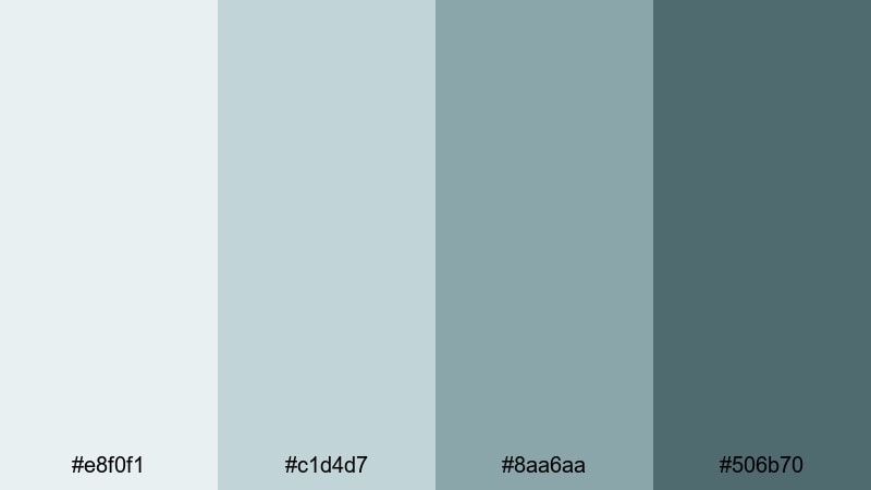
- HEX Codes: #e8f0f1, #c1d4d7, #8aa6aa, #506b70
- Mood: Calm, expansive, and meditative.
- Use for: Use in travel reels, slow cinematic b-roll, and wellness or mindfulness content.
Muted Ocean Drift features seafoam, slate, and ocean teal in a desaturated mix that feels coastal and calm. It brings the mood of a quiet shoreline rather than a bright tropical beach.
Apply this palette to travel reels, yoga or meditation visuals, and slow-motion b-roll. In Filmora, let your titles float over soft teal backdrops and nudge your highlights and shadows toward these hues for a soothing, unified seascape aesthetic.
Twilight Mist Scene
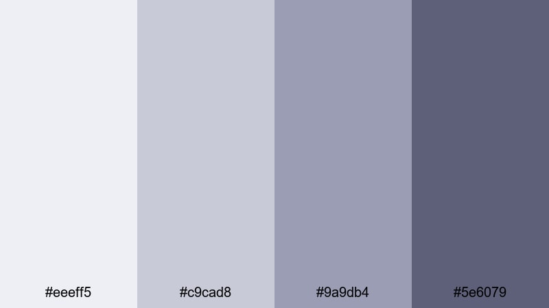
- HEX Codes: #eeeff5, #c9cad8, #9a9db4, #5e6079
- Mood: Ethereal, mysterious, and gently dramatic.
- Use for: Perfect for night city reels, moody edits, and cinematic title cards.
Twilight Mist Scene combines powdery blues and soft indigos to create a dreamy twilight feeling. The palette carries a sense of mystery and quiet tension, without the harshness of deep, saturated blues.
Use it for night city reels, moody edits, and cinematic title cards where you want viewers to feel like they are stepping into a story. In Filmora, use these colors for text glows, subtle gradients, and transitions to keep your night scenes consistent and cinematic.
Tips for Creating Muted Color Palettes
Muted palettes are all about balance: enough color to set a mood, but soft enough to keep your visuals easy to watch. Use these tips to combine muted tones with other colors and keep your video and design work clear, on-brand, and cinematic.
- Start with one key mood color (warm, cool, romantic, or urban), then desaturate it and build your palette around lighter and darker variations.
- Keep contrast in mind: pair light muted backgrounds with darker text or accents so titles, buttons, and captions remain readable in thumbnails and on mobile screens.
- Limit your palette to 3–5 core colors: one background, one primary accent, one secondary accent, plus optional highlight and shadow tones.
- Match your footage to your graphics: if your overlays use warm muted tones, nudge your video color grading in Filmora toward similar hues to avoid clashing.
- Use neutrals as glue: soft greys, beige, and off-whites can connect bolder muted colors and help your overall design feel cohesive.
- Test your palette in different scenes: bright daylight, indoor lighting, and night shots can shift color; adjust saturation and contrast so the palette still feels consistent.
- Respect your brand identity: adapt these muted palettes to your logo colors by slightly desaturating and warming or cooling them instead of changing your core brand too much.
- Create reusable presets: once you refine a muted look in Filmora, save it as a color preset so every new intro, reel, or long-form video keeps the same aesthetic.
Muted color palettes are a powerful way to shape emotion, build a recognizable brand, and give your videos a cinematic finish. Whether you lean into soft romantic blushes, minimal studio neutrals, warm film tones, or cool atmospheric blues, choosing and repeating a palette makes your channel feel intentional and professional.
Use the HEX codes in this guide as a starting point, then refine them inside Filmora with color grading, filters, and LUTs. Try these palettes on your next thumbnail series, vlog intro, or reel, and see how a consistent muted look can transform the way your audience experiences your content.
As you experiment, save your favorite grades and templates so your future projects load with your signature muted style already in place. The more consistently you apply your palette, the stronger and more cinematic your visual identity will become.
secure download