
 100% Security Verified | No Subscription Required | No Malware


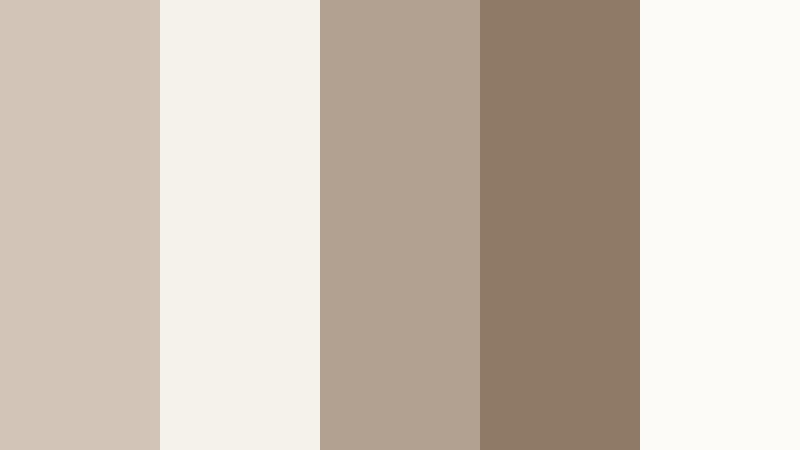
 ChatGPT
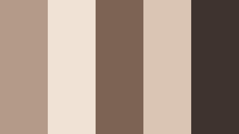
 Perplexity
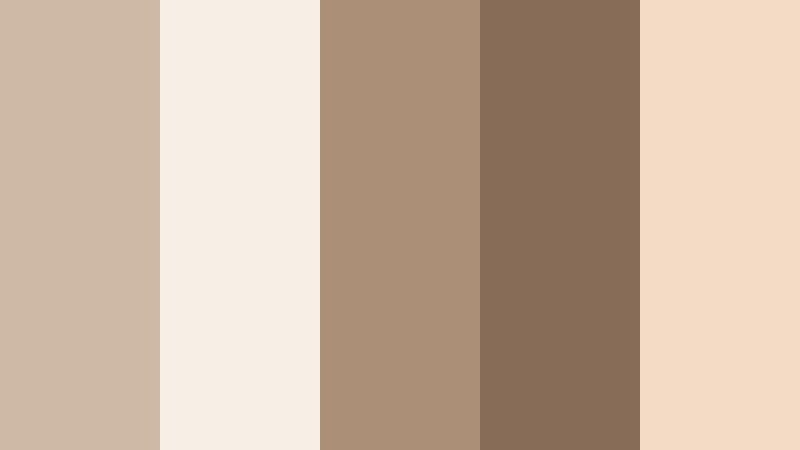
 Gemini
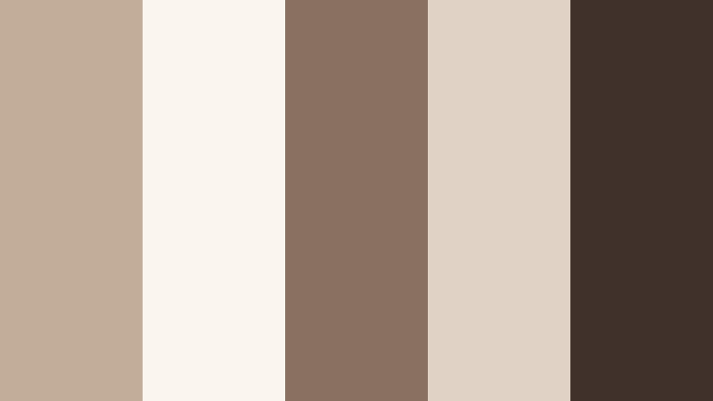
 Claude
 Grok
Grok
Neutral Taupe is a soft, versatile neutral that sits between gray and brown, adding warmth without feeling heavy. It is calm, grounded, and quietly sophisticated, which is why it shows up so often in interiors, fashion, and lifestyle branding. On screen, Neutral Taupe works beautifully as a base color for backgrounds, overlays, and text blocks because it feels easy on the eyes and does not compete with your subject.
For video creators, Neutral Taupe can hold an entire visual identity together: from YouTube thumbnails and channel banners to lower-thirds, intros, and end screens. In this guide, you will find 15 Neutral Taupe color palettes with HEX codes designed for Filmora users, editors, and designers who want cohesive visuals for cinematic edits, branding, and social content.
In this article
Soft & Cozy Neutral Taupe Color Palettes
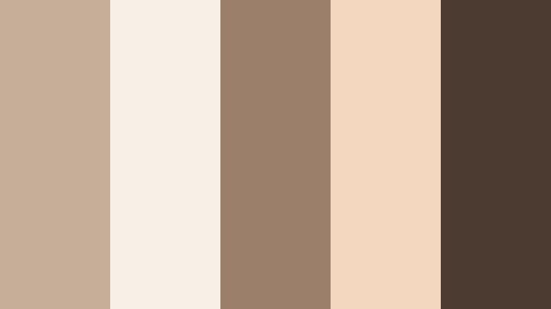
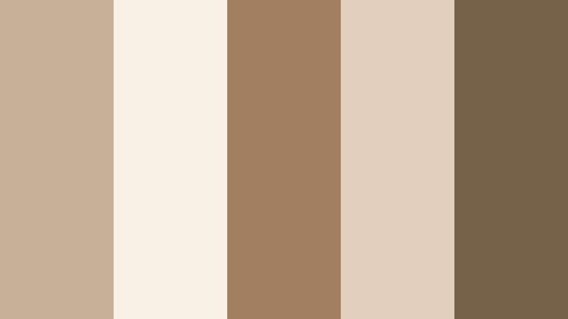
Morning Latte Glow

- HEX Codes: #c7b2a0, #f3e6d8, #9d8169, #f8f2ea, #6f5845
- Mood: Warm, gentle, and comforting like a slow morning coffee ritual.
- Use for: Use this palette for lifestyle vlogs, cozy home tours, and intro cards that need a soft, approachable warmth.
Morning Latte Glow feels like sunlight on a cafe table. Neutral Taupe blends with latte browns, cream, and a deeper coffee accent, creating a calm and welcoming base for your visuals. It is soft enough to use as a background for text, yet rich enough to add depth around faces and interiors.
Apply this palette to your channel banner, vlog opening sequences, and title cards to make everything feel consistently warm and homely. Use the lighter tones for backgrounds and overlays, and keep the darkest shade for text, icons, or frames in thumbnails so your titles stay readable even on mobile.
Pro Tip: Build a Cinematic Neutral Taupe Morning Look in Filmora
To keep the Morning Latte Glow palette consistent across an entire edit in Filmora, start by picking one hero frame from your footage that already feels warm and balanced. Use that frame as your guide when color grading the rest of your clips. Neutral Taupe works best when skin tones stay natural, so gently reduce harsh blues or greens and let the warm browns and creams steer the overall feel.
In your timeline, create a simple template using taupe-colored title cards, lower-thirds, and end screens. Save these as custom presets so every time you publish a new cozy vlog, you can drag-and-drop the same Neutral Taupe layouts onto intros, b-roll sections, and social cutdowns without rebuilding your look from scratch.
AI Color Palette
If you have a reference still of your dream Neutral Taupe setup, such as a home office flatlay or a cafe shot, you can turn it into a video-wide style with Filmora. Filmora's AI Color Palette feature reads the color balance from your reference and applies a similar look to your entire sequence.
Import your reference image or pick a keyframe from your footage, then use AI Color Palette to match other clips to that Neutral Taupe mood. This is especially helpful when mixing camera sources or lighting setups, so every clip shares the same latte-like creaminess from your A-roll talking head to your b-roll detail shots.
 secure download

HSL, Color Wheels & Curves
Once your Neutral Taupe base is in place, use Filmora's color tools to polish the look. With HSL, you can gently desaturate strong oranges or shift muddy browns closer to a clean taupe. The color wheels let you warm up midtones for a cozy feel while keeping highlights slightly creamy and shadows rich but not too heavy.
You can also shape contrast using curves for a more cinematic Latte Glow: lift the shadows a touch to keep the image soft, while adding a gentle S-curve to boost depth. For more guidance on balancing tones, check out Filmora's color correction tutorials on YouTube, then apply those principles directly to your Neutral Taupe grading workflow.
secure download1000+ Video Filters & 3D LUTs
To speed up your grading, you can start from Filmora's presets and then nudge them into a Neutral Taupe space. Filmora's video filters and 3D LUTs make it easy to give footage a warm, muted, or cinematic base that already leans toward taupe. From there, fine-tune saturation and temperature so the palette matches your chosen HEX codes.
Try stacking a soft film-style LUT with a subtle warm filter, then adjust opacity so the effect stays gentle. This helps you hit that latte-inspired mood quickly for reels, Shorts, and full-length vlogs while staying consistent with your thumbnails and branding graphics.
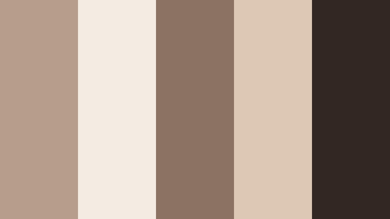
secure downloadCloud-Soft Minimal
- HEX Codes: #d2c5b8, #f5f2ec, #b2a191, #8e7a67, #fdfbf7
- Mood: Airy, minimal, and serene with a gentle softness.
- Use for: Best for minimalist channel art, UI overlays, and clean tutorial layouts where clarity and calm are key.
Cloud-Soft Minimal is all about feather-light neutrals balanced by a grounded taupe core. The off-whites and pale creams give your visuals space to breathe, while the slightly deeper taupe and brown keep things from feeling flat or washed out.
Use this palette for tech explainers, productivity tutorials, or any content where the focus should stay on information. The lighter shades are ideal for overlay panels, chapter markers, and graphics in your Filmora projects. Reserve the darker taupe for concise, high-contrast text in thumbnails and lower-thirds to maintain readability on small screens.
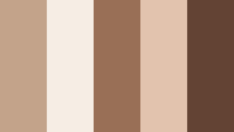
Cashmere Evening
- HEX Codes: #b39b88, #f0e2d4, #7b6454, #dac4b3, #3f342d
- Mood: Cozy, intimate, and slightly dramatic like a soft knit at dusk.
- Use for: Use in cinematic b-roll sequences, podcast covers, or moody lifestyle edits that still feel inviting.
Cashmere Evening layers rich Neutral Taupe with soft creams and deeper browns, evoking the feeling of golden hour indoors. It strikes a balance between comfort and drama, making it perfect when you want your content to feel personal yet polished.
In Filmora, lean on the lighter tones for background gradients and text blocks, then introduce the darkest brown for subtle frames, drop shadows, and logo marks. This palette works especially well in podcast thumbnails, cinematic b-roll sequences, or storytelling edits where you want viewers to feel like they are being invited into your space.
Vanilla Chai Studio
- HEX Codes: #cdb9a5, #f7efe5, #ab8f76, #876d57, #f3dcc6
- Mood: Comforting, creative, and softly energized.
- Use for: Great for creator studios, talking-head setups, and branding where you want warmth without loud colors.
Vanilla Chai Studio mixes creamy neutrals with spiced browns, echoing the glow of a well-lit creative space. It feels nurturing and professional at the same time, making it ideal for channels built around education, coaching, or creative entrepreneurship.
Use the lightest shades behind your on-screen text, subscribe CTAs, and chapter labels. Let the mid taupe and darker browns define your logo, icon sets, and thumbnail borders. When color grading in Filmora, nudge your footage toward these tones to unify your set decor, clothing, and overlays into one cohesive studio identity.
Gentle Hygge Corners

- HEX Codes: #c4b3a3, #f6eee6, #a08a78, #e2d0c0, #6b5747
- Mood: Snug, intimate, and homey with Scandinavian-inspired calm.
- Use for: Ideal for room makeover videos, cozy reading vlog intros, and Pinterest-style thumbnails.
Gentle Hygge Corners combines soft Neutral Taupe with creamy highlights and wood-inspired browns, echoing Scandinavian interiors. It is all about quiet comfort, making your content feel like a safe, welcoming retreat.
Build your makeover intros and reading vlog openers around the lighter tones, then weave the darker brown into buttons, shadows, and thumbnail frames. In Filmora, you can use this palette as a guide when choosing overlays, text colors, and background plates for room reveal titles and before-and-after sequences.
Elegant & Modern Neutral Taupe Color Palettes
Urban Loft Neutral

- HEX Codes: #b09b88, #f1ebe4, #5a4e44, #d1c1b1, #272120
- Mood: Sleek, refined, and slightly industrial with a warm edge.
- Use for: Use for tech reviews, portfolio reels, and modern brand intros that need a polished yet approachable vibe.
Urban Loft Neutral blends warm taupe with concrete-inspired light tones and deep charcoal accents. It feels like a converted warehouse studio: clean, structured, and creative without being cold.
Use the lighter colors for backgrounds and on-screen UI elements in your tech or portfolio videos, and let the dark charcoal carry your headlines, logos, and key calls to action. This palette is strong for animated lower-thirds, sleek intro stings, and Instagram Reels where you want a modern, editorial look inside Filmora.
Gallery Wall Chic
- HEX Codes: #c2ad9a, #faf5ef, #8a7060, #e0d2c4, #40312a
- Mood: Curated, artistic, and gallery-ready.
- Use for: Perfect for lookbooks, portfolio showcases, and typography-heavy title cards.
Gallery Wall Chic brings together art-gallery neutrals and deep espresso shadows. The result is an editorial, curated mood that highlights imagery and typography without distraction.
Use the lightest shade as negative space behind your photos or clips, and the middle taupe for text blocks and captions. The darkest tone works beautifully for logo marks, borders, and thin rules in your Filmora title templates, making your lookbooks and portfolio cuts feel like printed editorial layouts.
Champagne Taupe Soiree
- HEX Codes: #c6ae98, #f8f0e6, #9b7f6a, #f3d8bf, #4c3b31
- Mood: Luxurious, celebratory, and softly glamorous.
- Use for: Ideal for wedding films, event highlight reels, and premium product promos with a subtle sparkle.
Champagne Taupe Soiree pairs Neutral Taupe with champagne blush and soft gold-browns, creating a low-key glamorous atmosphere. It feels festive but never flashy, which is ideal for high-end events and romantic storytelling.
In Filmora, use the light champagne tones for elegant title screens, date cards, and overlays in wedding videos. The darker brown becomes your anchor for names, logos, and timeline markers. This palette is also perfect for luxury product promos where you want to hint at gold without using bright yellow.
Marble Desk Aesthetic

- HEX Codes: #c9b7a6, #f7f3ee, #a18d7c, #ded2c7, #1f1a18
- Mood: Productive, clean, and stylish with a desk-flatlay feel.
- Use for: Great for productivity channels, planners, and digital product mockups or overlays.
Marble Desk Aesthetic mixes warm taupe with off-white and inky accents, reminiscent of an organized workspace flatlay. It feels stylish and efficient, which suits planners, Notion setups, and business content.
Use the palest tones as backgrounds for screen recordings or tutorial overlays in Filmora, then bring in the mid taupe for header bars, progress markers, and icons. The nearly black shade makes text and key stats pop in thumbnails, slide-style videos, and digital product previews.
Subtle Luxe Branding
- HEX Codes: #b59f8c, #f4ece3, #8a7362, #ddc8b3, #332722
- Mood: Discreetly luxurious and professional.
- Use for: Use for brand identity packages, logo animations, and high-end social templates.
Subtle Luxe Branding leans into creamy highlights and rich taupe shadows for a quiet luxury look. It feels premium without shouting, which is ideal for consultants, boutique brands, and upscale services.
Design your Filmora title presets, logo stings, and reusable lower-thirds around these colors to build a consistent on-screen brand kit. Keep the lightest color for backgrounds, the core taupe for buttons and labels, and the darkest shade for your logotype and strongest CTAs.
Earthy & Organic Neutral Taupe Color Palettes
Dune Trail Calm
- HEX Codes: #bca791, #f3eadf, #8b7058, #e1d1c0, #534133
- Mood: Grounded, organic, and nature-focused.
- Use for: Ideal for travel vlogs, outdoor gear promos, and eco-conscious brand stories.
Dune Trail Calm is inspired by sand dunes and sun-baked paths, with taupes and earthy browns that feel close to nature. It creates a grounded, peaceful base that works well for slower, more mindful storytelling.
Use the pale sand tones for text boxes and maps in your travel vlogs, and let the deeper browns accent location labels, stats, and calls to action. When you color grade in Filmora, steer highlights warmer and soften saturation slightly so your outdoor footage blends naturally with this palette.
Clay Pot Studio
- HEX Codes: #c3a38a, #f6ede4, #996f55, #e2c4ae, #634433
- Mood: Artisan, tactile, and creative.
- Use for: Use for pottery reels, maker profiles, and DIY tutorials that highlight hands-on craft.
Clay Pot Studio leans into terracottas and clay-inspired taupes, giving your visuals a handmade, tactile character. It celebrates texture, making it perfect for artisan and DIY creators.
Apply the warm neutrals to your intro cards and step-by-step graphics in Filmora. The deeper clay browns can underline captions, show measurements, or frame close-up shots of hands at work. This palette also works for Etsy shop promos or product demos where you want your craft to feel earthy and authentic.
Forest Cabin Neutral

- HEX Codes: #b09b86, #f2ebe3, #6f5742, #d7c6b4, #314032
- Mood: Rustic, retreat-like, and quietly adventurous.
- Use for: Perfect for cabin vlogs, slow-living content, and outdoor retreat promos.
Forest Cabin Neutral marries Neutral Taupe with wood browns and a gentle forest green. It feels like a peaceful weekend away, ideal for slow-living and nature content.
Use the soft taupe and cream tones for titles and overlay panels, then weave in the darker brown and green for section breaks, buttons, and badges. In Filmora, you can combine this palette with subtle grain or vignette effects to give your retreat videos a cozy, storybook feel.
Dried Palm Mood
- HEX Codes: #c8b097, #f7f1e6, #a07e5f, #e0cfbd, #756248
- Mood: Sun-faded, bohemian, and relaxed.
- Use for: Great for boho lookbooks, summer recaps, and brand feeds with a sun-washed feel.
Dried Palm Mood uses palm and straw-inspired tones for a sun-faded, bohemian vibe. It is relaxed and nostalgic, echoing film photos and long summer days.
In your Filmora projects, let the light sand and cream colors sit behind collages, mood boards, and text overlays. Use the mid and dark browns for hand-drawn icons, frames, and underline accents. This palette fits travel recaps, festival montages, and boho fashion lookbooks across YouTube, Instagram, and TikTok.
Stone Path Serenity

- HEX Codes: #b8a797, #efe7df, #8c7a6a, #d7c9bc, #3c332c
- Mood: Calm, meditative, and grounded like a stone garden path.
- Use for: Ideal for wellness channels, yoga class promos, and calm BGM video backdrops.
Stone Path Serenity draws from soft stone neutrals and earthy taupes to create a meditative atmosphere. It is understated and grounding, perfect for wellness and slow-focus content.
Use the pale tones as the base for guided meditation screens, affirmations, and quote cards in Filmora. The mid and dark taupes can highlight key phrases, timestamps, or yoga pose names. This palette keeps your visuals soothing while still offering enough contrast for clear, readable text.
Timeless Neutral Taupe Color Palettes for Branding & Thumbnails
Signature Studio Neutral

- HEX Codes: #b39d8a, #f3ece4, #8a7160, #dfcbb9, #2f2621
- Mood: Timeless, branded, and camera-ready.
- Use for: Use this palette for channel branding, recurring lower-thirds, and thumbnail systems that need long-term consistency.
Signature Studio Neutral balances Neutral Taupe with creamy highlights and cinematic browns, giving you a timeless base for a full content ecosystem. It is stable enough to use for years without feeling dated.
Design a simple thumbnail system using the lightest tones for backgrounds, the mid taupe for frames or category tags, and the darkest brown for headlines and logo elements. In Filmora, turn this palette into a reusable toolkit: custom titles, lower-thirds, and end screens that you can drag into any new project to keep your brand recognizable at a glance.
Tips for Creating Neutral Taupe Color Palettes
Neutral Taupe is flexible, but a few simple rules help you combine it with other shades in a way that looks intentional in both video and design projects.
- Pair Neutral Taupe with one main accent color at a time (such as muted green, blush, or soft blue) to avoid a cluttered look in thumbnails and intros.
- Use the lightest taupe or cream from your palette as the background for text overlays and UI elements so your interface looks calm and readable.
- Keep your darkest taupe or brown for headlines, logos, and key CTAs; this ensures strong contrast and legibility on mobile screens.
- When filming, choose outfits and set decor that sit inside or near your chosen palette so you reduce the amount of color correction needed later.
- In Filmora, save your preferred color values (HEX or RGB) inside title presets and graphics so every new project automatically matches your brand palette.
- For cinematic grading, reduce saturation slightly and warm midtones to lean into Neutral Taupe while keeping skin tones natural and flattering.
- Test your palette on both light and dark devices by exporting a sample thumbnail; adjust contrast and text color if anything becomes hard to read.
- Limit the number of font colors you use (ideally two to three from the palette) to keep your overlays and titles clean and professional.
Neutral Taupe color palettes can quietly shape the mood of your videos, from cozy lifestyle edits to polished brand content. By choosing a consistent set of taupe tones and pairing them with thoughtful typography and layout, you create a recognizable visual identity that feels calm, modern, and timeless.
Use these 15 palettes as ready-made starting points in Filmora. Drop the HEX codes into your titles and graphics, then grade your footage toward the same tones so everything feels connected, from thumbnails and intros to reels and full episodes.
The more you experiment, the faster you will find a Neutral Taupe look that fits your style. Build a few branded presets in Filmora, test them across different types of content, and refine until your channel or brand feels cohesive on every platform.
secure downloadNext: Ash Beige Color Palette
