
 100% Security Verified | No Subscription Required | No Malware


 ChatGPT
 Perplexity
 Gemini
 Claude
 Grok
Grok
Pale Chartreuse is a bright, slightly yellow-leaning green that instantly feels fresh, optimistic, and creative. It sits between lime and soft neon, so it naturally draws the eye without feeling too harsh. In color psychology, this kind of light green suggests growth, energy, clarity, and modernity, which makes it ideal for digital-first brands and creators.
On screen, Pale Chartreuse works beautifully in video intros, channel branding, overlays, and thumbnails because it pops against dark backgrounds and soft neutrals alike. Below, you will find ready-made Pale Chartreuse color palettes with HEX codes that you can plug straight into your vlogs, motion graphics, YouTube thumbnails, lower thirds, and Filmora color grading workflows.
In this article
Fresh & Minimal Pale Chartreuse Color Palettes
Clean Studio Glow

- HEX Codes: #e5ff7a, #ffffff, #d1e3ff, #8fb3ff, #242c3f
- Mood: Bright, airy, and professional with a subtle tech edge.
- Use for: Use this palette for software explainer videos, productivity vlogs, or clean channel branding where you want clarity and a fresh pop of color.
Clean Studio Glow frames Pale Chartreuse with crisp white and cool digital blues, creating a studio-fresh look that feels smart and professional. The dark navy charcoal anchors everything so your text, icons, and UI elements stay legible even when you push the brightness.
Use this palette for tech explainers, SaaS demos, and tutorial intros where you want a modern interface vibe. In Filmora, you can apply Pale Chartreuse to buttons, progress bars, lower thirds, and subscribe animations, while the soft blues handle backgrounds, sidebars, and on-screen callouts for a polished channel identity.
Pro Tip: Keep Your Pale Chartreuse Branding Consistent in Filmora
When you build a clean, techy look around Pale Chartreuse, consistency is what makes your videos feel like a real brand. In Filmora, you can save your title presets, lower thirds, and overlays using the same HEX codes from this palette so every tutorial, webinar, or short has matching greens and blues.
Create a simple style system: use Pale Chartreuse for key actions (subscribe, download, next video), the blues for backgrounds and UI panels, and the deep navy for text or drop shadows. Once you lock this in as presets, you can apply the same look across intros, b-roll overlays, and social cutdowns without rebuilding graphics from scratch.
AI Color Palette
If you design a Clean Studio Glow reference frame or a mood board image, you can use Filmora to spread that Pale Chartreuse look across your whole edit. Filmora's AI Color Palette feature analyzes a reference clip or image and matches its tones to the rest of your timeline.
Import your hero frame that uses Pale Chartreuse, whites, and cool blues, then apply AI Color Palette to other shots so your screen recordings, talking head segments, and b-roll all share the same fresh studio mood. This is especially useful for longer tutorials where lighting changes, but you still want one cohesive brand color story.
 secure download

HSL, Color Wheels & Curves
To refine Pale Chartreuse so it looks premium instead of fluorescent, use Filmora's HSL and color wheels tools. Slightly desaturate the greens in your midtones, then nudge highlights toward a soft warm tone so the whites feel natural on skin while your chartreuse accents stay crisp.
You can deepen contrast with curves to give your clean palette a cinematic edge and use the color wheels to cool down shadows, which makes Pale Chartreuse details stand out even more. The tutorial in this Filmora color grading guide walks through balancing saturation and contrast so bright greens stay pleasing on any screen.
secure download1000+ Video Filters & 3D LUTs
Once your Pale Chartreuse palette is set, you can push it toward different aesthetics using Filmora's built-in looks. Filmora's video filters and 3D LUTs make it easy to turn a clean studio style into something more cinematic, nostalgic, or futuristic in a single click.
Try soft film LUTs to gently mute saturation while keeping chartreuse accents visible, or use modern digital filters to sharpen your interface graphics. You can stack subtle filters on top of your color grade so the HEX-based palette still reads correctly, but the overall mood shifts to match your series or campaign.
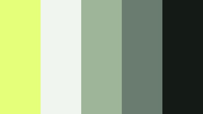
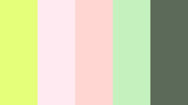
secure downloadNordic Herb Workspace

- HEX Codes: #e5ff7a, #f4f7f2, #c2d1c5, #7b8f87, #252b25
- Mood: Calm, grounded, and naturally focused.
- Use for: Ideal for productivity channels, desk setup videos, and minimalist brand intros with a soft eco-conscious vibe.
Nordic Herb Workspace wraps Pale Chartreuse in soft off-whites and desaturated greens for a natural, plant-filled desk feel. The palette is quiet and focused, like a minimal home office with herbs on the windowsill.
Use it for productivity vlogs, Notion or workspace tours, and branding where you want a slow-living, eco-aware tone. In thumbnails and lower thirds, keep Pale Chartreuse for accents and buttons, while the softer greens form background panels and frames so the whole composition feels calm and organized.
Citrus White Interface

- HEX Codes: #e5ff7a, #fdfdfd, #f5f0e6, #ffb347, #3b4b50
- Mood: Crisp, energetic, and user-friendly.
- Use for: Great for app promo videos, SaaS product demos, and clean social graphics that need a bright accent without overwhelming the frame.
Citrus White Interface combines Pale Chartreuse with clean whites, soft cream, and a warm orange accent for a friendly dashboard style. It feels like a modern app UI that is approachable but still professional.
This palette works especially well in screen-recorded tutorials, onboarding animations, and product explainers. Use Pale Chartreuse for key icons and highlight states, the orange for secondary CTAs, and the dark teal gray for readable body text in your Filmora titles, overlays, and end screens.
Greenroom Minimal Title Card
- HEX Codes: #e5ff7a, #f0f5f0, #9fb59a, #6a7c6f, #141a16
- Mood: Subtle, modern, and slightly cinematic.
- Use for: Use for intro title cards, end screens, and tasteful lower thirds on lifestyle or interview style videos.
Greenroom Minimal Title Card softens Pale Chartreuse with muted sage, eucalyptus tones, and deep charcoal. The result is modern and cinematic, like a backstage greenroom with soft studio lighting.
It is ideal for lifestyle channels, interviews, and documentaries that want a hint of brightness without loud colors. Use Pale Chartreuse sparingly in line accents, progress bars, or logo marks, while the deeper greens and charcoal carry your title cards, chapter markers, and credits in Filmora.
Soft Lemon Mist
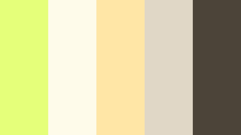
- HEX Codes: #e5ff7a, #fffbea, #ffe6a7, #e1d7c6, #4b4438
- Mood: Gentle, sunny, and welcoming.
- Use for: Perfect for lifestyle vlogs, cozy intros, and channels focused on wellness, journaling, or everyday routines.
Soft Lemon Mist merges Pale Chartreuse with creamy yellows and soft browns to create a hazy morning light feeling. It is warm, inviting, and great for content that focuses on gentle routines and self-care.
Apply this palette to intro cards, quote screens, and subtle overlays on top of your footage. Pale Chartreuse can highlight important text or small icons, while the creams and tans build soft gradient backgrounds for thumbnails, Instagram stories, and Filmora titles that feel cozy and approachable.
Playful & Pastel Pale Chartreuse Color Palettes
Matcha Cloud Daydream

- HEX Codes: #e5ff7a, #f9f5ff, #ffc1e3, #b6d8ff, #636b73
- Mood: Whimsical, dreamy, and kawaii-inspired.
- Use for: Use for playful vlog channels, stationery or craft content, and pastel gaming overlays.
Matcha Cloud Daydream wraps Pale Chartreuse in lilac, blush pink, and baby blue pastels. The look is dreamy and soft, like a matcha dessert bar or a pastel notebook spread.
Use this palette for cute vlogs, craft tutorials, and gamer overlays where you want a gentle, kawaii mood. In Filmora, reserve Pale Chartreuse for energizing buttons and stickers, while the purples and pinks form bubbly backgrounds, speech bubbles, and thumbnail frames that feel friendly and fun.
Candy Citrus Pop
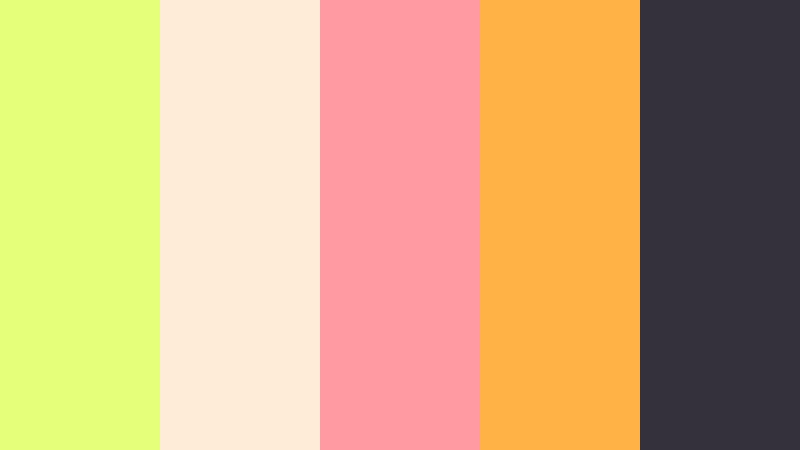
- HEX Codes: #e5ff7a, #ffecd6, #ff9aa2, #ffb347, #35313b
- Mood: Fun, energetic, and a bit retro.
- Use for: Great for fast-paced edits, challenge videos, and eye-catching YouTube thumbnails that need bold pastel energy.
Candy Citrus Pop turns Pale Chartreuse into part of a candy shop lineup, mixing it with strawberry pink, orange sherbet, and creamy beige. The deep plum gray keeps things grounded so text stays punchy.
This palette is perfect for high-energy cuts, reaction videos, and challenges. Use Pale Chartreuse and orange for large title words and subscribe badges, pink for supporting labels, and the dark base color for outlines and drop shadows in your Filmora graphic elements.
Summer Picnic Sketch
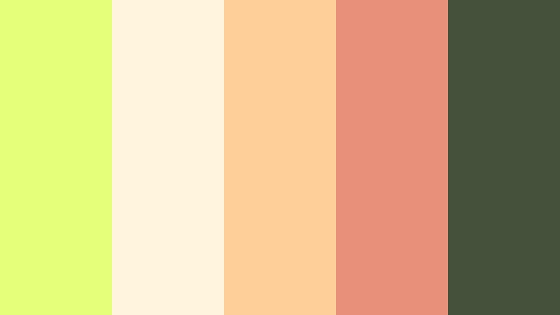
- HEX Codes: #e5ff7a, #fff5de, #ffcf99, #e8907a, #45513b
- Mood: Cheerful, nostalgic, and hand-drawn.
- Use for: Ideal for cooking shorts, picnic reels, and stop motion or doodle-style animations.
Summer Picnic Sketch blends Pale Chartreuse with peach, caramel, and warm coral, echoing illustrated recipe cards and picnic blankets. The olive charcoal provides enough contrast for sketch-style lines.
Use it for recipe videos, stop motion food content, and cozy outdoor vlogs. In Filmora, Pale Chartreuse can highlight ingredient lists or timers, while the warm oranges and browns color doodle frames, arrows, and thumbnail banners to create a hand-drawn, nostalgic look.
Neon Pastel Arcade

- HEX Codes: #e5ff7a, #ffe1ff, #cba5ff, #66e0ff, #182032
- Mood: Playful, futuristic, and slightly cyberpunk but soft.
- Use for: Perfect for gaming channels, tech shorts, and motion graphics with a pastel neon twist.
Neon Pastel Arcade pairs Pale Chartreuse with soft magenta, lavender, and cyan on top of a deep midnight blue. It feels like an arcade cabinet rendered in pastel neon instead of harsh lights.
This palette fits gaming intros, HUD overlays, and futuristic motion graphics. Use the deep navy as your base for full-frame backgrounds, then light up controls, score counters, and animated borders with Pale Chartreuse and cyan in Filmora to get a cyber vibe that is still easy on the eyes.
Garden Party Stickers
- HEX Codes: #e5ff7a, #ffeaf2, #ffd6d1, #c4f1be, #5c6a5a
- Mood: Lighthearted, crafty, and scrapbook-inspired.
- Use for: Use in planner content, DIY tutorials, and sticker-style social posts or reels.
Garden Party Stickers surrounds Pale Chartreuse with soft coral, blush, and mint for a scrapbook and planner feel. The muted green-gray acts like a pen outline, keeping everything readable.
Choose this palette for DIY crafts, journaling, and planning videos where you add lots of labels and badges on screen. In Filmora, Pale Chartreuse and mint are great for sticker backgrounds, while the corals and pinks highlight headers, date stamps, or icons in your thumbnails and reels.
Bold & Vibrant Pale Chartreuse Color Palettes
Electric Street Night

- HEX Codes: #e5ff7a, #111318, #ff3b6a, #00d4ff, #f5f5f5
- Mood: High-energy, urban, and cinematic.
- Use for: Great for music videos, dance edits, and high-impact channel trailers that need strong visual rhythm.
Electric Street Night throws Pale Chartreuse into a dark cityscape with deep charcoal, hot pink, and cyan. It feels like neon signs reflecting on wet pavement, perfect for fast cuts and bold transitions.
Use this palette for music videos, dance reels, and kinetic intros where contrast matters. Let Pale Chartreuse handle the main title text, with pink and cyan outlining shapes and glitch elements. The near-black background in Filmora helps every bright accent jump off the screen.
Sport Tech Pulse

- HEX Codes: #e5ff7a, #0f1720, #1f2933, #00ff9c, #f97316
- Mood: Dynamic, sporty, and performance-driven.
- Use for: Ideal for fitness content, product launches, and kinetic typography in ads or shorts.
Sport Tech Pulse mixes Pale Chartreuse with deep navy, electric teal, and a punch of orange for a performance-driven aesthetic. It recalls running shoes and sports wearables with LED accents.
This is a strong choice for workout edits, training plans, and product launches. Use Pale Chartreuse and teal for timers, progress bars, and speed lines, with orange for key metrics and CTAs. The dark blues form your base for overlays, stat cards, and full-screen title slates in Filmora.
Retro Lime Trailer

- HEX Codes: #e5ff7a, #222222, #ffb800, #ff5c7a, #f3f3f3
- Mood: Bold, nostalgic, and attention-grabbing.
- Use for: Use for channel trailers, show opens, and bold mid-video cards with a retro twist.
Retro Lime Trailer pairs Pale Chartreuse with jet black, golden yellow, and retro red to echo 80s posters and arcade flyers. Light gray adds a neutral option for backgrounds or text.
Use it for channel trailers, episodic intros, and bold mid-video cards. Pale Chartreuse can color your logo or hero word, while yellow and red animate in stripes, badges, and transitions. In Filmora, layer grain or VHS-style filters on top to push the retro vibe further.
Tropical Beat Splash

- HEX Codes: #e5ff7a, #ff7a89, #ffb347, #00b8a9, #1e2930
- Mood: Festive, rhythmic, and vacation-ready.
- Use for: Perfect for travel vlogs, festival aftermovies, and beach or pool party edits.
Tropical Beat Splash surrounds Pale Chartreuse with coral, warm orange, and teal on a dark slate background. It feels like sunset over a tropical festival with colored lights and reflections.
Use this palette for travel videos, beach parties, and festival montages. In Filmora, build animated wave shapes, split-screen transitions, and bold captions using chartreuse and teal, while coral and orange highlight key locations or moments in your storytelling.
Creator Studio Edge

- HEX Codes: #e5ff7a, #101827, #4b5563, #6366f1, #f9fafb
- Mood: Confident, modern, and content-creator focused.
- Use for: Great for YouTube or Twitch branding, tutorial series, and signature thumbnail styles.
Creator Studio Edge matches Pale Chartreuse with deep navy, slate gray, and a saturated digital indigo. Soft off-white brightens the mix for clean layouts.
This palette is built for creators who want a signature, tech-forward look. Use navy and gray for backgrounds, indigo for accent blocks, and Pale Chartreuse for your logo, channel name, and key buttons. In Filmora, this palette can run through your intros, overlays, and thumbnail templates to build a recognizable personal brand.
Elegant & Organic Pale Chartreuse Color Palettes
Olive Grove Editorial
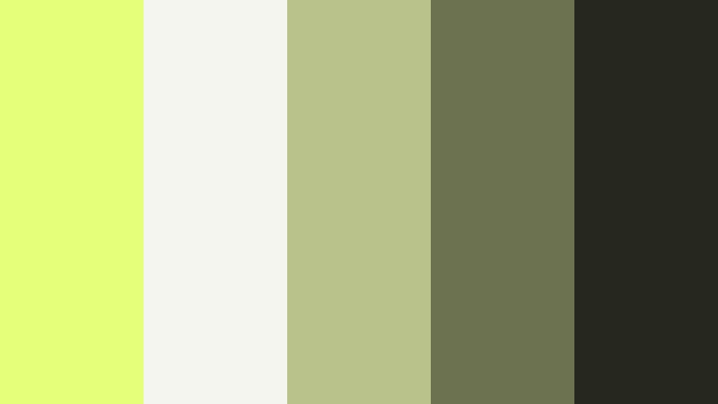
- HEX Codes: #e5ff7a, #f5f5f0, #b9c28a, #6c7150, #26281e
- Mood: Refined, earthy, and editorial.
- Use for: Best for brand films, lookbooks, and cinematic B-roll with a natural luxury feel.
Olive Grove Editorial tempers Pale Chartreuse into a more refined setting with olives, muted greens, and soft off-white. The deep earthy charcoal gives the palette a magazine-like, editorial weight.
Use it for fashion lookbooks, brand stories, and slow, cinematic B-roll in nature or lifestyle settings. In Filmora, apply Pale Chartreuse sparingly to logo marks, chapter titles, or navigation icons, while the olives and creams shape elegant lower thirds, frames, and subtle gradient washes over your footage.
Tips for Creating Pale Chartreuse Color Palettes
Pale Chartreuse is powerful, so pairing and balancing it well is the key to clean, professional videos and designs. Use these practical tips to get the most out of this fresh, energetic color in Filmora and beyond.
- Anchor bright Pale Chartreuse with dark neutrals like charcoal, navy, or deep green so titles and graphics stay readable on all screens.
- Use Pale Chartreuse as an accent, not the whole frame. Reserve it for CTAs, key words, icons, and progress bars, while neutrals or soft tones handle backgrounds.
- For skin-friendly edits, keep Pale Chartreuse mainly in graphic layers (titles, overlays) and avoid pushing midtones of the footage too far toward green.
- Check contrast in thumbnail mockups by zooming out or squinting. If text disappears, darken the background or lighten the text color instead of making chartreuse more neon.
- Stick to 1 main accent color (Pale Chartreuse) plus 2 to 3 support colors to avoid a cluttered look across intros, lower thirds, and end screens.
- Match your Filmora titles and graphics to your brand palette by entering the exact HEX codes from these palettes so your social posts and videos line up visually.
- Use Filmora color grading to gently nudge your footage toward warmer or cooler tones that complement your chosen palette instead of fighting it.
- Test your palette on both light and dark modes by creating one thumbnail with a bright background and one with a dark background to ensure Pale Chartreuse performs in both.
Pale Chartreuse can feel minimal, playful, bold, or luxurious depending on what you pair it with. The palettes above give you ready-made combinations for vlogs, trailers, tutorials, and brand films, so you are never guessing which colors work together on screen.
Drop these HEX codes into your overlays, subtitles, and graphic templates in Filmora to build a consistent visual identity across your whole channel. With tools like AI Color Palette, HSL controls, and LUTs, you can fine-tune each look until your Pale Chartreuse accents feel exactly as bright or subtle as your story needs.
Experiment with a few different palettes for intros, thumbnails, and end screens, then refine your favorite one into a signature style you can reuse across every upload.
secure download