
 100% Security Verified | No Subscription Required | No Malware


 ChatGPT
 Perplexity
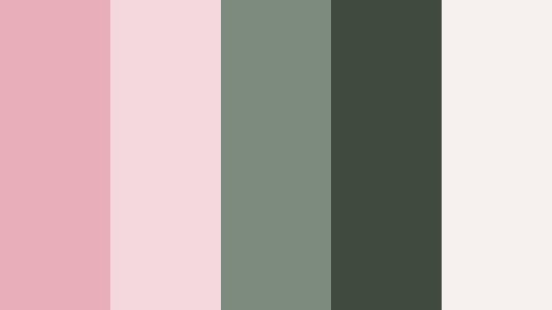
 Gemini
 Claude
 Grok
Grok
Powdered Rose is a soft, muted pink that feels gentle, nostalgic, and quietly confident. It sits between blush and dusty rose, which gives it a calm warmth without becoming too bright or childish. In color psychology, shades like Powdered Rose often communicate romance, kindness, and emotional safety, making them ideal for storytelling, lifestyle content, and brands that want to feel approachable and human.
On screen, Powdered Rose works beautifully in video backgrounds, lower thirds, YouTube thumbnails, title cards, and social intros. It flatters skin tones, pairs well with neutrals or deep accents, and instantly adds a polished, aesthetic look to vlogs, wedding highlights, and reels. Below are 15 ready-made Powdered Rose color palettes with HEX codes you can plug straight into your favorite tools and use consistently across your edits in Filmora, from color grading to motion graphics.
In this article
Soft And Romantic Powdered Rose Color Palettes
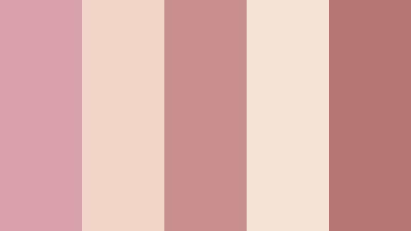
Morning Blush Whisper
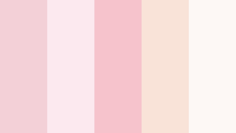
- HEX Codes: #f3d0d7, #fbe9ef, #f6c2cb, #f9e3d9, #fdf7f5
- Mood: Tender, dreamy, and quietly romantic.
- Use for: Ideal for wedding highlight videos, save-the-date animations, and soft storytelling thumbnails.
Morning Blush Whisper is a feather-light mix of Powdered Rose, milky whites, and soft peach tones. It feels like early morning light through sheer curtains, perfect when you want romance without drama. The palette is low-contrast and creamy, which keeps every frame looking smooth and flattering.
Use these HEX codes in your titles, lower thirds, and thumbnail backgrounds to create a consistent romantic identity for wedding films, engagement announcements, and couple vlogs. In Filmora, you can apply these colors to text, shapes, and overlays so your intros, transitions, and end screens all share the same soft Powdered Rose glow.
Pro Tip: Build a Cinematic Powdered Rose Glow in Filmora
To keep a Morning Blush Whisper vibe across an entire edit, create a simple style guide inside Filmora. Set your main Powdered Rose as the hero color for titles and subtitles, then use the lighter tints for backgrounds and panels. Save these as custom presets so every new sequence, from wedding highlights to Instagram reels, automatically follows the same soft, romantic look.
For B-roll and detail shots, lightly lower contrast and push warmth to match the Powdered Rose mood. When you add overlays like vignette or soft light textures, keep them subtle so skin tones stay natural, but everything still feels wrapped in the same gentle blush atmosphere.
AI Color Palette
If you already have a reference frame, moodboard, or color card based on Morning Blush Whisper, you can quickly spread that Powdered Rose style across your entire video. Filmora's AI Color Palette feature analyzes your reference colors and transfers the look to other clips with just a few clicks.
Import your hero shot with the perfect blush tones, select it as your source, then let AI Color Palette match the rest of your footage. This keeps your intros, vows, first-dance shots, and social cutdowns all aligned with the same delicate Powdered Rose palette without tedious manual grading.
 secure download

HSL, Color Wheels & Curves
Once your base Powdered Rose look is in place, use HSL controls to gently refine it. Slightly desaturate reds and magentas so the palette stays soft rather than candy-bright, and nudge the hue of pinks toward a warmer, peachy side to keep skin tones flattering. Color wheels let you warm the midtones while keeping highlights creamy and shadows neutral for a cinematic finish.
If you want more control, adjust curves to lift the shadows a touch and soften contrast, echoing the airy softness of Morning Blush Whisper. You can see how these tools shape a filmic aesthetic in Filmora's color grading tutorials on YouTube, then apply the same approach to your Powdered Rose projects.
secure download1000+ Video Filters & 3D LUTs
To speed up your Powdered Rose workflow, combine these HEX codes with Filmora's ready-made looks. Filmora's video filters and 3D LUTs make it easy to add soft bloom, pastel fades, or vintage warmth that blend beautifully with Morning Blush Whisper. This is especially useful when you need to deliver wedding highlights, Reels, and teaser clips in a tight schedule.
Choose a gentle pastel or romantic LUT, then fine-tune the intensity so the filter supports your Powdered Rose palette instead of overpowering it. You can save your favorite combinations as presets, so every new Powdered Rose project starts with a polished, cinematic base in seconds.
secure downloadVintage Love Letters
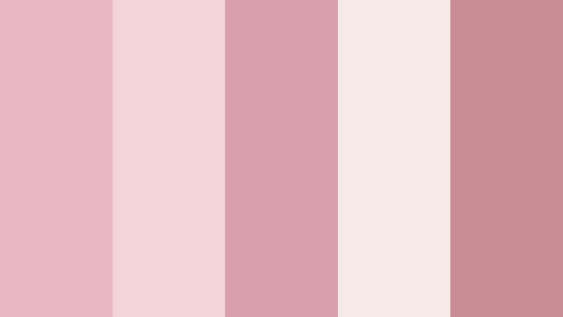
- HEX Codes: #e8b5c2, #f3d5d8, #d9a0aa, #f7e9e4, #c98c95
- Mood: Nostalgic, sentimental, and softly faded.
- Use for: Beautiful for cinematic title cards, nostalgic montage sequences, and romantic lyric videos.
Vintage Love Letters leans into slightly dustier rose tones mixed with creamy neutrals, mimicking the look of aged paper and faded ink. The palette feels sentimental and intimate, like a box of old photos or handwritten notes tied with ribbon.
Use it for story-driven edits, lyric videos, or relationship montages where you want to convey memory and time. In your thumbnails and title cards, place deeper rose shades behind text and use the lighter creams for borders, frames, and overlays so everything reads clearly while keeping that soft, vintage Powdered Rose mood.
Rose Petal Daydream
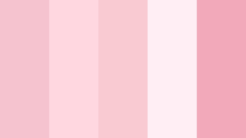
- HEX Codes: #f4c3cf, #ffd7e0, #f9cad2, #ffeef3, #f2a9b9
- Mood: Airy, flirtatious, and lighthearted.
- Use for: Perfect for lifestyle vlogs, fashion lookbooks, and playful product promos.
Rose Petal Daydream is full of soft, candy-like blush tones that stay pastel but still feel lively. The mix of warm pinks and airy highlights creates a modern romantic vibe that suits beauty, fashion, and everyday aesthetic content.
Apply the brighter shades to key elements like call-to-action buttons, subscribe stickers, or product highlights, and reserve the palest pinks for backgrounds and negative space. On YouTube thumbnails and Reels covers, this palette instantly signals feminine, upbeat content while remaining cohesive with Powdered Rose as the star.
Blushing Wedding Glow
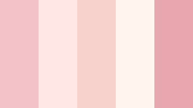
- HEX Codes: #f2c0c9, #ffe6e7, #f7d3cc, #fef4f0, #e5a6ad
- Mood: Elegant, joyful, and celebratory.
- Use for: Tailored for wedding highlight films, bridal brand intros, and event reels.
Blushing Wedding Glow combines Powdered Rose with soft ivory and warm coral notes, echoing bouquets, champagne, and late-afternoon light. It feels elevated and intentional, which is perfect for premium wedding studios and bridal brands.
Use it for title openers, chapter cards, and animated lower thirds in your wedding edits. The deeper rose tones frame important text like names and dates, while the lighter creams keep the overall design luxurious and clean. On social media, repeating this palette across highlight covers and teaser clips builds a recognizable bridal aesthetic.
Sepia Rose Memory
- HEX Codes: #d9a2ab, #f1d4c8, #c78d8f, #f6e4d9, #b57776
- Mood: Warm, nostalgic, and cinematic.
- Use for: Great for story-driven short films, travel diaries, and reflective vlogs.
Sepia Rose Memory layers Powdered Rose with muted browns and tan sepia accents, giving footage a filmic, memory-soaked look. It feels like an old photo album where rose tones and warm paper live side by side.
This palette works well for reflective voiceover pieces, slow travel diaries, or narrative shorts. Use the darker browns for subtle borders, frames, or lower thirds, and the rose shades for text, light leaks, or overlays. In thumbnails and cover art, this combination instantly signals warmth and nostalgia without looking too retro.
Pastel And Airy Powdered Rose Color Palettes
Cotton Candy Skies

- HEX Codes: #f7c7d8, #ffe1f0, #f6d5ff, #c8e5ff, #fdf8ff
- Mood: Playful, dreamy, and youthful.
- Use for: Perfect for playful intros, animated explainers, and kids or family content branding.
Cotton Candy Skies mixes Powdered Rose with lilac, baby blue, and marshmallow whites to echo pastel sunsets and carnival treats. The palette feels fun and dreamy, making it ideal for kid-friendly channels, wholesome family vlogs, and whimsical animations.
Use the cooler blues for contrast in text or icons while Powdered Rose handles buttons, highlights, and transitions. On YouTube and TikTok covers, this blend gives your channel a soft, pastel identity that still feels energetic and modern.
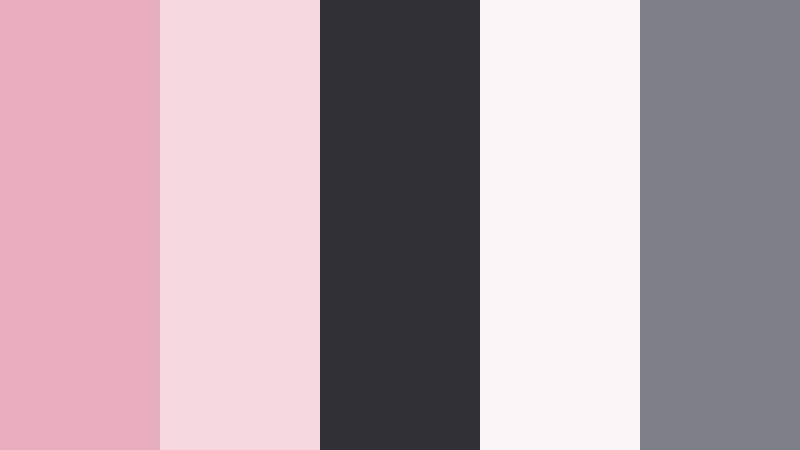
Cloud Soft Studio

- HEX Codes: #f3c1cd, #f8dde5, #e4eef6, #ffffff, #cbd5e1
- Mood: Clean, soft, and minimal with a cozy twist.
- Use for: Ideal for studio tour videos, creator brand kits, and minimalist lifestyle channels.
Cloud Soft Studio pairs Powdered Rose with cool misty blues, white, and light gray. It keeps things minimal and tidy while still feeling warm enough for personal content. The balance of warm and cool makes it versatile for creators who show both on-camera moments and screen recordings.
Use the rose tones as accent colors for titles, subscribe lower thirds, and icons, while whites and blues support background panels and overlays. This approach keeps your video layouts clean and readable for tutorials, studio tours, and productivity content, while still carrying a signature Powdered Rose touch.
Petal And Porcelain

- HEX Codes: #f0c0c9, #fbeff1, #f4e0d7, #e2d6cf, #f7f3f0
- Mood: Delicate, refined, and calming.
- Use for: Works well for skincare promos, ASMR visuals, and calm aesthetic reels.
Petal And Porcelain leans into spa-like calm with Powdered Rose, porcelain beige, and gently warmed whites. It feels soft, slow, and luxurious, making it a natural fit for skincare, beauty, and self-care content.
Use these tones for subtle animated text, product callouts, and soft borders that never distract from the visuals. On thumbnails, combine a beige or ivory background with Powdered Rose text and small product photos to instantly suggest a premium yet approachable beauty brand.
Pastel Cafe Corner

- HEX Codes: #f3b9c4, #ffe1d5, #f7f0e5, #d6e8df, #f5faf7
- Mood: Cozy, social, and softly energetic.
- Use for: Great for cafe vlog aesthetics, brunch content, and lifestyle thumbnails.
Pastel Cafe Corner combines Powdered Rose with minty green and latte creams to capture the feeling of a bright coffee shop. It is cozy and social without being overwhelming, perfect for brunch vlogs, travel diaries, and lifestyle chats.
Use the soft green as a subtle accent on icons or line elements, while Powdered Rose frames text and key objects like coffee cups or plates. This palette is great for Instagram Reels covers, YouTube community posts, and channel branding that centers around food, conversation, and laid-back city life.
Blossom Notebook Aesthetic

- HEX Codes: #f4c3ce, #ffe6f0, #f9f3ff, #d7e6ff, #f2f5fb
- Mood: Studious, gentle, and aesthetically organized.
- Use for: Ideal for study vlogs, Notion tutorials, and digital planning content.
Blossom Notebook Aesthetic mirrors popular studygram colors, mixing Powdered Rose with lavender and pale blue notebook shades. It gives your content a tidy, organized feel that still feels soft and calming.
Use the cooler tones for charts, UI overlays, and screen recording callouts, with Powdered Rose reserved for headings, progress bars, and key highlights. On thumbnails and chapter cards, this palette instantly signals productivity content that is aesthetic but not chaotic.
Elegant And Modern Powdered Rose Color Palettes
Blush And Charcoal Luxe
- HEX Codes: #e3aeb9, #f3d7dd, #2f3136, #faf4f5, #7c8187
- Mood: Sophisticated, confident, and design-forward.
- Use for: Great for brand intros, tech-meets-fashion promos, and premium course launches.
Blush And Charcoal Luxe contrasts soft Powdered Rose with deep charcoal grays. This mix feels premium, editorial, and intentional, making it excellent for brands that sit between tech and lifestyle or fashion and business.
Use dark charcoal backgrounds with rose-colored type for high-contrast, readable titles and lower thirds. The lighter blush and white tones can support infographic sections, testimonials, or pricing slides within your video, keeping everything sleek and upscale.
Rosy Minimal Workspace

- HEX Codes: #efbcc7, #f6e4ea, #fdfbfa, #d7dadd, #a3a6ab
- Mood: Clean, productive, and quietly feminine.
- Use for: Perfect for productivity channels, UI mockups, and SaaS product explainer videos.
Rosy Minimal Workspace balances warm Powdered Rose accents with cool gray and white. It feels like a calm, tidy desk setup, ideal for productivity, app walkthroughs, and workflow tutorials.
Apply the gray tones to UI mockups and screen overlays while using Powdered Rose sparingly for buttons, highlight boxes, and key metrics. This maintains a professional feel while giving your brand a subtle, recognizable tint that stands out from standard blue tech palettes.
Editorial Rose Noir
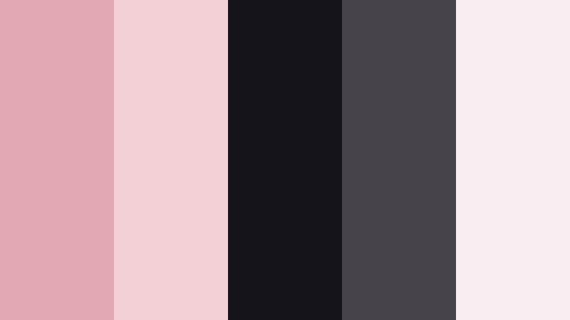
- HEX Codes: #e2a9b4, #f3cfd6, #15141a, #46434b, #f6eef0
- Mood: Moody, editorial, and dramatic.
- Use for: Ideal for fashion films, lookbooks, and cinematic trailers.
Editorial Rose Noir pits Powdered Rose against inky blacks and smoky grays, giving a moody, high-fashion feel. It is dramatic but still soft around the edges, making it great for fashion, beauty, or cinematic channel branding.
Use black or deep gray backgrounds with rose-toned typography and accent lines. In thumbnails, place a cut-out subject against a dark backdrop, then frame them with light rose panels or titles for a striking, magazine-style composition.
Bold And Expressive Powdered Rose Color Palettes
Sunset Studio Pop

- HEX Codes: #f2a3b2, #ffbfa0, #ffdf8a, #ff8c7a, #ffe9e5
- Mood: Energetic, fun, and warm like a golden-hour party.
- Use for: Great for upbeat channel trailers, music videos, and energetic social ads.
Sunset Studio Pop pushes Powdered Rose into a bolder, more saturated territory with tangerine and golden yellow. It feels like a lively sunset, perfect for dance edits, pop music videos, and high-energy channel intros.
Use the brighter yellows and oranges behind bold typography or for animated shapes that move with the beat. Powdered Rose can anchor your logo, main titles, and key callouts so even in a busy frame, your brand color still stands out.
Neon Sign Blush
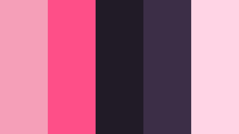
- HEX Codes: #f3a0b8, #ff4f88, #201b24, #3c2e47, #ffd5e5
- Mood: Urban, edgy, and nightlife-inspired.
- Use for: Perfect for club promos, dance edits, and bold title sequences.
Neon Sign Blush turns Powdered Rose into a nightlife star by pairing it with neon magenta and deep plum shadows. It feels like glowing signage against a dark city alley, ideal for club promos, choreography videos, and edgy intros.
Use the darkest shades for backgrounds and drop shadows, then apply the neon pinks to stroke effects around text, animated outlines, and motion graphics details. In thumbnails, a dark base with neon rose titles instantly communicates energy and attitude.
Rose And Sage Storyboard
- HEX Codes: #e8aeb9, #f3d9de, #7c8b7b, #3f4b3c, #f6f1ef
- Mood: Grounded, artistic, and narrative-focused.
- Use for: Works well for documentary-style edits, brand stories, and cinematic thumbnails.
Rose And Sage Storyboard balances Powdered Rose with earthy sage greens and off-whites. It is soft but grounded, giving a poetic, documentary feel that works well for brand stories, creative portfolios, and slower narrative pieces.
Use the sage tones for background blocks, sidebars, and subtle graphics, with Powdered Rose drawing attention to titles, quotes, and key timestamps. On thumbnails, this combo feels artistic and intentional, helping your videos stand out from typical saturated color schemes.
Tips for Creating Powdered Rose Color Palettes
Powdered Rose is flexible and forgiving, but it works best when you balance it carefully with neutrals, contrast, and accent shades. Here are practical tips to keep your color choices beautiful and usable in video and design.
- Pair Powdered Rose with soft neutrals like ivory, beige, or light gray for backgrounds so your frames feel airy, not cluttered.
- Add a deeper anchor color (charcoal, sepia brown, or Dark Moss Green) for text or key UI elements to ensure readability on small screens.
- Limit your main palette to 3 to 5 active colors: one hero Powdered Rose, one dark accent, and a couple of light support tones.
- Check contrast on mobile by previewing your thumbnails small; if text disappears, darken the background or lighten the type color.
- Keep branding consistent by reusing the same HEX codes across intros, lower thirds, end screens, and social graphics.
- When matching footage to your palette, gently adjust white balance and saturation so skin tones stay natural while backgrounds lean toward your Powdered Rose scheme.
- Use bolder complementary accents (like warm gold or muted green) sparingly to highlight CTAs or important diagrams without overwhelming the main rose tone.
- Create and save presets in your editor so you can apply the same Powdered Rose color grading and text styles across entire series or playlists.
Powdered Rose color palettes can make your videos feel romantic, trustworthy, and instantly recognizable. Whether you lean into soft wedding aesthetics, pastel study vibes, or edgy editorial contrasts, this gentle pink can become a strong part of your visual identity.
Try these 15 palettes as starting points for your thumbnails, intros, overlays, and color grading. By keeping your HEX codes consistent and refining the look with Filmora, you can shape a cohesive style that your audience remembers from one upload to the next.
Load your favorite Powdered Rose palette into Filmora, experiment with AI tools, grading controls, and filters, and build a signature look that fits your story, brand, or channel niche across every platform.
secure download