
 100% Security Verified | No Subscription Required | No Malware


 ChatGPT
 Perplexity
 Gemini
 Claude
 Grok
Grok
Purple turquoise sits right between cool ocean blues and dreamy violets. It feels imaginative, modern, and a little bit mystical, which is why so many creators use it for YouTube intros, vlogs, overlays, and gaming visuals. The combination suggests creativity and calm at the same time, making it perfect for channels that want to feel fresh, artistic, and trustworthy rather than loud or aggressive.
In video branding, a purple turquoise color palette works beautifully on titles, lower thirds, channel banners, and thumbnails. It can signal techy sophistication, soft pastel aesthetics, or neon nightlife vibes depending on the tones you choose. Below are 15 ready made purple turquoise color palettes with HEX codes, plus ideas on how to use each in Filmora for intros, transitions, effects, and more.
In this article
Soft & Dreamy Purple Turquoise Palettes
Seaside Lavender Haze
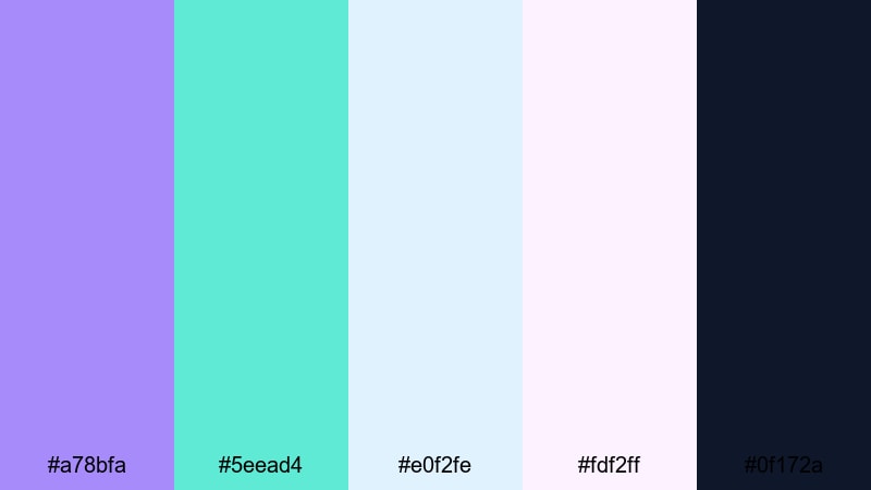
- HEX Codes: #a78bfa, #5eead4, #e0f2fe, #fdf2ff, #0f172a
- Mood: Calm, airy, and slightly nostalgic like a misty morning by the ocean.
- Use for: Ideal for relaxing vlog intros, wellness content, and dreamy travel recap titles.
Seaside Lavender Haze blends soft lavender with hazy turquoise and cloud like pastels. It feels peaceful and a little nostalgic, like rewinding a slow morning walk by the sea. The deep navy accent (#0f172a) adds just enough contrast so your text and icons still pop on thumbnails or end screens.
Use this palette for meditation videos, morning routines, or aesthetic B roll sequences. In Filmora, you can build matching title cards, subscribe animations, and chapter overlays that all share this same dreamy purple turquoise look, keeping your channel identity calm and coherent.
Pro Tip: Build a Cinematic Purple Turquoise Look in Filmora
When you use a palette as gentle as Seaside Lavender Haze, consistency across your edit is everything. In Filmora, pick one hero shade (for example the lavender #a78bfa) for titles and main text, and use the light turquoise and pastel whites as background blocks, shape layers, or lower third panels. Add the navy tone sparingly for outlines, drop shadows, or key icons to keep everything easy to read on both mobile and desktop.
Save your favorite combinations as custom presets for titles and transitions in Filmora. That way, your vlog intro, B roll labels, and social cutdowns all share the same soft purple turquoise identity without you manually rebuilding the look every time.
AI Color Palette
If you have a reference image of a misty shoreline or a lavender sky, you can turn it into a full video look in a few clicks. Filmora's AI Color Palette feature lets you sample that purple turquoise mood from one clip and apply it consistently across the rest of your timeline.
Import a still frame or color card that matches Seaside Lavender Haze, then use AI Color Palette to harmonize your A roll, B roll, and cutaways. Skin tones stay natural, while your highlights and shadows pick up the same lavender turquoise tint, making the whole edit feel like it belongs in the same world.
 secure download

HSL, Color Wheels & Curves
To push your purple turquoise look a little more cinematic, tweak it with HSL, color wheels, and curves in Filmora. Slightly desaturate blues and cyans, then lift the midtones in the color wheels toward lavender for a soft film like glow. You can deepen the shadows with a gentle S curve while keeping highlights creamy and pastel.
If you want a step by step walkthrough, watch this Filmora color grading tutorial on YouTube while experimenting with your own purple turquoise footage. Apply your adjustments as a preset, then reuse it for intros, reels, and shorts so your audience instantly recognizes your aesthetic.
secure download1000+ Video Filters & 3D LUTs
If you want to stylize your purple turquoise palettes even faster, start with Filmora's built in looks. Filmora's video filters and 3D LUTs make it easy to add glow, haze, or retro film contrast on top of your base colors. Choose gentle pastel filters for Seaside Lavender Haze, or mix in subtle grain LUTs for a dreamy, cinematic finish.
Apply a filter to an adjustment layer above your edit so every clip shares the same final polish. You still keep the core lavender and turquoise tones, but with a consistent professional finish that ties together intros, main content, outros, and Shorts or Reels exports.
secure downloadCotton Candy Tide
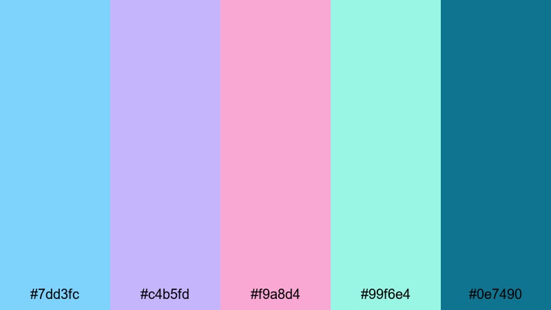
- HEX Codes: #7dd3fc, #c4b5fd, #f9a8d4, #99f6e4, #0e7490
- Mood: Sweet, whimsical, and playful with a soft pastel glow.
- Use for: Perfect for lifestyle vlogs, cute channel branding, and playful lower thirds.
Cotton Candy Tide mixes pastel turquoise, lilac, and pink into a sugar soft blend that feels like candy skies over the ocean. It is youthful and optimistic, with the deeper teal #0e7490 anchoring the palette so it does not feel too washed out on screen.
Use it for lifestyle vlogs, stationery or studytube videos, K pop inspired edits, and playful lower thirds. In Filmora, pair the lighter tones for backgrounds and overlays, then drop the teal into text, borders, and icons for easy to read titles and thumbnails.
Twilight Mermaid Glow
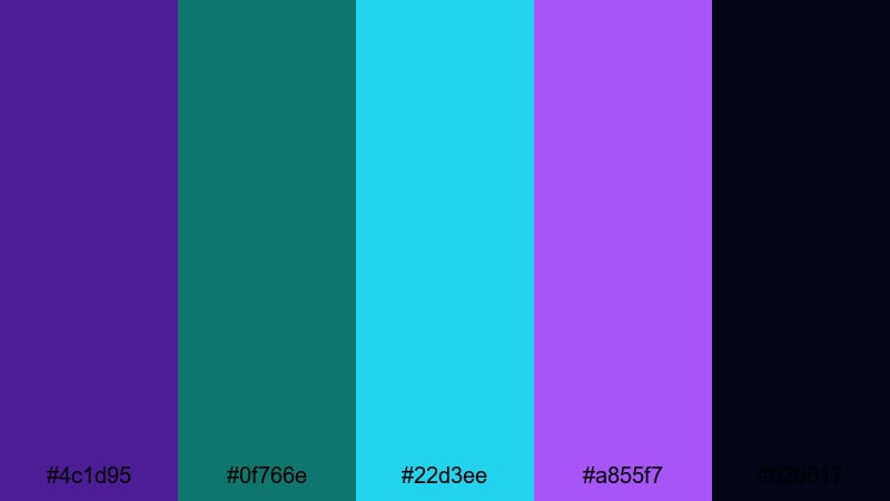
- HEX Codes: #4c1d95, #0f766e, #22d3ee, #a855f7, #020617
- Mood: Mystical and cinematic with a deep underwater fantasy feel.
- Use for: Great for fantasy edits, gaming highlights, and dreamy channel trailers.
Twilight Mermaid Glow dives into richer purples and glowing turquoise, balanced with a near black navy. The palette feels like bioluminescent light under deep water, ideal if you want your visuals to feel magical, game like, or slightly surreal.
Use the dark background color for title cards and outro slates, then let the turquoise and violet accents shine in animated text, glowing borders, or HUD style graphics. It works especially well for fantasy edits, RPG or MMO gaming highlights, and channel trailers with a cinematic purple turquoise twist.
Foggy Harbor Pastels
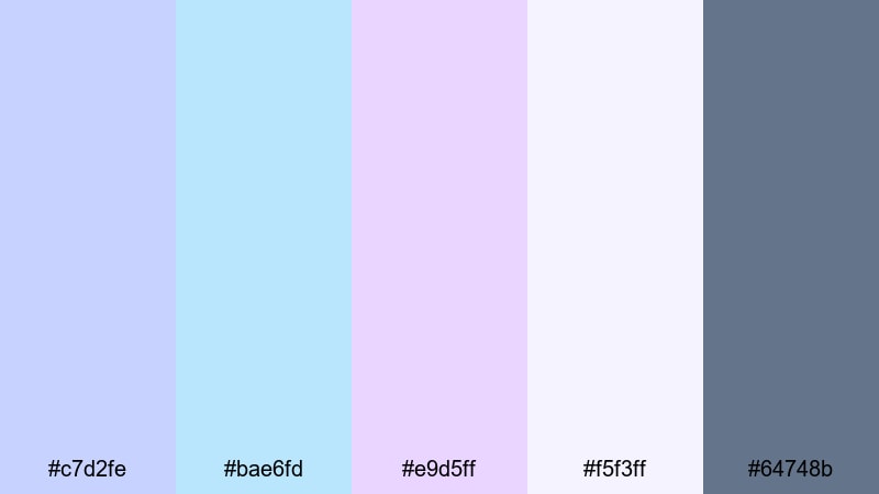
- HEX Codes: #c7d2fe, #bae6fd, #e9d5ff, #f5f3ff, #64748b
- Mood: Gentle, quiet, and introspective with a misty seaside mood.
- Use for: Best for cinematic travel diaries, calm voiceover segments, and soft overlays on B roll.
Foggy Harbor Pastels is made of muted purples, misty turquoise, and cool grays that feel like a quiet dock wrapped in fog. It is subtle and sophisticated, great when you want a soft wash of color without overwhelming your footage.
Use this palette for travel diaries, cinematic B roll, or reflective storytelling. In your Filmora project, combine these tones in lower thirds, chapter markers, and on screen captions so they stay legible but never distract from your images.
Bold & Neon Purple Turquoise Palettes
Electric Reef Night
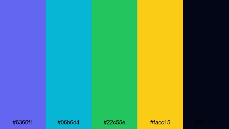
- HEX Codes: #6366f1, #06b6d4, #22c55e, #facc15, #020617
- Mood: High energy and punchy, like neon lights over dark water.
- Use for: Perfect for high tempo edits, tech promos, and bold gaming thumbnails.
Electric Reef Night throws saturated indigo, neon turquoise, lime green, and golden yellow against a nearly black base. The result feels like a cyberpunk reef or a city skyline reflected on midnight water, packed with contrast and energy.
Use the dark tone as your primary background for intros, outros, and full screen captions, then layer neon purple and turquoise on titles, progress bars, and animated callouts. It is an ideal purple turquoise palette for gaming thumbnails, tech product promos, or any edit that needs to grab attention in a split second.
Arcade Vapor Wave
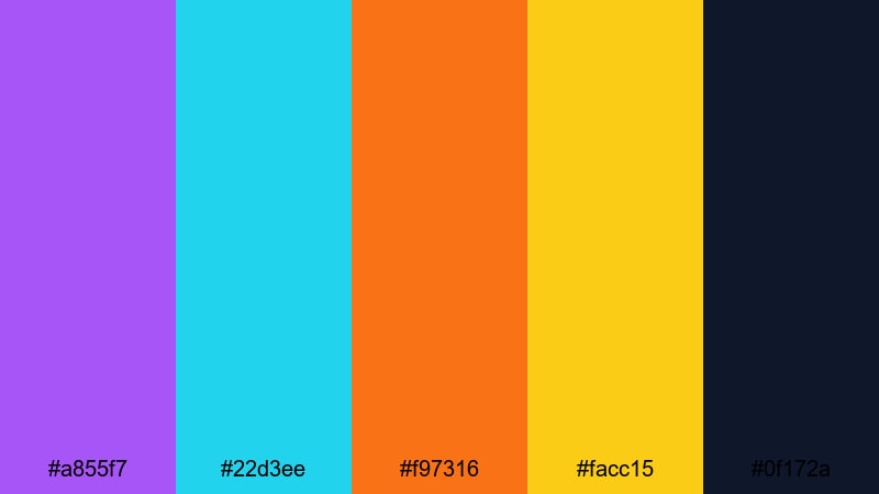
- HEX Codes: #a855f7, #22d3ee, #f97316, #facc15, #0f172a
- Mood: Retro futuristic with a nostalgic arcade glow.
- Use for: Great for retro edits, channel intros, and kinetic typography that needs strong contrast.
Arcade Vapor Wave mixes vivid purple and turquoise with hot orange and neon yellow, grounded by a deep navy. It builds an instant 80s or early 90s arcade feel, ideal if your channel leans into synthwave, lo fi beats, or retro gaming.
In Filmora, use purple and turquoise for main title text, with orange and yellow as accent lines, glitch blocks, or animated outlines. This palette works perfectly for kinetic typography, countdown screens, and bold lower thirds in neon themed edits.
Cyber Lagoon Pulse
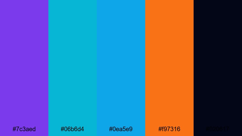
- HEX Codes: #7c3aed, #06b6d4, #0ea5e9, #f97316, #020617
- Mood: Techy, pulsing, and intense like a futuristic city by the water.
- Use for: Ideal for app promos, motion graphics, and fast cut edits with glitch effects.
Cyber Lagoon Pulse leans into electric purples and bright lagoon blues, with a punch of orange for urgency. Set on a dark background, the palette feels fast, digital, and slightly futuristic, perfect for high tech brands or UI heavy edits.
Use it in app demos, SaaS explainers, or motion graphics packages. In your video editor, apply turquoise to interface shapes and purple to headings, then use orange for key buttons, CTAs, or subscribe prompts so they stand out instantly.
Ultraviolet Surf Pop
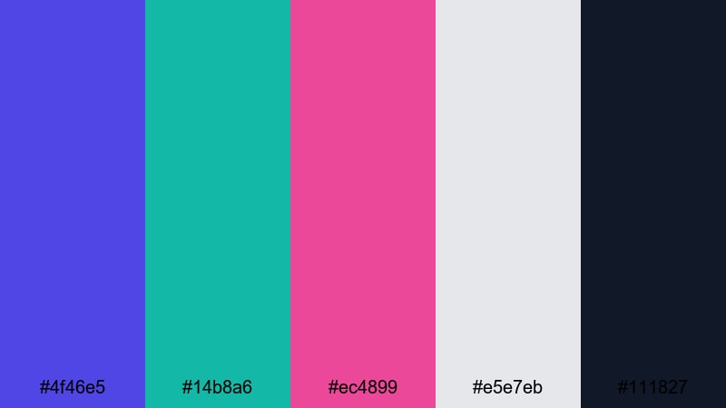
- HEX Codes: #4f46e5, #14b8a6, #ec4899, #e5e7eb, #111827
- Mood: Trendy and bold, mixing surf culture with nightclub neon.
- Use for: Perfect for music videos, festival recaps, and fashion lookbooks with attitude.
Ultraviolet Surf Pop brings together ultraviolet purple, saturated turquoise, and hot pink, balanced with clean neutrals. It feels like a beach party that keeps going into the neon lit night, energetic but still stylish.
Use the light gray background for captions and info cards, purple or turquoise for main titles, and hot pink as a highlight color for key words or animated shapes. It is great for music videos, festival recaps, and fashion reels where you want color to hit hard without sacrificing readability.
Elegant & Modern Purple Turquoise Palettes
Metro Glass Skyline
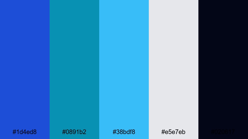
- HEX Codes: #1d4ed8, #0891b2, #38bdf8, #e5e7eb, #020617
- Mood: Sleek, polished, and urban with a cool corporate edge.
- Use for: Great for tech explainers, brand intros, and minimal lower thirds in professional videos.
Metro Glass Skyline combines refined blues and turquoise with soft gray and deep black, echoing glass buildings at dusk. It feels professional and modern, ideal for brands that want a cool tech vibe without going full neon.
Use the light gray for presentation backgrounds, turquoise for icons and graphs, and navy for headings. In Filmora, this palette works perfectly for clean logo stings, animated infographics, and corporate lower thirds in purple turquoise adjacent tones.
Opulent Aurora Lounge
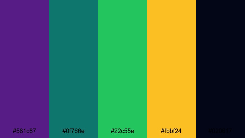
- HEX Codes: #581c87, #0f766e, #22c55e, #fbbf24, #020617
- Mood: Luxurious and moody like a high end cocktail bar under northern lights.
- Use for: Perfect for luxury product shots, cinematic trailers, and stylish brand bumpers.
Opulent Aurora Lounge pairs deep royal purple with emerald turquoise and golden accents on a dark base. It feels luxurious and dramatic, like ambient light in a premium bar or boutique hotel.
Use the purple for main backgrounds or title cards, turquoise and green for supporting shapes, and gold for headlines, price tags, or CTA text. This palette shines in product videos, brand trailers, and elegant openers where you want a rich purple turquoise atmosphere.
Sleek Studio Gradient
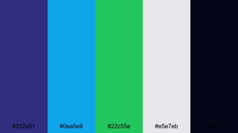
- HEX Codes: #312e81, #0ea5e9, #22c55e, #e5e7eb, #020617
- Mood: Modern, fresh, and balanced with a studio ready gloss.
- Use for: Ideal for YouTube channel branding, clean infographics, and tech reviews.
Sleek Studio Gradient blends cool purple with bright turquoise and fresh green, supported by crisp neutrals. It feels like a modern studio setup, polished but not cold, and works across both light and dark UI styles.
Use it for channel branding, tech review templates, or tutorial overlays. In your editor, build gradients from purple to turquoise for backgrounds and use the neutral tones for text, ensuring your purple turquoise accent colors stay the hero.
Velvet Ocean Suite
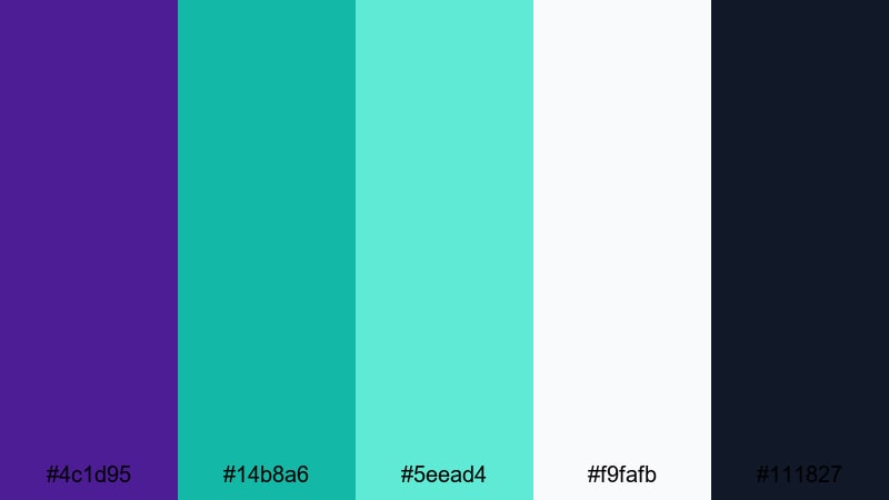
- HEX Codes: #4c1d95, #14b8a6, #5eead4, #f9fafb, #111827
- Mood: Calm yet upscale, like a boutique hotel overlooking the sea.
- Use for: Best for brand films, portfolio reels, and elegant slide transitions.
Velvet Ocean Suite uses velvety purple and layered turquoise on soft white and charcoal. It feels calm, expensive, and cinematic, like a private suite with an ocean view.
Use the off white as a clean canvas for portfolio pieces or case studies, then bring in purple and turquoise for headings, section dividers, and motion graphic accents. It is great for brand films, designers' showreels, and elegant slide style transitions in purple turquoise themes.
Pastel & Playful Purple Turquoise Palettes
Bubblegum Reef Party
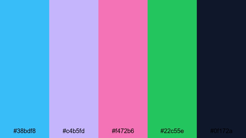
- HEX Codes: #38bdf8, #c4b5fd, #f472b6, #22c55e, #0f172a
- Mood: Fun, bubbly, and upbeat with a candy colored reef vibe.
- Use for: Great for kids content, party highlights, and energetic vlog thumbnails.
Bubblegum Reef Party mixes bright turquoise, bubblegum pink, and soft lilac with a pop of green, grounded by deep navy. It feels like confetti floating in clear water, bright and joyful.
Use this palette for kids content, birthday montages, and high energy vlogs. In your thumbnails, let turquoise or pink handle the main text, while lilac and green appear in shapes and stickers. The navy tone keeps titles sharp and readable even with all the playful purple turquoise accents around them.
Pastel Pixel Splash
- HEX Codes: #a5b4fc, #7dd3fc, #f9a8d4, #bbf7d0, #1f2937
- Mood: Soft and playful with a slightly digital, gamer inspired twist.
- Use for: Perfect for cozy gaming channels, casual tutorials, and playful overlay packs.
Pastel Pixel Splash combines pastel purple, turquoise, and pink with mint and charcoal. It feels cute and digital at the same time, like a cozy indie game or pixel art UI.
Use it for gaming overlays, casual tutorial layouts, or streaming scenes. In Filmora, set the dark charcoal as the base for text, then sprinkle pastel blocks, pixel borders, and button shapes in the lighter purple turquoise hues around your footage.
Candy Coast Daydream
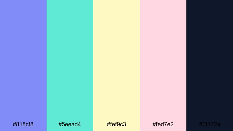
- HEX Codes: #818cf8, #5eead4, #fef9c3, #fed7e2, #0f172a
- Mood: Sunny, dreamy, and optimistic like a pastel beach fantasy.
- Use for: Ideal for summer vlogs, travel intros, and upbeat product promos.
Candy Coast Daydream blends soft periwinkle, bright turquoise, creamy yellow, and blush pink against a deep navy accent. It feels sunny and carefree, like a pastel beach afternoon frozen in time.
Use this purple turquoise palette for summer vlogs, travel intros, and fun product promos. In your edits, let the warm yellow and pink handle highlights and buttons, while purple and turquoise take care of titles, transitions, and animated borders that tie every scene into one cheerful aesthetic.
Tips for Creating Purple Turquoise Color Palettes
Whether you choose soft pastels or electric neon, a good purple turquoise palette should balance mood, contrast, and brand consistency. Keep these practical tips in mind when designing for video, thumbnails, and channel graphics.
- Pick one dominant hue: Choose either purple or turquoise as your hero color, then let the other support it in accents, gradients, or UI elements.
- Use dark neutrals for text: Deep navy or charcoal usually works better than pure black, giving enough contrast without looking harsh on pastel backgrounds.
- Limit high saturation: For cinematic edits, keep only one or two colors highly saturated and soften the rest using HSL controls so the image does not feel overwhelming.
- Test on mobile thumbnails: Export a mock thumbnail from Filmora and check it at small sizes; if your purple turquoise text is hard to read, darken the background or add solid blocks behind lettering.
- Match footage temperature: If your video is very warm (sunsets, indoor lamps), lean into warmer purples and turquoise; for cool cityscapes or tech content, use bluer versions of the same palette.
- Reuse colors across assets: Apply the same HEX codes to titles, lower thirds, subscribe animations, and end screens so your viewers instantly recognize your brand.
- Add one accent color: Many purple turquoise palettes benefit from a single accent (gold, pink, or lime) used sparingly for CTAs, progress bars, or key icons.
- Save presets in your editor: Once you dial in your palette for text styles, overlays, and filters, save them as presets so every new video feels visually consistent.
Purple turquoise color palettes are powerful tools for shaping mood, from calm seaside vlogs to neon gaming highlights and polished brand intros. By choosing the right mix of purples, turquoises, and supporting tones, you can make your videos feel instantly more intentional and recognizable.
Use these 15 palettes as a starting point, then fine tune them in Filmora with AI Color Palette, HSL controls, and filters that match your footage. The more consistently you apply your colors across thumbnails, titles, overlays, and transitions, the stronger your visual identity becomes.
Open a new project, drop in one of these palettes as your guide, and start experimenting. With a cohesive purple turquoise look, your intros, shorts, and full length videos can all tell the same visual story.
secure downloadNext: Pine Green Color Palette
