
 100% Security Verified | No Subscription Required | No Malware


 ChatGPT
 Perplexity
 Gemini
 Claude
 Grok
Grok
Silver Sage sits between soft green and muted gray, which is why it instantly feels calm, grounded, and refined. It is often linked with nature, mindfulness, and slow living, so it works beautifully for creators who want their visuals to feel soothing rather than loud. On screen, Silver Sage can soften harsh highlights, flatter skin tones, and make text overlays look premium without being overly formal.
For video creators and designers, Silver Sage is a go to color for YouTube thumbnails, intros, lower thirds, and channel branding. It pairs well with neutrals, warm skin friendly tones, and cinematic charcoals, making it easy to adapt to vlogs, tutorials, and aesthetic edits. Below you will find 15 Silver Sage color palettes with HEX codes you can apply directly in Filmora for color grading, graphics, and cohesive brand systems.
In this article
Calm & Minimal Silver Sage Color Palettes
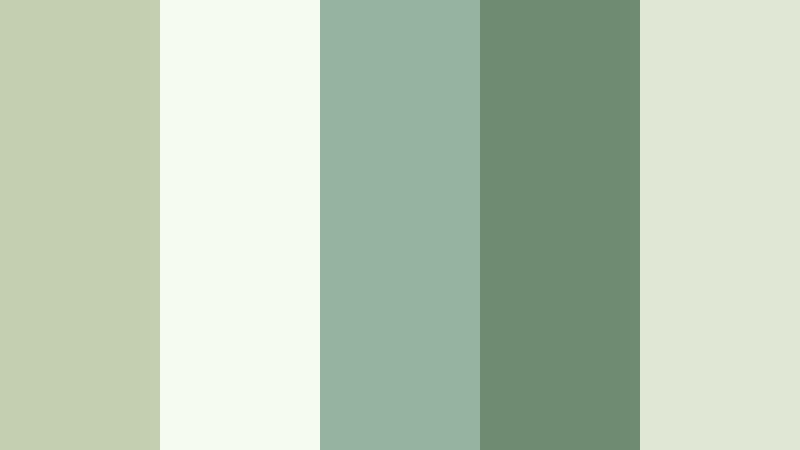
Morning Meadow Calm

- HEX Codes: #c2c7b5, #e5ebdd, #8f9480, #f7f8f3, #5f6556
- Mood: Tranquil and airy, like a quiet walk through dew covered grass.
- Use for: Ideal for minimalist vlog intros, lifestyle B-roll overlays, and soft spoken tutorial graphics.
This palette is a light, misty mix of Silver Sage with soft neutrals. The pale greens and off whites create a gentle wash over your visuals, while the deeper sage and muted charcoal add just enough structure for text and icons. It feels fresh but never loud, perfect for channels that lean into mindfulness, journaling, or peaceful routines.
Use Morning Meadow Calm for clean YouTube thumbnails, simple intro slates, and lower thirds that do not distract from your face or voice. The slightly darker tones (#8f9480 and #5f6556) are ideal for headlines or buttons, while the lighter shades keep backgrounds bright for productivity screens, desktop shots, and B roll overlays.
Pro Tip: Enhance Your Silver Sage Visuals With Filmora
To keep a soft Silver Sage look consistent from intro to end screen, build a simple color system in Filmora. Use one or two of the darker HEX values for titles and subscribe buttons, and reserve the lightest tones for backgrounds and subtle frames. Once you set these colors inside Filmora for text, shapes, and overlays, save the layout as a template so every new video keeps the same calm identity.
You can also bring in screenshots of your channel page or thumbnail mockups and match your in video graphics to those colors. This way your Silver Sage branding flows naturally from thumbnails to on screen captions, b roll labels, and end cards, even when you edit short social clips from the same project.
AI Color Palette
If you already have a Silver Sage moodboard or still frame you love, you can let Filmora handle the heavy lifting. Filmora's AI Color Palette feature analyzes a reference image and automatically applies a similar palette across your clips. That means your A roll, b roll, and cutaway shots all share the same soft greens and airy whites without manual tweaking.
Simply import a still from a scene that nails your Morning Meadow Calm look, then use AI Color Palette to match other footage. It is an easy way to keep Silver Sage tones balanced across different cameras, lighting conditions, and shooting locations.
 secure download

HSL, Color Wheels & Curves
To fine tune your Silver Sage tones, use HSL, color wheels, and curves inside Filmora. Slightly lowering saturation in the greens while lifting brightness can make your palette feel more airy and minimal. Adjust the midtone color wheel toward green gray for a cohesive wash, and use curves to keep shadows soft so your footage does not become too contrasty for this calm style.
If you want a more cinematic version of Morning Meadow Calm, gently deepen the shadows and cool the highlights in Filmora's color tools. This creates subtle depth while preserving the relaxed sage mood. You can see how these tools shape a look in Filmora's color grading tutorials on YouTube, then adapt the same logic to your Silver Sage values.
secure download1000+ Video Filters & 3D LUTs
Once your basic Silver Sage balance is set, Filmora's filters and LUTs can quickly push it toward vintage, modern, or dreamy aesthetics. Soft matte filters will reinforce the calm, misty feel of Morning Meadow Calm, while subtle teal and orange LUTs can warm up skin tones without losing the sage base.
Filmora's video filters and 3D LUTs make it easy to test different moods on the same palette. Apply a LUT to a single adjustment layer above your clips so you can toggle it on and off, compare looks, and refine until your Silver Sage visuals feel just right for your channel or campaign.
secure downloadStudio Loft Neutrals
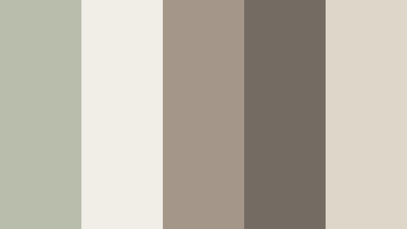
- HEX Codes: #b9beac, #f0eee6, #a4978a, #746c63, #ded7c9
- Mood: Modern, grounded, and softly sophisticated.
- Use for: Perfect for studio tour videos, product explainer layouts, and understated logo reveals.
Studio Loft Neutrals wraps Silver Sage in urban beiges and warm grays. The overall effect is modern but not cold, like a daylight studio with raw walls and soft textiles. It is ideal when you want a professional look for design, tech, or productivity content without using stark black and white.
Use the light neutrals (#f0eee6 and #ded7c9) as backgrounds for screen recordings and slides, while the richer tones (#a4978a and #746c63) define titles, logos, and call to action buttons. This palette is great for branding a series of videos, product explainers, or channel overlays that need to look polished and consistent.
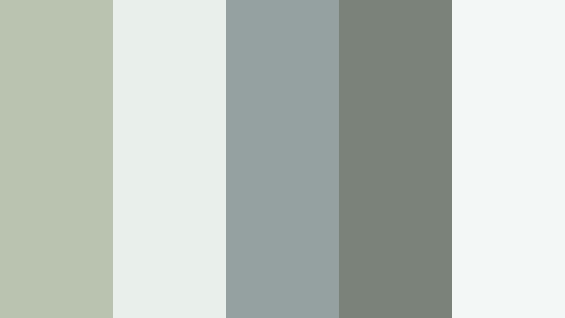
Quiet Workspace Flow

- HEX Codes: #c4cbb4, #f5f7f1, #9ba5a0, #6f7a73, #e2e7de
- Mood: Focused and contemplative, with a soft productivity vibe.
- Use for: Use for planning videos, Notion style dashboards, and clean lower thirds for tutorials.
Quiet Workspace Flow leans into cooler greens and soft grays that feel like a quiet co working corner. It keeps the frame clear and focused, which helps viewers stay with your instructions, to do lists, or planning sessions without visual noise.
Turn the lightest tones into backgrounds for calendar shots, app demos, and overlay cards, then reserve the mid and dark greens for labels, timelines, and chapter markers. This Silver Sage palette is especially strong for talking head content with many on screen notes or for channels built around studying, organizing, and digital planning.
Foggy Window Light
- HEX Codes: #bac2b0, #e9f0eb, #95a0a1, #7b827a, #f3f7f5
- Mood: Soft, hazy, and introspective, like a rainy morning in a city apartment.
- Use for: Great for cinematic vlogs, reflective voiceovers, and subtle title cards.
Foggy Window Light mixes Silver Sage with cool misty blues and smoky grays. It creates a gentle haze over your footage, perfect for reflective monologues, rainy day vlogs, or study sessions with lo fi music. The atmosphere is emotional but never heavy.
Use the lightest colors as soft gradients behind your titles, then add subtle text in the deeper shades for legibility. This palette works beautifully with slow camera moves, window reflections, and macro shots, especially when you want your edit to feel cinematic while staying clean and minimal.
Romantic & Organic Silver Sage Color Palettes
Garden Wedding Whisper

- HEX Codes: #c7ccb8, #fdf7f3, #f3d6cf, #a89f8f, #7a806c
- Mood: Softly romantic with an organic, outdoor feel.
- Use for: Perfect for wedding highlight reels, engagement announcements, and dreamy slideshow titles.
Garden Wedding Whisper pairs Silver Sage with blush and creamy ivory for a storybook romance feeling. The pastel warmth of #f3d6cf and the gentle neutrals soften the greens so everything feels airy and emotional without turning overly sugary.
Try this palette for bridal title cards, chapter markers in wedding films, and elegant lower thirds that introduce couples or locations. It is also great for engagement announcement graphics, save the date animations, and any storytelling edit that needs a natural but romantic color story.
Olive Grove Story

- HEX Codes: #b6c0a0, #e8eddc, #8e8f6e, #d2bfa2, #5c5f45
- Mood: Rustic, nostalgic, and nature soaked.
- Use for: Use for travel diaries, slow living content, and farm to table cooking videos.
Olive Grove Story leans into earthy olives and warm beige, giving your Silver Sage base a rustic, sunlit quality. It feels like walking through a Mediterranean orchard or filming at a countryside retreat, with a balance of greenery and weathered wood tones.
Use this palette for travel vlogs, slow living montages, and recipe videos that highlight fresh ingredients. The deeper green (#5c5f45) works well for text and icons over lighter backgrounds, while the warm beige shade #d2bfa2 adds a gentle sun kissed accent in frames, banners, and thumbnail borders.
Herb Garden Sketch
- HEX Codes: #c3cfb0, #f6fbf1, #94b49f, #6f8b72, #e0e8d5
- Mood: Fresh, botanical, and quietly joyful.
- Use for: Ideal for recipe cards, DIY herb garden videos, and eco friendly product promos.
Herb Garden Sketch combines Silver Sage with brighter leafy greens and very light off whites, evoking sketchbook pages filled with plant drawings. The look feels clean, organic, and uplifting, ideal for eco conscious creators or brands.
Turn the pale tints into backgrounds for ingredient callouts, plant labels, and product features, while the richer greens draw attention to key titles and icons. This palette keeps your visuals feeling fresh and honest, whether you are filming balcony gardening, zero waste tips, or natural skincare tutorials.
Vintage Linen Daydream

- HEX Codes: #c9cbb8, #fbf4eb, #e3ccb4, #a89a8a, #7b7d6a
- Mood: Softly nostalgic, like sun through old lace curtains.
- Use for: Great for poetry reels, journal style vlogs, and vintage themed lookbooks.
Vintage Linen Daydream blends Silver Sage with linen creams and soft tan, giving your work a tactile, slightly nostalgic feel. The palette is gentle enough for close ups of skin and fabrics, while still offering enough contrast for text and frames.
Use it in cinematic b roll of books, letters, and textiles, or to color grade fashion lookbooks that lean into neutral vintage styling. For thumbnails, combine the deeper neutral #a89a8a with the lighter background #fbf4eb to keep titles easy to read while preserving the daydream mood.
Modern & Cinematic Silver Sage Color Palettes
Architectural Sage Steel

- HEX Codes: #b1b8a5, #dfe4dd, #8d9395, #585e60, #202427
- Mood: Sleek, cinematic, and slightly moody.
- Use for: Perfect for architecture walkthroughs, tech product teasers, and cinematic city b-roll.
Architectural Sage Steel sets Silver Sage against cool grays and charcoal, giving a modern, structured feel to your visuals. It keeps things grounded and cinematic, like polished footage shot in a glass and concrete building.
Use the mid and dark grays for bold typography, lower thirds, and logo stings, while the lighter sage and gray tones wash backgrounds and transitions. This palette is especially strong for tech reviews, design breakdowns, and city b roll where you want a premium but restrained aesthetic.
Nordic Coastline Drift

- HEX Codes: #bcc4b2, #e6ecec, #9db0b6, #6f7e83, #2f3a3f
- Mood: Coastal, moody, and clean with a cinematic chill.
- Use for: Use in travel films, coastal drone footage, and moody study with me scenes.
Nordic Coastline Drift mixes Silver Sage with oceanic blues and deep charcoal, calling to mind misty piers and overcast shorelines. It has a quiet cinematic tension that works well for atmospheric travel films or reflective study scenes.
Let the light gray and sage tones support wide shots and text backgrounds, while the deeper blue grays add impact in transitions and title cards. In thumbnails, use the darkest shade #2f3a3f behind white or light text to make your title stand out against calm, sea toned imagery.
Urban Green Frame

- HEX Codes: #c0c9b1, #f0f3ed, #9ca89a, #59635a, #111417
- Mood: Contemporary, grounded, and subtly dramatic.
- Use for: Great for brand intros, motion graphics overlays, and stylish tutorial backgrounds.
Urban Green Frame keeps everything within a tight band of greens and charcoals, giving a strong visual identity without too many colors. The palette feels modern and grounded, ideal for brands that want to balance nature and city energy.
Use the darkest tone #111417 to frame your screen, create letterbox bars, or anchor text blocks. The lighter Silver Sage and green grays can fill backgrounds for motion graphics, data overlays, and tutorial layouts, giving your visuals a recognizable signature even in short clips.
Midnight Conservatory

- HEX Codes: #b5bfa8, #e1e6d9, #7d8c79, #39463e, #0c1411
- Mood: Lush, dramatic, and slightly mysterious.
- Use for: Ideal for cinematic color grading, teaser trailers, and moody fashion edits.
Midnight Conservatory pushes Silver Sage into a darker, more dramatic space with deep greens and near black tones. It feels like a greenhouse at night, full of shadow and subtle highlights, which is perfect for moody, fashion forward edits or cinematic trailers.
Use the deep shades (#39463e and #0c1411) for high contrast frames, title screens, and overlays, then let the lighter sage tones add pockets of light around faces or key objects. This palette is strong when you want to shift from daylight to night sequences while keeping a consistent color story.
Warm & Cozy Silver Sage Color Palettes
Sage Latte Corner

- HEX Codes: #c7cbb6, #f7f1e7, #d9c2a9, #a38a72, #6f6b5e
- Mood: Cozy, welcoming, and content creator friendly.
- Use for: Perfect for desk setup tours, coffee chats, and podcast cover art.
Sage Latte Corner blends Silver Sage with latte browns and creamy whites, creating a warm, inviting environment on screen. It is made for home office tours, chatty sit downs, and podcast visuals where you want viewers to feel like they are hanging out with you.
Lean on the light cream for backgrounds, use the mid browns for accents and lower thirds, and reserve the darker tones for titles and icons. In thumbnails, pairing Silver Sage with these warm coffee hues helps your content feel cozy and clickable without being too saturated.
Countryside Porch Glow

- HEX Codes: #c2c8b3, #fdf5e8, #f0d0a9, #ba9166, #746b57
- Mood: Golden hour warmth with a relaxed rural charm.
- Use for: Use for homestead vlogs, family highlight films, and outdoor lifestyle thumbnails.
Countryside Porch Glow uses Silver Sage as a soft anchor under honeyed neutrals and warm browns. It feels like late afternoon sun on a wooden porch, which makes it an excellent choice for family videos, outdoor lifestyle footage, and homestead content.
Use the warm peach and caramel tones (#f0d0a9 and #ba9166) to highlight key moments, buttons, or text, while the lighter hues and sage keep everything from becoming too intense. In intros and thumbnails, this palette instantly signals comfort, family, and slow evenings outside.
Storytime Hearthlight

- HEX Codes: #c4c6b4, #f8efe6, #e1b7a0, #b37f67, #5b5a4f
- Mood: Intimate, nostalgic, and gently cinematic.
- Use for: Great for bedtime story animations, narrative shorts, and cozy commentary channels.
Storytime Hearthlight wraps Silver Sage in amber and rosewood accents, giving your visuals a fireside glow. The palette is warm and intimate but still soft enough for long form viewing, which suits commentary channels, storytime animations, and narrative shorts.
Build warm vignettes using the darker browns around the frame, then let the lighter tones highlight faces, hands, and key props. For thumbnails, combine the soft Silver Sage background with warm title bars to create a recognizable, comforting look playlist after playlist.
Tips for Creating Silver Sage Color Palettes
When you design with Silver Sage, small choices in accent colors, contrast, and text treatment can decide whether your visuals feel calm, cinematic, or washed out. These tips will help you combine Silver Sage with other tones in a way that works for both video and static design.
- Pair Silver Sage with one warm and one cool accent so your palette feels balanced. For example, add a soft beige plus a cool charcoal to keep depth without clutter.
- Always test text contrast on mobile. Place your title color over the lightest and darkest Silver Sage tones and check readability at thumbnail size.
- Limit each video layout to 3 or 4 active colors from your palette. Use the rest for subtle background gradients, borders, and shadows.
- Match your color grade to your graphics. If your overlays use a muted Silver Sage palette, reduce saturation and contrast slightly in your footage so everything feels cohesive.
- Create a simple style guide: define HEX codes for background, main text, accent text, and call to action. Reuse those same values in every intro, lower third, and end card.
- Use warmer Silver Sage mixes (with beige or latte tones) for lifestyle, vlogs, and family edits, and cooler mixes (with gray or blue) for tech, productivity, and cinematic content.
- Check skin tones after grading. If Silver Sage makes faces look too gray, nudge the midtones slightly warmer while keeping backgrounds in the sage family.
- Export a few frames from your timeline and view them together as a mini moodboard. If one shot does not match the Silver Sage feel, adjust it in Filmora before final export.
Silver Sage color palettes are powerful tools for shaping mood and identity. From calm productivity setups to romantic wedding edits and moody cinematic sequences, this one hue can adapt to many stories when paired with the right neutrals and accents.
As you experiment with the 15 palettes above, save your favorite combinations inside Filmora so they become part of your regular workflow. Reusing the same Silver Sage tones in titles, overlays, and color grades will help your channel or brand feel instantly recognizable.
Open a new project, drop in a few clips, and start testing these HEX codes in your titles, gradients, and color tools. With Filmora handling the technical side, you can focus on choosing the Silver Sage palette that feels most like your voice and your audience.
secure download