
 100% Security Verified | No Subscription Required | No Malware

Slate Blue sits between blue and gray, carrying the calm of the ocean with a softly muted edge. It feels intelligent, trustworthy, and slightly dreamy, which is why so many brands use Slate Blue when they want to look modern but still approachable. In video and design, it instantly suggests depth and atmosphere without being as harsh as pure navy or as bright as aqua.
For creators and Filmora users, Slate Blue is a powerful base color for thumbnails, vlogs, intros, end screens, and cinematic color grading. Below you will find 15 ready-to-use Slate Blue color palettes with HEX codes, so you can match your branding, overlays, and LUT-style looks across all your creative projects.
In this article
Calm & Minimal Slate Blue Color Palettes
Foggy Harbor Morning
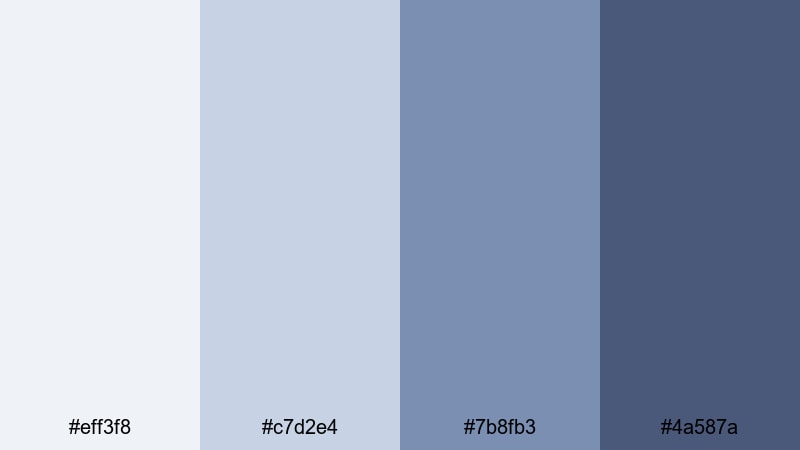
- HEX Codes: #eff3f8, #c7d2e4, #7b8fb3, #4a587a
- Mood: Calm, airy, and reflective, like an early walk by the sea.
- Use for: Perfect for travel vlogs, slow cinematic b-roll, and minimalist YouTube channel art.
Foggy Harbor Morning feels like soft sea mist drifting over quiet docks. The pale grays and light blues keep everything gentle and spacious, while the deeper Slate Blue anchors your frames so they never look washed out. This palette works beautifully for reflective storytelling, ASMR-style content, and peaceful day-in-the-life edits.
Use the lightest tones as backgrounds for titles and lower-thirds, then bring in the darker Slate Blue for logo animations, subscribe buttons, and timeline chapter markers. In thumbnails, pair a bright subject cutout with these misty hues to create a calm, cinematic preview that still stands out in a busy feed.
Pro Tip: Build a Calm Slate Blue Look in Filmora
To get the best from this soft Slate Blue palette, keep your entire edit speaking the same visual language. In Filmora, you can use the same HEX values (#eff3f8 to #4a587a) across text, shapes, and overlays so your intro, b-roll, and outro screens all feel like one cohesive story.
Create a simple style system: one Slate Blue shade for headlines, another for body text, and a darker tone for buttons or callouts. Save these as custom presets in Filmora so you can apply the same calm Slate Blue look to every new video on your channel in just a few clicks.
AI Color Palette
If you have a reference image that nails this foggy, seaside Slate Blue vibe, you do not need to guess the colors by eye. Filmora's AI Color Palette feature can read the tones from a still frame or design and apply that mood across your entire timeline.
Drop a frame from your favorite travel vlog or a custom color card into Filmora, then let AI Color Palette match the rest of your clips. This keeps your sky, shadows, and midtones consistently Slate Blue, so even footage from different cameras still feels like part of the same calm morning scene.
 secure download

HSL, Color Wheels & Curves
Once your overall Slate Blue mood is in place, use Filmora's HSL, color wheels, and curves to fine-tune it. Slightly desaturate blues for a more minimalist, editorial feel, or push shadows a little cooler on the color wheels to deepen that early-morning harbor atmosphere.
If you want a more advanced walkthrough, this Filmora color correction guide shows how to balance highlights, midtones, and shadows without breaking your Slate Blue palette. With curves, you can gently lift the blacks for a soft matte look or boost contrast for sharper, more cinematic foggy scenes.
secure download1000+ Video Filters & 3D LUTs
If you want to stylize your Slate Blue look even faster, lean on Filmora's built-in effects. Filmora's video filters and 3D LUTs make it easy to add subtle film grain, soft glows, or cinematic contrast while still keeping your main hues grounded in Slate Blue.
Stack a gentle cinematic LUT with a light vignette or blur filter to draw attention to your subject in thumbnails and opening shots. With over a thousand filters and LUTs, you can try different Slate Blue moods (from airy and minimal to darker and more dramatic) and save your favorites as go-to looks for your channel.
secure downloadScandinavian Loft Hues
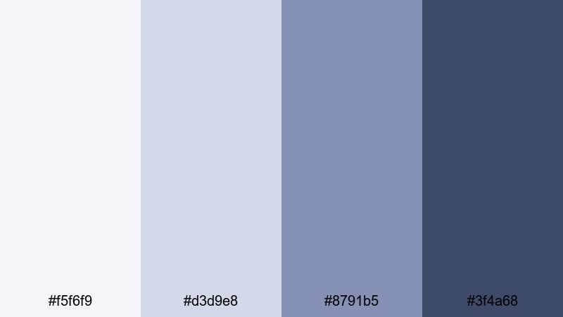
- HEX Codes: #f5f6f9, #d3d9e8, #8791b5, #3f4a68
- Mood: Clean, modern, and airy with a cozy minimal vibe.
- Use for: Use in lifestyle channels, home tour videos, and modern UI overlays for tutorials.
Scandinavian Loft Hues blends soft, cool neutrals with grounded Slate Blue for a polished, Nordic-inspired look. It feels like natural light on white walls, accented by sleek metal and denim tones.
Apply this palette to lifestyle vlogs, productivity setups, and interior tours by using the lightest shades for backgrounds and the darker blues for text, icons, and chapter markers. On YouTube thumbnails, pair a crisp portrait with these tones to signal minimalism, organization, and a modern Slate Blue aesthetic.
Cloudsoft Desktop
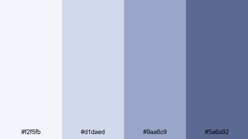
- HEX Codes: #f2f5fb, #d1daed, #9aa6c9, #5a6a92
- Mood: Focused, gentle, and productive, like a quiet work session.
- Use for: Great for productivity vlogs, screen recordings, and tutorial lower-thirds or title cards.
Cloudsoft Desktop is all about soft focus and clarity. The pale blues feel like a clean app interface, while the mid and dark Slate Blues add enough contrast for readable overlays.
Use it for Notion walkthroughs, coding tutorials, or study-with-me videos. Make your title cards in the lightest shades, with Slate Blue text and icons so viewers can easily read on laptops and phones. It is also perfect for branding your lower-thirds and end screens in a calm, tech-friendly Slate Blue aesthetic.
Quiet Library Stacks
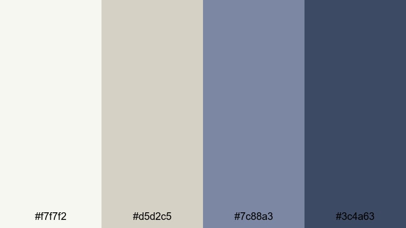
- HEX Codes: #f7f7f2, #d5d2c5, #7c88a3, #3c4a63
- Mood: Warmly intellectual, nostalgic, and thoughtful.
- Use for: Ideal for study-with-me videos, essay films, and documentary-style storytelling graphics.
Quiet Library Stacks mixes warm paper tones with Slate Blue shadows, creating a scholarly, slightly nostalgic feeling. It feels like reading under a desk lamp, surrounded by old books and soft background music.
Use the warm neutrals for backgrounds and frames, then let the Slate Blue tones handle text, page transitions, and chapter headings in your essays or commentary videos. This palette works especially well for long-form content where you want viewers to feel relaxed and focused, from video essays to podcast-style uploads with Slate Blue visual identity.
Moody & Cinematic Slate Blue Color Palettes
Midnight Harbor Scene
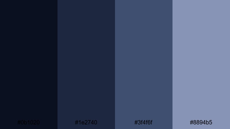
- HEX Codes: #0b1020, #1e2740, #3f4f6f, #8894b5
- Mood: Dramatic, cinematic, and mysterious like a night pier sequence.
- Use for: Best for trailers, short films, gaming intros, and moody music videos.
Midnight Harbor Scene layers deep navy blacks with glowing Slate Blue mids and soft steel highlights. It feels like a quiet dock at night, with just enough light to catch reflections on the water.
This palette is ideal for cinematic title sequences, game montages, or suspenseful story edits. Use the darkest shade for backgrounds and letterbox bars, then add titles and HUD-style graphics in the lighter Slate Blues for legibility. In thumbnails, contrast a bright character or subject against this dark slate backdrop to create drama and strong click appeal.
Rainy Neo Noir
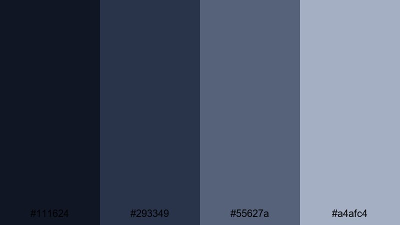
- HEX Codes: #111624, #293349, #55627a, #a4afc4
- Mood: Urban, rainy, and introspective with a subtle retro noir twist.
- Use for: Great for city night b-roll, tech reviews with edge, and stylized talking-head backdrops.
Rainy Neo Noir captures wet streets, glowing signs, and late-night reflections. The layered Slate Blues and metallic highlights suggest city lights bouncing off puddles and glass.
Use it when filming in low light or under street lamps, then push your grading toward these HEX tones for a consistent neo-noir look. In YouTube thumbnails or titles, combine the darker blues with sharp white or neon accent text to create a stylish, slightly retro tech or film-review brand.
Stormlit Coastline
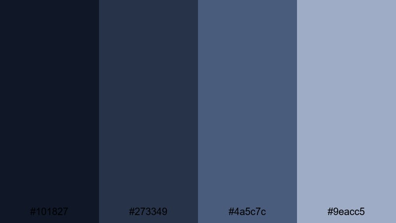
- HEX Codes: #101827, #273349, #4a5c7c, #9eacc5
- Mood: Brooding, windswept, and emotional like a storm rolling in.
- Use for: Use in travel montages, poetic shorts, and cinematic reels focused on nature and emotion.
Stormlit Coastline leans into moody ocean energy. Dark blues mimic storm clouds and cliffs, while muted Slate Blue highlights add the glow of distant light breaking through.
Apply this palette to drone shots over water, scenic time-lapses, or emotive short films. Grade your shadows toward the deepest navy, midtones into Slate Blue, and keep highlights soft and cool. For Instagram reels and TikTok edits, use these hues in text and overlays to unify very different clips under one powerful, stormy Slate Blue mood.
Deep Space Odyssey
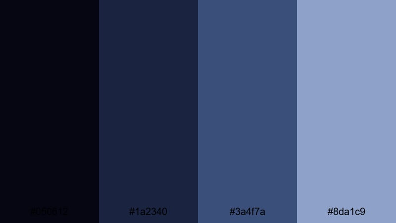
- HEX Codes: #050612, #1a2340, #3a4f7a, #8da1c9
- Mood: Futuristic, cosmic, and expansive with a sense of wonder.
- Use for: Perfect for sci-fi edits, tech explainers, logo reveals, and motion graphics backgrounds.
Deep Space Odyssey travels from almost-black space to luminous Slate Blue midtones, with light nebula-inspired highlights. It suggests galaxies, holograms, and high-tech dashboards.
Use the darkest shade for backgrounds and star fields, then build interface elements, infographics, and animated titles in the mid and light Slate Blues. This palette is strong for tech YouTube channels, product launches, and motion graphics where you want a clean but cinematic sci-fi Slate Blue core.
Bright & Playful Slate Blue Color Palettes
Cotton Candy Skylines
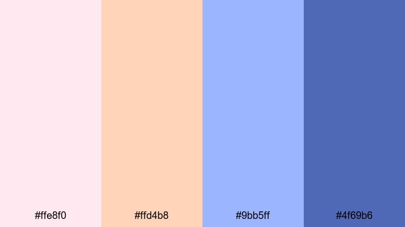
- HEX Codes: #ffe8f0, #ffd4b8, #9bb5ff, #4f69b6
- Mood: Whimsical, dreamy, and upbeat like pastel sunsets over a city.
- Use for: Great for lifestyle vlogs, travel diaries, and fun announcement posts or thumbnails.
Cotton Candy Skylines blends sugary pinks and peaches with airy Slate Blue skies. It feels optimistic and dreamy, like golden hour in the city with soft pastel clouds.
Use the warm tones to highlight faces, outfits, or important text, and let the Slate Blues handle backgrounds and borders. On thumbnails and channel banners, this combo looks playful but still balanced, making it ideal for upbeat lifestyle creators, travel vloggers, and creators who want a romantic Slate Blue accent instead of full-on neon.
Tropical Pool Party
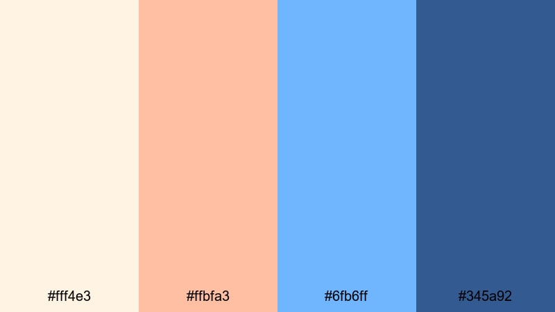
- HEX Codes: #fff4e3, #ffbfa3, #6fb6ff, #345a92
- Mood: Sunny, splashy, and energetic with a cool-water contrast.
- Use for: Use for summer vlogs, resort promos, and dynamic YouTube intros or end screens.
Tropical Pool Party splashes warm sand and tan tones against refreshing Slate Blue pool water. The palette feels like vacation: bright, energetic, and full of movement.
Use the light warm shades behind text and calls-to-action, then make your buttons, outlines, and transitions in the bold blues. This contrast is perfect for clickable thumbnails, countdown timers, and animated subscribe prompts in sunny, high-energy content.
Retro Arcade Splash
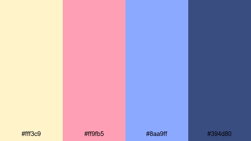
- HEX Codes: #fff3c9, #ff9fb5, #8aa9ff, #394d80
- Mood: Nostalgic, playful, and punchy with an 80s arcade vibe.
- Use for: Great for gaming channels, pop culture edits, and kinetic typography sequences.
Retro Arcade Splash throws creamy yellow and bubblegum pink together with electric Slate Blue. The result is fun, nostalgic, and full of motion, like classic arcade cabinets and neon signs.
Use the lighter pastels as backgrounds for motion titles, then set bold text or score counters in the darker Slate Blue for contrast. This palette works amazingly for gaming intros, meme edits, and any branding that leans into retro but still wants Slate Blue at its core.
Neon Street Pop
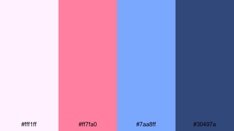
- HEX Codes: #fff1ff, #ff7fa0, #7aa8ff, #30497a
- Mood: Urban, trendy, and high-energy with a soft neon glow.
- Use for: Ideal for fashion lookbooks, short vertical videos, and social ads targeting younger audiences.
Neon Street Pop feels like pastel neon signs on a cool Slate Blue evening. Bright pinks grab attention, while the blues keep things grounded and stylish.
Use this palette for TikTok and Reels overlays, bold captions, and fashion or streetwear lookbooks. The darker Slate Blue makes a great backdrop for product shots, while the lighter shades are perfect for highlight text, stickers, and swipe-up arrows that still fit a cohesive Slate Blue aesthetic.
Elegant & Modern Slate Blue Color Palettes
Slate Suit Editorial
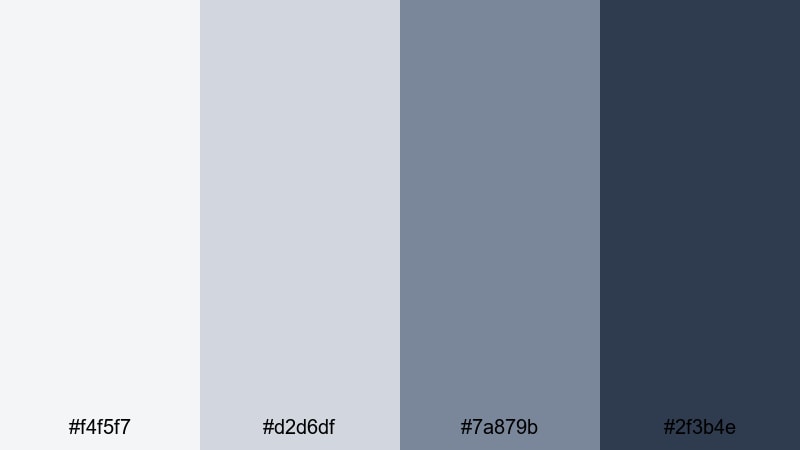
- HEX Codes: #f4f5f7, #d2d6df, #7a879b, #2f3b4e
- Mood: Professional, refined, and editorial with corporate polish.
- Use for: Use for brand videos, corporate explainers, LinkedIn content, and portfolio reels.
Slate Suit Editorial feels like a tailored blazer and a clean magazine layout. Cool grays and Slate Blue accents suggest professionalism, clarity, and trust.
Use the lightest shades as clean backgrounds for text and data overlays, while the mid and dark Slate Blues handle titles, infographics, and logo animations. This palette is ideal for LinkedIn videos, portfolio reels, and company explainers where you want a high-end Slate Blue brand identity instead of loud, saturated colors.
Luxury Hotel Lobby
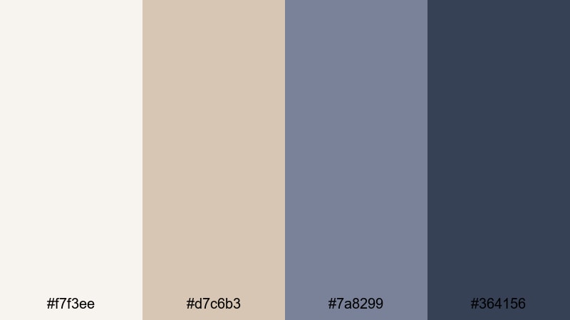
- HEX Codes: #f7f3ee, #d7c6b3, #7a8299, #364156
- Mood: Warm, luxurious, and welcoming with a boutique feel.
- Use for: Perfect for hospitality promos, wedding highlight films, and upscale product videos.
Luxury Hotel Lobby pairs creamy neutrals and soft gold-tan tones with muted Slate Blue accents. It feels warm and inviting, like a boutique hotel with soft lighting and curated decor.
Use the warm hues for skin-friendly backgrounds and environment shots, then add Slate Blue for lower-thirds, title cards, and logo reveals. This palette works well for wedding films, spa or resort promotions, and product spots where you want understated elegance instead of flashy color.
Tech Startup Interface
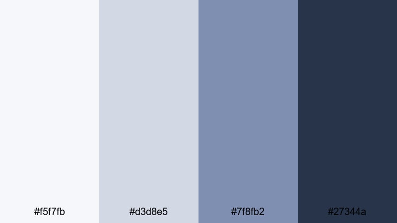
- HEX Codes: #f5f7fb, #d3d8e5, #7f8fb2, #27344a
- Mood: Crisp, innovative, and future-focused with a trustworthy edge.
- Use for: Ideal for app previews, SaaS explainer videos, UI showcases, and pitch decks.
Tech Startup Interface feels like a clean dashboard: fresh whites, soft grays, and confident Slate Blue controls. It communicates clarity, reliability, and forward-thinking design.
Use the light neutrals as your main canvas, then apply Slate Blue to buttons, data highlights, and logo or icon lockups. In app demos and UI animations, this palette keeps everything readable on screen while reinforcing a modern Slate Blue brand visual that works across websites, decks, and video intros.
Tips for Creating Slate Blue Color Palettes
Whether you edit vlogs, cinematic shorts, or promo videos, Slate Blue works best when you balance it with the right contrasts, skin-friendly neutrals, and consistent grading across your timeline.
- Pair Slate Blue with warm neutrals (beige, tan, soft cream) to keep faces flattering and prevent your video from feeling too cold or clinical.
- For thumbnails and text overlays, always check contrast: use the darkest Slate Blue against very light backgrounds, or invert it with white text over Slate Blue blocks.
- Choose one or two accent colors (like peach, soft pink, or muted gold) and reuse them with Slate Blue across intros, titles, and end screens for instant brand recognition.
- Match your color grading to your graphics: if your overlays are Slate Blue, gently push your midtones or shadows toward similar hues using Filmora's color tools.
- Test your palette on both desktop and mobile to make sure Slate Blue elements stay readable, especially small captions and lower-thirds.
- Keep B-roll and A-roll consistent: once you find a Slate Blue look you love, save it as a preset or LUT and apply it to new clips so your channel feels cohesive.
- Use lighter Slate Blue tints for backgrounds and UI-style elements, and reserve the deeper shades for borders, calls-to-action, and important text.
- If your footage has mixed lighting, neutralize color casts first, then lean into Slate Blue gently so you do not fight against strong yellow or green tints.
Slate Blue is versatile enough to feel calm, cinematic, playful, or premium depending on how you pair it. By using these 15 palettes and HEX codes, you can design thumbnails, intros, and full edits that carry a clear mood and recognizable visual identity across platforms.
Try a soft, minimal Slate Blue look for productivity content, switch to a moody cinematic palette for storytelling and music, or go bright and playful for lifestyle and fashion. In Filmora, you can save your favorite combinations, reuse them as presets, and mix them with filters and LUTs to build a Slate Blue aesthetic that truly belongs to your brand.
Open a new project, pick one of the palettes that matches your niche, and start experimenting. With consistent Slate Blue color grading and design, your channel or brand will look more professional and more memorable from the very first frame.
secure download