
 100% Security Verified | No Subscription Required | No Malware


 ChatGPT
 Perplexity
 Gemini
 Claude
 Grok
Grok
Soft Moss Green sits between earthy neutrals and fresh foliage tones, which makes it feel calming, organic, and trustworthy. It is the kind of green you see in misty forests, worn linen, and vintage botanical prints. In color psychology, these softened greens suggest balance, stability, and quiet optimism, so they work beautifully for creators who want visuals that feel natural rather than neon or overwhelming.
In video edits, branding, YouTube thumbnails, and channel intros, Soft Moss Green is a versatile base color. It pairs easily with creams, warm taupes, charcoal, and blush tones, so you can move from cozy vlogs to cinematic travel reels without changing your core brand palette. To help you do that, the palettes below collect Soft Moss Green color combinations with ready-to-use HEX codes, tailored for creators and Filmora users who want consistent, polished visuals across all their content.
In this article
Calm & Natural Soft Moss Green Color Palettes
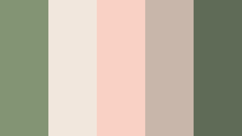
Forest Morning Haze
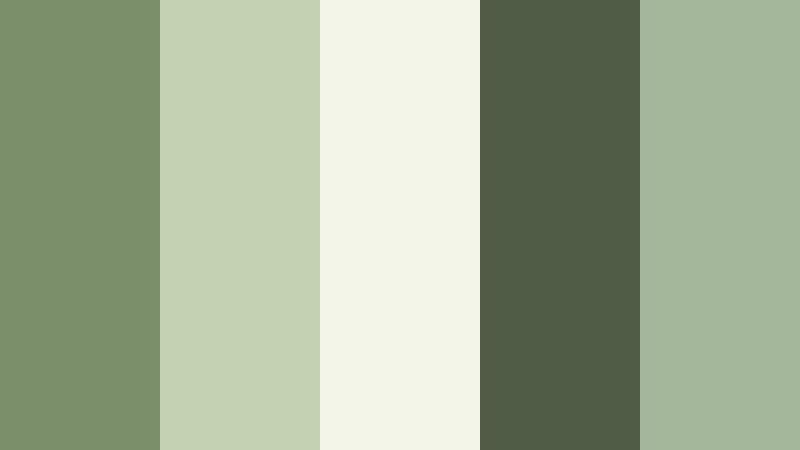
- HEX Codes: #7b8f6b, #c3d3b2, #f3f5e9, #4f5d47, #a4b79a
- Mood: Quiet, dewy, and grounded like a walk through the woods at sunrise.
- Use for: Great for nature vlogs, hiking reels, and slow cinematic b-roll with an organic feel.
Forest Morning Haze layers soft greens with misty off-whites and muted shadows, echoing the air just after sunrise in a dense forest. It feels peaceful and grounded, with enough contrast between the darker moss tones and lighter foliage hues to keep your visuals from looking flat.
Use this palette for nature storytelling, eco-friendly branding, or any video where you want viewers to feel calm and close to the outdoors. Apply the lighter tones to text and overlays, while the deeper greens anchor backgrounds, titles, and end cards. It is especially strong for travel thumbnails, outdoor channel intros, and slow b-roll sequences where you want a natural, cinematic tone without harsh saturation.
Pro Tip: Build A Cinematic Soft Moss Green Look In Filmora
When you grade footage around a palette like Forest Morning Haze, the key is consistency. In Filmora, start by adjusting white balance and exposure across your clips so the moss greens hit a similar luminance and warmth in every scene. Then, use a single color preset or LUT as a base and tweak it slightly per clip instead of starting from scratch each time.
You can also build a custom Soft Moss Green look by using one reference shot as your hero frame. Grade that first until the foliage, skin tones, and highlights match the palette, then copy and paste those settings across all your timeline sections, including intros, b-roll, and social media cutdowns. This keeps your channel feeling cohesive and professional.
AI Color Palette
If you have a favorite forest photo or color card with your ideal Soft Moss Green mix, you can turn it into a look for your entire project. Filmora's AI Color Palette feature lets you sample colors from a reference image and automatically apply that mood to all your clips.
Import your reference, choose a target clip, and let AI match the tones so your footage quickly picks up the same soft greens, gentle highlights, and muted shadows. This is especially helpful if you shoot on different days or cameras but want a single, unified Soft Moss Green aesthetic.
 secure download

HSL, Color Wheels & Curves
To refine Soft Moss Green tones, the HSL, color wheels, and curves tools in Filmora give you precise control. In HSL, gently lower the saturation of pure greens while nudging yellow-greens slightly warmer, so foliage looks soft and organic instead of neon. Use color wheels to cool your shadows and warm your midtones, adding cinematic depth without losing that grounded, natural vibe.
You can also shape contrast with the curves panel: add a subtle S-curve to deepen forest shadows and lift highlights just enough to preserve mist and haze. These techniques, similar to those shown in Filmora's YouTube tutorials on color grading, help you match this palette even if your original footage was shot in harsh sunlight or mixed lighting.
secure download1000+ Video Filters & 3D LUTs
Once your base colors are in place, you can stylize them quickly with Filmora's extensive presets. Filmora's video filters and 3D LUTs make it easy to add soft film grain, matte fades, or nostalgic tints that flatter Soft Moss Green without overpowering it.
Apply a subtle cinematic LUT to deepen shadows around your greens, or stack gentle diffusion and vignette filters to push the mood toward dreamy forest storytelling. Save your favorite combination as a custom preset, then reuse it on thumbnails, channel intros, and shorts so every piece of content reflects the same mossy aesthetic.
secure downloadMossy Riverbank Drift

- HEX Codes: #77876a, #9fb7a3, #e3efe8, #5a6a63, #c7d5c2
- Mood: Cool, reflective, and soothing with gentle waterside tones.
- Use for: Perfect for travel vlogs, meditation content, and title cards that need a relaxed, contemplative atmosphere.
Mossy Riverbank Drift softens Soft Moss Green with cool aquas and stone-inspired neutrals. The result feels like a quiet river edge, where greens blend into water and mist. It is calm and reflective rather than bright or energetic.
Use the deeper teal-greens for lower thirds, text boxes, and UI-style overlays, and reserve the pale aqua and light neutrals for backgrounds or negative space. This palette suits meditation channels, mindful productivity vlogs, and slow travel content where you want the viewer to slow down and breathe.
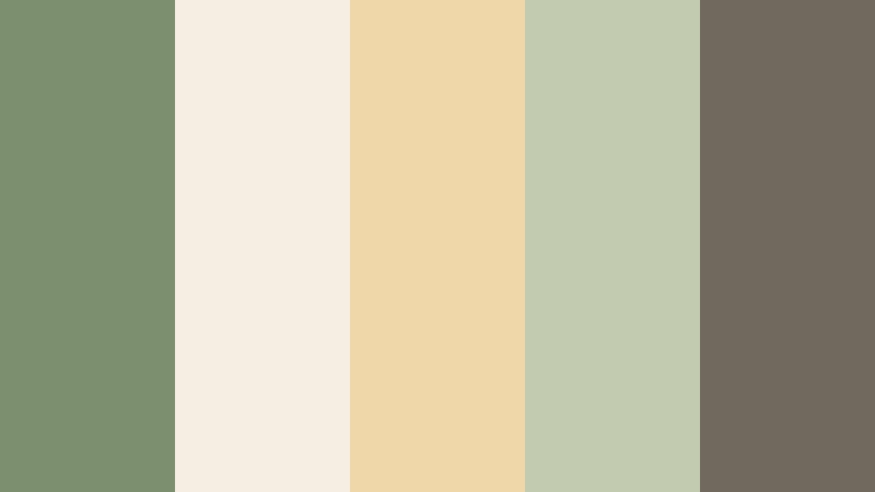
Garden Studio Neutral
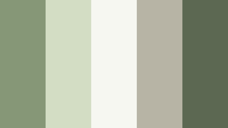
- HEX Codes: #859774, #d2ddc4, #f7f7f2, #b8b4a5, #5b6952
- Mood: Balanced, creative, and grounded with a touch of cozy sophistication.
- Use for: Use for talking-head videos, studio backdrops, and branding that needs a calm yet polished look.
Garden Studio Neutral mixes Soft Moss Green with creamy off-whites and warm taupes, creating the feeling of a styled indoor garden set. It is both natural and curated, perfect if you want your setup to look like a tidy, plant-filled studio instead of a wild forest.
This palette works well for lifestyle channels, tutorials, and personal brand graphics. Use the light cream for backgrounds and thumbnail negative space, the moss and deep green for titles and icons, and the taupe accents on borders, frames, and logo elements. It keeps your visuals approachable but still professional.
Wild Meadow Breeze
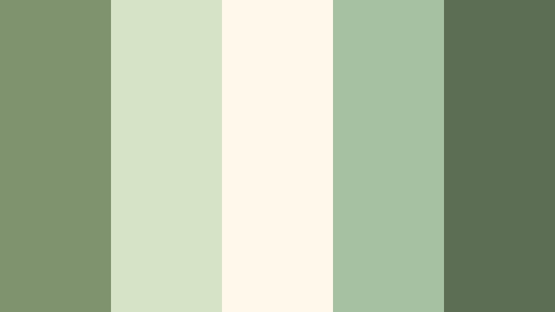
- HEX Codes: #7f936f, #d7e3c7, #fff9ec, #a6c1a2, #5c6f54
- Mood: Airy, optimistic, and softly rustic like an open field in late spring.
- Use for: Nice for slow living videos, recipe intros, and serene social content backgrounds.
Wild Meadow Breeze brightens Soft Moss Green with sunlit creams and light, fresh foliage tones. It feels airy and pastoral, like a wide-open field with soft light and gentle wind. The overall impression is optimistic without being overly pastel.
Use this palette for slow living vlogs, homesteading content, recipe intros, or reels about morning routines. Bright creams are perfect for clean text overlays, while the richer greens can frame your subject or outline key elements in thumbnails. It is also a strong choice for Instagram covers and Pinterest graphics where you want a breezy, rural mood.
Quiet Cabin Retreat
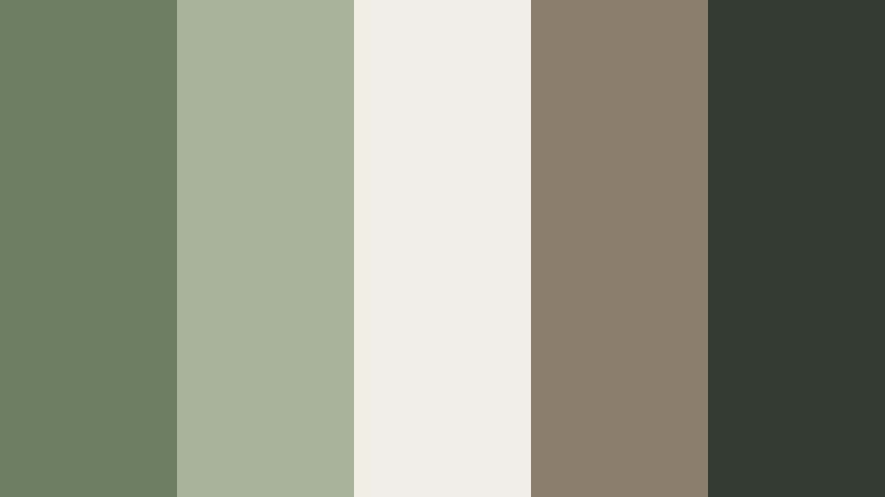
- HEX Codes: #6e7e63, #a9b39b, #f0eee5, #8b7f6c, #343b33
- Mood: Cozy, grounded, and slightly nostalgic with a rustic edge.
- Use for: Best for cabin vlogs, cozy B-roll, and title cards in outdoor or camping content.
Quiet Cabin Retreat blends moss greens with weathered browns and warm off-whites, evoking a wooden cabin tucked into the trees. It carries a nostalgic, rustic charm, great for content about camping, journaling, or unplugging from tech.
In thumbnails and intros, use the darkest green-brown for text or borders to anchor the design, while the lighter beige tones fill backgrounds and frames. This palette supports lower-contrast color grading and slightly faded edits, ideal if you want your footage to feel like memories rather than crisp documentary footage.
Soft & Romantic Soft Moss Green Color Palettes
Sage Lace Romance
- HEX Codes: #839474, #f2e7dd, #f9d2c4, #c7b6a9, #5f6b57
- Mood: Romantic, delicate, and nostalgic with a vintage bridal feel.
- Use for: Lovely for wedding highlight films, engagement trailers, and soft romantic thumbnails.
Sage Lace Romance pairs gentle moss greens with blush pinks, cream, and latte hues, creating a dreamy palette that feels made for weddings and love stories. The tones are soft and nostalgic, with just enough contrast between the deeper sage and the pale blush for clear readability.
Use the blush and cream shades as backgrounds for text and lower thirds, then let the richer greens support logos, monograms, and transition cards. This palette works beautifully in wedding highlight films, save-the-date teasers, or any romantic reel where you want emotions to feel tender and timeless.
Olive Blossom Afternoon

- HEX Codes: #7a8a69, #ffe8de, #f6f2ea, #e1c7b3, #b39b8b
- Mood: Warm, sunlit, and gentle like a golden hour picnic under olive trees.
- Use for: Use in lifestyle vlogs, family films, and cozy product promos that need warmth and softness.
Olive Blossom Afternoon leans into warm, peachy highlights and soft olive greens, capturing the feeling of golden hour sunlight through trees. It has a gentle glow that feels welcoming and intimate.
Apply this palette to family vlogs, cozy brand promos, or lifestyle content where you want your audience to feel at home. Pale peach and cream work for title cards and YouTube end screens, while olive and warm beige can frame your subject, accent call-to-action buttons, and tie together your thumbnails and channel banner.
Muted Botanical Poetry

- HEX Codes: #819474, #e9dfd0, #f6efe4, #c3c7b3, #9b8d80
- Mood: Artful, poetic, and slightly vintage like pressed flowers in an old journal.
- Use for: Perfect for aesthetic reels, poetry visuals, and cinematic title sequences.
Muted Botanical Poetry combines soft moss greens with parchment creams and dusty, journal-like neutrals. It feels like an old sketchbook filled with pressed leaves and delicate ink drawings, giving your content a thoughtful, artistic tone.
Use this palette for aesthetic edits, poetry visuals, or any series where text and typography are central. The light neutrals provide gentle contrast for elegant serif fonts, while the moss and taupe tones can shade borders, lines, and subtle gradient backgrounds in title sequences and Instagram reels.
Herbal Tea Daydream
- HEX Codes: #7c8f6e, #f5efe3, #f0d7aa, #c2cbb0, #6f6a5d
- Mood: Comforting, mellow, and slightly whimsical like an afternoon tea break.
- Use for: Great for cozy study with me videos, journaling content, and calm brand intros.
Herbal Tea Daydream surrounds Soft Moss Green with honey beige, warm cream, and gently muted neutrals. It feels like a quiet afternoon with a notebook and a steaming mug, making it ideal for calm, reflective content.
Use this palette on study-with-me videos, journaling tutorials, or brand intros that promise relaxation and focus. Apply the light creams and beiges behind subtitles or chapter markers, while the moss and darker neutrals highlight key words, icons, and call-to-action text in your thumbnails.
Vintage Conservatory Glow

- HEX Codes: #748669, #e6e2d4, #f9f1e1, #b0b9a3, #635d50
- Mood: Elegant, nostalgic, and softly luminous like an old glass conservatory.
- Use for: Ideal for aesthetic montages, interior tours, and branded lookbooks.
Vintage Conservatory Glow brings together subdued moss greens, antique whites, and warm stone tones, creating a refined, old-world atmosphere. It feels luminous but not bright, like light filtered through slightly dusty glass panes.
Choose this palette for aesthetic montages, interior tours, or lookbooks that lean into quiet luxury. Use the pale tones as backdrops for logos, collection names, or video titles, then weave the moss and stone shades through frames, divider lines, and accent shapes in your overlays and thumbnails.
Modern & Minimal Soft Moss Green Color Palettes
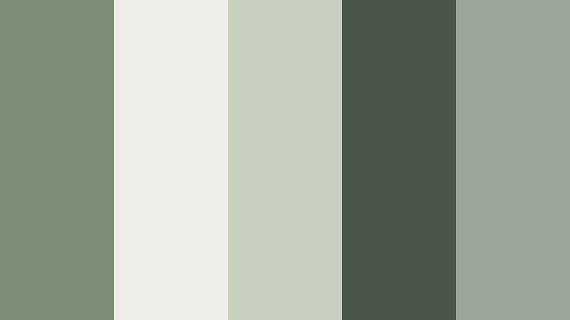
Clean Studio Moss

- HEX Codes: #7e8f73, #f4f5f0, #d0d6c5, #383f34, #a7b29d
- Mood: Fresh, minimal, and confident with a creative studio vibe.
- Use for: Use for channel branding, tech explainer videos, and polished UI mockups.
Clean Studio Moss pairs Soft Moss Green with crisp off-white, subtle grays, and a strong charcoal accent. It delivers a minimal, design-forward look that still feels organic thanks to the moss base.
This palette is ideal for tech explainers, design tutorials, or professional channel branding. Use the off-whites for clean layouts and backgrounds, the moss for primary buttons and headings, and the charcoal for text and icons to keep everything sharp and readable on both large screens and mobile devices.
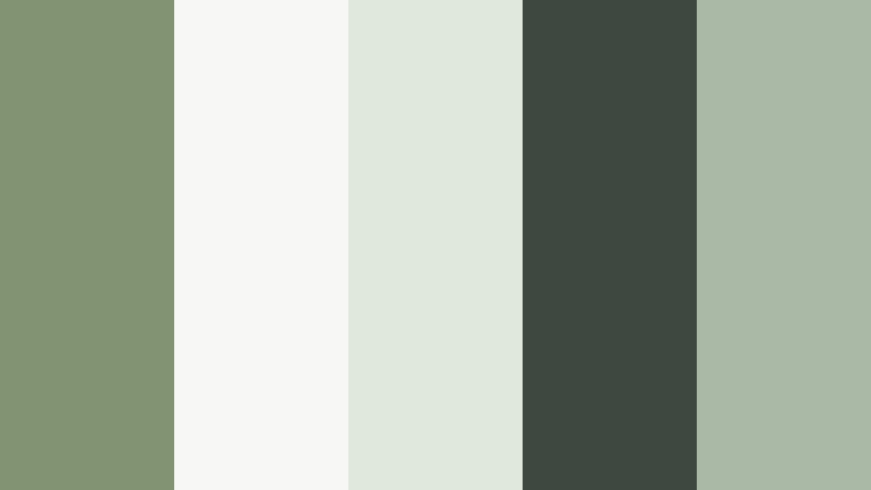
Nordic Moss Calm
- HEX Codes: #7c8d75, #ecefe7, #c8d0c1, #4b554a, #9ba798
- Mood: Scandinavian-inspired, calm, and orderly with a subtle design edge.
- Use for: Perfect for productivity content, minimal room tours, and modern brand kits.
Nordic Moss Calm reflects Scandinavian interiors: pale walls, soft textiles, and a few thoughtfully placed plants. The moss greens are cool and muted, balanced by plenty of light neutrals and a tidy dark accent.
Use this palette for productivity channels, minimal home tours, or modern brand kits. The light shades are great for clean title screens and planning graphics, while the darker green-gray provides enough contrast for subtitles and interface-style overlays without feeling harsh.
Urban Loft Foliage

- HEX Codes: #6f7f66, #f0f1ed, #b3b8b0, #25282a, #c6d2c2
- Mood: Chic, urban, and slightly industrial softened by greenery accents.
- Use for: Great for city vlogs, creative portfolios, and fashion lookbooks with a modern edge.
Urban Loft Foliage contrasts Soft Moss Green with concrete grays, crisp white, and deep charcoal, capturing the look of plants in an industrial loft. It feels modern and chic, with just enough softness from the green to keep things approachable.
This palette is a strong fit for city vlogs, photography portfolios, or fashion lookbooks. Use darker grays and black for bold typography, place moss accents behind your logo or on key buttons, and use the light neutrals to keep thumbnails and intro screens bright and clean.
Screenlight Moss Interface
- HEX Codes: #829373, #f7f8f5, #e0e7dc, #3e4740, #aab9a5
- Mood: Digital-friendly, clear, and balanced with a soft tech feel.
- Use for: Use for app UI demos, tutorial overlays, and clean motion graphics in videos.
Screenlight Moss Interface is built for readability on screens. Soft Moss Green is tuned to feel gentle on the eyes, while light UI neutrals and a clear dark accent keep text, icons, and diagrams sharp.
Use this palette for app demonstrations, tutorial overlays, and motion graphics where clarity matters. The light tones are perfect for panels and tooltips, the moss serves as a calm brand color, and the deep gray supports body text and timeline labels in your explainer videos.
Bold & Cinematic Soft Moss Green Color Palettes
Emerald Canopy Cinema
- HEX Codes: #6b7f62, #a8c09d, #f4f1e7, #243126, #4e5e48
- Mood: Dramatic, cinematic, and immersive like deep forest canopy shots.
- Use for: Perfect for cinematic travel edits, title sequences, and moody B-roll transitions.
Emerald Canopy Cinema deepens Soft Moss Green into richer forest tones, balanced by dark shadows and soft, hazy highlights. It feels immersive and cinematic, ideal for story-driven nature and travel edits.
Use the darkest green-black for letterboxing bars, bold titles, or suspenseful intro frames, while the lighter foliage greens and off-whites preserve detail in midtones and highlights. This palette suits moody B-roll transitions, narrative travel films, and dramatic channel trailers.
Noir Moss Contrast

- HEX Codes: #67765e, #f5f5f3, #111414, #9da991, #3b4339
- Mood: High contrast, moody, and refined with a subtle thriller edge.
- Use for: Use for intros, trailers, and commentary videos that need a bold yet grounded look.
Noir Moss Contrast sets soft moss accents against deep blacks and sharp whites, creating a noir-inspired look that still feels organic and grounded. The result is high contrast and dramatic, without leaning into neon or oversaturated colors.
Use this palette for commentary videos, intros, and trailers where you want a confident, slightly mysterious mood. Black and off-white handle your typography and backgrounds, while moss and gray-greens highlight key phrases, subscribe buttons, or timeline markers to keep everything cohesive.
Tips for Creating Soft Moss Green Color Palettes
When you build your own Soft Moss Green color palette for video and design, combining greens with the right neutrals and accents makes a huge difference to mood, readability, and brand consistency.
- Pair Soft Moss Green with warm creams or light beiges when you want cozy, romantic, or lifestyle visuals, and with cool grays for minimal, tech, or productivity content.
- Keep enough contrast between text and background by testing your HEX codes at small sizes; use deeper moss or charcoal for text over pale greens and neutrals.
- Limit yourself to 3 to 5 main colors per project (one hero green, one light neutral, one dark accent, and one or two support tones) to avoid cluttered thumbnails and overlays.
- Match your color grading to the palette by slightly desaturating harsh greens in-camera footage and nudging them toward your chosen moss HEX values in Filmora.
- Use consistent colors for repeated elements like lower thirds, subscribe buttons, and titles so viewers instantly recognize your brand style across videos.
- Test your palette on both mobile and desktop screens; adjust brightness and contrast if Soft Moss Green looks too dull on small, dim displays.
- For cinematic edits, keep Soft Moss Green subtle and let shadows, highlights, and a single accent color do the heavy emotional lifting.
- Create a reusable template in Filmora with your palette baked into titles, transitions, and overlays, so every new video starts with the same soft green aesthetic.
Soft Moss Green color palettes can quietly shape how viewers experience your content, from calm forest-inspired vlogs to modern, minimal explainers. The right combination of moss, neutrals, and accents builds a clear mood, strengthens your brand identity, and makes thumbnails and intros feel instantly recognizable.
Use the HEX codes above as ready-made starting points, then fine-tune them inside Filmora to match your footage, lighting, and story. Whether you lean into romantic creams, Nordic neutrals, or bold noir contrasts, keeping your Soft Moss Green consistent across edits will make your channel feel more intentional and cinematic.
Experiment with these palettes in Filmora, save your favorite looks as presets, and apply them to everything from long-form videos to Shorts, Reels, and thumbnails so your whole presence carries the same soft, mossy signature.
