
 100% Security Verified | No Subscription Required | No Malware


 ChatGPT
 Perplexity
 Gemini
 Claude
 Grok
Grok
Storm Gray sits between cool neutrality and quiet drama. It feels grounded and sophisticated, making it perfect for creators who want visuals that look polished without screaming for attention. Depending on how you combine it, Storm Gray can feel minimal and techy, cinematic and moody, or soft and cozy for everyday lifestyle content.
In video editing, branding, YouTube thumbnails, intros, and Instagram covers, a Storm Gray color palette is a reliable base shade that lets typography, skin tones, and accent colors shine. Below you will find 15 Storm Gray color palettes with HEX codes, plus practical ideas for using them in Filmora so you can keep your edits, overlays, and channel branding consistent.
In this article
Minimal & Modern Storm Gray Color Palettes
Urban Skyline Minimal
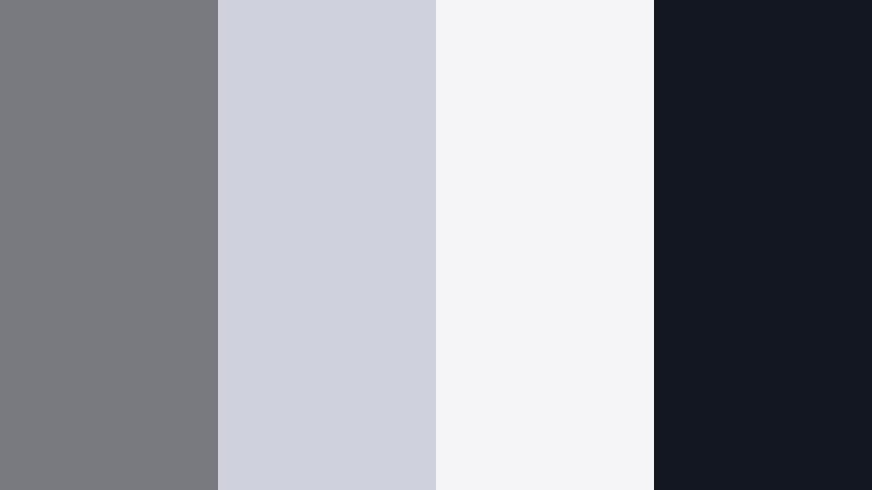
- HEX Codes: #787a80, #cfd2dc, #f5f5f7, #131721
- Mood: Clean, contemporary, and slightly moody, like a dawn cityscape.
- Use for: Great for minimalist channel intros, tech reviews, and cinematic lower thirds.
This palette balances mid-tone Storm Gray (#787a80) with two airy off-whites and a sharp ink accent (#131721). It feels like glass, concrete, and sky at first light, so your visuals look modern without feeling cold.
Use the lighter shades for backgrounds in titles, product frames, and YouTube thumbnails, while the darkest hue anchors text, icons, and logo marks. In Filmora, this set works beautifully for tech reviews, startup explainers, and clean B-roll overlays where you want focus on the product and motion, not the colors.
Pro Tip: Build a Cinematic Storm Gray Look in Filmora
To keep an Urban Skyline Minimal look consistent across an edit, start by picking one mid-tone gray as your reference. In Filmora, color correct one clip until your Storm Gray feels balanced, then copy those settings across all talking-head shots and B-roll. This keeps your entire video living in the same cool, city-inspired space.
You can then add simple graphic elements like lower thirds, subscribe bars, and end screens using the off-whites as backgrounds and the deepest gray for text. Because the palette is subtle, your brand logo or thumbnail text will always remain legible and professional.
AI Color Palette
If you have a screenshot or thumbnail mockup that already nails this Storm Gray vibe, you can use Filmora's AI Color Palette feature to match that look across your entire timeline. Import the reference image, let Filmora analyze its tones, and apply the style to other clips with one click.
This is an easy way to keep your tech channel or brand videos visually cohesive: your A-roll, B-roll, screen recordings, and outro cards all share the same gray balance and contrast, without having to tweak every clip manually.
 secure download

HSL, Color Wheels & Curves
Once your base Storm Gray palette is in place, fine-tune the look with Filmora's HSL, Color Wheels, and Curves. Use HSL to gently desaturate blues or cyans so screens and reflections do not pull attention away from your subject, then use the color wheels to push shadows slightly cooler and highlights slightly warmer for a cinematic contrast.
The curves panel lets you define exactly how deep your blacks go and how soft your whites stay, which is ideal for minimalist, urban-inspired edits. For more on shaping tones, you can watch Filmora's advanced color correction tutorial embedded below.
secure download1000+ Video Filters & 3D LUTs
If you want to stylize your Storm Gray look even faster, Filmora's video filters and 3D LUTs make it easy to add subtle contrast, film-style fades, or futuristic tech moods on top of this neutral base. Choose a LUT that leans cool and cinematic to enhance the urban feel, or a softer filter for more lifestyle content.
Because your palette is already grounded in Storm Gray and off-whites, these filters will feel like finishing touches instead of total makeovers. That means your brand colors and graphics still look like you, just with a more polished finish.
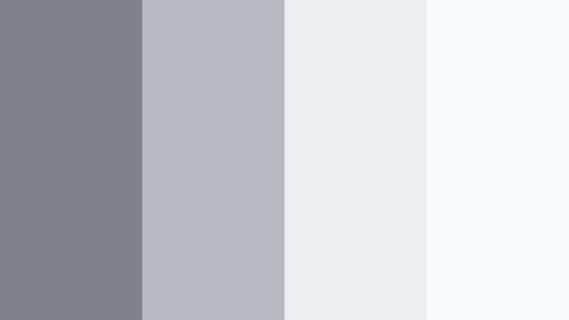
secure downloadConcrete Studio Calm

- HEX Codes: #7b7d83, #aeb0b8, #e1e3ea, #101417
- Mood: Grounded, refined, and studio-like with a professional edge.
- Use for: Perfect for talking-head tutorials, brand explainers, and UI-style motion graphics.
Concrete Studio Calm is all about smooth, studio-ready grays. The mid Storm Gray (#7b7d83) and softer neutrals (#aeb0b8, #e1e3ea) feel like polished concrete walls under softbox lighting, while the near-black #101417 adds crisp definition.
Use the lightest tone as a clean backdrop for how-to overlays, diagrams, and UI callouts in your tutorials. The deep gray is ideal for text, buttons, and logo treatments in thumbnails or intro animations, keeping your channel identity consistent and professional.
Glass Panel Reflections

- HEX Codes: #75777d, #b4c0cc, #e6eef7, #151822
- Mood: Airy yet structured, like light bouncing off glass towers.
- Use for: Works well for corporate reels, SaaS promos, and overlay graphics on product demos.
This palette adds a subtle blue tint to the neutrals (#b4c0cc, #e6eef7), echoing reflections on glass and metal. It keeps the structure and seriousness of Storm Gray while feeling slightly more high-tech and polished.
Use this set when designing corporate intros, app launch videos, or LinkedIn-ready promo clips. Light tones make perfect lower-third panels and data callouts, while #151822 adds dense contrast for key messages, CTAs, and logo reveals in Filmora.
Monochrome Editorial Edge

- HEX Codes: #6f7177, #9a9ca2, #d6d7dd, #050608
- Mood: Editorial, sleek, and fashion-forward without harsh contrast.
- Use for: Use in lookbooks, portfolio videos, and cinematic typography sequences.
Monochrome Editorial Edge layers Storm Gray from soft mid-tones to a deep near-black, creating a magazine-style monochrome world. Because the contrast is controlled rather than extreme, your visuals feel polished and intentional.
It is ideal for fashion reels, designer portfolios, and typography-led sequences where movement and layout matter more than color. Use the lighter grays as backgrounds for fullscreen text cards and the darkest tone for delicate, razor-sharp typography in intros and outros.
Soft Overcast Workspace

- HEX Codes: #808389, #c3c6cc, #f0f1f5, #1a1c21
- Mood: Softly focused, like a quiet overcast day at a creative desk.
- Use for: Ideal for productivity content, study-with-me vlogs, and workspace tours.
Soft Overcast Workspace mixes mid Storm Gray (#808389) with misty neutrals and a gentle dark accent. It mimics the calm, diffused light you get on cloudy days, which is perfect for study, planning, or deep-work aesthetics.
Use it to design chapter cards, checklist graphics, and timer overlays in study-with-me or productivity videos. The neutrals will not fight your desk footage or paper textures, while the darkest tone keeps timer numbers and labels crisp on any thumbnail or vertical cover.
Cinematic & Moody Storm Gray Color Palettes
Harbor Nightfall Drift

- HEX Codes: #72757b, #4c525a, #252932, #0b0d10
- Mood: Deep, cinematic, and introspective like a harbor at night.
- Use for: Great for cinematic travel reels, narrative shorts, and moody channel trailers.
Harbor Nightfall Drift takes Storm Gray into deeper waters, moving from muted mid-tones to rich charcoal and near-black. The palette feels slow and contemplative, ideal for storytelling instead of fast-paced content.
Use the lighter shades as subtle overlays or gradient vignettes in Filmora, then let the darker hues dominate backgrounds, title cards, and credit sequences. It suits narrative shorts, emotional travel sequences, and introspective channel trailers where you want viewers to sink into the atmosphere.
Rainwashed Alley

- HEX Codes: #797b81, #5a5f67, #333740, #14161d
- Mood: Gritty yet poetic, like streets just after a rainstorm.
- Use for: Perfect for street photography edits, urban b-roll, and noir-style title cards.
Rainwashed Alley blends Storm Gray with asphalt-like darks and soft mid-tones, capturing the look of wet streets and reflective puddles. It adds texture and grit without pushing into pure black.
Apply it to street photography edits, skate clips, or late-night city B-roll. Use lighter tones for caption bars and the darkest shade for noir-style titles and credit slates, creating a consistent, moody brand for your channel or social reels.
Thundercloud Horizon

- HEX Codes: #767880, #60636b, #3b3f48, #0e1015
- Mood: Tense and atmospheric, evoking an incoming storm on the horizon.
- Use for: Use in trailers, suspense edits, and drone shots that need added drama.
Thundercloud Horizon is built from stacked layers of Storm Gray, each one a little darker and denser. It naturally amplifies tension, like clouds rolling in just before a storm hits.
It is a strong fit for suspense edits, drone footage over mountains or cities, and gaming montages with darker storylines. Create titles, countdowns, and glitch effects using the darker shades as backgrounds and the lighter shades for subtle glows or strokes around your text.
Shadowed Loft Studio

- HEX Codes: #7d8086, #5b5e65, #2f333b, #080a0e
- Mood: Intimate, creative, and slightly mysterious like a dim loft studio.
- Use for: Great for musician sessions, behind-the-scenes edits, and interview setups.
Shadowed Loft Studio lives in the mid-to-dark range of Storm Gray, hinting at studio corners, instruments, and soft lamps rather than bright key lights. It feels intimate and handcrafted.
Use the mid grays for subtle gradient backgrounds behind lyrics or subtitles, and save the deepest hue (#080a0e) for intertitles, section cards, and logo stings. It works especially well for behind-the-scenes edits, podcast clips, and musician sessions where you want to keep the mood subdued and cinematic.
Fogbound Forest Fade

- HEX Codes: #7a7d83, #555961, #2a2e36, #0a0b0f
- Mood: Misty, mysterious, and slightly eerie like a fogged-in forest path.
- Use for: Perfect for nature vlogs with a dark twist, mystery stories, and game streams.
Fogbound Forest Fade pushes Storm Gray toward ink-dark greens and charcoal, bringing a subtle natural edge to a cinematic base. It feels like forest shadows and mist, ideal when nature content should lean mysterious instead of sunny.
Try it on darker nature vlogs, hiking stories, or game streams with fantasy or horror themes. Use lighter tones for small on-screen labels and mini-maps, and the deeper tones for overlays, frames, and stream panels that blend into the footage instead of standing out too brightly.
Soft & Cozy Storm Gray Color Palettes
Cloud Knit Comfort
- HEX Codes: #7f8288, #b7bac0, #eceef2, #f9fafc
- Mood: Soft, comforting, and snuggly like a favorite knit blanket.
- Use for: Ideal for lifestyle vlogs, cozy reading corners, and home decor edits.
Cloud Knit Comfort wraps Storm Gray in layered, cloud-like whites. The palette is very light and airy, with just enough gray to keep it from feeling sterile or overly bright.
Use it for lifestyle vlogs, book recommendations, home decor tours, and gentle B-roll of blankets, candles, and plants. The deeper gray (#7f8288) can support titles and small icons, while the lightest shades create soft backgrounds for checklists, journaling prompts, or intro cards in Filmora.
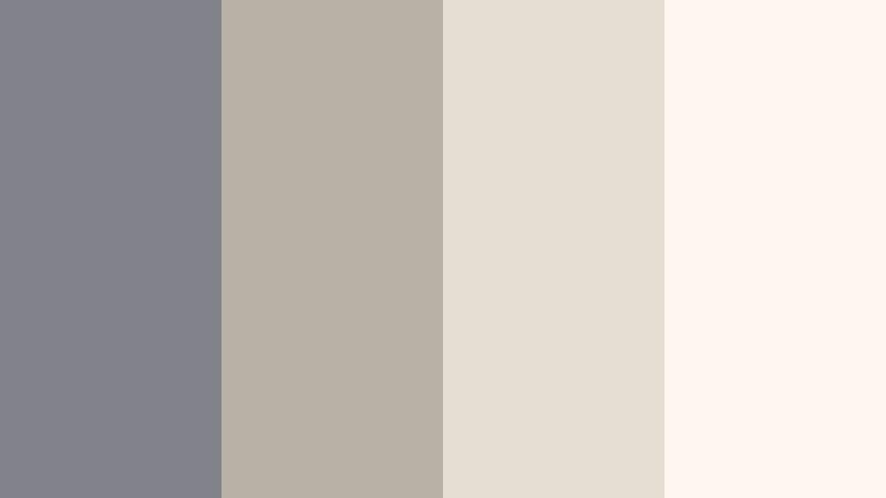
Morning Steam Latte

- HEX Codes: #797b81, #c0b7ae, #eee4da, #f7f2ec
- Mood: Warm, quiet, and slow-paced like a latte on a rainy morning.
- Use for: Great for cafe aesthetics, journaling videos, and morning routine content.
Morning Steam Latte pairs Storm Gray with latte-inspired beiges and creamy highlights. It merges cool and warm tones in a soft, approachable way, ideal for daily routines and gentle storytelling.
Use the warm neutrals as backgrounds for to-do lists, habit trackers, or quote cards, while Storm Gray anchors text, icons, and graphic details. It works especially well in thumbnails where you want to hint at coffee, notebooks, and cozy spaces even before the viewer presses play.
Overcast Bedroom Glow

- HEX Codes: #7c7f85, #c4c7cd, #f2f3f7, #fff9f2
- Mood: Gentle and restful, with soft light spilling through curtains.
- Use for: Use for slow living edits, reset day vlogs, and ASMR-style content.
Overcast Bedroom Glow combines pale Storm Gray with diffused whites and a hint of warm ivory (#fff9f2). It suggests quiet mornings, soft linens, and slow movement.
Apply it to slow living edits, reset-day vlogs, and ASMR videos where sound and pacing are the focus. In Filmora, you can use these tones for calm title cards, minimal subscribe reminders, and chapter markers that never feel too loud or distracting against restful footage.
Cozy Loft Workspace
- HEX Codes: #808389, #b8b0a4, #e6ddd1, #fdf7ef
- Mood: Creative, relaxed, and slightly rustic yet still modern.
- Use for: Perfect for creator desk tours, productivity tips, and aesthetic study edits.
Cozy Loft Workspace anchors everything in Storm Gray while layering on warm, wood-inspired neutrals. It feels like a modern studio with wooden shelves, paper, and plants, making it great for creator-centric content.
Use the warm tones as soft backgrounds for timestamps, titles, and tip boxes in productivity or desk-tour videos. Storm Gray can carry logos, icons, and buttons in your thumbnails and transitions, keeping your overall brand clean but still warm and inviting.
Bold Accent Storm Gray Color Palettes
Neon Crosswalk Pulse

- HEX Codes: #77797f, #111318, #00ffc3, #ff3366, #ffffff
- Mood: Energetic, urban, and punchy with a futuristic street vibe.
- Use for: Use in dynamic intros, creator brand stings, and high-energy transitions.
Neon Crosswalk Pulse sets Storm Gray and deep ink (#111318) as the street-level base, then slices through with neon teal (#00ffc3), electric pink (#ff3366), and clean white. It is designed for speed, movement, and bold statements.
Use gray and black for backgrounds and frames, then reserve neon accents for key actions: subscribe buttons, lower third highlights, glitch text, or call-to-action arrows. It is perfect for gaming intros, editing montages, and fast-paced creator stings built in Filmora.
Signal Flare Contrast
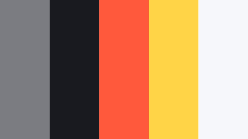
- HEX Codes: #7a7c82, #181a1f, #ff5a3c, #ffd447, #f6f7fb
- Mood: Alert, high-impact, and graphic, inspired by signal lights in the fog.
- Use for: Ideal for call-to-action cards, sale promos, and attention-grabbing thumbnails.
Signal Flare Contrast grounds everything in Storm Gray and deep ink (#181a1f), then adds hot orange (#ff5a3c) and warning yellow (#ffd447) on top. The nearly white neutral (#f6f7fb) keeps things from feeling heavy.
Use the neutral and gray for most of your thumbnail or promo card, and let the orange and yellow highlight discounts, limited-time text, arrows, and end-screen CTAs. It works especially well for channel announcements, product launches, or short promo edits where you need instant attention without sacrificing a cinematic gray base.
Tips for Creating Storm Gray Color Palettes
Storm Gray is flexible enough to feel minimal, cinematic, or cozy, depending on how you combine it. These tips will help you build palettes that look great on screens and stay consistent across your Filmora projects.
- Pair Storm Gray with one temperature direction at a time: cool blues for tech and cinematic edits, or warm beiges for lifestyle and cozy content.
- Always test text contrast: put your main title color on top of your chosen background gray and check readability at thumbnail size and on mobile.
- Use one accent color for emphasis: neon or warm accents stand out more when the rest of the palette stays in Storm Gray and soft neutrals.
- Match the palette to your footage: if your clips are already warm, pick gray palettes that include beige or ivory instead of icy whites.
- Keep brand elements consistent: use the same Storm Gray hex codes for logos, lower thirds, and end screens so your channel has a recognizable look.
- Control mood with brightness: lighter Storm Gray palettes feel clean and productive, while darker ones add drama and depth to cinematic edits.
- Use gradients, not flat blocks: gentle Storm Gray gradients in Filmora titles and overlays feel more polished and less like static slides.
- Save presets in Filmora: once you dial in a Storm Gray look with color correction and graphic elements, save it as a preset to reuse across videos.
Storm Gray palettes can quietly shape the personality of your videos, from sleek and corporate to moody, cozy, or bold with neon accents. By choosing the right combination of neutrals and accent colors, you can guide how viewers feel before they even hear a word of dialogue.
Try these 15 Storm Gray color combinations as ready-made starting points for your branding, thumbnails, intros, and overlays. Then refine them inside Filmora using AI Color Palette, HSL, and filters until they perfectly match your channel story.
The more consistently you use your chosen palette, the faster your audience will recognize your content in their feed. Open Filmora, drop in your footage, and start testing which Storm Gray mood best fits your next project.
secure download