
 100% Security Verified | No Subscription Required | No Malware


 ChatGPT
 Perplexity
 Gemini
 Claude
 Grok
Grok
Stormy Blue sits between deep navy and soft slate, carrying the feeling of rain clouds, open water, and late-night reflections. It feels calm but serious, making it a powerful choice for storytelling, productivity, tech, and cinematic content. Psychologically, Stormy Blue suggests trust, maturity, and introspection, which is why it works so well for brands and creators who want to look thoughtful, polished, and professional.
In video editing and design, Stormy Blue color palettes are ideal for YouTube thumbnails, vlogs, intros, cinematic edits, overlays, and even channel branding. Below are ready-to-use Stormy Blue color combinations with HEX codes so you can match your grading, graphics, and text styles. Every palette is designed with practical use in mind for Filmora users and content creators.
In this article
Moody Cinematic Stormy Blue Color Palettes
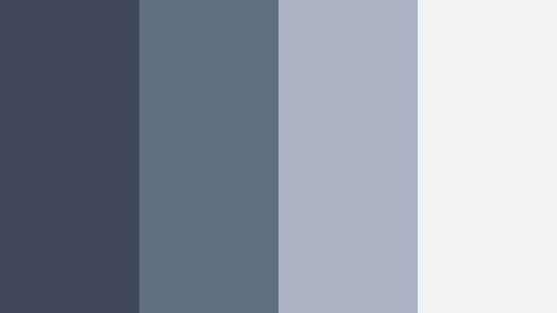
Harbor Night Cinematic

- HEX Codes: #2f3b4c, #1a2430, #70839a, #c9d4e0
- Mood: Dramatic, introspective, and filmic like a quiet port after sunset.
- Use for: Perfect for cinematic vlogs, travel documentaries, and emotional storytelling intros.
This palette leans into deep Stormy Blue shadows (#2f3b4c, #1a2430) with foggy gray-blue midtones (#70839a) and a soft highlight tone (#c9d4e0). On screen, it feels like standing by the harbor at night, hearing only water and distant city hum. It is ideal when you want your footage to look cinematic without pushing into harsh contrast.
Use Harbor Night Cinematic for narrative-driven edits, slow travel b-roll, or reflective talking-head videos. In thumbnails and titles, place text over the lighter tones while keeping backgrounds in the deeper blues to create drama and focus. For branding, this combo works well for channels that mix travel, storytelling, and personal growth content.
Pro Tip: Build a Cinematic Stormy Blue Look in Filmora
To keep a Harbor Night Cinematic feel consistent, start by picking one of the mid Stormy Blues as your core UI and text color in Filmora, then use the darkest tone only for deep backgrounds or letterbox bars. Add a gentle vignette and a slight fade in the blacks so your footage feels like it all lives in the same twilight atmosphere.
When editing a full project, reuse this palette for intros, lower thirds, end screens, and even subtitles. In Filmora, you can save your text styles and color presets so every new title or graphic automatically uses the same Stormy Blue combination across your channel.
AI Color Palette
If you have a harbor photo or a frame graded with this palette, you can turn it into a look for your entire video. Filmora's AI Color Palette feature analyzes your reference image and transfers the Stormy Blue tones, contrast, and highlights onto other clips in a couple of clicks.
Simply choose your best graded shot or a still image that represents your Harbor Night Cinematic style, then apply that palette to your full sequence. This keeps your vlogs, b-roll, and cutaways all locked into the same moody Stormy Blue mood without endless manual tweaking.
 secure download

HSL, Color Wheels & Curves
After matching your palette, use Filmora's HSL and color wheels to refine the Stormy Blue range. Slightly desaturate the blues in HSL to avoid banding, then use the midtone wheel to give them a cooler or warmer bias depending on your story. A subtle S-curve in the RGB curves panel can add contrast without crushing the details in those deep harbor shadows.
For a step-by-step walkthrough on shaping shadows, mids, and highlights, Filmora's YouTube tutorials on color grading with curves and wheels help you dial in a cinematic Stormy Blue that still keeps faces natural and skin tones believable.
secure download1000+ Video Filters & 3D LUTs
If you want to reach a Stormy Blue aesthetic faster, start from Filmora's built-in filters and LUTs, then nudge them toward your Harbor Night Cinematic HEX codes. Filmora's video filters and 3D LUTs make it easy to apply a moody base look, then stack additional color adjustments to lock in your exact tones.
You can layer subtle film-style LUTs with glow or vignette filters, then fine-tune the blues to match this palette. Once you are happy with the look, save it as a custom preset so every future harbor, city, or night vlog instantly takes on the same Stormy Blue personality.
secure downloadRain-Soaked City Streets

- HEX Codes: #263447, #3e5268, #8c9db0, #f1f3f6
- Mood: Urban, reflective, and slightly melancholic, like walking under neon lights after rain.
- Use for: Ideal for city b-roll, late-night tech reviews, and moody title cards.
Rain-Soaked City Streets uses layered Stormy Blues (#263447, #3e5268) against misty gray and a pale highlight white (#8c9db0, #f1f3f6). It feels urban and cinematic, like light bouncing off wet pavement. The contrast stays soft enough for faces while still making your frames feel polished and modern.
Use this palette for tech reviews filmed at night, urban exploration vlogs, or reflective storytime videos. For thumbnails, combine the darkest blue as the background, the mid blue as accent shapes, and the very light tone for headlines or call-to-action text.
Thundercloud Horizon

- HEX Codes: #1b2633, #314055, #5f6c7e, #aab4c2
- Mood: Brooding and powerful, capturing the build-up before a storm breaks.
- Use for: Works well for trailers, podcast visuals, and tense storytelling sequences.
Thundercloud Horizon moves from inky blues (#1b2633) into softened slate and steel (#314055, #5f6c7e, #aab4c2). The result is a brooding, suspenseful atmosphere that still looks clean and controlled. It captures the energy just before a storm hits, without going fully dark.
Apply this palette to true crime intros, podcast animations, or dramatic trailers. Use the lightest steel tone for readable typography and graphic overlays, while the darkest hue becomes your background, frames, and letterbox bars for a filmic finish.
Foggy Dockside Frames

- HEX Codes: #2a3746, #415366, #7a8997, #d5dde6
- Mood: Quiet, mysterious, and slightly nostalgic, like an empty pier at dawn.
- Use for: Great for reflective travel logs, ambient music videos, and minimalist openers.
Foggy Dockside Frames softens Stormy Blue into gentle shadows (#2a3746, #415366) with misty midtones and a cool highlight (#7a8997, #d5dde6). It feels nostalgic and calm, as if the world is wrapped in early-morning fog. The low contrast gives your footage a dreamy, almost analog touch.
Use this palette for ambient music videos, slow travel sequences, or minimal YouTube channel intros. For motion graphics and titles, place subtle text over the lighter gray-blue to keep readability while letting your visuals stay soft and atmospheric.
Midnight Script Titles

- HEX Codes: #151d27, #2b3949, #546477, #e1e6ee
- Mood: Sleek, modern, and editorial with a late-night broadcast feel.
- Use for: Perfect for title cards, lower thirds, and end screens on documentary or tech channels.
Midnight Script Titles is built on sharp Stormy Blue blacks (#151d27, #2b3949) with cool grays and an icy highlight (#546477, #e1e6ee). It has an editorial, late-night-show quality that works especially well for typography-heavy layouts.
Use the darkest blue for solid backgrounds and bars, the midtones for icons and graphic lines, and the icy white for your logos and titles. This palette is ideal for modern documentary intros, clean tech explainers, and signature end screens that feel premium.
Soft Coastal Stormy Blue Color Palettes
Misty Coastal Morning

- HEX Codes: #43556a, #6f8194, #a0b0c1, #f5f7fa
- Mood: Calm, airy, and refreshing like early light on a quiet shoreline.
- Use for: Lovely for lifestyle vlogs, morning routines, and wellness content branding.
Misty Coastal Morning softens Stormy Blue into gentle, airy hues (#43556a, #6f8194, #a0b0c1) with a very light white (#f5f7fa). It looks clean and refreshing, perfect for content that aims to feel calm, organized, and inspiring.
Use this palette in lifestyle thumbnails, productivity dashboards, or wellness channel overlays. Let the lightest tone fill your backgrounds and use the mid blues for titles, buttons, and icons so everything feels breezy and approachable.
Seaglass Drift

- HEX Codes: #3b4f62, #7c9da5, #c3dadb, #f9fbfb
- Mood: Light, breezy, and slightly nostalgic, like collecting seaglass on a cloudy day.
- Use for: Ideal for channel branding, subtle lower thirds, and soft product showcases.
Seaglass Drift pairs weathered Stormy Blue (#3b4f62) with muted aqua-grays and pale off-whites (#7c9da5, #c3dadb, #f9fbfb). It feels gentle and nostalgic, with just enough color to stand out while staying soft on the eyes.
This works beautifully for minimal branding, soft product shots, and understated lower thirds. Use the darkest tone sparingly for accents and line art, and rely on the lighter colors for backgrounds, frames, and gentle gradients in your Filmora titles.
Tidepool Reflections

- HEX Codes: #324556, #4c6272, #92a6b0, #e2edf2
- Mood: Peaceful and reflective with a cool marine depth.
- Use for: Great for B-roll overlays, meditative sequences, or chilled-out music edits.
Tidepool Reflections combines layered Stormy Blue tones (#324556, #4c6272) with silvered water hues and a hazy highlight (#92a6b0, #e2edf2). It feels like watching ripples along a shoreline, calm and slightly hypnotic.
Use this palette for meditation content, focus playlists, or chilled travel edits. In Filmora, you can color-key your overlays and shapes to these HEX values and keep the entire frame feeling cohesive and gently aquatic.
Overcast Beach Day
- HEX Codes: #3a4857, #5f6f7f, #a7b3c0, #f0f3f6
- Mood: Softly muted and cozy, like a quiet walk on a gray-sky shoreline.
- Use for: Perfect for minimalist travel diaries, intro cards, and subtle brand backgrounds.
Overcast Beach Day blends cool Stormy Blue (#3a4857, #5f6f7f) into low-contrast grays and a gentle shell white (#a7b3c0, #f0f3f6). It is desaturated and cozy, making your footage feel calm and understated.
Use it in minimal travel diaries, personal vlogs, or channels that want a soft, quiet aesthetic. Keep your key text on the lightest tone while using the mid blues for section dividers, frames, and graphic elements inside Filmora templates.
Harbor Mist Glow

- HEX Codes: #404f61, #6d7f92, #bac6d2, #ffffff
- Mood: Clean, modern, and softly luminous, with a hint of marina chic.
- Use for: Excellent for channel art, intros, and titles for design, travel, or productivity content.
Harbor Mist Glow balances Stormy Blue midtones (#404f61, #6d7f92) with airy cool grays and crisp white (#bac6d2, #ffffff). It looks modern and luminous, great for content that needs to feel both stylish and easy to read.
Use the brightest white as your main canvas and apply the blues to titles, icons, and animated shapes. This palette is especially strong for YouTube channel banners, intro animations, and productivity dashboards built inside Filmora.
Modern Professional Stormy Blue Color Palettes
Tech Studio Slate

- HEX Codes: #202b38, #3e4d60, #7f8b9b, #e7ebf2
- Mood: Sophisticated, minimal, and tech-forward with studio-grade polish.
- Use for: Great for tech reviews, SaaS explainers, UI showcases, and channel branding.
Tech Studio Slate uses structured Stormy Blues (#202b38, #3e4d60) with cool slate grays and a pale interface white (#7f8b9b, #e7ebf2). It feels like a clean studio set or a modern software dashboard, making your videos look instantly more professional.
Use this palette for hardware reviews, screen-recorded tutorials, and UI mockups. Let the dark blue sit behind your product shots while using the lighter tones for panels, info cards, and lower thirds in Filmora.
Executive Deep Blue

- HEX Codes: #141c25, #283546, #607187, #d3dbe5
- Mood: Authoritative, grounded, and trustworthy like a premium corporate brand.
- Use for: Ideal for business intros, finance explainers, LinkedIn content, and pitch decks.
Executive Deep Blue blends rich Stormy Blue shadows (#141c25, #283546) with structured midtones and a muted highlight (#607187, #d3dbe5). It feels serious and reliable, perfect for corporate storytelling and financial content.
Use the deepest shade for backgrounds and frames, with the muted highlight for charts, infographics, and key statistics. This palette makes LinkedIn videos, business intros, and pitch deck animations feel premium without looking flashy.
Minimal Deck Boards

- HEX Codes: #2c3642, #566370, #9ca6b2, #f6f8fa
- Mood: Clean, understated, and design-driven with a Scandinavian edge.
- Use for: Perfect for slideshow templates, tutorial frames, and modern lower thirds.
Minimal Deck Boards tones down Stormy Blue into muted, matte shades (#2c3642, #566370, #9ca6b2) against a bright but soft white (#f6f8fa). The look is minimalist and design-forward, ideal for creators who want their visuals to feel intentional and clutter-free.
Build slideshow templates, course content, and modern lower thirds with this palette as your base. Let the white fill most of the canvas and reserve the darkest blue for key accents, borders, and typography that needs attention.
Conference Room Chill

- HEX Codes: #323f4f, #55657a, #8f9eb0, #e8edf3
- Mood: Cool, calm, and collected with a polished corporate calmness.
- Use for: Great for webinar overlays, educational channels, and presentation-style videos.
Conference Room Chill pairs steady Stormy Blue tones (#323f4f, #55657a) with refined grays and a soft highlight (#8f9eb0, #e8edf3). It keeps things cool and relaxed, perfect for information-dense content that should not feel stressful.
Use this palette for webinar frames, Zoom overlays, and course modules. Place slides and bullet points on the lightest background, and use the mid blues for headers, icons, and callouts so your viewers can scan information easily.
Bold Contrast Stormy Blue Color Palettes
Neon Storm Glow
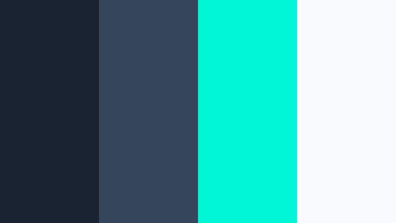
- HEX Codes: #182230, #34455a, #00f5d4, #f9fafb
- Mood: Energetic, edgy, and futuristic with a neon accent punch.
- Use for: Perfect for gaming intros, edgy motion graphics, and high-impact thumbnails.
Neon Storm Glow anchors dark Stormy Blue bases (#182230, #34455a) with a bright cyan-neon accent (#00f5d4) and clean white (#f9fafb). The result is a sharp, futuristic aesthetic that jumps off the screen while still feeling cool-toned and cohesive.
Use the neon color for call-to-action buttons, glow effects, and motion graphic accents, while relying on the dark blues for backgrounds. This palette fits gaming intros, tech promos, and bold social media posts that need to grab attention in a crowded feed.
Electric Harbor Lights

- HEX Codes: #1c2633, #3c4c63, #ffb400, #ffffff
- Mood: Vibrant and cinematic, like golden lights flickering over deep harbor water.
- Use for: Great for announcement cards, promo trailers, and bold call-to-action frames.
Electric Harbor Lights places inky Stormy Blues (#1c2633, #3c4c63) next to a striking amber accent (#ffb400) and bright white (#ffffff). Think of city lights hitting dark water: cinematic, bold, and instantly eye-catching.
Use the amber as your main highlight color for buttons, price tags, or countdowns, and keep text mostly in white for clarity. This palette is excellent for promo trailers, sales announcements, and any thumbnail where you want the viewer's eye to go straight to your call to action.
Tips for Creating Stormy Blue Color Palettes
Stormy Blue works across moody cinematic edits, soft coastal aesthetics, and professional branding. A few practical guidelines will help you combine it with other tones in a way that stays readable, on-brand, and easy to grade inside Filmora.
- Pair Stormy Blue with at least one light neutral (off-white or soft gray) so titles and UI elements stay legible on small screens.
- Pick one dominant Stormy Blue shade and treat the others as accents; this keeps your thumbnails and intros from looking muddy.
- Use warm accent colors (amber, peach, soft gold) sparingly to create contrast and draw attention to buttons, timestamps, or CTAs.
- When color grading footage, match your midtones to your chosen Stormy Blue range but keep skin tones natural by protecting reds and oranges in HSL.
- For branding, reuse the same HEX codes for your logo, lower thirds, and end screens so viewers associate that specific Stormy Blue palette with your channel.
- Test your palette in both light mode and dark mode layouts if you use on-screen graphics or text-heavy frames in Filmora.
- Export one frame from your edit, then adjust your palette if any text becomes hard to read or key elements blend into the background.
- Save your favorite combinations as Filmora custom presets so you can apply the same Stormy Blue look to future videos in seconds.
Stormy Blue color palettes can shift your content from casual to cinematic, from random to recognizable. Whether you choose a moody harbor look, a soft coastal setup, or a bold neon contrast, these HEX-based combinations help you control mood and build a strong visual identity.
Try dropping these palettes directly into your Filmora titles, overlays, and color grading tools. Once your intros, b-roll, and end screens all share the same Stormy Blue language, your channel or brand will feel more cohesive and professional.
Experiment, save your favorite looks as presets, and keep refining until your Stormy Blue aesthetic feels exactly like your voice on screen.
secure downloadNext: Dusty Navy Color Palette
