
 100% Security Verified | No Subscription Required | No Malware


 ChatGPT
 Perplexity
 Gemini
 Claude
 Grok
Grok
Ultramarine Blue is a deep, vivid blue that feels both cinematic and timeless. It is often linked with trust, depth, and creativity, making it a favorite for brands and creators who want their visuals to feel bold yet reliable. On screen, Ultramarine Blue can suggest night skies, ocean depth, or polished tech, depending on how you pair it with highlights, shadows, and accent colors.
For video editors, YouTubers, and designers, Ultramarine Blue works beautifully in intros, lower thirds, thumbnails, channel banners, and color grading. Below you will find ready-made Ultramarine Blue color palettes with HEX codes that you can plug directly into your branding, thumbnails, overlays, and Filmora projects to keep your visuals consistent and professional.
In this article
Cinematic Ultramarine Blue Color Palettes
Midnight Harbor Neon
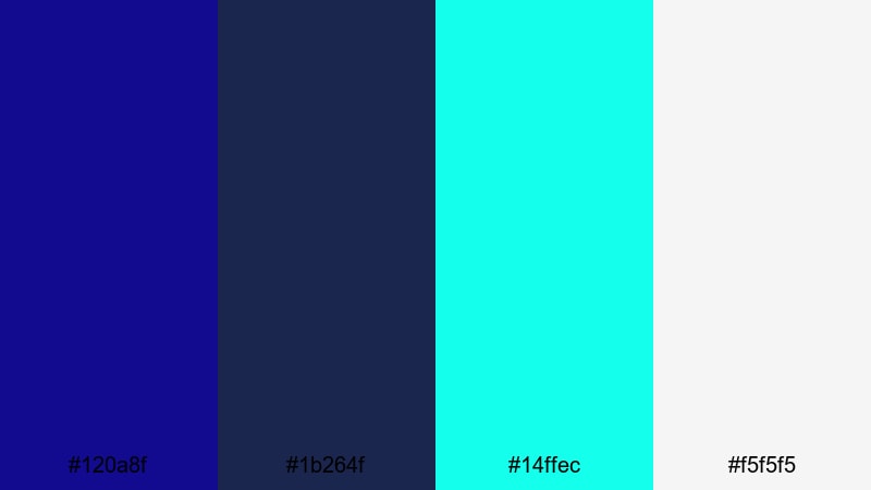
- HEX Codes: #120A8F, #1B264F, #14FFEC, #F5F5F5
- Mood: Moody and electric, like a harbor city glowing under neon lights at midnight.
- Use for: Ideal for cinematic travel vlogs, cyberpunk style intros, and dramatic gaming thumbnails that need high contrast accents.
This palette anchors everything in a deep Ultramarine Blue (#120A8F) and muted navy (#1B264F), then cuts through the darkness with neon teal (#14FFEC) and a clean soft white (#F5F5F5). The result feels like a night harbor scene lit by billboards and signs, perfect when you want drama without losing clarity.
Use the blues for your background plates, scenes, or gradients, then let the teal and white handle titles, HUD elements, or UI overlays. In Filmora, this palette is great for glitchy intros, cyberpunk transitions, or gaming thumbnails where Ultramarine Blue dominates the frame and neon teal highlights key text like episode numbers or call-to-action buttons.
Pro Tip: Build a Cinematic Ultramarine Blue Look in Filmora
To keep a strong Ultramarine Blue theme across an entire edit, start by choosing one or two shots that represent your ideal look for Midnight Harbor Neon. Color grade those hero shots first in Filmora using the Color panel, pushing shadows toward deep Ultramarine and keeping highlights clean and slightly cool.
Once you are happy, reuse those settings for your intro, B-roll, talking head shots, and end screen. This way, your travel vlog, gaming montage, or channel trailer feels like one cohesive night-world rather than a mix of random clips.
AI Color Palette
You can turn this palette into a full project style with almost no manual tweaking. Grab a still frame or a simple color card that shows your Ultramarine, teal, and white combination clearly. Then use Filmora's AI Color Palette feature to match that look across all your clips.
AI Color Palette analyzes the reference and transfers its color mood, contrast, and tint onto the rest of your timeline. It is especially useful for night city scenes shot on different cameras or in mixed lighting, helping you keep the Ultramarine Blue mood consistent from intro to outro.
 secure download

HSL, Color Wheels & Curves
To refine your Ultramarine Blue look, dive into Filmora's HSL, color wheels, and curves controls. With HSL, you can isolate blues and cyans to make Ultramarine deeper, bring teal closer to neon, or slightly desaturate backgrounds so that titles pop. Color wheels help you push shadows into a rich Ultramarine while keeping midtones skin-friendly and highlights neutral.
Use the curves panel to add a cinematic S-curve: gently lift shadows to avoid crushed blacks and roll off highlights so neon accents stay controlled. For more ideas on shaping dynamic blue tones, check out Filmora's color correction tools and experiment with different contrast levels on your night footage.
secure download1000+ Video Filters & 3D LUTs
If you want to stylize your Ultramarine Blue palette even faster, Filmora's filter and LUT library gives you a starting point. Apply a cool cinematic LUT to push your footage toward rich blues, then tweak saturation and contrast so the teal and white accents from Midnight Harbor Neon still read clearly.
Filmora's video filters and 3D LUTs make it easy to test multiple looks on the same timeline, from soft sci-fi glows to hard-edged cyberpunk contrast. Once you find a look you like, save it as a preset and reuse it on future Ultramarine Blue themed videos to keep your brand consistent.
secure downloadOcean Depths Cinema
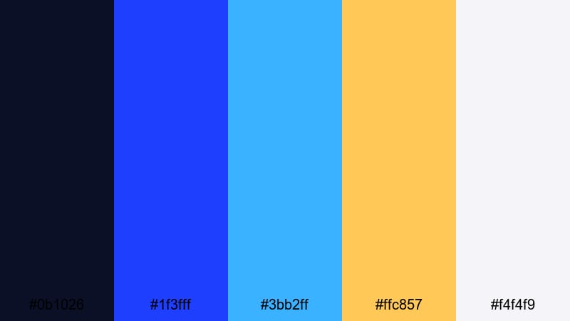
- HEX Codes: #0B1026, #1F3FFF, #3BB2FF, #FFC857, #F4F4F9
- Mood: Immersive and adventurous, evoking underwater scenes and epic sea voyages.
- Use for: Great for documentary style travel films, underwater footage, and cinematic logos that need a bold yet approachable feel.
Ocean Depths Cinema layers almost-black navy (#0B1026) with bright Ultramarine Blue (#1F3FFF) and a friendly sky cyan (#3BB2FF). A warm gold accent (#FFC857) and soft off white (#F4F4F9) keep it from feeling cold or distant, so you get the sense of deep water with a hopeful, adventurous twist.
Use the darkest tone as a backdrop for full-screen titles or logo stings, let Ultramarine and cyan grade your footage toward an oceanic feel, and reserve gold for subtle icons, progress bars, or subscribe buttons. This palette suits travel intros, diving B-roll, or any vlog where you want viewers to feel like they are journeying beneath the surface.
Stormy Skyline Fade
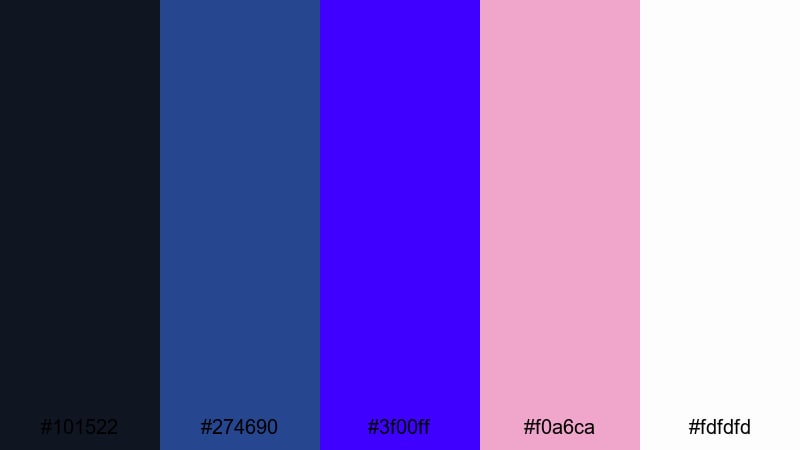
- HEX Codes: #101522, #274690, #3F00FF, #F0A6CA, #FDFDFD
- Mood: Dramatic and atmospheric, like a city skyline just before a summer storm.
- Use for: Perfect for moody film trailers, cityscape b roll, and storytelling shorts that balance drama with softness.
Stormy Skyline Fade builds a staircase of blue from deep charcoal navy (#101522) through steel-toned Ultramarine (#274690) to a vivid electric blue-violet (#3F00FF). Soft blush pink (#F0A6CA) and crisp white (#FDFDFD) add a gentle glow, like light reflecting on wet streets just before the rain hits.
For urban vlogs and narrative shorts, use the blues in your grade and overlays, then introduce blush as a contrasting accent in text, callouts, or light leaks. This combination works well for dramatic titles, before-and-after reveals, and emotional beats where you want tension without making the scene feel harsh or gloomy.
Lunar Tide Highlights
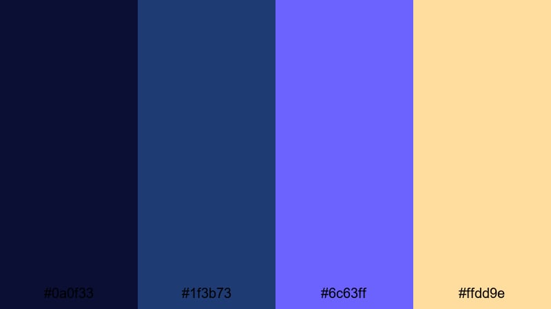
- HEX Codes: #0A0F33, #1F3B73, #6C63FF, #FFDD9E
- Mood: Mysterious and celestial, blending lunar night tones with soft tidal glow.
- Use for: Use for sci fi intros, nightscape timelapses, or dreamy title sequences with subtle golden highlights.
Lunar Tide Highlights mixes inky midnight blue (#0A0F33) and muted Ultramarine (#1F3B73) with a glowing periwinkle-lavender (#6C63FF). A pale, creamy gold (#FFDD9E) acts like moonlight on water, adding warmth without breaking the night-time mood.
Try this palette for sci-fi channel branding, starfield timelapses, or moody tutorial openings. Use the darker blues as your backdrop, periwinkle on key graphic elements, and pale gold sparingly on logo marks, subscribe CTAs, or chapter markers so they feel special and celestial.
Soft & Dreamy Ultramarine Blue Color Palettes
Blueberry Cotton Clouds
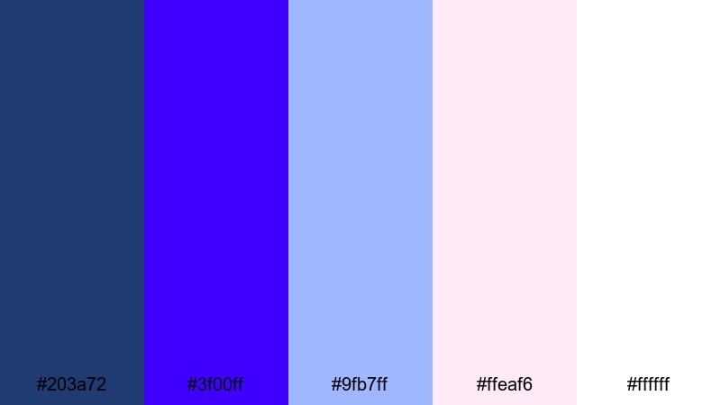
- HEX Codes: #203A72, #3F00FF, #9FB7FF, #FFEA F6, #FFFFFF
- Mood: Gentle and whimsical, like fluffy clouds drifting through a blueberry sky.
- Use for: Lovely for lifestyle vlogs, morning routines, and aesthetic study videos aiming for a calm, cozy atmosphere.
Blueberry Cotton Clouds combines a soft navy Ultramarine (#203A72) with vibrant Ultramarine Blue (#3F00FF), diffused by powdery baby blue (#9FB7FF), blush pink (#FFEA F6), and pure white (#FFFFFF). The overall vibe is clean, airy, and comforting, perfect for cozy scenes and slow mornings.
Use the deeper blues for lower thirds or frames, then keep your main backgrounds light, leaning on pale blue and white. Blush pink is a great choice for timestamps, study session labels, or gentle reminders to like and subscribe. This palette keeps your footage feeling bright without being stark, ideal for channels focused on productivity, journaling, or self-care.
Serene Dusk Story
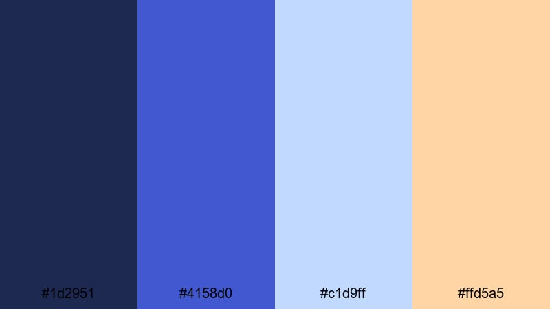
- HEX Codes: #1D2951, #4158D0, #C1D9FF, #FFD5A5
- Mood: Calm and reflective, capturing the slow shift from blue hour into twilight.
- Use for: Best for narrative vlogs, reflective storytelling videos, and soft branded outros with subtle warmth.
Serene Dusk Story shifts from muted Ultramarine navy (#1D2951) to a dreamy mid Ultramarine (#4158D0), then lifts into pastel sky blue (#C1D9FF) and a soft peach highlight (#FFD5A5). It feels like blue hour fading into a warm evening, perfect for reflective or storytelling-heavy content.
Use the darker blues in your backgrounds and overlays, keeping pastel blue for panels, callouts, and gentle lower thirds. Peach makes a subtle accent for end screen buttons, chapter headings, or brand marks when you want a hint of warmth that does not overpower the blue mood.
Powdered Sea Glass
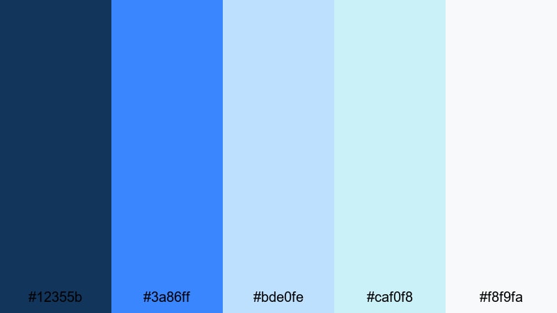
- HEX Codes: #12355B, #3A86FF, #BDE0FE, #CAF0F8, #F8F9FA
- Mood: Airy and refreshing, reminiscent of polished sea glass on a bright shoreline.
- Use for: Great for wellness channels, productivity content, and clean UI style overlays that feel light and modern.
Powdered Sea Glass starts with a cool blue base (#12355B) and clear Ultramarine-inspired blue (#3A86FF), then dissolves into gentle aquas (#BDE0FE, #CAF0F8) and a misty neutral (#F8F9FA). It feels fresh and minimal, like ocean air and sunlight on frosted glass.
Use this palette for channels that need calm clarity: wellness, meditation, workspace tours, or app walkthroughs. Let the light tones dominate screens and panels, using Ultramarine accents for important buttons, progress steps, or key data points so they are easy to see without feeling aggressive.
Twilight Pastel Glow
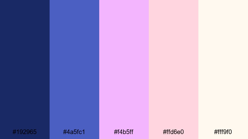
- HEX Codes: #192965, #4A5FC1, #F4B5FF, #FFD6E0, #FFF9F0
- Mood: Romantic and nostalgic, like pastel neon signs flickering at twilight.
- Use for: Ideal for aesthetic vlogs, study with me videos, and dreamy lookbooks targeting a soft pastel audience.
Twilight Pastel Glow pairs deep Ultramarine navy (#192965) with a velvety mid Ultramarine (#4A5FC1), then introduces candy-soft lavender (#F4B5FF), blush (#FFD6E0), and creamy off white (#FFF9F0). The palette feels like a pastel city night, perfect for dreamy or nostalgic content.
Let the darker blues frame your shots or appear in corner graphics, while pastel tones fill your title cards, widgets, and caption bars. This combination works especially well for pastel-themed channels, K-pop inspired edits, stationery hauls, or night study vlogs where you want a gentle glow instead of harsh neon.
Bold & Futuristic Ultramarine Blue Color Palettes
Neon Grid Horizon
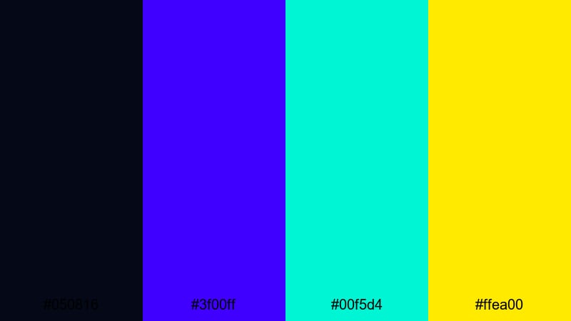
- HEX Codes: #050816, #3F00FF, #00F5D4, #FFEA00
- Mood: High energy and futuristic, like a retro neon grid stretching into the distance.
- Use for: Perfect for tech reviews, synthwave edits, and gaming intros that need bold, high contrast visuals.
Neon Grid Horizon throws bright Ultramarine (#3F00FF) against a nearly black base (#050816), then blasts the frame with electric cyan (#00F5D4) and acid yellow (#FFEA00). It channels retro-futuristic arcades and synthwave album covers in a compact palette.
Lean on the dark background and Ultramarine grid lines or frames, then let cyan and yellow pick out important text, scores, or UI elements. This palette is ideal for motion graphics intros, esports countdowns, and product B-roll where you want maximum impact and instant readability on thumbnails.
Digital Wave Pulse
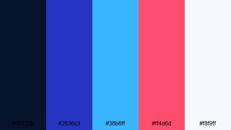
- HEX Codes: #07122B, #2636C3, #38B6FF, #FF4D6D, #F8F9FF
- Mood: Energetic and tech forward, pulsing like animated audio waves on screen.
- Use for: Use for app promos, podcast intros, and motion graphics where you want strong digital personality.
Digital Wave Pulse layers a dark blue base (#07122B) with a solid Ultramarine core (#2636C3) and bright cyan (#38B6FF). A punchy magenta red (#FF4D6D) and near-white blue tint (#F8F9FF) complete the look, giving you a palette that feels like live audio visualizers and equalizer bars.
Use the cool blues to build your waveforms, charts, and backgrounds, while magenta catches the eye on key badges, episode numbers, or important metrics. This palette works wonderfully for tech explainers, SaaS promos, music channels, and podcast intros that want a dynamic yet polished feel.
Ultraviolet Streamline
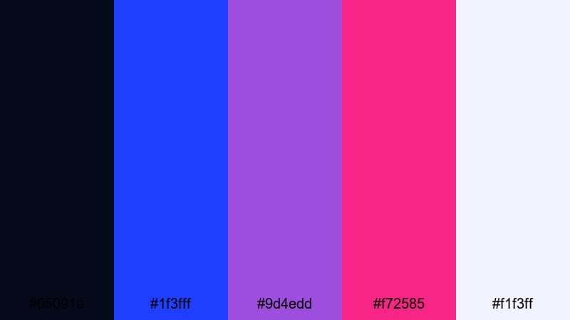
- HEX Codes: #05091A, #1F3FFF, #9D4EDD, #F72585, #F1F3FF
- Mood: Sleek and intense, balancing cool tech vibes with vibrant ultraviolet accents.
- Use for: Great for brand idents, esports overlays, and motion titles that should feel premium and cutting edge.
Ultraviolet Streamline builds a high-end tech feel with deep blue-black (#05091A), strong Ultramarine (#1F3FFF), and two vivid violets (#9D4EDD, #F72585). A light blue-tinged white (#F1F3FF) keeps everything readable while preserving the cool tone.
Use the blues as your base, then bring in violet and fuchsia as accent strokes, streaks, and highlight text. This palette is great for logo stings, esports overlays, and premium intros where you want to suggest speed, innovation, and modern tech design.
Glitch City Overture
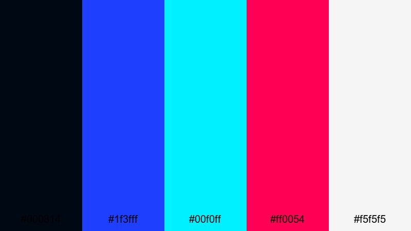
- HEX Codes: #000814, #1F3FFF, #00F0FF, #FF0054, #F5F5F5
- Mood: Edgy and chaotic, like a neon city seen through a glitching screen.
- Use for: Ideal for glitch transitions, music videos, and edgy channel branding focused on urban or cyber themes.
Glitch City Overture fuses an almost black midnight (#000814) with core Ultramarine (#1F3FFF), vivid cyan (#00F0FF), hot magenta (#FF0054), and clean white (#F5F5F5). It feels like a noisy, glitchy city night packed with signs, screens, and data.
Use the dark blue as your background canvas and Ultramarine for strong blocks, then slice in cyan and magenta as offset shadows, glitch streaks, or duplicated text. White ensures legibility, making this palette ideal for kinetic typography, music video overlays, and bold channel branding that needs to stand out in crowded feeds.
Elegant & Minimal Ultramarine Blue Color Palettes
Museum Gallery Blue
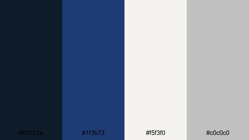
- HEX Codes: #0D1B2A, #1F3B73, #F5F3F0, #C0C0C0
- Mood: Quiet and refined, like a modern art gallery with deep blue accents.
- Use for: Best for minimalist brand videos, portfolio reels, and clean lower thirds that demand understated elegance.
Museum Gallery Blue mixes a dark, almost inky navy (#0D1B2A) with a softer Ultramarine-inspired blue (#1F3B73), then balances both with warm white (#F5F3F0) and soft gray (#C0C0C0). It has the calm, curated feeling of a high-end gallery or design studio.
Let the whites and grays dominate your backgrounds and whitespace, while the Ultramarine blues act as structural lines, logo colors, or headline text. This palette works especially well for portfolios, brand case studies, product demos, and LinkedIn-friendly content where you want a serious, polished presence.
Editorial Ink Contrast
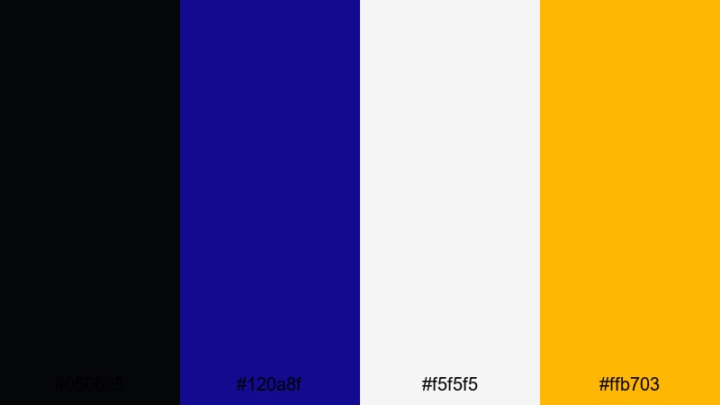
- HEX Codes: #050608, #120A8F, #F5F5F5, #FFB703
- Mood: Bold yet editorial, echoing deep ink on crisp magazine pages.
- Use for: Great for fashion lookbooks, cinematic title cards, and minimalist thumbnails with a premium feel.
Editorial Ink Contrast uses near-black ink (#050608) and classic Ultramarine Blue (#120A8F) against a clean white page (#F5F5F5), with a touch of warm amber (#FFB703) as a highlight. It instantly suggests magazines, print layouts, and high-end editorial design.
Keep your backgrounds bright and simple, using black and Ultramarine for typography and strong graphic blocks. Amber is best reserved for very limited accents: a logo mark, one key CTA, or a fine underline. This palette is ideal for fashion reels, lookbooks, cinematic title sequences, and thumbnails that need to look sharp, minimal, and premium.
Nordic Night Interface
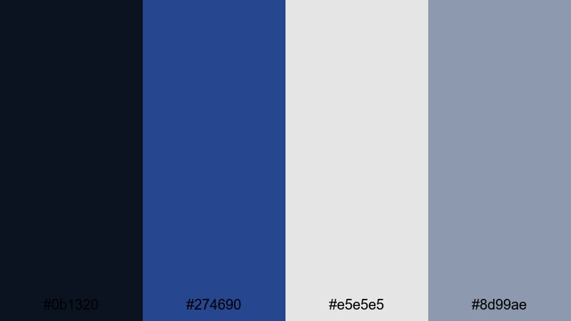
- HEX Codes: #0B1320, #274690, #E5E5E5, #8D99AE
- Mood: Cool and restrained, evoking a clear Nordic night sky over soft concrete tones.
- Use for: Ideal for clean UI overlays, productivity content, and tech explainers that need clarity without harsh color blocking.
Nordic Night Interface pairs deep blue-black (#0B1320) and steel Ultramarine (#274690) with pale gray (#E5E5E5) and slate gray (#8D99AE). The effect is cool, quiet, and structured, like a minimalist app interface against a night sky.
Use light gray as your main background, with Ultramarine reserved for headers, progress lines, and highlight icons. Dark blue is perfect for bars, navigation strips, or full-width intro sections. This palette suits productivity dashboards, UI mockups, step-by-step tutorials, and any video where clean information design matters.
Tips for Creating Ultramarine Blue Color Palettes
When you build your own Ultramarine Blue color palettes for video and design, focus on balance: mix deep blues with legible highlights, choose one or two accent colors, and always test how everything reads on small screens and thumbnails.
- Pick one primary Ultramarine Blue value (dark, mid, or bright) and build the rest of your palette around it for a clear visual identity.
- Always include at least one light neutral (white or off white) and one mid neutral (gray or beige) for readable text and UI elements.
- Use warm accents like gold, peach, or amber sparingly to guide attention to CTAs, subscribe buttons, or key stats without overwhelming the blue mood.
- For cinematic looks, push shadows slightly toward Ultramarine Blue and keep skin tones natural in the midtones using Filmora color tools.
- Check your thumbnails at small sizes to ensure dark Ultramarine backgrounds do not swallow your text; adjust contrast or stroke text if needed.
- Match your overlay colors to your graded footage: if the footage is very cool and blue, slightly desaturate your Ultramarine graphics to avoid color noise.
- Keep branding consistent by saving your HEX codes in Filmora presets or brand guides, so intros, lower thirds, and end screens all share the same Ultramarine Blue combinations.
- Test palettes in both light and dark modes: use Ultramarine as a base in dark layouts and as an accent in light layouts to keep flexibility across platforms.
Ultramarine Blue is powerful enough to define the mood of an entire channel or project. Whether you lean into cinematic night blues, soft pastel skies, bold neon grids, or minimal editorial layouts, these palettes give you ready-made HEX combinations that translate well into video, thumbnails, and branding.
Try a few of these Ultramarine Blue palettes inside Filmora and see how they change the feeling of your intros, transitions, and end screens. Once you land on a look that fits your story or brand, save it as your signature style and reuse it across vlogs, shorts, and social teasers for a consistent, recognizable presence.
With Filmora's color tools, AI features, and filter library, you can move from a simple color idea to a fully polished Ultramarine Blue aesthetic in just a few clicks.
secure downloadNext: Dark Gray Color Palette
