
 100% Security Verified | No Subscription Required | No Malware


 ChatGPT
 Perplexity
 Gemini
 Claude
 Grok
Grok
Verdigris sits between teal and turquoise, mixing calming blue with refreshing green. It often feels coastal, balanced, and a little cinematic, which makes it perfect for vlog aesthetics, branding, and eye-catching thumbnails. Used well, a Verdigris color palette suggests clarity, creativity, and trust while still feeling modern and stylish.
If you are designing channel art, YouTube intros, lower thirds, or cinematic color grading in Filmora, a well-planned Verdigris color combination can tie everything together. Below you will find 15 Verdigris color palettes with HEX codes, created for editors and designers who want ready-made schemes they can apply directly to titles, overlays, and video looks in Filmora.
In this article
Calm & Coastal Verdigris Color Palettes
Sea Glass Shoreline
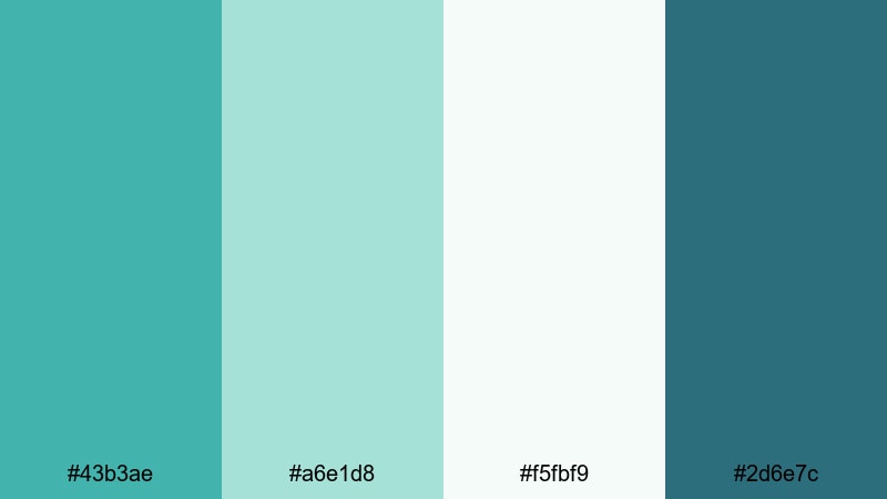
- HEX Codes: #43b3ae, #a6e1d8, #f5fbf9, #2d6e7c
- Mood: Breezy, relaxed, and refreshing like a quiet morning by the sea.
- Use for: Perfect for vlog intros, travel b-roll overlays, and channel art with a soft coastal feel.
Sea Glass Shoreline blends classic Verdigris with pale seafoam, airy white, and a grounding cool navy. The palette feels like early light on gentle waves: fresh, uplifting, and never too loud. It is ideal when you want a clean, coastal Verdigris color palette that still has enough contrast for on-screen text.
Use this scheme for YouTube channel banners, intro animations, and thumbnail frames where you want calm but polished visuals. In Filmora, you can apply the darker navy for lower thirds and outlines, keep Verdigris as your primary brand accent, and use the soft tints for backgrounds behind typography or logo reveals.
Pro Tip: Build a Calm Verdigris Aesthetic in Filmora
To keep a Sea Glass Shoreline look consistent across your entire edit, save your Verdigris color values as presets in Filmora. Use Verdigris and seafoam for titles, progress bars, and icons, then match your b-roll by nudging its tint slightly toward teal. This way your intros, b-roll overlays, and end screens all share the same airy coastal identity.
You can also design a simple graphic frame or subscribe animation using the navy as a border and Verdigris as a fill color, then reuse that asset across all your videos to lock in your brand style.
AI Color Palette
If you have a screenshot or thumbnail that already nails your Verdigris color combination, you can turn it into a reference look for a full video. Filmora's AI Color Palette feature lets you sample colors from that image and apply the same mood to the rest of your clips.
Import your Sea Glass Shoreline reference, open AI Color Palette, and let Filmora automatically harmonize your footage with similar teal, seafoam, and navy tones. This is perfect for vlogs and travel edits where you want every shot to feel like it belongs to the same coastal series.
 secure download

HSL, Color Wheels & Curves
Once your base look is in place, fine-tune the Verdigris tones using Filmora's HSL, color wheels, and curves controls. Slightly increasing saturation on the teal range while lowering saturation on other hues will keep your Verdigris accents prominent without making the image look overprocessed. Use the midtone and shadow color wheels to push blues gently toward green for that modern Verdigris feel.
If you want a more cinematic take, add a soft S-curve in the curves panel to deepen contrast, then lift the shadows a touch for a hazy, filmic coastal look. You can explore more grading ideas using Filmora's color correction tools alongside your chosen Verdigris palette.
secure download1000+ Video Filters & 3D LUTs
To speed up your workflow, try starting from one of Filmora's built-in filters or LUTs, then adjust it to match your Verdigris palette. For example, choose a cool cinematic LUT, reduce its intensity, and then nudge the hue so it lines up with your chosen greens and blues. This gives your footage a polished look that still respects your brand colors.
Filmora's video filters and 3D LUTs make it easy to create multiple variations of the same Verdigris aesthetic: one slightly warmer for lifestyle content, one cooler for tech videos, all built on the same core color scheme.
secure downloadHarbor Mist Morning

- HEX Codes: #4ab0a5, #d0e7e2, #8fb0b8, #233746
- Mood: Softly cinematic with a misty, contemplative harbor atmosphere.
- Use for: Ideal for slow-travel vlogs, reflective montages, and calm tutorial backgrounds.
Harbor Mist Morning pairs Verdigris with foggy grays and a deep harbor blue, giving your visuals a quiet, cinematic stillness. It feels grounded yet soft, like a calm dockside sunrise with muted colors and gentle reflections on the water.
This Verdigris color combination works especially well for voiceover content, slow-motion harbor shots, or reflective tutorials. Use the darkest tone for backgrounds behind text to keep everything readable, while the mid Verdigris and slate blue can color your icons, chapter markers, and timeline titles in Filmora.
Driftwood Tide
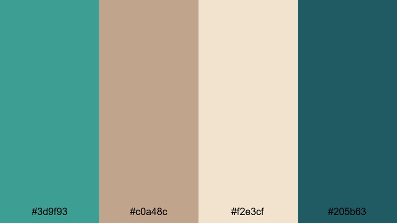
- HEX Codes: #3d9f93, #c0a48c, #f2e3cf, #205b63
- Mood: Earthy and grounded with a coastal boho twist.
- Use for: Great for lifestyle content, eco-brand intros, and warm yet airy thumbnails.
Driftwood Tide mixes a soft Verdigris with sandy neutrals and driftwood browns, anchored by a deep teal. The result is a relaxed beach-house vibe: organic, cozy, and slightly boho. It is perfect when you want a Verdigris palette that feels less digital and more natural.
Use this palette to style eco-friendly brand reels, slow living vlogs, or product shots made from natural materials. In thumbnails, pair Verdigris text over the light sand tone, then use the deeper teal as a subtle drop shadow or border to make your titles stand out in YouTube feeds.
Pelican Bay Pastels
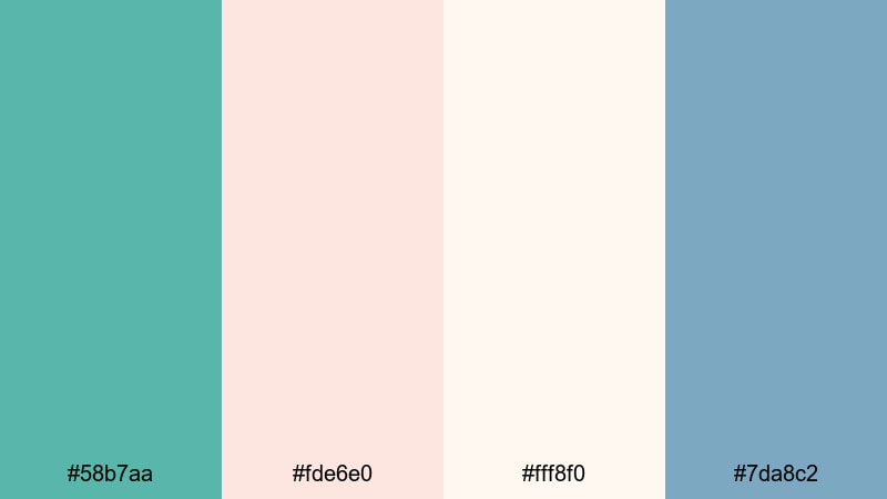
- HEX Codes: #58b7aa, #fde6e0, #fff8f0, #7da8c2
- Mood: Light, pastel, and friendly with a sunlit bayside feel.
- Use for: Use for travel thumbnails, family vlogs, and soft animated lower thirds.
Pelican Bay Pastels wraps Verdigris in blush and pale cream, supported by a soft powder blue. The mood is sunny, gentle, and welcoming, ideal for creators who want a friendly pastel aesthetic rather than heavy contrast.
Try this palette for family vlog intros, kid-friendly content, or lighthearted travel diaries. Use the pastel Verdigris and blue on your lower thirds in Filmora, keep the blush as a background panel behind profile images or text, and reserve the creamy white for clean, modern title cards.
Modern & Minimal Verdigris Color Palettes
Concrete Loft Verdigris
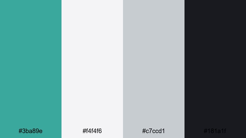
- HEX Codes: #3ba89e, #f4f4f6, #c7ccd1, #181a1f
- Mood: Clean, urban, and design-forward with a touch of tech edge.
- Use for: Perfect for tech reviews, modern brand openers, and sleek UI-style overlays.
Concrete Loft Verdigris sets a sharp Verdigris accent against cool grays and deep charcoal. It feels like a minimal studio or stylish co-working space: bright, structured, and professional. This is a great pick if you want your Verdigris color palette to feel modern and tech-driven.
Use Verdigris sparingly as an accent on subscribe buttons, progress bars, or data overlays while keeping most of the frame in light and medium gray. In Filmora, this combination is perfect for app walkthroughs, unboxing videos, and UI-style animated elements over screen recordings.
Screen Glow Teal

- HEX Codes: #41b3a8, #e5fbf8, #8ad2ca, #121b26
- Mood: Futuristic yet soft, like a glowing screen in a dark studio.
- Use for: Ideal for motion graphics, app promos, and animated subscribe buttons.
Screen Glow Teal focuses on luminous Verdigris and teal highlights against a deep navy background. The contrast suggests tech, innovation, and digital spaces, but the soft tints keep it inviting rather than harsh.
Use the darkest shade as your background color for titles and callouts, then let Verdigris and teal glow as outlines, glows, or animated strokes in Filmora. This palette is particularly strong for intros, logo stings, and overlay animations that mimic neon UI elements.
Gridline Interface
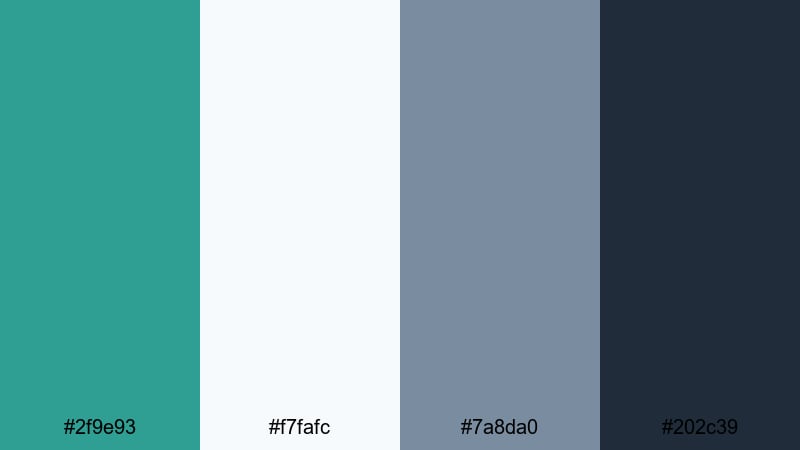
- HEX Codes: #2f9e93, #f7fafc, #7a8da0, #202c39
- Mood: Orderly, cool, and professional with subtle tech vibes.
- Use for: Great for tutorials, UX breakdowns, and clean overlay elements on screen recordings.
Gridline Interface balances Verdigris with off-white, slate blue, and a dark interface navy. It feels organized and clear, like a well-designed dashboard. This makes it an excellent Verdigris color combination for educational content and tutorials where clarity is critical.
Use Verdigris to highlight active states, buttons, and key steps in your on-screen guides, while the softer tones support text readability. In Filmora, you can build lower thirds and pointer graphics in these colors so viewers can easily follow each section of your video.
Nordic Studio Calm
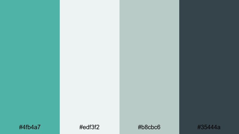
- HEX Codes: #4fb4a7, #edf3f2, #b8cbc6, #35444a
- Mood: Airy, minimalist, and calming with Scandinavian influence.
- Use for: Use for productivity channels, planning videos, and understated brand idents.
Nordic Studio Calm mixes a gentle Verdigris with foggy whites and soft charcoals, evoking a minimal studio with lots of natural light. It brings a focused, clutter-free feeling that suits productivity and workspace content.
Use this palette for weekly planning series, remote work tips, or quiet studio tours. Keep your backgrounds in light gray or off-white, use Verdigris for subtle underlines and icons, and reserve the dark tone for clear, high-contrast text in titles and info cards.
Vintage & Rustic Verdigris Color Palettes
Antique Patina Walls
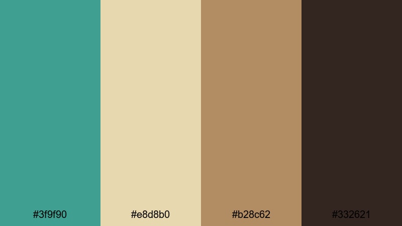
- HEX Codes: #3f9f90, #e8d8b0, #b28c62, #332621
- Mood: Warm, nostalgic, and slightly weathered like an old villa.
- Use for: Perfect for history content, cozy cafes, and cinematic travel edits.
Antique Patina Walls pairs Verdigris with parchment, caramel, and deep chocolate brown. It feels like aged paint on sunlit walls, with a hint of history built into every frame. This palette is ideal if you want your Verdigris aesthetic to feel timeless rather than ultra-modern.
Use it on travel videos shot in historic districts, cafe b-roll, or storytelling content. In Filmora, you can create title cards that use Verdigris as a main background, then add text in parchment with brown accents, or flip the combination for a softer, paper-like title style.
Verdigris Postcard Fade
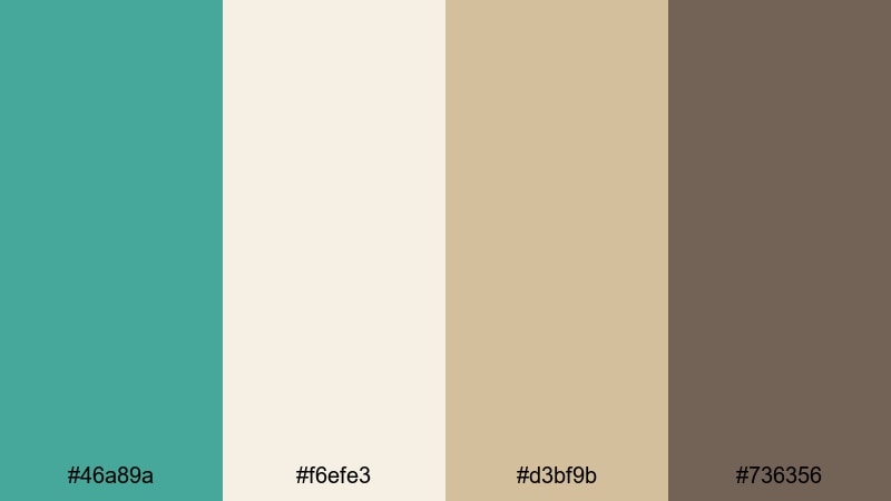
- HEX Codes: #46a89a, #f6efe3, #d3bf9b, #736356
- Mood: Softly faded and sentimental like a sunbleached postcard.
- Use for: Great for travel memories, wedding highlight reels, and retro title cards.
Verdigris Postcard Fade softens Verdigris with creamy neutrals and a muted brown, creating a gentle, washed-out feel. It mimics vintage prints and postcards that have faded slightly in the sun, adding instant nostalgia to your visuals.
Use this palette for memory-focused edits: wedding highlights, anniversary montages, or city trip recaps. In Filmora, pair Verdigris with the off-white tone for lower contrast text, then reserve the warm brown for date stamps, captions, or faux postcard graphics over your footage.
Copper Roof Rain

- HEX Codes: #3ca196, #ebdac7, #bc7f5a, #4a3b32
- Mood: Moody, tactile, and cinematic, inspired by aged copper in the rain.
- Use for: Ideal for documentary intros, mood reels, and atmospheric grading looks.
Copper Roof Rain contrasts cool Verdigris with copper and deep brown, producing a rich, tactile atmosphere. It feels like rain on metal rooftops and old city streets, with both warmth and coolness in the same frame.
This Verdigris color palette is perfect for moody B-roll, character portraits, and story-driven short films. Use Verdigris in shadows and midtones while letting copper tones appear in highlights or overlays. In Filmora, you can color titles in off-white or copper over a dark brown background to make them feel cinematic and intentional.
Bold & Cinematic Verdigris Color Palettes
Neon Noir Verdigris
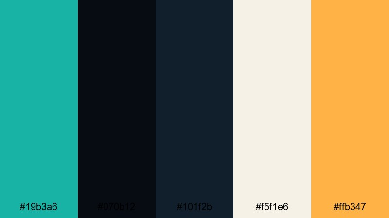
- HEX Codes: #19b3a6, #070b12, #101f2b, #f5f1e6, #ffb347
- Mood: High-contrast, stylish, and dramatic with a retro-futuristic edge.
- Use for: Perfect for title sequences, music videos, and bold gaming intros.
Neon Noir Verdigris pushes the color straight into retro-futuristic territory. Electric Verdigris glows against nearly black blues, softened by cream highlights and punched up by a neon amber accent. The palette feels like city lights, reflections on wet pavement, and synth-heavy soundtracks.
Use it for bold type animations, glitch transitions, and cyber-style overlays in Filmora. Let Verdigris and amber handle your main accents while you keep most of the frame dark, then add cream as a highlight color for logotypes or important UI elements in your intros.
Tropical Lens Flare

- HEX Codes: #3fc2af, #ffed75, #ff8b61, #1b3b4a
- Mood: Vibrant, energetic, and sun-drenched like a tropical festival.
- Use for: Use for travel reels, summer promos, and eye-catching social thumbnails.
Tropical Lens Flare combines punchy Verdigris with bright yellow and coral orange, all set against a deep teal base. It is saturated, fun, and full of movement, ideal whenever you want your Verdigris palette to feel like peak summer energy.
Use this set of colors for dynamic cuts, speed-ramped b-roll, and festival recaps. In Filmora thumbnails, place Verdigris or coral text over the dark teal, and use the yellow as a small but powerful highlight for arrows, badges, and emoji-style stickers.
Deep Current Titles
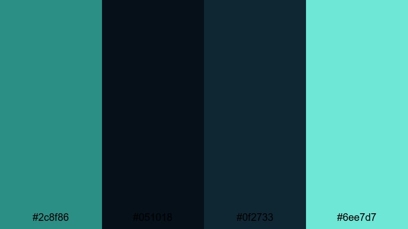
- HEX Codes: #2c8f86, #051018, #0f2733, #6ee7d7
- Mood: Mysterious and immersive, like being pulled into a deep ocean current.
- Use for: Great for suspense trailers, drone ocean shots, and bold typography overlays.
Deep Current Titles surrounds Verdigris with dark ocean teals and a bright aqua highlight, creating an immersive underwater mood. It is dramatic and slightly ominous, perfect for hooks, teasers, and cinematic text sequences.
Use the two darkest tones as your background gradients, then make your main titles in bright Verdigris or aqua for maximum contrast. In Filmora, this palette is especially strong for drone shots over water, mystery shorts, and documentary teasers where you want a deep, moody Verdigris visual identity.
Cyberwave Verdigris Grid
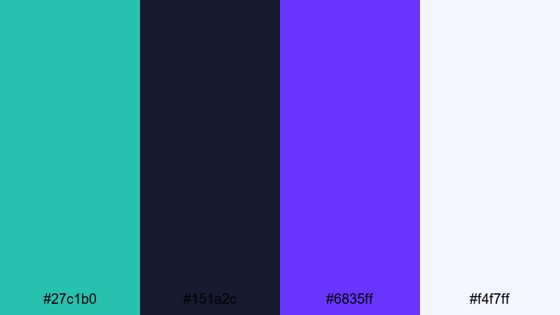
- HEX Codes: #27c1b0, #151a2c, #6835ff, #f4f7ff
- Mood: Electric, digital, and futuristic with a cyberpunk twist.
- Use for: Ideal for glitch transitions, esports branding, and dynamic motion graphics.
Cyberwave Verdigris Grid throws electric Verdigris together with deep midnight navy, vivid violet, and a pale interface white. The result is an energetic, high-tech look that suits gaming, futurist content, and motion graphics-heavy intros.
Use Verdigris and violet as alternating accent colors on text and HUD-style elements, while the dark navy grounds your scenes. In Filmora, this palette is ready-made for esports lower thirds, spinning logo reveals, and grid-based overlays synced to music or sound effects.
Tips for Creating Verdigris Color Palettes
Verdigris is flexible enough to feel coastal, techy, or cinematic depending on how you combine it. When building your own Verdigris color schemes for video and design, a few practical guidelines will help keep your visuals clean, readable, and on-brand.
- Pair Verdigris with neutrals first. Start with off-whites, soft grays, or dark navy, then add 1 or 2 accent colors so the palette stays balanced instead of chaotic.
- Check text contrast on thumbnails. Test white, black, and dark navy text over your Verdigris and accent colors to make sure titles stay readable on mobile screens.
- Choose a role for each color. Decide which tone is for backgrounds, which is for text, and which is for highlights, then stay consistent across your Filmora projects.
- Match footage temperature. If your Verdigris palette is cool, reduce warmth in your clips; if it is coastal and soft, lift shadows slightly and avoid overly harsh contrast.
- Limit strong accents. Use bright yellows, corals, or violets sparingly as highlight colors so Verdigris remains the star of your color story.
- Save presets in Filmora. Turn your favorite Verdigris hex codes into custom title styles, color presets, and LUT combinations so every new video can reuse the same look quickly.
- Test on different backgrounds. Preview your palette on both light and dark backgrounds in Filmora to see how it behaves in intros, overlays, and end screens.
- Keep social platforms in mind. Adjust saturation and contrast slightly for platforms like YouTube Shorts, Instagram Reels, or TikTok, where Verdigris needs to pop in a vertical, fast-scrolling feed.
Used well, Verdigris can give your channel a distinctive visual identity, from calm coastal edits to bold cyber visuals. Each of these 15 Verdigris color palettes offers a ready-made set of HEX codes you can plug straight into your titles, overlays, and filters in Filmora.
Try testing a few palettes across your next intro, lower thirds, and thumbnails, then see which one fits your brand and content style best. With Filmora's color tools, filters, and presets, you can turn any of these schemes into a consistent, professional look for your entire video series.
Once you find a Verdigris color combination you love, save it as your visual signature and use it across intros, social clips, and end screens so viewers instantly recognize your work.
secure download