
 100% Security Verified | No Subscription Required | No Malware


 ChatGPT
 Perplexity
 Gemini
 Claude
 Grok
Grok
Warm Driftwood sits in that sweet spot between beige and brown, carrying the warmth of sun-touched wood and the calm of natural neutrals. Psychologically, it feels grounded, safe, and inviting, which makes it ideal for cozy storytelling, reflective moments, and brands that want to project trust and authenticity. On screen, Warm Driftwood acts like a soft cinematic filter, gently unifying different shots without feeling heavy or over-stylized.
For creators, this tone works beautifully in video backgrounds, YouTube thumbnails, channel intros, lower thirds, and social media graphics. Below you will find 15 Warm Driftwood color palettes with HEX codes created for cinematic edits, vlogs, and branding. Each palette includes mood and use cases so Filmora users and visual creators can quickly translate these Warm Driftwood color combinations into real-world edits.
In this article
Cozy Cinematic Warm Driftwood Color Palettes
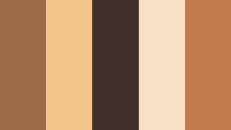
Fireside Driftwood Glow

- HEX Codes: #a47a5a, #f2d3b3, #6b4b3a, #d19b6c, #f9e6cf
- Mood: Cozy, nostalgic, and storytelling focused, like a warm evening by the fireplace.
- Use for: Ideal for cinematic vlogs, slow-travel films, and nostalgic title cards with gentle contrast.
This palette mixes toasted chestnut browns with soft beige highlights, creating a glow that feels like curling up beside a crackling fire. The deeper driftwood tones (#a47a5a, #6b4b3a) ground your frame, while the lighter creams (#f2d3b3, #f9e6cf) lift faces, titles, and key objects so they stand out without harsh contrast.
Use Fireside Driftwood Glow for story-driven edits, memory-focused reels, and reflective b-roll. It works especially well for YouTube thumbnails where you want a warm, cinematic look without oversaturated colors, and for branding elements like lower thirds, intro slates, and end screens that should feel intimate and handcrafted.
Pro Tip: Build a Cinematic Warm Driftwood Look in Filmora
To keep this fireside atmosphere consistent, start by picking one or two of the mid-tones in this palette as your base grade in Filmora. Apply a subtle warm tint to your footage, then use overlays and text boxes in the lighter HEX shades for titles, subscribe bars, and intro cards. This keeps every frame tied back to the same Warm Driftwood visual identity, from your opening scene to the end screen.
You can also save a custom color preset in Filmora, then reuse it across episodes or formats. That way, your cinematic Warm Driftwood look stays recognizable on long-form videos, YouTube Shorts, Reels, and even exported thumbnails.
AI Color Palette
If you have a reference still, brand board, or a photo of a real wooden interior that matches Fireside Driftwood Glow, you can turn it into your main grade using Filmora's AI Color Palette feature. The tool analyzes the colors in your reference image and applies similar tones, contrast, and warmth across your entire clip or sequence.
This is perfect when you want every shot in a vlog or travel film to share the same cozy, hearth-like atmosphere. Instead of grading each clip manually, you match once and let AI spread the Warm Driftwood feel through your timelines.
 secure download

HSL, Color Wheels & Curves
Once your base Warm Driftwood grade is in place, use Filmora's HSL and color wheels to refine it. Nudge oranges and yellows slightly warmer for skin tones, while keeping shadows in the rich browns to preserve that woodgrain feel. With curves, you can add a gentle S-shaped contrast so the image feels cinematic but still soft enough for cozy content.
The workflow shown in Filmora's YouTube tutorials on color grading with HSL, color wheels, and curves helps you control highlights and shadows precisely, so light sources glow while darker driftwood tones stay deep and reassuring.
secure download1000+ Video Filters & 3D LUTs
To speed up your Warm Driftwood workflow, start from Filmora's video filters and 3D LUTs that already add cinematic warmth and soft contrast. Choose a neutral, film-like LUT, then fine-tune it to match the HEX codes in Fireside Driftwood Glow.
This combination lets you quickly style whole projects while keeping room for your own brand nuances in overlays, titles, and graphics that use your exact Warm Driftwood palette.
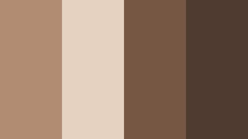
secure downloadWeathered Pier Evening

- HEX Codes: #8c6a52, #cfae8b, #4c3b32, #f0dac2
- Mood: Quiet, reflective, and slightly moody, like walking along an old pier at dusk.
- Use for: Use in documentary intros, reflective travel monologues, and calm youtube channel banners.
Weathered Pier Evening blends muted browns with creamy highlights for a calm, dusk-like tone. The darker shades echo old timber and shadows, while the lighter neutrals feel like the last soft light skimming the water.
This palette works well when you want contemplative visuals without leaning into heavy blues or greys. Use it for documentary-style intros, scenic monologues, channel headers, or podcast cover art where you need gentle contrast and legible text in a subdued, cinematic space.
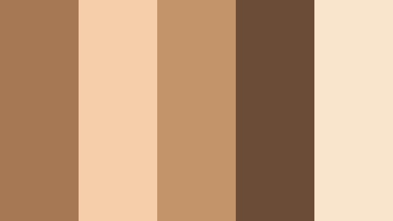
Campfire Story Night
- HEX Codes: #9b6c47, #f3c48b, #3d3028, #f7e0c5, #c27b4c
- Mood: Intimate, warm, and inviting with a hint of adventure.
- Use for: Great for travel vlogs, camp or vanlife content, and storytelling shorts with a cozy glow.
Campfire Story Night pairs smoky browns with ember-like oranges and soft cream. The deeper near-black brown (#3d3028) adds depth to night scenes, while the golden tones mimic firelight dancing across faces and objects.
Use this palette for outdoor storytelling, vanlife episodes, campsite b-roll, or thumbnails that need to feel adventurous yet safe. Titles and badges in the lighter oranges will pop nicely over darker footage, making your narratives easy to follow even in low light.
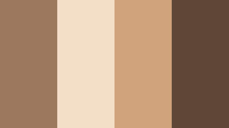
Sunlit Cabin Journals

- HEX Codes: #a98263, #f1d1ac, #5b4638, #e7be8a, #f9ebdb
- Mood: Soft, creative, and reflective, like writing in a sunlit wooden cabin.
- Use for: Perfect for productivity vlogs, study-with-me videos, and lifestyle branding graphics.
Sunlit Cabin Journals balances honeyed browns with parchment-like creams and soft golden accents. It feels like warm sunlight spilling over pages and wooden desks, ideal for content focused on calm productivity and creativity.
Use it as a base for study-with-me videos, journaling vlogs, Notion or workspace tours, and Instagram carousels. The lighter HEX codes are great for backgrounds behind text, while the darker browns can anchor logos, icons, and timeline lower thirds for a cohesive Warm Driftwood brand system.
Muted Coastal Drift

- HEX Codes: #7f6a5a, #cdb9a3, #3a3530, #f2e3d3
- Mood: Understated, coastal, and slightly wistful with a natural film-like softness.
- Use for: Use for seaside travel edits, brand reels with a natural feel, and subtle cinematic overlays.
Muted Coastal Drift leans into desaturated browns and sandy neutrals, echoing driftwood on a quiet shore. It feels airy and understated, with a film-like softness that never competes with the content of the frame.
This palette is ideal for gentle seaside b-roll, mindful travel diaries, and brand reels that want a natural, organic look. Use the lightest tones for text panels and overlays, and the darker shadows for separators, frames, and subtle borders in thumbnails or social posts.
Minimal & Modern Warm Driftwood Color Palettes
Driftwood Studio Neutrals

- HEX Codes: #a07e65, #f5e6d6, #534135, #d2b9a0
- Mood: Clean, modern, and professional with a grounded, earthy base.
- Use for: Great for channel branding, minimalist lower thirds, and UI-style overlays in tutorials.
Driftwood Studio Neutrals combines mid-browns with soft ivory and beige, creating a modern yet earthy palette. It feels like an edited studio environment where nothing is too bright or distracting.
This is a strong choice for tutorial channels, software walkthroughs, or online courses. Use the lighter HEX codes for clean UI-style panels and the darker browns for text, icons, and logo marks, giving your channel a professional Warm Driftwood identity.
Urban Loft Timber

- HEX Codes: #8e6c55, #f0ddc8, #372c26, #c7a385, #f7efe5
- Mood: Sleek yet cozy, like a modern loft with exposed wood and soft light.
- Use for: Perfect for tech reviews, design portfolios, and aesthetic reels with a warm minimal look.
Urban Loft Timber pairs deep coffee browns with refined creams, evoking high ceilings, wooden beams, and soft ambient light. It balances sophistication with warmth, staying minimal but never sterile.
Use it for tech and gear reviews, portfolio showcases, and Instagram reels where you want visuals to feel upscale. Backgrounds in the lightest tones keep product shots clean, while the darkest browns are ideal for bold typography in lower thirds and end cards.
Editorial Driftwood Monochrome
- HEX Codes: #b18c71, #e6d2c0, #745642, #503b30
- Mood: Editorial, confident, and slightly luxe while staying neutral and grounded.
- Use for: Use in lookbooks, fashion edits, and cinematic talking-head setups with strong typography.
Editorial Driftwood Monochrome stacks several warm brown tones together for a sleek, magazine-like feel. The range from light beige to rich chocolate creates depth while keeping everything in the same color family.
This palette shines in fashion lookbooks, brand campaigns, and talking-head videos with a sophisticated edge. Layer the lighter tones behind full-screen quotes or titles and use the darker ones for crisp, modern typography that stands out on social feeds.
Scandinavian Shoreline

- HEX Codes: #9a7d65, #f4eee5, #5f4a3b, #d8c6b3
- Mood: Airy, minimal, and calm with a soft Nordic warmth.
- Use for: Great for workspace tours, minimalist lifestyle vlogs, and subtle product showcases.
Scandinavian Shoreline fuses soft browns with off-whites and delicate beige for an airy, Nordic mood. It feels like a sunlit apartment by the sea, clean but still very human and warm.
Use it for minimalist lifestyle channels, workspace setups, and product demos where you want the item to be the hero without loud colors. The palette is perfect for branding systems that live across YouTube thumbnails, headers, and Instagram grid designs.
Cafe Counter Grain

- HEX Codes: #a1734f, #f7e0c6, #4a3527, #c89a6c
- Mood: Casual, modern, and inviting, like a cozy cafe with wooden counters.
- Use for: Ideal for coffee content, food channels, and lifestyle brand intros with subtle warmth.
Cafe Counter Grain combines rich espresso browns with latte creams and caramel tones, instantly evoking coffee culture. It feels inviting and social, great for content that revolves around food, cafes, or everyday city life.
Apply this palette to recipe videos, cafe tours, casual vlogs, or channel branding for baristas and food creators. Use the darkest brown for text and outlines, and lighter latte hues for backgrounds, overlays, and highlight boxes in both videos and thumbnails.
Soft & Romantic Warm Driftwood Color Palettes
Blush Toned Driftwood

- HEX Codes: #a77c5f, #f7d5c3, #f0b6a2, #6a4c3a, #fbece4
- Mood: Romantic, gentle, and nostalgic with a soft blush accent.
- Use for: Use for wedding films, engagement reels, and dreamy lifestyle thumbnails.
Blush Toned Driftwood softens Warm Driftwood with rosy blush and creamy whites. The result is tender and nostalgic, with just enough pink to feel romantic but not overly sweet.
It is ideal for wedding highlights, engagement reels, love-story montages, and dreamy lifestyle thumbnails. Use the blush tones for text accents and overlays, while the deeper driftwood browns anchor typography and logos so they remain readable across different platforms.
Vintage Postcard Sand
- HEX Codes: #9b785e, #f3dec8, #d0a27c, #5d4636
- Mood: Softly vintage and sentimental, like an old beach postcard.
- Use for: Perfect for travel diaries, heritage stories, and retro-styled montage sequences.
Vintage Postcard Sand uses sandy browns and sun-faded creams to mimic aged paper and old prints. It carries a gentle, sentimental energy that works beautifully with slow pans, film grain, and handwritten overlays.
Use it in travel diaries, family history projects, or retro-styled montage sequences. The mid-tones provide excellent backgrounds for subtle gradients, while the darkest brown can frame photos, chapter titles, and quote cards within your edits.
Honeyed Drift Afternoon

- HEX Codes: #b4875f, #f6d1a3, #8a623f, #fbe5c9, #5b4332
- Mood: Warm, dreamy, and optimistic, like golden light streaming through a window.
- Use for: Great for golden hour b-roll, cozy day-in-the-life vlogs, and soft intro cards.
Honeyed Drift Afternoon floods your visuals with golden, honey-like warmth. The palette moves from deep caramel to pale peach creams, mimicking the look of late afternoon sun.
It suits golden hour b-roll, cozy home vlogs, and soft intro cards where you want to emphasize comfort and optimism. Use the lighter shades for gradient backgrounds and the richest browns for subtle drop shadows and outlines on text in thumbnails and titles.
Desert Letter Home
- HEX Codes: #a67954, #f4cfaa, #c39369, #6a4c37, #f9e4cc
- Mood: Poetic, warm, and slightly wistful like handwritten letters from a desert trip.
- Use for: Use in travel letters, cinematic voiceovers, and soulful narrative shorts.
Desert Letter Home combines warm desert browns with parchment neutrals for a sun-worn, poetic mood. It has a storybook feel, as if each frame could sit beside handwritten notes and pressed flowers.
Use this palette for narrative shorts, travel letters, reflective voiceovers, or zine-inspired video essays. Design lower thirds and title cards with the lighter tones and keep main text and logos in the darker browns so they remain clear against footage and solid backgrounds.
Earthy & Adventurous Warm Driftwood Color Palettes
Trailhead Driftwood Map

- HEX Codes: #8e6947, #e2c39a, #3e3227, #c28d57, #f4e2c7
- Mood: Adventurous, grounded, and outdoorsy with a tactile, map-like feel.
- Use for: Ideal for hiking vlogs, camping intros, and adventure reel titles.
Trailhead Driftwood Map features rugged browns and map-paper neutrals, instantly suggesting topographic maps, trail markers, and worn backpacks. The palette feels tactile and grounded, perfect for content shot in forests, mountains, or national parks.
Use it in hiking vlogs, gear reviews, and adventure reel titles. Titles in the darker tones over light map-like backgrounds look clean and on-theme, while badges and icons in the mid-browns can unify your on-screen graphics and channel branding.
Harbor Crate Patina
- HEX Codes: #7b5f49, #c8af95, #2f2925, #e6d2bc
- Mood: Industrial yet organic, like weathered crates along a working harbor.
- Use for: Great for city exploration vlogs, dockside b-roll, and product shots with character.
Harbor Crate Patina blends smoky browns with patina-like neutrals, creating an industrial but still organic vibe. It recalls wooden crates, ropes, and worn metal against soft overcast light.
It works well for city walk-throughs, dockside b-roll, and product shots where you want grit with warmth. Use the darkest shade for bold titles or logo marks and the mid neutrals as understated backgrounds for text, specs, and overlay panels in reviews or cinematic shorts.
Tips for Creating Warm Driftwood Color Palettes
When you build your own Warm Driftwood color palette for video and design, focus on balancing depth, warmth, and readability so the look feels cinematic but still practical for overlays, text, and branding elements.
- Pick one hero driftwood mid-tone as your base grade, then build lighter highlight colors and darker accent shades around it for depth.
- Keep text contrast high by pairing dark browns with pale creams or beiges, especially for YouTube thumbnails and mobile-first graphics.
- Add a gentle accent color like blush, peach, or desaturated gold to highlight CTAs, subscribe buttons, or important labels.
- Match your palette to your footage: slightly warm your shadows and mid-tones so real wood, skin, and interiors harmonize with your chosen HEX codes.
- Use consistent background colors for intros, lower thirds, and end screens to make your channel or brand instantly recognizable.
- Test your palette on multiple devices and in both light and dark mode to ensure readability and mood stay consistent.
- Limit the number of active colors on screen at once; lean on 2 to 3 main tones and keep others as subtle accents.
- Save presets and reuse them across episodes so your Warm Driftwood aesthetic feels deliberate rather than accidental.
Warm Driftwood palettes are powerful tools for shaping mood, telling stories, and building a recognizable brand identity. From cozy cinematic vlogs to minimalist tech reviews and romantic highlight films, these neutral yet expressive tones help your visuals feel intentional and cohesive.
Try applying a few of the palettes above to your next edit in Filmora. Combine the HEX codes with Filmora's grading tools, AI Color Palette, filters, and LUTs to lock in a signature Warm Driftwood look across intros, b-roll, and social cutdowns.
As you experiment, you will learn which combinations of Warm Driftwood, accent blush, and sandy neutrals best match your voice and audience, turning color into one of your strongest storytelling tools.
secure download