
 100% Security Verified | No Subscription Required | No Malware


 ChatGPT
 Perplexity
 Gemini
 Claude
 Grok
Grok
Apricot Cream sits in the sweet spot between soft peach and warm beige. It feels comforting, approachable, and gently optimistic, which makes it a favorite for lifestyle brands, beauty content, and cozy vlogs. In color psychology, these hues suggest warmth, kindness, and ease, helping viewers relax and stay engaged with your story.
On screen, Apricot Cream works beautifully for YouTube thumbnails, channel intros, Instagram Reels, wedding highlight films, and branding overlays. Below you will find ready-made Apricot Cream color palettes with HEX codes tailored for creators and Filmora users, so you can color grade footage, design titles, and build a consistent aesthetic across all your projects.
In this article
Soft & Romantic Apricot Cream Color Palettes
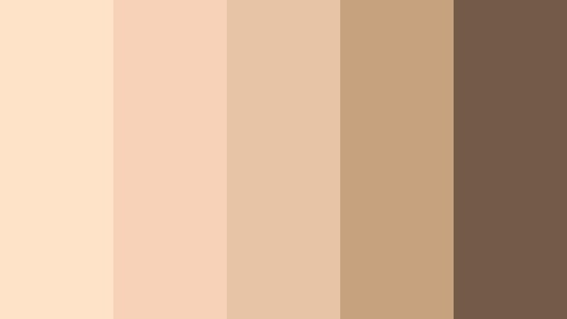
Golden Hour Apricot Glow

- HEX Codes: #ffdab3, #ffd1a3, #fbc89a, #f5a96b, #94543b
- Mood: Warm, gentle, and nostalgic like late afternoon sunlight.
- Use for: Ideal for dreamy wedding highlight films, sunlit travel vlogs, and soft lifestyle thumbnails.
Golden Hour Apricot Glow moves from pale Apricot Cream into deeper caramel and tan, echoing the way sunlight wraps around skin at sunset. It feels nostalgic and touchable, with enough contrast from the darker brown to add depth and definition to your frames.
Use this palette to color grade romantic wedding footage, warm up backlit portraits, or design thumbnails that promise cozy storytelling. In Filmora, you can pick the lighter tones for text boxes and backgrounds, then reserve the richest brown for titles, logos, or subtle borders so everything remains readable yet soft.
Pro Tip: Build a Cinematic Apricot Cream Glow in Filmora
To keep that warm, late-afternoon look consistent, start by building a custom color preset in Filmora. Apply subtle warmth to your midtones, lift the highlights slightly toward Apricot Cream, and keep shadows anchored in the caramel brown from this palette. Save that grade and reuse it on intros, b-roll, and social cutdowns so your entire project shares the same golden signature.
You can also layer light grain and a soft vignette to enhance the nostalgic vibe. Combine overlay graphics, title cards, and lower thirds using the lighter Apricot Cream shades so your whole video system feels cohesive without overwhelming the footage itself.
AI Color Palette
If you already have a perfect golden hour still or mood board, you can turn it into a grading shortcut. Filmora's AI Color Palette feature lets you sample the colors from that reference and apply the same Apricot Cream warmth across multiple clips in one go.
Import your reference image, let AI analyze the hues, and match that tone to your entire timeline or selected clips. This keeps skin tones natural while ensuring that every shot carries that same soft apricot glow, from opening shots to closing credits.
 secure download

HSL, Color Wheels & Curves
For finer control, use Filmora's HSL and color wheels to nudge oranges slightly toward Apricot Cream and soften any harsh yellows that break the mood. Adjust the midtone wheel toward warm peach while keeping blacks neutral so your image stays cinematic, not overly orange.
You can also use curves to gently lift the highlight curve and add a subtle S-curve for contrast. This creates luminous skin and glowing skies while preserving details in the shadows. For a full walkthrough on balancing tones, check out Filmora's advanced color grading tutorial on YouTube embedded below.
secure download1000+ Video Filters & 3D LUTs
To speed up your Apricot Cream workflow, explore Filmora's built-in presets. Filmora's video filters and 3D LUTs make it easy to add warmth, softness, or subtle film looks that pair perfectly with this palette.
Start with a warm cinematic LUT, then tweak the intensity so your light apricot tones stay gentle and not overly saturated. Stack diffusion or soft glow filters on b-roll, while keeping talking-head shots cleaner for a polished yet romantic style across your entire channel.
secure downloadApricot Blush Romance
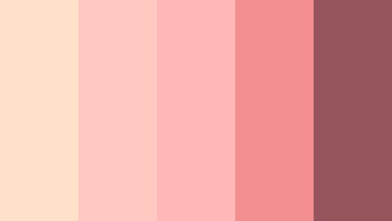
- HEX Codes: #ffe0c8, #ffc9c2, #ffb7b8, #f48f8f, #94555d
- Mood: Tender, romantic, and softly feminine.
- Use for: Use for engagement videos, love story shorts, and cover art for acoustic or lo-fi music edits.
Apricot Blush Romance blends creamy apricot with rose and muted berry, creating a tender, emotional palette. The lighter tones feel like flushed cheeks and soft petals, while the deeper berry hue adds weight and sophistication.
This combination is perfect for engagement films, lyric videos, or channel branding around love stories and heartfelt content. Use the soft apricot and blush shades for backgrounds and overlays, then let the muted berry carry text, call-to-action buttons, or logo marks in your Filmora intros and thumbnails.
Candlelit Apricot Evening

- HEX Codes: #fdd8bc, #f7c29c, #e8a679, #b97b5a, #4a3432
- Mood: Cozy, intimate, and cinematic like a dinner by candlelight.
- Use for: Perfect for food cinematography, restaurant promos, and intimate storytelling scenes.
Candlelit Apricot Evening moves from soft cream to rich amber and chocolate, capturing the glow of a dimly lit restaurant or home dinner. The darkest brown anchors the palette and gives you a dramatic base for shadows and typography.
Apply this palette to food and hospitality content where you want to highlight warmth and texture. In your edits, use the mid-range ambers for background graphics and the deep chocolate for menu-style titles, animated price tags, or logo stings. It works especially well in Filmora when combined with slow push-ins and gentle light leaks for a cinematic dining experience.
Apricot Linen Morning
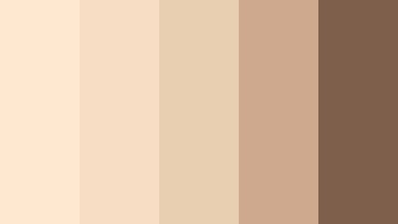
- HEX Codes: #ffe7d0, #f7ddc4, #e8cfb1, #cfa98e, #7d5f4b
- Mood: Airy, calm, and minimal like a slow weekend morning.
- Use for: Great for lifestyle channels, home decor reels, and minimalist brand intros.
Apricot Linen Morning layers soft creams, sand, and taupe to evoke freshly made beds and quiet coffee rituals. The palette is understated yet warm, making it ideal for minimalist aesthetics that still feel human.
Use the lightest tones as clean backgrounds for text and UI-style overlays in your how-to or home tour videos. The mid and dark browns can frame key information in thumbnails and end cards. Inside Filmora, this palette pairs well with simple, modern fonts and slow, smooth transitions to keep everything calm and uncluttered.
Peach Garden Whisper
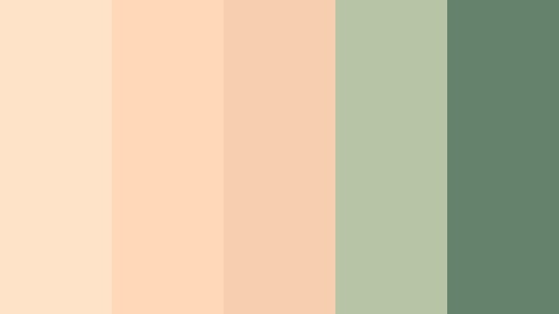
- HEX Codes: #ffe3c9, #ffd8b8, #f6cfae, #b6c6a4, #64826c
- Mood: Gentle, organic, and quietly romantic.
- Use for: Use in nature-inspired wedding reels, garden party promos, and soft aesthetic vlogs.
Peach Garden Whisper pairs delicate Apricot Cream with sage greens, evoking blossoms, leaves, and natural light. The interplay between warm peach and cool green creates a peaceful, organic balance.
It is a great choice for outdoor weddings, picnic scenes, flower shop promos, or any footage surrounded by nature. In Filmora, let the apricot shades color your titles and lower thirds, while the greens appear in accent bars, icons, or subtle frames around your video. This ensures your text stands out without fighting the natural greens in your footage.
Pastel & Airy Apricot Cream Color Palettes
Cloudy Apricot Pastels

- HEX Codes: #ffe9d6, #ffd7e0, #e3d8ff, #c9e5ff, #9ba6c7
- Mood: Dreamy, whimsical, and slightly surreal.
- Use for: Ideal for whimsical vlog intros, animation overlays, and playful channel branding.
Cloudy Apricot Pastels floats Apricot Cream together with soft lavender, blush, and baby blue. It feels like a cotton candy sky, light and slightly surreal, perfect for dreamy or fantasy-inspired content.
Use this palette when designing animated openers, YouTube channel banners, or title cards for creative vlogs. In Filmora, you can layer pastel shapes, doodles, and motion graphics using these hex codes, creating intros that feel gentle and playful without overpowering your footage.
Soft Sorbet Studio

- HEX Codes: #ffe3c5, #ffd3be, #ffc6d4, #f7e2ff, #b7cedb
- Mood: Playful, light, and creative like a pastel studio set.
- Use for: Use for art channel branding, DIY tutorials, and product flatlays that need a soft pop of color.
Soft Sorbet Studio feels like a bowl of pastel ice cream shades, mixing Apricot Cream with pink, lilac, and cool blue. It is light and uplifting, ideal for creative or educational content that still wants a soft aesthetic.
This palette shines in DIY craft tutorials, stationery or product flatlays, and channel graphics for artists. In Filmora, apply these colors to backgrounds behind your talking-head shots, animated labels for tools and materials, or playful lower thirds that guide viewers through each step.
Apricot Sky Daydream

- HEX Codes: #ffe2c8, #ffd2ae, #f4d2a0, #b3e2f7, #6fa4c4
- Mood: Light, optimistic, and refreshing like a sunny breezy day.
- Use for: Great for travel vlogs, summer lookbooks, and upbeat montage sequences.
Apricot Sky Daydream pairs warm apricot tones with bright, airy sky blues. The result feels like a breezy summer afternoon, optimistic and refreshing without becoming too intense.
Use it to brand travel vlogs, resort promos, or summer outfit lookbooks. In your edits, let the blues frame transition cards or map animations, while Apricot Cream supports titles, subtitles, and overlay shapes. This combination looks especially good with clear daylight footage and energetic music, easily built in Filmora with dynamic transitions and speed ramps.
Studio Macaron Mix

- HEX Codes: #ffe0c7, #ffd0c0, #f8d0e0, #d4e4ff, #99c1c8
- Mood: Cute, trendy, and social-media ready.
- Use for: Perfect for Instagram reels, TikTok edits, and thumbnail frames targeting a youthful audience.
Studio Macaron Mix brings together Apricot Cream, macaron pink, lilac, and powder blue for a sweet, trendy pastel set. It is tuned for social platforms where content needs to feel friendly and instantly clickable.
Try this palette in short-form Reels or TikToks, adding colored frames, captions, and stickers that reference these hex codes. In Filmora, combine vertical aspect ratios with bold pastel blocks behind your text to ensure legibility on mobile while keeping the vibe playful and modern.
Minimal Apricot Mist

- HEX Codes: #ffe9d5, #f1dfcf, #d3d7d5, #b0c2c0, #6f7e7b
- Mood: Soft, balanced, and modern with a calming haze.
- Use for: Use in UX design, app walkthrough videos, and tech explainers that still feel human and warm.
Minimal Apricot Mist tempers warm Apricot Cream with misty greys and seafoam green. The result is minimal and modern, but less clinical than pure grayscale, making it ideal for tech or productivity content that wants a human touch.
Use the light apricot tones as backgrounds for screen recordings or app demos. The cooler greys and greenish tones can outline key UI elements, feature callouts, or step-by-step labels in Filmora. It keeps your visuals clean and focused while maintaining a subtle warmth that viewers trust.
Modern & Elegant Apricot Cream Color Palettes
Apricot Stone Minimalism

- HEX Codes: #fddfca, #f2cfb5, #d4b49f, #a38b73, #3f3a36
- Mood: Refined, grounded, and quietly luxurious.
- Use for: Ideal for modern brand idents, portfolio reels, and minimalist product showcases.
Apricot Stone Minimalism combines Apricot Cream with stone, clay, and espresso accents. It feels luxurious and grounded, offering warmth without sacrificing a clean, high-end look.
This palette works well for design portfolios, architecture reels, and minimalist product campaigns. Let the light apricot and stone hues hold your backgrounds while the deepest espresso tone carries sleek titles, logo reveals, and key pricing information in Filmora. The subtle gradation between shades also makes it perfect for gradient overlays on hero shots.
Apricot Champagne Soiree
- HEX Codes: #ffe3c9, #f7d1b8, #e8c4a6, #c7a27f, #745b47
- Mood: Festive, polished, and upscale like a rooftop party.
- Use for: Use for event promos, launch trailers, and luxury lifestyle edits.
Apricot Champagne Soiree mixes Apricot Cream with champagne gold and warm mocha. It suggests celebrations, curated spaces, and special occasions without going full metallic.
Use this palette for brand launch teasers, gala recaps, or elegant product events. In Filmora, you can animate gold-tinted shapes and text reveals over lifestyle footage in the lighter apricot tones, then ground everything with the darker mocha as a frame or footer bar in your videos and thumbnails.
Urban Apricot Contrast

- HEX Codes: #ffd9bf, #f4c9a7, #b7bfc7, #6a7380, #22252b
- Mood: Modern, edgy, and city-ready with a soft heart.
- Use for: Great for tech lifestyle content, city vlogs, and sleek channel rebrands.
Urban Apricot Contrast pits soft Apricot Cream against steel grey and deep charcoal. This balance delivers an urban, contemporary feeling while keeping a gentle warmth in the highlights and midtones.
It is a strong choice for city vlogs, tech lifestyle channels, or brand refreshes that want approachability plus edge. In Filmora, use the dark charcoal as a backdrop for text and subscribe CTAs, while apricot accents highlight key stats, chapter markers, and map animations, ensuring contrast and readability across both desktop and mobile screens.
Editorial Apricot Mono

- HEX Codes: #ffe2cb, #f9cfb0, #e6b48b, #c48b5f, #8a5e3c
- Mood: Stylish, cohesive, and editorial-forward.
- Use for: Use in fashion lookbooks, brand campaigns, and cinematic title cards.
Editorial Apricot Mono is a monochrome gradient from pale Apricot Cream to deep terracotta. Because all the hues share a similar base, this palette instantly looks curated and color graded.
Use it in fashion lookbooks, narrative brand films, or aesthetic edits where color itself is a storytelling tool. In Filmora, you can map lighter shades to highlights and text overlays while using the mid and dark terracotta tones for bold full-screen titles, transitions, and chapter cards that feel like printed editorial spreads.
Playful & Vibrant Apricot Cream Color Palettes
Tropical Apricot Splash

- HEX Codes: #ffd9b8, #ffbe8a, #ff8b5c, #4fbfa8, #176b6a
- Mood: Energetic, sunny, and vacation-ready.
- Use for: Perfect for summer travel vlogs, festival recaps, and bold thumbnail designs.
Tropical Apricot Splash pushes Apricot Cream into punchy coral and balances it with teal and deep sea green. It is bright, energetic, and screams holidays, beaches, and festivals.
Use this palette for travel vlogs, summer festival recaps, or active lifestyle content. In Filmora, let coral tones dominate your titles and transition screens, while the teals highlight locations, dates, or on-screen graphics. This level of contrast helps thumbnails pop in crowded feeds and keeps your edits feeling fun and high-energy.
Apricot Pop Retro

- HEX Codes: #ffe0c4, #ffc88a, #ff9c6b, #5561c9, #1f2647
- Mood: Nostalgic, bold, and a little quirky.
- Use for: Use for retro-styled intros, podcast visuals, and bold creator branding.
Apricot Pop Retro pairs soft Apricot Cream and saturated orange with strong indigo accents. The mix feels nostalgic and bold, perfect for retro-inspired visuals with a modern twist.
Apply this palette to podcast cover art, 80s or 90s styled intros, or creator branding that leans into quirky, memorable visuals. In Filmora, use the dark indigo as a solid base or letterbox bar, while apricot and orange tones handle dynamic lower thirds and animated shapes that bounce to your soundtrack.
Tips for Creating Apricot Cream Color Palettes
When you build your own Apricot Cream color schemes for video and design, you want a balance of warmth, contrast, and readability that still fits your brand personality.
- Pair Apricot Cream with at least one darker accent color (like deep brown, charcoal, or berry) to keep text and UI elements readable in thumbnails and overlays.
- Use cooler companions such as sage, teal, or soft blue when your footage already has a lot of warm skin tones, so the overall image does not look overly orange.
- Keep 2 to 3 main colors for on-screen graphics in Filmora (background, accent, text) and reserve extra shades for subtle details only.
- Test your palette on both light and dark backgrounds; adjust brightness or saturation using Filmora's color tools to maintain contrast on mobile screens.
- Match your palette to your content niche: softer apricots for weddings and lifestyle, stronger corals and teals for travel and festivals, muted stone tones for tech or business.
- Build a reusable style guide: note your HEX codes, font choices, and typical layout styles so every new intro, lower third, and end screen stays on brand.
- Use reference images or mood boards inside Filmora's color tools to keep your Apricot Cream grading consistent across different cameras and shooting days.
- Check accessibility by placing sample text over your apricot backgrounds and verifying that headlines and buttons remain clear at small sizes.
Apricot Cream color palettes are versatile enough to feel romantic, minimalist, professional, or playful depending on what you pair them with. By choosing the right accents and contrasts, you can shape how viewers perceive your brand and guide their emotions throughout each video.
Use the HEX codes above as a starting point, then adapt them to your own footage and style inside Filmora. Whether you are building a wedding highlight reel, a cozy vlog, or a bold travel montage, consistent Apricot Cream tones will make your channel look intentional and recognizable.
Experiment with these palettes, save your favorite looks as presets, and let Filmora handle the heavy lifting for color grading, filters, and LUTs so you can focus on storytelling.
secure downloadNext: Dusty Pink Color Palette
