
 100% Security Verified | No Subscription Required | No Malware


 ChatGPT
 Perplexity
 Gemini
 Claude
 Grok
Grok
Deep Moss is a rich, grounded green that feels like shade under tall trees – stable, confident, and quietly cinematic. It suggests nature, depth, and focus, which makes it ideal when you want visuals to feel calm yet intentional rather than loud or flashy. In color psychology, this kind of deep green can imply trust, maturity, and reflection, perfect for serious storytelling or brands that want to signal reliability and eco-conscious values.
On screen, Deep Moss works beautifully in video color grading, branding, thumbnails, intros, and lower thirds. It can anchor moody cinematic edits, polish productivity vlogs, or elevate luxe fashion visuals. Below you will find 15 Deep Moss color palettes with HEX codes tailored for creators and Filmora users, so you can quickly apply them to titles, overlays, channel branding, and full video grades.
In this article
Earthy Cinematic Deep Moss Color Palettes
Forest Canopy Cinema
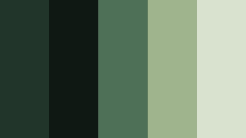
- HEX Codes: #21352a, #101814, #4d7056, #9fb38c, #d9e2cf
- Mood: Moody, grounded, and cinematic with a subtle softness.
- Use for: Ideal for cinematic travel films or outdoor documentary intros with natural, story-driven visuals.
Forest Canopy Cinema layers Deep Moss with muted sage and soft ecru, echoing the transition from dark understory to light filtering through leaves. The deep greens keep your visuals serious and immersive, while the lighter tones prevent the frame from feeling too heavy or flat.
Use this palette for nature vlogs, reflective travel edits, and documentary-style intros where you want to highlight foliage, misty mountains, or river views. In thumbnails and titles, let the darkest green sit behind white or ecru text for strong contrast. For branding, this combination works well for eco travel channels, outdoor gear reviews, or any creator focused on slow, thoughtful adventures.
Pro Tip: Build a Cinematic Deep Moss Look in Filmora
To keep a Forest Canopy Cinema look consistent across your whole edit, start by setting Deep Moss as your anchor tone in Filmora. Use it in your intro screens, lower thirds, and caption backgrounds, then echo the softer sage and ecru in your titles and callout graphics. This gives your project a cohesive, filmic identity even when you mix handheld shots, drone clips, and talking-head segments.
In travel films or outdoor vlogs, you can also use subtle overlays in Deep Moss and sage as gradient vignettes. This helps guide the viewer toward your subject while unifying footage shot in different lighting conditions or locations, all within Filmora's simple editing workspace.
AI Color Palette
If you have a favorite still frame or moodboard that captures this Forest Canopy Cinema palette, you can turn it into a full video look with Filmora's AI tools. Filmora's AI Color Palette feature lets you extract the Deep Moss and sage tones from a reference image, then apply that color style to other clips in just a few clicks.
This is especially useful for multi-day shoots where light and weather change constantly. By matching all your clips to one Deep Moss reference, your film keeps a steady, cinematic mood from opening shot to closing credits.
 secure download

HSL, Color Wheels & Curves
Once your Deep Moss base is in place, you can refine it using Filmora's tone controls. In HSL, gently desaturate greens and yellows to avoid neon foliage, then add a touch of warmth in the midtones using Color Wheels. Curves are ideal to deepen shadows for a more dramatic canopy feel while protecting detail in highlights like clouds or water reflections.
If you want a walkthrough of color grading techniques, Filmora's YouTube tutorials on using HSL and curves in cinematic edits can guide you through balancing Deep Moss shadows with softer highlights for a polished, movie-like finish.
secure download1000+ Video Filters & 3D LUTs
If you want a Deep Moss look without manual grading every clip, Filmora's built-in styles are a huge time saver. Filmora's video filters and 3D LUTs make it easy to add moody contrast, soften highlights, or push greens toward a more cinematic, desaturated tone that matches your palette.
Stack a gentle film-style LUT with a vignette or soft fade filter, then adjust intensity until your Forest Canopy Cinema colors feel cohesive. You can save this as a custom preset and reuse it across new projects to keep your Deep Moss branding consistent.
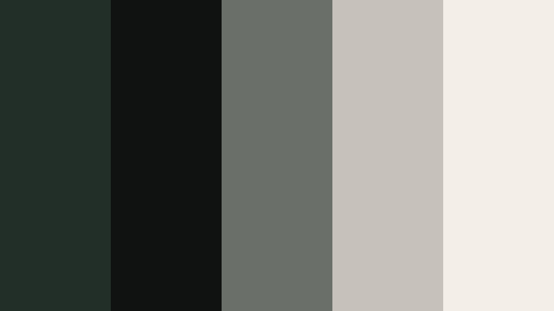
secure downloadMossy Trail Documentary
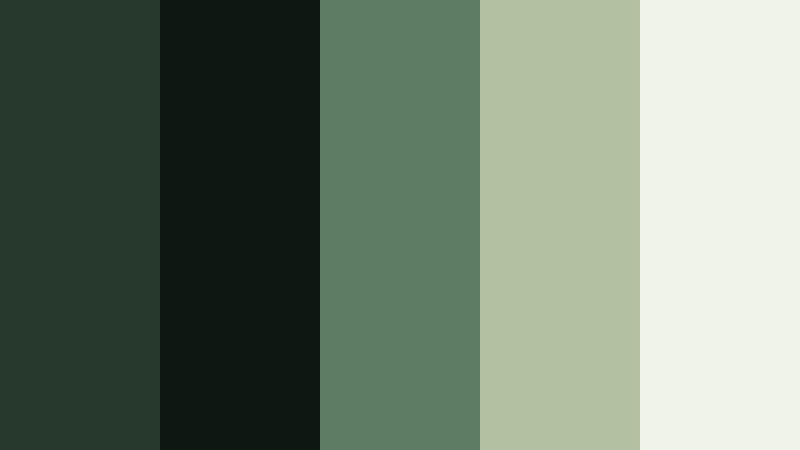
- HEX Codes: #26392c, #0f1713, #5e7b63, #b2c1a2, #f0f3e7
- Mood: Reflective, authentic, and nature-focused.
- Use for: Perfect for environmental docs, hiking recap videos, or calm b-roll sequences.
Mossy Trail Documentary is inspired by shaded forest paths and quiet undergrowth. Deep Moss and near-black anchors the frame, while dusty greens and off-white bring in clarity and honesty, making your visuals feel authentic instead of overly stylized.
Use the darkest tones for overlays, subtitles, or border frames, and reserve the off-white for readable text and data callouts. For hiking recaps and environmental pieces, this palette supports voiceovers, drone passes, and close-up nature shots with a calm, trustworthy mood that works well on YouTube and social thumbnails alike.
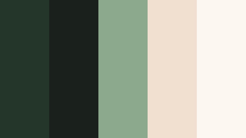
Evergreen Storyteller
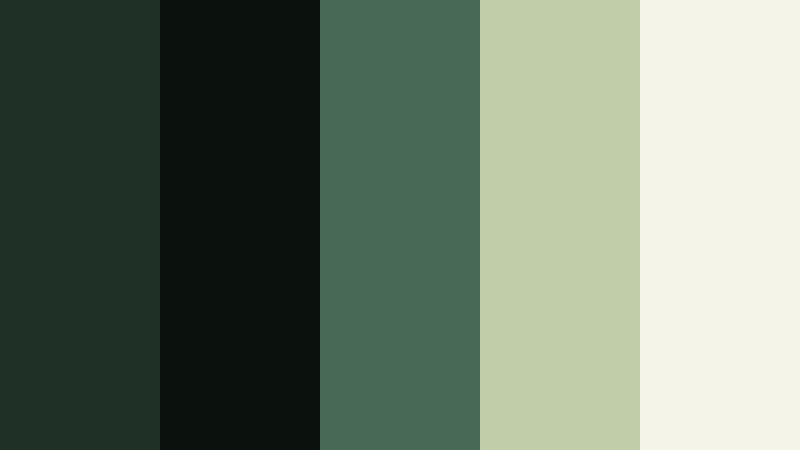
- HEX Codes: #1f3027, #0b110d, #486a55, #c1cda8, #f5f4e9
- Mood: Warm yet serious, ideal for narrative depth.
- Use for: Use in story-driven shorts or case study videos that balance warmth with professionalism.
Evergreen Storyteller mixes Deep Moss with olive and warm ivory for a palette that feels intimate and timeless. The greens keep your visuals grounded, while the gentle warmth in the neutrals adds a human touch that suits interviews and narrative-driven content.
Apply this palette in lower thirds for character names, documentary case studies, and chapter cards in mini-docs or branded stories. The ivory tones are perfect for legible title text, and the olive accents can highlight key phrases in thumbnails, presentations, or channel banners.
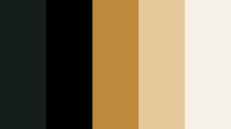
Campfire Wilderness Nights

- HEX Codes: #1b2720, #0a0f0c, #c97a42, #e0b67d, #f4ebdd
- Mood: Cozy, adventurous, and nostalgic.
- Use for: Great for camping vlogs, outdoor brand spots, or nostalgic travel montages.
Campfire Wilderness Nights pairs Deep Moss shadows with ember oranges and toasted beige to capture the glow of a fire in the forest. The dark greens recede into the background like night trees, while the orange and beige tones draw attention to faces, tents, and gear.
Use the warm accent colors for title text, logo reveals, and call-to-action buttons in camping or vanlife content. In thumbnails, place bright orange or beige text on Deep Moss backgrounds to make key phrases stand out in feeds without losing that cozy, outdoorsy vibe.
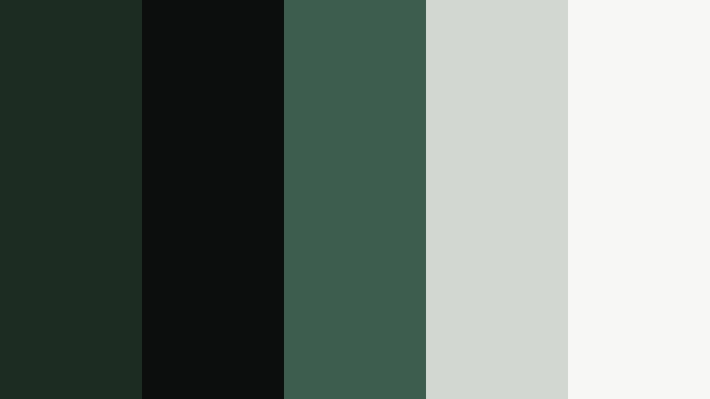
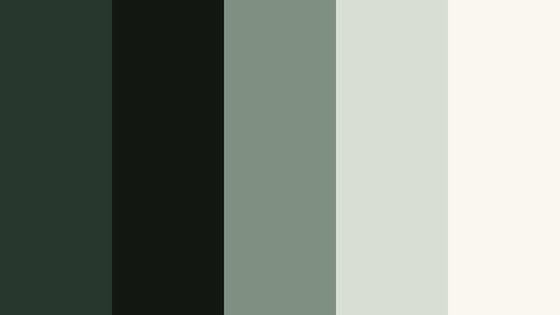
Mist Over Pine Valley

- HEX Codes: #24352a, #111716, #6f8777, #c6d1c4, #eef3f0
- Mood: Calm, misty, and introspective.
- Use for: Ideal for slow, reflective edits, meditative B-roll, or wellness content set in nature.
Mist Over Pine Valley softens Deep Moss with slatey greens and pale mist tones, giving your footage a tranquil, foggy-morning feel. Nothing is too bright or harsh, so the palette encourages slower pacing and mindful viewing.
This is a strong choice for meditation content, slow living vlogs, and breathing-room B-roll sequences. Use the lightest tones for clean title cards and minimal thumbnails, while keeping your backgrounds in the darker greens to add depth without drama.
Modern Minimal Deep Moss Color Palettes
Urban Moss Interface
- HEX Codes: #1c2c23, #0b0e0d, #3d5d4f, #d3d7d2, #f7f7f5
- Mood: Sleek, modern, and tech-forward.
- Use for: Great for app mockups, UI overlays in explainers, and minimalist channel branding.
Urban Moss Interface brings Deep Moss into a clean, digital context by pairing it with charcoal, muted teal, and light neutrals. It has the polish of a tech product launch but still feels grounded and human thanks to the green undertone.
Use this palette for UI overlays in tutorials, SaaS explainers, or startup pitch videos. Deep Moss and charcoal are excellent for navbar-style lower thirds, while the light neutrals keep titles, buttons, and icon labels sharp and readable on any screen.
Studio Loft Neutrals
- HEX Codes: #222f28, #101211, #6b6f69, #c6c2ba, #f3eee7
- Mood: Understated, design-driven, and editorial.
- Use for: Perfect for studio tours, productivity content, and design portfolio videos.
Studio Loft Neutrals frames Deep Moss with soft greys and warm oat tones, echoing concrete, textiles, and natural light in a creative studio. The look is intentionally muted, which helps your subject, artwork, or workspace details stand out.
Apply this palette to channel branding for design, architecture, or creator-business content. Use the darker greens and charcoals as background blocks for chapter headings and timeline graphics, while the light oat color keeps text readable in thumbnails, intros, and end screens.
Graphite Moss Branding

- HEX Codes: #1e2a24, #050707, #585f5a, #aeb4ae, #ffffff
- Mood: Confident, refined, and corporate-ready.
- Use for: Use for logos, lower thirds, and branded intro slates for agencies and consultants.
Graphite Moss Branding combines Deep Moss with inky black, graphite, and crisp white for a high-contrast, professional look. It feels like modern stationery or a sleek website translated into motion, suitable for serious brands and agencies.
Use Deep Moss and black as your core background colors in intros, outros, and title frames. The white and light grey tones are ideal for typography in presentations, webinar recordings, and LinkedIn-focused videos, where clarity and authority matter.
Minimal Workspace Calm

- HEX Codes: #22352a, #111816, #849387, #d7ddd5, #fbfbf8
- Mood: Light, calm, and productivity-focused.
- Use for: Great for desk setups, study vlogs, and productivity or tech content needing a soft yet modern look.
Minimal Workspace Calm uses Deep Moss as a subtle accent within a mostly light, airy palette. Dusty greens and soft off-whites create a sense of order and focus without feeling sterile, ideal for productivity and study content.
Use Deep Moss for small details like icons, progress bars, and timeline markers, while allowing the lighter tones to dominate your frames and thumbnails. This keeps your content approachable and clean, especially for long-form study-with-me or workflow breakdown videos.
Luxe & Dramatic Deep Moss Color Palettes
Emerald Velvet Title Card

- HEX Codes: #18251d, #050706, #20563f, #d0a96c, #f5efe5
- Mood: Luxurious, dramatic, and cinematic.
- Use for: Perfect for title cards, fashion promos, and dramatic openers with a high-end feel.
Emerald Velvet Title Card amplifies Deep Moss with jewel-toned emerald, champagne gold, and soft ivory. It feels like velvet, metallic foil, and spotlight combined, ideal when you want your intro or logo reveal to look premium.
Use Deep Moss and emerald as your background gradient, then set main titles in gold on ivory to create a rich, legible contrast. This palette suits fashion lookbooks, jewelry showcases, and high-end service promos on YouTube, Instagram Reels, and TikTok.
Gilded Moss Noir
- HEX Codes: #151f1a, #000000, #bd8a3b, #e4c89a, #f7f2e8
- Mood: Moody, opulent, and bold.
- Use for: Use for luxury product ads, perfume spots, or moody channel trailers.
Gilded Moss Noir contrasts inky Deep Moss and black with molten gold and soft cream. The result is unapologetically dramatic, great when you want to frame your subject like a luxury product campaign.
Keep most of the frame in Deep Moss and black, then reserve the gold and cream for text, borders, and logo animations. This palette works beautifully in slow, close-up shots of products, fragrance bottles, or fashion accessories, and it translates well into bold, high-contrast thumbnails.
Secret Library Aesthetic

- HEX Codes: #202a22, #0a0b09, #684531, #c39d7a, #efe3d4
- Mood: Scholarly, romantic, and quietly dramatic.
- Use for: Ideal for booktube channels, study montages, and vintage-inspired edits.
Secret Library Aesthetic combines Deep Moss shadows with worn leather browns and parchment cream. It feels like walking into an old bookshop, perfect for content about reading, writing, or academia.
Use Deep Moss and near-black for backgrounds and frame edges, and let the browns and cream highlight books, notebooks, and annotations. This palette looks great in book reviews, reading wrap-ups, and cozy study sequences, as well as in banner art and channel branding for bookish creators.
Midnight Conservatory

- HEX Codes: #1a2620, #050608, #395f4b, #9da88f, #e8ecde
- Mood: Dreamy, refined, and slightly mysterious.
- Use for: Great for fashion lookbooks, music videos, or gallery-style edits with soft motion.
Midnight Conservatory uses Deep Moss, muted teal, and pale sage to evoke a glasshouse at night. It is dark enough to feel mysterious but softened by cool, diffused highlights, which suits dreamy or artistic work.
Use the deeper tones as your base in music videos or fashion reels, allowing fabrics and skin tones to pop against them. The paler sage shades are ideal for intro text, track titles, or chapter labels, keeping everything readable while preserving the mood.
Soft & Natural Deep Moss Color Palettes
Moss And Linen Morning
- HEX Codes: #28382e, #131814, #7f8f82, #d9ded3, #faf7f0
- Mood: Soft, slow, and comforting.
- Use for: Perfect for morning routines, cozy lifestyle vlogs, and slow living content.
Moss And Linen Morning pairs Deep Moss with dusty green and linen neutrals, creating a quiet, homey atmosphere. It feels like early light on fabric and plants, ideal for content that focuses on rituals, habits, and everyday comfort.
Use the deepest greens in subtle transitions, overlays, or lower thirds, and let the linen tones dominate your titles, backgrounds, and thumbnail text. This palette keeps your channel feeling calm and approachable, whether you share home vlogs, routines, or lifestyle storytelling.
Garden Sketch Pastels
- HEX Codes: #233629, #1a211c, #8ca98d, #f1e0cf, #fdf7f2
- Mood: Airy, creative, and botanical.
- Use for: Great for art channels, DIY tutorials, and lighthearted garden or plant content.
Garden Sketch Pastels roots light, botanical pastels in the depth of Deep Moss. Leafy greens and petal-tinted creams keep the palette playful and creative, while the darker tones stop it from feeling too sweet.
This combination works well for art tutorials, journaling videos, gardening content, and craft channels. Use Deep Moss for outlines, dividers, and logo marks, while the pastel creams and greens fill in titles, lower thirds, and thumbnail backgrounds to give everything a soft, handmade charm.
Tips for Creating Deep Moss Color Palettes
When you build your own Deep Moss combinations for video and design, a bit of structure helps keep your visuals readable, on-brand, and easy to grade consistently in Filmora.
- Pair Deep Moss with at least one light neutral (ivory, cream, or light grey) so titles, captions, and UI overlays stay easy to read on all screens.
- Add a warm accent (gold, copper, or muted orange) when you want a luxe or adventurous feel, or stay with cool greens and greys for calm, minimal aesthetics.
- Check contrast on thumbnails by zooming out or viewing them small; Deep Moss backgrounds with white or pale text usually give the best clarity.
- Keep your brand consistent by limiting each project to one Deep Moss shade plus 3 to 4 support colors, then reuse them in titles, lower thirds, and end screens.
- Match footage and graphics by sampling colors from your video frames and adjusting HSL in Filmora so greens in the scene lean toward your chosen Deep Moss hue.
- Use darker Deep Moss tones for overlays, frames, and vignettes, and reserve midtones and highlights for faces, key objects, and call-to-action areas.
- Test palettes in both light and dark modes by previewing them over bright scenes and night shots, tweaking saturation and brightness where needed.
- Save successful looks as custom presets or LUTs in Filmora so you can quickly apply the same Deep Moss style across new episodes or client projects.
Deep Moss color palettes can quickly shift your content from casual to cinematic, from playful to premium. Whether you choose earthy, modern, luxe, or soft combinations, this deep green anchors your visuals with stability and character while your accent colors define the mood.
As you experiment with these 15 palettes, try them in your intros, lower thirds, titles, and full color grades inside Filmora. Once you lock in a Deep Moss look that suits your brand or channel, reusing it across thumbnails, shorts, and long-form videos will make your presence feel polished and instantly recognizable.
Open a current project or start a new one in Filmora, pick one palette, and build a custom look around it. With AI Color Palette, HSL controls, and ready-made LUTs, it is easy to refine Deep Moss into a signature style that matches your storytelling.
secure download