
 100% Security Verified | No Subscription Required | No Malware


 ChatGPT
 Perplexity
 Gemini
 Claude
 Grok
Grok
Drift Sand is a soft, warm beige that feels like sunlit powder on a calm beach. It sits between cream and light tan, which is why it instantly reads as calming, trustworthy, and timeless. In color psychology, this kind of sandy neutral reduces visual noise, helps the viewer relax, and lets skin tones and key subjects stand out without harsh contrast.
For video creators and designers, Drift Sand is a flexible base color for intros, lower thirds, thumbnails, LUTs, and full channel branding. It pairs beautifully with muted blues, soft greens, and warm browns to create cinematic, minimalist, or lifestyle aesthetics. Below you will find Drift Sand color palettes with precise HEX codes you can plug directly into your edit, thumbnail design, or Filmora workflow to keep your brand look consistent.
In this article
Soft And Airy Drift Sand Color Palettes
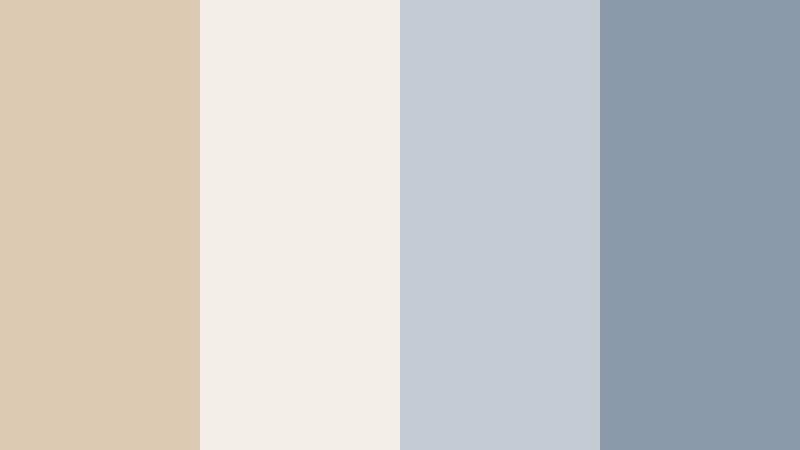
Coastal Drift Morning

- HEX Codes: #d8c3a5, #f6eee3, #9fbad1, #6f8697
- Mood: Calm, fresh, and breezy with a soft coastal atmosphere.
- Use for: Great for travel vlogs, lifestyle intros, and relaxed storytelling edits where you want a light, seaside feel.
Coastal Drift Morning mixes warm Drift Sand with sea-glass blues for a gentle, beachy atmosphere. The creamy beige and off white keep frames bright and soft, while the cool blue accents evoke ocean mist and distant horizons.
This palette works beautifully for travel vlogs, sunrise b roll, coastal B roll packs, and minimalist thumbnails where you want the viewer to feel refreshed. Use the lighter tones for backgrounds, overlays, and title cards, then reserve the deeper slate blue for key text, buttons, or callouts in your Filmora intros, end screens, and lower thirds.
Pro Tip: Enhance Your Drift Sand Coastal Visuals With Filmora
To keep this soft, seaside Drift Sand palette consistent across an edit, start by picking a hero shot that best represents your desired look. Use that as your visual reference while you color correct and grade the rest of the timeline in Filmora, matching skin tones to the warm beige and pushing skies and water toward the muted blues.
Apply the lighter Drift Sand tone to your title backgrounds and overlays, then reuse the slate blue for accent text and icons. Saving these elements as custom templates in Filmora helps you repeat the same look across travel series, shorts, and reels without rebuilding everything from scratch.
AI Color Palette
If you have a reference still of your perfect coastal scene, you can turn that image into a look for your whole video with Filmora. Filmora's AI Color Palette feature analyzes the colors in one clip or image and automatically applies that palette to other clips on your timeline.
Import your best Drift Sand beach frame or custom color card, use AI Color Palette to match the rest of your footage, and then fine tune if needed. This keeps the warm sand, soft whites, and gentle blues consistent from your intro to your B roll montage and outro screens.
 secure download

HSL, Color Wheels & Curves
Once your Drift Sand base look is in place, use HSL and color wheels in Filmora to refine the mood. Slightly desaturate blues for a misty morning vibe, warm up the midtones to keep sand and skin tones flattering, and use curves to lift shadows so your shots stay light and airy rather than contrasty.
On scenes that feel too flat, add a gentle S curve and a touch of teal to the shadows while preserving warm highlights. This kind of fine tuning helps every shot sit inside the same coastal Drift Sand palette without looking over-edited.
secure download1000+ Video Filters & 3D LUTs
If you want to get to a polished Drift Sand look faster, start with Filmora presets. Filmora's video filters and 3D LUTs make it easy to create airy neutrals, then you can adjust intensity to keep the palette subtle and natural.
Blend a light film LUT with a soft warm filter, reduce contrast, and then tweak opacity so your sand, sky, and skin tones stay realistic. Save the combination as a custom preset so every new coastal vlog, reel, or short can instantly match your established Drift Sand style.
secure downloadStudio Loft Daylight
- HEX Codes: #dcc9b2, #f3efe8, #c2cbd3, #8a9aa9
- Mood: Minimal, modern, and softly illuminated like a bright studio loft.
- Use for: Ideal for design tutorials, productivity channels, and clean UI overlays in explainer videos.
Studio Loft Daylight wraps Drift Sand in soft whites and cool gray blues, creating a modern, editorial atmosphere. It feels like a bright creative studio with big windows and gentle daylight.
Use the palest tone as your background for tutorial screens, keeping UI overlays and captions easy to read. The mid gray blues are perfect for icons, progress bars, chart lines, and call-to-action buttons in thumbnails or Filmora titles, giving your content a clean, tech friendly vibe without looking cold.
Desert Breeze Minimal
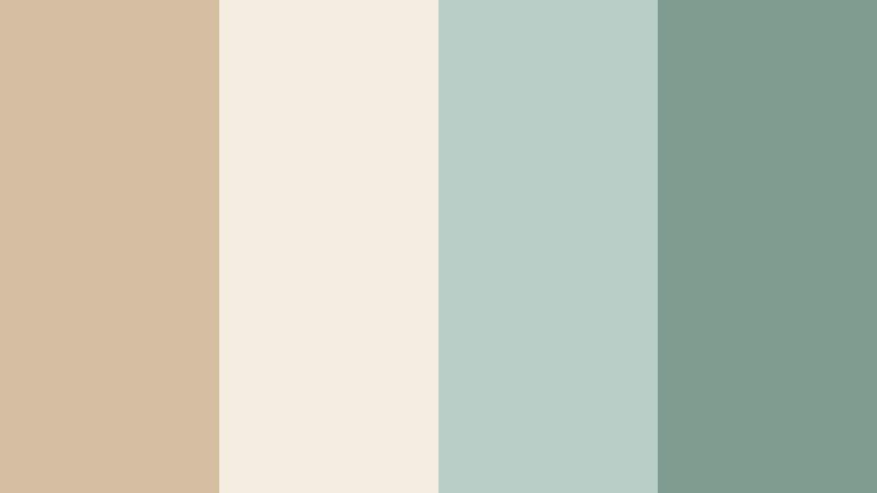
- HEX Codes: #d5bea2, #f4ecde, #b6cec5, #7f9c90
- Mood: Light, airy, and grounded with a whisper of desert greenery.
- Use for: Works well for wellness content, yoga intros, and soft product promos with a clean natural look.
Desert Breeze Minimal balances warm Drift Sand with muted sage greens, giving off a spa like calm. The light neutrals keep frames uncluttered, while the green tones hint at plants and nature.
This palette is great for wellness vlogs, guided meditations, yoga intros, and holistic product highlights. Use the greens for subtle accents on lower thirds or callout boxes, while Drift Sand and off white serve as soft backgrounds for titles and product shots in Filmora.
Powdered Latte Glow
- HEX Codes: #d2b89b, #f7eee4, #e1c9b3, #c19d7b
- Mood: Warm, cozy, and creamy like a softly lit coffee shop.
- Use for: Perfect for cafe b-roll, cozy vlogs, and storytelling thumbnails that feel inviting and intimate.
Powdered Latte Glow layers Drift Sand with creamy latte browns for a cozy, intimate atmosphere. It feels like soft light spilling through a cafe window onto a table of notebooks and mugs.
Use this palette in slow living vlogs, cafe reviews, storytelling shorts, or podcast visuals. Light tones can carry your background cards and chapter markers, while the deeper latte shade highlights key text in thumbnails and intro titles built in Filmora.
Morning Linen Edit

- HEX Codes: #ddc7aa, #faf5ec, #cfd3d8, #a3a9b0
- Mood: Fresh, clean, and slightly cool like crisp linen at sunrise.
- Use for: Use for minimalist edit templates, soft fashion lookbooks, and subtle lower thirds in tutorials.
Morning Linen Edit blends warm Drift Sand with pale whites and cool grays, capturing the feeling of fresh bedsheets and soft daylight. It is airy and polished without looking sterile.
This palette is ideal for fashion lookbooks, capsule wardrobe videos, and minimalist templates. The soft neutrals make product colors and outfits pop, while gray accents work well for understated typography in your Filmora lower thirds, titles, and end screens.
Warm And Cinematic Drift Sand Color Palettes
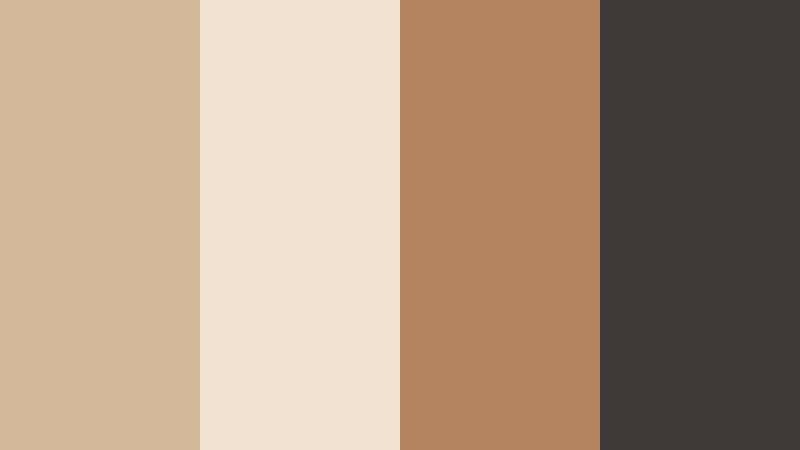
Golden Dune Cinema

- HEX Codes: #d1b38f, #f3e3c7, #c88f5b, #7a5837
- Mood: Cinematic, warm, and dramatic with golden desert light.
- Use for: Ideal for cinematic travel films, short films, and epic B-roll sequences needing a warm grade.
Golden Dune Cinema turns Drift Sand into a dramatic, golden hour experience. Light beige and cream mimic sunlit dunes, while the deeper browns add depth and contrast reminiscent of film stills.
Apply this palette to travel films, desert trips, and cinematic b roll edits. Use the soft tones for backgrounds and typography, and lean on the rich browns for outlines, bars, and bold titles in Filmora to frame your footage with a warm, movie like look.
Sunset Market Streets

- HEX Codes: #d6b599, #f7e0cd, #e08a5c, #b4553b
- Mood: Lively, warm, and story-driven like a sunset city market.
- Use for: Great for travel diaries, food reels, and street photography slideshows with rich sunset tones.
Sunset Market Streets pairs Drift Sand with spiced oranges and terracotta reds. It feels like walking through a busy market at golden hour, with warm shadows and glowing highlights.
Use this palette for food content, street photography reels, and travel diaries. The warm neutrals give space for busy scenes, while the vibrant oranges and reds are perfect accents for title text, price tags, stickers, and animated arrows in Filmora thumbnails and overlays.
Campfire Story Frame

- HEX Codes: #ccb093, #f4e3d2, #d4743a, #5a3a2b
- Mood: Nostalgic, intimate, and storytelling focused like moments around a fire.
- Use for: Fits narrative vlogs, documentary intros, and storytelling podcasts published on video.
Campfire Story Frame surrounds Drift Sand with ember oranges and deep brown shadows. It instantly adds nostalgia and intimacy, like sitting around a fire sharing stories.
Use this palette for narrative vlogs, personal documentaries, or story based podcasts. Keep Drift Sand and cream for background plates and subtitle bars, and use the ember orange for emphasis on key words or chapter titles in Filmora to draw attention without feeling aggressive.
Vintage Studio Reel
- HEX Codes: #d3b89a, #f1e2d1, #b48360, #3f3a38
- Mood: Retro, polished, and slightly moody with studio contrast.
- Use for: Best for retro-themed edits, channel trailers, and title sequences inspired by film photography.
Vintage Studio Reel gives Drift Sand a retro studio twist by pairing it with caramel browns and dark charcoal. It feels like old film prints and softbox lighting.
Use this palette for retro intros, channel trailers, and stylized transitions. The light tones are ideal for vintage inspired frames and borders, while the dark charcoal works well for bold title typography and logo lockups created in Filmora.
Dusty Orchard Frame

- HEX Codes: #d7bda0, #f6e7da, #c06c64, #7a474a
- Mood: Romantic, earthy, and softly dramatic with fruit-toned accents.
- Use for: Lovely for wedding highlights, engagement reels, and romantic storytelling pieces.
Dusty Orchard Frame blends Drift Sand with blushy reds and berry tones for a romantic, earthy feel. It is warm and emotional, but still restrained enough to keep footage elegant.
This palette suits wedding highlight films, engagement reels, and romantic storytelling edits. Use the neutral tones for backgrounds and lower thirds, while the fruit toned accents highlight names, dates, and key moments in Filmora titles and overlays.
Modern And Minimal Drift Sand Color Palettes
Urban Sand Interface
- HEX Codes: #d0b79b, #f2ebe3, #b0b7c2, #383f4a
- Mood: Clean, tech-forward, and urban with subtle warmth.
- Use for: Great for app previews, SaaS explainers, and overlay graphics in tech reviews.
Urban Sand Interface teams Drift Sand with cool gray blues and a strong navy charcoal. It feels like a modern app UI set against a warm, human background.
Use the soft neutrals as the base for explainer screens and dashboards, while the darker navy carries titles, buttons, and icons. In Filmora, this palette is ideal for app mockup animations, tech review overlays, and clean, easy to scan lower thirds.
Gallery Wall Neutral
- HEX Codes: #d8c0a3, #f7f1ea, #c3c3c0, #545453
- Mood: Artful, quiet, and gallery-ready with balanced neutrals.
- Use for: Use for portfolio reels, photography slideshows, and premium brand bumpers.
Gallery Wall Neutral wraps Drift Sand in soft off white and stone grays, creating a museum style calm. It is understated so that your footage or artwork can stay the hero.
Use this palette in portfolio reels, photography slideshows, architecture videos, and premium brand bumpers. The light tones are perfect for subtle frames and mats, while the darker gray supports clean logo locks and title text built with Filmora.
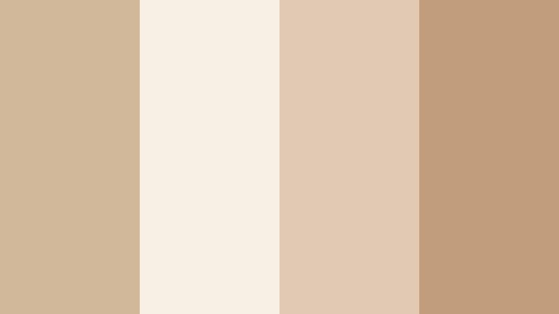
Editorial Sand Monochrome

- HEX Codes: #cdb294, #e8d6be, #a98965, #47392b
- Mood: Sophisticated, editorial, and focused with warm monochrome depth.
- Use for: Ideal for fashion lookbooks, product spotlights, and luxe brand intros with minimal text.
Editorial Sand Monochrome stays within a warm Drift Sand range, from pale beige to deep mocha. The narrow color spread feels intentional and high end, like a magazine spread.
Use it for fashion reels, product spotlights, and brand intros where typography and composition matter most. Let the lighter beige tones be your full screen backgrounds, and use the darkest brown for dramatic, minimal text and logo marks inside Filmora titles.
Concrete Loft Contrast
- HEX Codes: #d5bda0, #f0e8dd, #a4a9ae, #26282b
- Mood: Sleek, balanced, and design-driven with gentle contrast.
- Use for: Perfect for architecture reels, interior design tours, and cinematic b-roll of city spaces.
Concrete Loft Contrast combines Drift Sand with concrete grays and a dark charcoal accent. It is modern and architectural, with just enough warmth to feel inviting.
Use this palette for architecture tours, interior design videos, or minimal city b roll. Let the light neutrals become your information panels, and use the dark charcoal for section titles, time stamps, and navigation labels in Filmora so the visuals stay clean and legible.
Soft Brand Identity

- HEX Codes: #d9c3a9, #fbf5ee, #b6d0c7, #4f6f68
- Mood: Friendly, trustworthy, and contemporary with a soft brand feel.
- Use for: Use for channel branding, logo animations, and consistent social video templates.
Soft Brand Identity anchors Drift Sand with soft teal accents for a friendly, modern look. The palette feels trustworthy and professional but not overly corporate.
This is a strong choice for long term channel branding, logo stings, and recurring social templates. Use the warm neutrals as your core brand background, and reserve the teal tones for logos, icons, and subscribe or follow prompts built directly in Filmora, so your identity stays consistent across every platform.
Tips for Creating Drift Sand Color Palettes
Drift Sand works best when you combine it with carefully chosen accents and keep contrast controlled. These practical tips will help you build palettes that look great in video, thumbnails, and other design assets.
- Pair Drift Sand with one cool accent (blue, teal, or sage) and one dark neutral (charcoal or deep brown) to keep your palette balanced and versatile.
- Check text readability by testing white, Drift Sand, and dark accent colors on both light and dark backgrounds before finalizing your thumbnail or title design.
- Use Drift Sand as a base for backgrounds and lower thirds so your footage and skin tones stay the focus, especially in talking head or vlog content.
- Limit strong accent colors to buttons, key words, and icons so your Drift Sand palette still feels calm and cohesive.
- Match your color palette to your footage lighting; warm Drift Sand combinations suit golden hour, candles, and interiors, while cooler pairings work better with overcast or studio lighting.
- Save your HEX codes as custom colors in Filmora so you can quickly reuse the same Drift Sand tones across titles, shapes, and overlays.
- When grading, protect highlights so Drift Sand areas do not turn too white, and avoid pushing shadows so deep that your neutrals lose their softness.
- Build a simple brand guide with 2 Drift Sand shades, 1 accent, and 1 dark neutral, and use that same set for intros, outros, and social cuts to strengthen brand recognition.
Drift Sand color palettes are a powerful way to set mood, from calm coastal mornings to cinematic golden hour scenes. Used well, this soft neutral helps your subjects stand out, keeps your visuals welcoming, and anchors a recognizable brand identity across all your content.
With the HEX codes above, you can plug each palette directly into your editing and design tools and recreate the same mood in Filmora. Experiment with different combinations for intros, lower thirds, and LUT like grades until you find a signature Drift Sand look that fits your channel or brand.
Once you lock in your favorite palette, save it as part of your Filmora presets and templates. That way, every new video, short, and thumbnail can carry the same warm Drift Sand feel with just a few clicks.
secure download