
 100% Security Verified | No Subscription Required | No Malware


 ChatGPT
 Perplexity
 Gemini
 Claude
 Grok
Grok
Flat color palettes use solid, even tones with minimal shading or texture. This style feels clean, modern, and intentional, which is why it shows up everywhere from mobile apps to YouTube intros. Flat colors are easy to read on screens, make interfaces feel lighter, and help your audience focus on content instead of distractions.
For video creators, designers, and Filmora users, flat color combinations are perfect for branding, thumbnails, titles, and overlays. Below are 15 curated flat color palettes with HEX codes you can copy directly into your graphics, motion design, or video color grading to keep your projects consistent and visually sharp.
In this article
Minimal Flat Color Palettes
Concrete Studio Neutrals
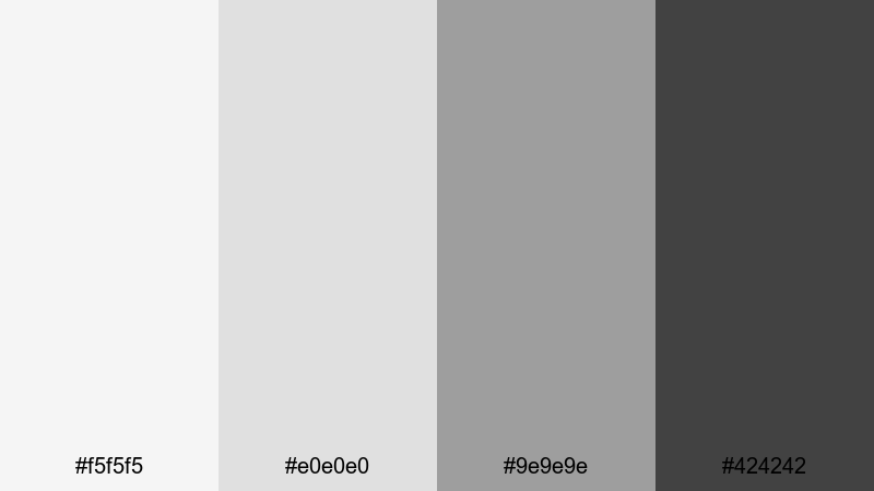
- HEX Codes: #f5f5f5, #e0e0e0, #9e9e9e, #424242
- Mood: Clean, structured, and professional with a calm urban edge.
- Use for: Great for minimalist video intros, tech explainer overlays, and clean UI-driven motion graphics.
This grayscale stack feels like a polished creative studio: bright light grays for backgrounds, a cool mid-tone for structure, and a deep charcoal for emphasis. It is modern, disciplined, and never fights with your footage or typography.
Use Concrete Studio Neutrals for product demos, software tutorials, and portfolio reels where clarity matters. Your titles, callouts, and lower thirds will stay perfectly legible in YouTube thumbnails, video intros, and overlays without stealing attention from the main content.
Pro Tip: Build a Cinematic Flat Neutral Look in Filmora
When you work with flat neutrals like this, consistency is everything. In Filmora, you can design a title or lower third using these HEX codes once, then save it as a custom preset so every intro, chapter card, and end screen matches the same Concrete Studio Neutrals look.
Combine these grays with simple motion, clean fonts, and subtle blur transitions in Filmora to create a cinematic, studio-grade experience across tutorials, product walkthroughs, and social cutdowns. Your whole edit will feel like it belongs to one cohesive brand.
AI Color Palette
If you already have a mood board, website, or UI mockup using Concrete Studio Neutrals, you can turn that into a reference for your whole video. Filmora's AI Color Palette feature analyzes the colors from a still frame or image and helps you match other clips to the same flat tones.
Import a clean frame with your neutral graphics, apply AI Color Palette to the rest of your footage, and your B-roll, A-roll, and overlays will share the same calm gray balance. This is ideal when you want your channel, course, or brand videos to look unified without manual tweaking on every clip.
 secure download

HSL, Color Wheels & Curves
Flat neutrals can shift easily if your footage is too warm or too cool. In Filmora, use HSL and color wheels to pull back strong color casts so your whites stay close to #f5f5f5 and your shadows lean toward #424242 rather than muddy brown or blue. If you are new to these tools, Filmora's color correction guide is a helpful starting point.
Curves let you fine-tune contrast while keeping the flat, graphic feel. Add a slight S-curve for a more cinematic punch, or keep the curve gentle for a softer, editorial look that pairs perfectly with flat UI overlays and minimal titles.
secure download1000+ Video Filters & 3D LUTs
Once your flat neutrals are in place, you can quickly test different moods using Filmora's filters and LUTs. Filmora's video filters and 3D LUTs make it easy to add a subtle warm wash, a cool tech vibe, or a more cinematic contrast while still keeping your flat design aesthetic intact.
Apply a LUT to unify clips from different cameras, then fine-tune opacity so your Concrete Studio Neutrals overlays remain the star. This keeps your brand visuals consistent whether you are editing tutorials, client case studies, or stylish portfolio videos.
secure downloadMonoline UI Blues
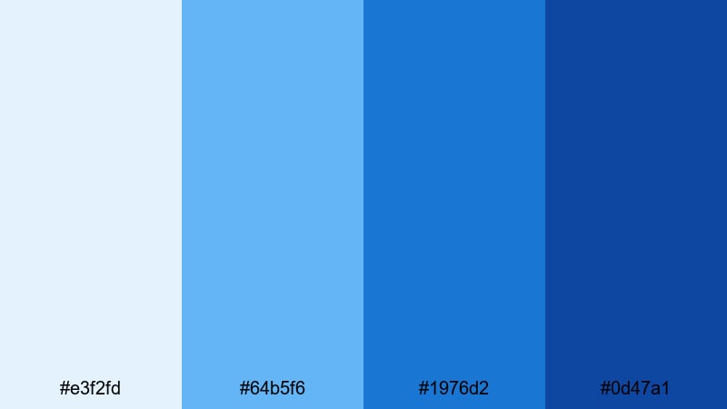
- HEX Codes: #e3f2fd, #64b5f6, #1976d2, #0d47a1
- Mood: Trustworthy, focused, and product-driven.
- Use for: Ideal for app walkthroughs, SaaS promos, and any interface-focused motion graphics.
Monoline UI Blues layers soft sky blues with deeper royal tones, creating a clear hierarchy that feels organized and dependable. Light blues work well as backgrounds, while the darker shades are perfect for icons, UI elements, and bold call-to-action text.
Use this palette for product demos, onboarding flows, and explainer videos where you want your audience to trust the interface. It also works great for YouTube thumbnails and channel branding that need a professional tech-forward look without feeling cold.
Muted Dashboard Greens
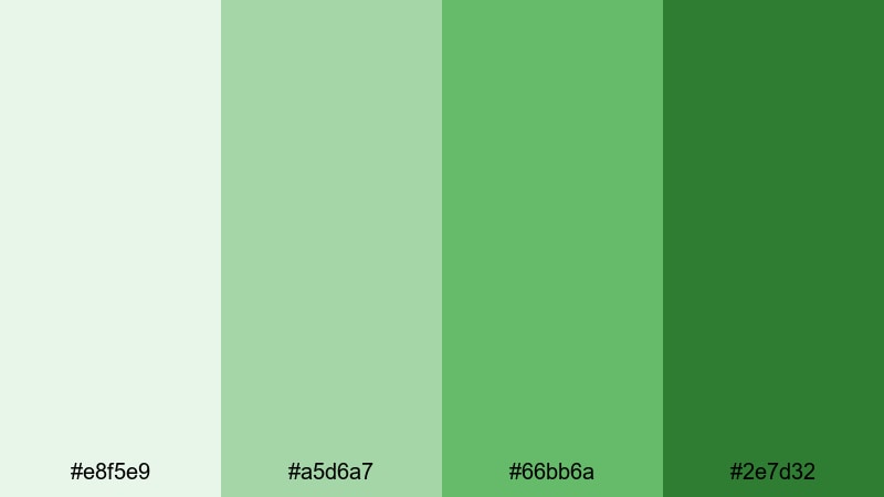
- HEX Codes: #e8f5e9, #a5d6a7, #66bb6a, #2e7d32
- Mood: Balanced, optimistic, and data-friendly.
- Use for: Works well for analytics dashboards, productivity tools, and educational explainers.
Muted Dashboard Greens feel like growth charts and healthy progress. Soft background greens support legibility, while the richer tones are ideal for accent numbers, graphs, and highlighted stats.
Use this palette when you are presenting metrics in screen recordings, creating infographic-style animations, or designing dashboard overlays inside Filmora. It keeps data videos calm and readable, especially for tutorials, case studies, and finance or productivity content.
Warm Beige Workspace
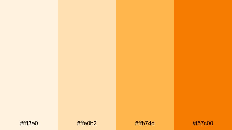
- HEX Codes: #fff3e0, #ffe0b2, #ffb74d, #f57c00
- Mood: Cozy, approachable, and creator-friendly.
- Use for: Perfect for desk setups, lifestyle vlogs, and creator branding overlays.
Warm Beige Workspace combines cream, soft orange, and deeper amber tones for a sunlit, cozy vibe. It feels like warm coffee light on a wooden desk, which is ideal for human, relatable content.
Use it for vlog title cards, routine breakdowns, productivity tips, and behind the scenes intros. The lighter hues make excellent backgrounds for text, while the deeper orange is perfect for subscribe buttons, callouts, and branded thumbnail frames.
Graphite Accent Duo
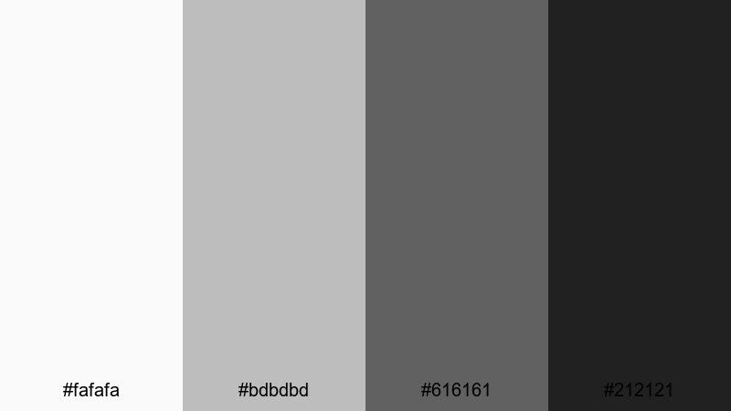
- HEX Codes: #fafafa, #bdbdbd, #616161, #212121
- Mood: Serious, cinematic, and understated.
- Use for: Strong for title cards, lower thirds, and premium brand intros where typography shines.
Graphite Accent Duo delivers a crisp grayscale gradient from soft off-white to rich near-black. It feels editorial, premium, and timeless, letting typography or logo marks become the main visual focus.
Use this palette when you want cinematic openers and clean lower thirds that will not date quickly. It is perfect for high-end tutorials, agency reels, and brand identities that rely on strong type and minimal flat color.
Bold Flat Color Palettes
Neon Street Pop
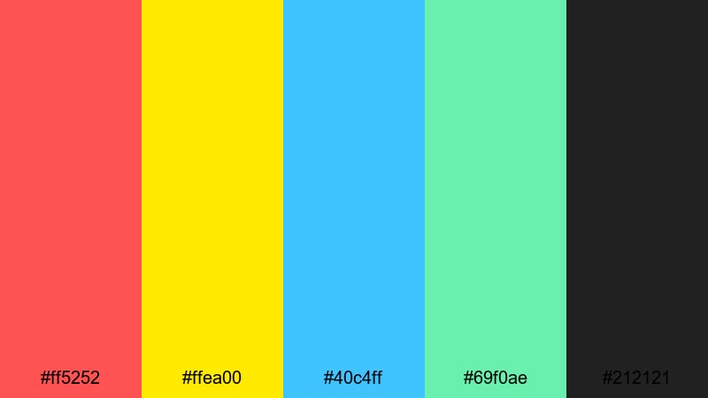
- HEX Codes: #ff5252, #ffea00, #40c4ff, #69f0ae, #212121
- Mood: Energetic, youthful, and attention grabbing.
- Use for: Ideal for YouTube thumbnails, hype reels, music videos, and fast-cut shorts.
Neon Street Pop is all about impact: hot red, electric yellow, punchy cyan, and fresh mint anchored by deep charcoal. It screams energy and movement, perfect for short-form content competing in busy feeds.
Use the dark #212121 as a base, then let the neons highlight text, borders, and motion graphics. This palette is great for reaction videos, dance edits, channel intros, and any thumbnail where you want instant click appeal.
Retro Gaming HUD
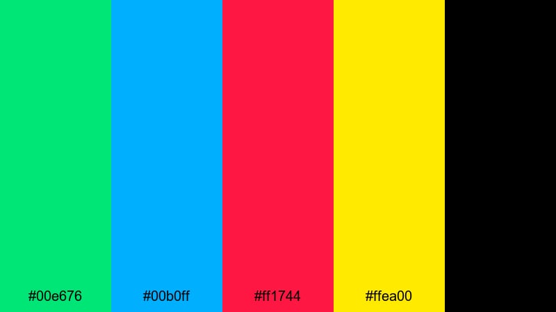
- HEX Codes: #00e676, #00b0ff, #ff1744, #ffea00, #000000
- Mood: Playful, nostalgic, and arcade inspired.
- Use for: Great for gaming intros, stream overlays, and retro themed motion graphics.
Retro Gaming HUD brings back CRT-era vibes with electric greens, blues, reds, and yellow over pure black. It instantly feels like an old-school HUD or arcade cabinet screen.
Use it for stream overlays, kill counters, retro-style title cards, and animated alerts. In thumbnails, the bright flat colors against black create a strong retro gamer identity that is easy to recognize at a glance.
Digital Sunset Blast
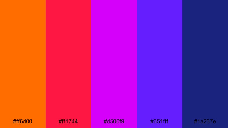
- HEX Codes: #ff6d00, #ff1744, #d500f9, #651fff, #1a237e
- Mood: Dramatic, cinematic, and highly saturated.
- Use for: Use for cinematic openers, travel montages, and dramatic transition scenes.
Digital Sunset Blast stacks blazing orange and crimson with intense magenta and deep purples, echoing a hyper-saturated sunset. It has the punch of a music video mixed with the drama of a movie trailer.
Use this palette in gradients for title backgrounds, transition wipes, and animated shapes. It works well for travel edits, festival recaps, or any cinematic opener where you want big emotion and bold flat color.
Cyberpunk Interface
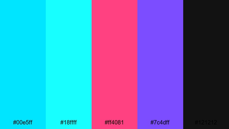
- HEX Codes: #00e5ff, #18ffff, #ff4081, #7c4dff, #121212
- Mood: Futuristic, edgy, and tech forward.
- Use for: Perfect for sci fi edits, tech launches, and glitchy UI motion graphics.
Cyberpunk Interface contrasts bright cyan and aqua with hot magenta and violet, all glowing over deep near-black. It feels like a neon city night, packed with holograms and UI overlays.
Use it for glitch transitions, HUD elements, and title sequences in sci fi or tech-heavy content. On thumbnails and banners, these colors immediately signal futuristic themes and fast-paced storytelling.
Tropical Thumbnail Burst
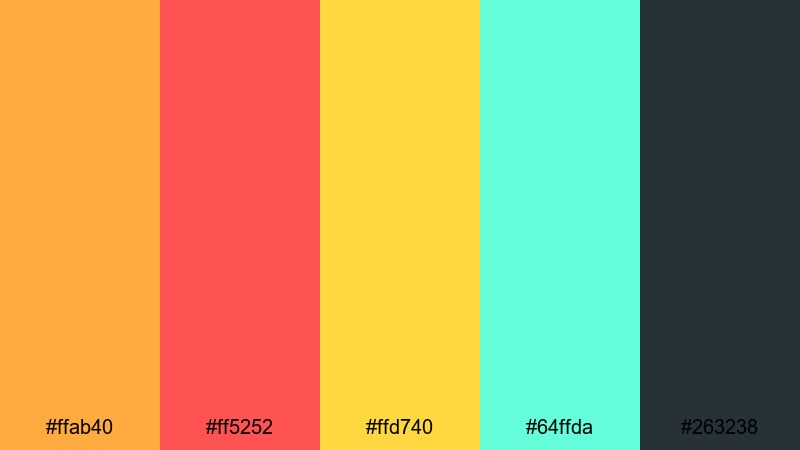
- HEX Codes: #ffab40, #ff5252, #ffd740, #64ffda, #263238
- Mood: Fun, adventurous, and vacation ready.
- Use for: Best for travel vlogs, lifestyle content, and eye catching channel art.
Tropical Thumbnail Burst mixes juicy oranges, bright red, sunny yellow, and fresh aqua on top of a dark blue-gray base. It captures beach sunsets, cocktails, and travel excitement in one bold flat palette.
Use it to frame your thumbnails, highlight location names, or create animated sticker-style graphics in Filmora. It is ideal for travel vlogs, summer lookbooks, and lifestyle channels that want a playful, adventurous mood.
Soft Flat Color Palettes
Pastel Storyboard Calm
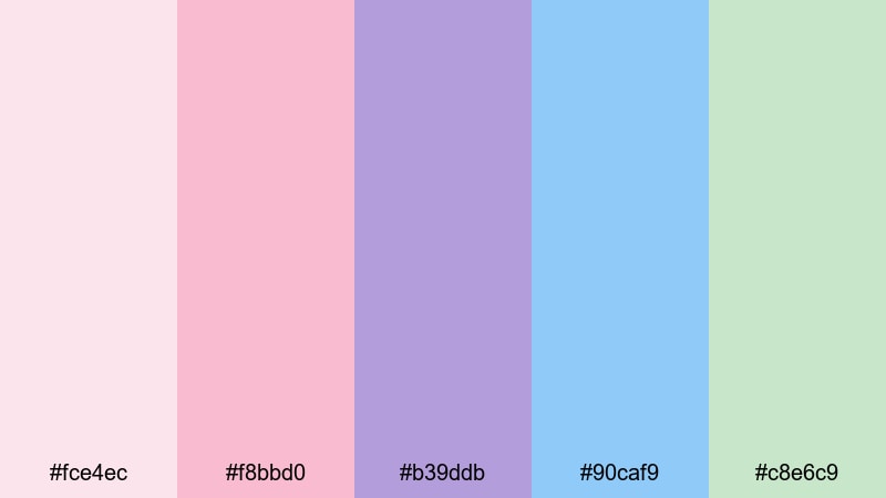
- HEX Codes: #fce4ec, #f8bbd0, #b39ddb, #90caf9, #c8e6c9
- Mood: Gentle, dreamy, and reassuring.
- Use for: Ideal for wellness content, educational explainers, and aesthetic reels.
Pastel Storyboard Calm blends soft pinks, lavender, sky blue, and mint green into a gentle, airy palette. It feels reassuring and kind, without losing visual variety or clarity.
Use it for chapter cards in wellness videos, intro slides for classes, or aesthetic reels with inspirational text. The light tones are perfect for Instagram Reels covers, YouTube thumbnails, and gentle flat illustrations inside your videos.
Cloudy Morning UI
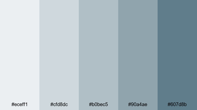
- HEX Codes: #eceff1, #cfd8dc, #b0bec5, #90a4ae, #607d8b
- Mood: Quiet, thoughtful, and productivity focused.
- Use for: Great for productivity apps, note taking videos, and calm desk tours.
Cloudy Morning UI feels like an overcast day at your desk, with layered blue-grays that keep focus on the task at hand. It is calm, neutral, and extremely easy on the eyes.
Use this palette in screen recordings, planner videos, and app demos where you want to reduce distraction. It works well for long-form study vlogs and tutorials because the flat, muted colors do not tire viewers over time.
Blush Portfolio Frames
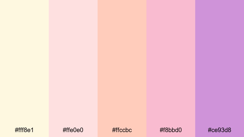
- HEX Codes: #fff8e1, #ffe0e0, #ffccbc, #f8bbd0, #ce93d8
- Mood: Elegant, creative, and portfolio friendly.
- Use for: Use in lookbooks, creator portfolios, and soft product showcases.
Blush Portfolio Frames layers creams, blush pinks, and lavender into an elegant, slightly feminine palette. It feels refined and creative, ideal for showcasing art, photography, or lifestyle products.
Use soft backgrounds for full-screen frames and solid color blocks around your work, then let product shots or portraits sit in the center. It is an excellent choice for lookbooks, brand reels, and Instagram or YouTube channel rebrands that want a gentle, polished flat aesthetic.
Mint Learning Hub
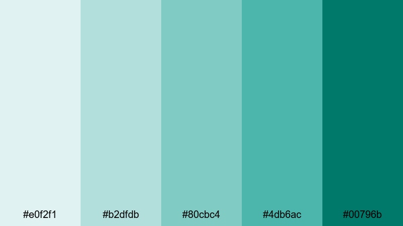
- HEX Codes: #e0f2f1, #b2dfdb, #80cbc4, #4db6ac, #00796b
- Mood: Fresh, educational, and growth oriented.
- Use for: Perfect for course intros, explainer animations, and tutorial overlays.
Mint Learning Hub stacks layered mints and teals that feel clean and studious, but still friendly. The lighter tones make ideal backdrops for icons and text, while the deeper teal provides accent weight.
Use this palette for course title cards, lesson chapter markers, and animated diagrams. It is especially effective for coding tutorials, language learning, and how-to content because it keeps the mood fresh and focused without feeling sterile.
Calm Productivity Desk
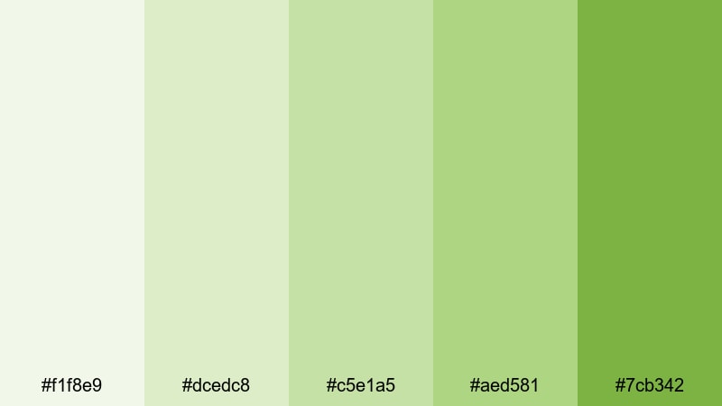
- HEX Codes: #f1f8e9, #dcedc8, #c5e1a5, #aed581, #7cb342
- Mood: Balanced, natural, and focus enhancing.
- Use for: Works well for study vlogs, planning videos, and workspace b roll.
Calm Productivity Desk uses soft, plant-inspired greens that feel like daylight on leaves. It creates a relaxed, organized atmosphere that pairs beautifully with real desk setups and analog tools.
Use it for planning videos, bullet journal content, and long study sessions where overlays and titles should support concentration. The palette also works as a subtle branding system for channels built around productivity, minimalism, or sustainable living.
Tips for Creating Flat Color Palettes
Flat color palettes work best when they are simple, consistent, and tuned for screen readability. Here are some practical tips to combine flat colors with your footage and design elements for cleaner, more professional videos.
- Choose 3 to 5 core colors and stick to them across your entire video, thumbnail set, and channel branding.
- Ensure strong contrast between background and text colors so titles, captions, and UI elements remain readable on mobile screens.
- Use one dark anchor color (like #212121 or #121212) to ground bright or pastel tones and give your layouts structure.
- Sample colors from your footage (clothing, environment, product) so overlays and graphics feel naturally integrated.
- Reserve the boldest flat color for calls to action such as subscribe buttons, key stats, or important labels.
- Test your palette on both light and dark thumbnails to see how it behaves in YouTube and social media previews.
- Create reusable presets in Filmora for titles, lower thirds, and transitions using your chosen HEX codes to keep every edit on brand.
- Adjust saturation and brightness slightly for different platforms so your flat colors do not look washed out or overly intense.
Conclusion
Flat color palettes are a powerful way to shape the mood and identity of your videos. Minimal neutrals can make tutorials feel sharp and professional, bold neons can turn music or gaming edits into visual events, and soft pastels can make educational or lifestyle content more welcoming.
By starting with these 15 flat color combinations and their exact HEX codes, you can quickly test different looks for your thumbnails, intros, overlays, and full edits. Filmora makes it easy to lock in a palette, match it across clips, and refine it with color tools, filters, and LUTs.
Experiment with a few of these palettes inside Filmora, save your favorites as reusable presets, and you will build a consistent visual style that viewers recognize instantly across every platform.
secure downloadNext: Dandelion Color Palette
