
 100% Security Verified | No Subscription Required | No Malware


 ChatGPT
 Perplexity
 Gemini
 Claude
 Grok
Grok
Muted Cranberry sits between classic red and soft rose, with a slightly dusky, desaturated character that feels refined rather than loud. It suggests warmth, intimacy, and emotional depth, which is why it works so well for love stories, lifestyle content, cozy interiors, and personal brands that want to feel mature yet approachable.
On screen and in design, Muted Cranberry is versatile enough for YouTube thumbnails, cinematic intros, lower thirds, social media branding, and even full video color grades. Below you will find ready made Muted Cranberry color palettes with HEX codes, designed for creators and Filmora users who want consistent, aesthetic visuals across their videos and graphics.
In this article
Soft And Romantic Muted Cranberry Color Palettes
Blush Cranberry Whisper
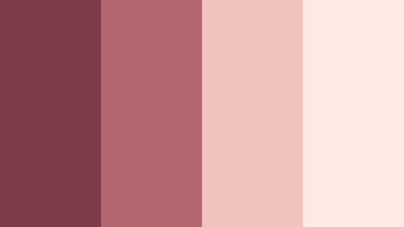
- HEX Codes: #7d3b47, #b5676f, #f2c2bf, #ffe9e3
- Mood: Tender, nostalgic, and softly romantic.
- Use for: Ideal for wedding highlight reels, save the date animations, and dreamy lifestyle thumbnails.
Blush Cranberry Whisper layers deep Muted Cranberry with rosy mid tones and creamy highlights for a gentle, romantic feel. The palette looks like faded petals and soft lipstick, giving your footage a nostalgic glow without feeling overly saturated.
Use it to guide your grading for wedding films, proposal stories, or sentimental vlogs. The lighter tones are perfect for backgrounds in YouTube thumbnails, title cards, and Instagram covers, while the deeper cranberry anchors text, lower thirds, and logo elements for a cohesive brand look.
Pro Tip: Enhance Your Muted Cranberry Visuals With Filmora
To keep this blush toned Muted Cranberry palette consistent, set it as your visual reference at the start of an edit in Filmora. Build a look that uses the dark cranberry for contrast in your titles and overlays, then repeat the softer pinks and creams in intros, b roll, and end screens.
Save your favorite adjustments as custom presets so every wedding highlight, romantic vlog, or short reel you produce carries the same tender, cranberry tinted atmosphere. This makes your channel instantly recognizable while still giving you room to adapt per project.
AI Color Palette
You can capture this exact Muted Cranberry palette from a single still frame or mood board and spread it across your entire timeline. Filmora's AI Color Palette feature analyzes your reference and applies the same tones to all your clips in a few clicks.
Import a screenshot that shows your ideal mix of cranberry, blush, and cream, then let AI Color Palette match the mood across ceremony clips, portraits, decor shots, and even vertical reels for social media. This keeps everything feeling like one unified story, even if you shot on different days or in different lighting.
 secure download

HSL, Color Wheels & Curves
For fine control over your Muted Cranberry tones, use Filmora's HSL, color wheels, and curves. Slightly desaturate reds and magentas to keep skin tones natural, then nudge the midtone wheel toward cranberry for that soft, romantic cast while preserving neutral whites and creamy highlights.
Use the curves panel to lift shadows for a hazy, film like finish, or deepen them for more contrast in thumbnails and title cards. Combining HSL and curves, as shown in Filmora's color grading tutorials on YouTube, helps you dial in a signature Muted Cranberry look that works across shots and lighting conditions.
secure download1000+ Video Filters & 3D LUTs
If you want to push this Muted Cranberry aesthetic further, Filmora's video filters and 3D LUTs make it easy to experiment. Start with a soft film LUT, then layer subtle glow or vignette filters to enhance the dreamy quality of your shots.
You can save different versions of your cranberry look for weddings, lifestyle vlogs, or Instagram Reels, and apply them in one step. This helps you move quickly while still keeping your color story polished and on brand.
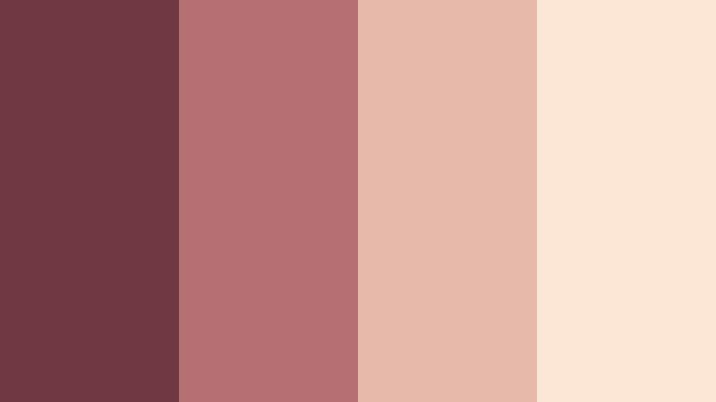
secure downloadVintage Rose Letters

- HEX Codes: #743542, #c07a7c, #f0d2c6, #f9efe7
- Mood: Warm, intimate, and handwritten love note energy.
- Use for: Use in letterboxing bars, intro frames, and titles for nostalgic love stories or memoir-style videos.
Vintage Rose Letters feels like faded stationery and old photographs. The deep Muted Cranberry is softened by dusty rose and parchment creams, creating an intimate and slightly nostalgic look.
Apply this palette to letterbox bars, title slates, or quote overlays in story driven vlogs and relationship content. It also works well for channel banners, podcast covers, and Pinterest graphics where you want gentle romance without bright, saturated pinks.
Twilight Cranberry Bloom

- HEX Codes: #6a3240, #9c5660, #e6b0af, #f7e3da
- Mood: Dreamy twilight with gentle floral warmth.
- Use for: Beautiful for dreamy travel reels, cinematic b-roll overlays, and feminine brand intros.
Twilight Cranberry Bloom captures that soft moment between sunset and night, with deep cranberry shadows moving into hazy, floral pinks and beige. It feels dreamy and cinematic without losing warmth.
Use it to grade golden hour b roll, delicate travel sequences, or soft focus lifestyle shots. The lighter tones work perfectly in YouTube intros, Instagram stories, and cover thumbnails for feminine brands, while the darker cranberry grounds text and logo marks.
Cranberry Macaron Delight

- HEX Codes: #803847, #cf7b83, #f8c9ce, #fff3f2
- Mood: Playful, sweet, and pastel patisserie inspired.
- Use for: Works well for dessert shorts, cafe vlogs, product shots, and cute channel branding.
Cranberry Macaron Delight is sugary and pastel, like a bakery window full of treats. Muted Cranberry acts as the anchor shade, surrounded by light, creamy pinks that feel soft and appetizing.
Apply this palette to dessert b roll, cafe interiors, and product close ups for cosmetics, stationery, or small accessories. It is also a natural fit for playful channel branding, K beauty thumbnails, and TikTok reels where you want a cute but not overly neon aesthetic.
Rosewood Bedroom Glow
- HEX Codes: #703842, #b46f70, #e7b9aa, #fbe6d6
- Mood: Cozy, intimate, and softly cinematic.
- Use for: Use in morning routine vlogs, bedroom makeovers, and slow living montages.
Rosewood Bedroom Glow mixes Muted Cranberry with rosewood and peachy nude tones to create a warm, lived in atmosphere. It feels like soft lamp light on wooden furniture and linen sheets.
Use this palette to grade slow living content, bedroom and office makeovers, and morning or night routines. In your thumbnails and title cards, let the darker rosewood support text while the lighter peaches fill backgrounds for a calm, inviting channel aesthetic.
Moody And Cinematic Muted Cranberry Color Palettes
Cranberry Noir Frame
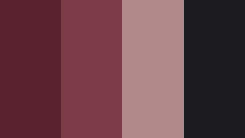
- HEX Codes: #5a222e, #7d3b47, #b08a8a, #1c1b1f
- Mood: Dark, moody, and cinematic with a hint of mystery.
- Use for: Perfect for short films, dramatic title cards, and documentary style intros.
Cranberry Noir Frame combines inky shadows with Muted Cranberry and dusty neutrals to create a film noir inspired palette. The deep near black shade enhances contrast, letting cranberry details subtly glow.
Use it to grade narrative shorts, mystery themed content, or serious documentary intros. In thumbnails, pair the darkest tone as a background with bold white type and cranberry accents to communicate drama and sophistication at a glance.
Stormy Harbor Cranberry

- HEX Codes: #642f3b, #9c6669, #64727d, #11151b
- Mood: Brooding, windswept, and coastal dramatic.
- Use for: Use in moody travel films, sea themed b-roll, and atmospheric title cards.
Stormy Harbor Cranberry pushes Muted Cranberry against cool storm blues and charcoal, creating a windswept, coastal mood. The contrast between warm cranberry and steel blue gives your footage emotional tension.
It is ideal for moody seaside travel videos, shipyard or harbor b roll, and intros for reflective documentaries. Use the blue and charcoal shades as backgrounds or gradient overlays, with cranberry reserved for key text, markers, and subtle wardrobe accents.
Cranberry Ember Night
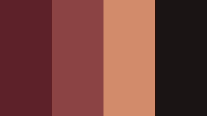
- HEX Codes: #5b2028, #8c4344, #d08b6a, #1a1514
- Mood: Smoldering, intimate, and fireside cinematic.
- Use for: Great for music videos, bar scenes, cozy night interiors, and storyline climaxes.
Cranberry Ember Night wraps Muted Cranberry in smoky browns and ember orange, evoking dimly lit bars and firelight. The palette feels intimate, smoldering, and perfect for emotionally charged scenes.
Use it in music videos, bar sequences, late night conversations, and key storyline climaxes. In graphics, the ember tone can highlight important CTA buttons or chapter titles against dark backgrounds, while cranberry unifies your branding.
Old Cinema Marquee Cranberry

- HEX Codes: #702d37, #b15f5f, #e3c58a, #2b2624
- Mood: Retro cinema, dramatic yet nostalgic.
- Use for: Use for film review channels, retro title slates, and podcast cover art.
Old Cinema Marquee Cranberry blends Muted Cranberry with mustard gold and soft charcoal to recall vintage theater lights. It feels dramatic but warmly nostalgic, like classic movie posters.
Use it for film review channels, movie trivia shorts, and retro styled podcast art. The mustard shade is excellent for accent lines, rating stars, or icons, while cranberry anchors logos and bold display text in your thumbnails and intro animations.
Cranberry Velvet Curtain

- HEX Codes: #6b2833, #9e4a56, #caa3a1, #261920
- Mood: Theatrical, luxurious, and introspective.
- Use for: Perfect for performance clips, stage reels, and dramatic reveal sequences.
Cranberry Velvet Curtain pairs theater velvet Muted Cranberry with mauve and deep plum like shadows behind a stage. The effect is rich, dramatic, and slightly introspective.
Use this palette for performance reels, theater recaps, dance videos, and reveal sequences. In design, let the darkest tone frame your shots or appear as letterbox bars, with brighter cranberry and mauve highlighting names, song titles, or act numbers.
Modern And Minimal Muted Cranberry Color Palettes
Cranberry And Concrete Calm

- HEX Codes: #7a3a46, #a97a7d, #d7cfca, #f5f2ee
- Mood: Calm, refined, and softly urban.
- Use for: Ideal for minimalist brand intros, portfolio reels, and UI overlays in tutorials.
Cranberry And Concrete Calm grounds Muted Cranberry with soft taupe and concrete beige. It feels like a polished city loft; stylish, understated, and very modern.
Use this palette across portfolio reels, agency showreels, and clean tutorial overlays. The neutral tones are ideal for backgrounds behind UI mockups or screen recordings, while cranberry acts as an accent color for buttons, progress bars, and key typography.
Muted Cranberry Branding Suite
- HEX Codes: #753842, #b98684, #e1d7d3, #ffffff
- Mood: Polished, professional, and brand ready.
- Use for: Use for logo stings, lower thirds, and cohesive channel identity systems.
Muted Cranberry Branding Suite balances rich cranberry with blush beige, soft neutrals, and crisp white. It is tailored for professional but warm branding that feels approachable.
Use this palette to design logo stings, animated lower thirds, and end screens. In YouTube thumbnails and website headers, keep white or light beige as the main background and let cranberry appear in logos, icons, and key phrases for a clean but distinctive identity.
Cranberry Sand Workspace

- HEX Codes: #7b3d48, #c0928c, #e7d3c4, #fdf8f1
- Mood: Productive, cozy, and focus friendly.
- Use for: Great for desk setup videos, productivity vlogs, and educational channel graphics.
Cranberry Sand Workspace mixes Muted Cranberry with sandy beige and off white for a calm studio desk vibe. It suggests productivity with a cozy edge, perfect for creators who film at home.
Use it in desk setup tours, study with me videos, and Notion or workspace tutorials. On thumbnails and slides, let the light sand tones dominate the canvas while cranberry highlights section headers, callouts, and subscriber CTAs.
Faded Cranberry Grid

- HEX Codes: #6f323d, #a96b6f, #c8b8b2, #ebe7e2
- Mood: Structured, editorial, and softly corporate.
- Use for: Use in slide templates, case study videos, and clean social carousels.
Faded Cranberry Grid offers an editorial blend of Muted Cranberry and cool greige. It feels structured and understated, ideal for business focused content that still wants a touch of warmth.
Apply this palette to slide templates, LinkedIn carousels, and case study videos. Use the light greige for backgrounds, the mid tones for section blocks or data highlights, and deep cranberry for key metrics, headlines, or brand accents.
Playful And Lifestyle Muted Cranberry Color Palettes
Cranberry Picnic Afternoon

- HEX Codes: #883b46, #cf7a77, #ffd1a1, #fff4d9
- Mood: Sunny, friendly, and outdoorsy fun.
- Use for: Great for picnic vlogs, family days out, food content, and park reels.
Cranberry Picnic Afternoon brings together warm Muted Cranberry, peach, and picnic blanket cream for a golden outdoor vibe. It feels cheerful and relaxed, like a late summer day in the park.
Use it for family vlogs, picnic or barbecue videos, and casual food content. In thumbnails and Reels covers, keep the peach and cream shades big and bright, then use cranberry for titles, borders, or illustrated doodles that pull the composition together.
Cranberry City Coffee Run

- HEX Codes: #7f3a45, #b87871, #f2c6a0, #f8efe5
- Mood: Casual, caffeinated, and city weekend ready.
- Use for: Use in cafe hopping vlogs, outfit of the day shorts, and lifestyle thumbnails.
Cranberry City Coffee Run pairs Muted Cranberry with latte beige and caramel tones to capture cozy weekend coffee runs. It feels casual, stylish, and very Instagram friendly.
Use this palette across cafe hopping vlogs, OOTD reels, and lifestyle thumbnails. The lighter latte hues make inviting backgrounds for text and stickers, while cranberry appears in your titles, outlines, and logo for a consistent, warm city aesthetic.
Tips for Creating Muted Cranberry Color Palettes
Muted Cranberry is flexible, but it shines when you pair it thoughtfully with neutrals, pastels, or deep accent shades. These tips will help you build palettes that look polished in both video and design.
- Balance warm and cool: Pair Muted Cranberry with warm nudes for romantic looks, or with cool greys and blues for cinematic, moody edits.
- Protect readability: Use the deepest cranberry or charcoal for text over light backgrounds, and avoid placing small white text directly over mid cranberry tones.
- Limit your palette: Aim for 3 to 5 colors per project so your branding and color grading remain clear and consistent.
- Use neutrals as a base: Let creams, beiges, or greiges cover most of the frame, then use cranberry sparingly as an accent to avoid visual overload.
- Test in different lighting: Check how your Muted Cranberry choices look in daylight, tungsten, and low light footage to make sure they do not skew too brown or too pink.
- Match wardrobe and props: Coordinate clothing, decor, and small props with your palette so your color story feels intentional on camera.
- Create preset looks: In Filmora, save your favorite Muted Cranberry grades as presets or LUTs so thumbnails, intros, and reels all share the same tone.
- Adapt for platforms: Use higher contrast versions of your palette for small mobile thumbnails, and more subtle gradients for full screen video and web design.
Muted Cranberry color palettes can instantly shift the mood of your content, from soft and romantic to moody, cinematic, or clean and modern. With the right supporting tones, this color becomes a strong foundation for thumbnails, logos, intros, and full video grades that feel cohesive and recognizable.
Use the HEX codes above as starting points, then fine tune your look directly inside Filmora. Whether you are polishing a wedding highlight, building a lifestyle brand, or designing a minimalist portfolio, consistent Muted Cranberry tones will help your visuals feel intentional and on brand.
Experiment with a few palettes, save your favorite setups as presets, and keep refining until you land on a signature cranberry style that viewers associate with your name or channel.
secure download