
 100% Security Verified | No Subscription Required | No Malware


 ChatGPT
 Perplexity
 Gemini
 Claude
 Grok
Grok
Muted Terracotta sits between earthy clay and soft blush, giving you warmth without feeling loud or saturated. It feels grounded, nostalgic, and human, which makes it ideal for videos, thumbnails, and branding that should feel welcoming instead of hyper-polished or neon. On screen, this color reads as stylish but approachable, with a calm cinematic edge.
For creators and Filmora users, Muted Terracotta works beautifully in YouTube intros, vlog aesthetics, channel branding, lower thirds, and even product shots. Below you will find 15 Muted Terracotta color palettes with HEX codes you can plug directly into your graphics, titles, and color grading to keep your content cohesive across thumbnails, Reels, Shorts, and long-form videos.
In this article
Soft & Romantic Muted Terracotta Color Palettes
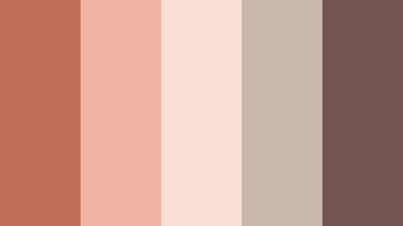
Dusky Rose Afternoon
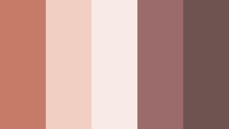
- HEX Codes: #c57b65, #f1d0c3, #f8ebe6, #9b6b6b, #6e5450
- Mood: Gentle, nostalgic, and softly romantic.
- Use for: Lovely for wedding highlight reels, engagement teasers, and dreamy lifestyle thumbnails.
Dusky Rose Afternoon softens Muted Terracotta into a blushy clay touched by evening light. The gentle creams and rose browns give your frame a nostalgic glow, like sun slipping through lace curtains. It feels intimate without becoming overly pink or sweet.
Use this palette for wedding and couple footage, love story montages, journaling vlogs, and romantic lifestyle thumbnails. In Filmora, you can match title cards, lower thirds, and transitions to these HEX codes so your intros, b roll, and end screens all share the same warm, dusky atmosphere.
Pro Tip: Enhance Your Muted Terracotta Romance With Filmora
To keep a romantic palette like Dusky Rose Afternoon consistent across an entire project, set up a simple style system in Filmora. Use the darkest hex (#6e5450) for text, mid terracotta (#c57b65) for accents and buttons, and the lightest cream (#f8ebe6) as a background color for title cards and credit screens.
Save your favorite title designs and overlays as custom presets. That way, every wedding highlight, engagement teaser, and lifestyle intro you edit in Filmora can reuse the same Muted Terracotta styling without rebuilding it each time.
AI Color Palette
If you have a reference photo that perfectly captures this soft Muted Terracotta vibe (for example, a bouquet on clay tiles or a sunset flat lay), you can turn it into a grading base for your whole video. Filmora's AI Color Palette feature analyzes the colors in your reference and applies a similar look to your timeline clips.
Import the image or a hero shot from your project, let AI pick out the key tones, and then cascade that look across A roll, b roll, and even cutaways. Your skin tones, fabrics, and decor will all settle into the same gentle Muted Terracotta family with just a few clicks.
 secure download

HSL, Color Wheels & Curves
Once the general look is in place, use HSL tools in Filmora to nudge oranges, reds, and pinks into the exact Muted Terracotta shade you want. Lighten the reds for a soft blush on skin, shift oranges slightly toward red for cohesive clay tones, and desaturate yellows so they do not distract from the romantic warmth.
With color wheels and curves, you can push shadows slightly cooler for contrast while keeping midtones and highlights warm. This split creates depth and a subtle cinematic feel without losing that calm Muted Terracotta base. To see how these controls work in practice, check out Filmora's tutorial on advanced color grading in the embedded video below.
secure download1000+ Video Filters & 3D LUTs
To move faster, lean on Filmora's built in looks. Filmora's video filters and 3D LUTs make it easy to add vintage warmth, soft glow, or cinematic depth that flatters Muted Terracotta tones. Start with a warm, filmic LUT, then dial it back and fine tune saturation so the terracotta remains gentle, not orange-heavy.
You can stack a subtle soft focus filter or grain effect on top to get that dreamy, nostalgic finish many romantic vlogs use. Save your favorite combo as a custom preset, and you will be able to apply your signature Muted Terracotta look to future videos in seconds.
secure downloadBlush Hearth Glow
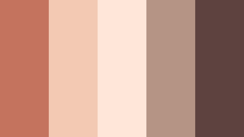
- HEX Codes: #c3735e, #f4c9b3, #ffe6d8, #b69484, #5c4340
- Mood: Warm, cozy, and inviting.
- Use for: Great for home decor tours, cozy cooking videos, and soft lifestyle branding.
Blush Hearth Glow feels like a fireside evening translated into color. Muted Terracotta sits at the center, wrapped in blush, cream, and soft brown that echo candlelight on textiles and wood. It is warm without being heavy, perfect for slow living visuals.
Use it in cooking channels, home decor walkthroughs, or cozy night routines. Design thumbnail backgrounds in the lighter tones, then use the deep brown for typography and UI elements such as subscribe buttons or chapter markers so everything remains on brand.
Sunset Letters
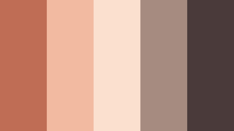
- HEX Codes: #bf6d55, #f2baa0, #fce0cf, #a48c80, #4b3a3a
- Mood: Sentimental, handwritten, and poetic.
- Use for: Beautiful for lyric videos, journaling reels, and cinematic title cards.
Sunset Letters brings together peachy terracotta, parchment creams, and ink like browns. It feels handwritten and intimate, like reading old letters during golden hour. The palette is soft but still distinct enough to carry typography and graphic overlays.
Apply it to lyric videos, reflective vlogs, and aesthetic B roll sequences with text on screen. Use the darkest shade for handwriting style fonts, and keep backgrounds in the lighter peach and cream so your subtitles, titles, or chapter labels remain legible on mobile screens.
Apricot Veil
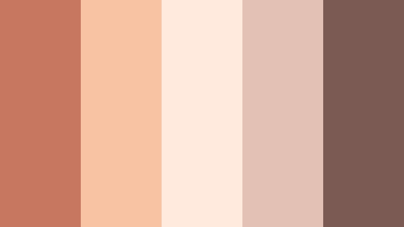
- HEX Codes: #c7775f, #f7c3a3, #ffeadd, #e3c2b5, #7a5a53
- Mood: Light, airy, and affectionately warm.
- Use for: Use for fashion lookbooks, bridal content, and soft product promos.
Apricot Veil turns Muted Terracotta into something almost weightless. Airy apricot, chiffon like creams, and gentle taupes wrap your visuals in a soft haze. It is perfect when you want warmth but still need a lot of lightness and negative space.
Try it for pastel fashion edits, bridal teasers, and skincare or jewelry promos. In your thumbnails and lower thirds, let the apricot shade frame your subject while keeping text on the darker taupe (#7a5a53) for clarity.
Clay Petal Keepsake
- HEX Codes: #c06f59, #f0b5a3, #f8dfd6, #c9b7ad, #745552
- Mood: Handcrafted, nostalgic, and intimate.
- Use for: Perfect for DIY channels, pottery reels, and handmade product showcases.
Clay Petal Keepsake mixes clay like terracotta with soft petal pinks and gentle neutrals. The result feels handmade and sentimental, like pressed flowers inside a craft journal. It suits tactile, process focused content.
Use it for ceramics, candle making, sewing, or handmade product videos. Base labels and titles on the neutrals and pinks, then bring in the deeper brown (#745552) to ground your text and UI so viewers can still read every overlay clearly.
Earthy & Organic Muted Terracotta Color Palettes
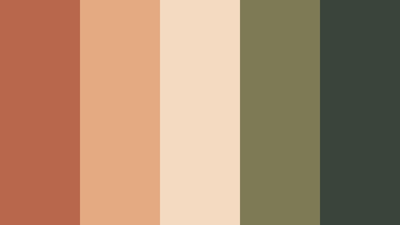
Desert Studio Calm

- HEX Codes: #bc6b53, #f2c19b, #f6e4d4, #9f8c70, #4f4a3a
- Mood: Minimal, grounded, and creatively focused.
- Use for: Ideal for workspace tours, productivity videos, and minimalist brand intros.
Desert Studio Calm pairs Muted Terracotta with sandy beige, parchment cream, and soft olive neutrals. It evokes a sunlight washed studio in a desert city: minimal, intentional, and grounded.
This palette fits productivity YouTube channels, workspace makeovers, and creative business branding. Try using the creams and beiges as clean backdrops for titles, with terracotta and olive as restrained accent colors for icons and highlight text.
Terracotta Market Stroll

- HEX Codes: #c26e50, #e7af8a, #f5d8b8, #8a7b5b, #374038
- Mood: Lively yet grounded, artisan and local.
- Use for: Use for travel vlogs, street food videos, and city market montages.
Terracotta Market Stroll combines sunworn Muted Terracotta with spice tones, wheat neutrals, and deep olive greens. It captures the feeling of wandering local markets filled with ceramics, fabric, and fresh produce.
Use this palette for on the go travel B roll, street food features, and artisan storytelling. In thumbnails and lower thirds, rely on the darker olive (#374038) for text against the bright terracotta and peach backgrounds so your titles stand out even on small screens.
Clay Canyon Trail

- HEX Codes: #b7634a, #e59f79, #f5d2af, #7b6a54, #28323a
- Mood: Adventurous, rustic, and cinematic.
- Use for: Great for hiking vlogs, outdoor brand spots, and travel montages.
Clay Canyon Trail sets warm canyon terracotta against dusty browns and deep slate blue gray. It feels adventurous and cinematic, like sunrise over rocky trails and desert cliffs.
Use it in hiking vlogs, national park guides, and outdoor brand promos. Let the slate shade (#28323a) carry your overlays, maps, or stats, while the terracotta and peach tones echo the landscape in your grading and thumbnail backgrounds.
Olive Grove Ember
- HEX Codes: #b8664c, #e4aa82, #f3dac1, #7d7a55, #39443a
- Mood: Organic, rustic, and sun-drenched.
- Use for: Perfect for farm-to-table content, recipe videos, and sustainable brand visuals.
Olive Grove Ember blends glowing Muted Terracotta with olive greens and wheat neutrals. It feels like late afternoon in an orchard or farm, with sun on leaves and clay tiles underfoot.
This palette works beautifully for food creators, farm to table restaurants, and eco conscious brands. Use the lighter neutrals as plates or card backgrounds in your thumbnails and overlays, letting terracotta and olive handle accents, badges, and CTA buttons.
Ceramic Workshop Light

- HEX Codes: #c27158, #f0b698, #fde0c8, #b0a28f, #4d4740
- Mood: Artisanal, tactile, and softly industrial.
- Use for: Use for studio tours, maker documentaries, and product close-ups.
Ceramic Workshop Light combines kiln warmed Muted Terracotta with chalky neutrals and clay grays. It feels tactile and artisanal, but with a slight industrial edge that works well in modern studios.
It is ideal for maker documentaries, product close ups, and process reels. Design your graphics so product names and prices use the darker gray (#4d4740), while the terracotta and creams form gentle blocks behind shots of tools, hands, and finished pieces.
Modern & Minimal Muted Terracotta Color Palettes
Urban Clay Accent
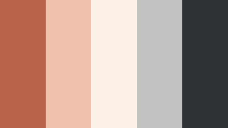
- HEX Codes: #b9634d, #f0c1aa, #faf0e8, #c3c2c0, #2f3237
- Mood: Clean, modern, and subtly warm.
- Use for: Ideal for tech explainers, app promos, and minimalist brand idents.
Urban Clay Accent balances Muted Terracotta with cool concrete grays and bright ivory. It delivers a sleek, modern look with just enough warmth to keep your visuals from feeling sterile.
Use this palette for SaaS promos, UI walkthroughs, and minimal channel branding. Keep backgrounds in the light gray and ivory, then use terracotta for buttons, progress bars, and key icons so viewers instantly notice where to look in your explainer videos and thumbnails.
Editorial Brick Monochrome

- HEX Codes: #b85f49, #cf8067, #e6a48b, #f3cab5, #f9e3d6
- Mood: Sophisticated, editorial, and cohesive.
- Use for: Great for lookbooks, magazine-style intros, and brand campaigns.
Editorial Brick Monochrome is a full spectrum of Muted Terracotta, from deep brick to whisper light peach. The monochrome approach makes layouts and grids look instantly curated and high end.
It is ideal for fashion lookbooks, stylized intros, and cohesive social campaigns. Use the darker bricks for large headings and the softest tones for background panels, ensuring your thumbnail and video titles are both legible and visually consistent.
Studio Loft Neutrals

- HEX Codes: #b65e48, #e8b29b, #f6e3d8, #b6b1aa, #3b3a38
- Mood: Airy, creative, and understated.
- Use for: Use for workspace B-roll, portfolio showcases, and design tutorials.
Studio Loft Neutrals layers Muted Terracotta among off whites and soft grays, echoing brick walls, concrete, and light filled windows. It feels creative but unobtrusive, ideal when your work should be the focus, not the color grade.
Use it for design tutorials, portfolio reels, or agency showreels. Set your main interface graphics in gray and ivory, and reserve terracotta for highlights such as keyframes, section headers, or callouts so they gently draw attention.
Cinematic & Vintage Muted Terracotta Color Palettes
Vintage Postcard Fade

- HEX Codes: #b45b46, #e0a48a, #f3d6bd, #b7a58c, #46515a
- Mood: Nostalgic, cinematic, and slightly faded.
- Use for: Perfect for travel diaries, 8mm style edits, and retro film titles.
Vintage Postcard Fade pairs Muted Terracotta with postcard creams and a smoky blue gray that feels like old film stock. The palette looks sun softened, as if your footage has aged gracefully over time.
Use it for travel diaries, retro intros, and 8mm style edits. Apply terracotta and cream tones to overlays, frames, and title cards, while using the blue gray (#46515a) to anchor typography so it stands out against the softened background colors.
Café Super 8 Grain

- HEX Codes: #b65f4a, #d89a78, #f1cfad, #a18f7b, #303441
- Mood: Moody, grainy, and intimate.
- Use for: Use for coffee shop vlogs, late-night edits, and moody storytelling.
Cafe Super 8 Grain brings coffee stained Muted Terracotta together with filmic browns and twilight navy. It has a moody, grain heavy feel that instantly suggests quiet conversations and late night reflections.
Apply it to cafe vlogs, narrative shorts, and intimate storytelling edits. Use the darkest navy (#303441) as your text color over warm terracotta and cream backgrounds so subtitles and titles remain readable even in low light scenes.
Rustic Frame Memory

- HEX Codes: #b45c47, #d5926f, #f0caa6, #8f7e66, #2c3235
- Mood: Emotional, storytelling-driven, and timeless.
- Use for: Ideal for family documentaries, legacy films, and heartfelt brand stories.
Rustic Frame Memory wraps Muted Terracotta in antique neutrals and deep charcoal, like an old photo frame on a wooden shelf. It is emotional and timeless, perfect for stories that span generations.
Use it on family documentaries, legacy projects, or heartfelt brand films. Incorporate the lighter tones for photo inspired frames and panels, and the dark charcoal (#2c3235) for titles, timestamps, and lower thirds so important information is easy to read across all devices.
Tips for Creating Muted Terracotta Color Palettes
Muted Terracotta works best when it is balanced with supportive neutrals and clear contrast. Here are practical tips to build palettes that look beautiful on screen and in your designs.
- Pair Muted Terracotta with light neutrals (ivory, sand, soft gray) so the warm tones have room to breathe instead of overpowering your frame.
- Choose a dark accent shade (charcoal, deep brown, or navy) for text and UI elements to keep thumbnails, captions, and lower thirds readable.
- Limit yourself to 3 to 5 active colors per layout: one main terracotta, one dark accent, one light background, and one or two secondary tones.
- Test your palette on mobile by shrinking thumbnails to actual feed size and checking whether text and subjects still pop against the Muted Terracotta tones.
- For branding, lock in a single HEX value for your primary terracotta and reuse it across intros, end screens, overlays, and channel art for instant recognition.
- When grading footage, keep skin tones natural by adjusting HSL rather than pushing all oranges too far toward red or brown.
- Use cooler shadows (blue gray or slate) under warm Muted Terracotta midtones to add cinematic depth without making the frame feel cold.
- Create a simple style guide that lists your HEX codes, font choices, and usage rules so every new video or graphic stays consistent with your Muted Terracotta theme.
Muted Terracotta color palettes can completely reshape the mood of your videos and designs. From soft romantic edits to earthy travel diaries and modern brand launches, this warm neutral gives you a cinematic foundation that feels both current and timeless.
Try sampling a few of the HEX codes above in Filmora, then build matching titles, overlays, and color grading looks around them. Once you lock in a palette that feels like your brand, saving it as presets will help every thumbnail, Reel, Short, and full length video feel cohesive at a glance.
Open a new project, drop in your footage, and experiment with Muted Terracotta tones using Filmora's color tools, AI Color Palette, and filters until you find a signature look you can reuse across your whole channel.
secure download