
 100% Security Verified | No Subscription Required | No Malware


 ChatGPT
 Perplexity
 Gemini
 Claude
 Grok
Grok
Powder Blue is one of those rare colors that instantly feels calm, trustworthy, and modern. It sits between sky blue and soft gray, which makes it perfect for videos and designs that should feel light, clean, and emotionally warm at the same time. In color psychology, Powder Blue suggests clarity, reliability, quiet confidence, and a gentle sense of optimism, so it fits naturally in wellness, lifestyle, tech, and personal brand content.
For creators, a well chosen Powder Blue color palette can make YouTube thumbnails more clickable, intros more cohesive, and on screen graphics easier to read and remember. Below you will find 15 ready to use Powder Blue color palettes with HEX codes, organized by mood and style. They are designed with video creators and Filmora users in mind, so you can easily apply them to titles, overlays, filters, and full channel branding.
In this article
Soft & Dreamy Powder Blue Color Palettes
Morning Cloud Whisper
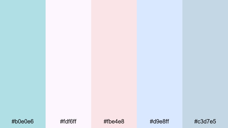
- HEX Codes: #b0e0e6, #fdf6ff, #fbe4e8, #d9e8ff, #c3d7e5
- Mood: Gentle, airy, and comforting like a quiet sunrise.
- Use for: Perfect for cozy vlog intros, morning routine videos, and soft lifestyle thumbnails.
This Powder Blue color palette feels like opening the curtains onto a bright but hazy morning. The combination of Powder Blue, blush pinks, and cloud like whites creates a soothing, dreamy wash of color that never feels too sharp or clinical.
Use Morning Cloud Whisper for YouTube intros, soft b roll overlays, and channel banners where you want a calm, welcoming first impression. In Filmora, you can apply these HEX codes to titles, lower thirds, and background shapes so your thumbnails, video frames, and end screens all share the same cozy morning atmosphere.
Pro Tip: Enhance Your Powder Blue Visuals With Filmora
When you build an edit around a delicate Powder Blue palette like Morning Cloud Whisper, consistency is everything. In Filmora, you can save your title styles, shapes, and subtitle presets with these HEX codes so every new clip automatically matches your visual identity.
Use this palette on your intro card, lower thirds, and subscribe animations, then duplicate those elements across your timeline. With a couple of saved presets, you can keep your Powder Blue look consistent in long vlogs, shorts, community posts, and repurposed social clips.
AI Color Palette
If you have a reference image with the exact Powder Blue look you love (for example, a screenshot using Morning Cloud Whisper), you can let Filmora do the heavy lifting. Filmora's AI Color Palette feature analyzes the colors in your reference and applies that style to other clips in your project.
Drop your favorite shot with perfect Powder Blue tones onto the timeline, use AI Color Palette to match the rest of your footage, and your A roll, B roll, and cutaways will all share the same soft, dreamy atmosphere. This keeps your thumbnails, intros, and reels visually aligned without manual tweaking on every clip.
 secure download

HSL, Color Wheels & Curves
To fine tune a Powder Blue look, open Filmora's HSL and color wheels. Nudge the blue and cyan hues slightly toward teal for a fresher feel, or toward purple for a more romantic, dreamy mood. You can reduce saturation in the shadows and keep midtones soft to avoid harsh, crunchy blues.
Use curves to gently lift the highlights and lower the contrast in shadows so faces remain flattering against soft Powder Blue backgrounds. Filmora's color correction tools help you transform a flat, neutral shot into a cinematic, airy scene that still respects your chosen palette.
secure download1000+ Video Filters & 3D LUTs
If you do not want to build a Powder Blue color grade from scratch, you can start with Filmora's presets. Filmora's video filters and 3D LUTs make it easy to add soft pastels, cinematic fades, or gentle glows that blend beautifully with a Powder Blue scheme.
Apply a pastel or film style LUT, then tweak the HSL blues to align with the Morning Cloud Whisper HEX codes. This gives you a polished, cohesive look for morning routines, study vlogs, or aesthetic BGM videos in just a few clicks.
secure downloadCotton Sky Daydream

- HEX Codes: #b0e0e6, #fffaf0, #ffd6e8, #cce7ff, #a4c3d9
- Mood: Dreamy, nostalgic, and lightly romantic.
- Use for: Ideal for aesthetic montages, travel diaries, and dreamy title cards.
Cotton Sky Daydream mixes Powder Blue with creamy whites and soft pinks that feel like cotton candy clouds at golden hour. The colors are bright enough to stay clear on screen, but gentle enough to keep everything nostalgic and slightly romantic.
Use this palette for travel diaries, slow motion city walks, date vlogs, or dreamy B roll sequences. In Filmora, apply these HEX codes to your title cards, chapter markers, and thumbnail backgrounds to give your channel a consistent, soft aesthetic that viewers instantly recognize.
Serene Bedroom Light
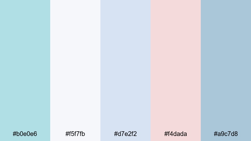
- HEX Codes: #b0e0e6, #f5f7fb, #d7e2f2, #f4dada, #a9c7d8
- Mood: Calm, intimate, and quietly personal.
- Use for: Great for room makeover videos, journaling content, ASMR, and soft-spoken tutorials.
Serene Bedroom Light feels like soft daylight spilling across a tidy room. The muted blues and gentle pinks create an intimate atmosphere that works beautifully for quiet, personal content.
Use this Powder Blue color combination for desk tour overlays, chapter titles in journaling videos, or lower thirds in ASMR content. The palette avoids harsh contrast, so subtitles and graphics remain gentle on the eyes during longer watch sessions.
Misty Shoreline Calm

- HEX Codes: #b0e0e6, #f7f9fb, #c7d9e8, #a5c8c9, #8ba0b2
- Mood: Peaceful, coastal, and slightly melancholic.
- Use for: Use in seaside travel edits, calming b roll, and relaxing background loops.
Misty Shoreline Calm captures the feeling of walking along an overcast beach. Powder Blue mixes with seafoam greens and foggy grays to create a peaceful but slightly melancholic mood that still feels cinematic.
This pastel Powder Blue color palette is perfect for ocean B roll, meditation loops, ambient music visuals, or rainy day travel vlogs. Pair it with slow transitions and subtle Filmora filters to give your audience a calm, immersive experience.
Minimal & Modern Powder Blue Color Palettes
Nordic Interface Clean
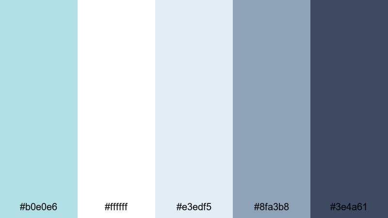
- HEX Codes: #b0e0e6, #ffffff, #e3edf5, #8fa3b8, #3e4a61
- Mood: Fresh, minimal, and highly organized.
- Use for: Perfect for app promos, UI demos, tech explainers, and channel branding.
Nordic Interface Clean gives Powder Blue a crisp, professional edge. Bright whites and soft grays keep everything light, while deeper slate accents add enough contrast for clean text and UI elements.
Use this palette for interface mockups, software walkthroughs, SaaS demos, or productivity channel branding. In Filmora, apply the darker tones to text and icons, and use Powder Blue as a backdrop for frames, buttons, and callout boxes to achieve a modern, Scandinavian inspired look.
Airy Workspace Minimal

- HEX Codes: #b0e0e6, #f9fbfd, #dde7ef, #9fb6c5, #2c3e50
- Mood: Productive, focused, and understated.
- Use for: Ideal for productivity vlogs, coding videos, and minimalist tutorial layouts.
Airy Workspace Minimal balances light, airy blues with a deep navy anchor. It feels like a tidy desk setup lit by daylight, designed to keep attention on the content instead of flashy graphics.
Use the light Powder Blue tones as background panels and the dark navy for titles, bullet points, and UI callouts. This palette works especially well for Notion tutorials, coding sessions, or productivity tips where you want everything to look organized and distraction free.
Frosted Glass UI
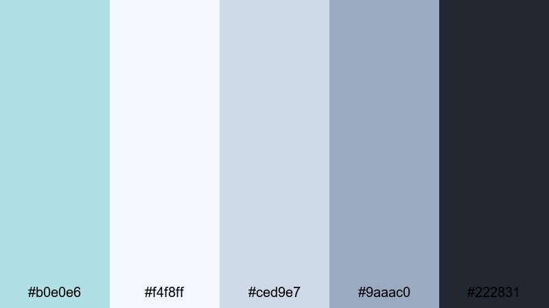
- HEX Codes: #b0e0e6, #f4f8ff, #ced9e7, #9aaac0, #222831
- Mood: Sleek, techy, and slightly futuristic.
- Use for: Great for software walkthroughs, overlays, lower thirds, and dashboard visuals.
Frosted Glass UI is inspired by translucent panels and glassmorphism interfaces. Powder Blue and cool grays give you a sleek, tech focused palette, while the dark charcoal tone keeps text and icons readable.
Use this scheme for overlay panels, data dashboards, and lower thirds in tech reviews or crypto, finance, and productivity channels. Add blurred shapes and semi transparent boxes in Filmora to really sell the frosted glass effect without overwhelming the viewer.
Tech Startup Breeze
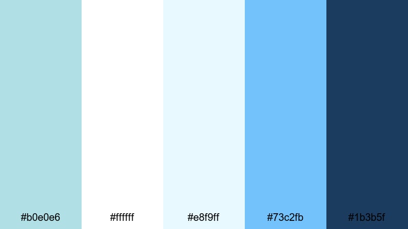
- HEX Codes: #b0e0e6, #ffffff, #e8f9ff, #73c2fb, #1b3b5f
- Mood: Optimistic, energetic, and forward thinking.
- Use for: Perfect for pitch videos, product launches, SaaS promos, and channel trailers.
Tech Startup Breeze boosts Powder Blue with brighter sky blue accents and crisp whites to create a confident, energetic visual identity. It feels agile, innovative, and approachable at the same time.
Use the vivid blue as your accent for buttons, CTAs, and key metrics in pitch decks or product launch videos. Powder Blue and white can form the base of your slides, channel art, and thumbnail backgrounds, helping your startup or tech brand look polished and trustworthy.
Vintage & Nostalgic Powder Blue Color Palettes
Faded Polaroid Skies
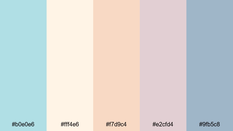
- HEX Codes: #b0e0e6, #fff4e6, #f7d9c4, #e2cfd4, #9fb5c8
- Mood: Nostalgic, warm, and softly muted.
- Use for: Great for memory montages, family videos, and retro styled storytelling.
Faded Polaroid Skies pairs Powder Blue with sun washed creams and peaches, echoing the look of aged instant film. The result is warm, sentimental, and slightly desaturated, perfect for stories about the past.
Use this palette for family compilations, childhood flashbacks, or travel recap videos. Combine it with subtle film grain and vignette filters in Filmora to reinforce the vintage feel while keeping faces and text clear.
Retro Beach Motel

- HEX Codes: #b0e0e6, #ffeed6, #ffc8a2, #e2a9b8, #7fa6c9
- Mood: Playful, summery, and slightly kitschy.
- Use for: Use for travel vlogs, retro transitions, and nostalgic summer highlight reels.
Retro Beach Motel brings Powder Blue together with creamy corals and warm peach tones that feel like vintage motel signs and classic beach postcards. It is playful and sunny, with a fun analog twist.
Use this palette for summer travel vlogs, skate edits, festival recaps, or nostalgic lookbooks. In thumbnails, let Powder Blue frame your subject, and use the warm accent colors on text and stickers to catch the eye in crowded feeds.
Old Diary Pastels

- HEX Codes: #b0e0e6, #fdf2f2, #f3dfe3, #ddc1c8, #8ea6bd
- Mood: Sentimental, quiet, and story driven.
- Use for: Perfect for narrative shorts, journaling edits, and soft documentary style pieces.
Old Diary Pastels feels like flipping through a well loved journal. Dusty pinks, worn neutrals, and Powder Blue create a palette that is emotional and introspective, but still clean enough for modern screens.
Use it in narrative shorts, commentary videos, or personal storytelling where emotions matter. Apply these HEX codes to title cards, date stamps, and chapter breaks to link each episode or entry into a cohesive visual series.
Bold & Cinematic Powder Blue Color Palettes
Neon Night Drive
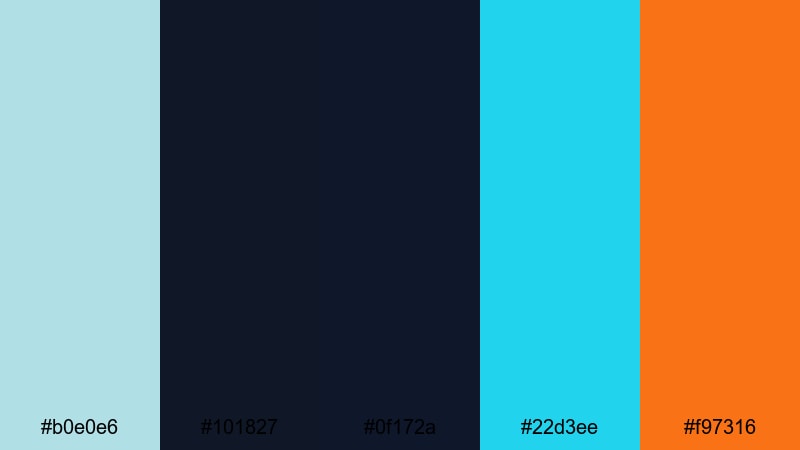
- HEX Codes: #b0e0e6, #101827, #0f172a, #22d3ee, #f97316
- Mood: High energy, urban, and futuristic.
- Use for: Ideal for nightlife edits, gaming intros, tech reviews, and fast paced trailers.
Neon Night Drive places Powder Blue next to deep inky blues, electric cyan, and a punchy orange accent. It is built for contrast and movement, like city lights streaking past a windshield at night.
Use this cinematic Powder Blue color palette for gaming intros, EDM edits, urban travel clips, or tech review openings. Let the darker tones dominate your background and use the cyan and orange for animated accents, HUD elements, and key text to grab attention instantly.
Ocean Storm Drama
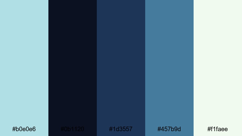
- HEX Codes: #b0e0e6, #0b1120, #1d3557, #457b9d, #f1faee
- Mood: Moody, powerful, and atmospheric.
- Use for: Great for cinematic b roll, drone shots, travel films, and dramatic story beats.
Ocean Storm Drama leans into powerful navies and sea greens, with Powder Blue acting as a highlight that cuts through the darkness. It feels dramatic and expansive, like a stormy sea under a small break in the clouds.
Use this palette for drone footage, intense travel sequences, or emotional story beats. In Filmora, you can apply these tones through LUTs and color wheels to add depth and tension without pushing skin tones too far from natural.
Electric City Skyline

- HEX Codes: #b0e0e6, #020617, #1e293b, #38bdf8, #facc15
- Mood: Energetic, urban, and attention grabbing.
- Use for: Perfect for YouTube intros, motion graphics, and dynamic title sequences.
Electric City Skyline combines inky midnight blues with bright cyan and a spark of yellow, grounded by Powder Blue. The contrast makes text and icons jump off the screen, especially on dark backgrounds.
Use this bold Powder Blue color combination for channel intros, motion graphic templates, or shorts that need instant impact. Keep the background dark, use Powder Blue and cyan for large shapes, and reserve the yellow for short, powerful highlights like arrows, numbers, or key words.
Studio Spotlight Pop
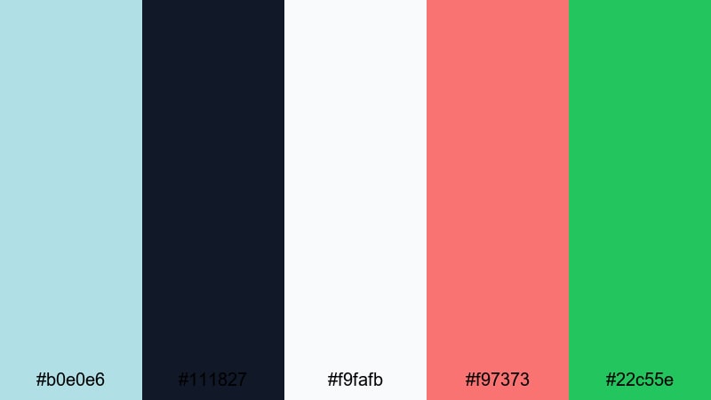
- HEX Codes: #b0e0e6, #111827, #f9fafb, #f97373, #22c55e
- Mood: Confident, polished, and creator focused.
- Use for: Use for creator branding, talk show layouts, and high energy tutorial thumbnails.
Studio Spotlight Pop uses Powder Blue as a cool base under studio darks and whites, with bold red and green accents. It feels like a modern talk show set or pro YouTube studio, energetic but still controlled.
Use this palette for commentary layouts, podcast video frames, interview shows, or tutorial thumbnails where your face is the focus. Powder Blue and white can frame your shot, while the red and green accents draw attention to subscribe buttons, chapter labels, or key tips.
Tips for Creating Powder Blue Color Palettes
Powder Blue is flexible enough to work with pastels, neutrals, and bold cinematic tones. A few simple rules will help you combine it with other colors for thumbnails, overlays, and full brand systems that look clean and intentional.
- Decide the mood first: pair Powder Blue with white and light gray for minimal tech content, or with peach and cream for soft lifestyle and nostalgic vlogs.
- Use contrast wisely: on light Powder Blue backgrounds, pick a darker navy or charcoal for titles and controls so text stays readable on mobile screens.
- Limit accent colors: choose one or two strong accents (such as coral, yellow, or neon cyan) so your Powder Blue palette does not look chaotic.
- Match footage to graphics: in Filmora, lightly shift highlights and midtones toward your chosen Powder Blue so your footage, titles, and frames feel unified.
- Keep skin tones natural: when cooling your image, protect oranges and reds in HSL so faces do not turn gray or overly cyan next to Powder Blue elements.
- Test on thumbnails: export a few thumbnail mockups in your palette and preview them at small sizes to check legibility and click worthiness.
- Create reusable presets: save title styles, color boards, and filter presets in Filmora that lock in your Powder Blue HEX codes for future videos.
- Balance light and dark: mix at least one deep shade and one almost white tone with Powder Blue so you can design depth, hierarchy, and clear focus areas.
Used well, a Powder Blue color palette can make your channel feel calm, trustworthy, and visually consistent from the first thumbnail to the final end screen. Whether you prefer soft and dreamy, sleek and minimal, or bold and cinematic looks, there is a Powder Blue combination that fits your storytelling style and brand identity.
Try these 15 palettes as starting points in Filmora: apply the HEX codes to titles and graphics, then refine the grade with AI Color Palette, HSL, and LUTs until your videos feel exactly the way you want. Once your Powder Blue look is locked in, you can reuse it across vlogs, shorts, trailers, and social posts for a recognizable creator brand.
Open a new project, drop in a few test clips, and experiment with these Powder Blue color combinations in Filmora to see how quickly your visuals level up.
secure download