
 100% Security Verified | No Subscription Required | No Malware


 ChatGPT
 Perplexity
 Gemini
 Claude
 Grok
Grok
Powder Blue Gray sits between soft sky blue and neutral gray, giving it a calm, airy personality that still feels modern and grounded. It is often linked with clarity, trust, and quiet confidence, which makes it a favorite for brands that want to look approachable yet professional. On screen, this shade reduces visual noise and lets your subject or message breathe.
For video creators, Powder Blue Gray works beautifully in YouTube thumbnails, clean intros, subtle lower thirds, and cinematic color grading. It pairs well with pastels for romantic edits, with charcoals for tech or city visuals, and with whites for minimal lifestyle content. Below you will find ready-made Powder Blue Gray color palettes with HEX codes you can plug straight into Filmora for titles, overlays, and LUT-style grading.
In this article
Soft And Airy Powder Blue Gray Color Palettes
Morning Haze Minimal

- HEX Codes: #c9d7e3, #edf2f7, #b0bec8, #8a9aa5
- Mood: Calm, light, and understated like a quiet overcast morning.
- Use for: Perfect for clean YouTube intros, productivity vlogs, and minimal UI overlays on lifestyle content.
Morning Haze Minimal mixes soft Powder Blue Gray with misty whites and cool neutrals to create an almost weightless, decluttered visual field. It feels like opening your window on a cool, quiet morning before the day starts.
Use this palette for minimalist channels, productivity vlogs, or any edit where you want the viewer to focus on message and motion, not loud colors. In Filmora, apply these HEX codes to titles, lower thirds, and icon overlays, and use the lightest tones as thumbnail backgrounds to keep your branding consistent across intros, B roll, and end screens.
Pro Tip: Build a Calm Powder Blue Gray Aesthetic in Filmora
To keep the Morning Haze Minimal look consistent across an entire project, set up a simple style guide inside Filmora. Choose one main Powder Blue Gray for backgrounds, a slightly darker gray for text, and reserve the deepest shade for accents like subscribe buttons or callouts. Save these as custom colors so you can reuse them in every title and shape.
When editing a full series of productivity or lifestyle videos, you can copy and paste attributes from one Powder Blue Gray title or element to the next. This helps your thumbnails, intros, overlays, and end cards all share the same calm visual language without having to rebuild the palette each time.
AI Color Palette
If you already have a screenshot or brand board featuring this Powder Blue Gray mix, Filmora's AI Color Palette feature can pull that look into your footage automatically. Use a still frame from your favorite shot or a simple color card using these HEX codes as the reference image.
AI Color Palette then analyzes the reference and applies a matching grade to your entire timeline, helping your A roll, B roll, and even stock clips share the same cool, hazy mood. It is a quick way to maintain a soft, airy tone even when your clips were shot under slightly different lighting.
 secure download

HSL, Color Wheels & Curves
To fine tune a Powder Blue Gray look like Morning Haze Minimal, use Filmora's HSL controls to gently desaturate other hues that distract from the palette. Push blues slightly toward cyan and reduce saturation in yellows and reds so skin tones stay natural while the background keeps that soft, overcast character.
Color wheels and curves are great for making this palette more cinematic. Use the midtone wheel to cool the image with a subtle blue shift, and lift the shadows a little to preserve the airy mood. Then refine contrast with curves, softening highlights so whites do not blow out, but still look bright and clean.
secure download1000+ Video Filters & 3D LUTs
If you want to stylize your Powder Blue Gray palette even faster, Filmora's video filters and 3D LUTs make it easy to test different moods on top of Morning Haze Minimal. Start with a clean grade, then apply gentle film emulation, pastel, or soft fade filters to see which version fits your brand.
You can save your favorite combination as a custom preset and reuse it across thumbnails, intros, reels, and long form edits, so every video instantly feels part of the same calm, Powder Blue Gray world.
secure downloadCloud Drift Neutrals

- HEX Codes: #ccd9e4, #f5f7fa, #d0c9c0, #9ca8b3
- Mood: Weightless, gentle, and breezy with a soft neutral balance.
- Use for: Great for aesthetic reels, voiceover explainers, and calm background graphics in tutorial videos.
Cloud Drift Neutrals blends Powder Blue Gray with off white and warm stone tones, giving your visuals a dreamy yet grounded balance. It feels like clouds slowly passing over a neutral cityscape, never drawing too much attention to itself.
Use this palette for calm explainer videos, text heavy slides, and social content where readability matters. In thumbnails and title cards, let the warm stone color support faces or products, while the blue gray and off white keep everything clean and modern.
Coastal Fog Breeze

- HEX Codes: #c2d2dd, #f0f4f6, #b7c4c7, #7f8f97
- Mood: Airy coastal calm with a hint of cool sea mist.
- Use for: Ideal for travel vlogs set by the sea, ambient B roll sequences, and subtle lower third graphics.
Coastal Fog Breeze leans into dusty coastal blues and soft grays, creating the feeling of standing on a pier wrapped in early morning mist. It is tranquil and cinematic without being too dark or dramatic.
Apply this palette to travel vlogs, drone shots over water, and relaxed holiday highlights. In Filmora, use the darker gray for location labels and the lighter tones for map graphics or chapter markers so your information is clear but still matches the foggy, coastal mood.
Iced Porcelain Glow

- HEX Codes: #d3e0ea, #ffffff, #c0ccd5, #a1b0bb
- Mood: Bright, polished, and delicately cool like fine porcelain.
- Use for: Best for beauty channels, skincare product demos, and bright studio thumbnails.
Iced Porcelain Glow ties crisp whites with cool Powder Blue Gray accents, giving your visuals a high key, polished look. It echoes clean studio lighting and glossy product photography.
Use it for beauty content, skincare routines, and tech unboxings where you want everything to look fresh and hygienic. In thumbnails and intros, keep the background white and use the blue gray for borders, text, and product callouts to maintain a premium yet soft aesthetic.
Frosted Window Light

- HEX Codes: #c6d5e0, #e8eef2, #b3bfc9, #949fa8
- Mood: Softly diffused, introspective, and serene.
- Use for: Use in study-with-me edits, journaling shorts, and lo-fi playlist visuals that need gentle clarity.
Frosted Window Light captures the way winter daylight filters through glass, with muted blues and cool grays that feel quiet and reflective. It supports slow, thoughtful storytelling without stealing attention.
Try this palette on lo fi study mixes, journaling montages, or book content. Use the mid range grays as card backgrounds for quotes or timestamps, and keep your line art or icons in the darker shade for soft but readable overlays.
Elegant And Modern Powder Blue Gray Color Palettes
Urban Steel Skyline
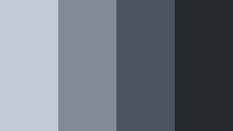
- HEX Codes: #c0ccd6, #7f8b96, #4b5560, #24282d
- Mood: Modern, sleek, and slightly moody with an urban edge.
- Use for: Perfect for tech reviews, cinematic b roll of cityscapes, and premium SaaS brand intros.
Urban Steel Skyline blends soft Powder Blue Gray with deeper charcoal tones, echoing glass towers and steel structures. It feels polished and contemporary with just enough mood to look cinematic.
Use this palette to frame tech gear, dashboards, or city B roll. In Filmora, assign the darkest shade to your logo bars and text, the mid grays for panels, and the lightest blue gray for subtle gradients behind UI demos or product callouts.
Glass Tower Reflections
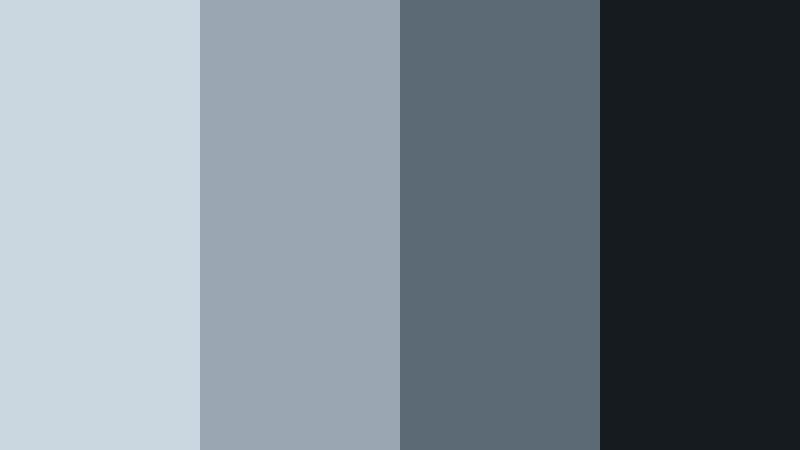
- HEX Codes: #cad7e1, #9aa7b3, #5c6a76, #161b20
- Mood: Refined, cool, and corporate with reflective depth.
- Use for: Great for pitch decks, fintech motion graphics, and modern title screens in documentaries.
Glass Tower Reflections uses layered cool blues with inky dark tones to mimic light on mirrored skyscrapers. It carries a corporate, boardroom ready feel that works well for serious topics.
Use it for business explainers, financial breakdowns, and documentary titles. Let the darkest shade define typography and key shapes, while the lighter blue grays fill charts, timelines, and animated infographics.
Nordic Slate Calm

- HEX Codes: #c7d4df, #e2e6ea, #95a1ab, #505861
- Mood: Scandinavian minimal with quiet sophistication.
- Use for: Use for interior design tours, architecture reels, and refined brand explainer videos.
Nordic Slate Calm combines Powder Blue Gray with slate and pale neutrals, echoing Scandinavian interiors and minimalist furniture. It feels curated, tidy, and quietly luxurious.
Apply this palette to design focused content, home tours, and branding for creative studios. In thumbnails, mix the paler hues for spacious backgrounds and reserve the slate tone for clean, sans serif titles and subtle dividing lines.
Ink Blueprint Studio

- HEX Codes: #c3d2de, #8b9aac, #2f3a4b, #10141b
- Mood: Creative, technical, and focused like a design lab.
- Use for: Ideal for tutorials, software walkthroughs, and motion graphics that highlight structure and clarity.
Ink Blueprint Studio frames Powder Blue Gray with deeper ink and navy tones, which immediately hints at technical drawings, schematics, and studio spaces. It feels analytical but still visually rich.
Use this palette for coding tutorials, design breakdowns, or product feature explainers. Give diagrams and UI mockups the lighter tones, and use the inky shades as backgrounds for white text and interface highlights.
Muted Silver Monochrome

- HEX Codes: #cdd8e1, #b3bcc5, #8b939b, #5c6369
- Mood: Subtle, monochrome elegance with a cool metallic hint.
- Use for: Great for logo reveals, lower thirds, and text-heavy explainers where readability matters.
Muted Silver Monochrome is a restrained spectrum of cool grays built around Powder Blue Gray, creating a sleek, nearly metallic look. Because it is almost entirely monochrome, it is very easy on the eyes.
Use it for typography led content, logo stings, and branded frames. On YouTube thumbnails, this palette gives a premium, editorial feel; a single accent color like a small red or teal detail will then stand out powerfully against the cool gray field.
Romantic And Pastel Powder Blue Gray Color Palettes
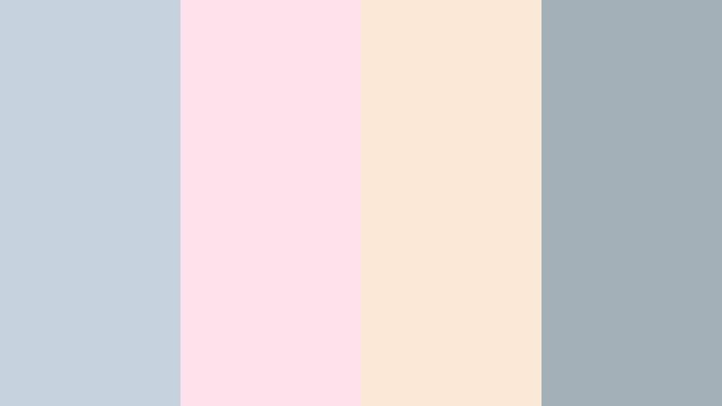
Blush Cloud Romance

- HEX Codes: #c8d6e2, #ffd6dc, #ffeef2, #b0a9b8
- Mood: Softly romantic, dreamy, and feminine.
- Use for: Perfect for wedding highlight films, engagement reels, and romantic montage sequences.
Blush Cloud Romance flows Powder Blue Gray into blush pinks and soft mauve, creating a pastel haze that feels gentle and emotional. It is romantic without becoming overly saturated or sugary.
Use this palette in wedding highlights, proposal videos, and memory edits. In Filmora, let the pink tones tint your light leaks or overlays, while the blue gray and mauve handle titles, date stamps, and monograms for a cohesive love story aesthetic.
Lavender Mist Daydream

- HEX Codes: #c7d5e1, #e7e2ff, #f9f2ff, #b3aec9
- Mood: Whimsical, airy, and slightly nostalgic.
- Use for: Use for dreamy edits, slow fashion lookbooks, and pastel-inspired vlogs.
Lavender Mist Daydream mixes Powder Blue Gray with pale lavender and soft violet, building a light, imaginative atmosphere. It feels dreamy and slightly nostalgic, like early spring afternoons.
Apply it to slow fashion clips, aesthetic vlogs, and pastel themed channels. Use the lighter shades as backgrounds for animated text or hand drawn doodles, and keep the slightly deeper lavender for titles and subtle frame borders to maintain contrast.
Peony Overcast Garden
- HEX Codes: #c4d3de, #ffe1eb, #fbe9d8, #a4b0b8
- Mood: Gentle, floral, and nostalgic with a soft cloudy backdrop.
- Use for: Ideal for lifestyle montages, seasonal trailers, and moodboards focused on soft florals.
Peony Overcast Garden anchors warm peony pink and soft peach against Powder Blue Gray, creating a floral but subdued atmosphere. It feels like walking through a garden under a light cloud cover.
Use it for seasonal openers, lifestyle montages, and Pinterest style moodboard videos. Make thumbnails with pale peach or pink as the backdrop and overlay blue gray frames and typography for a soft but structured presentation.
Cinematic And Moody Powder Blue Gray Color Palettes
Rainwashed Concrete Streets

- HEX Codes: #c1ced9, #7a868f, #4a5259, #1d2226
- Mood: Cinematic, gritty, and introspective like a rainy city scene.
- Use for: Great for short films, narrative edits, and moody travel sequences with urban stories.
Rainwashed Concrete Streets places cool Powder Blue Gray against deep asphalt tones, mimicking wet pavement and cloudy skies. It is cinematic and introspective without relying on harsh contrast.
Use this palette for urban travel films, street photography edits, and narrative shorts. In Filmora, apply the darker grays as letterboxing bars or title backgrounds, while the lighter tones tint your shadows for a cohesive rainwashed look.
Dusk Harbor Overlook

- HEX Codes: #c3d1dc, #9aa7b4, #56616c, #14191e
- Mood: Quiet, cinematic twilight with a hint of mystery.
- Use for: Use for travel documentaries, drone shots at blue hour, and atmospheric title cards.
Dusk Harbor Overlook layers Powder Blue Gray with harbor blues and deep twilight shadows, capturing the feel of blue hour over water. It carries a quiet, slightly mysterious tone that suits emotional storytelling.
Apply this palette to drone passes over bays, harbor cities, and reflective narrative scenes. In thumbnails and title cards, use the deepest shade as a base, let the lighter blues sit behind key text, and add subtle gradients to suggest evening light fading into night.
Tips for Creating Powder Blue Gray Color Palettes
When building your own Powder Blue Gray color palettes for video and design, balance mood and readability so your visuals stay both beautiful and functional across thumbnails, intros, and full edits.
- Pair Powder Blue Gray with one darker anchor color (charcoal, deep navy) for legible titles and UI elements on bright or pastel backgrounds.
- Use off whites and very light grays as background blocks so text and icons have room to breathe without blowing out to pure white.
- Add a single warm accent (blush, peach, soft beige) to prevent your palette from feeling too cold, especially for lifestyle, vlog, and wedding content.
- Check contrast on mobile by previewing thumbnails at small size; if text disappears, darken your Powder Blue Gray or add a semi transparent overlay behind type.
- Keep brand consistency by reusing the same 3 to 5 HEX codes for titles, borders, and buttons across every video, reel, and short.
- Match your footage by lightly cooling midtones and shadows in Filmora so the live action clips sit naturally with your Powder Blue Gray graphics.
- For cinematic projects, lower saturation in other colors while keeping Powder Blue Gray and complementary tones slightly richer to guide the viewer's eye.
- Save custom presets in Filmora for commonly used elements (lower thirds, end screens, chapter cards) set to your Powder Blue Gray palette to streamline editing.
Powder Blue Gray is versatile enough to feel soft and airy, sleek and corporate, romantic, or moody depending on what you pair it with. Used well, it becomes a subtle signature that ties your channel, brand, or film together across thumbnails, intros, and entire edits.
Whether you are crafting cinematic travel sequences or calm study vlogs, these palettes give you ready made combinations and HEX codes you can drop straight into Filmora. Experiment with them, tweak the tones to match your footage, and save your favorite looks as reusable presets.
The more consistently you apply your Powder Blue Gray color choices, the more recognizable your content will become, from the first glance at a thumbnail to the final frame of your video.
secure download