
 100% Security Verified | No Subscription Required | No Malware


 ChatGPT
 Perplexity
 Gemini
 Claude
 Grok
Grok
Storm Blue is a deep, cool shade that feels calm yet intense, like a stormy sky just before the rain breaks. In color psychology, blues are linked to trust, stability, and clarity, while darker storm tones add drama, depth, and a cinematic edge. That makes Storm Blue perfect for content that needs to feel professional but still emotional and visually striking.
For video creators and designers, Storm Blue works beautifully in intros, lower thirds, thumbnails, overlays, and full branding systems. Below you will find ready-to-use Storm Blue color palettes with HEX codes, designed for Filmora users and other creators who want consistent color grading, cohesive thumbnails, and standout social posts.
In this article
Cinematic Storm Blue Color Palettes
Midnight Harbor Cinematic

- HEX Codes: #1b263b, #415a77, #778da9, #0d1b2a
- Mood: Moody, cinematic, and quietly powerful, evoking deep night skies and calm harbors.
- Use for: Ideal for cinematic intros, dramatic travel vlogs, trailers, and filmic lower thirds.
Midnight Harbor Cinematic layers inky navy tones with softer, desaturated blues for a look that feels like a still harbor at midnight. The contrast between #0d1b2a and the mid-tones #415a77 and #778da9 gives your frames natural depth without feeling harsh.
Use this palette for story-driven videos, moody travel edits, or serious branding where you want the viewer to feel immersed. It works especially well for title cards, lower thirds, and thumbnail backgrounds that hint at drama and mystery while staying polished and professional.
Pro Tip: Build a Cinematic Storm Blue Look in Filmora
To keep a Midnight Harbor Cinematic mood consistent, set one of the deep Storm Blue shades as your base brand color in Filmora. Use it in your titles, transitions, and overlays, then echo the lighter blues in accent lines, subtitles, and callouts. This creates a cohesive look from your intro through b-roll and end screen.
You can also save your favorite Midnight Harbor-inspired settings as custom presets in Filmora. That way, every new project, series, or episode automatically inherits the same Storm Blue mood, making your channel feel like a unified visual experience instead of a mix of unrelated videos.
AI Color Palette
If you have a reference still or mood board that uses this Midnight Harbor Cinematic palette, you can transfer that exact Storm Blue feel to all your clips using Filmora's AI Color Palette feature. It analyzes the colors in your source frame and applies a matching palette across the rest of your footage.
Filmora's AI Color Palette feature is especially useful when you shoot in different locations or lighting conditions but still want a unified Storm Blue grade. Start with one perfectly graded shot, then let AI handle the color matching for the rest of your timeline.
 secure download

HSL, Color Wheels & Curves
To refine your Storm Blue tones even further, use HSL controls in Filmora to slightly desaturate blues in the shadows while lifting saturation in the mid-tones. This preserves the Midnight Harbor depth while keeping details visible on smaller screens, like phones and tablets.
With color wheels and curves, you can push shadows toward the #0d1b2a range and gently cool the highlights so they lean into #778da9. This kind of subtle grading, as shown in Filmora's color correction tutorials on YouTube, helps you build a signature cinematic Storm Blue look that feels intentional rather than flat.
secure download1000+ Video Filters & 3D LUTs
If you want to stylize your Storm Blue palette faster, Filmora's built-in looks can give Midnight Harbor Cinematic a specific genre feel: think noir mystery, coastal documentary, or tech thriller. Start with your palette, then layer filters or LUTs to add texture, contrast, and subtle tints.
Filmora's video filters and 3D LUTs make it easy to experiment without destroying your base colors. Try a cinematic LUT for depth, then fine-tune opacity so your carefully chosen Storm Blue HEX codes remain the hero of the frame.
secure downloadStormfront Skyline Grade

- HEX Codes: #0b1b3b, #26436b, #4f6fae, #9fb3d9
- Mood: Dramatic and atmospheric with a high-contrast, city-at-dusk vibe.
- Use for: Great for tech promos, cityscape b-roll, and edgy motion graphics overlays.
Stormfront Skyline Grade channels the energy of a city right before a storm. Deep indigo shadows (#0b1b3b) meet brighter, steely blues (#4f6fae, #9fb3d9), creating a vertical gradient that feels like skyscrapers piercing a moody sky.
Use this palette in tech-driven edits, app promos, and city b-roll sequences. The darker tones are ideal for backgrounds and overlays, while the lighter blues make clean, legible text for titles, end screens, and social media thumbnails.
Deep Current Noir

- HEX Codes: #09111f, #132338, #264563, #3e6c8f
- Mood: Mysterious, noir, and introspective, with subtle depth and shadow.
- Use for: Perfect for mystery shorts, crime podcasts on YouTube, and low-key narrative sequences.
Deep Current Noir is all about shadowy blues that feel like deep water and smoky alleyways. The palette leans heavily on dark cyan-blues, with #09111f and #132338 anchoring your shadows and #3e6c8f adding just enough lift for details.
It works well for noir-inspired intros, true-crime podcast visuals, or any video where you want viewers to lean in and pay attention. Use the lighter shades for subtle highlights on text, waveform overlays, or UI elements while keeping most of the screen wrapped in dark Storm Blue atmosphere.
Soft & Serene Storm Blue Color Palettes
Soft Tidal Morning

- HEX Codes: #e5f2ff, #c5ddf5, #8fb3d9, #466b99
- Mood: Gentle, hopeful, and airy, like a quiet morning by the sea.
- Use for: Use for calm lifestyle vlogs, morning routines, wellness intros, and lower-third titles.
Soft Tidal Morning blends pale sky tones with a grounded Storm Blue accent. The light shades (#e5f2ff, #c5ddf5) feel clean and breathable, while #466b99 gives you enough depth for text, icons, and emphasis.
This palette is perfect for wellness channels, morning routine videos, productivity content, and minimalist thumbnails. Use the lightest tones for background blocks or negative space and reserve the darker Storm Blue for titles, buttons, and key on-screen labels.
Rainwashed Windows

- HEX Codes: #edf3f7, #cadae8, #91abc8, #4e6d8a
- Mood: Calm, reflective, and slightly nostalgic, like rainy-day journaling.
- Use for: Ideal for study-with-me videos, cozy podcasts, and subtle UI elements.
Rainwashed Windows feels like soft daylight coming through a wet windowpane. The palette mixes gentle off-whites and dusty blues, creating a low-contrast look that is easy on the eyes during long viewing sessions.
Use it in quiet study playlists, lo-fi streams, or podcast episodes where viewers focus on audio while the visuals stay calm and consistent. The deeper #4e6d8a shade is great for subtle UI overlays, chapter markers, and minimalist thumbnail text.
Cloudbreak Horizon
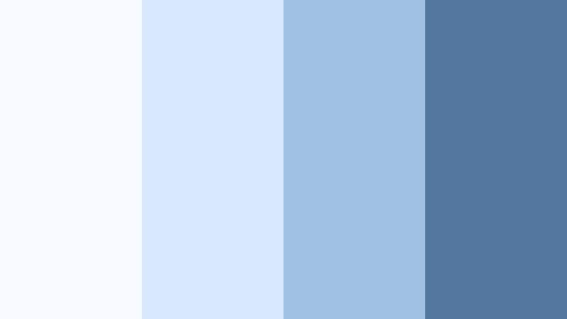
- HEX Codes: #f7fbff, #d7e8ff, #9fc0e0, #54779d
- Mood: Uplifting and tranquil, with a sense of open sky and fresh air.
- Use for: Great for travel reels, drone shots, inspirational quote cards, and website heroes.
Cloudbreak Horizon captures the feeling of a bright sky after a storm clears. The soft whites and pale blues keep things optimistic, while #54779d adds just enough weight for text and graphic accents.
It is ideal for travel creators, drone cinematography, and inspirational branding. Use the lighter hues as backgrounds for quotes or titles and let the deeper Storm Blue create clean contrast for logos, CTAs, and social overlays.
Harbor Mist Minimal

- HEX Codes: #f2f5f8, #dde5ee, #a9b8cb, #607187
- Mood: Minimal, clean, and calming with a refined softness.
- Use for: Perfect for clean channel branding, app-style overlays, and tutorial graphics.
Harbor Mist Minimal leans into gentle grays and toned-down Storm Blues, delivering a subtle, modern look. The palette avoids harsh contrast, which makes it well suited for educational content, software tutorials, and productivity channels.
Use the lightest tones as your canvas and the mid-tone blues (#a9b8cb, #607187) for typography, icons, and simple shapes. In thumbnails and intros, this palette feels trustworthy and clutter-free, making your content look instantly more professional.
Bold & Energetic Storm Blue Color Palettes
Electric Storm Surf

- HEX Codes: #0f274a, #1f4f82, #00b2ff, #ffb22e
- Mood: High-energy, electric, and adventurous, like big waves under neon lights.
- Use for: Great for sports edits, gaming channels, and eye-catching thumbnails.
Electric Storm Surf takes classic Storm Blue and supercharges it with neon cyan (#00b2ff) and a punchy golden accent (#ffb22e). The result feels dynamic and modern, perfect for content that needs to grab attention in a crowded feed.
Use the deep blues as backgrounds for energetic edits, then pop key text, badges, or buttons in cyan and gold. This palette is ideal for gaming intros, sports highlight reels, and bold YouTube thumbnails that highlight scores, rankings, or reactions.
Thunderbolt Neon Pop

- HEX Codes: #071732, #152f5f, #27b3ff, #ff3b6a, #ffe66d
- Mood: Vibrant, playful, and attention-grabbing with a neon streak.
- Use for: Perfect for YouTube intros, pop culture edits, and promo banners that must stand out.
Thunderbolt Neon Pop builds on dark Storm Blue foundations with electric cyan, hot pink, and bright yellow. It is loud in the best way, turning any frame into a high-impact graphic moment.
Use the darker blues to keep some balance, then deploy the neon accents on text outlines, animated stickers, and subscriber callouts. This palette works especially well for pop culture commentary, meme edits, music-related content, and bold social ads.
Regatta Victory Line

- HEX Codes: #0b2640, #145da0, #f5f5f5, #ffcc33
- Mood: Confident, competitive, and sporty with a crisp maritime feel.
- Use for: Use for sports highlights, race recaps, brand sponsorship intros, and badges.
Regatta Victory Line pairs deep nautical blues with bright white and a golden accent. The combination feels sporty and premium, like a championship event or professional team branding.
Use the darker Storm Blue as your base overlay, the bright blue for secondary text or stats, and #ffcc33 for medals, trophies, and key numbers. This palette fits sports videos, race recaps, fitness channels, and sponsored intros where you want to highlight wins and achievements.
Urban Storm Graffiti
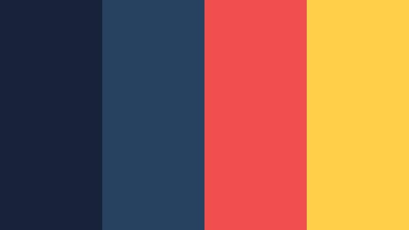
- HEX Codes: #152238, #274160, #f04d4f, #ffcf4a
- Mood: Edgy, streetwise, and creative with a gritty-urban twist.
- Use for: Great for streetwear lookbooks, dance videos, and graffiti-style lower thirds.
Urban Storm Graffiti combines Storm Blue bases with graffiti-style red (#f04d4f) and yellow (#ffcf4a). The blues keep things grounded and cinematic, while the warm accents feel like spray paint and street lights.
Use this palette for dance edits, streetwear promos, skate videos, and city lifestyle vlogs. The blues make strong background blocks and drop shadows for text, while the red and yellow draw the eye to titles, tags, and animated transitions.
Elegant & Modern Storm Blue Color Palettes
Sleek Harbor Corporate

- HEX Codes: #121b2b, #273852, #4a6486, #e5eaf0
- Mood: Professional, steady, and trustworthy with a modern corporate edge.
- Use for: Perfect for business explainers, SaaS promos, and LinkedIn-ready graphics.
Sleek Harbor Corporate uses deep Storm Blue tones to communicate trust and stability, softened by a light gray-blue highlight (#e5eaf0). It feels like a modern corporate dashboard rather than a traditional suit-and-tie design.
Use the darkest shade for backgrounds or sidebars, the mid-tones for charts and icons, and the lightest color for panels and captions. This palette makes business explainers, SaaS product demos, and LinkedIn content look polished and credible without feeling cold.
Nordic Steel Calm

- HEX Codes: #142032, #30445c, #7f8fa3, #dfe4ea
- Mood: Cool, composed, and Scandinavian-inspired with a design-first feel.
- Use for: Use for design portfolios, UI mockups, and minimalist product showcases.
Nordic Steel Calm combines Storm Blue with steel-gray neutrals, giving it a Scandinavian-inspired design vibe. It looks intentional and refined, ideal for creators who care about layout, whitespace, and typography.
Use the darker hues (#142032, #30445c) as anchors for your interface elements and overlays, while the lighter grays keep backgrounds bright and clean. This palette works especially well in product reels, portfolio videos, and mockup-style presentations where design is the focus.
Velvet Night Luxe

- HEX Codes: #050815, #101b33, #2f4564, #c0c8d6
- Mood: Luxurious, intimate, and sophisticated, like velvet seats in a boutique cinema.
- Use for: Great for luxury brand intros, beauty promos, and premium product reels.
Velvet Night Luxe is all about rich, velvety Storm Blue shadows with a soft metallic highlight (#c0c8d6). It feels premium and cinematic, perfect for high-end brands, beauty content, and luxury product visuals.
Use the darkest shades for full-screen backgrounds or vignette effects, then bring in the lighter blue and soft metallic for titles, logo reveals, and product close-ups. In thumbnails and hero scenes, this palette instantly suggests quality and exclusivity.
Coastal Studio Neutral

- HEX Codes: #1c3147, #52657c, #b7c2cf, #f6f7f9
- Mood: Balanced, airy, and modern with a subtle coastal studio vibe.
- Use for: Ideal for creators who want a timeless channel look, from vlogs to tutorials.
Coastal Studio Neutral blends Storm Blue with soft, almost-white neutrals to create a timeless, versatile palette. It feels like a bright studio apartment with a view of the sea, making it easy to match a wide range of footage and niches.
Use the darker blues for your logo, titles, and navigation elements, while the neutrals keep backgrounds fresh and uncluttered. This palette is flexible enough for vlogs, tutorials, interviews, and channel branding that needs to last for years without looking dated.
Tips for Creating Storm Blue Color Palettes
When you build your own Storm Blue color palettes for video and design, a few practical guidelines can help you keep visuals clear, on-brand, and easy to grade in Filmora.
- Pair Storm Blue with a light neutral (off-white or pale gray) to maintain text readability in titles, lower thirds, and thumbnails.
- Use one main Storm Blue shade as your brand anchor, then add 2 to 3 supporting tones (lighter and darker variations) for depth and flexibility.
- Add a single accent color (gold, coral, neon cyan, or soft pink) to highlight CTAs, key stats, or important words without overwhelming the frame.
- Check your palette on both dark and light backgrounds to ensure contrast remains strong on mobile screens and in YouTube thumbnails.
- Match your grade to your footage: go darker and more saturated with Storm Blue for cinematic night scenes, and lighter, softer tones for lifestyle or wellness content.
- Keep overlays slightly transparent so your Storm Blue elements enhance, not hide, the underlying footage.
- Save your favorite palettes as presets or templates in Filmora, so every intro, end screen, and graphic uses the same consistent colors.
- Test your palette in grayscale to make sure important elements are still visible when contrast, not color, does the heavy lifting.
Storm Blue color palettes can dramatically shape how viewers feel about your videos and your brand. From moody cinematic edits to clean corporate explainers and neon gaming intros, this versatile hue can be calm, intense, or playful depending on how you combine it.
Use the 15 palettes above as plug-and-play starting points for your intros, overlays, thumbnails, and branding. Then refine them in Filmora so your Storm Blue tones stay consistent from your first frame to your end screen.
Whether you lean into Midnight Harbor shadows or Cloudbreak skies, experimenting with Storm Blue inside Filmora will help you develop a recognizable visual identity that stands out on every platform.
secure downloadNext: Storm Gray Color Palette
