
 100% Security Verified | No Subscription Required | No Malware


 ChatGPT
 Perplexity
 Gemini
 Claude
 Grok
Grok
Terracotta Rose sits between earthy clay and softened blush, mixing warmth with subtle romance. It feels grounded but still delicate, which is why it works so well for emotional storytelling, lifestyle branding, and cinematic aesthetics. On screen, this tone instantly suggests intimacy, nostalgia, and comfort, without looking too bright or too cold.
For video creators, Terracotta Rose is a powerful accent for YouTube thumbnails, title cards, intros, lower thirds, and social media posts. Paired with the right supporting colors, it can define a full visual identity for vlogs, wedding films, travel videos, and Instagram Reels. Below are ready-made Terracotta Rose color palettes with HEX codes you can plug directly into Filmora, your design tool, or your branding guide.
In this article
Soft And Romantic Terracotta Rose Color Palettes
Sunlit Blush Courtyard
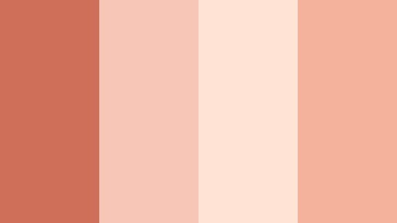
- HEX Codes: #ce6f5a, #f7c6b7, #ffe4d5, #f4b19c
- Mood: warm, tender, and nostalgic
- Use for: Use this palette for romantic travel vlogs, engagement teasers, and dreamy lifestyle intros.
Sunlit Blush Courtyard feels like soft Terracotta Rose tiles glowing at golden hour, washed with creamy blush and gentle peach. The combination is light, inviting, and emotional, perfect when you want your visuals to feel like a treasured memory.
Use this palette on overlays, titles, and thumbnail backgrounds for engagement videos, romantic B-roll, or sentimental lifestyle clips. In Filmora, you can pull these HEX codes into your text, shapes, and filters so your intros, lower thirds, and end screens all share the same warm, sunlit Terracotta Rose atmosphere.
Pro Tip: Enhance Your Terracotta Rose Visuals With Filmora
To keep a Terracotta Rose look consistent from first frame to last, build a simple style system inside Filmora. Use one of the mid-tone Terracotta shades for titles and key graphic accents, then apply the lighter blush tones to backgrounds, frames, and callout shapes.
Save these settings as custom presets for text, overlays, and transitions. That way, every time you cut a new romantic travel vlog or engagement teaser, you can drop in your Terracotta Rose presets and instantly match intros, B-roll captions, and outro cards without rebuilding the look from scratch.
AI Color Palette
If you have a reference photo of a Terracotta Rose courtyard, sunset, or decor set, you can use it to color-match an entire video. Filmora's AI Color Palette feature analyzes your reference frame and applies its color style to other clips in your timeline.
Import the clip with your ideal Terracotta Rose mood, choose it as the reference, then run AI Color Palette on the rest of your footage. This gives your full edit the same soft warmth, so A-roll, B-roll, and cutaway shots all feel like they belong to one cohesive story.
 secure download

HSL, Color Wheels & Curves
To refine your Terracotta Rose look, use HSL controls in Filmora to gently boost saturation in the red and orange channels while slightly muting yellows. Then, with color wheels, warm up midtones and cool the shadows for a cinematic separation between skin tones and background.
If you want more drama, use curves to deepen shadows while protecting highlights, creating that soft golden glow often seen in romantic films. You can see how tonal control shapes a cinematic mood in Filmora's tutorial on color grading with HSL, color wheels, and curves and then adapt those ideas to your Terracotta Rose palette.
secure download1000+ Video Filters & 3D LUTs
If you want Terracotta Rose vibes fast, you can start from a preset and tweak from there. Filmora’s video filters and 3D LUTs make it easy to add warm, cinematic toning in one click, then adjust intensity and color balance to match your chosen HEX codes.
Stack subtle filters, add a warm LUT, and then refine skin tones with HSL to keep faces natural while backgrounds lean into Terracotta Rose. This workflow lets you build a signature warm aesthetic for vlogs, wedding films, or brand content without advanced grading knowledge.
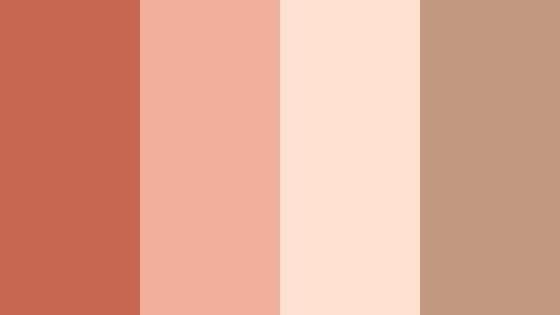
secure downloadVintage Rose Postcard

- HEX Codes: #c96352, #f1b3a0, #fbe0cf, #8b5b4a
- Mood: sentimental, cozy, and slightly nostalgic
- Use for: Ideal for memory-filled montage sequences, wedding highlight reels, and retro-inspired title cards.
Vintage Rose Postcard combines dusty Terracotta Rose with warm neutral creams and a deeper brown accent, echoing faded ink and old paper. It has a built-in retro feeling, which makes every frame look like a memory pulled from a box of keepsakes.
Apply this palette to title cards, lower thirds, and split-screen layouts for wedding recaps or family documentaries. The darker brown works well for legible text over light backgrounds, while the Terracotta Rose tones highlight important elements in thumbnails and overlays.
Terracotta Honeymoon Glow

- HEX Codes: #d2745d, #ffcab5, #ffe9dd, #f8b29a
- Mood: romantic, glowing, and intimate
- Use for: Use in honeymoon travel films, couple portraits, and lifestyle brand intros focused on warmth and connection.
Terracotta Honeymoon Glow leans into bright peach and creamy highlights, wrapping classic Terracotta Rose in light and air. The palette feels like soft sun on skin, with enough contrast to keep details clear while still looking dreamy.
This is perfect for couple travel vlogs, romantic getaways, and lifestyle brands that want to emphasize connection and tenderness. Use the deeper Terracotta tone for headers or logo reveals, and keep the lighter shades for backgrounds in end screens, reels covers, and story highlight covers.
Blush Terra Studio

- HEX Codes: #c85f4a, #f4b8a4, #ffe2d4, #f7d0c0
- Mood: artful, gentle, and feminine
- Use for: Great for creator studio tours, beauty channels, and aesthetic desk setup videos.
Blush Terra Studio feels like an airy artist loft, where Terracotta Rose meets soft blush and creamy neutrals. It is gentle and feminine without becoming overly sweet, making it ideal for creators who want a polished but approachable presence.
Use the strongest Terracotta shade for product callouts, YouTube subscribe buttons, and important headers, while the lighter tones can frame your workspace shots and beauty close-ups. In thumbnails, this palette keeps everything cohesive even when you mix screenshots, portraits, and graphics.
Cafe Rosette Morning
- HEX Codes: #c66851, #f0b09b, #ffe1d0, #c2987e
- Mood: cozy, calm, and comforting
- Use for: Use for cafe vlogs, slow living content, and ASMR-style videos with warm, cozy tones.
Cafe Rosette Morning blends Terracotta Rose with latte browns and cream, capturing the feeling of quiet coffee shop corners and slow mornings. The brown note grounds the palette so it never becomes too pastel or washed out.
Use this combination in slow living vlogs, ambient study videos, or cafe review content. Let the Terracotta Rose sit in your titles and callouts while the latte browns appear in backgrounds, frames, and simple icons to keep your content warm and cozy but still easy to read.
Earthy And Cinematic Terracotta Rose Color Palettes
Desert Ember Horizon
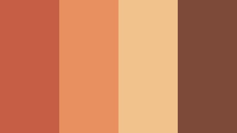
- HEX Codes: #c55e45, #e8905f, #f1c28b, #7d4a3a
- Mood: cinematic, adventurous, and grounded
- Use for: Perfect for travel films, cinematic B-roll, and outdoor adventure intros.
Desert Ember Horizon unites bold Terracotta Rose with sunburnt amber, sandy gold, and a deep earthy brown. It instantly recalls desert sunsets, canyon walls, and campfire embers glowing against dark silhouettes.
Use the darker brown and Terracotta shades in your opening titles, lower thirds, and logo reveals for outdoor travel films. The golden tones work beautifully as subtle overlays or gradient backgrounds in end screens, capturing a cinematic, wanderlust-driven mood across your entire edit.
Terracotta Alley Market

- HEX Codes: #cb644b, #f29c71, #f6d2a4, #5b4134
- Mood: lively, rustic, and authentic
- Use for: Use in street food videos, market documentaries, and handheld city walk-throughs.
Terracotta Alley Market mixes spiced Terracotta Rose with warm gold and a rich brown that feels like aged wood and cobblestones. The palette is lively but still earthy, echoing the textures and colors of old-town markets.
It is a great fit for street food vlogs and handheld travel diaries. Let Terracotta Rose guide your thumbnail text and overlay boxes, while the darker shade grounds subtitles and chapter markers so they stay readable over busy street footage.
Clay Roofline Cinema

- HEX Codes: #bf5a44, #e48c6d, #f2c7a3, #374151
- Mood: moody, cinematic, and narrative-driven
- Use for: Great for short films, cityscape b-roll, and moody travel edits with a storytelling focus.
Clay Roofline Cinema sets warm Terracotta rooftops against a cool slate sky, creating a natural cinematic contrast. The rich warm tones pull focus, while the deep blue-gray brings mood and structure to the frame.
Use the Terracotta tones in your title cards, chapter headings, and key graphic elements, and reserve the slate shade for backgrounds, drop shadows, and borders. This contrast works especially well for narrative travel pieces, city stories, or channel trailers that need a more serious cinematic edge.
Campfire Story Night
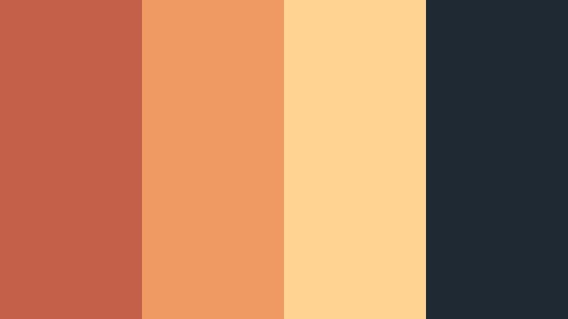
- HEX Codes: #c46049, #f09a63, #ffd392, #1f2933
- Mood: intimate, adventurous, and cozy
- Use for: Use for outdoor camping vlogs, storytelling overlays, and podcast-style video backdrops.
Campfire Story Night pairs smoky Terracotta Rose and ember gold with a deep night blue. The palette feels like sharing stories around a fire, with glowing faces framed against a dark forest or sky.
This works well for camping vlogs, storytelling podcasts with video, and late-night talk-style content. Use the Terracotta and gold for waveform highlights, chapter markers, and key quotes, while the dark blue anchors lower thirds and background panels for legibility.
Terracotta Railway Dust

- HEX Codes: #c35a48, #e19b7e, #f0cfb4, #44403c
- Mood: gritty, nostalgic, and cinematic
- Use for: Perfect for travel journals, train journey edits, and documentary-style sequences.
Terracotta Railway Dust combines weathered Terracotta Rose with dusty beige and charcoal gray, channeling old platforms, rails, and industrial textures. It has a grounded, documentary feel that still keeps a touch of warmth.
Use the Terracotta tone in titles and story labels, the beige for overlays and frames, and the charcoal shade for text and icons over bright footage. The balance feels authentic and slightly gritty, suited to travel diaries, rail journeys, and urban documentaries.
Modern And Minimal Terracotta Rose Color Palettes
Terracotta Brand Studio
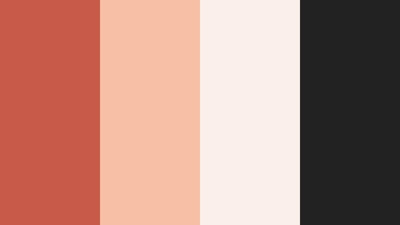
- HEX Codes: #c75a49, #f7c0a5, #faf0e9, #222222
- Mood: polished, contemporary, and confident
- Use for: Ideal for logo animations, channel branding, lower thirds, and clean UI overlays.
Terracotta Brand Studio uses Terracotta Rose as a strong accent against soft neutrals and deep charcoal. It looks modern and professional, ideal if you want warmth without losing a clean, minimal style.
Use the dark charcoal (#222222) for main text, the light neutrals for backgrounds, and Terracotta Rose as your signature accent for logos, buttons, and calls to action. This palette translates perfectly into channel banners, YouTube lower thirds, and website elements so your brand feels cohesive across platforms.
Muted Terra Interface

- HEX Codes: #b85545, #e9b09b, #f7e0d4, #4b5563
- Mood: subtle, techy, and user-friendly
- Use for: Use for app mockups, UI overlays inside tutorials, and explainer video graphics.
Muted Terra Interface softens Terracotta Rose and pairs it with cool gray, creating a UI-friendly palette that feels warm but still technical. It avoids the harshness of pure red while remaining eye-catching enough for buttons and highlights.
Use the gray tone for text, timeline labels, and chart axes inside your tutorials, while the Terracotta shades highlight important steps, progress bars, or clickable elements. This keeps educational or tech content clear and structured, with just enough warmth to feel human.
Editorial Terra Monochrome

- HEX Codes: #c55948, #e08b75, #f0b9a5, #f9e4db
- Mood: editorial, chic, and clean
- Use for: Perfect for lookbooks, fashion edits, and minimalist title sequences.
Editorial Terra Monochrome explores Terracotta Rose in different depths, from rich clay to pale blush. The lack of strong contrasting colors gives it a calm, magazine-like elegance that puts focus on typography and imagery.
Use the deeper shades for headings and the lightest for backgrounds and margins. This palette works well in fashion lookbooks, portfolio videos, or any content where you want the color grading and typography to look like a high-end editorial spread.
Playful And Lifestyle Terracotta Rose Color Palettes
Terracotta Brunch Table

- HEX Codes: #c8644f, #f1aa87, #ffe0b8, #6b7280
- Mood: cheerful, social, and relaxed
- Use for: Use for brunch vlogs, lifestyle reels, and product flat-lay videos.
Terracotta Brunch Table pairs juicy Terracotta Rose with apricot and a soft slate accent. It feels casual and social, like chatting over brunch with friends, and works well for upbeat lifestyle content.
Use Terracotta and apricot tones for thumbnail text, call-to-action buttons, and sticker-like graphics on Reels or Shorts. The slate gray keeps captions and stats readable, especially when you place them over lighter food or table shots.
Sunset Gym Session

- HEX Codes: #c65b4a, #f38a7f, #ffd3c3, #374151
- Mood: energetic, modern, and motivating
- Use for: Perfect for fitness vlogs, motivational shorts, and sporty brand intros.
Sunset Gym Session blends sporty Terracotta Rose with energetic coral and a grounded navy-gray. It feels dynamic and motivating, like training while the sun sets outside the gym windows.
Use the warm tones for progress bars, workout labels, and motivational phrases, and rely on the navy-gray for solid, high-contrast text. This palette is ideal for fitness thumbnails, timer overlays, and animated lower thirds that highlight sets, reps, or key milestones.
Terracotta City Balcony

- HEX Codes: #c65f4b, #f2a78e, #ffe6cf, #9ca3af
- Mood: casual, airy, and optimistic
- Use for: Great for day-in-the-life vlogs, apartment tours, and social media intros.
Terracotta City Balcony combines soft Terracotta Rose with bright, airy neutrals and a cool gray accent. It feels like coffee on a balcony, light breeze, and relaxed daily routines.
This palette is ideal for day-in-the-life vlogs, room tours, and casual creator intros. Let Terracotta highlight your logo, subscribe prompts, and video titles, while neutrals and gray shape background panels, frames, and subtle dividers that keep your layout clean and organized.
Tips for Creating Terracotta Rose Color Palettes
When building your own Terracotta Rose color palette for video and design, balance warmth, contrast, and readability so your visuals feel cozy but still clear and professional.
- Pair Terracotta Rose with one darker neutral (charcoal, slate, deep brown) to keep text and icons readable over light footage.
- Add at least one light accent shade (cream or blush) to prevent your frames from feeling heavy or overly saturated.
- Use Terracotta Rose as an accent, not the base, in long videos to avoid viewer fatigue; let neutrals carry most backgrounds.
- Check your thumbnails in small sizes to ensure Terracotta Rose text still stands out against your chosen background color.
- Keep brand consistency by assigning roles: Terracotta for CTAs and highlights, neutrals for backgrounds, dark tones for body text.
- Match your footage by slightly warming highlights and midtones in Filmora so your graded clips align with your Terracotta palette.
- Create separate palettes for light mode and dark mode overlays so Terracotta Rose accents remain visible on both bright and dark scenes.
- Export a few test frames from Filmora and compare them side by side with your palette swatches to fine-tune saturation and contrast before final delivery.
Terracotta Rose color palettes can instantly shift your videos from generic to recognizable, shaping the emotional tone of your stories and giving your brand a warm, human identity. Whether you prefer soft romantic tones, earthy cinematic looks, or clean modern layouts, there is a Terracotta Rose combination that can match your style.
Try these palettes as starting points inside Filmora: apply the HEX codes to text, shapes, and overlays, then match your footage with grading tools for a unified look. As you refine your favorite combinations, you can turn Terracotta Rose into a signature color that runs through your thumbnails, intros, and social content.
The more consistently you use your chosen palette, the faster viewers will recognize your work at a glance. Experiment, save presets, and let Terracotta Rose carry the warmth and personality of your stories across every platform.
secure downloadNext: Clay Red Color Palette
