
 100% Security Verified | No Subscription Required | No Malware


 ChatGPT
 Perplexity
 Gemini
 Claude
 Grok
Grok
Warm Sandstone sits between beige and soft terracotta, bringing together the comfort of neutrals with the glow of late afternoon light. It feels human, tactile, and calm, which is why it works so well for cozy vlogs, lifestyle channels, and brands that want to feel warm but still minimalist. In video, this family of tones flatters skin, softens harsh highlights, and instantly makes a frame feel more cinematic and intentional.
For creators and Filmora users, Warm Sandstone color combinations are perfect for YouTube thumbnails, intros, lower thirds, Instagram reels, branding kits, and custom LUTs. Below you will find 15 Warm Sandstone color palettes with ready to use HEX codes, so you can build consistent aesthetics across your edits, channel art, and social posts with just a few clicks.
In this article
Soft & Cozy Warm Sandstone Color Palettes
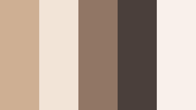
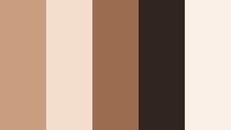
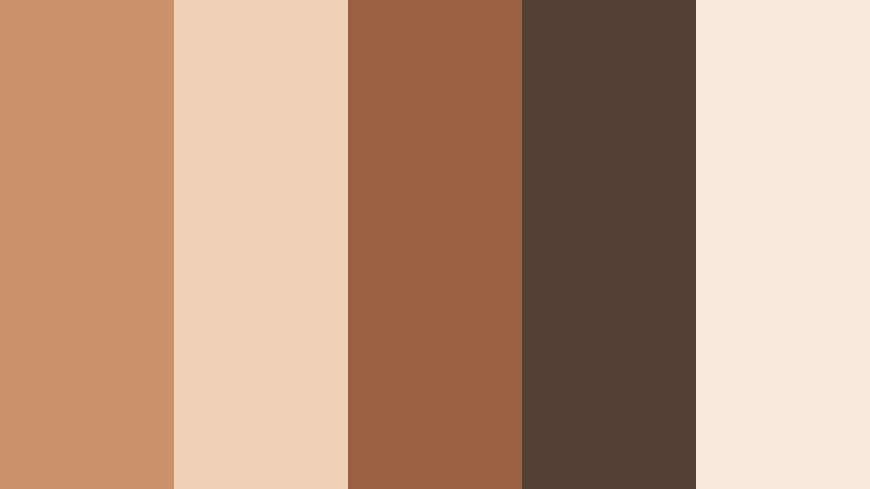
Sunlit Courtyard Calm
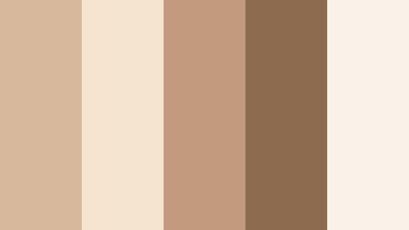
- HEX Codes: #d7b89c, #f5e4d0, #c49a7e, #8c6b4f, #f9f2e8
- Mood: Gentle, relaxed, and sun warmed like an afternoon in a Mediterranean courtyard.
- Use for: Ideal for lifestyle vlogs, home decor reels, and calm talking head scenes that need a soft, approachable warmth.
An airy blend of creamy neutrals and Warm Sandstone browns, Sunlit Courtyard Calm feels like warm light bouncing off stone walls. The soft beiges keep your frame bright and open, while the deeper browns add just enough depth to avoid feeling flat.
Use this palette for everyday vlogs, room makeovers, and calm talking head videos where you want viewers to feel welcome and at ease. The lighter tones (#f5e4d0 and #f9f2e8) work well for backgrounds and overlays, while the mid and dark shades (#c49a7e and #8c6b4f) are perfect for titles, lower thirds, and YouTube thumbnail text that still looks gentle instead of harsh.
Pro Tip: Build a Cinematic Warm Sandstone Look in Filmora
To keep a soft Warm Sandstone mood consistent across an entire project, build a simple color style in Filmora and reuse it everywhere. Start by grading one hero clip with subtle warmth in the midtones, softer highlights, and slightly lifted shadows to match the Sunlit Courtyard Calm palette. Then apply this look to your main A roll, B roll, intros, and outros so your channel feels cohesive from the first frame to the end card.
You can also save color presets inside Filmora, so every time you create home decor reels or cozy lifestyle vlogs, you can reapply your Warm Sandstone look in seconds. This keeps your brand identity clear even when you shoot in different rooms, times of day, or lighting setups.
AI Color Palette
If you already have a reference image that captures your ideal Warm Sandstone mood, you can let Filmora do the heavy lifting. Filmora's AI Color Palette feature lets you sample the tones from that reference and automatically match the rest of your clips, so every shot inherits the same creamy beiges and soft browns.
Import your favorite still frame, moodboard, or thumbnail design, assign it as the source, and then match your edit to it. This makes it easy to keep your Warm Sandstone aesthetic stable across mixed lighting and different cameras without manually tweaking each clip.
 secure download

HSL, Color Wheels & Curves
To fine tune Warm Sandstone tones in Filmora, use HSL, color wheels, and curves for precise control. Slightly desaturate yellows and oranges to keep skin tones natural, then gently warm the midtones in the color wheels for that signature sandstone glow. Lift the shadows a touch with curves to avoid crushed blacks and maintain a soft, airy feel that suits lifestyle and home decor content.
If you want a more advanced breakdown, you can follow tutorials that show how to shape color using Filmora's grading tools, then adapt the steps to your own Warm Sandstone palette. This helps you move from a flat, camera neutral image to something that feels curated and cinematic.
secure download1000+ Video Filters & 3D LUTs
When you do not have time to grade from scratch, Filmora's video filters and 3D LUTs make it easy to push your Warm Sandstone palette toward a specific style. Add a vintage LUT to make sandstone tones feel nostalgic, or try clean modern filters that keep beiges neutral and polished for design focused content.
You can stack subtle filters on top of your base grade, then adjust intensity so you never lose your original sandstone balance. This is especially useful when you are building a consistent channel aesthetic for vlogs, shorts, and teaser trailers.
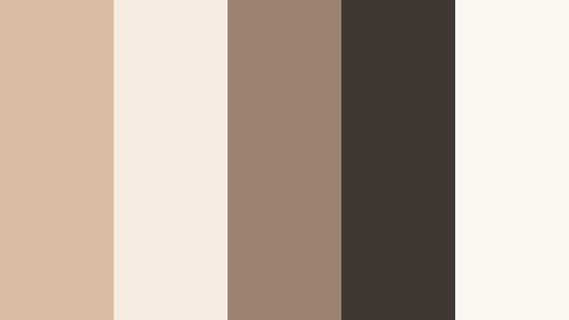
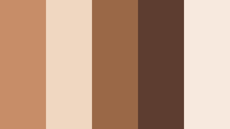
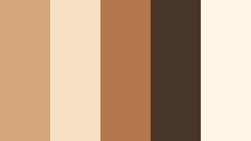
secure downloadMorning Latte Glow
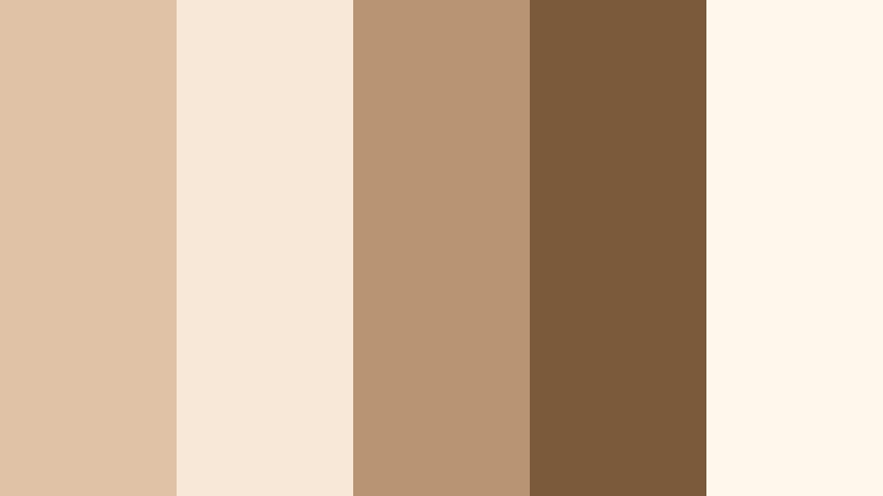
- HEX Codes: #e0c3a6, #f7e8d8, #b89474, #7a5a3a, #fff6ec
- Mood: Comforting and cozy, like a warm latte on a slow morning.
- Use for: Perfect for cafe reviews, study vlogs, or branding for cozy podcasts and bookish content.
Morning Latte Glow blends creamy tans with toasted browns for a palette that feels intimate and slow paced. The lighter hues create a milky foam backdrop, while the richer browns give the sense of freshly pulled espresso.
Use the softest colors (#f7e8d8 and #fff6ec) for backgrounds, panels, and thumbnail frames, then accent your titles, annotations, and logo marks with the deeper browns (#b89474 and #7a5a3a). This palette is ideal for creators filming cafe B roll, study sessions, cozy podcast intros, or bookish reels that should feel warm but still clean.
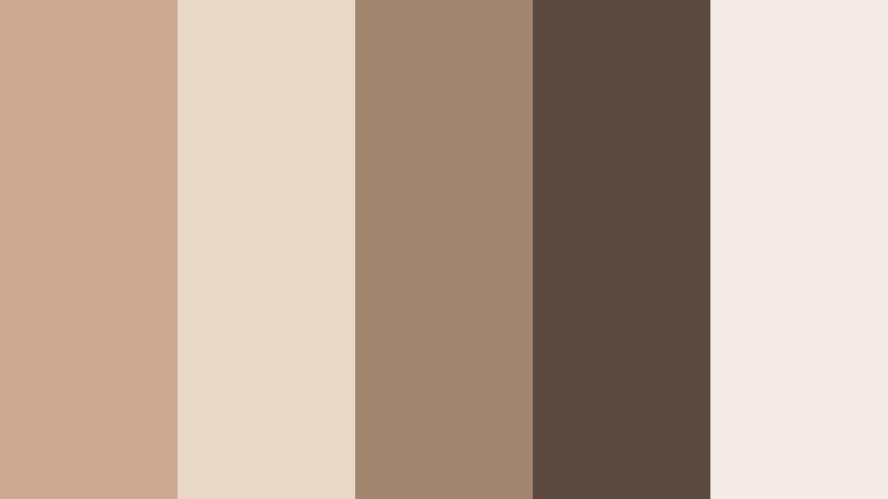
Desert Morning Mist
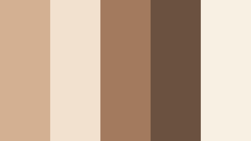
- HEX Codes: #d4b093, #f3e1cf, #a27b5f, #6a5241, #f9f0e4
- Mood: Quiet and introspective, evoking early light over desert sands.
- Use for: Great for travel videos, landscape b roll, and minimalist mood films with a gentle, natural warmth.
Desert Morning Mist mixes soft sandy neutrals with muted browns to capture the feel of a hazy sunrise over dunes. The palette feels grounded and reflective, making it perfect for story driven content and gentle travel sequences.
In practice, use the paler tones for full screen text cards, title screens, and lower thirds, then let the deeper shades act as accents in overlays, icons, and subtle borders. It works especially well when grading footage with natural rock, sand, or warm stone, helping you maintain a cohesive Warm Sandstone theme across intros, B roll, and end screens.
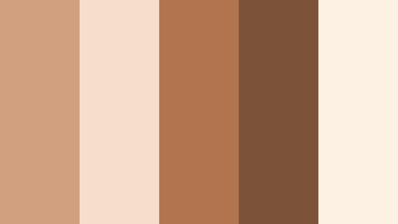
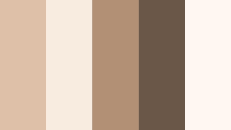
Clay Studio Whisper

- HEX Codes: #cfa487, #f4ddc6, #aa7a5a, #7b5a46, #f8efe3
- Mood: Handcrafted, artistic, and quietly inspiring like a ceramics studio.
- Use for: Use for DIY channels, craft tutorials, and branding for handmade product promos or Etsy style visuals.
Clay Studio Whisper leans into earthy clays and soft creams, giving your visuals a tactile, handmade warmth. It feels like natural light on unfinished pottery, with enough contrast to stay visually interesting without feeling loud.
Choose the light tones (#f4ddc6 and #f8efe3) for backgrounds and title bars, and keep the richer clays (#aa7a5a and #7b5a46) for buttons, callouts, and key text in thumbnails or intro animations. This palette is especially strong for DIY tutorials, Etsy style product showcases, and maker profiles, where you want your brand to look organic and artisanal.
Autumn Hearth Light
- HEX Codes: #d1a07e, #f6deca, #b2734f, #7c5339, #fdf1e4
- Mood: Nostalgic and homey, with the feel of early autumn evenings by the hearth.
- Use for: Perfect for cozy fall vlogs, family memories, recipe videos, and seasonal thumbnails.
Autumn Hearth Light combines warm cinnamon browns with glowing creams, adding an instant hint of fall nostalgia to your visuals. It flatters skin tones and food shots, making everything feel like it is lit by soft, indoor warmth.
Use the creams (#f6deca and #fdf1e4) behind your titles or callouts, then let the spicier browns (#b2734f and #7c5339) drive text, icons, and accents in intros and thumbnails. It is a strong choice for recipe videos, family vlog series, and seasonal promotions where you want to lean into a cozy, home focused Warm Sandstone vibe.
Elegant & Modern Warm Sandstone Color Palettes
Sandstone Penthouse Chic
- HEX Codes: #cfaf94, #f2e4d7, #917665, #4a4039, #f8f1ea
- Mood: Sophisticated and modern, like a high rise loft with soft natural finishes.
- Use for: Ideal for luxury branding, interior design tours, real estate walkthroughs, and sleek portfolio websites.
Sandstone Penthouse Chic turns Warm Sandstone into a polished, urban ready palette. The neutrals are refined rather than rustic, while the deep espresso accent (#4a4039) adds a sense of structure and sophistication.
Use the lighter hues (#f2e4d7 and #f8f1ea) as clean backdrops for typography, UI overlays, and lower thirds, and reserve the medium and dark browns for logo marks, headline text, and high contrast thumbnail titles. It is a great fit for luxury home tours, architecture channels, and personal brands that want to feel premium but still warm and approachable.
Minimal Gallery Beige
- HEX Codes: #d9bda3, #f6ebe0, #9a8372, #3f3732, #fcf6f0
- Mood: Clean, airy, and gallery like with quiet confidence.
- Use for: Great for design portfolios, editing tutorials, UI mockups, and minimalist brand intros.
Minimal Gallery Beige focuses on light beiges and charcoal accents, creating a calm gallery atmosphere where your content can stand out. The overall feel is minimal and professional, yet still softly warm thanks to the Warm Sandstone undertones.
The pale base colors (#f6ebe0 and #fcf6f0) are perfect for negative space in thumbnails and intro slates, while the darker browns (#9a8372 and #3f3732) give you crisp, legible text. This palette suits channels that talk about design, tech, or editing, where you want your visuals to look modern and uncluttered.
Stone Loft Monochrome
- HEX Codes: #caa891, #e9d7c7, #a2856f, #5a4a40, #f4ece4
- Mood: Understated, cool headed, and design driven with a monochrome twist.
- Use for: Use for tech product spots, brand explainers, and UI focused motion graphics that need a neutral yet warm foundation.
Stone Loft Monochrome narrows the palette to a tight range of Warm Sandstone tones, creating a sleek monochrome look. Because all the colors are variations of the same family, your video or branding feels extremely consistent and controlled.
Use the lighter shades for backgrounds and content frames, and the dark browns for bold titles, icons, and keylines in your graphics. This palette works especially well for motion graphics, explainers, and product demos where you want the UI or the product to be the hero, supported by calm, neutral Warm Sandstone tones.
Champagne Terrace Evening
- HEX Codes: #ddc0a7, #f8ece1, #b19076, #6a5748, #fff7f0
- Mood: Effortlessly elegant, like an outdoor rooftop event at golden hour.
- Use for: Perfect for wedding highlights, event recaps, brand trailers, and cinematic reels with a refined but warm mood.
Champagne Terrace Evening mixes champagne creams with toasted browns for a soft, upscale ambiance. The lightest tones feel like golden hour reflected off glass and linen, while the deeper hues add subtle drama and contrast.
Use the pale shades for full frame title cards and openers in wedding films or event recaps, then integrate the darker browns into lower thirds, dividers, and logo lockups. This palette also works beautifully for brand trailers and reels where you want to suggest luxury and warmth without resorting to bold or saturated colors.
Editorial Sandstone Contrast
- HEX Codes: #c89f80, #f2ddcc, #9b6b4e, #2f2620, #f9f0e7
- Mood: High end and editorial, with a hint of dramatic contrast.
- Use for: Best for fashion lookbooks, cinematic trailers, and thumbnails that need a chic neutral with bold depth.
Editorial Sandstone Contrast sharpens Warm Sandstone with inky dark browns, giving your visuals an editorial, magazine inspired edge. The lighter tones keep everything wearable and natural, while #2f2620 adds strong, cinematic contrast.
Use this palette when designing fashion lookbooks, cinematic trailers, or hero thumbnails. Let the creamy hues fill most of the frame, and drop in the darkest color for text, borders, or background elements behind key titles. The result is a chic neutral look that still feels earthy and approachable.
Earthy & Organic Warm Sandstone Color Palettes
Canyon Trail Dust
- HEX Codes: #c58e68, #f0d7c2, #9a6847, #5c3d2f, #f7e9dd
- Mood: Adventurous and rugged, reminiscent of canyon hikes and dusty trails.
- Use for: Use in travel montages, outdoor gear promos, and nature documentaries needing grounded, earthy tones.
Canyon Trail Dust leans into terracotta browns and sandy highlights to bring a cinematic outdoorsy feel to your edit. The palette feels sunbaked and rugged, making it ideal for adventure content and travel storytelling.
Use the lighter shades (#f0d7c2 and #f7e9dd) for map overlays, captions, and intro cards, and lean on the richer browns (#9a6847 and #5c3d2f) for logo stings, gear callouts, and strong thumbnail titles. This palette will help unify drone shots, hiking POV, and close ups of rock, dust, and equipment into one cohesive Warm Sandstone story.
Olive Grove Sandstone
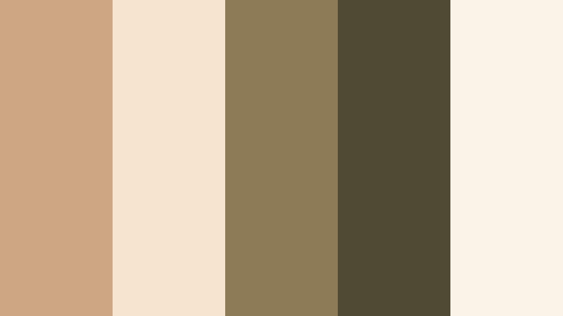
- HEX Codes: #cfa684, #f6e3d0, #8c7b56, #4f4a34, #fbf3e7
- Mood: Organic, rustic, and rooted in nature with soft agricultural charm.
- Use for: Perfect for farm to table content, slow living vlogs, and sustainable brand visuals.
Olive Grove Sandstone blends warm beiges with muted olive inspired tones, giving your visuals an organic, eco friendly feel. It suggests authenticity and natural materials without relying on bright greens.
Use the brighter neutrals for background panels and simple text screens, while the olive toned browns (#8c7b56 and #4f4a34) highlight important copy, badges, and on screen prompts. This palette works well for slow living vlogs, farm to table stories, gardening content, and sustainable brand campaigns that want to look rooted in the earth.
Dune Grass Horizon
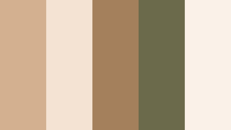
- HEX Codes: #d2b090, #f4e3d2, #a4805d, #6b6a4b, #faf2e8
- Mood: Breezy and grounded, like walking dunes lined with wild grasses.
- Use for: Great for beachside travel edits, wellness content, and calm product b rolls for skincare or lifestyle brands.
Dune Grass Horizon balances sandy tans with muted grassy tones to create a breezy, grounded palette. It feels calm and coastal without defaulting to blues, making it perfect when you want a neutral, wellness forward look.
Let the light shades (#f4e3d2 and #faf2e8) carry your backgrounds and soft gradients, and use the mid and dark tones for text, buttons, and product callouts. This scheme is great for skincare B roll, yoga or meditation content, and beachside travel vlogs where you want a serene Warm Sandstone atmosphere.
Potter Market Street
- HEX Codes: #c9926b, #f1d2b8, #996043, #534032, #f8e9dc
- Mood: Vibrant yet earthy, evoking artisan markets and handmade pottery stalls.
- Use for: Ideal for travel vlogs, food markets, maker profiles, and documentary style edits with human warmth.
Potter Market Street uses burnt clays and sandy neutrals to bring a sense of bustling, human warmth to your visuals. It feels alive but still grounded, echoing the look of street markets, ceramics, and hand made crafts.
Use the lighter hues for full frame titles and subtitle bars, then introduce the deeper clays (#996043 and #534032) in logo marks, badge styles, and call to action overlays. This palette suits documentary style edits, cultural travel vlogs, food markets, and maker stories where Warm Sandstone tones can tie together faces, food, and objects into a cohesive narrative.
Cinematic & Dramatic Warm Sandstone Color Palettes
Golden Hour Sandstone Fade
- HEX Codes: #d4a578, #f8e0c5, #b3784c, #47352a, #fff4e6
- Mood: Cinematic and emotive, like a long lens shot at the edge of sunset.
- Use for: Best for emotional story scenes, wedding films, and thumbnail frames that lean into golden hour drama.
Golden Hour Sandstone Fade pushes Warm Sandstone toward glowing ambers and deeper browns, amplifying the magic of low sun. The palette is emotive and cinematic, perfect for storytelling that should feel romantic or nostalgic.
Use the soft highlight tones (#f8e0c5 and #fff4e6) in title cards, intros, and soft vignettes, and let the richer and darker browns (#b3784c and #47352a) carry your typography and shadow accents. This combination makes skies, skin, and backlit hair glow in thumbnails and hero shots, ideal for wedding highlights, narrative shorts, and any scene that leans heavily into golden hour visuals.
Tips for Creating Warm Sandstone Color Palettes
When you create your own Warm Sandstone color palettes for video and design, focus on balancing light, mid, and dark tones so your frames feel cozy but still clear and readable on every screen.
- Pair at least one light Warm Sandstone shade with one deep accent color so your text, icons, and logos always have enough contrast for readability.
- Use the lightest beige or cream as your main background color in thumbnails and title cards, and keep the darkest brown for key headlines and call to action buttons.
- Blend Warm Sandstone with muted greens or olives when you want an eco friendly, organic feel for sustainable or wellness brands.
- For cinematic looks, slightly desaturate your palette and deepen the midtones so the scene feels richer without becoming overly orange.
- Make sure skin tones stay natural by avoiding extreme orange shifts; keep Warm Sandstone warmth mostly in backgrounds, mids, and shadows.
- Reuse the same 3 to 5 HEX codes across channel art, lower thirds, intro animations, and subtitles to build a recognizable brand identity.
- Test your palettes on both light and dark devices, and check how they look at thumbnail size to ensure important text still stands out.
- Create separate Warm Sandstone variations for daytime and nighttime footage by slightly adjusting brightness and contrast but keeping the same core HEX colors.
Warm Sandstone palettes give you a flexible way to shape mood and brand identity, from cozy vlogs and artisan stories to high end interiors and cinematic golden hour edits. With the right mix of light creams, mid sandstone tones, and deep browns, you can create visuals that feel warm, grounded, and visually consistent across every platform.
Drop these HEX codes into your titles, overlays, and color grading inside Filmora to see how each palette changes the emotion of your footage. Once you find a combination that fits your channel or brand, turn it into a repeatable style using presets, AI color tools, and LUTs so every new upload feels like part of the same visual world.
Whether you are designing a new YouTube thumbnail style, refining your intro sequence, or building a full Warm Sandstone brand kit, Filmora gives you the tools to experiment quickly and lock in the exact mood you want.
secure download