So you have your work flow sorted out and you're well on your way with Filmora but you're not quite happy with your results or something just seems off when you watch your videos back. You may be missing an important element of all visual media and that's composition. This is where the building blocks of every frame come together to make a visually pleasing piece for the viewer and helps the eyes concentrate on the content rather than trying to figure out what they are looking at.
I'm sure you may have heard of the rule of thirds for art or photography and you may not know or understand what it is. You may even be wondering how the rule of thirds can help you with your video creation. Well, that is what I'm going to show and explain to you today.
In this article
What is the rule of thirds
At its core the rule of thirds is a guide to follow whenever you create something visual.
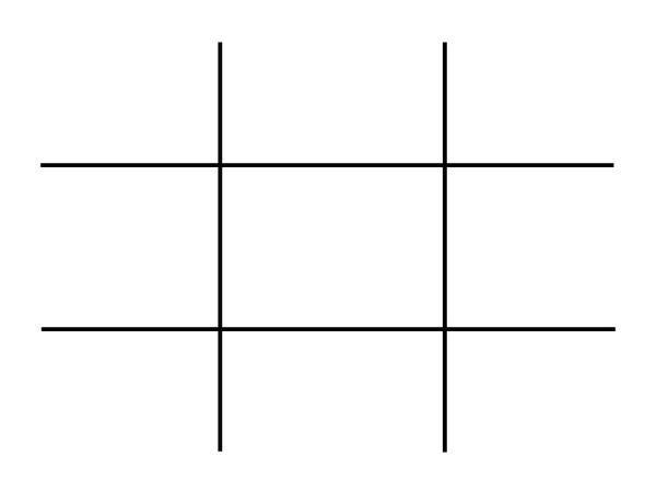
You break an image into thirds both horizontally and vertically, in doing this you are left with nine boxes and four gridlines, the rule states that by placing key elements in line with gridlines you will have an overall better composition.
To gain a better understanding of this here is a visual example of the gridlines and nine boxes.
This may seem simple but is often overlooked due to time restraints and eagerness to get that video out there. By following these guidelines your overall composition will gain interesting and pleasing results that can help with viewer engagement. This is only one piece of the puzzle but as any photography professional or artist will tell you, It's the small things that add up.
How to use the rule of thirds
To show how to use the rule of thirds I will be showing an image with and without the use of the guidelines. In doing this you will be able to see how impactful this system is and how it can help with your own creations within Filmora.
This will be our scene example, you can see buildings, boats, water and skyline. This may be typical of a backdrop or an insert for a holiday picture amongst many other things.
I will now show this picture with no compositional thought and without the use of the thirds system.
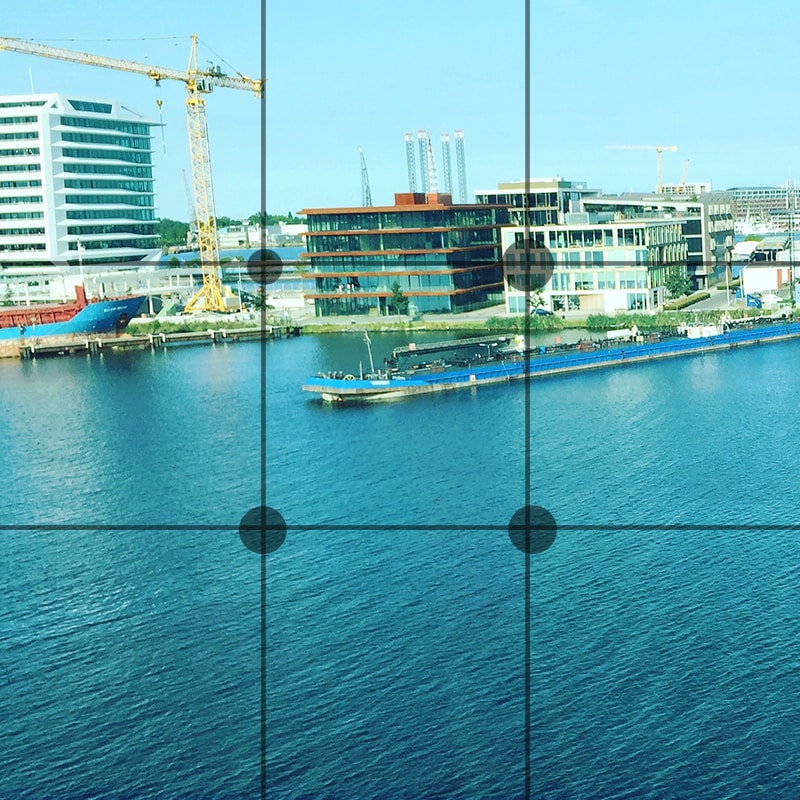
Notice how all the elements are in the scene but it just looks interesting and something just seems off when you look at it. You may find yourself searching for understanding of the image rather than taking the image in and concentrating on what the creator intended. This is seen commonly due to the need to fit every element in the scene but sometimes it is best to sacrifice something you may see as important for the sake of the whole picture.
We will now look at the example image with the rule of thirds in place and see if overall this makes a more interesting scene.

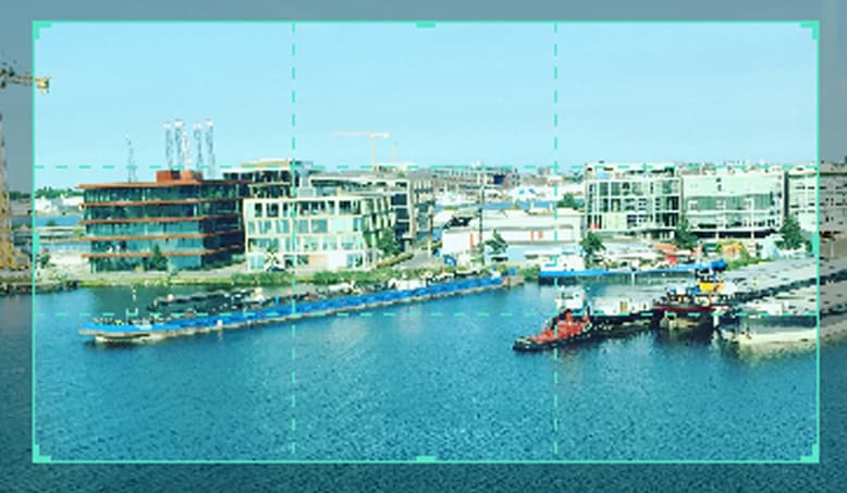
We have aligned the skyline with the first horizontal grid line and aligned the boats with the vertical grid lines. We have sacrificed the crane in the scene but overall I'm sure you can agree that this is more pleasing and makes more sense when you're viewing this. The whole middle section of the scene now has information within it and the contrast between the middle and the rest of the scene directs your eyes to what was intended to be viewed, This is called effect use of empty space. In doing this you save yourself time from adding more information to direct the viewer.
Placing key elements directly in the center of your scene can seem static and boring but by placing elements to one side or using the first and second horizontal grid lines you create something called Dynamism , where the viewer sees an element along the grid and takes a journey through the rest of the image.
Studies have shown that this is the humans natural way of viewing imagery, we first find something interesting to look at and then journey around that. So by using this rule you are creating a more natural process for your viewer.
Tips when starting using the rule of thirds
The first tip I would say is to view other videos, YouTube is a good starting point. Watch interviews and notice where the chairs are aligned. Watch reviewers and notice where they position themselves in the scene. Lastly watch movies and pause on an interesting scene and try to deconstruct where everything is placed and why they chose that composition.
The idea with the rule is to have it become something you do naturally, by always considering the form you save yourself time in the editing process. The key things you have in your mind whenever you make a scene should be.
1. What is the key element in my scene or what am I trying to make the viewer focus on.
2. where do I intend to place these in my scene?
3. Have I created a balanced scene with enough negative space to direct the eye.
If you consider this with every video you make then in time this will become as natural as drinking water on a hot day. As a practice you could open some old projects and apply this rule to your video to see the results and you may find yourself impressed with the change.
When is it best to not use the rule of thirds?
The rule is very useful when you're aiming to grab the attention towards a certain element but that being said, when you have a symmetrical scene you can get away with not using the rule as your eyes can make sense of symmetry very well.
Even when working with a symmetrical scene you can incorporate the rule within for elements such as people or key figures but in this situation it is down to the creator to figure what they feel is best in any given shot.
How to Use Rule of Thirds in Filmora
The tools provided within Filmora are generous and one great feature is the crop and size tool.
When inserting an image or movie file you can right click on the timeline and select crop and size bringing up a handy screen with the gridlines already there for you. It's just a matter of aligning your shot for the best composition.
For reference I will show you what this looks like.
First right click the timeline on the image you want to reposition. Alternatively you can select the desired insert and press Alt+C this will also bring up the same editing box.
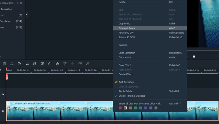
Now click on the crop and zoom option and this editor will appear.
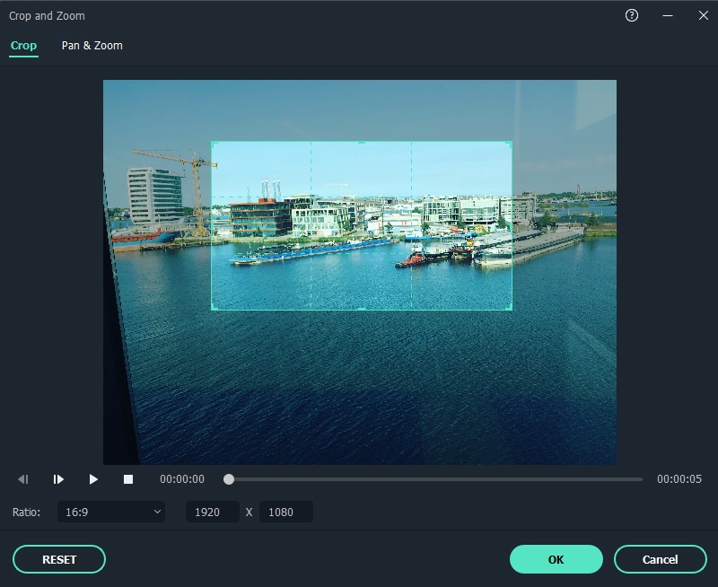
As you can see you are able to align the shot and change the aspect ratio to align with your project. For a better look at the built in grid lines see image below.
Conclusion
To conclude, the rule of thirds is very important within visual media and is tough within the fundamentals of art and photography from beginner level right up to the highest point of education, Practice thinking about your placement of key elements within your videos and how this affects your overall composition. The goal is to have this as an automatic thought when shooting your videos or still images. This is a small change you can make but has a big impact on how a viewer engages your content and in return leaves a positive opinion towards your creativity and eye for detail.


 100% Security Verified | No Subscription Required | No Malware

