

 100% Security Verified | No Subscription Required | No Malware

Polaroid Color brings together soft contrast, warm highlights, faded shadows, and nostalgic pastel tones. Its creamy neutrals, dusty pinks, muted greens, and gentle blues can make visual content feel personal, familiar, and slightly nostalgic without looking outdated. This color direction is especially effective when you want a relaxed, human, and story-driven mood.
Creators can use Polaroid Color in video edits, branding, thumbnails, intros, social posts, packaging, and presentation designs. Below are 15 Polaroid Color color palettes with HEX codes for creators and Filmora users, along with practical ideas for applying each combination to footage and creative projects.
In this article
Soft & Nostalgic Polaroid Color Palettes
Sunlit Kitchen Window

- HEX Codes: #f6e6c8, #e9cba3, #b9c8b0, #8ca6a0, #f4b6a6
- Mood: Warm, familiar, and gently nostalgic, like a quiet morning captured on instant film.
- Use for: Use this palette for lifestyle thumbnails, cozy vlog intros, recipe videos, home branding, and warm social content.
Sunlit Kitchen Window blends creamy neutrals with faded sage and coral for an inviting vintage feel. The warm base makes skin tones and natural textures feel comfortable, while the green and coral accents add enough contrast to keep layouts lively.
Try the palette in home and food videos by using cream for backgrounds, sage for lower thirds, and coral for titles or calls to action. It also works well for vlog openers, cozy thumbnails, recipe cards, and brand graphics that need a welcoming analog character.
Pro Tip: Build A Warm Polaroid Color Look In Filmora
Filmora can help keep the Sunlit Kitchen Window palette consistent from the first frame to the final social cut. Use warm cream and soft peach tones in title cards, then repeat the faded sage and blue-green accents in captions, transitions, and b-roll overlays. This creates a clear visual thread across cozy intros, kitchen close-ups, and lifestyle sequences.
For a more natural result, apply the warm treatment gently and preserve detail in bright areas. A restrained look will make the footage feel like a carefully collected set of instant-film memories rather than an overly strong color effect.
AI Color Palette
Filmora's AI Color Palette feature can sample a reference image or color card based on this Polaroid Color combination and apply a related look across an entire video. Use a still image with cream highlights, sage details, and muted coral accents as the visual reference for your footage.
This is useful when clips were recorded in different rooms or under changing lighting conditions. Applying a shared palette helps unify intros, b-roll, talking-head clips, and short-form exports without manually matching every shot.
 secure download

HSL, Color Wheels & Curves
Use HSL controls to refine the balance between the sage, teal, and coral notes in Sunlit Kitchen Window. You can reduce saturation in distracting greens, lift warm highlights for a soft morning glow, and add a small amount of blue-green to shadows for depth. Color wheels can then separate the warm highlights from cooler shadows while keeping faces natural.
Curves are useful for creating a gentle faded-film contrast. Lift the black point slightly, soften the brightest highlights, and make small RGB adjustments rather than pushing every channel strongly. For additional guidance, this Filmora color matching tutorial shows how to refine a consistent look.
secure download1000+ Video Filters & 3D LUTs
Filmora's library of video filters and 3D LUTs makes it easy to stylize Sunlit Kitchen Window without building every adjustment from scratch. Start with a soft vintage or faded-film preset, then lower its intensity so the cream, sage, and coral relationships remain visible.
Use the same filter family on an intro, main sequence, and thumbnail still to create a recognizable visual identity. A subtle grain or light leak can support the instant-film mood, but it should remain secondary to the palette and the subject of the video.
secure downloadApricot Memory
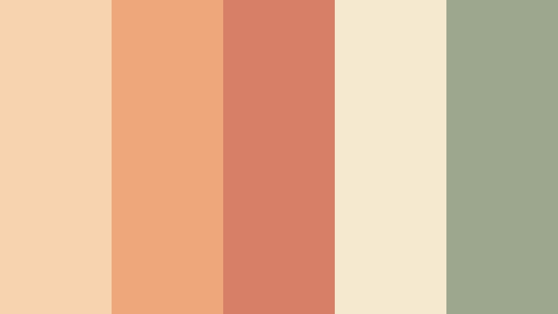
- HEX Codes: #f7d3b0, #eea77b, #d87f68, #f5e9d0, #9da78e
- Mood: Cheerful, tender, and sun-faded with a playful analog character.
- Use for: Use this palette for travel reels, personal vlogs, playful packaging, photo collages, and upbeat social thumbnails.
Apricot Memory pairs soft peach and terracotta with an understated olive accent. The pale cream base keeps the palette light, while the deeper coral adds warmth and visual focus. It feels personal, optimistic, and naturally nostalgic.
Use peach for title cards and background panels, terracotta for key words or animated stickers, and olive for small details that need contrast. This combination fits travel reels, personal vlogs, photo montages, playful packaging, and upbeat social content.
Dusty Rose Snapshot
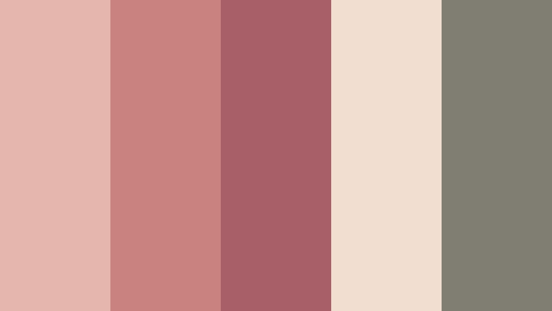
- HEX Codes: #e5b6ad, #c98280, #a85f68, #f1ded0, #807e73
- Mood: Romantic, intimate, and softly dramatic with a faded photographic finish.
- Use for: Use this palette for wedding videos, relationship stories, beauty branding, editorial graphics, and sentimental social posts.
Dusty Rose Snapshot combines muted rose tones with warm ivory and gray olive. It creates an emotional look without feeling overly sweet, making it suitable for intimate storytelling and refined visual identities.
Use the darker rose as a title color, the ivory as a clean background, and the gray olive for text, borders, or shadow details. In video, the palette works well for wedding edits, relationship stories, beauty intros, and sentimental reels.
Creamy Daydream
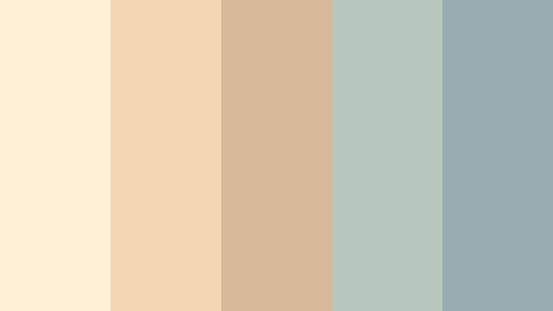
- HEX Codes: #fff1d6, #f5d6b3, #d8b89b, #b7c7bd, #9aabb2
- Mood: Airy, calm, and dreamy with a soft-focus analog quality.
- Use for: Use this palette for wellness videos, minimalist websites, journaling content, calm UI designs, and gentle brand intros.
Creamy Daydream uses pale cream, powdery tan, and cool blue-gray to create a peaceful visual rhythm. The restrained contrast gives designs a clean appearance while the muted tones add a subtle nostalgic touch.
This palette is a strong choice for meditation videos, journaling channels, wellness branding, and minimalist title sequences. Use blue-gray for navigation or captions when you need more readability against the light cream background.
Faded Summer Polaroid Color Palettes
Poolside Summer
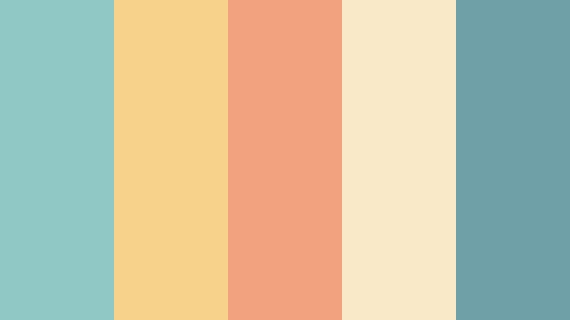
- HEX Codes: #8fc8c4, #f7d28b, #f2a27f, #f9e9c9, #6fa0a8
- Mood: Bright, relaxed, and nostalgic, evoking long afternoons beside a sunlit pool.
- Use for: Use this palette for summer travel content, vacation thumbnails, resort branding, outdoor product videos, and seasonal campaigns.
Poolside Summer balances aqua and sky blue with sunny yellow and soft coral. It brings a cheerful holiday mood while keeping the colors slightly faded and film-like, so the result feels relaxed rather than harsh.
Use aqua for large visual areas, yellow for highlights, and coral for calls to action or thumbnail text. The palette is effective for vacation edits, resort promotions, outdoor product videos, and summer campaign graphics.
Citrus Road Trip
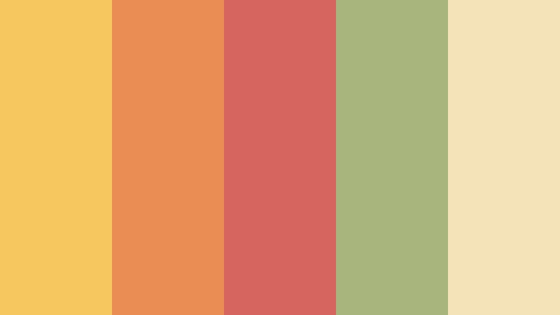
- HEX Codes: #f5c85f, #e98d55, #d5655e, #a8b67e, #f4e2b9
- Mood: Adventurous, energetic, and sun-warmed with a carefree road trip spirit.
- Use for: Use this palette for travel vlogs, road trip edits, event posters, outdoor campaigns, and colorful video thumbnails.
Citrus Road Trip combines golden yellow, faded orange, tomato red, and muted green. Its warm colors suggest movement, sunlight, and discovery, while the cream tone helps prevent the combination from becoming overwhelming.
Try yellow for route lines or map graphics, orange for transitions, and faded red for important title moments. It adds personality to road trip videos, travel thumbnails, event posters, and outdoor brand campaigns.
Sandy Boardwalk
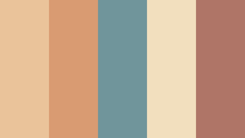
- HEX Codes: #e9c49b, #d99b72, #70959a, #f1dfbd, #af7668
- Mood: Relaxed, coastal, and lightly weathered like a seaside photograph from another decade.
- Use for: Use this palette for beach videos, coastal branding, travel guides, lifestyle packaging, and retro-inspired social graphics.
Sandy Boardwalk blends warm sand with dusty teal and faded brick for a laid-back coastal look. The combination feels authentic and tactile, with enough blue-green contrast to suggest the sea without losing its sun-washed quality.
Use the sandy shades as a background for travel graphics and the teal tone for labels, subtitles, or navigation elements. Faded brick is useful for small emphasis areas in beach videos, travel guides, packaging, and social templates.
Golden Hour Picnic
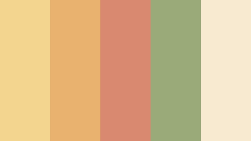
- HEX Codes: #f4d58d, #e9b36f, #d88970, #9bab78, #f7ead1
- Mood: Sunny, friendly, and romantic with the soft glow of late afternoon.
- Use for: Use this palette for picnic content, food videos, outdoor weddings, event invitations, and warm lifestyle branding.
Golden Hour Picnic pairs honeyed yellow with peach, dusty coral, and natural green. The colors suggest late-afternoon light and create a welcoming glow that works well with food, people, and outdoor scenery.
Apply the cream and yellow tones to title cards, use green for natural details, and reserve coral for buttons or important words. This palette is a natural fit for food videos, outdoor weddings, picnic content, event invitations, and lifestyle branding.
Modern Retro Polaroid Color Palettes
Midnight Flash
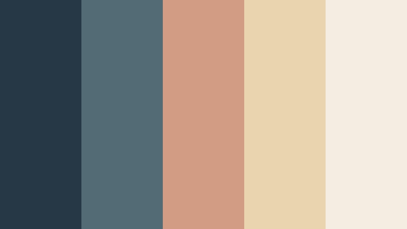
- HEX Codes: #263746, #526c76, #d29b83, #ead4ad, #f4eee2
- Mood: Cool, cinematic, and quietly stylish with the contrast of a nighttime flash photograph.
- Use for: Use this palette for music videos, fashion edits, modern portfolios, tech branding, and dramatic social thumbnails.
Midnight Flash contrasts deep blue-gray with muted peach, cream, and tan. The dark base creates a cinematic foundation, while the warm accents provide the visual contrast associated with a flash photograph.
Use the deepest blue-gray for backgrounds and titles, then bring in peach or cream for faces, product details, and key text. It delivers a refined retro look for fashion edits, music content, tech branding, and dramatic thumbnails.
Velvet Camera Club
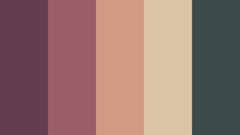
- HEX Codes: #633e4c, #9a5e67, #d09a83, #d9c5a5, #3d4a4a
- Mood: Moody, artistic, and sophisticated with a vintage editorial edge.
- Use for: Use this palette for fashion branding, album artwork, cinematic titles, boutique packaging, and editorial video projects.
Velvet Camera Club layers wine, muted rose, dusty peach, and charcoal teal. It feels luxurious and expressive, but the softened colors preserve the imperfect charm of analog photography.
Use wine and charcoal teal for strong backgrounds, dusty peach for highlights, and parchment tan for text or packaging surfaces. The palette suits boutique brands, album covers, fashion films, cinematic titles, and editorial layouts.
Studio Contact Sheet
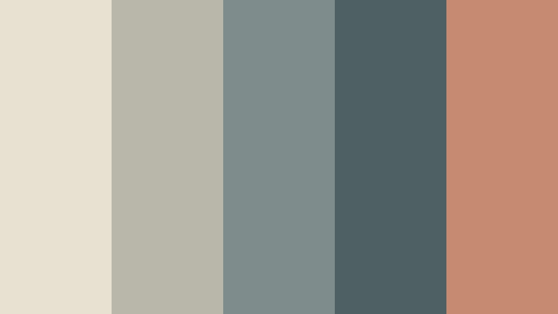
- HEX Codes: #e8e1d2, #b9b7aa, #7e8d8c, #4f6065, #c58a72
- Mood: Thoughtful, balanced, and creative with a tactile design-studio atmosphere.
- Use for: Use this palette for portfolio websites, creative agency branding, presentation decks, UI systems, and behind-the-scenes content.
Studio Contact Sheet combines paper white, neutral gray, blue-gray, and clay orange. It is practical for professional layouts that need a distinct film-inspired identity without relying on bright or highly saturated colors.
Use the pale neutral as a foundation, blue-gray for text and interface elements, and clay orange for highlights or section markers. The palette works especially well for portfolios, agency presentations, editing tutorials, and behind-the-scenes production content.
Neon Afterglow
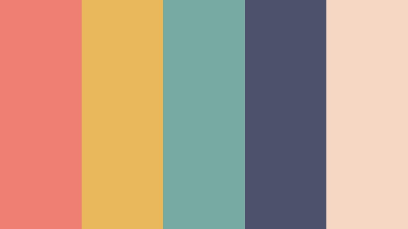
- HEX Codes: #ef7f72, #e9b85c, #78aaa4, #4d526b, #f5d7c3
- Mood: Playful, energetic, and slightly dreamy with a faded nightlife glow.
- Use for: Use this palette for music content, gaming thumbnails, youth campaigns, animated titles, and vibrant social media graphics.
Neon Afterglow softens coral, amber, teal, and indigo with a pale blush background. It feels expressive and modern while preserving a vintage color cast that makes bright accents easier to integrate.
Use indigo for contrast, coral and amber for animated titles, and teal for secondary graphics or interface details. This palette can give music videos, gaming thumbnails, youth campaigns, and social graphics a lively but polished identity.
Earthy Analog Polaroid Color Palettes
Forest Cabin Film
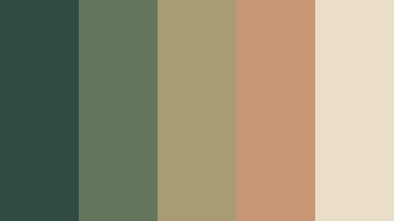
- HEX Codes: #314c43, #65755d, #a99b72, #c99776, #eadfc6
- Mood: Grounded, quiet, and restorative with the warmth of an outdoor film photograph.
- Use for: Use this palette for nature videos, sustainable brands, cabin rentals, documentary titles, and earthy product packaging.
Forest Cabin Film combines pine green, moss, muted ochre, and clay with a soft cream base. The darker greens create a dependable foundation, while ochre and clay add warmth and a handcrafted quality.
Use this palette for hiking videos, cabin tours, environmental stories, and sustainable product branding. Cream works well for readable text, while clay can highlight calls to action, chapter titles, or important objects in a thumbnail.
Old Bookstore Glow

- HEX Codes: #6b4b3e, #a16f55, #c79b71, #e2c9a2, #5c6660
- Mood: Intellectual, cozy, and richly nostalgic with a quiet creative spirit.
- Use for: Use this palette for book content, educational videos, literary branding, cafe packaging, and editorial layouts.
Old Bookstore Glow uses warm brown, caramel, parchment, and muted green to suggest well-loved pages and amber light. Its earthy contrast feels thoughtful and established, making it useful for designs built around knowledge and storytelling.
Use parchment as a background, brown for headings, caramel for accents, and muted green for secondary labels. This palette is ideal for book reviews, educational videos, literary brands, cafe menus, and editorial video sequences.
Rainy Window Notes

- HEX Codes: #6e8589, #9eafb0, #c7b9aa, #d9c6b4, #4d5961
- Mood: Reflective, peaceful, and cinematic with a soft rainy-day atmosphere.
- Use for: Use this palette for reflective vlogs, poetry videos, ambient content, wellness interfaces, and introspective brand storytelling.
Rainy Window Notes pairs blue-gray shades with warm taupe and soft beige. The restrained contrast creates a calm, cinematic look that supports quiet narratives without competing with the subject.
Use the darker blue-gray for readable text and subtle framing, then let the lighter blue-gray and beige shape the main composition. It works well for poetry videos, ambient edits, reflective vlogs, wellness interfaces, and slow storytelling.
Desert Postcard
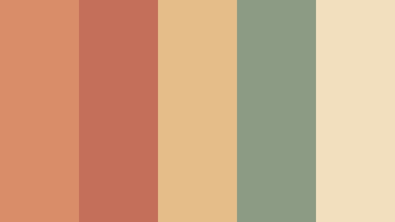
- HEX Codes: #d88f68, #c36f59, #e5bd88, #8c9b83, #f2dfbd
- Mood: Open, adventurous, and sunbaked with a handcrafted travel-poster feeling.
- Use for: Use this palette for travel branding, landscape videos, outdoor campaigns, postcards, and expressive thumbnail designs.
Desert Postcard combines terracotta, sand, faded green, and cream for a warm western mood. The colors feel memorable and tactile, with enough natural green to balance the sunbaked oranges and reds.
Use terracotta for bold titles, sand and cream for open backgrounds, and faded green for maps, badges, or supporting text. This palette is naturally suited to travel storytelling, landscape videos, outdoor campaigns, postcard designs, and expressive thumbnails.
Tips for Creating Polaroid Color Color Palettes
Polaroid Color palettes work best when their faded warmth is balanced with clear contrast and a consistent visual purpose. Combine soft neutrals with one or two stronger accents, then test the colors against real footage, thumbnail layouts, and brand elements before finalizing your design system.
- Use cream, parchment, or soft beige as a background when you want a light and nostalgic foundation.
- Pair muted Polaroid Color tones with a darker blue-gray, charcoal, or forest green to improve text readability.
- Choose one accent color for calls to action, animated titles, logos, and other important interface elements.
- Match the palette to the lighting in your footage. Warm palettes suit sunlight and indoor scenes, while blue-gray combinations fit overcast or evening clips.
- Reduce saturation instead of removing color completely. Slightly faded tones usually feel more natural than heavily desaturated footage.
- Repeat the same colors across intros, lower thirds, transitions, thumbnails, and end screens to strengthen brand recognition.
- Check skin tones after applying a Polaroid Color look. Warm overlays should enhance the mood without making faces look overly orange or pink.
- Use color hierarchy in every design. Reserve the strongest contrast for the message or subject you want viewers to notice first.
Polaroid Color palettes can shape the emotional direction of a project before viewers hear the first line of dialogue. Creamy neutrals can make a vlog feel welcoming, dusty roses can create intimacy, faded aqua can suggest summer, and earthy greens can support dependable, nature-focused storytelling.
The 15 combinations above provide a starting point for videos, branding, thumbnails, social content, and creative layouts. Test different HEX combinations against your footage, then adjust saturation, contrast, highlights, and shadows until the result feels consistent with your subject and audience.
Filmora makes it easier to turn these color ideas into a repeatable editing style. Start with a reference image, match the overall palette, refine the tones with manual controls, and finish with a subtle filter or 3D LUT that supports the analog mood.
secure download