

 100% Security Verified | No Subscription Required | No Malware

8mm Film Color is associated with warmth, memory, and the gentle imperfections of analog footage. Sepia browns, amber highlights, faded creams, dusty greens, and muted blues can make a video feel personal, cinematic, and timeless. These tones often create a sense of comfort and authenticity, which makes them useful for storytelling and emotional visual communication.
Creators can use 8mm Film Color in video edits, branding, thumbnails, title cards, intros, social media graphics, and presentation design. This guide provides 8mm Film Color color palettes with HEX codes for creators and Filmora users, along with practical ideas for applying each combination to modern creative projects.
In this article
Nostalgic & Warm 8mm Film Color Palettes
Sepia Home Movie
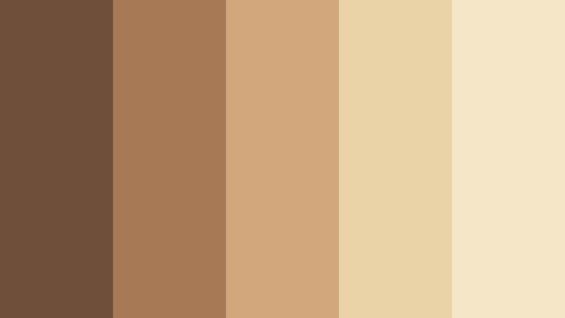
- HEX Codes: #704f3a, #a87955, #d1a77b, #ead3a7, #f5e6c8
- Mood: Warm, sentimental, and softly nostalgic.
- Use for: This palette works well for family story videos, vintage thumbnails, wedding films, and personal brand intros.
Sepia browns and sunlit cream create the feeling of a treasured home movie. The darker brown shades can anchor title cards and lower thirds, while the soft beige tones add light to backgrounds and transitions.
Use this 8mm Film Color combination for intimate storytelling, memory-driven designs, wedding montages, and personal introductions. A subtle grain effect and gentle fade can make the palette feel even more authentic without making the footage look dated.
Pro Tip: Build A Warm 8mm Film Look In Filmora
Filmora can help keep the Sepia Home Movie palette consistent from the opening title to the final frame. Apply warm color adjustments to the main footage, then use matching tones for b-roll, captions, transitions, and social media cutdowns.
For a polished result, reserve the darkest brown for important text and visual anchors. Use the cream shades for breathing room, background panels, and end cards so the edit remains readable while preserving its nostalgic character.
AI Color Palette
Start with a reference image, scanned film frame, or custom color card that contains the Sepia Home Movie tones. Filmora's AI Color Palette feature can help transfer the overall color character across clips, making footage from different cameras feel more unified.
This workflow is useful for family films, wedding edits, and travel stories that include a mixture of indoor and outdoor shots. Apply the palette first, then make small exposure and skin tone corrections for a natural finish.
 secure download

HSL, Color Wheels & Curves
Use HSL controls to refine the balance between earthy browns, muted oranges, and pale cream. Slightly reducing saturation in the highlights can make the footage look more like aged film, while warming the midtones can bring faces and natural textures closer to the Sepia Home Movie mood.
Color wheels and curves are useful for adding depth without losing softness. Keep the shadows slightly warm, protect highlight detail, and use a gentle curve rather than a high-contrast adjustment. This creates a cinematic image that still feels comfortable and personal.
secure download1000+ Video Filters & 3D LUTs
Filmora's library of filters and LUTs makes it easy to give the Sepia Home Movie palette a consistent analog finish. Filmora's video filters and 3D LUTs make it easy to test warm film looks, faded highlights, and subtle vintage treatments without rebuilding the grade from scratch.
Try a light filter on the full edit, then adjust its strength for close-ups, outdoor scenes, and title sequences. This helps the footage feel connected while allowing important moments to retain natural detail.
secure downloadAmber Reel Memories
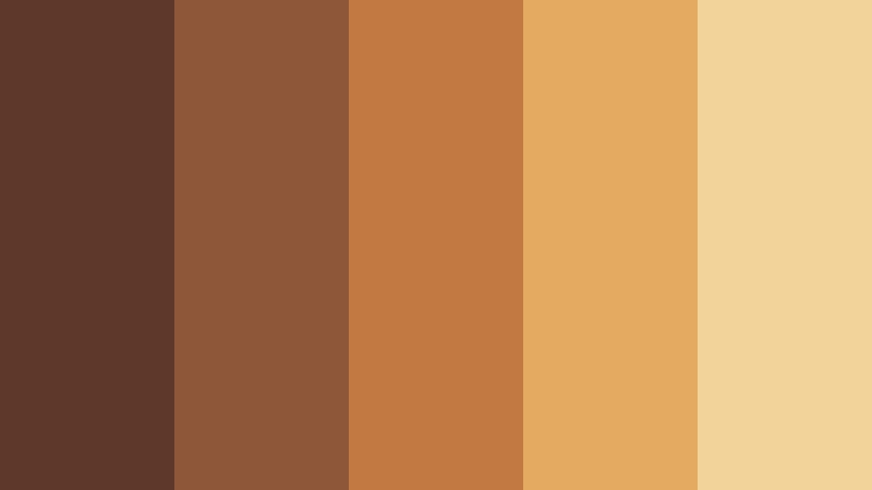
- HEX Codes: #5e382b, #8f5739, #c27a43, #e4aa62, #f2d49b
- Mood: Golden, comforting, and richly nostalgic.
- Use for: This palette is ideal for travel reels, food videos, retro packaging, and warm social media graphics.
Amber highlights and earthy shadows mimic the glow of aged film stock. The rich brown base adds visual weight, while golden orange and pale amber bring energy to the frame.
Use this palette for travel reels, food videos, retro packaging, and lifestyle graphics. It works especially well when the subject includes wood, leather, natural food textures, sunset light, or warm indoor scenes.
Rustic Cinema Glow
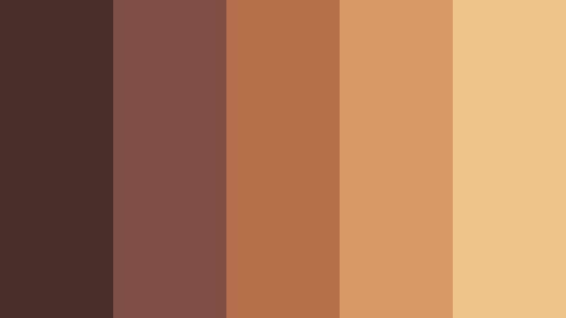
- HEX Codes: #4a302b, #805044, #b66e4b, #d99a68, #f0c58c
- Mood: Rustic, cinematic, and gently dramatic.
- Use for: Use this palette for documentary titles, artisan branding, cinematic thumbnails, and handcrafted product visuals.
Muted rust and copper tones create a tactile, analog mood. The palette feels expressive without becoming overly bright, making it suitable for subjects that need warmth and authenticity.
Use the deepest brown for title cards and borders, then introduce copper and peach in thumbnails, product shots, and intro animations. It is a strong choice for artisan brands and documentary-style storytelling.
Honeyed Picture Days
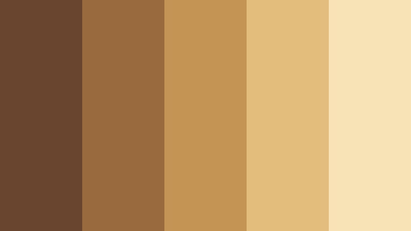
- HEX Codes: #69452f, #9a6a3f, #c49455, #e2bd7b, #f7e3b5
- Mood: Cheerful, sunny, and warmly nostalgic.
- Use for: This palette suits childhood montage videos, cheerful vlogs, educational content, and friendly website accents.
Honey gold and soft beige capture the bright optimism of old picture days. The combination feels welcoming and light, with enough brown contrast to keep text and important details clear.
Apply it to childhood montages, cheerful vlogs, educational videos, and friendly brand intros. The lighter shades are useful for backgrounds, while the gold tones can highlight buttons, captions, and thumbnail subjects.
Moody & Cinematic 8mm Film Color Palettes
Midnight Projector

- HEX Codes: #171b27, #303447, #56556a, #8c7880, #c5a18e
- Mood: Mysterious, cinematic, and quietly romantic.
- Use for: This palette works well for film title cards, music videos, dramatic thumbnails, and dark-mode creative interfaces.
Deep blue-black shadows meet faded mauve and dusty rose in this quietly dramatic palette. It feels like an old projector glowing in a dark room, with soft highlights providing a subtle romantic touch.
Use Midnight Projector for title cards, music videos, night scenes, and dark-mode layouts. Keep the darkest shades in the background and use dusty rose sparingly for text, highlights, and emotional focal points.
Dusty Noir Frames
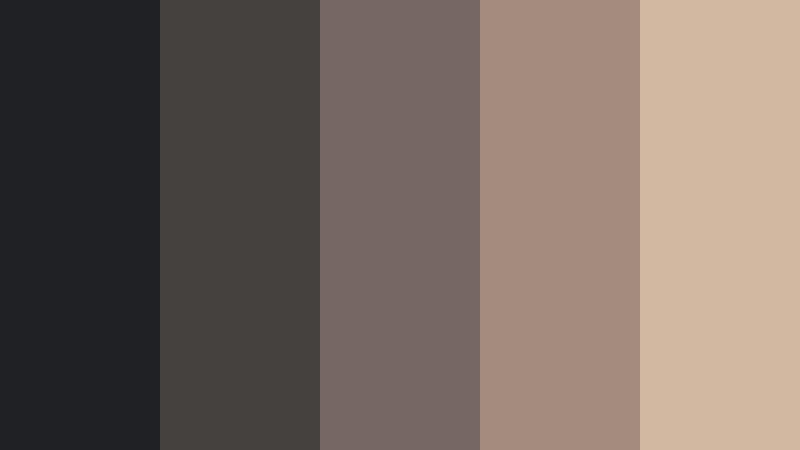
- HEX Codes: #202124, #45413f, #766762, #a58b7d, #d2b7a1
- Mood: Sophisticated, restrained, and atmospheric.
- Use for: Use it for editorial layouts, fashion reels, cinematic brand intros, and minimalist portfolio pages.
Charcoal, taupe, and faded blush create a refined analog noir effect. The colors provide depth without relying on strong saturation, which gives visual work a polished and controlled appearance.
This palette is useful for fashion reels, editorial thumbnails, minimalist websites, and cinematic brand introductions. Pair the light blush with charcoal text or backgrounds to create readable contrast with a soft vintage edge.
Blue Hour Grain

- HEX Codes: #1c2b3d, #3d5265, #66778a, #a7a9a2, #d7c6ac
- Mood: Reflective, calm, and cinematic.
- Use for: This palette is a strong fit for evening travel videos, reflective vlogs, app interfaces, and atmospheric photography layouts.
Cool blue-gray shades fade into grainy beige highlights, suggesting the quiet transition between daylight and night. It feels thoughtful and spacious, with enough warmth to avoid looking too cold.
Use Blue Hour Grain for evening travel videos, reflective vlogs, photography portfolios, and calm interface designs. The darker blue tones work well for backgrounds, while beige can guide attention toward captions and key visual details.
Faded Theater Seats
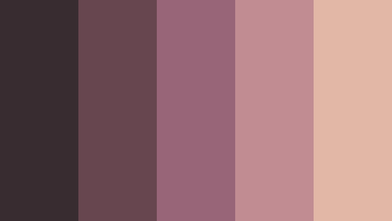
- HEX Codes: #382c31, #684650, #986477, #c18d92, #e1b8a5
- Mood: Romantic, theatrical, and softly dramatic.
- Use for: Use this palette for performance videos, creative portfolios, event promotions, and expressive social content.
Faded berry and dusty rose recall worn theater seats under soft stage lighting. The darker plum shades add drama, while the pink and peach tones keep the overall mood approachable.
This combination works well for performance videos, event posters, music artwork, and expressive social media campaigns. Use the berry tones for headlines and borders, then add rose highlights to create a gentle spotlight effect.
Sunlit & Faded 8mm Film Color Palettes
Sunwashed Road Trip
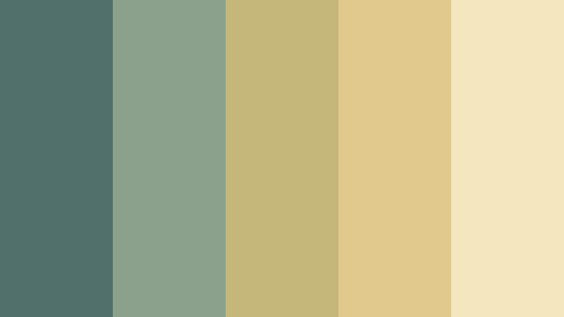
- HEX Codes: #52706b, #8ca18c, #c4b779, #e1c98d, #f4e7bd
- Mood: Free-spirited, relaxed, and optimistic.
- Use for: This palette is perfect for road trip vlogs, outdoor thumbnails, travel branding, and casual social media campaigns.
Faded sage, dusty teal, and cream evoke a long drive under bright summer light. The palette feels adventurous yet comfortably worn-in, making it a natural fit for travel and outdoor stories.
Use Sunwashed Road Trip in road trip vlogs, travel thumbnails, outdoor brand graphics, and casual campaign designs. Cream can provide a clean base, while sage and teal bring natural contrast to maps, captions, and scenic footage.
Meadow Film Bloom
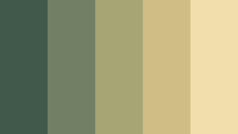
- HEX Codes: #40594a, #718064, #a8a574, #d0bd83, #f0dfac
- Mood: Natural, peaceful, and gently joyful.
- Use for: Use it for wellness content, garden videos, eco-friendly packaging, and nature-inspired website designs.
Olive greens and faded yellow create the impression of flowers captured on vintage film. The colors feel organic and approachable, with a gentle brightness that suits calm but optimistic content.
Meadow Film Bloom is useful for wellness videos, garden content, eco-friendly packaging, and nature-inspired websites. Use dark green for text and structure, then bring in faded yellow for buttons, icons, and sunny visual accents.
Coastal Memory Fade

- HEX Codes: #3d5960, #6f8583, #a9aaa0, #d4c29d, #f1dfb8
- Mood: Serene, airy, and wistful.
- Use for: This palette works well for beach videos, vacation recaps, hospitality branding, and calming lifestyle graphics.
Soft sea tones blend with faded sand and cream for a relaxed coastal mood. The slightly muted colors give modern designs a sun-worn analog finish without losing their clean appearance.
Use Coastal Memory Fade for beach videos, vacation recaps, hotel branding, and calm lifestyle graphics. The deep teal can define headings and frames, while sand and cream create open backgrounds that feel bright and peaceful.
Porchlight Summer
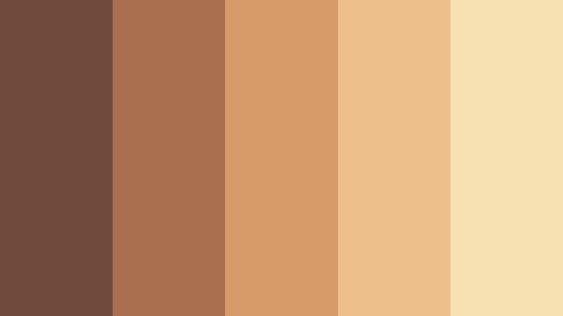
- HEX Codes: #704a3a, #a96f4f, #d69b69, #edc08b, #f7e1b3
- Mood: Friendly, nostalgic, and inviting.
- Use for: This palette is suited to summer campaigns, recipe videos, community brands, and warm lifestyle thumbnails.
Soft terracotta and golden peach feel like an evening spent outdoors. The palette is friendly and familiar, with warm highlights that can make everyday scenes feel more inviting.
Porchlight Summer works well for summer campaigns, recipe videos, community projects, and lifestyle thumbnails. Use terracotta for graphic structure and peach or cream for backgrounds, captions, and gentle transitions.
Modern Film-Inspired 8mm Film Color Palettes
Analog Studio Pop
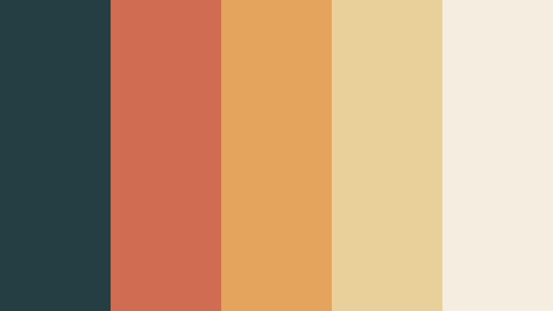
- HEX Codes: #243f43, #d06c52, #e5a45e, #e9cf99, #f3eee0
- Mood: Playful, creative, and design-forward.
- Use for: Use this palette for creator branding, video intros, product packaging, presentation slides, and bold social graphics.
A dark teal foundation lets coral and amber accents stand out with retro energy. The light cream shade balances the stronger colors and gives the palette a clean, contemporary finish.
Use Analog Studio Pop for creator branding, video intros, product launches, presentation slides, and bold social content. Teal can establish a recognizable brand base, while coral and amber can highlight calls to action and key moments.
Retro Creative Desk
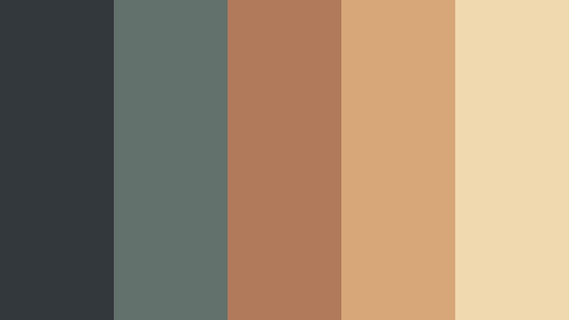
- HEX Codes: #33383d, #63716d, #b07a5b, #d8a777, #f0d9ae
- Mood: Thoughtful, creative, and grounded.
- Use for: This palette fits design portfolios, editing tutorials, productivity content, and editorial-style brand systems.
Slate, muted green, and warm tan suggest a creative workspace filled with analog tools. The colors feel polished but retain a handmade quality, making them suitable for thoughtful educational and creative content.
Apply Retro Creative Desk to design portfolios, editing tutorials, productivity videos, and editorial layouts. Use slate for structure, muted green for secondary elements, and warm tan to give thumbnails and title cards a tactile personality.
Cinematic Citrus Frame

- HEX Codes: #263c3b, #47705d, #9b9b58, #d8af55, #f1d995
- Mood: Energetic, fresh, and cinematic.
- Use for: This palette is ideal for food content, energetic thumbnails, motion graphics, startup branding, and digital campaigns.
Deep green and citrus gold create a lively film-inspired contrast. The combination brings vintage color science into bright, contemporary compositions while keeping the overall look grounded.
Use Cinematic Citrus Frame for food content, motion graphics, startup branding, and energetic thumbnails. Green works well as a background or frame color, while gold can direct attention to product details, captions, and animated accents.
Indie Film Poster
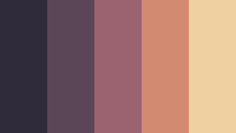
- HEX Codes: #302b3a, #5b4657, #9b6370, #d28b70, #efd0a1
- Mood: Artistic, expressive, and nostalgic.
- Use for: Use it for independent film promotions, podcast covers, music artwork, creative thumbnails, and event posters.
Plum shadows and faded coral create the look of a thoughtfully designed indie poster. The palette feels expressive and memorable, with a slightly unconventional balance that suits artistic projects.
Use Indie Film Poster for independent film promotions, podcast covers, music artwork, event posters, and creative thumbnails. Keep plum in the background for depth, then use coral and pale peach to make titles and visual details stand out.
Tips for Creating 8mm Film Color Color Palettes
Creating an effective 8mm Film Color palette is about balancing nostalgia with clarity. Combine warm browns, faded highlights, muted greens, dusty blues, or soft coral with enough contrast for readable text and recognizable branding. The best palette depends on the footage, audience, platform, and emotional response you want to create.
- Use dark brown, charcoal, deep teal, or plum for text and structural elements so captions remain readable over faded backgrounds.
- Pair warm 8mm Film Color tones with cream or pale beige to create soft contrast without losing the vintage mood.
- Limit the number of strong accent colors in a single edit. One coral, amber, gold, or rose accent is often enough to guide attention.
- Match the palette to the lighting in your footage. Warm palettes suit sunlight and indoor scenes, while blue-gray palettes work well for evening or overcast shots.
- Keep branding consistent by using the same colors for title cards, thumbnails, lower thirds, end screens, and social media templates.
- Check skin tones after applying a vintage filter. A nostalgic look should support natural faces rather than making them appear overly orange or gray.
- Test the palette on different screens and video platforms to confirm that shadows, highlights, and text maintain sufficient contrast.
- Use grain, softness, and faded contrast carefully. These effects can strengthen an analog mood, but too much texture may reduce detail and readability.
8mm Film Color palettes can shape the emotional direction of a project before viewers read a single word. Warm sepia and amber combinations suggest memory and comfort, while blue-gray, plum, and charcoal palettes create a more cinematic or reflective atmosphere. Sunlit greens, faded teal, and cream can make travel and lifestyle content feel relaxed and authentic.
Choose a palette that supports your footage and brand identity, then repeat its key colors across intros, thumbnails, captions, transitions, and end cards. This creates a visual system that feels intentional rather than randomly vintage.
Filmora makes it easier to test these palettes, match footage, and build a consistent analog-inspired look. Start with one of the HEX combinations above, adjust the strength for each scene, and refine the final result with filters, color controls, and well-placed graphic accents.
secure download