

 100% Security Verified | No Subscription Required | No Malware

Pastel Color shades are known for their soft, calming, and approachable character. Tints of pink, blue, green, yellow, lavender, and peach can create feelings of warmth, optimism, nostalgia, and relaxation. Because these colors are gentle on the eye, they work especially well when a project needs to feel friendly, expressive, and visually polished.
In video and design, Pastel Color combinations can shape the mood of thumbnails, intros, social posts, brand identities, packaging, and entire visual campaigns. This guide provides 15 Pastel Color color palettes with HEX codes for creators, designers, marketers, and Filmora users who want a consistent look across their projects.
In this article
Soft & Romantic Pastel Color Palettes
Blush Dawn
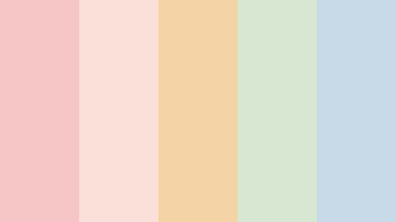
- HEX Codes: #f7c8c8, #f9e0d9, #f6d6a8, #d9e8d3, #c8dce8
- Mood: Gentle, warm, and quietly optimistic.
- Use for: This palette works well for lifestyle thumbnails, wedding videos, beauty branding, and soft social content.
Blush Dawn pairs warm blush and peach tones with airy sage and blue accents. The combination feels tender and welcoming, while the green and blue shades add enough balance to keep the design from looking too sweet or one-dimensional.
Try this palette for opening titles, romantic montage sequences, wedding invitations, beauty tutorials, or lifestyle thumbnails. Use blush and peach as the dominant colors, then reserve sage and blue for backgrounds, icons, text panels, or small accents.
Pro Tip: Enhance Your Pastel Color Visuals with Filmora
Filmora can help you carry the Blush Dawn mood throughout an entire edit. Use the warm blush and peach shades in title cards, lower thirds, transitions, and thumbnail graphics, then echo the sage and blue accents in b-roll overlays or end screens for a cohesive visual rhythm.
For a softer result, combine the palette with gentle fades, subtle film grain, and restrained motion. This approach keeps wedding videos, beauty content, and personal storytelling edits warm and consistent without making every frame look identical.
AI Color Palette
Creators can use a reference image, mood board, or Blush Dawn color card to establish a visual direction for an entire video. Filmora's AI Color Palette feature can help apply the reference look across clips, making different shots feel more unified.
This is useful when footage was recorded in different locations or under changing lighting conditions. Start with the blush, peach, sage, and blue relationship, then review each clip and make small adjustments where skin tones or highlights need extra care.
 secure download

HSL, Color Wheels & Curves
Use HSL controls to fine-tune the saturation and brightness of the blush, peach, sage, and blue channels. Lowering saturation slightly can create a more cinematic finish, while lifting the highlights gives skin tones and bright backgrounds a soft, airy appearance.
Color wheels and curves are useful for balancing contrast without losing the gentle character of the palette. Add a small amount of warmth to the highlights, keep shadows neutral, and use a soft curve to preserve detail in pale backgrounds. These color grading techniques can help create a polished result.
secure download1000+ Video Filters & 3D LUTs
Filmora's filter library can quickly extend the Blush Dawn look across different types of footage. Choose a soft portrait treatment for beauty clips, a warm cinematic filter for wedding scenes, or a lightly faded option for nostalgic lifestyle content.
Filmora's video filters and 3D LUTs make it easy to test several versions of the same pastel mood. Apply them lightly, then adjust intensity so the pink and peach tones remain visible without flattening natural contrast.
secure downloadLavender Promise
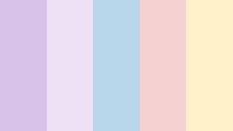
- HEX Codes: #d9c2e9, #eee1f5, #b9d7ea, #f6d1d1, #fff1c9
- Mood: Dreamy, graceful, and imaginative.
- Use for: Use this palette for music videos, bridal content, wellness graphics, book covers, and elegant brand intros.
Lavender Promise blends soft violet with powder blue, rose, and creamy yellow. The violet creates an imaginative foundation, while the pale blue and yellow prevent the design from feeling too heavy or overly formal.
Use lavender for title cards or large background areas, then add powder blue to support transitions and rose for emotional highlights. Creamy yellow can bring attention to captions, logos, and small details in bridal content, music videos, or wellness graphics.
Rosewater Reverie
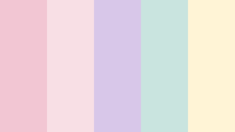
- HEX Codes: #f3c6d3, #f8dfe5, #d8c7e8, #c9e3df, #fff4d6
- Mood: Serene, affectionate, and nostalgic.
- Use for: This palette is ideal for romantic reels, self-care content, stationery, packaging, and soft editorial layouts.
Rosewater Reverie combines delicate pinks with lilac, mint, and warm ivory. It gives creative projects a calm, nostalgic character, making it a strong choice for visuals that should feel personal and comforting.
Use the pinks in romantic reels and self-care thumbnails, then bring in mint and lilac for graphic accents or background panels. Warm ivory works as a reliable neutral for packaging, stationery, editorial layouts, and readable text areas.
Peach Petal Mist
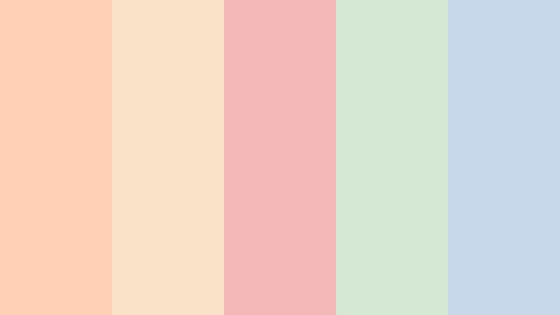
- HEX Codes: #ffd0b5, #f9e2c8, #f5b8b8, #d5e8d4, #c7d8eb
- Mood: Fresh, affectionate, and lighthearted.
- Use for: Use it for food videos, skincare campaigns, cheerful thumbnails, app illustrations, and seasonal social posts.
Peach Petal Mist brings together soft coral, cream, blush, green, and blue. It feels sunny and friendly while keeping a refined pastel balance, so it can work for both playful campaigns and polished brand content.
Make peach and cream the main colors in food videos or skincare graphics, then use blush for calls to action and green or blue for contrast. The palette also works well in seasonal intros, recipe cards, app illustrations, and bright social media templates.
Nature Inspired Pastel Color Palettes
Meadow Haze
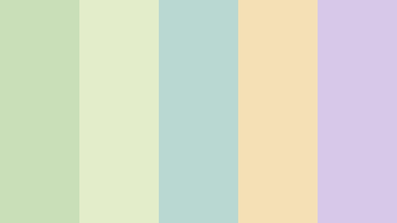
- HEX Codes: #c9dfb8, #e4edc9, #b9d8d1, #f5dfb5, #d7c7e8
- Mood: Natural, peaceful, and restorative.
- Use for: This palette works well for eco branding, travel videos, nature thumbnails, wellness interfaces, and sustainable packaging.
Meadow Haze mixes muted green with misty teal, butter yellow, and lavender. The colors create an organic atmosphere that feels grounded and modern, with enough variety to support both natural footage and designed graphics.
Use green and teal for nature video overlays or eco branding, while butter yellow can highlight key information in travel thumbnails. Lavender adds a gentle creative accent to wellness interfaces, sustainable packaging, and calm video intros.
Seaside Sorbet
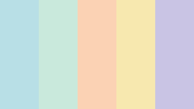
- HEX Codes: #b8dfe5, #c8e9dc, #f9d3b4, #f6e8ae, #c9c4e4
- Mood: Bright, breezy, and refreshing.
- Use for: Use this palette for summer travel content, beach thumbnails, resort branding, food packaging, and upbeat social videos.
Seaside Sorbet pairs ocean blue and mint with peach, lemon, and soft violet. The combination feels playful and refreshing, making it a natural fit for warm-weather storytelling and light, energetic content.
Use blue and mint as the foundation for beach footage, resort graphics, and travel intros. Peach and lemon can draw attention to titles, location labels, or product details, while soft violet adds depth to thumbnails and social templates.
Moss And Milk

- HEX Codes: #b7c9a8, #dce5c8, #f5efd9, #d6c1b5, #b8d3d8
- Mood: Calm, earthy, and understated.
- Use for: This palette is suited to minimalist websites, home decor videos, eco campaigns, product labels, and quiet lifestyle content.
Moss And Milk balances soft olive with pale cream, dusty taupe, and blue gray. It offers a natural and sophisticated foundation for clean visual design, especially when a project needs warmth without bright or saturated colors.
Try cream as the main background color and use olive for headings, borders, or product accents. Taupe and blue gray can support home decor footage, minimalist websites, product labels, and quiet lifestyle edits with a calm editorial feel.
Wildflower Air

- HEX Codes: #c9b7e8, #f4bfd0, #f8dca9, #c7e1c0, #b9d6e5
- Mood: Joyful, airy, and expressive.
- Use for: This palette works well for creative portfolios, festival graphics, playful intros, floral packaging, and colorful social content.
Wildflower Air combines lavender, pink, golden cream, leaf green, and sky blue. It feels like a bright garden translated into a polished pastel system, with enough contrast to make creative compositions feel lively.
Use lavender and pink for expressive title treatments, then add green and blue to separate sections or support floral imagery. Golden cream is useful for warm highlights in festival graphics, portfolio pages, packaging, and colorful social videos.
Elegant & Modern Pastel Color Palettes
Quiet Luxury

- HEX Codes: #d9d2c3, #eee8dc, #c8d5dc, #d8c5d5, #b9c4ba
- Mood: Refined, composed, and contemporary.
- Use for: Use it for premium brand intros, fashion videos, editorial graphics, website interfaces, and minimalist product design.
Quiet Luxury uses restrained beige, gray blue, mauve, and sage to create a polished pastel look. Its low-key color relationships add softness without losing structure, making the palette suitable for premium and minimalist visual identities.
Use beige and cream as background tones, then introduce gray blue or mauve in typography, product callouts, and motion graphics. The muted sage shade can connect fashion footage, editorial layouts, and luxury product videos to a more natural visual direction.
Cloud Studio
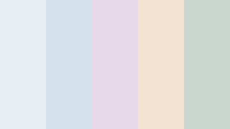
- HEX Codes: #e8edf1, #d5e2ec, #e7d9e8, #f3e3d0, #cbd8d2
- Mood: Clean, spacious, and creative.
- Use for: This palette is ideal for design portfolios, productivity apps, tutorial videos, tech branding, and bright workspace content.
Cloud Studio combines cool whites and blue grays with soft lilac, cream, and sage. The result is clear and modern but still approachable, which makes it useful for digital products and educational content.
Use the pale blue grays for interface backgrounds and tutorial panels, then add lilac or sage to show categories, steps, or feature highlights. Cream can soften tech branding and make workspace videos feel more comfortable and inviting.
Sage Gallery

- HEX Codes: #b9cbb8, #dce6d3, #e8d7c8, #c9d7e4, #d8c8dc
- Mood: Artful, balanced, and tranquil.
- Use for: Use this palette for gallery-style websites, interior design content, calm presentations, lifestyle packaging, and curated social feeds.
Sage Gallery layers muted green with warm beige, powder blue, and dusty lavender. It feels curated and peaceful, giving visual storytelling projects a considered look without relying on harsh contrast.
Let sage guide the overall identity, then use beige for spacious backgrounds and blue for informational elements. Dusty lavender can bring a subtle artistic note to interior design videos, gallery websites, presentations, and lifestyle packaging.
Porcelain Bloom

- HEX Codes: #f2e9e1, #e8cfd2, #c9dce0, #d8d2e8, #d9e2c7
- Mood: Delicate, polished, and serene.
- Use for: This palette works well for beauty packaging, boutique branding, editorial thumbnails, calm user interfaces, and elegant product videos.
Porcelain Bloom pairs creamy porcelain with dusty rose, blue, violet, and pale green. The blend feels delicate but versatile, offering a refined foundation for both print layouts and digital campaigns.
Use porcelain as a spacious background and dusty rose for brand details or beauty-focused titles. Blue, violet, and pale green can distinguish product features, navigation elements, and visual sections in boutique branding or elegant product videos.
Playful Pastel Color Palettes
Candy Cloud
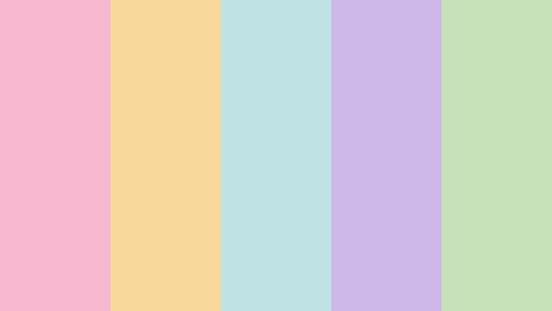
- HEX Codes: #f7b8cf, #f9d99b, #bfe3e5, #cdb8e8, #c8e1b8
- Mood: Playful, cheerful, and youthful.
- Use for: Use this palette for kids content, gaming thumbnails, creator intros, app illustrations, stickers, and energetic social campaigns.
Candy Cloud combines sweet pink, yellow, aqua, lavender, and green for a cheerful visual punch. It is colorful enough to stand out in busy feeds while remaining soft, friendly, and easy to adapt.
Use pink or aqua as the main attention color in gaming thumbnails and creator intros. Yellow can highlight buttons and text, while lavender and green help organize stickers, icons, app illustrations, and energetic social graphics.
Lemonade Picnic
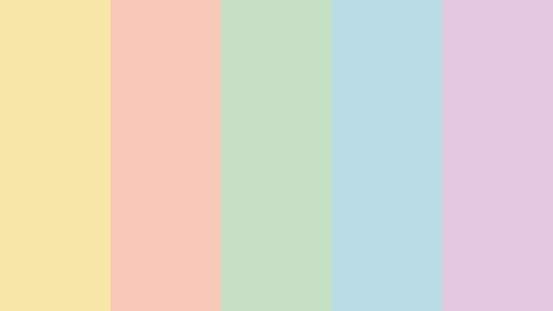
- HEX Codes: #f7e7a8, #f8c8b8, #c6e0c5, #b9dce5, #e3c8df
- Mood: Sunny, casual, and inviting.
- Use for: This palette is great for recipe videos, picnic content, summer campaigns, playful packaging, and friendly community posts.
Lemonade Picnic blends lemon yellow with coral, mint, sky blue, and lilac. It creates a relaxed and happy atmosphere with a distinct seasonal charm, making it effective for content that should feel social and approachable.
Use lemon yellow for headings and graphic highlights, with coral supporting food shots or friendly calls to action. Mint, blue, and lilac can separate scenes in recipe videos, summer campaigns, packaging designs, and community-focused posts.
Bubblegum Breeze
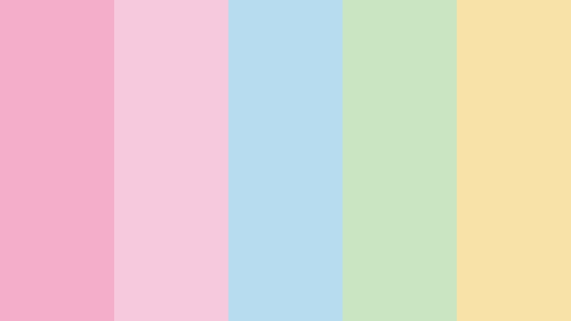
- HEX Codes: #f4aeca, #f7c9dd, #b8dcef, #c9e6c0, #f8e2a8
- Mood: Fun, breezy, and optimistic.
- Use for: Use it for fashion reels, lifestyle thumbnails, pop-inspired branding, social templates, and playful motion graphics.
Bubblegum Breeze pairs bright pastel pink with airy blue, fresh green, and soft yellow. It feels upbeat and expressive without overwhelming the composition, especially when the brighter pink is used selectively.
Use pink for fashion titles, stickers, or brand moments, then rely on blue and green to create visual breathing room. Yellow can add energy to transitions and motion graphics while keeping lifestyle thumbnails and social templates welcoming.
Pastel Arcade
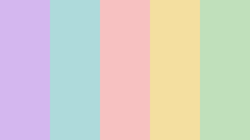
- HEX Codes: #d4b8ed, #aedadb, #f7c1c1, #f5dfa0, #bfe0b8
- Mood: Energetic, creative, and nostalgic.
- Use for: This palette works well for gaming content, retro-inspired videos, music graphics, creator branding, and interactive digital experiences.
Pastel Arcade combines lavender, aqua, pink, yellow, and green for a playful retro mood. It brings personality to digital projects while preserving a soft finish that feels more contemporary than highly saturated neon colors.
Use aqua and lavender for gaming interfaces or retro title cards, then bring in pink and yellow for score markers, transitions, and key graphics. Green can balance the composition and give creator branding or music videos a fresh accent.
Tips for Creating Pastel Color Color Palettes
Pastel Color combinations are easiest to use when each shade has a clear role. Choose one or two dominant colors, add a supporting neutral, and reserve the remaining shades for accents. This creates visual harmony across video footage, thumbnails, brand graphics, and social content.
- Use one dominant pastel shade for backgrounds or large graphic areas, then assign secondary colors to titles, borders, icons, and transitions.
- Check text readability carefully. Pair pale backgrounds with a darker pastel, charcoal, navy, or another strong neutral for important captions.
- Keep brand consistency by saving the chosen HEX codes and reusing them in thumbnails, intros, lower thirds, end screens, and social templates.
- Match the palette to the footage. Warm pastel combinations suit golden light and skin-focused content, while blue and green palettes work well with outdoor or cool-toned scenes.
- Use contrast through brightness and temperature when saturation is low. A slightly darker sage or blue can define a composition without disrupting a soft mood.
- Do not use every color equally. A simple ratio such as 60 percent dominant color, 30 percent supporting color, and 10 percent accent can keep the design organized.
- Test the palette on different screens and export settings. Very pale yellow, pink, and blue shades can lose definition when compressed for social platforms.
- Add a small amount of texture, shadow, or motion when a pastel design feels flat. Subtle grain, soft gradients, and gentle transitions can create depth without making the look harsh.
Pastel Color palettes can make a project feel calm, romantic, natural, elegant, youthful, or imaginative. The best combination depends on the story you want to tell and the audience you want to reach.
From Blush Dawn and Lavender Promise to Quiet Luxury and Pastel Arcade, these HEX-coded palettes give you a practical starting point for thumbnails, intros, branding, social posts, and complete video styles. You can adjust saturation, contrast, and accent colors as your footage and platform require.
Try these Pastel Color palette ideas in Filmora to create a consistent visual identity across your edits. Use color matching, grading tools, filters, and LUTs to turn a reference image or mood board into a polished video look.
secure downloadNext: Neon Color Color Palette
