

 100% Security Verified | No Subscription Required | No Malware

The Free Dribbble Motion LUT Pack helps motion designers and product designers give interface animations a polished visual direction. Use these Dribbble motion video filters to shape contrast, color balance, and atmosphere across motion studies, UI demos, and design presentations.
Each filter is designed for fast experimentation in Filmora, so you can test different treatments without rebuilding your color grade from scratch. Start with a clean interface capture, apply a look that supports the concept, and fine-tune intensity until the motion feels clear, intentional, and presentation-ready.
In this article
Neon Interface Studies
Electric Blue UI
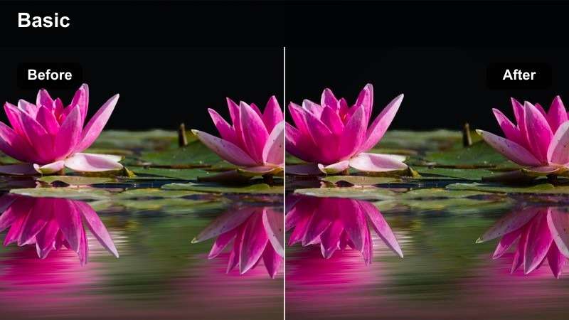
- Effect look: cool cyan highlights with crisp blue shadows and controlled contrast
- Best for: dark mode prototypes, product dashboards, and futuristic motion studies
- Editing tip: reduce intensity slightly on bright interface elements to preserve text legibility
Electric Blue UI gives dark interface footage a precise cyan and blue treatment that makes navigation elements, charts, and motion paths stand out. The controlled contrast creates a sleek visual direction while keeping the overall design suitable for polished product presentations.
In Filmora, apply the filter to a short interface clip first, then adjust strength, exposure, and contrast around the brightest screen elements. Lowering the intensity slightly can help preserve small labels and white text while maintaining the futuristic atmosphere.
Magenta Dashboard
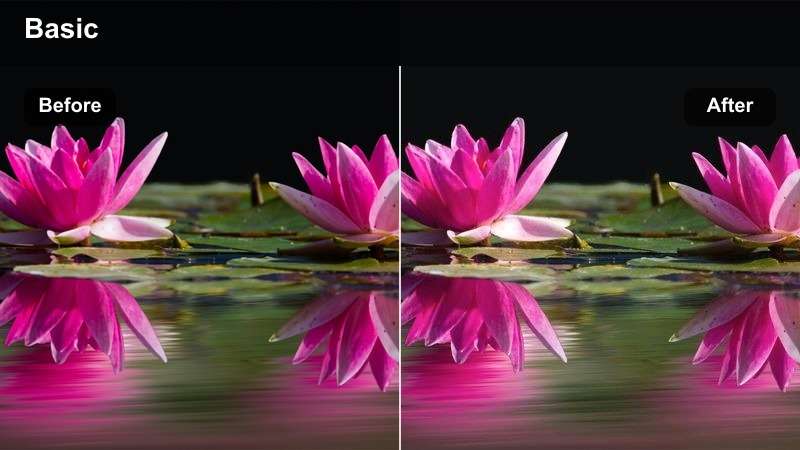
- Effect look: violet midtones with magenta accents and soft luminous highlights
- Best for: creative analytics screens, music app demos, and expressive product presentations
- Editing tip: balance saturated pink elements with neutral gray panels for a focused visual hierarchy
Magenta Dashboard introduces vivid violet midtones and expressive pink accents to creative interface animations. It adds personality to analytics screens and product demos while preserving enough structure for viewers to follow the layout and interaction flow.
Use this Filmora filter at a moderate strength when your source already includes saturated interface colors. Keep large background panels closer to neutral and reserve the strongest magenta tones for selected data points, buttons, or active states.
Cyan Glass Interface
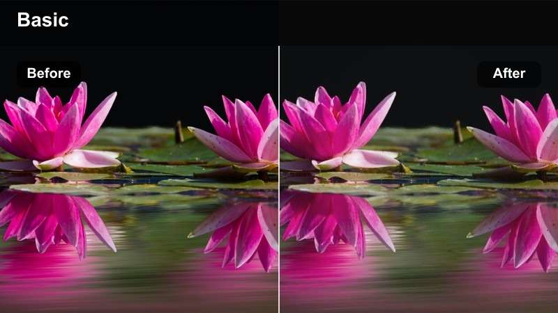
- Effect look: translucent cyan tones with lifted blacks and polished highlights
- Best for: glassmorphism concepts, spatial UI studies, and futuristic onboarding sequences
- Editing tip: use moderate exposure and avoid clipping bright glass layers during transitions
Cyan Glass Interface creates an airy treatment for layered cards, translucent panels, and spatial interface concepts. Lifted blacks and controlled highlights help the glass effect feel polished without removing the depth between overlapping elements.
Apply the filter before refining individual overlays in Filmora, then check the brightest glass edges during animated transitions. Moderate exposure and careful opacity adjustments can preserve separation between cards, backgrounds, and interface text.
Build a Matching AI Color Palette
Use Filmora's AI color tools to explore palettes that complement the selected Dribbble motion filter. A coordinated palette can help connect interface accents, background tones, and presentation graphics.
Start with the dominant color in your product concept, then refine the generated palette so it supports accessibility, brand consistency, and clear motion hierarchy.
 secure download

Editorial Product Presentations
Warm Editorial UI
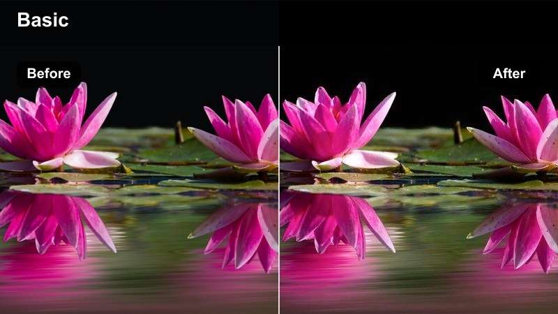
- Effect look: warm beige highlights with muted charcoal contrast and refined skin-neutral balance
- Best for: brand presentations, portfolio walkthroughs, and premium product case studies
- Editing tip: preserve neutral whites in interface cards so the warm treatment feels intentional rather than tinted
Warm Editorial UI gives product stories a refined, inviting tone through beige highlights and muted charcoal contrast. It works especially well for portfolio walkthroughs and case studies that need a premium visual language rather than a heavily stylized effect.
In Filmora, combine this look with slower camera movement and deliberate transitions to support an editorial pace. Keep interface cards and large white areas close to neutral so the warmth feels designed instead of accidental.
Monochrome Product Flow
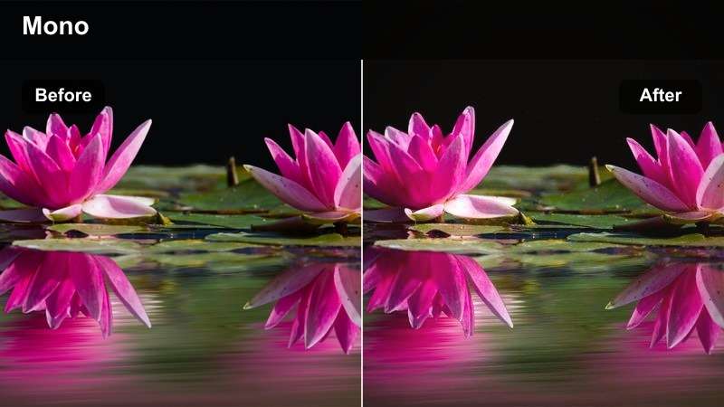
- Effect look: neutral grayscale with strong geometry and soft controlled contrast
- Best for: UX process videos, wireframe studies, and typography-led product demos
- Editing tip: add one brand accent after grading to guide attention through the interaction sequence
Monochrome Product Flow removes distracting color so viewers can focus on layout, typography, spacing, and interaction logic. Its restrained grayscale treatment is useful for UX process videos and wireframe studies where structure carries the story.
Apply the filter across the sequence in Filmora, then add one carefully chosen brand accent to active states or the final callout. This approach keeps the presentation consistent while giving important interactions a clear visual signal.
Soft Lavender Brand
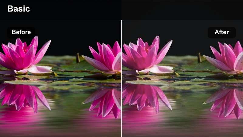
- Effect look: pastel lavender midtones with soft white highlights and gentle blue shadows
- Best for: wellness platforms, community products, and friendly brand motion systems
- Editing tip: keep shadow detail visible when grading pale interface backgrounds and rounded cards
Soft Lavender Brand creates a calm, contemporary appearance for rounded cards, friendly mobile products, and wellness-oriented interfaces. Pastel midtones and gentle blue shadows support a welcoming presentation without overpowering the underlying design.
Use gentle contrast and avoid excessive sharpening in Filmora when the source relies on soft spacing and rounded forms. A subtle vignette can help center attention on the active screen while keeping the overall brand mood light.
Dark Mode Motion Demos
Midnight Cobalt
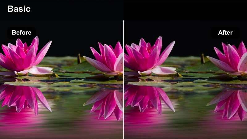
- Effect look: deep navy blacks with cobalt highlights and a cinematic cool finish
- Best for: developer tools, fintech dashboards, and cinematic app launch sequences
- Editing tip: lift the darkest tones slightly so navigation elements remain visible on compressed exports
Midnight Cobalt gives dark interfaces a cinematic cool finish with navy blacks and concentrated cobalt highlights. It is a strong option for fintech dashboards, developer tools, and product reveals that depend on a focused nighttime atmosphere.
Lift the darkest tones slightly in Filmora if navigation elements or subtle panel boundaries begin to disappear. Review the completed export on both bright displays and standard laptop screens because compression can reduce separation in dark footage.
Graphite Contrast
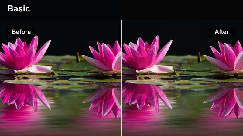
- Effect look: graphite neutrals with firm contrast and clean white interface accents
- Best for: design system previews, enterprise software demos, and technical motion studies
- Editing tip: reduce contrast during fast zooms to prevent thin borders and icons from disappearing
Graphite Contrast delivers a structured neutral look for technical motion studies and enterprise software demos. Firm contrast and clean white accents help viewers inspect components, states, and relationships across a design system preview.
Use the filter at a lower contrast level during fast zooms or detailed transitions in Filmora. Avoid adding too much glow, since crisp borders, icons, and labels need to remain easy to evaluate throughout the sequence.
Emerald Data Glow
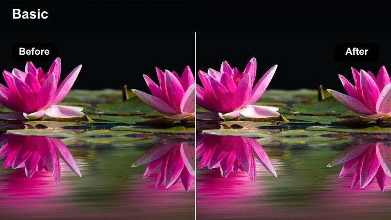
- Effect look: deep green shadows with emerald data highlights and balanced neutral surfaces
- Best for: data visualization, sustainability dashboards, and progress tracking interfaces
- Editing tip: keep green highlights localized to charts and status indicators for stronger meaning
Emerald Data Glow is designed for data-driven interfaces where color needs to support meaning. Deep green shadows and emerald highlights can make charts, progress indicators, and completed states feel connected and intentional.
In Filmora, keep emerald tones localized to charts and status indicators instead of tinting every surface. Neutral panels around those elements preserve information hierarchy and make positive movement easier to understand.
Design Presentation Finales
Sunset Gradient Reveal
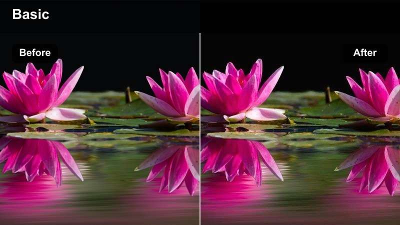
- Effect look: coral highlights with violet shadows and smooth high-energy gradient transitions
- Best for: portfolio finales, campaign launch screens, and bold concept presentations
- Editing tip: time the strongest color shift with the final product reveal or logo animation
Sunset Gradient Reveal adds energy to product launches and portfolio finales through coral highlights and violet shadows. Its expressive color movement is especially effective when the presentation builds toward a logo, product, or campaign reveal.
Use keyframes in Filmora to increase filter strength near the final milestone rather than applying maximum intensity throughout the clip. This creates a more purposeful build and leaves the strongest visual impact for the ending.
Clean Studio White
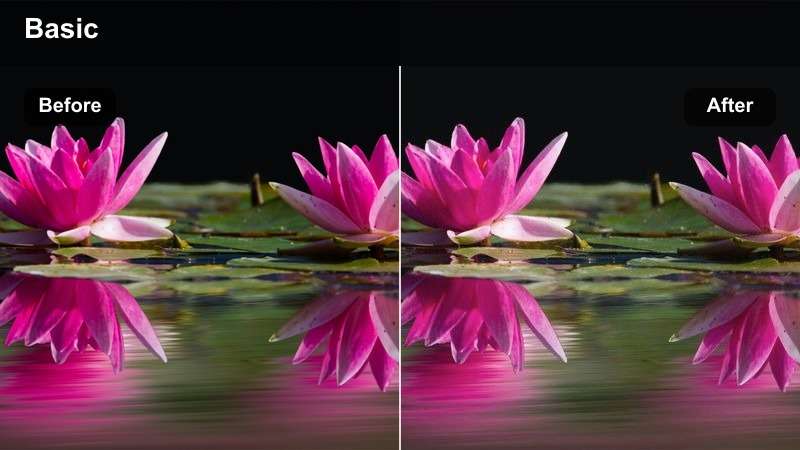
- Effect look: bright neutral whites with soft gray shadows and precise natural color
- Best for: case study covers, product mockups, and minimal interface demonstrations
- Editing tip: lower highlights slightly when white cards or large empty canvases dominate the frame
Clean Studio White provides an accurate, polished treatment for minimal product showcases and interface demonstrations. Bright whites, soft gray shadows, and natural color help the presentation feel clean without appearing flat or overprocessed.
Lower highlights slightly in Filmora when large white canvases or interface cards dominate the frame. Retain gentle shadows around devices and panels so separate layers remain visible against the bright background.
Coral Action Accent
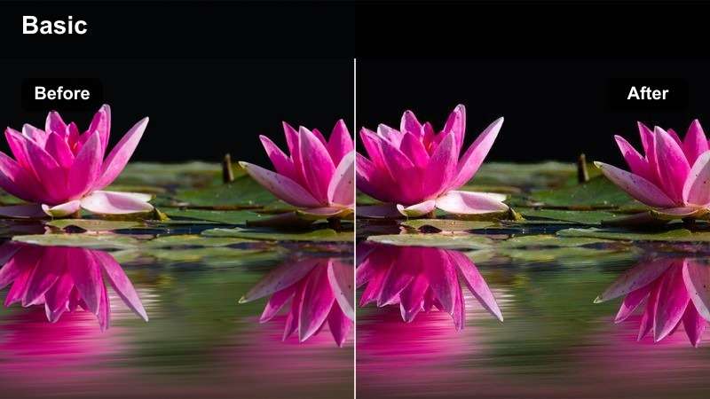
- Effect look: warm coral interaction states with neutral backgrounds and polished contrast
- Best for: mobile app walkthroughs, call-to-action sequences, and energetic brand demos
- Editing tip: use selective masking if only buttons, cursors, or confirmation states should carry the coral tone
Coral Action Accent emphasizes the moments that matter most in a mobile walkthrough, including buttons, cursor paths, and confirmation states. Neutral backgrounds keep the accent focused so viewers can quickly understand the interaction sequence.
Use selective masking in Filmora when only specific interface elements should carry the coral tone. Keep the accent consistent from the first action through the final confirmation so the short demo feels connected and easy to follow.
Preview Dribbble Motion Video Filters
Preview each filter on a short interface clip before applying it to a full presentation. This makes it easier to compare contrast, highlight behavior, and color shifts across animated screens.
For the clearest comparison, use the same clip, export settings, and filter intensity for every preview.
secure download1000+ Video Filters and 3D LUTs
Filters can establish the overall mood, while LUTs help guide the broader color transformation. Apply them carefully in stages so your UI elements remain readable and your brand colors stay controlled.
Try a low-strength filter first, add a compatible LUT, and finish with manual exposure and saturation adjustments for a balanced result.
secure downloadTips for Using Dribbble Motion Lut Download Filters in Filmora
- Capture or export interface footage at the highest practical resolution before applying color treatments.
- Use short test clips to compare Dribbble motion color grading styles before grading the full project.
- Keep text, icons, and interaction states legible after every filter adjustment.
- Apply lower intensity when the source footage already contains strong brand colors or gradients.
- Use keyframes to vary filter strength during reveals, transitions, and presentation finales.
- Check the final export on both dark and light displays to catch crushed shadows or clipped highlights.
- Save a clean ungraded version of the project so you can compare the effect and revise the visual direction later.
The Free Dribbble Motion LUT Pack gives motion designers and product designers a practical starting point for UI motion color grading. From neon interface studies to clean design presentation finales, these filters can help your motion work feel more cohesive and intentional.
Download the pack, test each look on your own motion studies, and adjust intensity to match the product, audience, and presentation goal. For more coordinated looks, continue with the Dribbble motion LUT collection.
secure download