

 100% Security Verified | No Subscription Required | No Malware

Stop Motion Color sits at the meeting point of tactile craft and on-screen storytelling. Warm clays, paper layers, lantern light, and grainy film stock all send a signal: this world was built by hand, one frame at a time. In video, those hues shape how viewers feel about a vlog intro, a claymation brand mark, a thumbnail, or a title card. Soft pinks and mint suggest a friendly workshop. Deep navy and ember red hint at a secret night shoot. Sepia and dusty gold pull a sequence toward archive and memory.
When you lock a Stop Motion Color palette early, intros, lower thirds, packaging stills, and social cuts stay on the same handmade wavelength. The 15 Stop Motion Color color palettes below include HEX codes you can drop into titles, overlays, and set design. Filmora users can carry the same combinations through color matching, HSL tweaks, filters, and LUTs so every frame still looks like it came from the same tiny studio.
In this article
Handmade Clay Stop Motion Color Palettes
Plasticine Workshop Glow
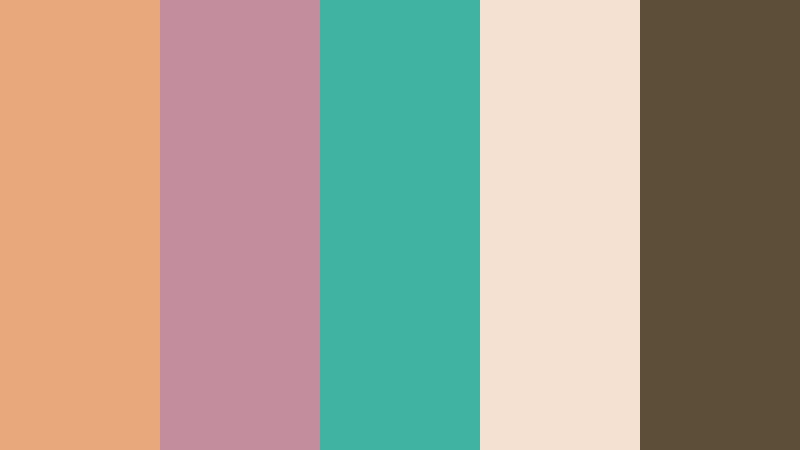
- HEX Codes: #e8a87c, #c38d9e, #41b3a3, #f4e1d2, #5d4e37
- Mood: Tactile, playful, and warmly handmade
- Use for: Works well for claymation brand intros, craft vlog thumbnails, and behind-the-scenes studio graphics.
Soft clay pinks, mint, and workshop brown feel like a table full of fresh plasticine, with fingerprints still in the light. The mix reads friendly rather than childish, so it can carry a maker tutorial without looking like a toy commercial. Use the cream as a clean background, mint for UI accents, and the brown for type that needs to sit on the set.
On video, this palette holds together for channel art, end screens, and BTS stills of the sculpting desk. Keep the peach and rose in titles, then let mint flash on buttons or progress bars so the handmade look stays consistent from thumbnail to final frame.
Pro Tip: Keep Stop Motion Color Clay Tones Consistent in Filmora
Handmade footage shifts under desk lamps, window light, and phone cameras, so the same plasticine can look orange in one shot and dusty in the next. Filmora helps you lock Plasticine Workshop Glow across intros, craft vlogs, and social cuts by matching highlights to the cream HEX, pulling midtones toward clay pink, and keeping shadows in workshop brown. Apply the look to titles and overlays so the edit still feels like one studio, even when the raw frames were shot on different days.
Save the grade as a custom look, then reuse it on thumbnails, lower thirds, and recap reels. That way the mint accent and warm clay stay on brand instead of drifting toward generic pastel.
AI Color Palette
If you already have a photo of your clay table, a color card, or a finished puppet still, you can feed that reference into Filmora and push the whole timeline toward the same Stop Motion Color mix. Filmora's AI Color Palette feature reads the dominant hues and maps them onto clips, so peach, rose, mint, and brown land in similar ranges from the first title to the last making-of shot.
This is especially useful when you mix DSLR close-ups with phone B-roll. The tool keeps the handmade palette readable on small screens without forcing you to grade every clip from scratch.
 secure download

HSL, Color Wheels & Curves
After the global match, fine-tune Stop Motion Color clay with HSL, wheels, and curves. Nudge orange and magenta toward #e8a87c and #c38d9e, keep mint from going neon, and drop the brown so type still reads on cream. Lift the highlights slightly so the plasticine looks lit, then roll the shadows toward #5d4e37 for a desk-lamp weight.
Filmora's HSL color wheels and curves let you protect skin and clay highlights while you push the rest of the frame into the palette. A gentle S-curve adds contrast for thumbnails without crushing the tactile texture you spent hours sculpting.
secure download1000+ Video Filters & 3D LUTs
When you need a faster pass, Filmora's video filters and 3D LUTs can stylize Stop Motion Color palettes without flattening the clay. Warm analog LUTs support the peach and brown, while a light film-grain filter adds the handmade texture viewers expect from frame-by-frame work.
Preview a few looks on a hero close-up, then apply the winner to titles and recap montages so the whole package still matches Plasticine Workshop Glow. Dial the intensity down if the mint starts to clip or the cream turns yellow.
secure downloadFelt Wire Studio Mix
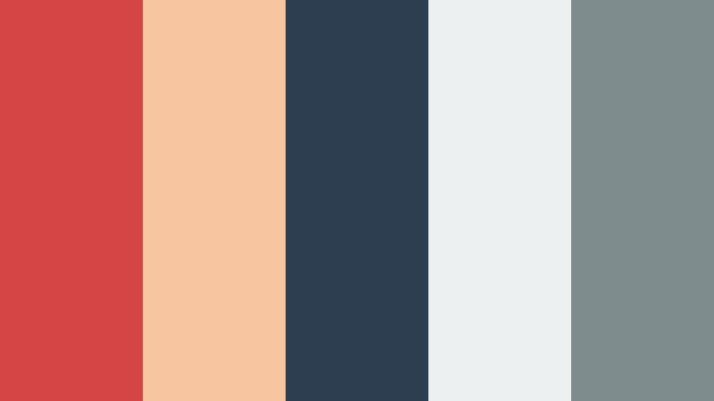
- HEX Codes: #d64545, #f7c59f, #2c3e50, #ecf0f1, #7f8c8d
- Mood: Crafty, focused, and slightly theatrical
- Use for: Ideal for stop-motion course covers, felt puppet titles, and educational social clips.
Felt red, peach, and steel gray recall wire armatures on a tidy workbench. The red gives puppets a stage presence, while cool gray and paper white keep the frame from turning into a circus. It suits skill-share intros and craft-brand packaging that still need a studio story.
Use navy-gray for backgrounds and captions, peach for skin-adjacent felt, and the red as a single accent on titles or chapter markers. That contrast stays sharp in square posts and course thumbnails where you only have a second to look professional and handmade at once.
Earthen Armature Warmth

- HEX Codes: #8d6e63, #d7ccc8, #bf360c, #fff8e1, #4e342e
- Mood: Grounded, rustic, and quietly intense
- Use for: Great for earthy product spots, pottery-inspired motion, and warm YouTube end cards.
Terracotta, cream, and deep clay brown give frames a kiln-fired weight. The palette feels slower and more physical than bright craft colors, which helps artisan brands and tactile food or craft commercials. Keep the burnt orange as a spark, not a wash, so the earth tones stay premium.
On end cards and product spots, set cream as negative space, brown as type, and terracotta on the hero object. The result looks like a still from a studio with real clay on the floor, not a stock overlay.
Sculpted Honey Light
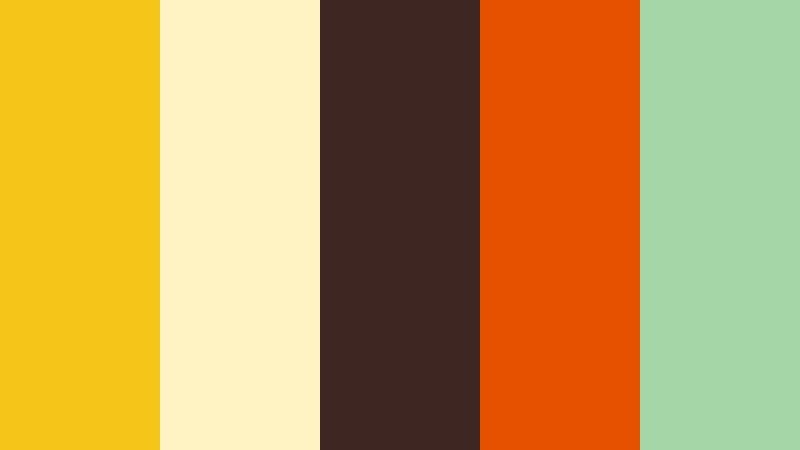
- HEX Codes: #f5c518, #fff3c4, #3e2723, #e65100, #a5d6a7
- Mood: Sunny, curious, and inviting
- Use for: Perfect for kids craft channels, honey-toned title cards, and cheerful app splash screens.
Honey gold, orange, and leaf green feel like sunlight on a sculpting desk. The dark brown grounds the brightness so titles stay readable, while green keeps the mix from turning into pure candy. Use it for upbeat tutorials and playful brand kits that still need a handmade edge.
Let gold lead the thumbnail, orange punch the call to action, and green sit on secondary icons. In motion, a slow wash of honey light across a clay hero shot can sell curiosity before the first voiceover line.
Cinematic Frame Stop Motion Color Palettes
Midnight Set Lantern

- HEX Codes: #1a1a2e, #e94560, #0f3460, #f9ed69, #16213e
- Mood: Dramatic, secretive, and story-driven
- Use for: Strong for trailer thumbnails, dark fairytale shorts, and moody title sequences.
Navy, lantern yellow, and ember red stage a night shoot on a tiny set. The yellow behaves like a practical lamp, the red like a curtain or a warning, and the deep blues hold the rest of the world in shadow. Mystery stories and cinematic vlog covers pop in a feed because the contrast is already built in.
Keep most of the frame in #1a1a2e and #16213e, then spend the yellow on one light source or a title word. That restraint makes a 15-second trailer feel bigger than the table it was shot on.
Grainy Film Amber
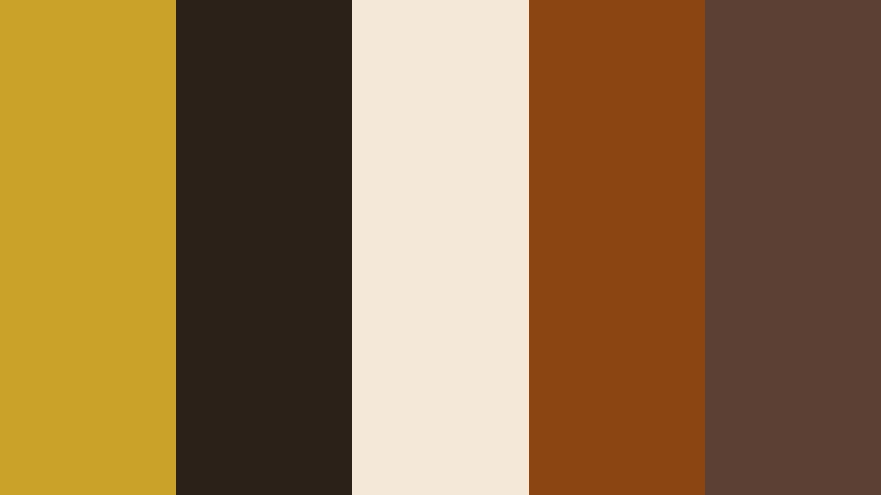
- HEX Codes: #c9a227, #2b2118, #f4e9d8, #8b4513, #5c4033
- Mood: Nostalgic, textured, and analog
- Use for: Fits film-look overlays, vintage ads, and grainy social teasers.
Amber, walnut, and paper cream mimic old stock and dusty gels. The palette is less about brightness and more about the feeling of a print that has lived in a can. Choose it for analog-style recaps and heritage brand films where Stop Motion Color should look like it was processed, not designed in a template.
Pair cream with walnut type, then let amber sit on a single prop or logo lockup. A light grain overlay on top of these HEX values sells the analog story without muddying the cutouts.
Shadow Box Drama
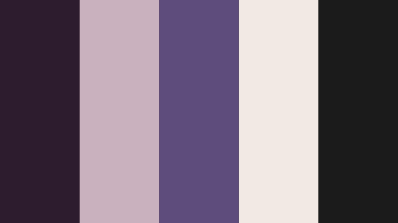
- HEX Codes: #2d1b2e, #c9b1bd, #5c4d7d, #f2e9e4, #1b1b1b
- Mood: Intimate, poetic, and slightly haunted
- Use for: Excellent for poetry videos, shadow-puppet sequences, and elegant UI dark modes.
Plum, lilac gray, and ink black feel like a lit box of cut silhouettes. The palette supports quiet narratives and premium editorial motion because it never shouts. Paper cream keeps captions readable while purple midtones give depth to layers of card and fabric.
Use black and plum for the box interior, lilac for secondary type, and cream for the silhouette edge. The same mix works in a dark-mode interface if you animate a stop-motion brand into an app or a premium series page.
Timelapse Ember Stage
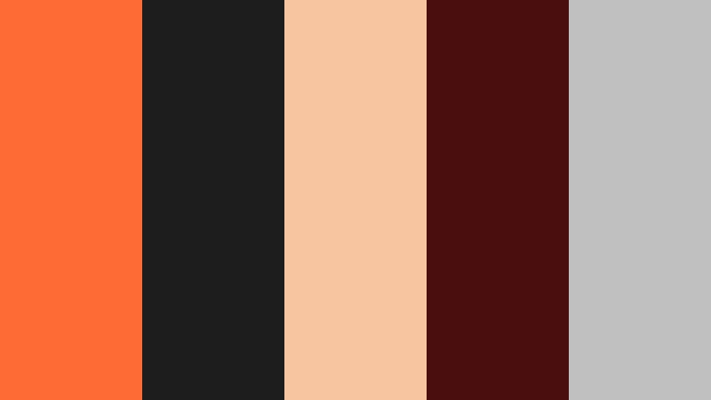
- HEX Codes: #ff6b35, #1d1d1d, #f7c59f, #4a0e0e, #c0c0c0
- Mood: Urgent, glowing, and high-contrast
- Use for: Use in action recaps, making-of montages, and high-energy YouTube intros.
Ember orange against charcoal and silver reads like a hot lamp over a stage. Fast cuts stay readable on thumbnails and lower thirds because the orange is a clear signal color and the darks hold the rest of the information. Peach keeps faces and felt from going harsh under that heat.
Reserve #ff6b35 for motion hits, arrows, and the first second of an intro. Let silver handle UI chrome and charcoal carry the background so the energy never turns into visual noise.
Playful Paper Cut Stop Motion Color Palettes
Paper Theater Sunrise

- HEX Codes: #ff6b6b, #ffe66d, #4ecdc4, #f7fff7, #1a535c
- Mood: Bright, storybook, and optimistic
- Use for: Great for kids stories, explainer openers, and colorful Instagram reels.
Coral, lemon, and teal stack like layered paper at dawn. The near-white sheet color keeps the stack airy, while deep teal gives type a place to land. The mix is friendly for educational series and cheerful brand kits that still need clear contrast on mobile.
Build scenes as overlapping planes: lemon sky, coral characters, teal ground. In a reel, flash the coral on the hook text, then settle into teal captions so the storybook energy does not fight the voiceover.
Brick Table Daydream

- HEX Codes: #c41e3a, #fdd835, #1565c0, #eceff1, #212121
- Mood: Toyful, bold, and energetic
- Use for: Works for toy unboxings, desk-build time-lapses, and clickable channel art.
Primary brick red, yellow, and blue sit on clean table gray. It shouts playtime while staying sharp for UI buttons and packaging. The near-black is there so you can still set a strong headline over a busy brick build.
Use gray as the desk, black for the channel name, and the three primaries as the toys themselves. Thumbnails stay clickable because the colors already behave like a well-known brick brand without copying a logo.
Puppet Booth Carnival

- HEX Codes: #ff4d6d, #ffd23f, #3d5a80, #ee6c4d, #293241
- Mood: Festive, loud, and theatrical
- Use for: Ideal for festival recaps, puppet-show titles, and event motion graphics.
Booth pink, mustard, and carnival navy feel like tickets and curtains. Use it when a sequence needs parade energy and clear contrast. The coral-orange sits between pink and gold so the palette does not split into two competing brands.
Let navy own the booth interior and captions. Spend pink and mustard on bunting, type, and a single moving puppet so festival recaps stay loud without becoming unreadable on a phone.
Cutout Garden Story
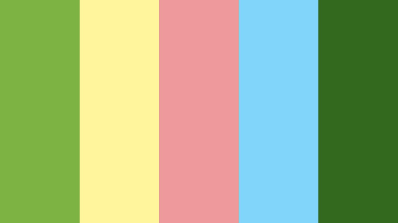
- HEX Codes: #7cb342, #fff59d, #ef9a9a, #81d4fa, #33691e
- Mood: Fresh, gentle, and whimsical
- Use for: Lovely for nature explainers, spring campaigns, and soft lifestyle vlogs.
Leaf green, blossom pink, and sky blue mimic stacked garden papers. Pale yellow acts like sunlight on the cut edges. It keeps eco brands and kids science clips light and readable, with a darker green for labels and chapter titles.
Build depth by putting dark green in the foreground leaves and blue in the farthest plane. Soft pink flowers can double as like-and-subscribe accents without leaving the garden story.
Vintage Grain Stop Motion Color Palettes
Dusty Projector Glow
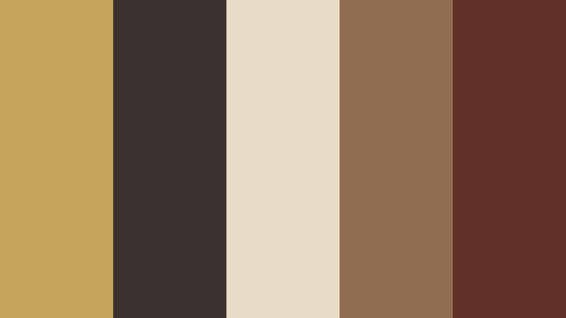
- HEX Codes: #c4a35a, #3b2f2f, #e8dcc4, #8d6a50, #5e3023
- Mood: Faded, warm, and archival
- Use for: Fits documentary bumpers, museum clips, and retro product films.
Projector gold and cocoa brown look like light on a worn screen. The palette supports history stories and analog-brand packaging because nothing is fully saturated. Cream paper and mid brown sit between the gold highlight and the dark cocoa so type never disappears.
Grade talking-head inserts toward cocoa, then let gold live in title cards and map graphics. A slight vignette in #3b2f2f can sell the projector without hiding the stop-motion craft.
Attic Frame Memory
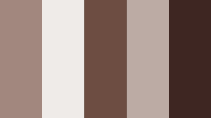
- HEX Codes: #a1887f, #efebe9, #6d4c41, #bcaaa4, #3e2723
- Mood: Soft, sentimental, and quiet
- Use for: Useful for family montage videos, photo-to-motion pieces, and memoir titles.
Dusty taupe and attic cream feel like found frames in a trunk. It is a calm choice for keepsake films and gentle social stories. The range is narrow on purpose, so old photos, paper puppets, and modern titles can share one Stop Motion Color world.
Keep cream as the mat, taupe as the frame, and deep brown as the caption. When you animate a still into motion, this palette hides the jump between decades because nothing looks newly printed.
Silent Era Sepia Stage
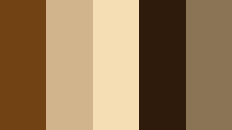
- HEX Codes: #704214, #d2b48c, #f5deb3, #2f1b0c, #8b7355
- Mood: Classic, theatrical, and timeless
- Use for: Best for silent-film homages, title cards, and heritage logo animations.
Deep sepia, tan, and stage brown recall hand-cranked frames. Use it for classic title treatments and museum-ready motion design. The wheat highlight gives intertitles a paper glow, while near-black brown holds the iris and the stage floor.
Set logos in #704214 on #f5deb3, then animate a slow iris in #2f1b0c. The palette is limited, which is the point: it asks the viewer to watch the performance, not a rainbow of modern craft supplies.
Tips for Creating Stop Motion Color Color Palettes
Stop Motion Color works best when the palette respects both the physical set and the screen. Combine clay, paper, and grain hues with a few neutrals so titles stay readable, brands stay recognizable, and the handmade texture does not get lost in a busy feed.
- Pick one hero hue (clay pink, lantern yellow, brick red) and two supporting tones so the set and the edit share a clear lead color.
- Always include a dark and a light HEX for captions. Handmade textures eat contrast, especially on thumbnails.
- Match practical lights on the table to a palette color: honey gold for daylight desks, ember orange for night stages, projector gold for archival pieces.
- Keep skin, felt, and clay in the midtones. Push saturation on paper props and type instead of on faces.
- Test the palette at 1080px wide and at phone size. If a mint or lemon wash disappears, darken the type, not the whole grade.
- Reuse the same HEX codes in channel art, end screens, and packaging so the brand feels like one workshop.
- When mixing live-action B-roll with frame-by-frame shots, grade both toward the same neutrals first, then add the accent color.
- Limit grain and LUT strength. Texture should feel like clay and paper, not like a filter sitting on top of them.
Stop Motion Color palettes do more than decorate a set. They tell the viewer whether the story is a sunny workshop, a midnight fairytale, a paper carnival, or a trunk of old frames. HEX codes make that mood portable, from clay on the desk to titles, thumbnails, and brand kits.
Try these 15 combinations on a short intro or a social cut in Filmora. Match a reference still, tune HSL so the clay and paper stay honest, then save the look so the next episode starts in the same handmade world.
Once the palette is locked, every frame-by-frame hour you spend on the table shows up on screen as a coherent brand, not a pile of mixed lighting. That is the quiet power of a Stop Motion Color plan: it lets the craft stay visible, and the story stay clear.
secure download