

 100% Security Verified | No Subscription Required | No Malware

Whiteboard animation color sits at the intersection of classroom memory and modern explainer design. Pale boards, charcoal strokes, and marker accents signal clarity, so viewers expect diagrams they can follow, notes they can trust, and motion that feels hand-drawn rather than overproduced. In video, those same hues shape intros, thumbnails, lower thirds, and brand sketches: white space keeps type readable, dark ink carries the story, and a few saturated pops mark the takeaway.
Used well, a whiteboard animation color palette turns tutorials, vlogs, and product walkthroughs into a consistent visual language. The 15 combinations below include HEX codes you can drop into titles, doodle overlays, and Filmora color tools so every scene, from the first sketch to the end card, stays on-brand and easy to scan.
In this article
Classic Marker Whiteboard Animation Color Palettes
Chalk Dust Classic

- HEX Codes: #ffffff, #1a1a1a, #757575, #e53935, #f5f5f5
- Mood: Clean, familiar, and highly readable
- Use for: Explainer intros, tutorial thumbnails, and educational social clips that need classic whiteboard contrast.
Chalk Dust Classic is the look most people picture when they think of a real board: bright white, charcoal lines, a soft gray for secondary notes, and one red marker for the punchline. That contrast makes doodles, arrows, and step numbers stay sharp on phones and in compressed YouTube frames.
Use the red accent sparingly on CTAs, key terms, and circled details so the rest of the frame feels like honest sketching. It is a reliable base for how-to series, course thumbnails, and brand sketches that should feel instructional rather than decorative.
Pro Tip: Keep Whiteboard Animation Color Sketches Consistent in Filmora
Whiteboard animation color only works when the board stays white, the ink stays dark, and the accent marker never drifts between clips. In Filmora you can lock this Chalk Dust Classic mix across intros, b-roll overlays, titles, and social cuts so every doodle reads as one lesson instead of a pile of mismatched markers.
Apply the HEX values to text, shape elements, and color correction once, then reuse that look on thumbnails and end screens. The result is a clean classroom feel even when you mix live footage with animated sketches.
AI Color Palette
If you already have a reference still of a whiteboard, a marker swatch, or a branded doodle frame, you can map those tones onto a full timeline. Filmora's AI Color Palette feature reads the dominant whites, inks, and accent reds, then helps you push the rest of the video toward the same chalkboard contrast.
That is especially useful when stock b-roll, screen recordings, and hand-drawn overlays arrive with different white balances. One palette pass keeps highlights bright, shadows inky, and the red callouts aligned from the first sketch to the last CTA.
 secure download

HSL, Color Wheels & Curves
Classic marker looks fail when the board turns cream or the black ink goes muddy. Filmora's HSL, color wheels, and curves tools let you lift the whites, deepen the charcoal, and keep the red accent from clipping on highlights.
Nudge luminance on the board so paper texture stays visible without going gray. Pull shadows slightly cooler for a dry-erase feel, then tighten the red hue so arrows and underlines match across titles, stickers, and kinetic type.
secure download1000+ Video Filters & 3D LUTs
When you want the doodle world to feel slightly more cinematic without losing marker honesty, a light LUT can add paper grain or a cooler classroom grade. Filmora's video filters and 3D LUTs make it easy to stylize whiteboard animation color palettes while keeping contrast high enough for text and line art.
Choose subtle looks for education and stronger grades for ads. Preview on a frame that includes white board, black ink, and the red accent so filters never crush the whites or mute the one color that carries the call to action.
secure downloadSchoolyard Sketch Lines
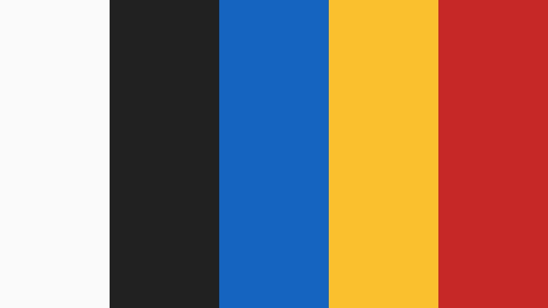
- HEX Codes: #fafafa, #212121, #1565c0, #fbc02d, #c62828
- Mood: Nostalgic, lively, and instructional
- Use for: Classroom vlogs, kids education series, and course intro sequences.
Blue, yellow, and red markers on a pale board recall school diagrams, science posters, and primary-color highlighters. The palette feels nostalgic without looking dated, because the ink is still dark enough for captions and the board stays almost white.
It is a strong choice for lesson recaps, playful course marketing, and kids education series where each color can stand for a topic. Keep yellow on highlights and stars, blue on headings, and red on corrections or urgent labels so the "classroom code" stays readable in motion.
Ink And Eraser Night

- HEX Codes: #eceff1, #263238, #90a4ae, #00838f, #455a64
- Mood: Calm, focused, and slightly technical
- Use for: Process videos, UX explainers, and product walkthrough overlays.
Cool gray ink and a teal marker make the drawing feel like a late-night whiteboard in a studio, not a noisy classroom. The board is slightly off-white, which softens glare and keeps UI sketches and flowcharts looking professional.
Use this mix for SaaS demos, stepwise infographics, and process videos where the viewer needs to think, not cheer. Teal can mark the current step or active button, while slate grays handle structure, arrows, and secondary notes.
Dry Erase Contrast

- HEX Codes: #ffffff, #000000, #1976d2, #ffeb3b, #424242
- Mood: Sharp, direct, and high energy
- Use for: YouTube thumbnails, kinetic typography, and high-contrast whiteboard ads.
Pure black on pure white, with blue and yellow pops, is built for small screens. Lines stay crisp after compression, and the yellow marker behaves like a highlighter that still reads on a busy thumbnail.
Reserve black for the main sketch, gray for supporting labels, blue for links or brand cues, and yellow for the one phrase you want clicked. It is ideal when doodles, prices, or hook lines must survive mobile autoplay and dense YouTube grids.
Bold Infographic Whiteboard Animation Color Palettes
Pop Marker Burst

- HEX Codes: #ffffff, #212121, #ff5722, #2196f3, #43a047
- Mood: Upbeat, bold, and easy to scan
- Use for: Infographic animations, statistic callouts, and social carousel videos.
Orange, blue, and green markers act like a traffic-light system on a white board: one hue for warnings or growth, one for facts, one for success. Against charcoal ink, those colors scan instantly in charts, numbered lists, and icon rows.
This palette suits data stories, energetic brand explainers, and carousel-style shorts where each color can own a metric. Keep the ink dark so the bright markers never fight the drawing, and repeat the same color logic from intro graph to end-card recap.
Explainer Spotlight

- HEX Codes: #fafafa, #1b1b1b, #ffc107, #e91e63, #3f51b5
- Mood: Playful, cinematic, and memorable
- Use for: Brand storyboards, feature highlight reels, and animated FAQ videos.
Gold, magenta, and indigo turn a white field into a small stage. The markers feel more theatrical than school supplies, which helps character-led doodles, mascot explainers, and product launches stand out from generic black-and-red boards.
Use gold for hero features, magenta for personality or FAQs, and indigo for structure and UI frames. The near-black ink keeps the drama readable, so the palette works in storyboards, highlight reels, and branded bumper sequences.
Chart Line Energy

- HEX Codes: #ffffff, #37474f, #00acc1, #fb8c00, #7cb342
- Mood: Analytical, fresh, and optimistic
- Use for: Finance explainers, dashboard motion graphics, and report summaries.
Cyan, orange, and green lines feel like a living dashboard drawn by hand. Blue-gray ink suggests spreadsheets and graphs without the coldness of a full dark UI, while the white board keeps numbers airy.
Assign cyan to trends, orange to alerts or targets, and green to positive KPIs. That mapping translates cleanly into quarterly update animations, finance explainers, and motion graphics that recap a report in under a minute.
Doodle Alert Mix

- HEX Codes: #fffde7, #212121, #f44336, #039be5, #8e24aa
- Mood: Urgent, quirky, and attention-grabbing
- Use for: Promo stingers, sale announcements, and hook frames in short-form video.
A cream board with red, blue, and purple markers shouts without filling the frame. The warm paper tone already feels like a sticky note, so even a simple scribble reads as a promo or a hook.
Use red for deadlines and discounts, blue for facts, and purple for brand personality or "wait, watch this" moments. It is built for CTAs, sale announcements, and fast educational shorts where the first second has to stop the scroll.
Soft Educational Whiteboard Animation Color Palettes
Classroom Pastel Notes

- HEX Codes: #ffffff, #546e7a, #81d4fa, #aed581, #ffcc80
- Mood: Friendly, patient, and approachable
- Use for: Kids lessons, onboarding series, and gentle how-to content.
Soft blue, green, and peach markers feel welcoming, like washable classroom pens rather than neon highlighters. Slate ink keeps the sketches adult enough for onboarding, while the pastels lower the pressure for beginners.
This mix suits kids lessons, community education campaigns, and first-week product tours. Color-code topics lightly, keep plenty of white around each doodle, and let the peach accent mark encouragement instead of alarms.
Gentle Lesson Glow

- HEX Codes: #fafafa, #455a64, #b39ddb, #80cbc4, #ffab91
- Mood: Soothing, creative, and thoughtful
- Use for: Wellness explainers, art process videos, and slow-paced storyboards.
Lavender, mint, and coral keep sketches light and kind. The board stays almost white, but the markers suggest journals, mood boards, and studio notes instead of test prep.
Use it for wellness explainers, art process videos, and mindful learning brands. Slow line animations, handwritten titles, and soft lower thirds all benefit from this quieter whiteboard animation color combination.
Study Highlighter Soft

- HEX Codes: #ffffff, #5d4037, #fff59d, #c5e1a5, #90caf9
- Mood: Focused, warm, and studious
- Use for: Study-with-me vlogs, note-taking demos, and exam tip reels.
Highlighter yellow, green, and blue on white mimic real study notes, while warm brown ink feels like a fine liner instead of a dry-erase marker. The palette immediately says "desk, textbook, revision" without needing a classroom set.
Academic creators and e-learning ads can map yellow to key terms, green to summaries, and blue to sources or formulas. It works in study-with-me vlogs, note-taking demos, and short exam-tip reels where authenticity matters more than flash.
Storytime Sketch Warm

- HEX Codes: #fff8e1, #3e2723, #ce93d8, #80deea, #ef9a9a
- Mood: Whimsical, cozy, and narrative
- Use for: Storytelling animations, kids book trailers, and brand origin doodles.
Warm cream paper with lilac, aqua, and rose markers feels like a picture book left open on a table. Brown ink grounds the fairy-tale pastels so characters and captions stay clear.
This is a natural fit for narrative whiteboard films, kids book trailers, and origin-story doodles. Let each character or chapter own a marker color, and keep the cream background consistent so the whole film feels like one illustrated notebook.
Modern Brand Whiteboard Animation Color Palettes
Startup Sketch Grid

- HEX Codes: #ffffff, #102027, #0277bd, #00bfa5, #ff6d00
- Mood: Confident, modern, and ambitious
- Use for: Pitch videos, app explainers, and startup landing page loops.
Deep ink with teal and orange accents feels like a seed-round deck drawn on a conference-room board. The white field stays investor-clean, while orange marks the opportunity and teal marks the product.
Use it for founder stories, feature grids, and app explainers that need energy without cartoon chaos. Pair the dark ink with tight typography and simple icons so the palette reads as strategy, not decoration.
Saas Marker Clean
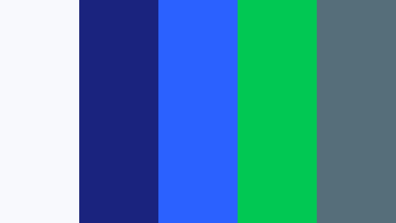
- HEX Codes: #f7f9fc, #1a237e, #2962ff, #00c853, #546e7a
- Mood: Polished, trustworthy, and digital
- Use for: SaaS onboarding videos, UI sketch animations, and B2B social ads.
Navy and electric blue markers on cool white feel product-ready, as if a designer sketched the interface and then circled the conversion path in green. The cool board color matches typical software UIs, so live product footage and doodles sit in the same world.
This palette fits software tours, onboarding series, and B2B ads. Keep navy for structure, electric blue for interactive elements, and green for success states so the whiteboard animation color language mirrors the actual product.
Minimal Pitch Board

- HEX Codes: #ffffff, #212121, #78909c, #448aff, #ff5252
- Mood: Sleek, decisive, and premium
- Use for: Keynote openers, investor recaps, and luxury brand doodle ads.
Mostly monochrome, with one blue spark and one red spark, this mix is about restraint. Gray handles supporting labels, blue handles insight, and red handles the single decision or risk you want remembered.
It works for executive summaries, keynote openers, and refined motion sketches where luxury brands still want a human, hand-drawn beat. Leave generous white space, animate fewer lines, and let those two accents do the talking.
Tips for Creating Whiteboard Animation Color Color Palettes
Whiteboard animation color is less about filling the frame and more about protecting contrast: a bright board, dark ink, and a short list of marker hues that always mean the same thing. Build the palette around readability first, then assign accents to hierarchy, emotion, and brand so every doodle, thumbnail, and title card feels like one classroom.
- Keep the board near white (#ffffff to a very light gray or cream) so line art, captions, and small-screen type stay high contrast.
- Use one dark ink for all primary drawing; mixing several near-blacks makes sketches look dirty after compression.
- Limit accent markers to two or three hues and give each a job (warning, success, highlight, brand) across the whole series.
- Test palettes on a phone-sized crop: yellows and pastels that look fine on a monitor can vanish on a YouTube thumbnail.
- Match live footage white balance to the board HEX so overlays, talking-head clips, and doodles share the same paper tone.
- Repeat HEX codes in titles, stickers, end cards, and channel art so the whiteboard look becomes a brand system, not a one-off effect.
- Reserve the loudest color for CTAs and key numbers; if everything is neon, nothing reads as the takeaway.
- When grading in Filmora, protect whites and ink first, then tune marker hues with HSL so filters never crush the board or muddy the lines.
A whiteboard animation color palette is a teaching tool as much as a style. Classic marker sets build trust, bold infographic mixes speed up data, soft pastels invite beginners, and modern brand boards make pitches feel designed rather than improvised. HEX codes keep that language stable from the first sketch to the last frame.
Try these combinations on intros, explainer overlays, and social cuts in Filmora. Lock the board, ink, and accents once, then reuse them so every vlog, lesson, and product tour looks like it was drawn on the same wall.
When you are ready to push a reference still across an entire timeline, or to fine-tune marker hues with HSL and LUTs, Filmora gives you a fast path from swatch to finished video without losing the hand-drawn clarity that makes whiteboard animation work.<|eos|>
