

 100% Security Verified | No Subscription Required | No Malware

Anime Color palettes are a fast way to shape emotion, pacing, and brand identity in video and design. Bright pinks, electric blues, soft sakura tones, and deep neon shadows can make a thumbnail feel louder, an intro feel faster, or a UI feel more expressive.
This guide gives you Anime Color color palettes with HEX codes for creators and Filmora users who want ready-to-use combinations for thumbnails, reels, branding, anime themed edits, motion graphics, and social content.
In this article
Vibrant Anime Color Palettes
Electric Hero Entrance
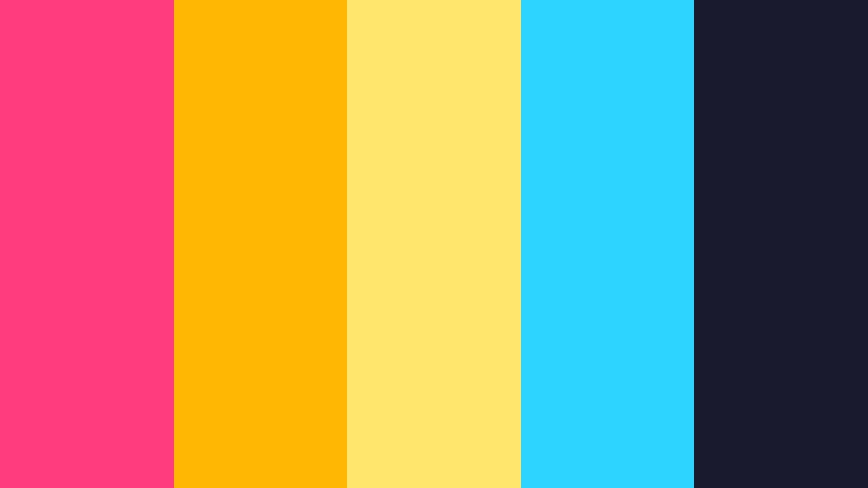
- HEX Codes: #ff3c7d, #ffb703, #ffe66d, #2dd4ff, #1a1a2e
- Mood: bold, high-energy, and heroic
- Use for: Use for trailer thumbnails, action-packed intros, and channel branding that needs instant impact.
This palette hits hard with hot pink, gold, and electric blue, so it instantly feels like a big anime reveal. The deep navy base keeps the brighter shades looking sharper and more dramatic, which helps the whole palette feel powerful instead of chaotic.
Use it for thumbnails, motion graphics, gaming edits, or any intro that needs a fast first impression. The contrast is strong enough to hold attention on small screens, especially when paired with bold type and fast cuts.
Pro Tip: Build A Heroic Anime Color Look In Filmora
Use this palette to keep action scenes, titles, and transitions visually connected. In Filmora, you can match the pink, gold, and blue accents across your intro, lower thirds, and end screen so the edit feels like one cohesive launch sequence.
If you are making a trailer, keep the dark navy as your base and let the brighter tones drive key moments like title reveals, impact frames, and call to action screens. That balance helps the edit stay energetic without losing readability.
AI Color Palette
When you have a reference image or color card for this look, Filmora's AI Color Palette feature can transfer those tones across the whole video. That makes it easy to keep hero shots, text cards, and social cutdowns aligned with the same Anime Color style.
It is especially useful if you want one thumbnail frame, one intro clip, and one reel version to share the same bright anime identity without manual color matching on every shot.
 secure download

HSL, Color Wheels & Curves
Fine tuning this palette with HSL can make the pinks more vivid, the blues cleaner, and the shadows more cinematic. Use Filmora's color grading controls to push highlights warmer and keep dark areas rich without flattening the image.
Color wheels help you separate the energy of the foreground from the cooler background tones, while curves can add punch to action frames and title cards. That is a simple way to make anime inspired footage feel brighter, deeper, and more polished.
secure download1000+ Video Filters & 3D LUTs
Filmora's video filters and 3D LUTs can quickly turn this bright palette into a stylized anime opening or a more polished promo. Try filters that boost contrast and saturation so the electric accents stay vivid on thumbnails and short-form edits.
If you want a more dramatic finish, use LUTs that deepen the navy base while preserving the warm gold and pink highlights. That creates a cleaner look for trailers, gaming reels, and branded intro sequences.
secure downloadTurbo Transformation
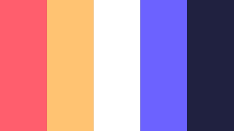
- HEX Codes: #ff5f6d, #ffc371, #ffffff, #6c63ff, #202040
- Mood: uplifting, fast, and futuristic
- Use for: Use for transformation edits, reel covers, and product promos that need a bright, polished look.
Warm coral and cool violet create a playful contrast that feels like a magical power up. The white space keeps the palette fresh, so it still looks clean in titles, product shots, and social overlays.
This is a smart choice for launch content, before and after edits, or any reel that needs to feel quick and positive. It gives you enough brightness for attention and enough depth for a modern finish.
Arcade Pulse Bloom
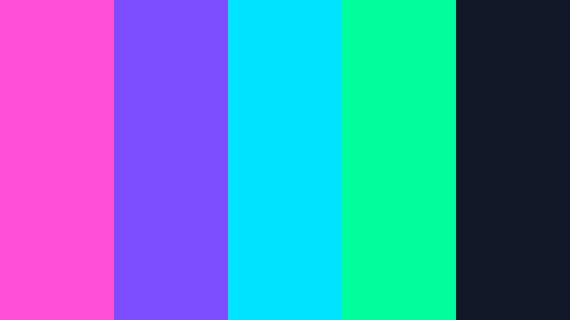
- HEX Codes: #ff4fd8, #7c4dff, #00e5ff, #00ff9c, #111827
- Mood: electric, playful, and neon
- Use for: Use for gaming thumbnails, stream overlays, and energetic brand intros with a digital edge.
Neon magenta, cyan, and green give this palette a strong arcade glow. The dark base keeps the bright tones from feeling noisy, which makes it easier to use in motion titles and UI accents.
It fits sci fi edits, game intros, and streamer branding that needs instant energy. Add it to lower thirds or buttons when you want a bold digital look that still feels controlled.
Laser Cherry Spark

- HEX Codes: #ff2d55, #ff7a00, #ffd166, #ffef9f, #3b1d3f
- Mood: fiery, cheerful, and flashy
- Use for: Use for lyric videos, highlight reels, and social content that needs warm, candy-like color.
This palette feels like a bright anime candy shop with a dramatic edge. The mix of cherry red, amber, and soft yellow creates a lively rhythm that works well in expressive edits.
Use it for promo cards, lyric visuals, or packaging mockups when you want warmth and sparkle at the same time. It is also a strong pick for thumbnails that need a lively, emotional hook.
Sunrise Manga Splash
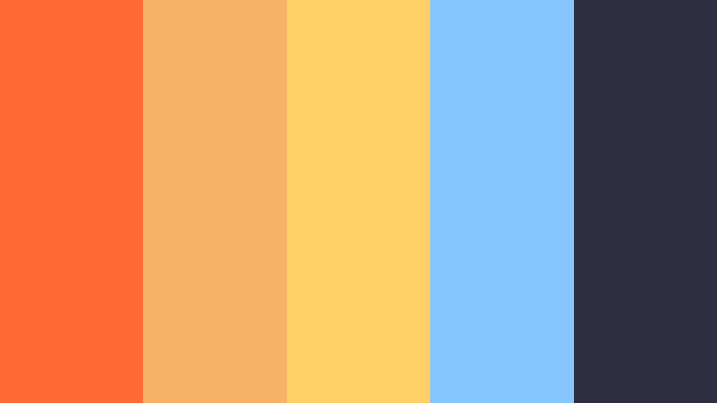
- HEX Codes: #ff6b35, #f7b267, #ffd166, #86c5ff, #2f2e41
- Mood: sunny, optimistic, and expressive
- Use for: Use for lifestyle edits, opening cards, and colorful brand assets that need a friendly feel.
Sunrise orange and soft sky blue give this palette a hand drawn anime feel with a cheerful mood. The darker anchor shade adds balance, so the overall look stays readable and polished.
It works well for intro frames, stickers, editorial layouts, and lifestyle content that should feel welcoming. Use it when you want a bright, friendly color story without pushing into neon territory.
Soft Anime Color Palettes
Sakura Whisper
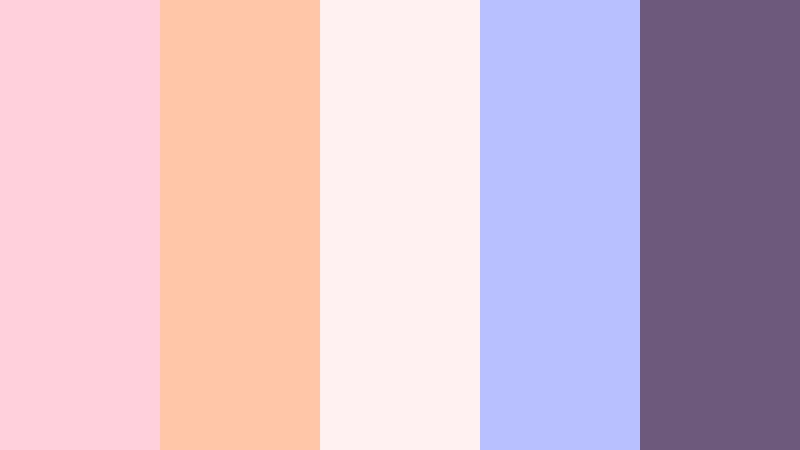
- HEX Codes: #ffd1dc, #ffc6a8, #fff1f2, #b8c0ff, #6d597a
- Mood: gentle, romantic, and dreamy
- Use for: Use for wedding edits, pastel thumbnails, and soft branding with a delicate mood.
Blush pink and lilac give this palette a calm cherry blossom feel. The soft neutrals keep it light, romantic, and easy to use in beauty content, quotes, or cozy social covers.
It is a natural fit for wedding edits, delicate branding, and thumbnail designs that should feel graceful instead of loud. Use it to add warmth while keeping the look airy and refined.
Cloud Cafe Dream

- HEX Codes: #f7f3ee, #e8d8c3, #c7d3dd, #a8b8c8, #7d6f86
- Mood: cozy, airy, and understated
- Use for: Use for minimal UI, cafe branding, and soft vlog covers that need a clean pastel finish.
Cream, latte, and misty blue make this palette feel quiet and approachable. The muted contrast is ideal for minimal visuals that should look polished without drawing too much attention to themselves.
Use it for product shots, lifestyle titles, cafe branding, or calm animated scenes. It also works well in layouts where you want the background to support the message rather than compete with it.
Moonlit Schoolyard
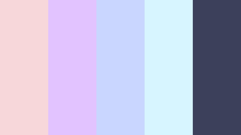
- HEX Codes: #f8d7da, #e2c2ff, #c9d6ff, #d6f5ff, #3d405b
- Mood: nostalgic, calm, and tender
- Use for: Use for storytime videos, character edits, and gentle social posts with a youthful tone.
Pale pink and moonlit blue create a soft after school atmosphere that feels nostalgic and sweet. The darker slate tone adds structure, which helps the palette hold up in overlays and editorial layouts.
This is a strong choice for diary style videos, anime character edits, and sentimental content. It can make storytime thumbnails and social graphics feel more personal and emotionally warm.
Peach Ribbon Magic

- HEX Codes: #ffd7ba, #ffb5a7, #fcd5ce, #d9ed92, #9d8189
- Mood: sweet, playful, and warm
- Use for: Use for beauty reels, cute packaging, and friendly thumbnail designs that feel inviting.
Peach, buttercream, and soft rose make this palette feel like a pastel candy ribbon. The small touch of green adds freshness, so the palette avoids looking too flat or overly sweet.
It works well for creator brands, stationery mockups, packaging visuals, and beauty reels. Use it when you want a friendly thumbnail or social post that feels welcoming from the first glance.
Cyberpunk Anime Color Palettes
Neon Alley Chase
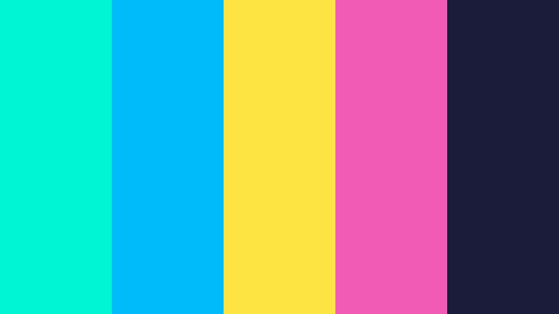
- HEX Codes: #00f5d4, #00bbf9, #fee440, #f15bb5, #1b1b3a
- Mood: tense, sleek, and electric
- Use for: Use for fast cuts, cyberpunk title cards, and tech promos that need sharp contrast.
Bright neon accents against deep navy create a city at night feeling with a strong cyberpunk edge. The contrast is crisp enough to keep motion graphics readable while still feeling intense.
Use it for trailers, HUD overlays, and futuristic branding that needs speed and impact. It also works well in thumbnail design when you want a bright focal point against a dark backdrop.
Hologram Rain Scene
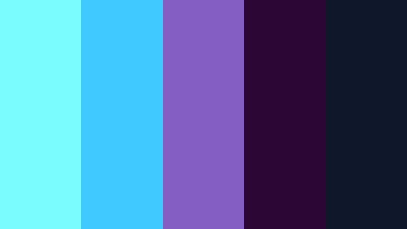
- HEX Codes: #7afcff, #40c9ff, #845ec2, #2c0735, #0f172a
- Mood: moody, cool, and futuristic
- Use for: Use for sci-fi explainers, app demos, and atmospheric thumbnails with a digital glow.
Icy blue and violet tones make this palette feel like a rainy hologram sequence. It has a sleek digital mood that works especially well in scenes with glass, light streaks, or technology themes.
Use it for motion design, intros, and UI concepts when you want a futuristic look without overwhelming the frame. The darker tones give you room to add text and interface details cleanly.
Chrome Heart Signal
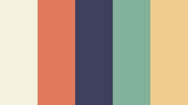
- HEX Codes: #f4f1de, #e07a5f, #3d405b, #81b29a, #f2cc8f
- Mood: modern, stylish, and dramatic
- Use for: Use for fashion content, bold cover art, and editorial graphics with a sleek edge.
This palette pairs soft chrome neutrals with muted teal and amber for a premium, editorial feel. It is less neon than many cyberpunk looks, which gives it a stylish and more mature edge.
Use it for fashion thumbnails, product pages, and branded sequences that need drama without looking too loud. It works well when you want cyber-inspired style with a refined finish.
Cinematic Anime Color Palettes
Sunset Finale Frame
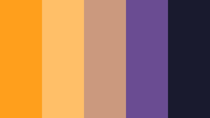
- HEX Codes: #ff9f1c, #ffbf69, #cb997e, #6a4c93, #1a1a2e
- Mood: romantic, wide, and dramatic
- Use for: Use for ending cards, travel edits, and cinematic thumbnails with a sunset glow.
Amber and plum tones give this palette a film poster feel with a warm sunset atmosphere. The deep navy anchor adds enough contrast to keep the palette cinematic and grounded.
Use it for trailers, title slates, travel edits, and ending cards that need a memorable finish. It is especially effective when you want the frame to feel emotional and expansive.
Starfall Afterglow

- HEX Codes: #0b132b, #1c2541, #3a506b, #5bc0be, #f5f3f4
- Mood: cosmic, reflective, and elegant
- Use for: Use for opening credits, space themed edits, and polished UI with a calm cinematic style.
Deep blue layers and icy highlights create a night sky mood with a clean, elegant finish. The palette feels spacious, which makes it great for reflective storytelling and premium visuals.
Use it in opening credits, space edits, or any UI layout where you want calm contrast and a polished look. It also pairs nicely with slow motion footage and atmospheric transitions.
Velvet Opening Credits
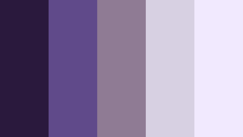
- HEX Codes: #2b193d, #5f4b8b, #8d7b93, #d6d1e0, #f1e9ff
- Mood: lush, refined, and dreamy
- Use for: Use for luxury branding, film inspired reels, and soft dramatic layouts that need a polished look.
Rich violet and velvet neutrals make this palette feel elegant and story driven. It balances softness and depth well, which gives you a polished base for premium branding or cinematic edits.
It suits beauty campaigns, opening credits, and refined thumbnails that need a luxurious look. Use it when you want a dreamy anime inspired palette with a more sophisticated finish.
Tips for Creating Anime Color Color Palettes
Anime Color palettes work best when bright accents, soft neutrals, and dark anchors are balanced with purpose. For video and design, focus on contrast, readability, and consistency so the colors support the story instead of distracting from it.
- Use one dominant color and two supporting shades to keep the palette clear.
- Pair bright anime tones with deep navy or charcoal for better contrast.
- Keep text readable by avoiding highly saturated colors behind small type.
- Match the palette to the mood of the footage, not just the thumbnail design.
- Use the same HEX codes across intros, lower thirds, and end screens for brand consistency.
- Soften loud colors with pastel or neutral tones when you need a calmer result.
- Test your palette on mobile screens to make sure details still stand out.
- Use LUTs and color controls to push the look toward cinematic or playful depending on the project.
Anime Color palettes can shape the mood of a project in seconds, from energetic neon edits to soft pastel storytelling. The right combination can make a thumbnail feel clickable, a brand feel memorable, and an intro feel more polished.
Try these palettes in Filmora to see how quickly you can build a consistent visual style across edits, reels, promos, and branded content. Small changes in hue, contrast, and saturation can turn a simple composition into a strong anime inspired look.
When you keep your colors intentional, your visuals feel more cohesive and more professional. That is why Anime Color combinations are such a useful starting point for creators who want style with structure.
secure download