

 100% Security Verified | No Subscription Required | No Malware

Burgundy And Blush Jewelry Store Color combines the depth of wine-inspired burgundy with the softness of blush pink. Burgundy can suggest confidence, luxury, and emotional richness, while blush adds warmth, romance, and approachability. Together, these shades create a balanced visual identity that feels elegant without appearing overly formal.
This color combination works well for jewelry branding, wedding videos, beauty content, fashion thumbnails, cinematic intros, product showcases, and lifestyle edits. Below, you will find Burgundy And Blush Jewelry Store Color palettes with HEX codes for creators, designers, and Filmora users who want to build a consistent and memorable visual style.
In this article
Soft And Romantic Burgundy And Blush Jewelry Store Color Palettes
Rosewood Romance
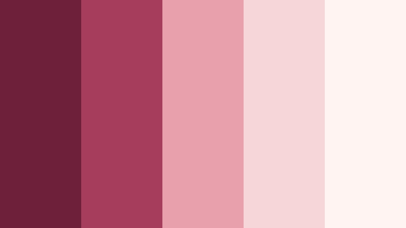
- HEX Codes: #6e1f3a, #a63d5d, #e8a0ad, #f6d6d9, #fff4f1
- Mood: Tender, romantic, and softly luxurious.
- Use for: Use this palette for jewelry thumbnails, wedding reels, beauty intros, and romantic social content.
Rosewood Romance pairs rich burgundy with delicate blush tones for a graceful, intimate look. The dark rosewood shade provides structure, while the lighter pinks create a soft and welcoming finish.
This palette works beautifully for bridal branding, feminine packaging, jewelry product photography, and elegant video overlays. Use burgundy for title cards or borders and reserve the palest shades for backgrounds, captions, and transition frames.
Pro Tip: Enhance Your Burgundy And Blush Jewelry Store Color Visuals with Filmora
Filmora can help keep the Rosewood Romance palette consistent across your entire edit. Apply the deeper burgundy shades to opening titles, logo animations, and keyframes, then use blush accents in b-roll overlays, lower thirds, and end screens.
For romantic reels and jewelry showcases, combine gentle transitions with warm highlights and controlled saturation. This creates a polished visual flow from the first frame to the final call to action.
AI Color Palette
Creators can use a reference image, product photograph, or color card based on Rosewood Romance to guide the look of an entire video. Filmora's AI Color Palette feature helps transfer the visual character of the reference across selected clips.
This is useful when footage comes from different cameras or lighting conditions. Apply the palette to jewelry close-ups, wedding b-roll, social clips, and branded intros to create a more unified result.
 secure download

HSL, Color Wheels & Curves
Use HSL controls to refine the relationship between burgundy, rose, and blush tones. You can deepen burgundy in the shadows, reduce unwanted orange in skin tones, or increase the brightness of blush highlights for a softer jewelry-commercial look.
Color wheels and curves provide more control over contrast and atmosphere. Lift the shadows slightly for an airy romantic edit, or add richer contrast for a cinematic finish. Filmora's color adjustment tools make it easier to preserve the mood while matching clips from different scenes.
secure download1000+ Video Filters & 3D LUTs
Filmora's library can quickly stylize Rosewood Romance footage with soft cinematic filters, warm portrait treatments, and subtle glow effects. Apply a filter to a full sequence, then lower its intensity so the burgundy and blush colors remain natural.
Filmora's video filters and 3D LUTs make it easy to build a repeatable look for jewelry campaigns, wedding edits, and social media series. Use the same treatment across thumbnails and videos to strengthen brand recognition.
secure downloadVelvet Petal Glow
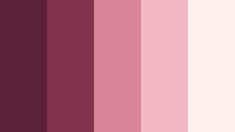
- HEX Codes: #581f35, #84324e, #d98298, #f3b8c2, #fff0ed
- Mood: Warm, polished, and softly radiant.
- Use for: Use this palette for product showcases, lifestyle vlogs, social stories, and polished brand intros.
Velvet Petal Glow creates a plush, feminine atmosphere with layered berry and blush shades. Its darker tones add richness, while the pink highlights keep the composition radiant and inviting.
Use this palette for product showcases, beauty tutorials, lifestyle vlogs, and polished brand intros. It is especially effective when blush appears in backgrounds and berry tones are reserved for logos, captions, and visual accents.
Blush Wine Whisper
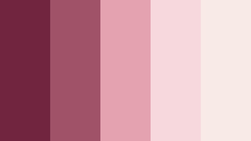
- HEX Codes: #72253f, #9f5268, #e3a2af, #f7d8dc, #f8ebe5
- Mood: Dreamy, gentle, and quietly sophisticated.
- Use for: Use this palette for fashion edits, romantic announcements, Pinterest graphics, and boutique website sections.
Blush Wine Whisper balances a deep wine accent with airy pink neutrals. The result is gentle and editorial, with enough contrast to keep text and product details visible.
Try it in fashion edits, romantic announcements, boutique websites, and Pinterest graphics. Use the warm cream shade as a calm canvas and add wine-colored details to guide attention toward key messages.
Antique Rose Charm
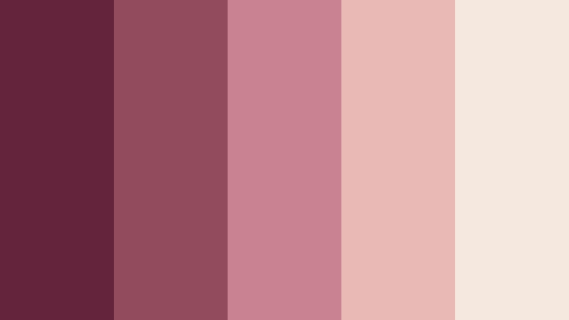
- HEX Codes: #64243b, #914b5d, #c9828f, #e9b9b5, #f5e8df
- Mood: Nostalgic, graceful, and artisan-inspired.
- Use for: Use this palette for vintage jewelry stories, handmade product packaging, slow-living videos, and editorial layouts.
Antique Rose Charm combines burgundy and muted rose with a warm cream base. It feels nostalgic and handcrafted, making it a natural fit for artisan brands and vintage-inspired storytelling.
Use the darker shades for borders, labels, or title cards, and let the cream and dusty rose tones support slow-living videos, packaging mockups, and editorial layouts.
Elegant And Refined Burgundy And Blush Jewelry Store Color Palettes
Garnet Satin Luxe
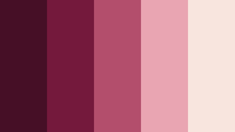
- HEX Codes: #430f25, #741b3b, #b24e68, #e8a5b0, #f5e5dc
- Mood: Opulent, confident, and refined.
- Use for: Use this palette for luxury jewelry ads, cinematic brand intros, premium packaging, and high-end landing pages.
Garnet Satin Luxe uses a dark garnet foundation with satin blush accents for a premium finish. The strong contrast makes jewelry, logos, and product details appear more dramatic and elevated.
Use it for luxury advertisements, cinematic intros, premium packaging, and high-end landing pages. Keep the darkest shade behind bright product photography to create a gallery-like presentation.
Bordeaux Silk Reserve
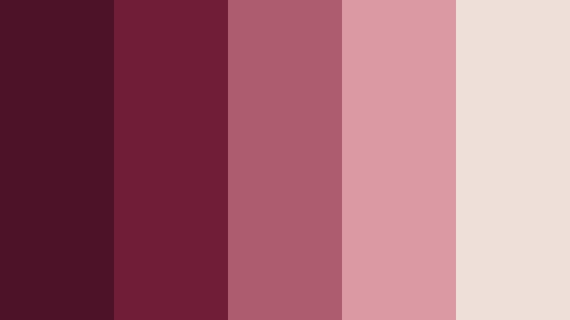
- HEX Codes: #4d1228, #701d38, #ad5b6e, #d99aa3, #eee0d8
- Mood: Classic, luxurious, and composed.
- Use for: Use this palette for premium brand videos, jewelry lookbooks, editorial thumbnails, and sophisticated UI accents.
Bordeaux Silk Reserve brings a classic wine shade together with subdued blush and ivory. Its measured contrast feels timeless and polished rather than trendy.
This is a strong choice for jewelry lookbooks, editorial thumbnails, premium brand videos, and sophisticated interface accents. Use ivory for breathing room and bordeaux for high-priority text or buttons.
Merlot Pearl Atelier
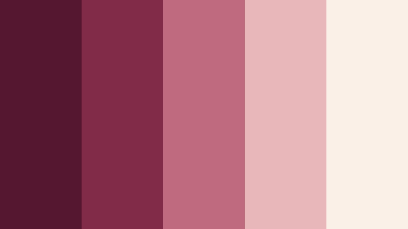
- HEX Codes: #55172f, #812b49, #c06a7d, #e8b7b9, #faf0e8
- Mood: Artful, luxurious, and softly luminous.
- Use for: Use this palette for atelier branding, craft tutorials, luxury social content, and refined product interfaces.
Merlot Pearl Atelier pairs deep merlot with pearly blush and warm off-white. It feels handcrafted yet luxurious, creating a refined setting for detailed product stories.
Use it for atelier branding, craft tutorials, luxury social posts, and product interfaces. The off-white background can keep layouts light while the merlot shade provides a distinctive brand anchor.
Regal Berry Veil
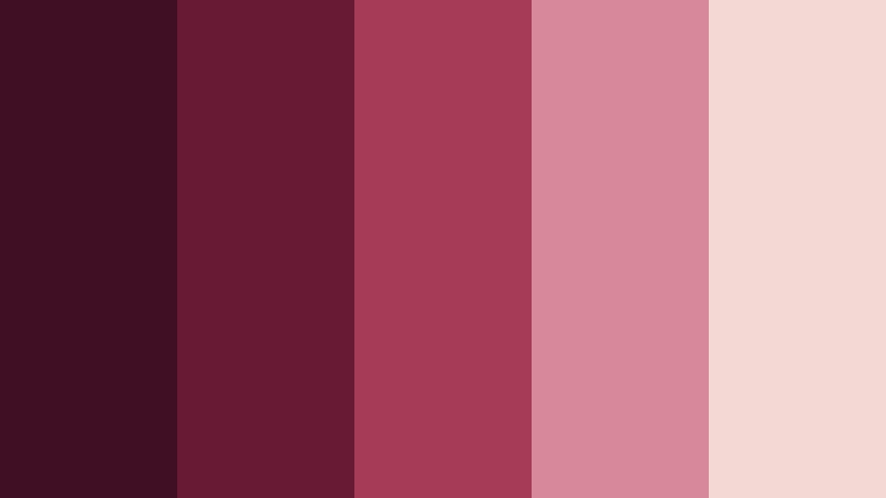
- HEX Codes: #3f1023, #681934, #a63b58, #d88999, #f3d9d3
- Mood: Regal, dramatic, and romantic.
- Use for: Use this palette for cinematic intros, evening event graphics, fashion content, and luxury ecommerce design.
Regal Berry Veil creates contrast through dark berry tones and a glowing blush highlight. It feels dramatic and romantic, with enough visual strength for evening-inspired campaigns.
Use it in cinematic intros, fashion edits, event graphics, and luxury ecommerce designs. Place pale blush near focal objects to create a soft glow against the deeper berry background.
Bold And Vibrant Burgundy And Blush Jewelry Store Color Palettes
Berry Flash Statement
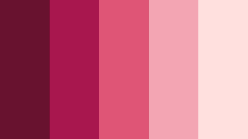
- HEX Codes: #68122f, #a7184e, #df5575, #f4a5b3, #ffe0df
- Mood: Energetic, expressive, and fashion-forward.
- Use for: Use this palette for social media thumbnails, beauty launches, animated titles, and attention-grabbing campaigns.
Berry Flash Statement adds vivid berry and pink energy to the burgundy and blush theme. Its lively contrast is designed to attract attention quickly in fast-moving digital spaces.
Use it for social thumbnails, beauty launches, animated titles, and promotional campaigns. Reserve the brightest pink for short accents so the overall composition remains clear and easy to scan.
Crimson Blush Spark
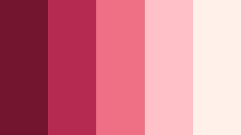
- HEX Codes: #74152f, #b52a50, #ef6f85, #ffc0c8, #fff0e9
- Mood: Bright, playful, and confident.
- Use for: Use this palette for product launches, creator branding, short-form video, and vibrant promotional graphics.
Crimson Blush Spark mixes energetic crimson with lively blush highlights. It gives fashion and jewelry content a youthful, memorable visual punch.
Use crimson for strong headlines and motion graphics, then add blush to product frames, stickers, and callouts. The warm near-white shade helps balance the brighter colors in short-form video.
Ruby Petal Pop
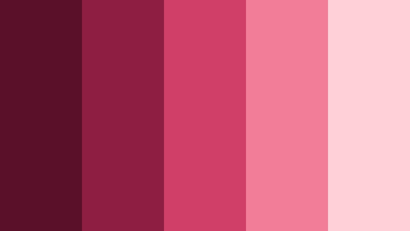
- HEX Codes: #5b1029, #8e1f42, #cf3f67, #f27d98, #ffd0d7
- Mood: Playful, glamorous, and high-impact.
- Use for: Use this palette for reels, music visuals, pop-up campaigns, fashion graphics, and dynamic app interfaces.
Ruby Petal Pop delivers a lively blend of ruby, pink, and soft blush. It feels glamorous and expressive, making it well suited to content that needs immediate visual impact.
Try it for reels, music visuals, pop-up campaigns, fashion graphics, and dynamic app interfaces. Use the softest pink for highlights and reserve ruby for important buttons, titles, or animated elements.
Magenta Wine Pulse
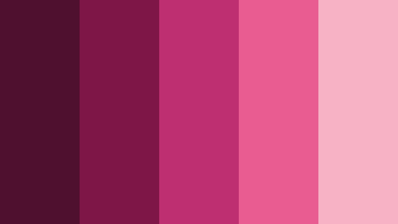
- HEX Codes: #4f102d, #7e1748, #bd2f70, #e85c91, #f8b2c5
- Mood: Modern, fearless, and expressive.
- Use for: Use this palette for music videos, creator intros, event promos, digital ads, and bold social templates.
Magenta Wine Pulse pushes the palette toward electric berry and magenta accents. It feels modern and fearless, with strong digital contrast for motion-led creative work.
Use it in music videos, creator intros, event promos, and digital ads. Pair the deepest wine tone with bright magenta for kinetic title sequences, then soften the frame with blush for readable transitions.
Modern And Minimal Burgundy And Blush Jewelry Store Color Palettes
Muted Blush Gallery
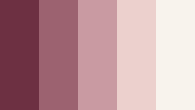
- HEX Codes: #6d3043, #9d6270, #c99aa0, #ead1ce, #f8f3ed
- Mood: Calm, editorial, and contemporary.
- Use for: Use this palette for minimalist websites, portfolio videos, product cards, and clean social templates.
Muted Blush Gallery softens burgundy with dusty rose and a creamy neutral. It creates a calm, editorial look that feels modern without becoming stark.
This versatile palette is ideal for portfolio videos, product cards, minimalist websites, and clean social templates. Use the cream tone as the primary background and add burgundy sparingly for hierarchy.
Burgundy Clay Balance
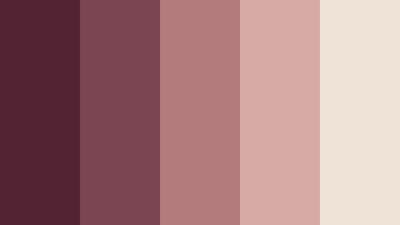
- HEX Codes: #542333, #7b4651, #b47b7d, #d8aaa5, #efe2d6
- Mood: Grounded, warm, and thoughtfully modern.
- Use for: Use this palette for lifestyle content, ecommerce UI, brand systems, packaging, and calm tutorial videos.
Burgundy Clay Balance introduces earthy blush and clay undertones for a grounded look. It works well when a jewelry brand needs warmth without excessive sweetness.
Use it for lifestyle content, ecommerce interfaces, packaging, and calm tutorial videos. The clay-inspired midtones can connect product imagery with natural textures such as stone, paper, wood, and fabric.
Plum Blush Monogram
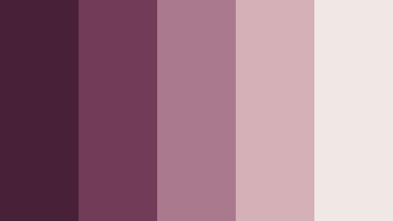
- HEX Codes: #462035, #713d56, #a8788b, #d5b1b5, #f2e8e2
- Mood: Quietly artistic, balanced, and sophisticated.
- Use for: Use this palette for monogram logos, title cards, presentation decks, app interfaces, and refined brand content.
Plum Blush Monogram combines a muted plum with soft rose and a light neutral background. Its restrained contrast creates an elegant and adaptable visual identity.
Use it for monogram logos, title cards, presentation decks, app interfaces, and refined brand content. The plum shade gives the design personality, while the pale neutral keeps layouts open and readable.
Tips for Creating Burgundy And Blush Jewelry Store Color Color Palettes
A successful Burgundy And Blush Jewelry Store Color palette should balance emotional warmth with practical readability. Start with one dominant shade, choose one or two supporting tones, and use a light neutral to give video frames, thumbnails, and layouts enough breathing room.
- Use deep burgundy for headlines, logos, borders, and other elements that need strong contrast.
- Use blush as an accent rather than covering every surface, especially in small thumbnails and mobile layouts.
- Add ivory, cream, or warm white to prevent the palette from feeling too dark or visually crowded.
- Check text readability against every background, particularly when using pale pink captions over bright footage.
- Match the palette to the footage by adjusting white balance, skin tones, highlights, and shadows before adding creative filters.
- Keep the same burgundy and blush shades across intros, lower thirds, thumbnails, end screens, and social templates.
- Use brighter berry or magenta accents for calls to action, animated titles, and short-form content that needs extra energy.
- Test the final palette on both large screens and mobile devices so subtle blush tones do not disappear.
Burgundy And Blush Jewelry Store Color palettes can shape a project from the first frame to the final brand touchpoint. Softer combinations create romance and approachability, while deeper burgundy and vivid berry shades communicate confidence, luxury, and creative energy.
Choose a palette that matches your subject, audience, and footage. A bridal video may benefit from warm creams and delicate blush, while a fashion campaign may need darker wine tones and brighter pink accents for stronger impact.
Filmora makes it easy to test these combinations in real projects. Experiment with color matching, HSL adjustments, curves, filters, and 3D LUTs to build a consistent Burgundy And Blush Jewelry Store Color look across videos, thumbnails, and branded content.
secure downloadNext: Sage Green And Terracotta Home Decor Store Color Color Palette
