

 100% Security Verified | No Subscription Required | No Malware

Sage green and terracotta create a warm, grounded visual language that blends natural calm with handcrafted energy. Sage green suggests balance, freshness, and comfort, while terracotta adds warmth, creativity, and a sunlit earthy character. Together, they can make home decor content, lifestyle videos, thumbnails, and brand visuals feel welcoming and memorable.
This collection provides Sage Green And Terracotta Home Decor Store Color color palettes with HEX codes for creators and Filmora users. Use these combinations to shape video intros, b-roll, title cards, social media graphics, product presentations, and complete visual identities.
In this article
Earthy And Welcoming Sage Green And Terracotta Home Decor Store Color Color Palettes
Desert Courtyard
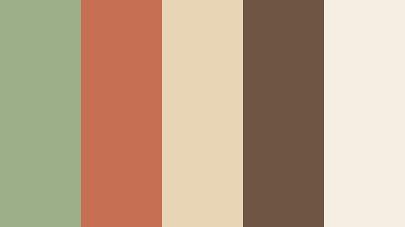
- HEX Codes: #9caf88, #c66f52, #e8d5b5, #6f5543, #f5eee2
- Mood: Warm, grounded, and inviting with a sunlit desert character.
- Use for: Use this palette for home decor thumbnails, lifestyle brand intros, room tours, and earthy social content.
Desert Courtyard blends muted sage with terracotta and sandy neutrals for a welcoming, organic look. The soft green creates a restful foundation, while the clay tone adds enough warmth to keep the design expressive and personal.
Use the darker brown for readable titles, borders, or logo details, and reserve the creamy neutral for open space. In video, this combination works well for room tours, handcrafted product stories, warm intros, and lifestyle thumbnails that need a natural sense of place.
Pro Tip: Enhance Your Sage Green And Terracotta Home Decor Store Color Visuals with Filmora
Filmora can help you carry the Desert Courtyard look across an entire edit. Use the sage and terracotta tones in your opening title, lower thirds, transitions, and b-roll accents so the visual identity feels consistent from the first frame to the last.
For home decor and lifestyle footage, keep the palette balanced by using terracotta as an accent rather than covering every element with warm orange. This creates a polished edit with enough contrast for captions, product details, and social media crops.
AI Color Palette
Take a reference image, mood board, or digital color card based on Desert Courtyard and use Filmora's AI Color Palette feature to apply its visual character across your footage. This can help unify clips recorded in different rooms, lighting conditions, or locations.
The tool is especially useful for matching room tour footage, outdoor b-roll, and branded graphics. Start with a representative image, review the result, and make small manual adjustments when skin tones or bright surfaces need extra care.
 secure download

HSL, Color Wheels & Curves
Use HSL controls to refine the relationship between the sage and terracotta tones. You can slightly reduce green saturation for a softer editorial finish, increase orange luminance to brighten clay details, or shift the highlights toward cream for a sunlit result. Color wheels can add warmth to the highlights while keeping the shadows grounded in brown or deep green.
Curves provide additional control over contrast. A gentle S-curve can make the footage more cinematic, while lifted shadows can create the relaxed, airy feeling often associated with home decor content.
secure download1000+ Video Filters & 3D LUTs
Filmora's collection of filters and LUTs makes it easy to stylize Desert Courtyard footage without adjusting every clip from scratch. Try a warm cinematic preset for room tours, then reduce its intensity so the sage remains natural and the terracotta stays rich rather than oversaturated.
Filmora's video filters and 3D LUTs make it easy to build a repeatable look for intros, product clips, and short-form videos. Apply a consistent preset first, then fine-tune individual shots for matching exposure and white balance.
secure downloadClay Garden Retreat
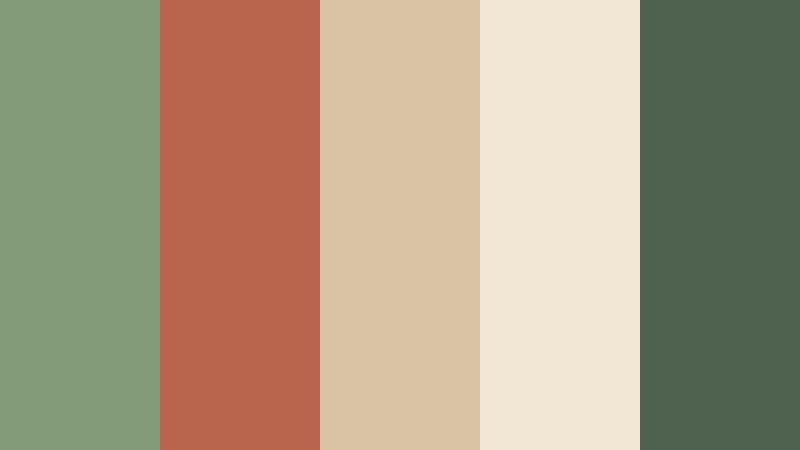
- HEX Codes: #849b78, #b9654d, #d8c3a5, #f2e7d5, #4f6250
- Mood: Natural, restful, and softly rustic.
- Use for: Use this palette for garden videos, wellness graphics, handmade packaging, and cozy home design posts.
Clay Garden Retreat pairs leafy sage tones with fired clay and warm cream. The result feels calm and artisanal without losing visual warmth. Its deep green accent gives the lighter colors structure and definition.
This palette is a strong choice for garden videos, wellness intros, handmade packaging, and cozy home design posts. Use the cream shades as a background, then bring in terracotta for buttons, chapter labels, or thumbnail objects.
Sunbaked Olive Hearth
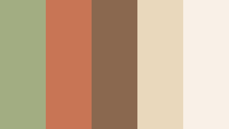
- HEX Codes: #a2ad82, #c87555, #8a684f, #ead8bd, #f8f1e7
- Mood: Comforting, sunny, and lived-in.
- Use for: Use this palette for cooking content, family lifestyle thumbnails, home renovation stories, and warm brand packaging.
Sunbaked Olive Hearth creates a friendly domestic mood through soft olive, terracotta, and toasted brown. It feels personal and approachable, with enough neutral space to keep layouts clean.
Use it for cooking content, family lifestyle videos, home renovation stories, and warm packaging mockups. The darker brown is useful for text and outlines, while the pale cream works well behind footage or title cards.
Canyon Herb Market
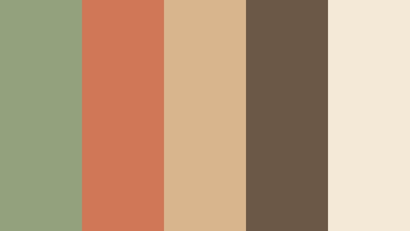
- HEX Codes: #91a27c, #cf7757, #d9b58d, #6b5847, #f4e9d6
- Mood: Fresh, handcrafted, and gently adventurous.
- Use for: Use this palette for food branding, farmers market graphics, travel vlogs, and rustic social media templates.
Canyon Herb Market combines herbal green with canyon clay and natural tan. The colors feel fresh and handcrafted, while the dark brown adds enough contrast for labels, captions, and graphic dividers.
Its balanced contrast suits food branding, farmers market graphics, travel vlogs, and rustic social templates. Try terracotta for animated titles and sage for map markers, chapter cards, or branded overlays.
Soft And Serene Sage Green And Terracotta Home Decor Store Color Color Palettes
Misted Terracotta Morning
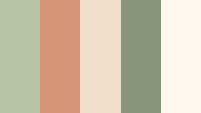
- HEX Codes: #b7c5a5, #d79578, #f1dfca, #87957b, #fff9f0
- Mood: Airy, gentle, and quietly optimistic.
- Use for: Use this palette for morning routine videos, skincare branding, soft thumbnails, and minimalist social content.
Misted Terracotta Morning softens the earthy pairing with pale sage, blush clay, and creamy white. It creates a clean and peaceful atmosphere for delicate visuals and gentle storytelling.
Use the pale colors for backgrounds and title cards, then add muted terracotta to highlight product names or key moments in morning routine videos. The darker sage provides subtle readability without making the design feel heavy.
Sage Blossom Nook
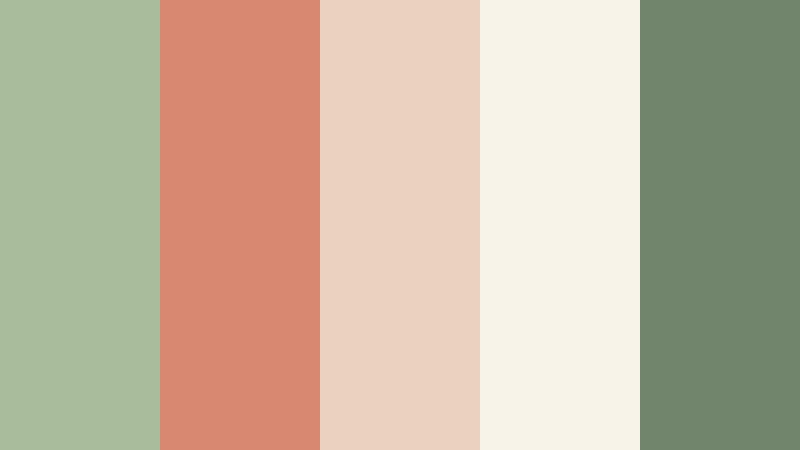
- HEX Codes: #a9bd9c, #d88770, #ead2c0, #f8f3e9, #71856d
- Mood: Tender, relaxed, and subtly romantic.
- Use for: Use this palette for boutique interiors, beauty content, journaling videos, and calm lifestyle graphics.
Sage Blossom Nook brings floral softness to sage and terracotta with dusty rose and warm ivory accents. It feels tender and welcoming, making it suitable for designs with a relaxed or subtly romantic tone.
Use it for boutique interior tours, beauty content, journaling videos, and calm lifestyle graphics. The deep sage can anchor small text areas, while the rose-clay shade creates gentle visual emphasis in thumbnails and transitions.
Quiet Adobe Light
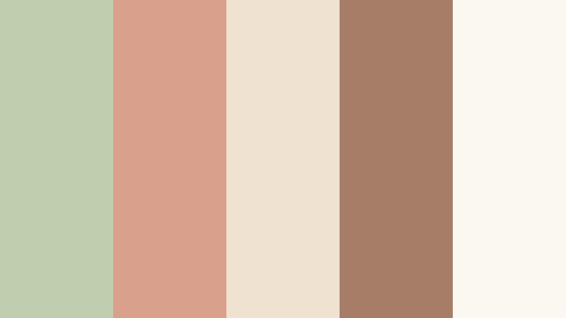
- HEX Codes: #c0cdae, #d9a18b, #f0e2d0, #a77d68, #fbf8f2
- Mood: Peaceful, refined, and softly sunlit.
- Use for: Use this palette for architecture videos, modern home tours, presentation slides, and understated web layouts.
Quiet Adobe Light uses pale sage and muted terracotta to create an elegant neutral foundation. The palette leaves plenty of breathing room and supports a calm visual rhythm.
It works especially well for architecture videos, modern home tours, presentation slides, and understated web layouts. Use the muted brown as a small contrast color for labels, icons, or thin graphic lines.
Peach Sage Whisper
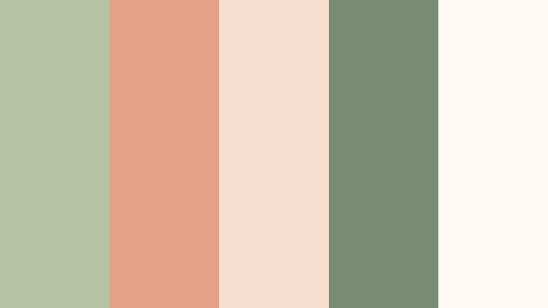
- HEX Codes: #b4c3a4, #e5a187, #f6dfce, #788b73, #fffaf4
- Mood: Lighthearted, fresh, and comforting.
- Use for: Use this palette for social reels, nursery decor content, cheerful product cards, and friendly UI accents.
Peach Sage Whisper combines fresh green with soft peach terracotta and bright cream. It feels upbeat while remaining gentle, making it easy to use in friendly and approachable visual systems.
Try it for social reels, nursery decor content, cheerful product cards, and welcoming user interface accents. Use the deeper sage for text and the peach tone for animated highlights, stickers, or call-to-action elements.
Elegant And Modern Sage Green And Terracotta Home Decor Store Color Color Palettes
Modern Hearth Studio
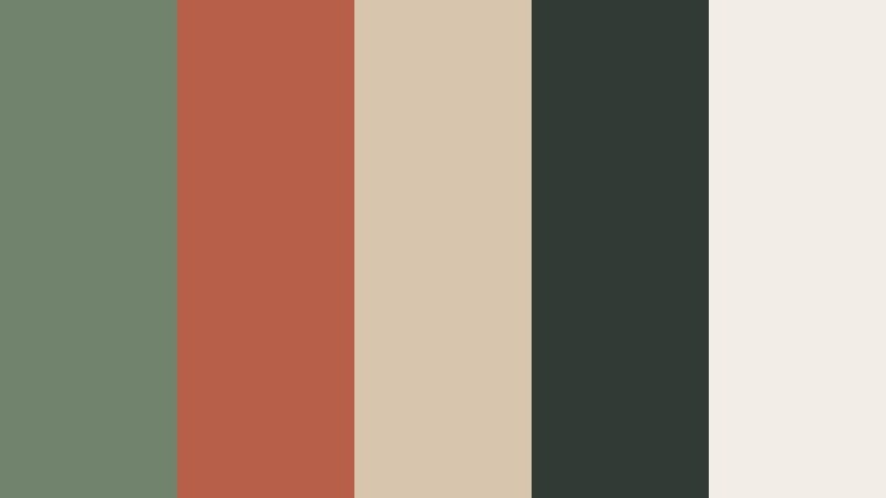
- HEX Codes: #71836d, #b85f49, #d8c5ad, #303b35, #f3eee5
- Mood: Polished, confident, and contemporary.
- Use for: Use this palette for premium home brands, cinematic intros, editorial thumbnails, and modern website interfaces.
Modern Hearth Studio sharpens the earthy pairing with deep charcoal green and warm ivory. It delivers a sophisticated look with strong contrast for text, titles, and brand marks.
Use the dark green for intro backgrounds or headline panels, then bring in terracotta as a controlled accent. This combination suits premium home brands, cinematic intros, editorial thumbnails, and modern website interfaces.
Copper Leaf Gallery
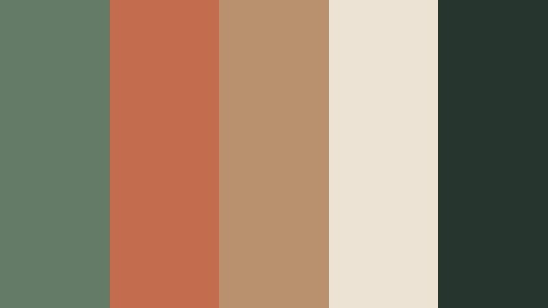
- HEX Codes: #647b68, #c36d4e, #b8926e, #ece3d5, #27352f
- Mood: Artful, premium, and quietly dramatic.
- Use for: Use this palette for gallery promotions, furniture branding, fashion reels, and elegant product presentation videos.
Copper Leaf Gallery pairs deep botanical sage with copper terracotta and dark forest accents. It feels curated and luxurious without becoming overly formal or cold.
This palette is effective for gallery promotions, furniture branding, fashion reels, and elegant product videos. Use the light stone shade to frame product imagery and the dark forest tone to create a strong visual anchor.
Heritage Clay Modern
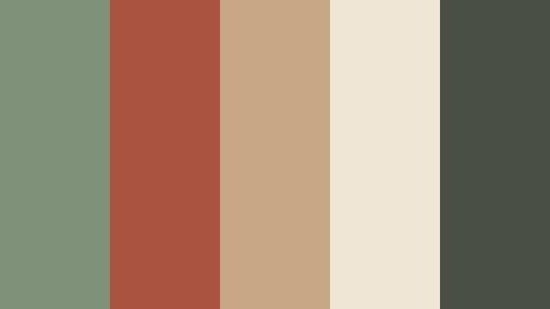
- HEX Codes: #80917a, #a95340, #c7a784, #f0e6d5, #4a4f43
- Mood: Timeless, assured, and design-forward.
- Use for: Use this palette for heritage brands, renovation content, logo reveals, and editorial design systems.
Heritage Clay Modern combines aged sage and rich terracotta with stone and charcoal neutrals. It creates a grounded identity that bridges traditional materials and contemporary design.
Use it for renovation content, heritage brand stories, logo reveals, and editorial layouts. The rich terracotta can emphasize before-and-after moments, while the charcoal neutral improves text clarity across video graphics.
Terracotta Linework
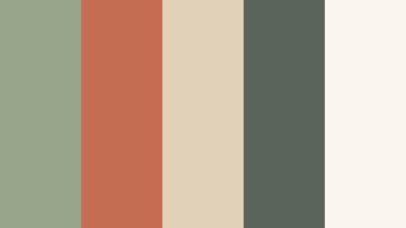
- HEX Codes: #98a58b, #c56d52, #e2d1b9, #59645a, #fbf6ed
- Mood: Structured, warm, and visually balanced.
- Use for: Use this palette for architectural diagrams, brand systems, clean thumbnails, and modern presentation templates.
Terracotta Linework uses restrained sage and clay with pale stone and dark green for crisp contrast. It works well when a layout needs both warmth and precision.
Use this palette for architectural diagrams, clean thumbnails, modern presentation templates, and branded explainers. The terracotta is strong enough for lines and highlights, while the pale stone keeps complex layouts easy to scan.
Bold And Vibrant Sage Green And Terracotta Home Decor Store Color Color Palettes
Sunset Mosaic
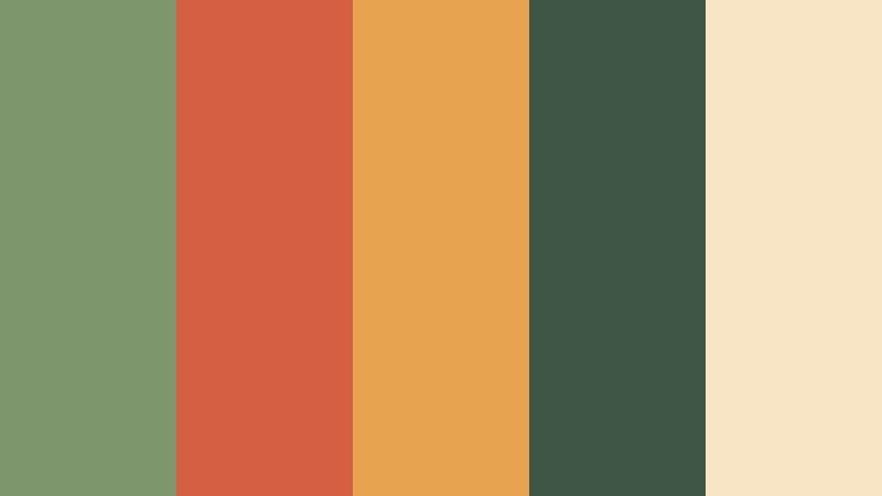
- HEX Codes: #7d966b, #d45f43, #e7a34f, #3f5545, #f7e5c5
- Mood: Energetic, expressive, and richly sun-warmed.
- Use for: Use this palette for travel videos, bold thumbnails, event graphics, animated titles, and colorful social campaigns.
Sunset Mosaic gives sage and terracotta a vivid lift with golden amber and dark green. It is made for memorable visuals with a strong sense of place and lively contrast.
Use amber for animated accents and key thumbnail details, then balance it with dark green text or framing. The palette works well for travel videos, event graphics, bold title sequences, and colorful social campaigns.
Desert Fiesta
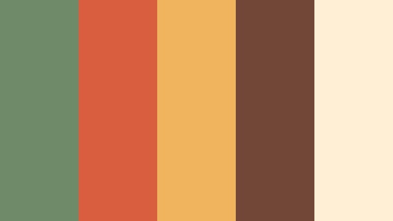
- HEX Codes: #6f8a68, #d85e3f, #f0b45e, #734738, #fff0d5
- Mood: Joyful, lively, and celebratory.
- Use for: Use this palette for festival promos, food content, creator branding, energetic reels, and colorful packaging.
Desert Fiesta turns the earthy pairing into a spirited combination with orange, golden yellow, and deep clay. It adds personality and movement to high-energy creative projects.
Use the bright colors selectively for stickers, text animations, transitions, and thumbnail highlights. The deep clay and sage tones provide enough grounding for food content, festival promotions, creator branding, and energetic reels.
Cactus Ember
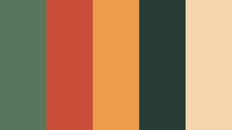
- HEX Codes: #58755d, #c84f39, #ee9b4b, #273b35, #f4d7ad
- Mood: Adventurous, vivid, and confidently earthy.
- Use for: Use this palette for outdoor brands, adventure vlogs, gaming overlays, bold logos, and attention-grabbing video covers.
Cactus Ember combines deep cactus green with fiery terracotta and bright orange. The high contrast makes it effective for dynamic digital content and strong visual hooks.
Use the darkest green for backgrounds and the orange tones for titles, icons, or calls to action. This palette suits outdoor brands, adventure vlogs, gaming overlays, bold logos, and attention-grabbing video covers.
Tips for Creating Sage Green And Terracotta Home Decor Store Color Color Palettes
Sage green and terracotta can support many different moods, from soft and serene to bold and energetic. The best results come from controlling contrast, assigning each color a clear role, and checking how the palette behaves across footage, text, thumbnails, and different screen sizes.
- Use sage green as the main foundation when you want a calm, natural, or wellness-focused mood.
- Use terracotta as an accent for warmth, movement, and visual emphasis rather than applying it equally everywhere.
- Pair both colors with cream, sand, or warm white to create clean backgrounds and improve readability.
- Add a deep brown, charcoal green, or forest shade for text, logos, outlines, and title cards that need strong contrast.
- Match the palette to the footage by checking skin tones, natural light, wall colors, furniture, and outdoor backgrounds.
- Keep brand consistency by reusing the same HEX values in intros, lower thirds, thumbnails, captions, and social templates.
- Test saturated terracotta and orange accents at small sizes to make sure they remain readable without overpowering the subject.
- Save separate versions of the palette for light, dark, cinematic, and mobile-first layouts so each edit remains clear.
Sage green and terracotta palettes can shape the emotional identity of a project before viewers hear the first line of dialogue. Softer combinations feel peaceful and welcoming, while darker or brighter versions can make a brand appear more confident, expressive, or adventurous.
Use the HEX codes in this collection as a starting point, then adapt saturation, brightness, and contrast to match your footage. A consistent color system can make home decor videos, lifestyle content, product stories, and creator brands feel more intentional.
Filmora gives you practical tools for testing these combinations across intros, b-roll, captions, filters, and full video timelines. Try a reference palette, compare several treatments, and adjust the final look until the sage and terracotta tones support your story.
secure downloadNext: Royal Blue And Orange Electronics Store Color Color Palette
