

 100% Security Verified | No Subscription Required | No Malware

Calm color palettes use soft, balanced tones to create feelings of peace, trust, comfort, and emotional clarity. Muted blues, gentle greens, warm neutrals, lavender shades, and softened earth colors can make visual content feel more welcoming and less overwhelming.
These colors are useful for video editing, branding, thumbnails, title cards, intros, vlogs, social media graphics, and modern design projects. This guide provides Calm Color Palette color palettes with HEX codes so creators and Filmora users can build consistent, relaxing visuals across their projects.
In this article
Soft & Serene Calm Color Palette Color Palettes
Clouded Lavender
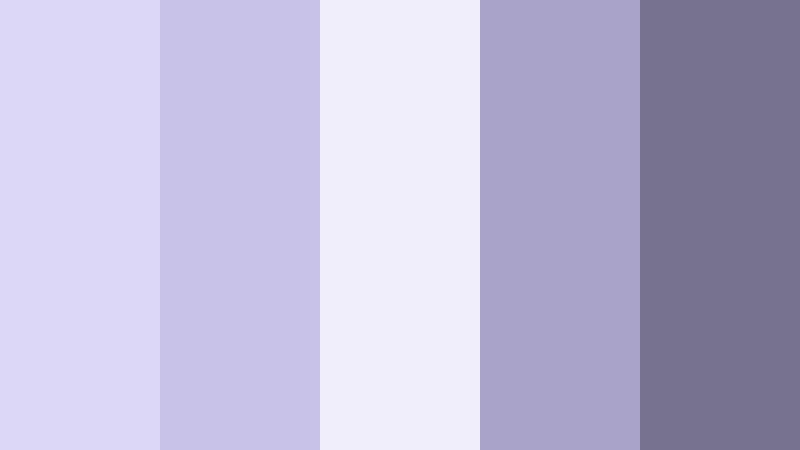
- HEX Codes: #dcd6f7, #c8c2e8, #f1eefb, #a9a3c9, #77728f
- Mood: Peaceful, reflective, and softly sophisticated.
- Use for: Use this palette for wellness videos, meditation thumbnails, gentle brand intros, and quiet lifestyle content.
Clouded Lavender blends airy lilac tones with muted violet accents for a soothing visual rhythm. The pale lavender shades create an open, gentle foundation, while the deeper violet tones add structure and enough contrast for text, borders, and focal details.
This palette works especially well for mindful content, beauty design, and soft editorial layouts. In video, use the lighter colors for title cards and background panels, then bring in the darker violet shades for subtitles, transitions, logos, and calm cinematic intros.
Pro Tip: Build A Soft Lavender Look In Filmora
Use Clouded Lavender as a visual guide when editing wellness videos, quiet lifestyle reels, or meditation content in Filmora. Apply the pale lilac tones to title cards and overlays, then repeat the muted violet accent in lower thirds, logo animations, and end screens to create a consistent visual flow.
For b-roll, balance bright exposure with gentle contrast so the lavender tones remain airy rather than gray. Keeping the same accent color across intros, transitions, and social edits helps the entire project feel calm and thoughtfully designed.
AI Color Palette
Creators can use a reference image, mood board, or color card based on Clouded Lavender and apply its visual character across an entire video. Filmora's AI Color Palette feature helps match the look of different clips so footage from different cameras or lighting conditions feels more unified.
This is useful when a project includes indoor talking-head footage, lavender product shots, and outdoor b-roll. Start with the reference palette, apply it to key clips, and then make small adjustments for skin tones and readability.
 secure download

HSL, Color Wheels & Curves
Filmora's HSL controls can refine Clouded Lavender by adjusting the saturation and brightness of the lilac, violet, and blue channels. Use the color wheels to keep highlights soft and luminous while adding a subtle violet balance to the shadows. Curves can add gentle contrast without losing the relaxed feeling of the palette.
For a more cinematic finish, slightly lower harsh highlights and deepen the darkest violet tones. Keep skin tones natural and check subtitle contrast against pale backgrounds before exporting.
secure download1000+ Video Filters & 3D LUTs
Filmora's filter and LUT library makes it easy to give Clouded Lavender footage a polished visual direction. Choose a soft, low-contrast filter for meditation clips, or use a cooler lavender LUT for dreamy music videos and beauty content.
Filmora's video filters and 3D LUTs make it easy to test different levels of softness, contrast, and color depth without manually grading every clip.
secure downloadMisty Rosewater
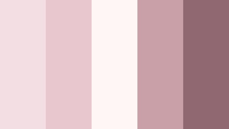
- HEX Codes: #f3dfe3, #e8c7cf, #fff7f5, #c99fa8, #8f6872
- Mood: Tender, warm, and quietly romantic.
- Use for: Use this palette for self-care content, romantic reels, beauty packaging, social posts, and elegant vlog thumbnails.
Misty Rosewater combines pale blush tones with softened berry accents for a graceful, comforting look. The nearly white pink creates a clean background, while the rose and berry shades bring warmth and emotional depth.
Use it for self-care content, romantic reels, beauty packaging, and elegant vlog thumbnails. In video, pale blush works well in opening cards and overlays, while the darker rose tone can define headings, captions, and small graphic details.
Quiet Blue Hour

- HEX Codes: #c8d9e8, #a9c1d5, #e8f0f5, #718da5, #40566b
- Mood: Calm, contemplative, and softly cinematic.
- Use for: Use this palette for evening vlogs, cinematic title cards, podcast branding, travel videos, and reflective social content.
Quiet Blue Hour captures the peaceful transition between daylight and night with cool, muted blues. Its pale blue-gray shades feel spacious and relaxed, while the deep blue accent adds a cinematic anchor.
This palette is a strong choice for evening vlogs, travel videos, podcast branding, and reflective storytelling. Use the lightest blue for backgrounds and the deepest shade for title text, logos, navigation elements, or dramatic closing cards.
Vanilla Haze
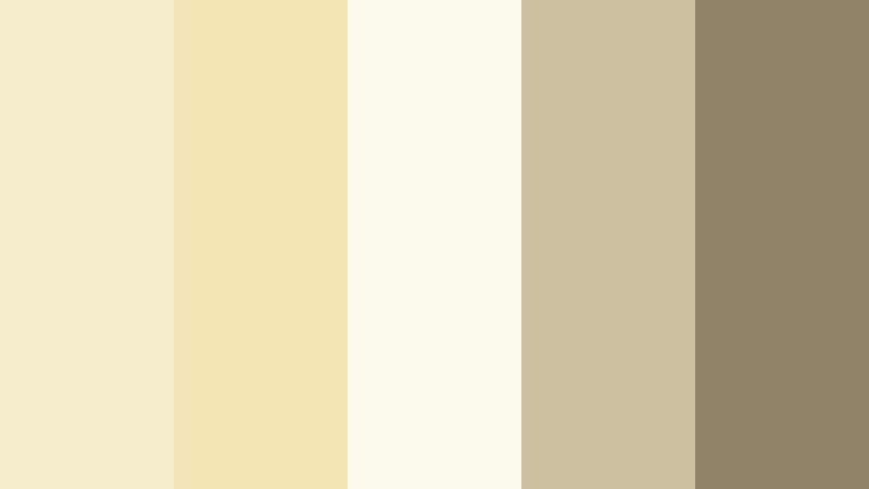
- HEX Codes: #f7edcf, #f3e4b5, #fffaf0, #cdbf9d, #8f8469
- Mood: Comforting, sunny, and understated.
- Use for: Use this palette for food content, cozy home videos, lifestyle branding, packaging, and warm social media graphics.
Vanilla Haze pairs creamy neutrals with soft golden tones to create a welcoming visual mood. It feels warm without becoming overly bright, making it useful for friendly designs that need clarity and ease.
Use this palette for food content, cozy home videos, lifestyle branding, and warm social graphics. Cream can support readable text panels, while the muted gold and olive-gray shades add depth to thumbnails, packaging, and branded intros.
Nature-Inspired Calm Color Palette Color Palettes
Sage Garden
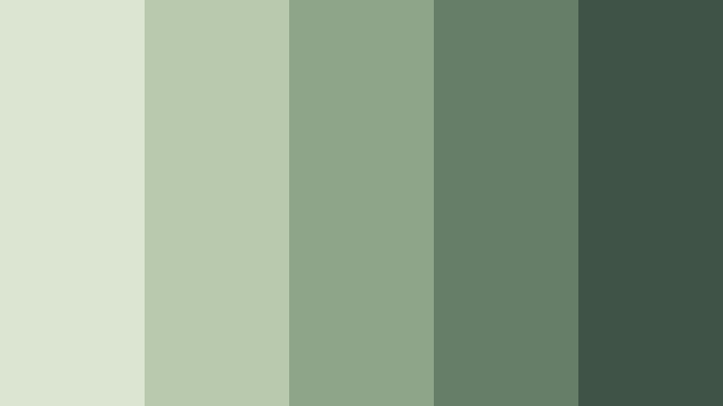
- HEX Codes: #dce5d1, #b8c9ad, #8fa58a, #667d67, #3f5447
- Mood: Grounded, restorative, and organic.
- Use for: Use this palette for sustainable brands, gardening videos, wellness content, app interfaces, and nature-inspired thumbnails.
Sage Garden brings together layered green shades that feel fresh, balanced, and connected to nature. The pale sage tones keep layouts open, while the deeper forest green gives text and visual accents a stable foundation.
It supports clean layouts and calming visual storytelling for sustainable brands, gardening videos, wellness channels, and nature-inspired thumbnails. Pair the mid-tone green with natural footage, wood textures, and soft daylight for a cohesive result.
Sea Glass Retreat
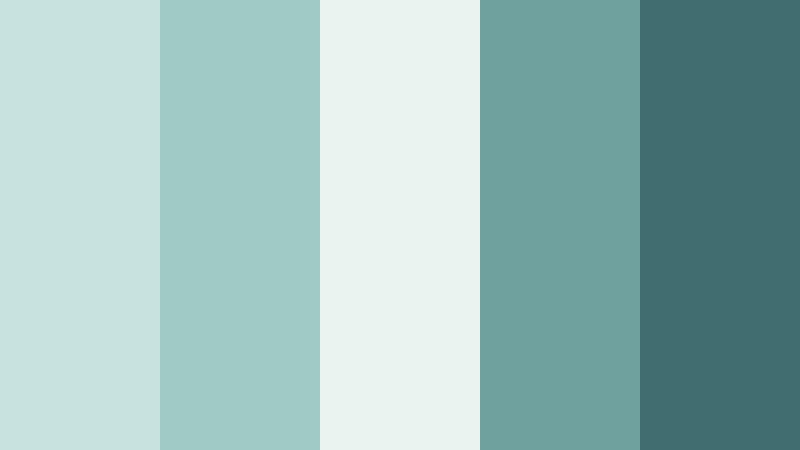
- HEX Codes: #c8e3df, #9fcac6, #e9f4f0, #6fa29f, #416c70
- Mood: Refreshing, coastal, and tranquil.
- Use for: Use this palette for travel content, beach videos, spa branding, mobile interfaces, and clean lifestyle graphics.
Sea Glass Retreat uses soft aqua and seafoam shades to evoke a quiet shoreline. The palette feels airy and refreshing, with a darker teal accent that can create definition without losing its relaxed character.
Use it for beach videos, travel content, spa branding, and clean lifestyle graphics. Aqua backgrounds work well behind maps, captions, and product details, while the deep teal can highlight calls to action and logo elements.
Mossy Morning
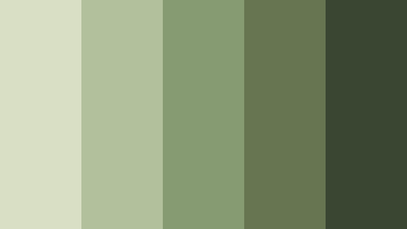
- HEX Codes: #d8dfc5, #b2c19c, #879b72, #657651, #394732
- Mood: Earthy, peaceful, and quietly resilient.
- Use for: Use this palette for outdoor adventures, eco-friendly packaging, documentary videos, editorial design, and grounded brand identities.
Mossy Morning layers soft olive greens with deep woodland accents for a natural, balanced finish. Its muted colors feel authentic and understated, making them suitable for brands that value sustainability, craft, and slow living.
This palette is well suited to outdoor adventures, documentary videos, editorial design, and eco-friendly packaging. Use the lighter greens for backgrounds and the deepest woodland shade for captions, icons, and strong graphic framing.
Dune At Dusk

- HEX Codes: #e5d4bf, #cbb297, #a8876c, #765d4e, #493c36
- Mood: Warm, grounded, and contemplative.
- Use for: Use this palette for travel films, desert photography, artisan brands, cinematic intros, and earthy social media designs.
Dune At Dusk combines sandy neutrals with dusky brown tones for a grounded, cinematic feel. The lighter beige shades add warmth and space, while the dark brown provides depth for text, borders, and dramatic visual transitions.
Use it for travel films, desert photography, artisan brands, and earthy social media designs. It pairs naturally with golden-hour footage, textured paper backgrounds, handmade products, and slow-paced cinematic intros.
Elegant & Modern Calm Color Palette Color Palettes
Stone And Linen
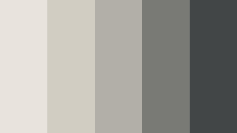
- HEX Codes: #e8e4dc, #d2cdc2, #b2afa7, #797a76, #424646
- Mood: Refined, balanced, and effortlessly modern.
- Use for: Use this palette for minimalist websites, architecture videos, luxury packaging, presentation decks, and professional brand systems.
Stone And Linen creates a polished neutral foundation with subtle shifts from warm cream to charcoal gray. The restrained contrast feels premium and dependable, making the palette flexible across digital and printed designs.
It works well for minimalist websites, architecture videos, luxury packaging, presentation decks, and professional brand systems. Use the light neutrals for spacious layouts and the charcoal tone for headlines, logos, and important interface controls.
Moonlit Slate

- HEX Codes: #d7dde2, #aebbc5, #7d8d99, #596b78, #303d48
- Mood: Cool, focused, and sophisticated.
- Use for: Use this palette for tech videos, productivity content, corporate presentations, dashboard interfaces, and modern title sequences.
Moonlit Slate balances pale blue-gray highlights with deep slate tones for a calm but confident look. It creates a focused, professional atmosphere while keeping digital designs from feeling too harsh or sterile.
Use it for productivity videos, corporate presentations, dashboards, and modern title sequences. The pale shades can separate content areas, while the darkest slate works well for navigation, bold headings, and high-contrast overlays.
Muted Terracotta
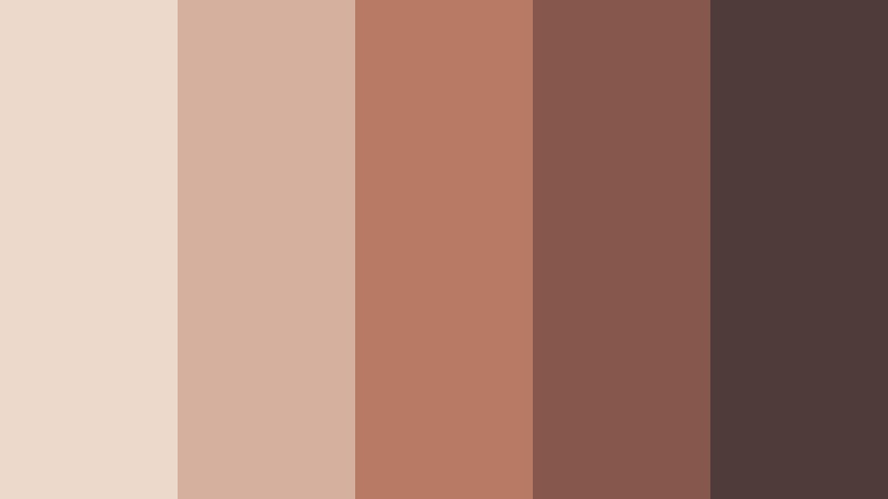
- HEX Codes: #edd8cc, #d6b09e, #b87965, #86574c, #4f3c39
- Mood: Artistic, cozy, and confidently understated.
- Use for: Use this palette for creative portfolios, cooking videos, handmade product branding, editorial thumbnails, and interior design content.
Muted Terracotta brings warmth and personality through softened clay tones and deep earthy accents. It feels expressive while maintaining a relaxed, sophisticated balance that works across both rustic and modern projects.
Use it for creative portfolios, cooking videos, handmade product branding, editorial thumbnails, and interior design content. The pale terracotta can soften backgrounds, while the darker clay shades add focus to titles, labels, and brand marks.
Pewter And Pearl

- HEX Codes: #eeeef0, #d4d5d8, #b0b4ba, #7f858c, #4f565e
- Mood: Polished, cool, and quietly luxurious.
- Use for: Use this palette for fashion videos, jewelry branding, product mockups, UI design, and sophisticated social templates.
Pewter And Pearl combines luminous pale gray with refined metallic-inspired shades. It creates a clean, upscale appearance without feeling stark, especially when balanced with soft lighting and subtle texture.
This palette is useful for fashion videos, jewelry branding, product mockups, and sophisticated social templates. Use the pearl shades for backgrounds and product space, then apply pewter gray to headings, outlines, icons, and elegant transition cards.
Dreamy & Coastal Calm Color Palette Color Palettes
Lavender Tide
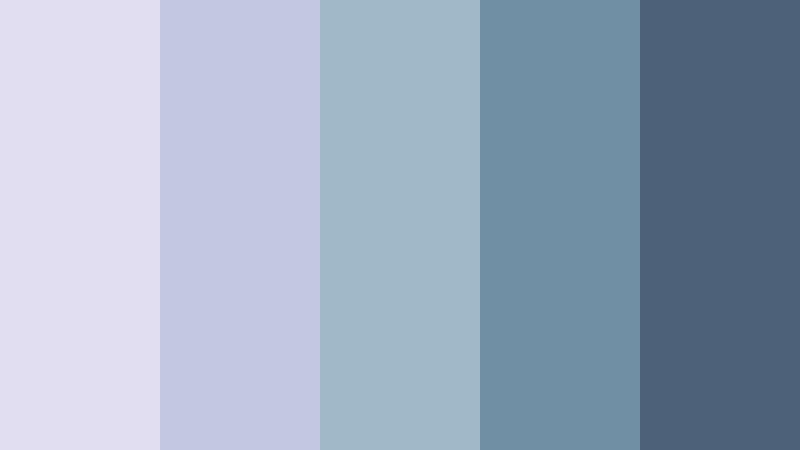
- HEX Codes: #e2def2, #c3c8e2, #a1b8c9, #718fa4, #4d6178
- Mood: Dreamy, open, and gently refreshing.
- Use for: Use this palette for coastal travel reels, dreamy music videos, skincare branding, lifestyle apps, and atmospheric thumbnails.
Lavender Tide blends cool lilac with oceanic blue-gray shades for a peaceful, imaginative effect. The combination feels both airy and cinematic, with enough contrast to support clear text and visual hierarchy.
It works beautifully for coastal travel reels, dreamy music videos, skincare branding, and atmospheric thumbnails. Use lilac for soft transitions and graphic backgrounds, then bring in blue-gray accents for captions, logos, and cinematic title cards.
Powdered Sky

- HEX Codes: #dceaf3, #bfd8e7, #a8c6d6, #769caf, #536f81
- Mood: Light, optimistic, and spacious.
- Use for: Use this palette for morning vlogs, educational content, aviation or travel branding, social graphics, and friendly interface design.
Powdered Sky captures the openness of a clear morning with soft blue layers and muted steel accents. It gives content a bright, organized, and welcoming feel without relying on intense saturation.
Use it for morning vlogs, educational content, travel branding, and friendly interfaces. The palest blue can support clean layouts and title cards, while the steel-blue tones improve contrast in captions, charts, buttons, and thumbnail text.
Coastal Fog
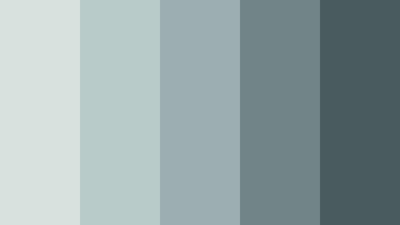
- HEX Codes: #d9e1df, #b9cbc9, #9caeaf, #718486, #4a5b60
- Mood: Quiet, atmospheric, and introspective.
- Use for: Use this palette for documentary storytelling, rainy-day videos, podcast covers, minimalist websites, and moody travel content.
Coastal Fog layers desaturated blue-green shades to create a soft, cinematic haze. Its low-saturation character is ideal for designs that favor atmosphere, restraint, and emotional depth over bright visual energy.
Use it for documentary storytelling, rainy-day videos, podcast covers, minimalist websites, and moody travel content. The deeper blue-green shade can anchor titles and subtitles, while the lighter tones create a misty background for stills and video overlays.
Moonflower Mist
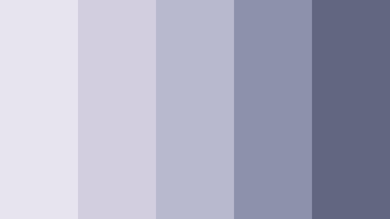
- HEX Codes: #e7e4ef, #d2cedf, #b8b9cf, #8d91ab, #62677f
- Mood: Mystical, gentle, and creatively inspiring.
- Use for: Use this palette for poetry videos, music covers, creative portfolios, night-themed content, and elegant digital campaigns.
Moonflower Mist pairs pale lavender-gray with dusky blue-violet tones for a subtle nighttime mood. It adds imagination and softness while keeping the overall composition controlled and easy to read.
This palette suits poetry videos, music covers, creative portfolios, night-themed content, and elegant digital campaigns. Use the pale shades for dreamy backgrounds and the dusky accents for type, framing, motion graphics, and atmospheric intros.
Tips for Creating Calm Color Palette Color Palettes
Calm palettes work best when their softness is supported by clear contrast, consistent branding, and footage that matches the intended mood. Combine a light base color with one or two mid-tone accents and a deeper shade for readable text, visual structure, and memorable brand details.
- Use one dominant light or muted color as the foundation, then reserve darker shades for headings, subtitles, logos, and important calls to action.
- Check text readability on every background, especially when using pale lavender, cream, blush, or blue-gray tones in thumbnails and title cards.
- Keep the same accent colors across intros, lower thirds, transitions, captions, end screens, and social media graphics to strengthen brand consistency.
- Match the palette to the lighting and subject of your footage. Soft greens suit natural scenes, while blue-gray palettes often work well with evening or rainy footage.
- Use saturation carefully. Muted colors create a calm mood, but slightly increasing saturation in one accent can help a logo, product, or key message stand out.
- Balance warm and cool colors to control the emotional direction of a video. Warm beige and terracotta can add comfort, while blue and green tones can make content feel fresher.
- Test your palette on different screens and export sizes. A color that looks subtle on a large monitor may become too faint on a mobile thumbnail.
- Use color grading tools, filters, and LUTs consistently across clips so footage from different cameras does not break the visual rhythm.
Calm color palettes can shape how viewers experience a video before they hear the first line or understand the full message. Lavender, blue, green, cream, gray, and earthy tones can make a brand feel more thoughtful, reliable, restorative, or refined.
The right palette also helps connect separate creative elements. A repeated color system can unify footage, thumbnails, intros, captions, product graphics, and social posts into one recognizable visual identity.
Try these Calm Color Palette combinations in Filmora and adjust them to match your footage, audience, and brand personality. With color matching, HSL controls, curves, filters, and LUTs, you can build a consistent look without manually recreating every adjustment on each clip.
secure download