

 100% Security Verified | No Subscription Required | No Malware

Dark Academia Color is built around deep, muted tones that suggest old libraries, handwritten notes, antique furniture, candlelight, and thoughtful study. Its combination of charcoal, plum, forest green, aged gold, parchment, and faded brown can make visual content feel intellectual, nostalgic, mysterious, and quietly cinematic.
These colors are especially effective for video intros, cinematic thumbnails, bookish branding, study vlogs, editorial layouts, mood boards, and atmospheric social content. Below, you will find Dark Academia Color color palettes with HEX codes for creators and Filmora users, along with practical ideas for applying each combination to video and design projects.
In this article
Moody & Scholarly Dark Academia Color Palettes
Library After Midnight
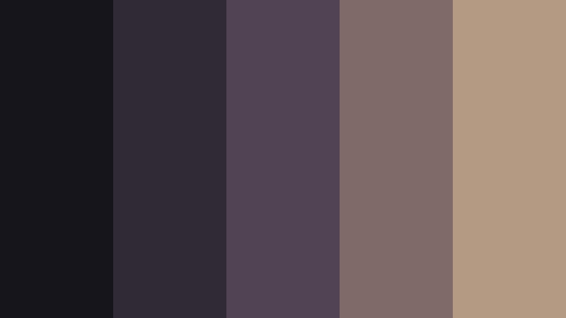
- HEX Codes: #17151c, #302a35, #514354, #806a68, #b49a83
- Mood: Intellectual, mysterious, and quietly dramatic.
- Use for: This palette works well for cinematic thumbnails, bookish video intros, editorial layouts, and atmospheric social content.
Deep plum, charcoal, and muted tan create the feeling of an old library after dark. The darkest shades provide a serious foundation, while the softened tan adds enough warmth to keep the composition from feeling flat or severe.
Use this combination for literary branding, study content, reading vlogs, and refined visual storytelling. In video, reserve the light tan for title text, subtitles, or small highlights so the typography remains readable against the darker background.
Pro Tip: Build A Cinematic Library Look In Filmora
Use the darkest plum and charcoal tones for title cards, lower thirds, and background overlays, then introduce muted tan through captions, transitions, or b-roll accents. Filmora can help you repeat these colors across intros, reading footage, desk scenes, and short social edits so the full project feels visually connected.
For a more polished result, keep skin tones and important subjects natural while applying the palette mainly to shadows, graphics, background elements, and selected highlights. This creates a dark academic atmosphere without making every frame look overly tinted.
AI Color Palette
Creators can capture this Library After Midnight palette from a reference image, mood board, or digital color card and apply its visual character across an entire project. Filmora's AI Color Palette feature can help match footage from different cameras or locations while keeping the plum, charcoal, and antique tan relationship consistent.
Apply the palette to a reading vlog, cinematic essay, or book review, then refine individual clips when lighting conditions vary. This approach is useful when you want a unified look across an intro, b-roll sequence, and final title card.
 secure download

HSL, Color Wheels & Curves
Use HSL controls to deepen the purple and plum tones while slightly reducing overly bright or saturated colors. The color wheels can add cool blue-violet detail to the shadows and a restrained beige warmth to the highlights, giving the footage a cinematic library atmosphere.
Curves are useful for creating a gentle contrast shape: lower the shadows, protect the detail in dark areas, and lift the midtones slightly so books, faces, and handwritten details remain visible. These adjustments help maintain the mood without losing essential visual information.
secure download1000+ Video Filters & 3D LUTs
Filmora's library can quickly reinforce the Library After Midnight mood with vintage, cinematic, muted, and low-light treatments. Filmora's video filters and 3D LUTs make it easy to test several versions of the palette before choosing the look that best suits your footage.
Apply a subtle filter to the full edit, then use opacity and clip-level adjustments to preserve important details. A restrained LUT can work especially well for candlelit desk scenes, old book close-ups, and slow-moving atmospheric introductions.
secure downloadInk And Antique Paper

- HEX Codes: #101820, #263746, #59656f, #b8a995, #e0d2b8
- Mood: Thoughtful, timeless, and quietly nostalgic.
- Use for: This palette is ideal for writing channels, educational content, portfolio websites, stationery, and minimalist brand presentations.
Ink blue and weathered paper tones evoke handwritten notes, fountain pens, and treasured archives. The combination feels more restrained than a high-contrast black and white design, giving educational and editorial content a sense of warmth and history.
Use the dark blue shades for headers, title cards, and interface panels, then use antique paper for backgrounds, subtitles, or callout blocks. It is a dependable palette for writing channels, educational videos, portfolio websites, and stationery-inspired branding.
Poet's Corner
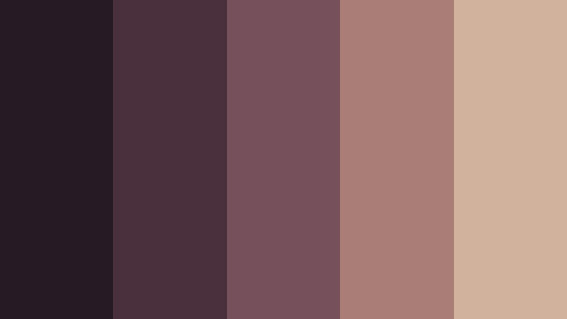
- HEX Codes: #241b24, #49303c, #76505a, #aa7d76, #d1b29d
- Mood: Romantic, introspective, and softly melancholic.
- Use for: Use this palette for poetry videos, personal essays, wedding stationery, lifestyle thumbnails, and expressive social media graphics.
Berry shades and faded rose add a tender romantic edge to the Dark Academia Color aesthetic. The deep plum gives the palette emotional weight, while dusty rose and soft beige make it feel personal rather than severe.
This palette is effective for poetry readings, personal essays, romance storytelling, and expressive thumbnails. Use the lighter rose tones for captions and graphic details, especially when the background contains dark plum or brown footage.
Velvet Study Hall
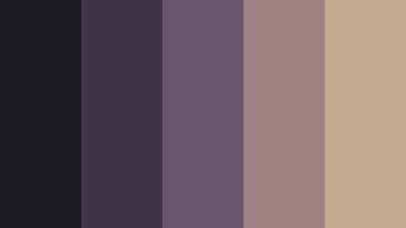
- HEX Codes: #1d1a22, #3e3546, #67566d, #9b817f, #c5aa91
- Mood: Elegant, contemplative, and softly luxurious.
- Use for: This palette suits premium course branding, study-with-me videos, fashion reels, website headers, and sophisticated presentation templates.
Muted violet, velvet brown, and antique beige create a polished study hall atmosphere. The palette feels luxurious but understated, making it suitable for creators who want intellectual charm with a refined finish.
Use the violet tones for title cards and graphic accents, then introduce antique beige in typography or frame borders. It can give study videos, fashion reels, premium courses, and website headers a cohesive sense of quiet sophistication.
Gothic & Dramatic Dark Academia Color Palettes
Ravenwood Manor

- HEX Codes: #0d1110, #202a27, #39463b, #6d694b, #b09a6f
- Mood: Gothic, secretive, and grounded in nature.
- Use for: Use it for mystery thumbnails, horror-lite storytelling, gothic brand identities, game interfaces, and dramatic video transitions.
Near-black green and aged gold suggest an overgrown manor surrounded by ancient trees. The green undertones keep the palette connected to nature, while the muted gold creates the impression of old frames, brass fittings, and forgotten rooms.
Use it for mystery thumbnails, gothic storytelling, game interfaces, and dramatic transitions. Aged gold works best as a limited accent for icons, chapter titles, or focal details against the deep green foundation.
Obsidian Candlelight

- HEX Codes: #0b0c10, #242126, #493a38, #80604f, #c49a6c
- Mood: Dramatic, intimate, and cinematic.
- Use for: This palette is effective for film reviews, luxury packaging, title cards, nightlife content, and high-contrast social media designs.
Obsidian black and candlelit copper create a rich, cinematic atmosphere. The copper tones add warmth and visual depth, making the dark foundation feel intimate instead of empty.
This palette is a strong choice for film reviews, luxury packaging, nightlife content, and title cards. Use copper sparingly in logos, borders, highlights, and typography to create contrast without weakening the dramatic mood.
Black Rose Archive
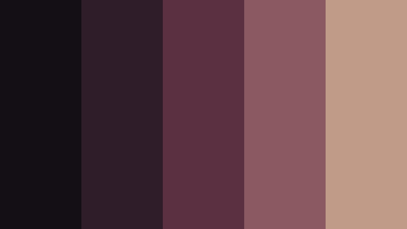
- HEX Codes: #130f15, #2f1d29, #5b3041, #8b5961, #c09b88
- Mood: Passionate, gothic, and poetic.
- Use for: This palette works beautifully for beauty campaigns, music visuals, gothic invitations, romance storytelling, and editorial thumbnails.
Blackened plum and dusty rose bring a dramatic floral quality to dark visual systems. The deep shades feel passionate and gothic, while the faded rose gives the composition an elegant, poetic softness.
Use the palette in beauty campaigns, music visuals, romance narratives, and editorial thumbnails. A dusty rose title or light accent can guide attention toward a subject without competing with the darker background.
Stormy Cathedral

- HEX Codes: #171d25, #303b49, #566574, #8d8d83, #c2bca9
- Mood: Solemn, majestic, and atmospheric.
- Use for: Use it in historical documentaries, architectural presentations, cinematic title sequences, travel videos, and immersive website designs.
Slate blue, stone gray, and weathered cream recall rain moving across an old cathedral. The palette feels serious and spacious, with enough muted light to support architectural details and wide establishing shots.
It works well for historical documentaries, travel videos, architectural presentations, and cinematic title sequences. Use weathered cream for text and maps, while keeping slate blue and gray in the footage, backgrounds, or interface elements.
Warm & Vintage Dark Academia Color Palettes
Brass And Leather
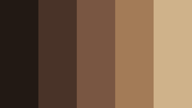
- HEX Codes: #211914, #493329, #785642, #a47b57, #d0b28a
- Mood: Warm, tactile, and quietly luxurious.
- Use for: This palette is ideal for craft brands, book reviews, leather goods, cafe content, packaging, and warm lifestyle video branding.
Leather brown, aged brass, and parchment beige create a tactile vintage impression. The colors suggest well-used notebooks, wooden desks, antique hardware, and carefully made objects.
Use the darkest brown for backgrounds and framing, then bring in brass and beige for logos, captions, product details, and transitions. This palette gives craft brands, book reviews, cafes, and lifestyle videos a welcoming academic character with premium appeal.
Autumn Reading Room
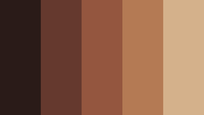
- HEX Codes: #2b1b18, #633a2d, #94563d, #b47a54, #d4b18a
- Mood: Comforting, nostalgic, and richly autumnal.
- Use for: Use this palette for seasonal thumbnails, reading vlogs, cozy interiors, cafe menus, social content, and lifestyle brand graphics.
Burnt sienna and warm caramel feel like late afternoon light in a wood-paneled reading room. The darker brown adds grounding, while the orange and beige shades create comfort and seasonal richness.
This combination is ideal for autumn thumbnails, reading vlogs, cozy interior videos, and cafe menus. Apply the brighter caramel tones to thumbnail text or graphic accents so the design remains inviting and easy to scan.
Cedar And Chestnut
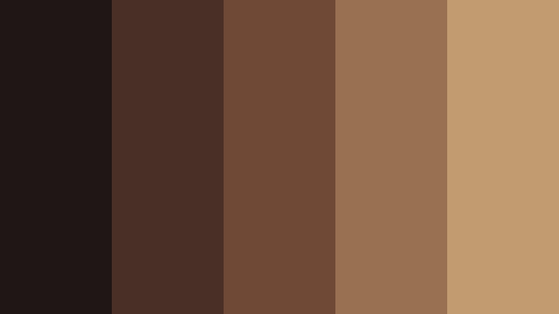
- HEX Codes: #1e1715, #493027, #704936, #987052, #c29b70
- Mood: Earthy, grounded, and traditional.
- Use for: This palette suits artisan packaging, woodworking content, heritage brands, food photography, and cozy video backgrounds.
Cedar brown and chestnut tones create a dependable, old-world foundation. The colors feel natural and handcrafted, making them a good fit for projects that emphasize materials, tradition, and careful workmanship.
Use the deep brown for background panels, the medium chestnut shades for overlays, and the lighter tan for typography. It can bring warmth to artisan packaging, woodworking videos, heritage brands, and food photography.
Dusty Portrait Gallery
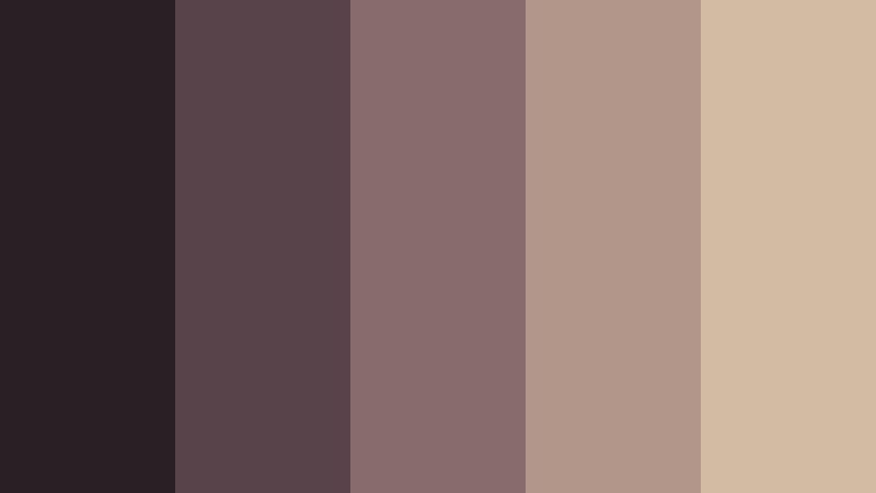
- HEX Codes: #292025, #59434a, #876b6d, #b2968a, #d1bca3
- Mood: Artistic, graceful, and nostalgic.
- Use for: Use it for portrait photography, art channels, fashion lookbooks, museum content, wedding design, and elegant presentation slides.
Dusty mauve and gallery beige suggest faded oil paintings, quiet museum halls, and softly lit portraits. The palette feels graceful and cultured, with enough contrast to support both photography and typography.
Use mauve for overlays and branding details, then reserve gallery beige for captions, borders, and presentation backgrounds. It works especially well for portrait photography, fashion lookbooks, museum content, wedding design, and art-focused channels.
Refined & Atmospheric Dark Academia Color Palettes
Mossbound Classics

- HEX Codes: #17211c, #34483a, #637052, #9a9870, #c8bd91
- Mood: Natural, contemplative, and quietly refined.
- Use for: This palette works well for botanical brands, sustainable packaging, outdoor essays, educational videos, and calm interface designs.
Moss green and muted olive bring an organic quality to the Dark Academia Color style. The shades feel scholarly yet connected to gardens, forests, botanical collections, and well-worn classics.
Use the deep green for logos, title cards, and backgrounds, then apply olive and parchment to icons, subtitles, or informational graphics. This palette is a natural fit for sustainable brands, educational videos, outdoor essays, and calm interface designs.
Blue Hour Manuscript

- HEX Codes: #101927, #223452, #405575, #788299, #b8b2a4
- Mood: Serene, cerebral, and slightly mysterious.
- Use for: Use this palette for productivity videos, night photography, technology brands, digital journals, and clean editorial interfaces.
Inky blue and softened gray capture the stillness of writing during blue hour. The palette balances concentration with a cool, cinematic calm, making it less warm than traditional brown-based academic palettes.
Use the lighter gray for text and interface details, while keeping inky blue for title cards, backgrounds, and transitions. It is particularly effective for productivity videos, night photography, digital journals, and technology brands with a thoughtful identity.
Ebon And Sage

- HEX Codes: #111513, #27352d, #536354, #8a9276, #c5b993
- Mood: Balanced, mature, and restorative.
- Use for: This palette is a strong fit for wellness editorials, book covers, eco-conscious brands, educational graphics, and understated social content.
Ebon charcoal paired with sage and parchment creates a calm, cultivated look. The dark foundation gives the palette depth, while the sage and parchment shades add freshness and clarity.
Use it for wellness editorials, book covers, eco-conscious packaging, educational graphics, and understated social content. Sage can soften dark video backgrounds, while parchment provides a readable accent for captions, labels, and calls to action.
Tips for Creating Dark Academia Color Color Palettes
A successful Dark Academia Color palette should create atmosphere while preserving readability and visual balance. Combine deep, muted foundations with carefully chosen warm or light accents, and adjust the proportions based on the footage, platform, and identity of the project.
- Use one or two deep anchor colors for backgrounds, title cards, borders, and large graphic areas.
- Add a lighter parchment, beige, gray, or muted rose tone for readable text and important interface details.
- Keep accent colors restrained so brass, copper, sage, plum, or burnt sienna remain visually meaningful.
- Check contrast on mobile screens, especially for thumbnail titles, subtitles, buttons, and small navigation text.
- Match the palette to the footage before applying a strong filter. Wood, books, stone, candlelight, and natural textures often support the style naturally.
- Use the same accent color across intros, lower thirds, transitions, thumbnails, and end screens to strengthen branding consistency.
- Reduce saturation when the footage feels too modern or bright, but preserve enough color separation to avoid a dull gray image.
- Test the palette in both light and dark layouts so your brand remains flexible across video platforms, websites, and social media.
Dark Academia Color palettes can shape more than the appearance of a project. They can suggest intelligence, nostalgia, romance, mystery, craftsmanship, or quiet reflection, helping viewers understand the personality of a channel or brand before the first sentence is spoken.
Whether you choose deep plum, antique paper, forest green, candlelit copper, or blue-hour ink, the best results come from using the colors consistently and with purpose. Start with one of the HEX combinations above, then adapt the balance of shadows, highlights, typography, and accents to match your footage.
Filmora makes it easier to test these palettes across intros, b-roll, thumbnails, transitions, and social edits. Try several combinations, refine the tones, and build a Dark Academia Color visual system that feels distinctive without becoming difficult to read.
secure download