

 100% Security Verified | No Subscription Required | No Malware

Dark colors can create a sense of depth, mystery, elegance, and emotional intensity. Deep navy, charcoal, black, forest green, plum, and dark teal often make visuals feel more cinematic and focused, while carefully chosen bright accents can guide attention and strengthen contrast.
A dark color palette works especially well for video intros, dramatic thumbnails, brand identities, title cards, social media graphics, and editorial layouts. Below are dark color palette color combinations with HEX codes for creators, designers, and Filmora users who want a consistent look across videos and creative projects.
In this article
Moody & Cinematic Dark Color Palette Color Palettes
Midnight Cinema

- HEX Codes: #0b0f1a, #171d2b, #2b3448, #596275, #c2cad6
- Mood: Mysterious, polished, and cinematic with a cool nocturnal atmosphere.
- Use for: This palette works well for film trailers, dramatic thumbnails, video intros, and sleek editorial designs.
Midnight Cinema pairs deep navy tones with muted steel highlights for a refined cinematic feel. The darkest shades establish a quiet, dramatic foundation, while the lighter blue-gray tones add enough separation for text, subjects, and graphic elements.
Use this palette for story-driven videos, moody b-roll, title sequences, and premium thumbnails. The cool contrast also works well for branding that needs to feel sophisticated without becoming overly severe.
Pro Tip: Build a Cinematic Dark Color Palette Look in Filmora
Use Filmora to carry the Midnight Cinema palette from your opening title to the final frame. Apply deep navy tones to intro backgrounds, lower the saturation of b-roll, and reserve the steel highlights for captions, logos, and key visual details.
For a consistent edit, create a repeatable visual treatment for your footage. Match your intro, transitions, overlays, and social cutdowns so the cool nocturnal mood remains recognizable across every format.
AI Color Palette
Creators can use a reference image, mood board, or custom color card to guide the visual direction of an entire project. Filmora's AI Color Palette feature helps apply the character of Midnight Cinema across different clips, making mixed footage feel more unified.
This is useful when a project includes footage recorded in different lighting conditions. The tool can help bring shadows, midtones, and highlights closer to the same cool cinematic style while preserving the details that make each shot useful.
 secure download

HSL, Color Wheels & Curves
Fine-tune Midnight Cinema with HSL controls by reducing overly bright blues and slightly lifting muted steel tones. Use the color wheels to add cool blue to the shadows, keep the midtones neutral, and introduce a restrained silver tint to highlights. Curves can deepen the blacks while protecting important facial details and bright text.
These adjustments make the palette feel more cinematic without crushing the image. A gentle S-curve can add contrast, while selective saturation control keeps navy and blue-gray elements rich instead of artificial.
secure download1000+ Video Filters & 3D LUTs
Filmora's filter and LUT library gives you a quick way to test different versions of the Midnight Cinema look. Start with a cool cinematic preset, then reduce its intensity so the navy shadows, steel highlights, and skin tones remain balanced.
Filmora's video filters and 3D LUTs make it easy to stylize a full sequence while keeping the visual direction consistent. Combine a subtle LUT with manual exposure and contrast adjustments for a more controlled result.
secure downloadVelvet Night
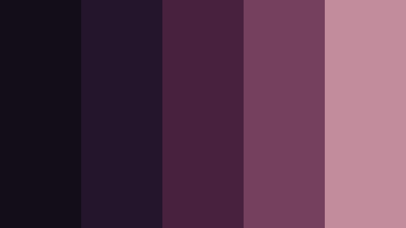
- HEX Codes: #120d18, #25152c, #48213f, #75405d, #c28c9d
- Mood: Luxurious, romantic, and softly dramatic with a rich evening glow.
- Use for: This palette works well for beauty videos, fashion branding, music covers, social posts, and elegant title cards.
Velvet Night blends plum, wine, and dusty rose for a sophisticated dark palette. The deeper shades create an intimate background, while the muted rose highlight adds warmth and a graceful focal point.
Use it for beauty tutorials, fashion edits, music artwork, and elegant video intros. It also suits social templates where a dark background needs a softer, more inviting accent.
Obsidian Ember
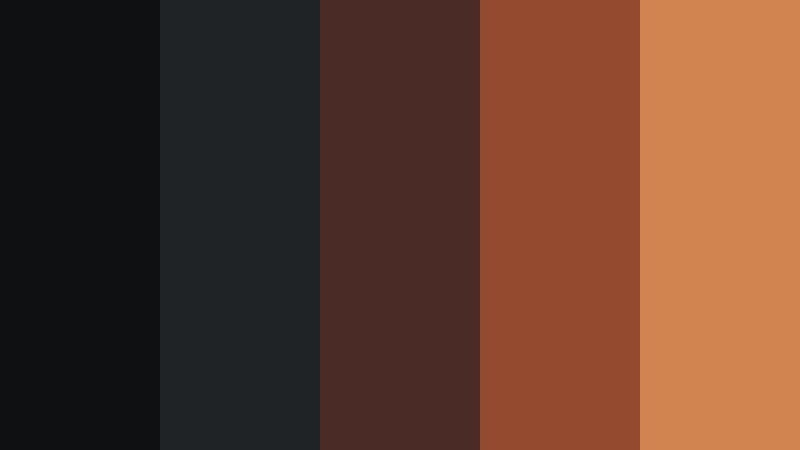
- HEX Codes: #0e1012, #202326, #4a2b25, #934a2f, #d1844f
- Mood: Bold, fiery, and atmospheric with a strong feeling of hidden energy.
- Use for: This palette works well for gaming content, action edits, product launches, event posters, and attention-grabbing thumbnails.
Obsidian Ember combines near-black neutrals with burnt orange accents. The dark foundation feels powerful and controlled, while the ember tones suggest heat, movement, and energy beneath the surface.
Use the orange shades for countdowns, buttons, subject outlines, or dramatic transitions. This makes the palette effective for action videos, gaming content, product reveals, and bold promotional graphics.
Rainy Boulevard
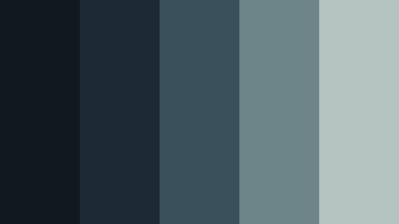
- HEX Codes: #101820, #1d2a34, #38515b, #6d8588, #b6c4c1
- Mood: Reflective, urban, and calm with a cool rainy-night feeling.
- Use for: This palette works well for travel vlogs, city montages, documentary titles, ambient content, and minimalist interfaces.
Rainy Boulevard uses blue-gray shades and soft misty highlights to evoke a quiet city after dark. Its layered neutrals provide a calm visual rhythm that feels modern without becoming cold or empty.
It is a strong choice for travel vlogs, reflective documentaries, urban montages, and ambient videos. Use the pale gray accent for subtitles and map details so important information stays readable against darker footage.
Elegant & Modern Dark Color Palette Color Palettes
Graphite Luxe
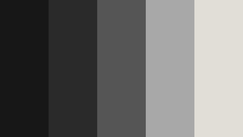
- HEX Codes: #171717, #2a2a2a, #555555, #a8a8a8, #e1ded8
- Mood: Minimal, premium, and confident with a clean monochrome balance.
- Use for: This palette works well for luxury branding, product videos, portfolio websites, UI layouts, and professional presentations.
Graphite Luxe creates a polished foundation with layered charcoal and silver-gray tones. A warm off-white accent keeps the monochrome structure welcoming and helps text, product details, and interface elements stand out.
Use this palette for product demonstrations, portfolio videos, premium thumbnails, and clean presentation slides. Its flexible gray range also makes it easy to pair with a single bright accent color for calls to action.
Onyx Goldline
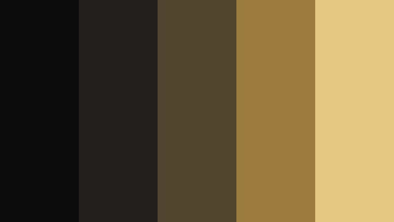
- HEX Codes: #0c0c0c, #22201c, #51452f, #9b7b3e, #e5c982
- Mood: Opulent, refined, and timeless with a subtle metallic impression.
- Use for: This palette works well for jewelry branding, luxury packaging, cinematic logos, event invitations, and premium social content.
Onyx Goldline pairs deep black with antique gold accents for a high-end visual statement. The restrained gold range feels luxurious without requiring excessive decoration or complex graphics.
Use gold for logos, borders, key words, and small interface details rather than covering large areas. This approach works well for jewelry videos, event announcements, premium packaging, and cinematic brand reveals.
Slate Architecture
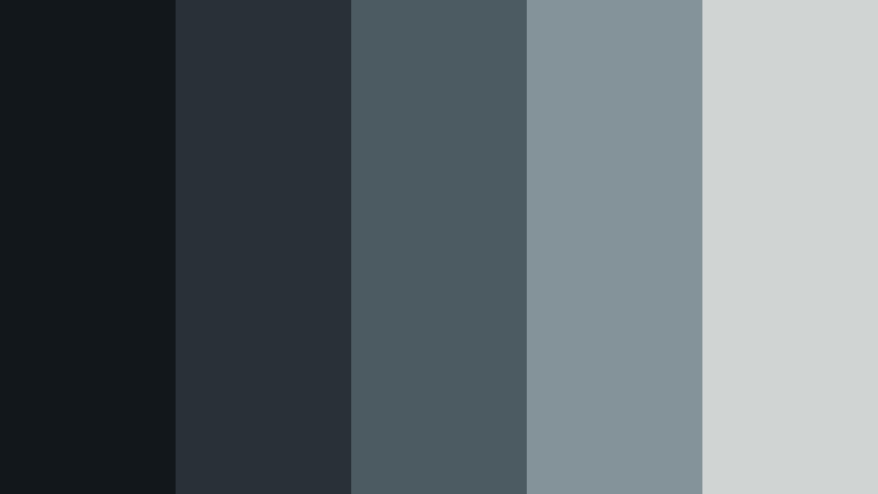
- HEX Codes: #12171b, #283138, #4c5a61, #84939a, #d0d5d4
- Mood: Structured, intelligent, and contemporary with a calm professional tone.
- Use for: This palette works well for architecture reels, tech brands, business presentations, dashboards, and clean website interfaces.
Slate Architecture combines blue charcoal with pale concrete-inspired neutrals. The result is precise and contemporary, making it especially suitable for structured layouts and content that depends on clarity.
Use the medium slate colors for panels, captions, and navigation elements, then reserve the lightest tone for important information. The palette works naturally with architectural footage, technology explainers, and professional brand systems.
Ink And Ivory

- HEX Codes: #111315, #25282a, #4b5052, #9fa5a5, #f1eee6
- Mood: Editorial, thoughtful, and understated with a timeless reading experience.
- Use for: This palette works well for publishing projects, educational videos, personal brands, typography designs, and editorial thumbnails.
Ink And Ivory gives classic black-and-white contrast a softer modern finish. Its restrained gray range supports comfortable reading and keeps text-heavy compositions from feeling too stark.
Use ivory for headlines, subtitles, and graphic accents against ink backgrounds. This palette is useful for educational videos, essays, personal brand content, editorial thumbnails, and typography-focused intros.
Earthy & Mysterious Dark Color Palette Color Palettes
Forest Afterglow
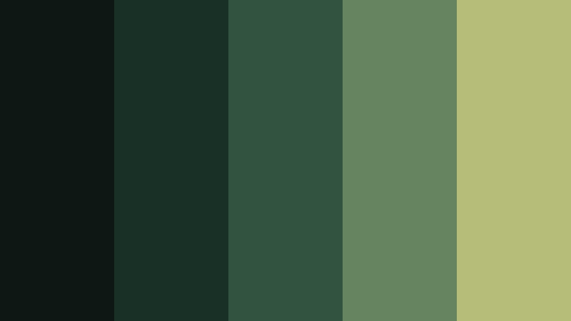
- HEX Codes: #0d1713, #193027, #31533f, #66845d, #b6bd78
- Mood: Organic, grounded, and quietly magical with a woodland atmosphere.
- Use for: This palette works well for nature vlogs, outdoor brands, wellness content, environmental campaigns, and rustic packaging.
Forest Afterglow layers deep green with mossy and muted yellow-green accents. It feels natural and immersive, while the lighter tones add a gentle glow that prevents the palette from becoming too heavy.
Use it for outdoor footage, environmental campaigns, wellness content, and nature-focused thumbnails. The yellow-green accent is effective for small highlights, map markers, captions, and organic logo details.
Moss And Clay
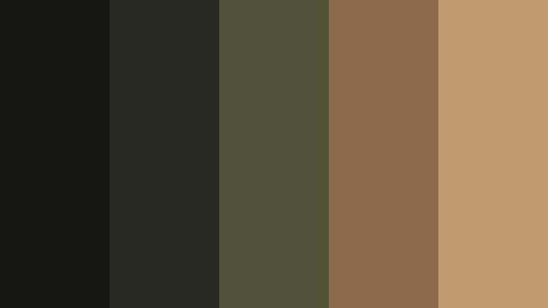
- HEX Codes: #151613, #292b20, #53533a, #8b6b4b, #c09b70
- Mood: Warm, earthy, and handcrafted with a relaxed natural character.
- Use for: This palette works well for handmade products, cooking videos, lifestyle branding, craft tutorials, and cozy social content.
Moss And Clay combines dark olive with clay and sand tones for an inviting rustic look. The earthy combination feels authentic and tactile, making it a natural fit for content centered on craft, food, and everyday living.
Use the clay and sand shades in title cards, product labels, recipe steps, and thumbnail text. The palette creates warmth without relying on bright colors, which helps cozy content maintain a grounded visual identity.
Deep Ocean Mineral
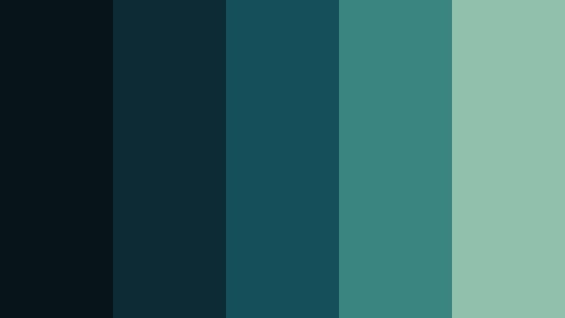
- HEX Codes: #07151b, #0d2b35, #15505a, #3b8580, #8fc1ad
- Mood: Cool, exploratory, and serene with a sense of depth and discovery.
- Use for: This palette works well for ocean content, science videos, travel branding, wellness apps, and atmospheric motion graphics.
Deep Ocean Mineral uses dark teal and sea-green highlights to create a rich underwater mood. Its layered tones feel both calming and adventurous, with enough contrast to support text and motion graphics.
Use the darkest teal for backgrounds and the lighter sea-green shades for data points, transitions, and visual accents. The palette is well suited to ocean documentaries, science explainers, travel branding, and relaxing wellness videos.
Cocoa Twilight
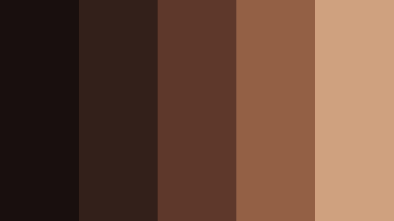
- HEX Codes: #18100e, #34201a, #5e3828, #936044, #d0a17e
- Mood: Comforting, intimate, and warm with a mellow evening glow.
- Use for: This palette works well for coffee branding, food videos, lifestyle thumbnails, cozy interiors, and autumn campaigns.
Cocoa Twilight pairs espresso browns with soft caramel highlights for a welcoming dark palette. It adds warmth and depth to content designed to feel personal, relaxed, and familiar.
Use caramel tones for product close-ups, recipe labels, captions, and warm transitions. This palette works especially well with coffee content, cozy interiors, autumn campaigns, and lifestyle videos with soft lighting.
Bold & Dramatic Dark Color Palette Color Palettes
Electric Eclipse
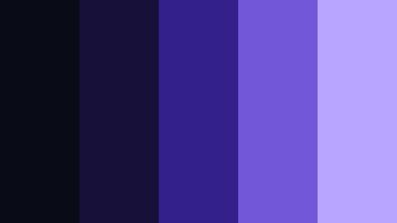
- HEX Codes: #090b16, #17113a, #34208a, #7257d9, #b8a5ff
- Mood: Futuristic, energetic, and imaginative with a vivid digital edge.
- Use for: This palette works well for gaming thumbnails, music visuals, app launches, creator branding, and energetic social videos.
Electric Eclipse uses deep violet and luminous lavender to create a striking modern contrast. The dark purples feel immersive, while the bright lavender delivers a clear digital glow.
Use the brightest shade for buttons, logos, waveform graphics, captions, and quick transitions. It is made for gaming content, creator branding, music visuals, and technology-focused videos that need drama and movement.
Crimson Voltage
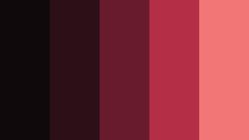
- HEX Codes: #10090c, #2b1018, #671b2c, #b42e46, #f27675
- Mood: Passionate, daring, and intense with a powerful emotional charge.
- Use for: This palette works well for music videos, sports content, fashion campaigns, bold logos, and promotional graphics.
Crimson Voltage combines blackened red with vivid coral highlights for immediate impact. The darker reds establish a strong emotional base, while coral adds energy and urgency to important visual moments.
Use crimson for backgrounds, overlays, and dramatic transitions, then apply coral to scores, product details, and calls to action. This palette brings confidence to sports edits, fashion campaigns, music videos, and promotional graphics.
Neon Night Market

- HEX Codes: #0b1118, #102b32, #12605c, #e05b3f, #f3b63f
- Mood: Playful, electric, and urban with a lively late-night atmosphere.
- Use for: This palette works well for nightlife promos, streetwear branding, food reels, event graphics, and colorful social media content.
Neon Night Market contrasts dark teal with neon coral and golden yellow accents. The combination feels energetic and contemporary, bringing the atmosphere of a busy urban evening to digital content.
Use teal as the main visual foundation and apply coral or yellow selectively to signs, titles, stickers, and transition effects. This balance keeps the palette lively while preserving enough dark space for readable text and strong composition.
Tips for Creating Dark Color Palette Color Palettes
A successful dark color palette needs more than several deep shades. Combine dark foundations with carefully chosen bright or muted accents so your video and design projects remain readable, balanced, and consistent across screens.
- Use at least one lighter color for titles, subtitles, icons, and other important information.
- Limit bright accent colors to key moments such as calls to action, logos, transitions, or subject highlights.
- Check text contrast against every background, especially when designing thumbnails and mobile video graphics.
- Match the palette to the lighting and subject matter of your footage instead of forcing the same treatment onto every scene.
- Keep brand colors consistent across intros, lower thirds, thumbnails, social posts, and end screens.
- Use HSL adjustments to control saturation and brightness when a dark color looks too strong or too dull.
- Reserve the deepest shades for backgrounds and shadows so the visual hierarchy remains clear.
- Test your palette on both bright and dim displays to make sure details and text remain visible.
Dark color palettes can shape the emotional direction of a project before viewers hear a word. A cool navy combination can feel cinematic and thoughtful, while dark green, brown, or teal can make content feel natural, calm, or exploratory. High-contrast violet, red, and neon combinations create a more energetic identity.
Choose a palette that supports your message, then use its HEX codes consistently across footage, thumbnails, graphics, and branding. Filmora makes it easier to test these dark color palette ideas, apply a unified look, and refine the final result with color tools, filters, and LUTs.
Try one of these combinations on a short intro or social edit first. Once the balance feels right, carry the same colors into your titles, transitions, overlays, and promotional assets for a more recognizable visual style.
secure download