

 100% Security Verified | No Subscription Required | No Malware

Energetic Color Palette color choices use bright, saturated, and high-contrast tones to create feelings of excitement, confidence, movement, and optimism. Orange, yellow, neon green, cyan, pink, red, and violet can make a visual identity feel active and memorable, while darker foundations help control intensity and improve focus.
These energetic color palettes are useful for video projects, branding, thumbnails, animated intros, music videos, gaming content, social media campaigns, and product designs. Below, you will find Energetic Color Palette color palettes with HEX codes for creators and Filmora users who want to build bold, consistent visuals.
In this article
Bold & Vibrant Energetic Color Palette Color Palettes
Neon Citrus Rush
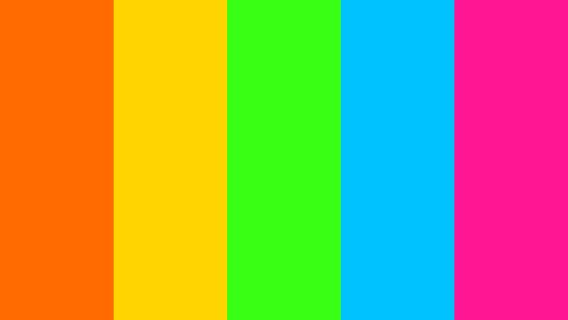
- HEX Codes: #ff6b00, #ffd500, #39ff14, #00c2ff, #ff1493
- Mood: Electric, playful, and full of forward momentum.
- Use for: This palette works well for energetic thumbnails, music videos, sports content, gaming intros, and youth-focused social campaigns.
Neon Citrus Rush combines hot citrus shades with electric blue and pink for instant visual impact. The orange and yellow tones create warmth and movement, while neon green, cyan, and pink add a distinctly modern digital edge.
Use this combination for fast-cut social edits, music video graphics, sports highlights, and gaming thumbnails. A darker background can make the brighter tones glow, while using one neon shade as an accent can keep a busy intro or branded layout easy to follow.
Pro Tip: Enhance Your Energetic Color Palette Visuals with Filmora
Filmora helps you carry the Neon Citrus Rush look across an entire edit instead of limiting it to one title card. Apply the palette to opening graphics, lower thirds, transitions, b-roll accents, and end screens so the project feels visually connected from beginning to end.
For social videos, use orange or yellow for key calls to action and reserve pink or cyan for highlights. This creates a clear visual hierarchy while keeping the energetic color palette bold and recognizable.
AI Color Palette
Creators can provide Filmora with a reference image, color card, or finished graphic that contains the Neon Citrus Rush palette. Filmora's AI Color Palette feature can then help apply the same visual direction across clips, making footage from different cameras or locations feel more consistent.
This approach is useful for matching a bright intro to the main footage, balancing b-roll, and bringing a unified look to a series of short social edits without adjusting every clip from scratch.
 secure download

HSL, Color Wheels & Curves
Use Filmora's HSL controls to fine-tune the saturation and brightness of each Neon Citrus Rush shade. You can reduce green saturation in skin-tone areas, strengthen cyan in shadows, or make orange highlights more cinematic without affecting the entire image equally.
Color wheels and curves are useful for shaping contrast between deep backgrounds and luminous accents. For practical guidance on balancing color and contrast, use Filmora's color adjustment techniques as a reference while refining your footage.
secure download1000+ Video Filters & 3D LUTs
Filmora's library of filters and LUTs gives creators a quick way to stylize Neon Citrus Rush footage. Start with a vivid or high-contrast preset, then lower its intensity if the colors compete with faces, product details, or important on-screen text.
Filmora's video filters and 3D LUTs make it easy to test several energetic treatments before choosing the one that best matches the footage. Save a preferred adjustment for repeated use across a branded video series.
secure downloadElectric Festival
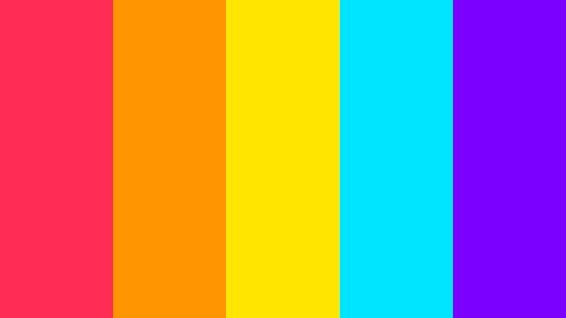
- HEX Codes: #ff2d55, #ff9500, #ffe600, #00e5ff, #7a00ff
- Mood: Celebratory, dynamic, and confidently expressive.
- Use for: This palette is ideal for event promos, festival recaps, creator branding, animated titles, and attention-grabbing social content.
Electric Festival layers vivid warm and cool tones to create a lively party atmosphere. The strong red-pink, orange, and yellow base feels celebratory, while cyan and violet provide contrast for a richer digital composition.
Use it in animated titles, event recaps, creator logos, and short-form promotional videos. Keep one dominant color for backgrounds and use the cooler shades for text, icons, or motion accents to prevent the layout from becoming overwhelming.
Turbo Pop
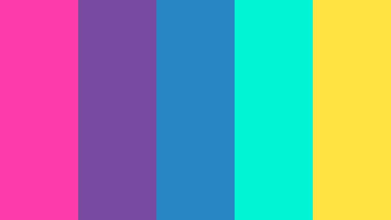
- HEX Codes: #ff3cac, #784ba0, #2b86c5, #00f5d4, #fee440
- Mood: Fast-paced, optimistic, and creatively daring.
- Use for: Use Turbo Pop for app launches, fashion reels, pop music visuals, product teasers, and bold creator thumbnails.
Turbo Pop balances vivid pink, violet, blue, aqua, and yellow for a polished but playful look. The colors add speed and personality without feeling random, making the palette suitable for both expressive and commercial projects.
Try pink or violet for branding elements, blue for supporting backgrounds, and yellow for important calls to action. In video, the palette works especially well with rhythmic cuts, kinetic typography, and quick product reveals.
Firecracker Fusion

- HEX Codes: #ff1744, #ff5722, #ffb300, #8bc34a, #00bcd4
- Mood: Fiery, adventurous, and intensely lively.
- Use for: This palette suits travel videos, outdoor adventure content, promotional trailers, food packaging, and bold brand intros.
Firecracker Fusion pairs flame-inspired reds and oranges with fresh green and cyan accents. It creates a vivid sense of action, discovery, and celebration, making ordinary visuals feel more immediate and expressive.
Use the warm shades for title cards, transitions, and thumbnail focal points, then add green or cyan to suggest nature, freshness, or outdoor energy. It is a natural fit for travel channels, adventure trailers, and food content.
Fresh & Playful Energetic Color Palette Color Palettes
Tropical Voltage

- HEX Codes: #00a896, #02c39a, #f0f3bd, #fcbf49, #f77f00
- Mood: Fresh, sunny, adventurous, and uplifting.
- Use for: Tropical Voltage works well for travel vlogs, summer campaigns, wellness content, resort branding, and lifestyle packaging.
Tropical Voltage blends refreshing greens with warm golden accents for a bright, active feel. Its teal and mint tones suggest clear water and natural energy, while yellow and orange bring in the warmth of sunlight.
Use it for travel intros, resort promotions, wellness thumbnails, and summer social campaigns. The pale yellow can support readable text areas, while orange is useful for buttons, location markers, or small animated details.
Aqua Arcade
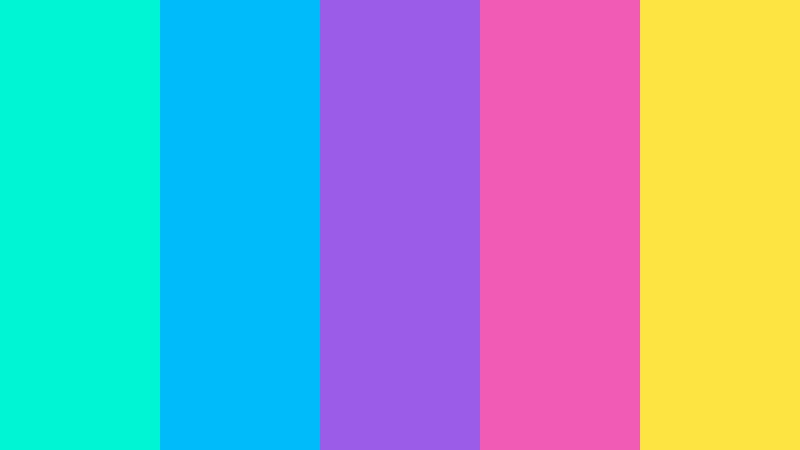
- HEX Codes: #00f5d4, #00bbf9, #9b5de5, #f15bb5, #fee440
- Mood: Playful, futuristic, and wonderfully nostalgic.
- Use for: Use Aqua Arcade for gaming channels, tech explainers, animated UI, app interfaces, and retro-inspired social graphics.
Aqua Arcade mixes bright aqua and blue with purple, pink, and yellow for a cheerful digital atmosphere. It feels nostalgic while remaining fresh, making it effective for modern gaming and technology projects.
Use aqua and blue as the primary interface or background colors, then add pink and yellow to highlight buttons, scores, captions, or thumbnail subjects. Pixel-inspired patterns and animated glows can strengthen its arcade character.
Juicy Lime Beat
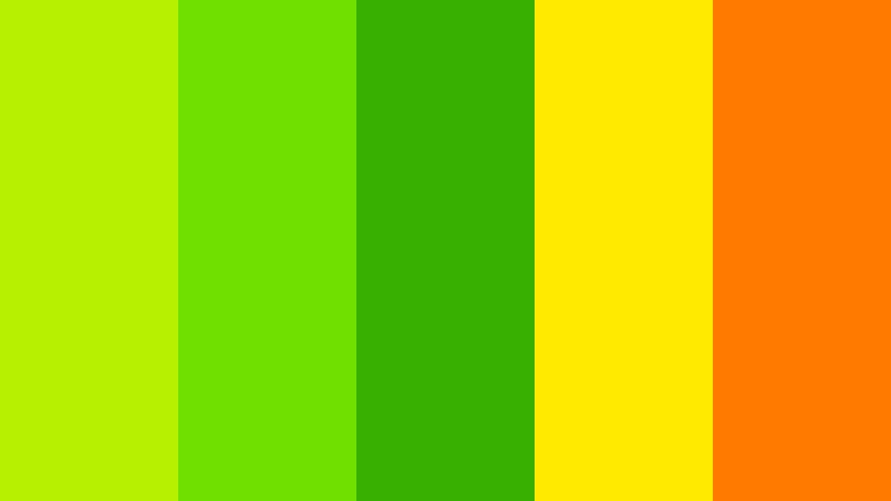
- HEX Codes: #b7f000, #70e000, #38b000, #ffea00, #ff7b00
- Mood: Zesty, optimistic, and full of creative spark.
- Use for: This palette is effective for fitness videos, eco campaigns, food content, startup branding, and lively presentation graphics.
Juicy Lime Beat uses energetic greens with yellow and orange to create a crisp, active look. The palette immediately suggests freshness and optimism, which makes it particularly useful for health, food, fitness, and sustainability topics.
Bright lime can make a thumbnail stand out, while orange and yellow can guide attention toward text or product details. For video, use the greens in overlays and backgrounds and keep the warm shades for transitions and calls to action.
Candy Current

- HEX Codes: #ff70a6, #ff9770, #ffd670, #e9ff70, #70d6ff
- Mood: Sweet, friendly, bright, and approachable.
- Use for: Candy Current is a great fit for beauty reels, cheerful tutorials, kids content, lifestyle brands, packaging, and playful web interfaces.
Candy Current combines soft candy tones with a lively blue accent for a welcoming visual identity. It adds energy while keeping the overall mood warm, friendly, and easy to enjoy.
This palette works well for beauty tutorials, lifestyle content, product packaging, and approachable brand graphics. Use the pink and peach shades for warmth, yellow and lime for highlights, and blue to add balance to titles or interface elements.
Modern & High-Contrast Energetic Color Palette Color Palettes
Midnight Laser
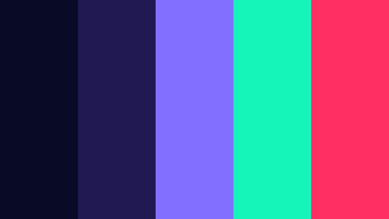
- HEX Codes: #090a24, #211951, #836fff, #15f5ba, #ff2e63
- Mood: Sleek, dramatic, futuristic, and powerful.
- Use for: This palette works especially well for cinematic intros, technology brands, music videos, gaming interfaces, and premium digital campaigns.
Midnight Laser places glowing violet, mint, and pink against deep night tones. The contrast creates a cinematic look with strong depth and a futuristic finish.
Use the dark colors as a stable foundation for video backgrounds, then introduce mint or pink as lighting accents, title effects, or interface highlights. It is an excellent choice for projects that need energy without losing a premium atmosphere.
Voltage Noir
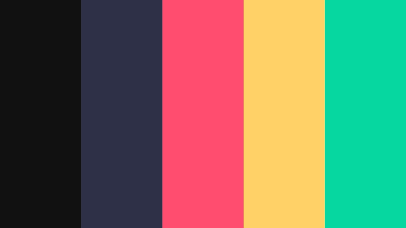
- HEX Codes: #111111, #2d3047, #ff4d6d, #ffd166, #06d6a0
- Mood: Confident, polished, and charged with controlled intensity.
- Use for: Use Voltage Noir for brand films, fashion content, editorial layouts, product launches, and sophisticated social media graphics.
Voltage Noir pairs a refined dark foundation with energetic coral, yellow, and mint accents. It delivers impact while maintaining a clean, professional structure.
The charcoal and slate tones are useful for polished backgrounds and editorial layouts. Add coral to create emotion, yellow to draw attention, and mint to suggest freshness in product demos, fashion edits, or brand films.
Chrome Sunrise

- HEX Codes: #1b1b1b, #6c757d, #ced4da, #ff7f11, #ffb703
- Mood: Modern, optimistic, and boldly refined.
- Use for: Chrome Sunrise is suited to automotive videos, design portfolios, product demos, architecture reels, and modern packaging.
Chrome Sunrise combines metallic neutrals with vivid orange and gold for a confident, polished look. It gives energetic concepts a more structured and premium visual tone.
Use the gray shades for clean layouts, product backgrounds, and architectural frames. Orange and gold can then guide the eye toward a car detail, product feature, title, or transition without disrupting the refined visual system.
Ultraviolet Motion
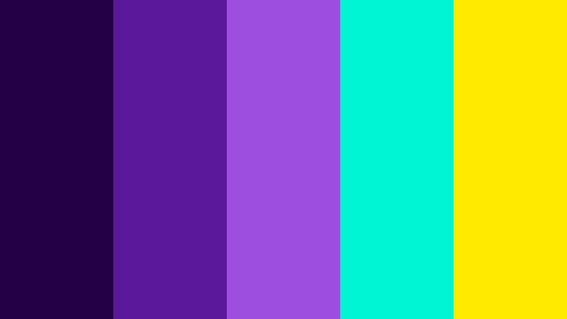
- HEX Codes: #240046, #5a189a, #9d4edd, #00f5d4, #ffea00
- Mood: Creative, mysterious, and intensely imaginative.
- Use for: This palette is ideal for motion design, music artwork, sci-fi videos, immersive websites, and bold presentation covers.
Ultraviolet Motion creates a deep atmospheric base with bright aqua and yellow highlights. It feels experimental and energetic, making it strong for expressive visual storytelling.
Use purple tones for cinematic backgrounds, music artwork, and atmospheric transitions. Aqua and yellow are effective for glowing details, key phrases, sci-fi interface elements, and thumbnail accents that need immediate visibility.
Redline Momentum
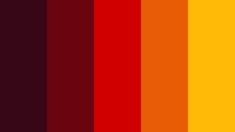
- HEX Codes: #370617, #6a040f, #d00000, #e85d04, #ffba08
- Mood: Urgent, passionate, daring, and action-oriented.
- Use for: Redline Momentum works well for sports promos, automotive content, action trailers, restaurant branding, and conversion-focused thumbnails.
Redline Momentum moves from deep burgundy to bright red, orange, and gold for a powerful sense of speed. It is built for visuals that need urgency, emotional heat, and a strong focal point.
Use the darker reds to create depth in backgrounds and the brighter red or orange to emphasize movement, offers, or dramatic moments. Gold works well for premium details, while the full palette can give action trailers and sports edits a strong visual pulse.
Tips for Creating Energetic Color Palette Color Palettes
Energetic color palettes become more effective when bright colors are balanced with structure, contrast, and a clear visual hierarchy. Use the following tips to keep videos and designs exciting while protecting readability and brand consistency.
- Choose one dominant color, one supporting color, and one or two accent colors instead of using every shade at the same intensity.
- Pair neon or highly saturated colors with dark, neutral, or muted backgrounds to improve contrast and focus.
- Check text readability on thumbnails, title cards, and social graphics before exporting the final design.
- Match the palette to the footage. Warm reds and oranges suit action, food, and travel, while aqua, violet, and cyan often suit technology and gaming.
- Keep branded colors consistent across intros, lower thirds, transitions, captions, thumbnails, and end screens.
- Use bright colors to guide attention toward important information, such as a product feature, sale price, speaker name, or call to action.
- Reduce saturation in skin tones and important natural details if the palette makes the footage look unnatural.
- Preview colors on mobile screens and different displays because highly saturated shades can appear brighter or less readable depending on the device.
Energetic Color Palette combinations can quickly shape the mood of a project and make a visual identity easier to remember. Bright citrus tones feel playful and active, tropical greens suggest freshness, and high-contrast violet or red combinations can create a cinematic sense of power.
Whether you are creating a vlog intro, product launch, music video, sports edit, or social media campaign, start with a small set of HEX codes and apply them consistently. Filmora makes it easier to test the look, match footage, refine tones, and add filters or LUTs until the final result feels cohesive.
Try one of these palettes with your next video project and adjust the intensity to suit your footage, audience, and brand personality. A controlled use of energetic color can help every frame feel more purposeful and engaging.
secure download