

 100% Security Verified | No Subscription Required | No Malware

Film Look Color brings warmth, texture, and emotional depth to visual projects. Its mix of softened highlights, rich shadows, and slightly faded tones can make footage feel nostalgic, intimate, and cinematic. Depending on the balance of warm and cool shades, it can suggest adventure, romance, mystery, authenticity, or quiet reflection.
Creators use Film Look Color in video edits, travel vlogs, thumbnails, intros, brand identities, social campaigns, and editorial designs. Below, you will find Film Look Color color palettes with HEX codes, practical use cases, and ideas for applying each look in Filmora.
In this article
Warm Cinematic Film Look Color Palettes
Sunset Grain
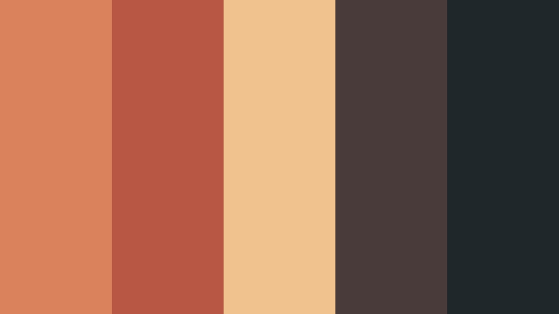
- HEX Codes: #d9825b, #b95745, #f0c38e, #493b3a, #20272b
- Mood: Warm, nostalgic, and softly dramatic with a classic analog feel.
- Use for: This palette works well for travel films, sunset vlogs, cinematic thumbnails, and emotional brand intros.
Sunset Grain blends glowing orange and dusty red with deep charcoal for a timeless film aesthetic. The warm highlights create an inviting focal point, while the darker neutrals keep the composition grounded and cinematic.
Use it for sunset b-roll, personal stories, travel montages, and emotional opening sequences. The orange and cream shades can guide title design and thumbnails, while the charcoal tones help maintain readable text and balanced contrast.
Pro Tip: Build A Cinematic Film Look Color Look in Filmora
Filmora can help you carry the Sunset Grain mood across an entire edit. Apply warm adjustments to your introduction, match the color of outdoor b-roll, and use the darker charcoal tones for title cards, lower thirds, and transitions.
Keep the orange and dusty red accents consistent instead of changing them from scene to scene. This creates a unified visual identity for travel vlogs, branded intros, and social videos.
AI Color Palette
Use a still image, color card, or favorite film frame as a reference for the Sunset Grain palette. Filmora's AI Color Palette feature can help transfer the overall color character to other clips, making warm highlights and muted shadows more consistent.
This is especially useful when footage comes from different cameras or lighting conditions. Apply the palette across a sequence, then make small creative adjustments to preserve skin tones and important details.
 secure download

HSL, Color Wheels & Curves
Fine-tune Sunset Grain with HSL controls by slightly increasing orange saturation and reducing unwanted colors in the shadows. Use the color wheels to warm the highlights, add a subtle red-brown quality to the midtones, and keep the deepest shadows neutral enough to protect detail.
Curves can add a gentle film-style contrast by lifting the black point and softening very bright highlights. This keeps the image atmospheric rather than overly sharp or digital.
secure download1000+ Video Filters & 3D LUTs
Filmora's video filters and 3D LUTs make it easy to stylize Sunset Grain without building every adjustment from scratch. Start with a warm cinematic filter, then reduce its intensity so the orange and dusty red tones remain natural.
Use different filter strengths for different parts of the edit. A stronger look can suit the opening montage, while a lighter version keeps dialogue, product shots, and skin tones comfortable to watch.
secure downloadAmber Boulevard
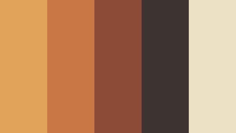
- HEX Codes: #e0a458, #c87842, #8e4b39, #3e3433, #eee0c5
- Mood: Golden, urban, and confident with a polished vintage atmosphere.
- Use for: This palette is ideal for city videos, fashion edits, restaurant branding, and cinematic social content.
Amber Boulevard pairs golden highlights with brick red, espresso brown, and cream. The combination feels like late afternoon light reflected from city streets, giving modern visuals a polished but approachable vintage character.
Use the cream shade for clean text areas, the golden tone for accents, and the dark brown shades for backgrounds or title cards. It is a strong choice for fashion reels, restaurant promos, and urban lifestyle branding.
Copper Memory
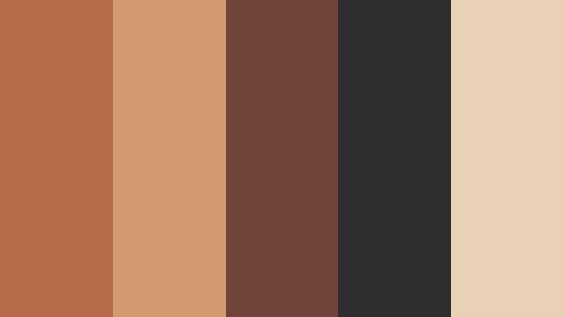
- HEX Codes: #b86b4b, #d29a70, #70443b, #302d31, #e7d2b5
- Mood: Reflective, earthy, and sentimental with a quiet documentary tone.
- Use for: Use this palette for family stories, lifestyle documentaries, handmade product videos, and personal portfolios.
Copper Memory creates a grounded, human feeling through muted copper, warm beige, and dark brown. Its subdued contrast supports stories about memory, craft, family, and everyday authenticity.
Use the copper shades for transitions and visual accents, then reserve the darkest tones for typography or frames. The palette works especially well with close-up details, natural light, slow camera movement, and documentary-style narration.
Golden Hour Motel
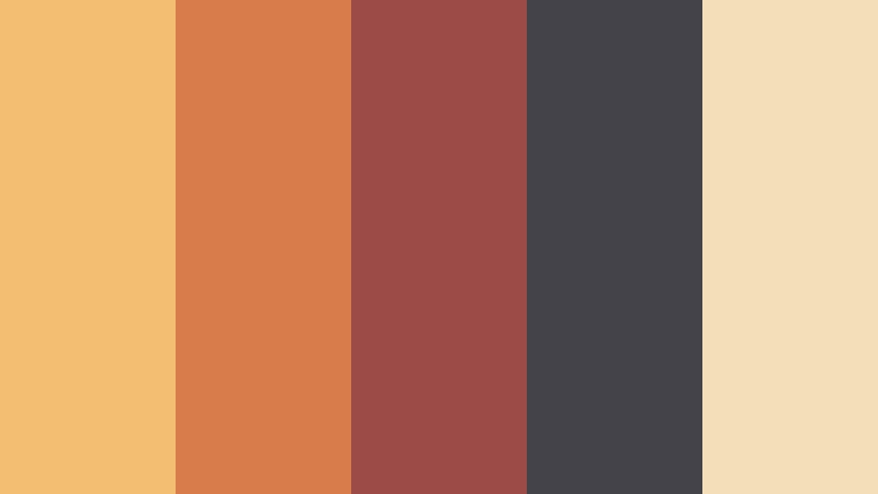
- HEX Codes: #f3bd72, #d77c4b, #9b4c46, #45434a, #f2dfb8
- Mood: Playful, nostalgic, and cinematic with a hint of roadside adventure.
- Use for: This palette works for road trip edits, music videos, travel thumbnails, and retro-inspired packaging.
Golden Hour Motel combines warm yellow, coral, faded red, and dusky violet gray. It feels like a memorable stop on a long summer drive, with enough contrast to keep the design energetic.
Use the yellow and coral shades to make thumbnails and music video titles stand out. The dusky gray can support backgrounds, while the cream tone keeps packaging, captions, and brand layouts from becoming too intense.
Cool Moody Film Look Color Palettes
Midnight Projection

- HEX Codes: #182535, #31465a, #6e8191, #c1a878, #e8dfcf
- Mood: Thoughtful, atmospheric, and refined with a nocturnal cinema mood.
- Use for: This palette is a strong choice for film reviews, tech intros, title cards, editorial layouts, and nighttime videos.
Midnight Projection uses layered blue grays with muted gold and ivory highlights. The deep blues create cinematic depth, while the warm accents add a subtle sense of light from a projector or old theater.
Use the darkest navy for backgrounds and the ivory shade for readable headings. Gold works well for buttons, chapter markers, logos, and small highlights in film reviews, technology videos, and editorial designs.
Rainy Neon Street

- HEX Codes: #24313d, #385a63, #8bc3bf, #d35b68, #f0c879
- Mood: Moody, electric, and urban with a stylish late-night energy.
- Use for: Use this palette for music videos, gaming content, nightlife promos, cyberpunk graphics, and social thumbnails.
Rainy Neon Street balances cool teal shadows with pink and yellow accents. It creates a modern analog look inspired by wet pavement, glowing signs, and city lights after dark.
Keep the teal shades dominant and use pink or yellow selectively for visual emphasis. This approach helps thumbnails, gaming overlays, music titles, and nightlife graphics feel vivid without losing their moody foundation.
Blue Hour Reverie

- HEX Codes: #253b59, #52708a, #9bb5bd, #d7b48b, #f1e4d0
- Mood: Calm, poetic, and spacious with a soft twilight feeling.
- Use for: This palette suits slow living videos, cinematic landscapes, wellness branding, and reflective social content.
Blue Hour Reverie combines gentle blue tones with sandy beige and warm ivory. The result is peaceful and spacious, making it useful for visuals that need a subtle cinematic glow rather than dramatic contrast.
Use it for landscape sequences, meditation content, travel stories, and calm brand identities. The warm beige accents can guide captions and icons, while the blue shades create a consistent background for video and web design.
Indigo Dust
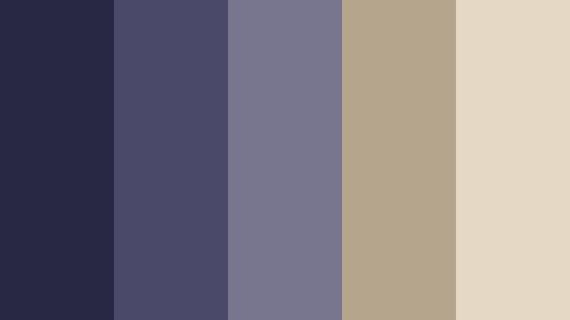
- HEX Codes: #292844, #4b4969, #77768e, #b5a58d, #e5d8c5
- Mood: Dreamy, introspective, and slightly mysterious with a faded analog finish.
- Use for: This palette works well for poetry videos, fashion reels, album art, editorial design, and moody personal branding.
Indigo Dust softens deep indigo with lavender gray, taupe, and warm cream. It feels artistic and restrained, like an aged photographic print with carefully preserved color.
Use the indigo shades for cinematic backdrops and fashion sequences, then add cream for type and taupe for supporting details. The palette is also effective for album covers, personal websites, and reflective short-form video.
Soft Faded Film Look Color Palettes
Rose Window
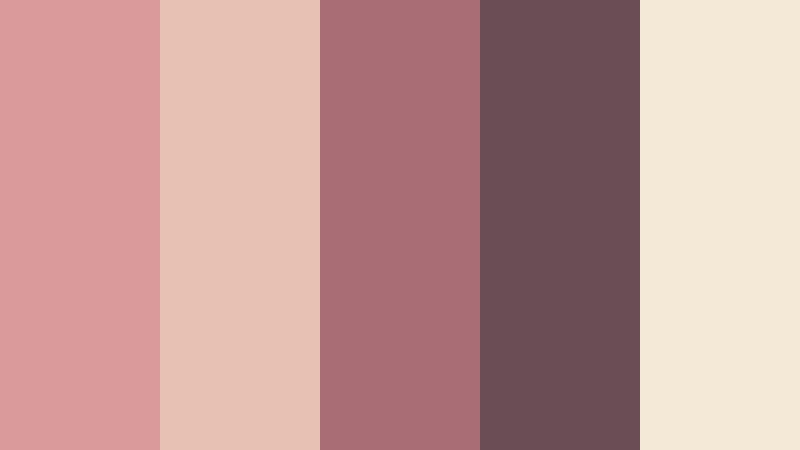
- HEX Codes: #d99a9c, #e7c2b4, #a96d75, #6b4d55, #f4e8d7
- Mood: Tender, romantic, and graceful with a softly faded finish.
- Use for: Use this palette for wedding films, beauty content, lifestyle brands, invitations, and elegant social graphics.
Rose Window pairs dusty rose with blush, mauve, and warm cream. It gives creative projects a delicate emotional tone while the deeper mauve shade adds enough structure for titles and contrast.
Use the lighter tones for backgrounds, overlays, and romantic transitions. The darker rose can define logos, headings, and graphic borders in wedding videos, beauty campaigns, and lifestyle branding.
Faded Lavender Reel
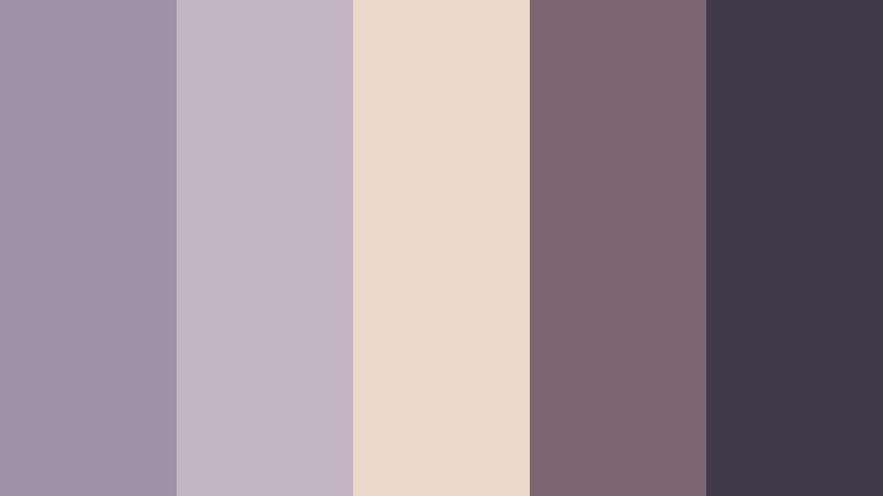
- HEX Codes: #9f91a8, #c3b5c2, #ead8c8, #7b6672, #3f3b4a
- Mood: Gentle, artistic, and nostalgic with a dreamy editorial quality.
- Use for: This palette is ideal for beauty tutorials, creative portfolios, book content, scrapbook videos, and soft brand identities.
Faded Lavender Reel blends muted purple with pale peach and charcoal plum. Its low-intensity colors feel expressive and nostalgic, inspired by aged photographic prints and handmade editorial pages.
Use lavender and peach for backgrounds, transitions, and soft overlays. The charcoal plum provides readable contrast for captions, logos, and thumbnail text without disrupting the gentle mood.
Peach Polaroid
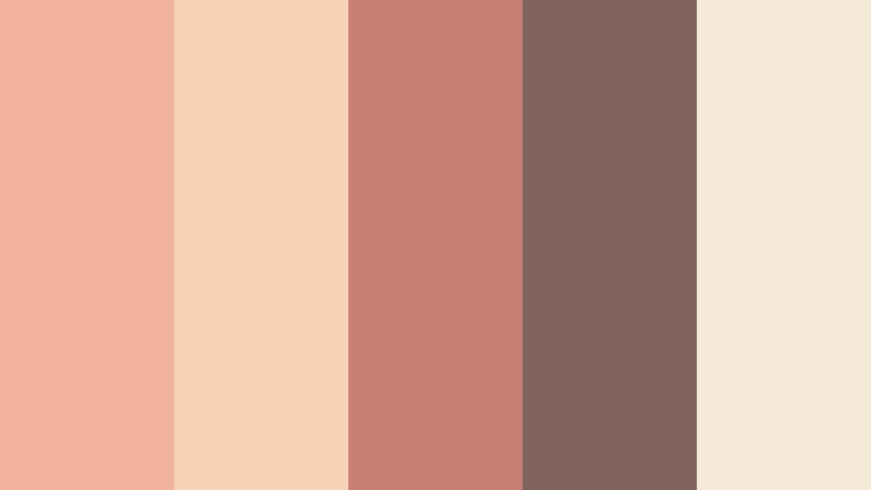
- HEX Codes: #f2b39b, #f7d3b5, #c77f73, #80625f, #f5ead8
- Mood: Friendly, sunny, and nostalgic with a cheerful vintage charm.
- Use for: This palette works for food videos, creator intros, lifestyle thumbnails, packaging, and warm social campaigns.
Peach Polaroid combines soft peach, coral, cocoa, and creamy white. It feels approachable and bright while retaining the softness associated with analog film and instant photography.
Use peach for title cards and thumbnail backgrounds, coral for calls to action, and cocoa for readable text. This palette suits creator brands that want to feel friendly, familiar, and visually warm.
Mossy Portrait
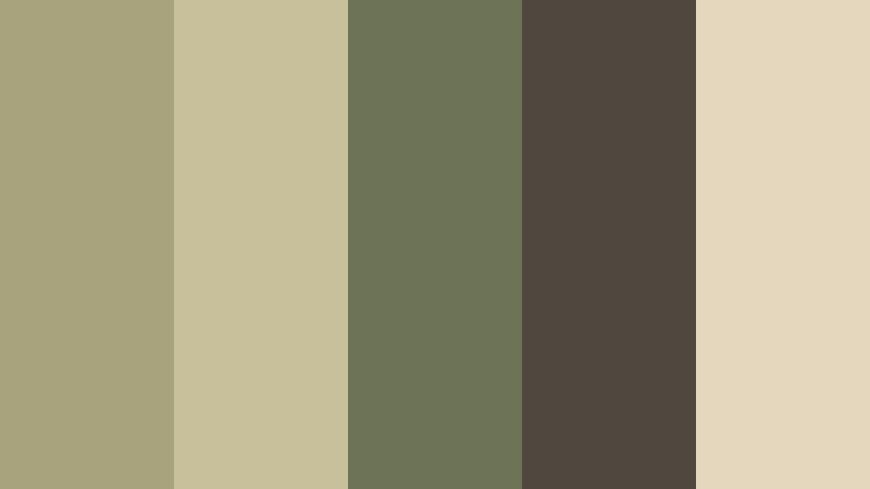
- HEX Codes: #a8a27d, #c7c09b, #6d7357, #50483e, #e5d7bd
- Mood: Natural, quiet, and grounded with a rustic portrait-film character.
- Use for: Use this palette for outdoor brands, documentary portraits, sustainable packaging, and nature-focused video content.
Mossy Portrait mixes faded olive with stone, brown, and warm parchment. It brings an organic, understated quality to visual storytelling and works naturally with outdoor footage, wood textures, and soft daylight.
Use olive for graphic accents and backgrounds, parchment for text areas, and brown for strong contrast. The palette can make sustainability campaigns, documentary portraits, and handmade product videos feel honest and grounded.
Modern Contrast Film Look Color Palettes
Chrome And Cobalt
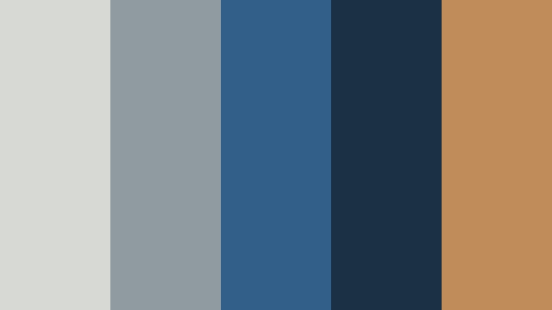
- HEX Codes: #d7d9d5, #8f9aa1, #315f8a, #1c3045, #c08c5a
- Mood: Sleek, energetic, and modern with a polished retro edge.
- Use for: This palette is useful for tech videos, product launches, sports edits, automotive branding, and sharp presentation slides.
Chrome And Cobalt contrasts cool silver and strong blue with a small copper accent. It feels precise and confident, combining a modern interface style with a subtle retro-film character.
Use silver and blue for clean layouts, dark navy for contrast, and copper only where you want attention. This makes the palette effective for product demonstrations, sports graphics, automotive videos, and technology branding.
Scarlet Contact Sheet
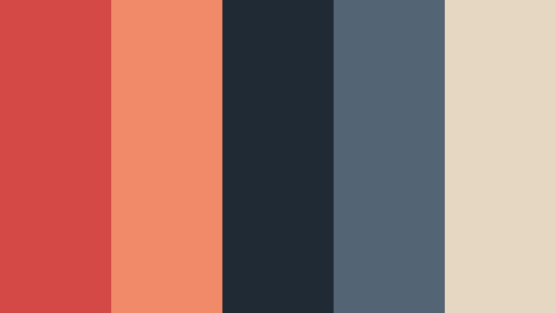
- HEX Codes: #d44945, #f08a68, #202a35, #536575, #e6d7c3
- Mood: Bold, expressive, and editorial with a dynamic photographic feel.
- Use for: This palette works well for fashion campaigns, music thumbnails, event graphics, bold intros, and creative portfolios.
Scarlet Contact Sheet places vivid red and coral against deep blue gray and cream. The contrast is memorable and energetic, with a visual character inspired by contact sheets, darkrooms, and editorial photography.
Use scarlet for key titles or transition moments, then balance it with blue gray backgrounds and cream text panels. This keeps fashion edits, event graphics, and music thumbnails bold without becoming visually crowded.
Olive Cinema Frame
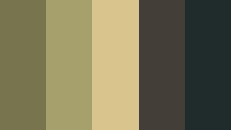
- HEX Codes: #76754e, #a6a06c, #d9c58c, #443e39, #202b2b
- Mood: Confident, earthy, and cinematic with a refined utilitarian tone.
- Use for: Use this palette for documentary titles, outdoor gear brands, editorial videos, packaging, and minimalist interfaces.
Olive Cinema Frame combines muted green and ochre with dark charcoal and blackened teal. It creates a strong visual system that feels vintage, practical, and contemporary at the same time.
Use olive and ochre for visual markers, charcoal for backgrounds, and blackened teal for deep contrast. The palette works especially well when a brand needs an outdoors-oriented identity with a polished editorial finish.
Desert Film Negative
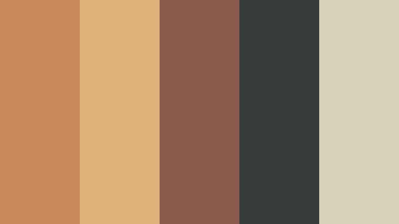
- HEX Codes: #c9895c, #e0b27b, #8a5b4c, #363b3a, #d8d1b9
- Mood: Adventurous, textured, and balanced with a sunbaked cinematic mood.
- Use for: This palette is a great fit for travel stories, outdoor campaigns, documentary graphics, and atmospheric website design.
Desert Film Negative pairs sandy gold and terracotta with deep neutral shadows. It brings warmth and texture to modern film-inspired work while keeping enough contrast for clear typography and structured layouts.
Use the golden tones in landscape footage and travel thumbnails, then use the deep neutral shades for captions, navigation, and title cards. The parchment color can soften websites, presentations, and documentary graphics.
Tips for Creating Film Look Color Color Palettes
A strong Film Look Color palette usually combines one dominant mood color with supporting neutrals and one or two controlled accents. When you match the palette to your footage, audience, and brand personality, the final video or design feels more intentional and memorable.
- Choose one dominant Film Look Color family first, then add lighter and darker variations to create hierarchy.
- Use warm orange, copper, or red accents to create energy, nostalgia, and emotional focus.
- Pair muted film colors with dark neutrals so titles, subtitles, and thumbnail text remain readable.
- Use cool blue, teal, or indigo shadows when you want a moodier, more atmospheric cinematic look.
- Match the palette to the lighting in your footage. Warm palettes suit golden light, while cooler palettes often work well with shade and night scenes.
- Keep brand colors consistent across intros, transitions, lower thirds, thumbnails, and social graphics.
- Use accent colors sparingly for calls to action, important objects, logos, and key moments in the edit.
- Check skin tones and product colors after applying a film look so the creative grade does not reduce natural detail.
Film Look Color palettes can shape the emotional direction of a project before viewers hear the first line of dialogue. Warm combinations can make a brand feel personal and nostalgic, while cool or faded combinations can suggest mystery, calm, artistry, or authenticity.
Try these HEX combinations in thumbnails, title cards, brand graphics, and video color grades. Filmora makes it easier to test different looks, match clips, and keep the same visual language across an entire project.
Whether you are creating a travel film, a creator intro, a documentary, or a product campaign, a carefully selected palette can make every scene feel more connected and recognizable.
secure downloadNext: Vhs Color Color Palette
