

 100% Security Verified | No Subscription Required | No Malware

Forest color palettes bring the calm, depth, and organic character of woodland environments into creative work. Deep greens can suggest stability and trust, while sage, moss, cream, olive, and earthy accents add warmth, balance, and natural energy. Together, these tones can make a visual project feel grounded, thoughtful, and connected to the outdoors.
Creators use forest color palette combinations for video intros, nature documentaries, vlog thumbnails, social media graphics, brand identities, product packaging, and cinematic title cards. Below, you will find Forest Color Palette color palettes with HEX codes, practical use cases, and creative direction for creators and Filmora users.
In this article
Earthy & Natural Forest Color Palette Color Palettes
Moss Morning
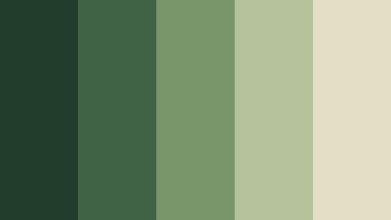
- HEX Codes: #233d2b, #3f6344, #78966a, #b5c29b, #e3dfc5
- Mood: Calm, grounded, and quietly refreshing.
- Use for: This palette works well for nature documentaries, wellness videos, eco brand intros, and peaceful vlog thumbnails.
Moss Morning combines deep greens with soft sage and warm cream for a natural, welcoming look. The darkest shades create a dependable foundation, while the lighter tones keep the overall design open and comfortable.
Use this forest color palette for mindful content, sustainable brands, outdoor storytelling, and gentle video intros. In thumbnails, cream can support readable text while moss green creates a strong visual connection to nature.
Pro Tip: Build A Consistent Moss Morning Look with Filmora
Filmora can help you carry the Moss Morning palette across an entire edit. Use the deeper greens for opening titles and transitions, mid-tone greens for b-roll overlays, and sage or cream for captions, lower thirds, and end screens.
For a cohesive vlog or brand video, repeat the same palette in your intro, thumbnail graphics, logo animation, and social cutdowns. This creates a recognizable visual system without making every frame look identical.
AI Color Palette
Creators can provide Filmora with a reference image, color card, or frame that represents the Moss Morning palette. Filmora's AI Color Palette feature can then apply a similar color treatment across clips, helping different cameras and lighting conditions feel more unified.
This is useful when forest footage includes bright outdoor scenes, shaded trails, and indoor talking-head shots. Applying the palette across the project can make the edit feel calmer, more natural, and visually connected.
 secure download

HSL, Color Wheels & Curves
Filmora's HSL controls let you fine-tune the greens in Moss Morning by adjusting hue, saturation, and luminance separately. Lower saturation for a soft documentary style, or deepen the shadows and slightly warm the highlights for a more cinematic woodland look.
Use the color wheels to balance skin tones against green backgrounds, then use curves to protect detail in dark trees and shaded footage. These adjustments help the palette stay atmospheric without making faces or important subjects look dull.
secure download1000+ Video Filters & 3D LUTs
Filmora's video filters and 3D LUTs make it easy to stylize Moss Morning footage without building every adjustment from scratch. Start with a natural or cinematic filter, then reduce its intensity so the sage and cream accents remain soft.
Filters are especially useful for creating matching versions of a project for YouTube, Instagram, and short-form video. Apply a consistent treatment to forest b-roll, title cards, and transition clips to maintain the same grounded visual identity.
secure downloadPine Trail
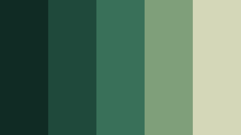
- HEX Codes: #102a24, #1f4a3b, #39705a, #7e9f78, #d4d7b8
- Mood: Adventurous, steady, and connected to the outdoors.
- Use for: Use this palette for hiking content, travel videos, outdoor gear branding, cinematic title cards, and rugged social campaigns.
Pine Trail blends dark pine shades with muted green and pale lichen tones. The result feels durable and adventurous without becoming harsh, making it a natural fit for outdoor stories that need energy and reliability.
Use the deepest greens for title cards, maps, and logo backgrounds, then reserve the lichen tone for labels and readable text. It can give hiking videos and travel thumbnails a strong, practical identity.
Fern Canopy
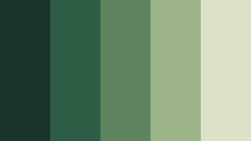
- HEX Codes: #18352b, #2e5d46, #5e855f, #9eb58a, #dce2c7
- Mood: Fresh, balanced, and softly organic.
- Use for: This palette is ideal for botanical branding, educational videos, organic product packaging, and clean website interfaces.
Fern Canopy creates a layered botanical feeling with rich forest greens and gentle pale foliage tones. Its contrast is clear enough for information design while still feeling soft and natural.
Try it for plant care tutorials, organic product videos, educational intros, and clean web graphics. Pale foliage tones can separate text panels from darker green footage without breaking the botanical theme.
Woodland Amber
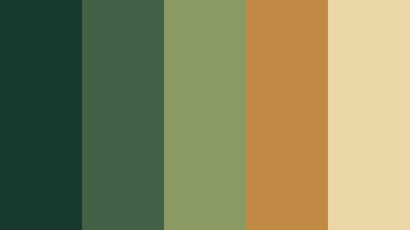
- HEX Codes: #17382d, #416246, #8a9a62, #c08a45, #ead7a5
- Mood: Warm, rustic, and inviting.
- Use for: Use it for autumn travel reels, artisanal brands, food videos, rustic thumbnails, and storytelling projects with a cozy atmosphere.
Woodland Amber pairs forest greens with golden ochre and warm cream. The amber accent adds a handcrafted, seasonal character while the greens keep the composition connected to nature.
Use ochre for buttons, captions, badges, or key words in a thumbnail. This combination works particularly well for autumn footage, farm-to-table brands, craft products, and warm narrative videos.
Moody & Cinematic Forest Color Palette Color Palettes
Twilight Grove

- HEX Codes: #101d1b, #1b3531, #315449, #667965, #b7b99b
- Mood: Mysterious, cinematic, and contemplative.
- Use for: This palette works well for film openings, mystery content, atmospheric music videos, editorial graphics, and dramatic social thumbnails.
Twilight Grove uses shadowy green tones softened by muted gray and moss. It creates depth and a refined cinematic mood, especially in scenes with fog, low light, or quiet movement.
Use the darkest shades for title backgrounds and dramatic transitions. The pale moss accent can highlight important words in thumbnails or provide enough contrast for subtitles and editorial layouts.
Deep Evergreen

- HEX Codes: #071b18, #0e3029, #1d5140, #42705b, #9aaa85
- Mood: Powerful, sophisticated, and immersive.
- Use for: Use this palette for premium brand intros, technology videos, luxury packaging, dark mode interfaces, and bold presentation slides.
Deep Evergreen builds a confident visual foundation from near-black green through polished evergreen shades. The muted sage accent keeps the look legible and modern without weakening its premium character.
It is effective for bold title animation, luxury product reveals, technology explainers, and dark presentation themes. Pair the light sage with clean white typography for strong hierarchy.
Rainy Cedar

- HEX Codes: #182823, #2c4438, #536755, #7f8870, #b6ad8e
- Mood: Reflective, earthy, and quietly elegant.
- Use for: This palette suits slow living videos, rain ambience content, editorial layouts, coffee branding, and understated lifestyle campaigns.
Rainy Cedar combines cool woodland greens with softened gray and beige. It feels intimate and natural while maintaining a polished editorial finish that works across video and still design.
Use it for quiet morning routines, coffee videos, reading content, and rain ambience edits. Beige can warm up the composition, while the darker green shades add depth to text panels and intro screens.
Night Fern
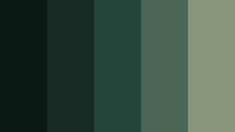
- HEX Codes: #0b1715, #162b25, #25453a, #4b6652, #89957a
- Mood: Quiet, mysterious, and focused.
- Use for: Use Night Fern for nighttime vlogs, suspenseful trailers, premium UI themes, podcast artwork, and minimal video title sequences.
Night Fern delivers a low-light forest mood with subtle green contrast. It is especially effective when you want depth, focus, and a modern dark aesthetic without relying on pure black.
Use the lighter fern shade for icons, captions, and small interface details. In suspenseful videos, a controlled green tint can make nighttime footage feel intentional and atmospheric.
Emerald Shadow
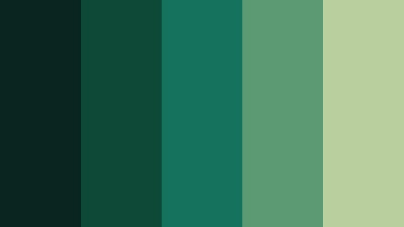
- HEX Codes: #09251f, #0e4938, #14735a, #5b9a72, #b9cf9e
- Mood: Lush, confident, and vibrant.
- Use for: This palette works well for fashion reels, beauty branding, energetic intros, gaming graphics, and high-contrast social content.
Emerald Shadow adds vivid jewel-green energy to a deep forest base. It creates a bold, premium look that stands out in fast-moving digital content and high-impact promotional visuals.
Use the brightest green as a controlled accent for motion graphics, logos, or thumbnail highlights. The deeper shades can frame the composition and prevent the vivid tones from becoming overwhelming.
Soft & Botanical Forest Color Palette Color Palettes
Sage Meadow
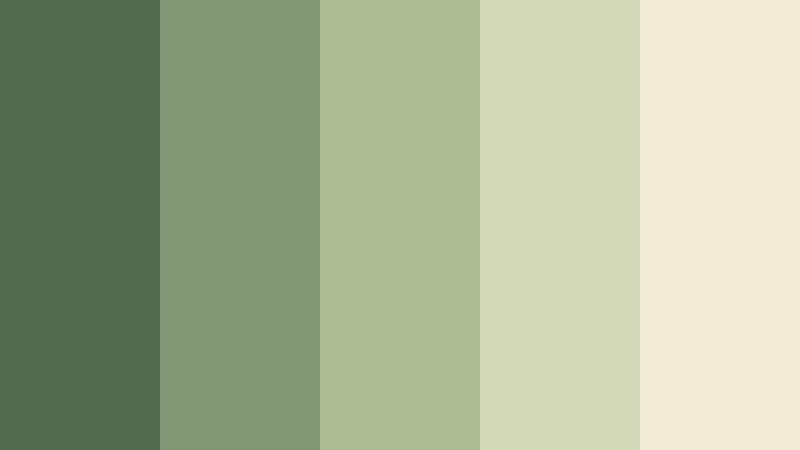
- HEX Codes: #536b50, #829776, #aebc94, #d1d7b7, #f1ead5
- Mood: Gentle, airy, and restorative.
- Use for: Use this palette for wellness content, soft vlog thumbnails, skincare branding, lifestyle websites, and calm social media templates.
Sage Meadow offers a light, soothing interpretation of forest color through sage, pale green, and warm ivory. It feels approachable and easy to use in spacious layouts.
Use ivory as a clean background for captions and product information, then add sage to footage overlays, logos, and thumbnail borders. The palette supports wellness, skincare, and slow living content.
Lichen Bloom
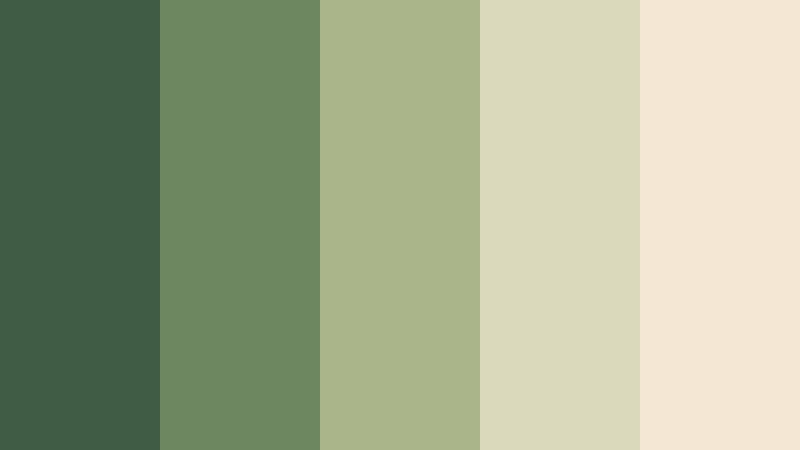
- HEX Codes: #405c43, #6f875f, #a8b58b, #d8d9b8, #f3e7cf
- Mood: Organic, delicate, and optimistic.
- Use for: This palette is effective for floral content, handmade products, eco packaging, creative portfolios, and gentle brand presentations.
Lichen Bloom pairs mossy greens with pale botanical neutrals for a soft natural finish. It is a strong choice for designs that need warmth without heavy contrast.
Use the cream tone behind product names, portfolio text, or social captions. The muted greens are suitable for floral reels, handmade product showcases, and eco-conscious branding with a welcoming tone.
Willow Mist

- HEX Codes: #3e5b4b, #70907a, #a6b99d, #d5dcc8, #eef0df
- Mood: Peaceful, clean, and graceful.
- Use for: Use Willow Mist for meditation videos, minimalist websites, health branding, gentle presentations, and airy product visuals.
Willow Mist creates a light and tranquil forest feeling with cool greens and soft off-whites. Its restrained contrast supports clean, spacious compositions.
This palette works well for meditation intros, health explainers, minimalist product videos, and quiet presentation slides. Use the darker willow tone for headings and the pale shades for backgrounds and transitions.
Clover Cream
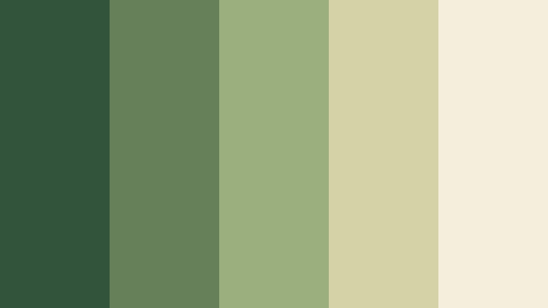
- HEX Codes: #31543b, #66815a, #9bae7d, #d6d2a8, #f5eedc
- Mood: Friendly, sunny, and natural.
- Use for: This palette works well for family-friendly content, food packaging, farm brands, cheerful thumbnails, and approachable social campaigns.
Clover Cream balances leafy greens with buttery cream and soft yellow-green accents. It brings an upbeat, down-to-earth quality to creative projects.
Use cream for friendly backgrounds and the strongest green for readable headline text. The palette can give food videos, farm brands, family content, and social campaigns a warm natural personality.
Modern & Refined Forest Color Palette Color Palettes
Olive Studio
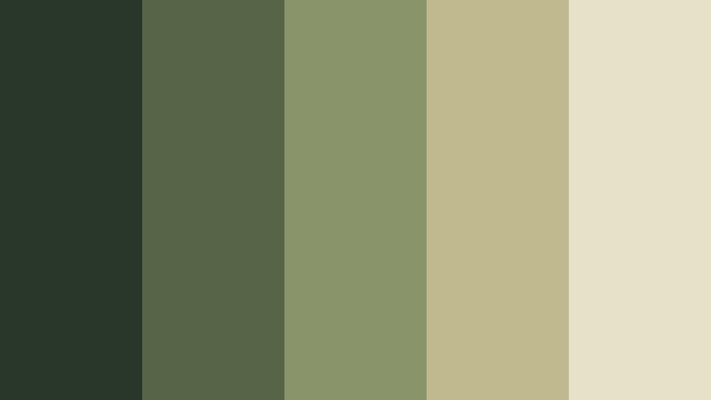
- HEX Codes: #28372a, #566447, #89946a, #c1b98e, #e8e1c9
- Mood: Polished, balanced, and contemporary.
- Use for: Use this palette for interior design content, modern brand systems, editorial videos, product presentations, and sophisticated UI layouts.
Olive Studio refines forest tones with muted olive, khaki, and warm neutral accents. It feels current and versatile across both digital and print design.
Use olive for interface elements, product labels, and graphic overlays, while the pale neutral can create breathing room. This combination is especially useful for interior design videos and refined brand presentations.
Botanical Noir
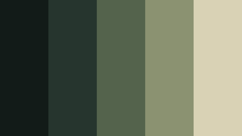
- HEX Codes: #111b18, #26362e, #53634c, #8b9271, #d9d2b4
- Mood: Elegant, dramatic, and understated.
- Use for: This palette is ideal for luxury labels, fashion videos, editorial thumbnails, dark presentation themes, and premium product storytelling.
Botanical Noir uses deep charcoal green with refined olive and parchment accents. It delivers a luxurious forest-inspired look with strong visual hierarchy.
Use parchment for elegant typography and product details, then keep the charcoal green behind dramatic footage or logo animations. It can make fashion reels, luxury packaging, and editorial campaigns feel more distinctive.
Laurel Luxe
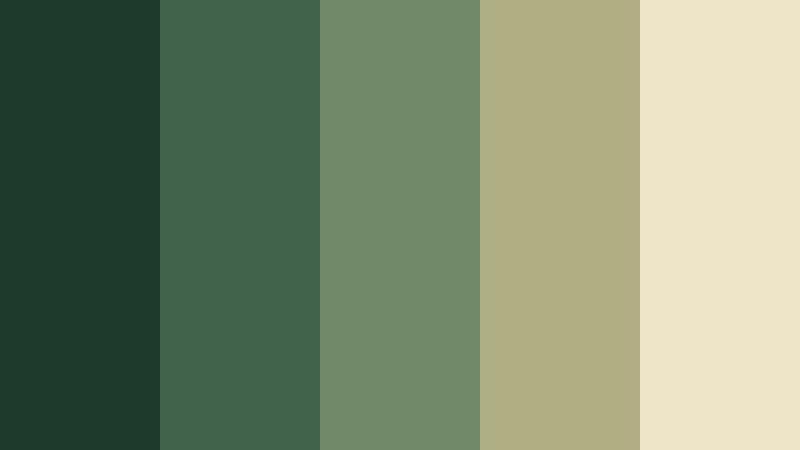
- HEX Codes: #1e3a2d, #42634b, #718968, #b0ae82, #eee4c8
- Mood: Classic, confident, and elevated.
- Use for: Use Laurel Luxe for business branding, wedding films, premium packaging, portfolio sites, and elegant title cards.
Laurel Luxe combines classic laurel green with muted gold and ivory for a graceful finish. It works especially well when forest color needs to feel upscale, established, and warm.
Use muted gold for thin borders, logo details, and key transitions. Ivory typography can keep wedding films, business introductions, and portfolio presentations polished while the greens provide a stable visual base.
Tips for Creating Forest Color Palette Color Palettes
Forest colors are flexible, but the best combinations usually balance deep greens with lighter neutrals or a carefully chosen warm accent. Use the following tips to keep your video and design work attractive, readable, and consistent.
- Pair dark forest green with cream, ivory, or pale sage when you need strong text readability.
- Use one dominant green, one supporting green, and one accent color instead of giving every shade equal visual weight.
- Add amber, ochre, muted gold, or warm beige to make a forest color palette feel more welcoming and seasonal.
- Reduce saturation when matching natural footage, documentary scenes, wellness content, or slow living videos.
- Check skin tones carefully after applying green color grading so people remain natural against woodland backgrounds.
- Repeat palette colors across intros, lower thirds, thumbnails, captions, transitions, and end screens to build brand consistency.
- Use the lightest palette shade for backgrounds and the darkest shade for headlines, logos, or strong visual framing.
- Match the palette to the lighting of your footage. Deep cinematic greens suit shadowy scenes, while sage and cream work better with bright daylight.
Forest color palettes can shape the emotional direction of a project, from calm and restorative to bold, luxurious, or mysterious. Deep greens provide stability and depth, while sage, cream, amber, olive, and botanical neutrals help define the personality of a brand or video.
Test different combinations across your footage, thumbnails, title cards, and social graphics to find the right balance. Filmora makes it easier to apply a consistent forest-inspired look, refine individual tones, and keep your visual identity connected from the first frame to the final call to action.
Choose a palette that supports your story, then adjust contrast and saturation based on the platform, subject, and lighting. A thoughtful Forest Color Palette can make creative work feel more memorable without overpowering the message.
secure download