

 100% Security Verified | No Subscription Required | No Malware

Luxury Brand Color palettes are associated with sophistication, exclusivity, confidence, and refined taste. Deep neutrals, metallic accents, jewel tones, soft creams, and muted earth colors can make a visual identity feel more premium while giving videos and designs a polished emotional tone.
Creators use Luxury Brand Color combinations for branding, product videos, fashion edits, thumbnails, intros, social media graphics, packaging, and editorial layouts. Below are Luxury Brand Color color palettes with HEX codes to help creators and Filmora users build elegant, consistent visuals for video and design projects.
In this article
Elegant And Modern Luxury Brand Color Palettes
Champagne Noir Prestige
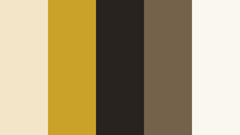
- HEX Codes: #f3e5c8, #c9a227, #28231f, #75624a, #faf7f0
- Mood: Refined, exclusive, and quietly dramatic.
- Use for: This palette works well for luxury brand intros, premium product reveals, editorial thumbnails, and sophisticated packaging.
Champagne gold and deep noir create a polished high-end look with strong contrast. The warm metallic tone suggests celebration and quality, while the dark brown-black shade adds structure and cinematic depth.
Use the lighter champagne and ivory tones for backgrounds, text areas, and product highlights. Reserve noir and muted brown for title cards, logos, borders, or dramatic transitions in fashion edits, luxury product videos, and premium social media campaigns.
Pro Tip: Build A Cinematic Luxury Brand Color Look In Filmora
Filmora can help you carry the Champagne Noir Prestige palette across your entire edit. Apply dark noir tones to title cards and transitions, then use champagne accents for logos, captions, lower thirds, and product callouts so every scene feels connected.
For b-roll, keep the footage slightly warm and protect the ivory highlights from becoming too bright. This creates a controlled, editorial finish that works especially well for jewelry, watches, beauty products, fashion, and luxury lifestyle content.
AI Color Palette
Creators can use a reference image, color card, or brand mood board built around Champagne Noir Prestige and apply its visual character across an entire video. Filmora's AI Color Palette feature helps match clips so that different cameras, lighting conditions, and locations feel more consistent.
Use the palette as a guide for matching the overall tone, then refine individual shots when necessary. This is useful for maintaining a premium appearance across intros, product footage, interviews, and short-form social edits.
 secure download

HSL, Color Wheels & Curves
Use HSL controls to fine-tune the balance between champagne, gold, brown, and ivory. Slightly reducing saturation in the shadows can make the palette feel more cinematic, while warming the highlights helps metallic details and skin tones blend naturally with the overall look.
Color wheels can add warmth to the highlights and a subtle cool balance to the shadows. Curves are useful for creating a gentle S-curve that increases contrast without losing the soft luxury of the lighter tones. For a practical visual guide, review this Filmora color grading tutorial.
secure download1000+ Video Filters & 3D LUTs
Filmora's video filters and 3D LUTs make it easy to stylize Champagne Noir Prestige without adjusting every clip from scratch. Start with a cinematic or warm filter, then reduce its intensity to preserve the clean contrast between gold, ivory, and noir.
Filters can also help unify footage recorded in different environments. Apply the same base look to product shots, b-roll, and social cutdowns, then use individual adjustments for exposure and skin tone control.
secure downloadVelvet Mocha Affair
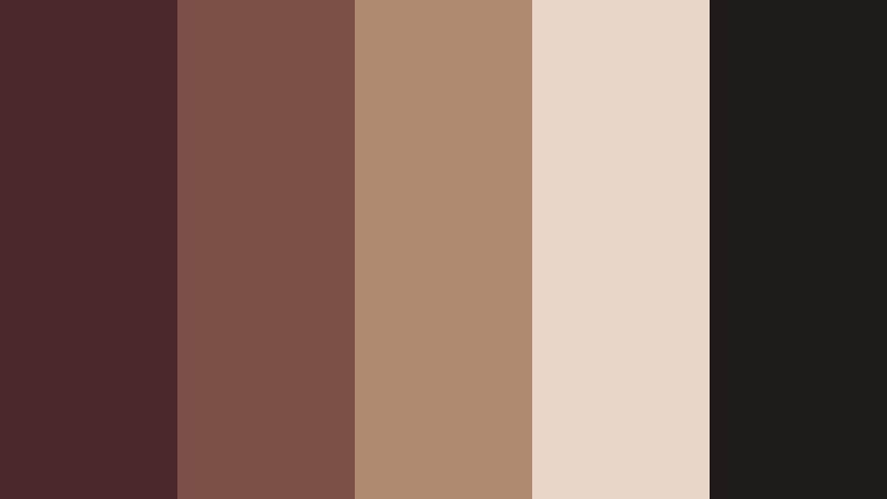
- HEX Codes: #4a2928, #7b5143, #b08a70, #e8d7c8, #201b1b
- Mood: Warm, intimate, and indulgently sophisticated.
- Use for: This palette is ideal for beauty videos, coffee branding, boutique interiors, fashion reels, and moody social content.
Velvet Mocha Affair combines rich mocha shades with soft cream for a luxurious and welcoming atmosphere. The deep brown tones add intimacy, while the lighter beige shades keep the design from feeling too heavy.
Use mocha for backgrounds, borders, and title cards, then introduce cream or tan for readable text and product details. This palette is particularly effective for coffee content, beauty tutorials, boutique branding, and lifestyle thumbnails with a warm editorial mood.
Pearl And Platinum
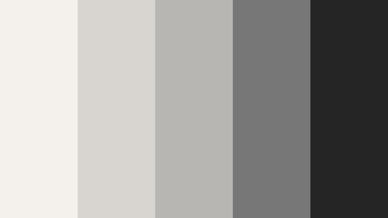
- HEX Codes: #f4f1ec, #d8d5d0, #b8b6b2, #777777, #252525
- Mood: Minimal, luminous, and effortlessly contemporary.
- Use for: This palette works well for clean UI designs, tech presentations, modern logos, skincare packaging, and polished video openers.
Pearl white and platinum gray create a sleek premium aesthetic without competing with the main content. The palette feels bright, controlled, and contemporary, making it a strong choice for clean visual systems.
Use charcoal for text and navigation elements, mid-gray for secondary information, and pearl tones for spacious backgrounds. In video, this combination works well for skincare, technology, architecture, presentation slides, and minimalist product reveals.
Satin Emerald Reserve
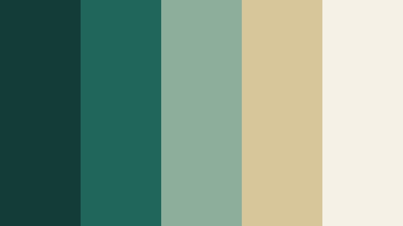
- HEX Codes: #123c35, #21665a, #8cae9b, #d6c69a, #f5f1e6
- Mood: Opulent, grounded, and naturally prestigious.
- Use for: This palette is effective for wellness brands, luxury travel videos, premium packaging, restaurant menus, and cinematic nature footage.
Deep emerald paired with muted gold and ivory feels both exclusive and organic. The green shades suggest richness and renewal, while the soft neutrals add balance and a refined finish.
Use emerald for title backgrounds and brand marks, muted gold for accents, and ivory for text or open space. This combination brings depth to destination edits, wellness content, hospitality branding, and premium nature footage.
Soft And Romantic Luxury Brand Color Palettes
Rose Gold Reverie
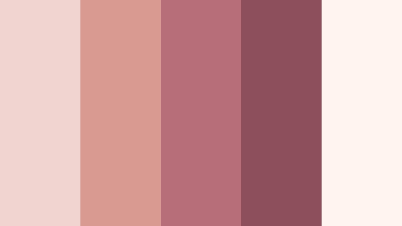
- HEX Codes: #f1d4cf, #d99a91, #b76e79, #8c4f5b, #fff4ee
- Mood: Romantic, graceful, and softly glamorous.
- Use for: This palette is perfect for wedding videos, beauty thumbnails, fashion campaigns, invitation designs, and feminine lifestyle content.
Blush pink and rose gold create a delicate luxury look with a warm emotional pull. The palette feels celebratory and graceful while still offering enough darker contrast for readable typography and elegant transitions.
Use pale blush as a background, rose tones for graphics and captions, and deep mauve for logos or headline text. It is a natural fit for wedding films, beauty campaigns, fashion reels, personal brands, and celebratory social content.
Lavender Silk Soiree
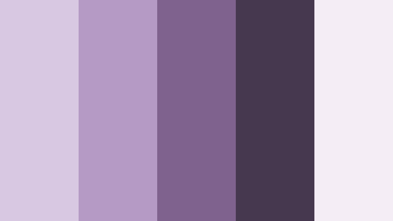
- HEX Codes: #d8c8e2, #b49ac4, #80628f, #453950, #f5edf5
- Mood: Dreamy, creative, and elegantly mysterious.
- Use for: This palette suits beauty tutorials, creative portfolios, dreamy vlogs, music visuals, and refined social media templates.
Silky lavender shades paired with plum and soft white create a modern romantic mood. It feels imaginative and polished, with enough depth to support dramatic titles and cinematic visual effects.
Use the lighter lavender shades for backgrounds and overlays, then bring in plum for typography, borders, and focal elements. This palette works especially well for artistic projects, beauty content, music visuals, and dreamy vlog intros.
Ivory Blush Atelier
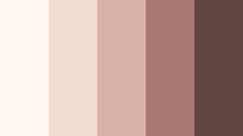
- HEX Codes: #fff9f2, #f2ddd5, #d8b2a9, #a97873, #604744
- Mood: Gentle, artisanal, and warmly elegant.
- Use for: Use this palette for handmade product videos, boutique branding, lifestyle thumbnails, editorial layouts, and cozy luxury packaging.
Ivory and blush create a soft foundation while muted terracotta adds character. The combination feels personal, crafted, and premium without appearing overly formal or distant.
Choose ivory for clean layouts and product backgrounds, blush for subtle graphic accents, and muted brown for readable text. It is well suited to handmade goods, home decor, boutique packaging, lifestyle videos, and editorial storytelling.
Amethyst Cashmere
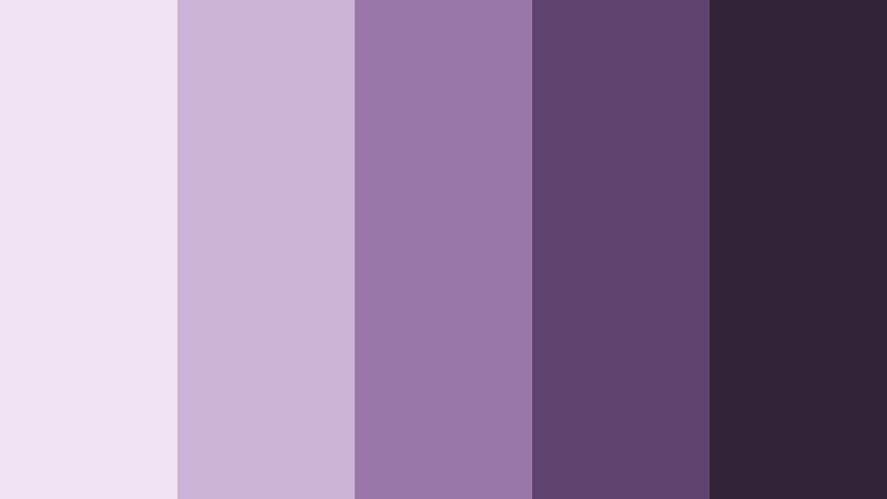
- HEX Codes: #eee5f0, #cbb4d5, #9977a8, #5f426e, #302536
- Mood: Plush, artistic, and richly romantic.
- Use for: This palette works well for luxury fashion reels, album artwork, personal branding, podcast covers, and dramatic title sequences.
Amethyst and cashmere neutrals give this palette a plush, expressive feeling. The pale tones soften the design, while the deeper purple shades create a memorable and distinctive visual signature.
Use amethyst for graphic accents, deep plum for titles and logos, and pale gray-lilac for spacious backgrounds. This palette is a strong choice for fashion edits, podcast covers, music content, personal branding, and dramatic opening sequences.
Bold And Vibrant Luxury Brand Color Palettes
Cobalt Gold Dynasty

- HEX Codes: #123c72, #1b63a4, #d4af37, #f2d98b, #101820
- Mood: Confident, commanding, and regal.
- Use for: This palette is excellent for business intros, sports luxury campaigns, bold thumbnails, event branding, and high-impact presentation slides.
Cobalt blue and metallic gold create a powerful premium contrast. Cobalt communicates confidence and reliability, while gold adds authority, celebration, and a strong sense of value.
Use dark blue for title cards and backgrounds, bright blue for motion accents, and gold for logos, headlines, and key moments. The palette can make business content, event promos, presentation slides, and luxury sports campaigns feel authoritative and memorable.
Ruby Velvet Gala
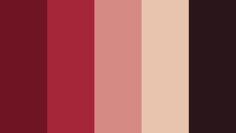
- HEX Codes: #6e1423, #a62639, #d58b83, #e8c4ae, #29151a
- Mood: Dramatic, passionate, and theatrical.
- Use for: This palette fits gala invitations, luxury restaurant videos, beauty campaigns, cinematic trailers, and attention-grabbing social thumbnails.
Ruby and velvet black deliver drama, while muted blush and beige keep the design balanced. The darker reds feel passionate and theatrical, making the palette ideal for visual storytelling that needs immediate emotional impact.
Use ruby for focal graphics and calls to action, velvet black for cinematic framing, and beige or blush for supporting text. This palette is effective for restaurant branding, beauty launches, gala promotions, trailers, and bold social media thumbnails.
Sapphire Silk Society
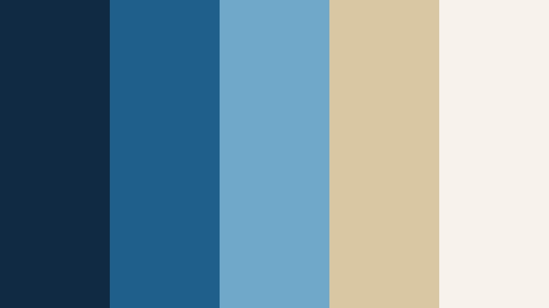
- HEX Codes: #102a43, #1f5f8b, #6fa8c9, #d9c7a3, #f7f3ea
- Mood: Cultured, poised, and quietly powerful.
- Use for: This palette is useful for finance branding, luxury travel content, educational videos, corporate decks, and premium editorial graphics.
Sapphire blue gains warmth from silk-like beige and ivory accents. The result feels trustworthy, elevated, and versatile across digital and print design, with enough contrast for professional communication.
Use the deepest blue for structure and headlines, lighter blue for secondary elements, and beige or ivory for balance. It works well for finance videos, luxury travel stories, corporate presentations, educational content, and premium editorial layouts.
Onyx Coral Statement
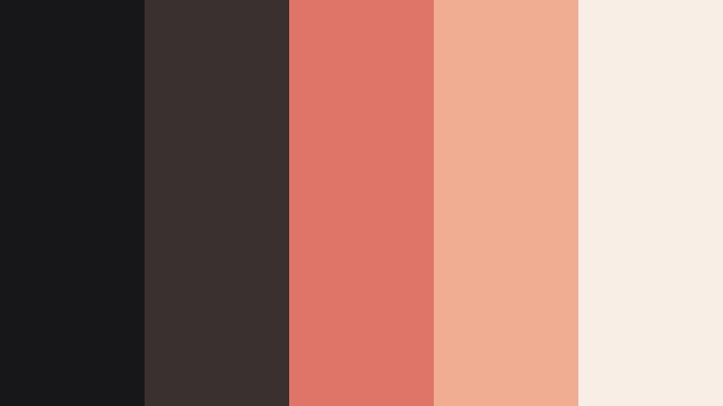
- HEX Codes: #171719, #3a3030, #df7568, #f1ad91, #f9eee5
- Mood: Striking, modern, and fashion-forward.
- Use for: Use this palette for modern fashion edits, product launches, bold UI accents, social campaigns, and dynamic motion graphics.
Onyx gives the palette a strong foundation while coral and peach add energetic sophistication. The dark base creates structure and contrast, while the warm accents make the design feel current and expressive.
Use onyx for backgrounds and cinematic frames, coral for calls to action and animated titles, and peach or cream for softer supporting details. This combination is ideal for fashion content, product launches, motion graphics, and modern social campaigns.
Natural And Earthy Luxury Brand Color Palettes
Terracotta Estate
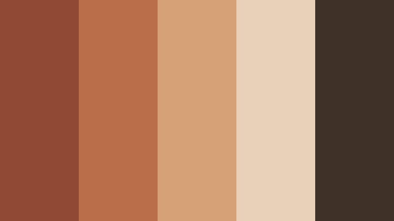
- HEX Codes: #8f4935, #b96f4a, #d7a177, #e8d1b8, #3f3028
- Mood: Earthy, welcoming, and richly handcrafted.
- Use for: This palette works well for travel vlogs, artisan brands, home decor content, restaurant identities, and warm lifestyle thumbnails.
Terracotta and clay tones create a grounded luxury feel inspired by sunlit estates and handmade materials. The palette feels tactile, warm, and authentic while retaining enough depth for premium design work.
Use terracotta for headings, graphic accents, and transitions, then pair it with pale sand for backgrounds and dark brown for readable text. It is a natural fit for travel vlogs, artisan products, home decor, restaurant branding, and lifestyle thumbnails.
Olive Cashmere Club
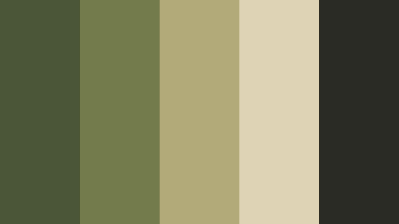
- HEX Codes: #4b5638, #737b4b, #b2aa78, #ded3b5, #292b24
- Mood: Calm, cultivated, and naturally exclusive.
- Use for: This palette is suited to wellness videos, sustainable brands, outdoor luxury campaigns, editorial layouts, and refined packaging.
Olive green and cashmere beige bring an understated premium quality to natural visuals. The green tones suggest calm and authenticity, while the neutral shades provide a soft, sophisticated foundation.
Use olive for logos, overlays, and title cards, and introduce beige for backgrounds or product labels. This palette balances organic character with a refined design finish, making it useful for wellness, sustainability, outdoor luxury, and lifestyle content.
Midnight Sand Escape
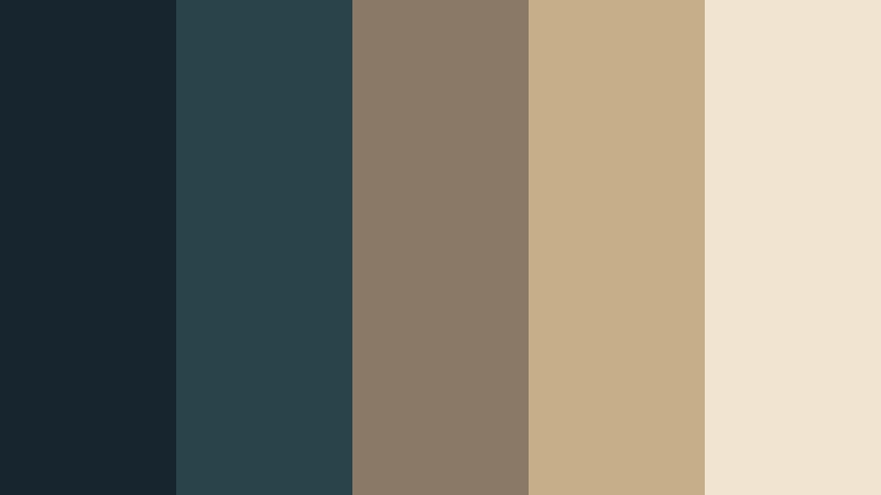
- HEX Codes: #17252f, #29434b, #8a7966, #c6ae8b, #f1e5d2
- Mood: Serene, cinematic, and quietly adventurous.
- Use for: This palette is ideal for luxury travel films, destination thumbnails, hotel branding, documentary titles, and atmospheric website design.
Midnight blue-green paired with sand and cream evokes a refined escape. The dark tones add cinematic depth, while the warmer neutrals make the overall look inviting rather than cold.
Use midnight blue-green for title sequences and dramatic backgrounds, then add sand or cream for captions, maps, and destination details. This combination gives travel stories, hotel videos, documentaries, and atmospheric websites a warm and sophisticated identity.
Tips for Creating Luxury Brand Color Color Palettes
A strong Luxury Brand Color palette should feel intentional across every touchpoint, from video footage and thumbnails to logos, captions, and social media templates. Combine a dominant shade with supporting neutrals and one or two accent colors so the result feels premium without becoming visually crowded.
- Use contrast carefully so titles, subtitles, and calls to action remain readable on both bright and dark footage.
- Pair rich Luxury Brand Color shades with ivory, cream, beige, or soft gray to create breathing room in the design.
- Use metallic colors such as gold or champagne as accents rather than covering large areas, which helps them feel more exclusive.
- Choose colors that match the lighting and subject of your footage. Warm palettes suit golden-hour scenes, while jewel tones can support controlled studio lighting.
- Keep the same core colors across intros, lower thirds, thumbnails, transitions, logos, and end screens to strengthen brand recognition.
- Test HEX colors on mobile screens and small thumbnails because subtle contrast can disappear when the design is reduced.
- Use one dominant color, one supporting color, and one accent color before adding more shades to avoid a disconnected visual identity.
- Adjust saturation and brightness based on the project mood. Muted colors feel timeless, while brighter accents create a more energetic luxury style.
Luxury Brand Color palettes can shape how viewers interpret a product, story, or creator identity before the first spoken word. Deep neutrals suggest exclusivity, metallic accents add polish, jewel tones create authority, and soft earth colors bring warmth and authenticity.
Try these HEX combinations in your next thumbnail, intro, product video, or social media campaign. Filmora gives you practical tools for matching footage, refining tones, applying filters, and keeping your visual identity consistent from the opening frame to the final call to action.
Experiment with different levels of contrast and saturation to find the version that best suits your brand. A carefully controlled palette can make even a simple edit feel more cohesive, memorable, and premium.
secure download